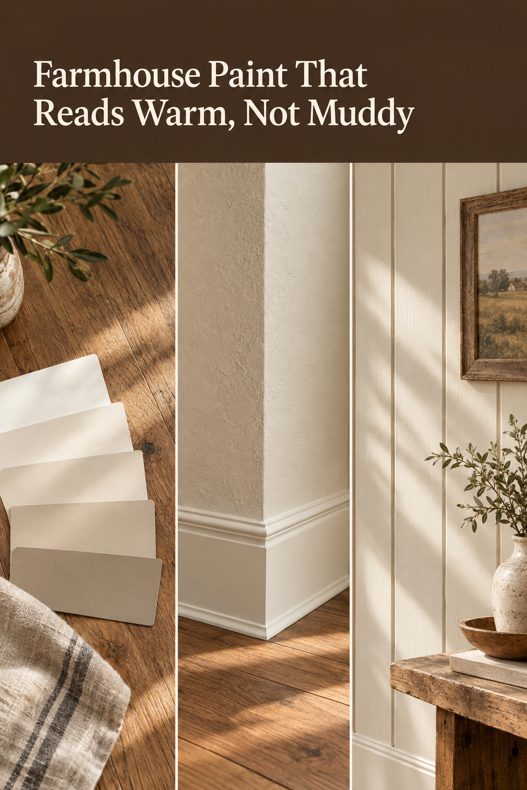
A room is quiet or it is not, and paint decides more of that than furniture does. Most people choosing modern farmhouse paint colors are chasing a feeling they had in someone else’s light. Then the tin goes on their wall and the warmth drains out. It is flat by four o’clock and grey by lamplight. The colour was chosen for another room’s light.
TL;DR
- The three warm whites this style leans on are near-identical in brightness (SW Alabaster LRV 82, BM Swiss Coffee OC-45 at 82, BM White Dove OC-17 at 83.16) and still behave three ways in one room, because LRV says nothing of undertone.
- A warm white under 2700K bulbs compounds its warmth, while a cool white under that bulb fights it. No LRV figure predicts either.
- Grade the sheen rather than using one everywhere: matte or eggshell on walls, semi-gloss on trim, per Sherwin-Williams’ and Benjamin Moore’s guidance.
Where Modern Farmhouse Paint Colors Go Wrong
Reading a light reflectance value as a light budget
I have never specified a paint schedule or mixed a can for a living, and I will not write as though I have. I have spent eight years treating light as an input to a mind rather than a finish: how much a room holds, and what it asks of you at seven in the morning. The borrowing, stated plainly: I read a light reflectance value the way I read a room’s light budget. It is an analogy and no credential. LRV measures the percentage of light a colour returns rather than absorbs, from 0 at absolute black to 100 at pure white.
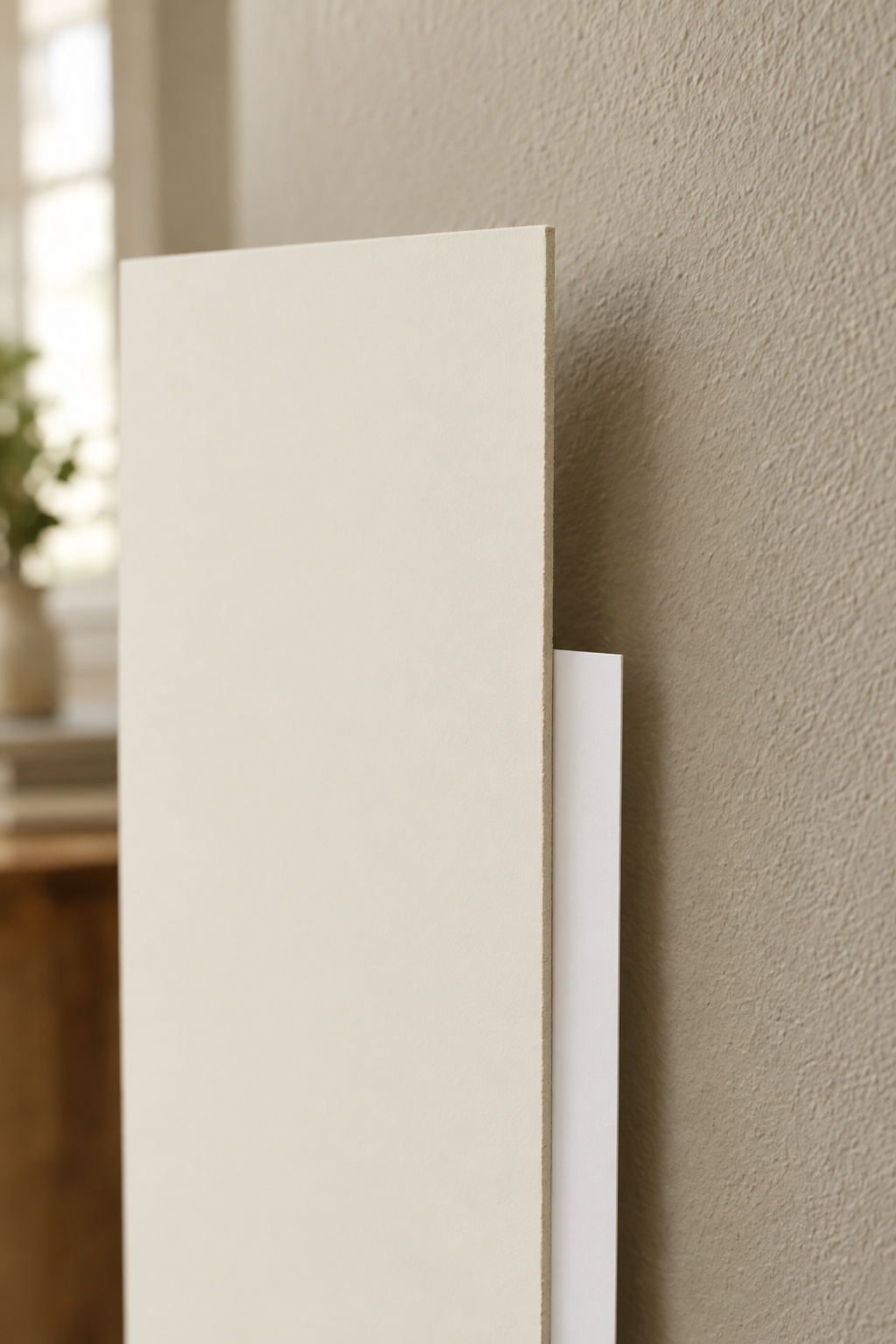
Here the usual assumption breaks: a higher LRV is not uniformly safer. LRV measures how much light comes back, not what colour it comes back, so a high-LRV white returns more of whatever cast the room’s light already carries. Under mismatched bulbs it can look worse than a mid-LRV greige under suitable light. Brightness is a quantity. Warmth is not.
What a swatch can’t tell you
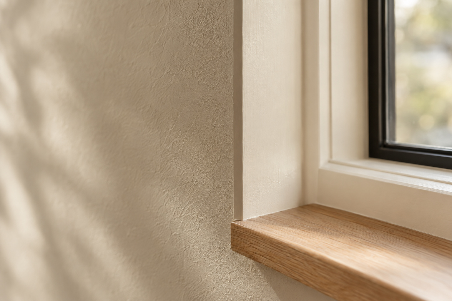
Undertone is a secondary colour inside the mix, and it shows only by comparison. Sue Wadden, Sherwin-Williams’ director of color marketing, says it flatly: “If you’re just looking at a white by itself, it will probably just look white.” A one-inch chip shows no scale, no adjacent colour and no time of day. Read the mid-to-darker steps of the strip, and put large samples against the floor and trim you own.
The Modern Farmhouse Paint Colors That Read Warm, Not Muddy
The warm-white band by LRV
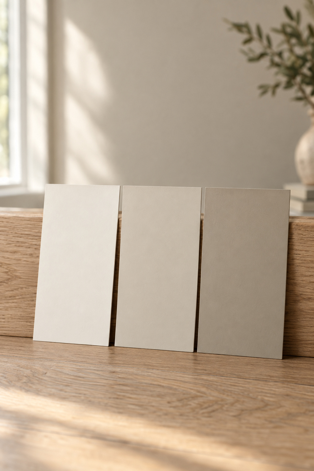
Three whites carry this style. Their brightness is functionally identical, yet they behave differently in one room.
| Colour | LRV | Undertone | Source grade |
|---|---|---|---|
| Sherwin-Williams Alabaster SW 7008 | 82 | Yellow-cream | Manufacturer |
| Benjamin Moore Swiss Coffee OC-45 | 82 | Subtle green lean; suits north-facing and low-light rooms | Trade |
| Benjamin Moore White Dove OC-17 | 83.16 | Creamy yellow with a grey balance | Trade |
One point of LRV separates the extremes, and the results differ three ways. Alabaster’s figure is the manufacturer’s own and the other two are trade figures. I say so rather than imply one authority for all three. A fourth sits here only for comparison: Benjamin Moore Simply White OC-117, warm beside natural wood under daylight and bulbs alike, though its recorded use is dining-room-scoped. Treat it as data, not a recommendation.
Stepping down into greige, and where each one fails
Below the whites the light budget tightens, and each step has a recorded failure.
| Colour | LRV | Where it fails |
|---|---|---|
| BM Pale Oak OC-20 | ~70 | Reads medium grey in a dark north-facing room instead of soft warm beige |
| BM Edgecomb Gray HC-173 | 63.09 | Holds warmth in dim rooms, but flattens out entirely with no daylight at all |
| SW Accessible Beige SW 7036 | 58 | Heavy or muddy in low light and small rooms; wants south or west exposure |
Pale Oak’s value is recorded as approximate, so I keep the tilde and do not tidy it into false precision. As LRV falls, undertone risk rises. Less returned light carries the warmth, so the room’s own cast takes over, and lower is not cosier by default.
What a Cool-White Wall Does Under a Warm Bulb
2700K light and warm-versus-cool paint
Two measurements explain nearly every wall that looked right in the store and wrong at home. Benjamin Moore’s technical course on light keeps them apart.
| Measurement | What it describes | Working numbers |
|---|---|---|
| Correlated colour temperature (Kelvin) | the colour of the light itself — lower warmer, higher bluer | residential lighting 2500–5000K; 2700K is standard soft white |
| Colour rendering index (0–100) | how faithfully that light renders everything else | above 80 adequate, 90+ excellent |
Under 2700K, warm colours enhance creamy, yellow and peach undertones. Under 5000K daylight the same wall emphasises blue and grey. Past roughly 3800–4200K the light stops supplying the warmth the colour was built to return.
The compounding-warmth pairing that works
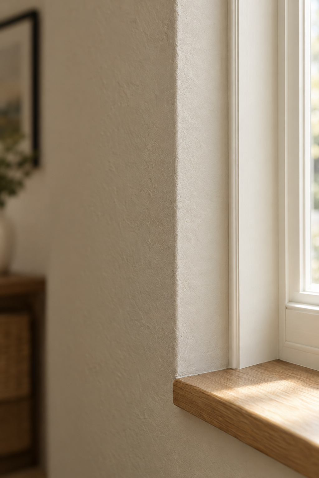
A warm white in the LRV 75–84 band under 2700K compounds, with paint undertone and bulb cast reinforcing each other. A cool white at the same brightness fights that bulb, and the room never settles. Keep fixtures within about 500K of each other, adjoining rooms included: a 2700K lamp under a 4000K overhead is two rooms of light in one. Tonight, swap a bulb for 2700K and watch the wall you have.
Getting the Trim Warmer Than the Wall
The single most common mistake in this palette
I once sat with a client in tech who could not bring herself to use her finished meditation room. One small object, a wall clock, asked something of her whenever she looked up, and the room came right when it came down. One object can hold a room hostage, and in a farmhouse palette it is rarely furniture. It is usually a stark, cool-toned trim board bought as a safe neutral, contradicting every warm wall it touches.
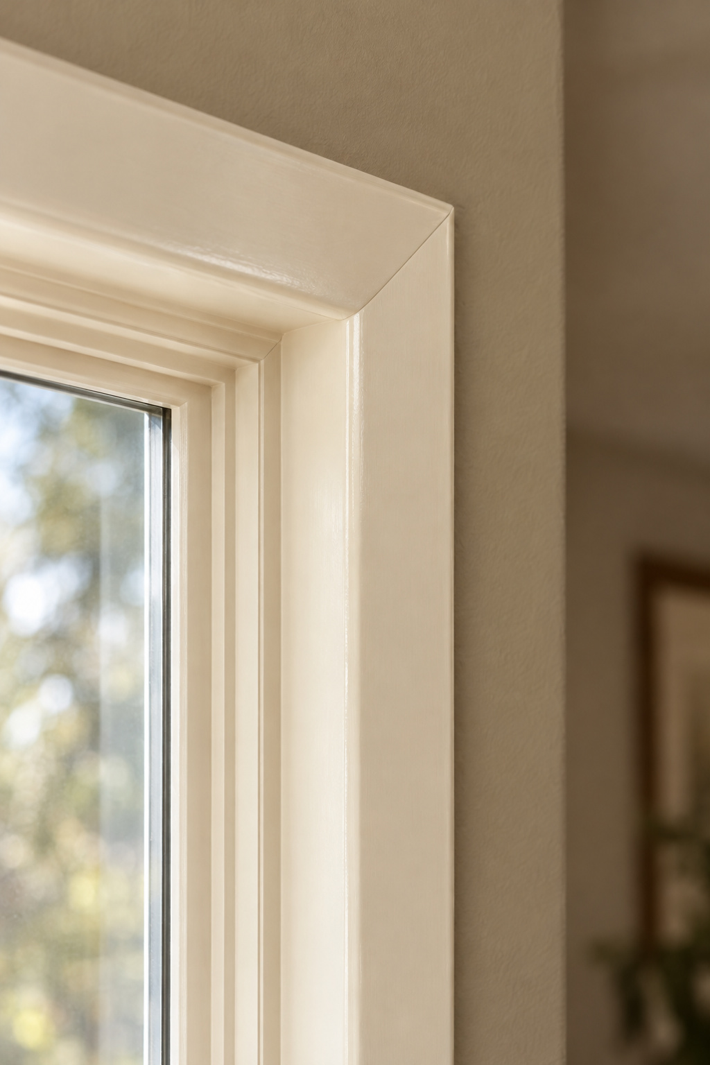
Named designers, quoted independently, say cool white trim against a warm-undertone wall looks harsh and leaves the wall beside it dull. Sherwin-Williams says it from the other side: pure white trim suits strong daylight and cool-toned walls, and in dim rooms it will look grey. Stay inside one undertone family, since mismatched undertones are the mechanism behind a room that feels off for no visible reason.
Distribution follows the same logic. The 60/30/10 split is a trade rule of thumb, and it earns its keep here because the dominant 60 does the light-returning work. The 30 and 10 are the safe places for saturation.
A quick test against your own wall colour
Hold the trim white against the wall colour or its sample; the mismatch stays invisible until the two sit side by side. If you would rather not coordinate a third white for the ceiling, pick one that already looks warm from the can.
Sheen: Where the Flat Builder-White Look Actually Comes From
Colour is rarely the cause of the flat, faintly clinical version of this style. One sheen used everywhere is.
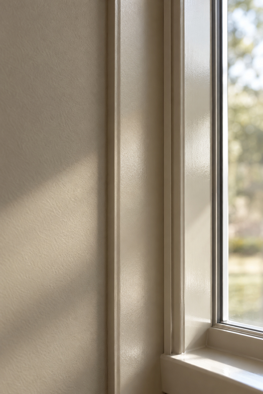
Reading the gloss and reflectance bands
If LRV is how much light a surface returns, sheen is how it returns it: scattered softly, or bounced straight back.
| Sheen | Light reflected |
|---|---|
| Flat / matte | 0–5% |
| Eggshell | 10–25% |
| Satin | 25–35% |
| Semi-gloss | 35–70% |
| Gloss | 70%+ |
The step between matte and eggshell shows on one colour from one tin, and a dark paint looks measurably lighter in eggshell. Check the finish before blaming the colour.
The right sheen for walls versus trim
Two manufacturers, sourced separately, land on the same split.
| Surface | Sherwin-Williams | Benjamin Moore |
|---|---|---|
| Living-room walls | matte | eggshell |
| Trim, doors, cabinets, wainscoting | semi-gloss | semi-gloss or soft gloss |
The reasoning is functional before visual. Trim takes contact and must wipe clean, while a lower sheen on walls softens plaster texture instead of lighting every flaw.
Painting a Boarded Wall
Why sheen and undertone read differently on shiplap
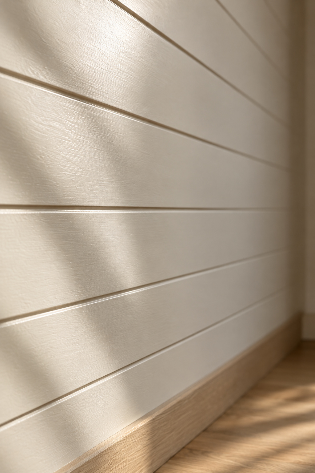
Boards leave all of the above standing and make it visible. The grooves throw shadow lines, so a colour can shift across the day on a boarded wall in a way it never would on drywall. Lighter warm whites keep the grooves as texture, and darker colours harden them into lines. Satin is the sheen commonly recommended for board walls, though that rests on one trade source, without the manufacturer consensus behind the rest of this.
Where the full wall-paneling guide lives
Board width, the reveal gap and how long timber sits before fixing are Tess Carver’s, in her guide to painting a boarded wall, and I have sourced no competing figure. If you are also weighing whether this palette lasts, Henrik Larsson covers how to keep a farmhouse palette from reading dated. Paint is one decision inside the wider farmhouse scheme this colour sits in.
Come back to where this started: a room that holds its warmth at four o’clock and at nine in the evening. No famous colour name gives you that. Three readings do: the light a colour returns, the light your bulbs supply, and how each surface hands it back. Sample three whites on your wall and look morning, midday and lamplit. The one warm in all three is yours.
FAQ
Do warm whites work in a room with little natural light?
Yes, though the choice narrows. Benjamin Moore Swiss Coffee OC-45 at LRV 82 is recommended for low-light and north-facing rooms, and both major manufacturers advise a white with a hint of yellow against a cool northern cast. Stay in the LRV 75–84 band: Pale Oak at ~70 goes grey there.
How many paint samples should you test before committing?
Three independent sources converge on three: fewer risks missing a better option, and past five the colours blur. Designer Bobby Berk narrows to three to five candidates, paints a two-foot-square patch of each on the wall, then views them morning, midday and evening.
Does ceiling color need to match the wall color?
No. The usual default matches the ceiling to the trim white rather than the wall, which avoids coordinating a third white. A bright cool ceiling over warm walls draws the eye to the join and can make the ceiling look lower; a white leaning to the wall’s undertone softens that line.