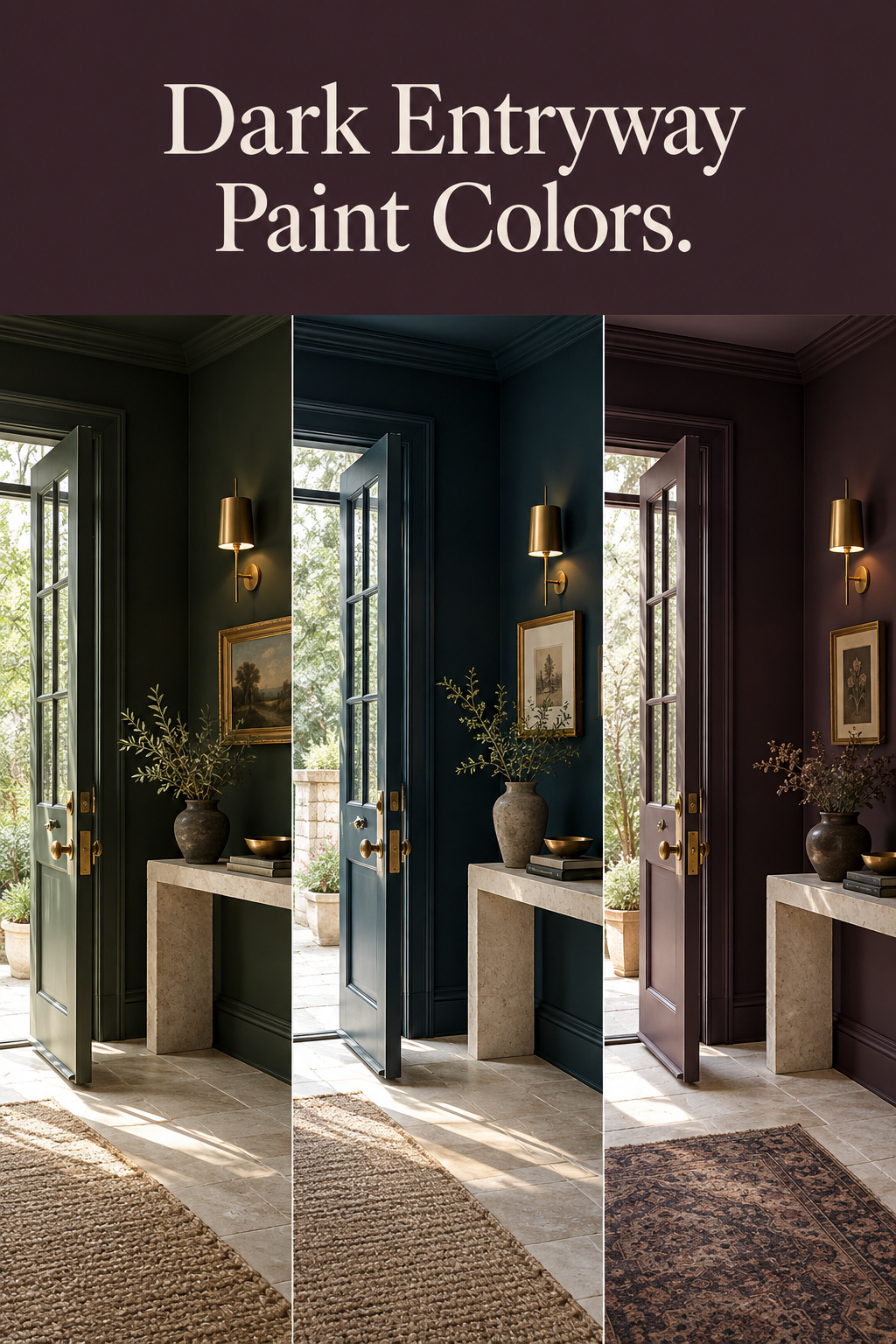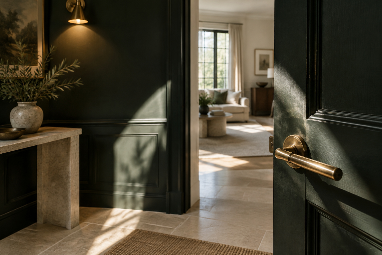
A paint chip is a small, honest-looking thing: five colors in a strip, pale to deep, the darkest square at the bottom. Under the store’s even ceiling light, every bottom square looks calm and certain, and most dark entryway paint colors pass that test. Few are shown the light that matters in an entry: the front door swinging open on a full sky. I have ruled most dark wall colors out at two moments, the open door and the view back from the brighter room next door. What is left is a short list, a test for it and one rule for choosing.
TL;DR
- An entry is judged at two moments no other room forces on a color: the door opening onto daylight, and the sightline from the brighter room beyond. Choose for both, not for the chip.
- For a north-facing door, pick a warm-undertoned dark near the top of the “dark” LRV band (roughly 2-10), such as Benjamin Moore Forest Green (LRV 7.58) or Van Buren Brown (LRV 9.52), over cooler options like Hunter Green (LRV 6.39).
- Test on an A2 board with two coats and a 24-hour dry, checked morning, noon and evening, then add a fourth check with the door wide open.
Why an Entryway Judges a Dark Color Differently
Most rooms are judged in one light. An entry is seen at two extremes on every use: the moment the door opens onto daylight, and the moment you look back into it from a brighter room.
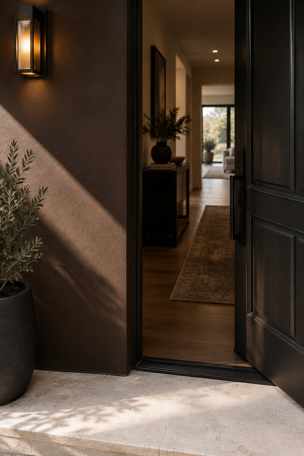
Settle first what you want to see the second the door opens. Which dark color you like under store light comes later.
For years I have photographed rooms at 7am in February. If a room holds up in the poorest light the year offers, it holds up. An entry turned that habit around: here the hardest light is not the dim one. It is the door opening. A dark wall that looks rich in a closed, lamp-lit hall can turn gray and chalky the instant a slab of sky falls across it. That is the version your guests see first.
This is where the chip lies. It never shows the color hit by a shaft of daylight, or set beside whatever is on the walls of the next room. Color research treats a surface and the light on it as one relationship, not a fixed fact, and an entry stretches that relationship furthest. The general case for dark walls lives in the site’s Moody Living Room Paint Colors article. This one stays at the door.
What Happens When Daylight Hits the Wall
Which way does your front door face? That answer does more to your color than the color card does.
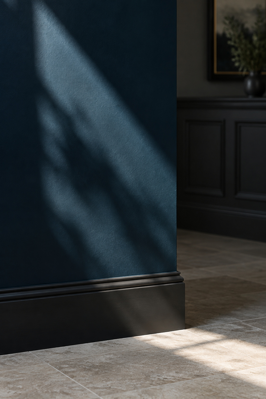
A north-facing door lets in the least light of any orientation, and cool-undertoned darks suffer most under it. Sherwin-Williams advises a warm undertone beneath the dark hue for north light, chosen from the higher end of your LRV band, because that light flatters nothing. Coolness shows more sharply on a dark wall than a pale one, since less reflected light is there to warm it back. A south-facing door is the forgiving case, and Farrow & Ball singles out south-facing spaces as the easiest for a dark choice.
LRV, light reflectance value, is the number to filter with. It runs from 0 to 100 on a standardized scale (BS 8493). Calling roughly LRV 2-10 “dark” is a design convention layered on top of that scale, not part of the standard. It’s useful for sorting chips and not a technical cutoff.
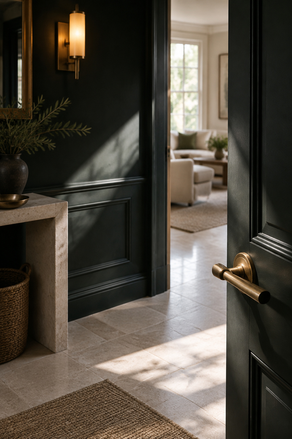
The open door also puts the brightest thing in the house directly beside your wall. Josef Albers described this as simultaneous contrast: a bright area next to a dark one makes both look more extreme than either alone. A 2013 field study by López-Besora and colleagues at the Universitat Politècnica de Catalunya found identical light levels perceived as brighter or darker depending on wall color. The same paint looks like two colors six feet apart.
Black is the reference every other dark is measured against at that door. Black and near-black entry walls make their own case, covered on their own page, so everything below is the rest of the dark range.
The Green, Blue and Aubergine Families — and What Each Does Next to Daylight
Here is the short list. Benjamin Moore publishes its own LRVs, so I prefer them where the number matters. Farrow & Ball does not, and third-party estimates for its colors disagree wildly, which makes that brand’s figure approximate.
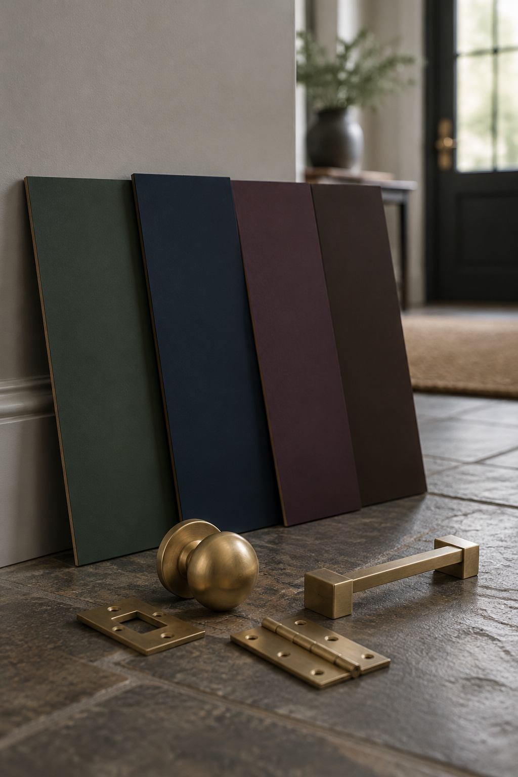
| Color | Family | LRV | Undertone | At the open door |
|---|---|---|---|---|
| Benjamin Moore Forest Green 2047-10 | Deep green | 7.58 | Warm yellow-green | Holds its value |
| Benjamin Moore Hunter Green 2041-10 | Deep green | 6.39 | Cool blue-green | Can go gray under north light |
| Farrow & Ball Hague Blue No. 30 | Navy / ink | about 7 (estimate) | Shifts navy to teal | Moves with the light |
| Benjamin Moore Hale Navy HC-154 | Navy | 8 | Green | Strong after dark too |
| Benjamin Moore Exotic Purple 2071-10 | Aubergine | 5.46 | Violet | Near-black until the door opens |
| Benjamin Moore Van Buren Brown HC-70 | Red-brown | 9.52 | Warm red | Warm, avoids the muddy read |
Deep greens and navy blues against a bright doorway
Two greens show how much undertone matters at a threshold. Forest Green has enough yellow warmth to hold its value when daylight hits it, and the manufacturer rates it for whole-home use. Hunter Green is cooler and the brand recommends it as an accent. Under a north-facing door it is the one likely to go gray and flat. For a north-facing entry, choose Forest Green and stop looking.
Hague Blue moves between navy, ultramarine and deep teal with the light, which is exactly the instability an open door exposes. That can be lovely if you accept a wall that changes its mind. Hale Navy is steadier. Its green undertone warms under warm lamp light, which is how most entries are lit after dark. I found no manufacturer-published LRV for a true teal, so I give none.
The two families usually skipped deserve a look. Exotic Purple looks nearly black in anything short of direct daylight, then returns to violet when the door opens, so choose it only after testing there. Van Buren Brown, which the brand calls “a deep, dignified brown that leans towards black,” is warm enough to avoid the muddy look a cooler brown takes under weak north light.
At the door, then:
- Warm: Forest Green, Hale Navy, Van Buren Brown
- Cool: Hunter Green, Hague Blue in cool light
- Test first: Exotic Purple, which changes most between closed and open
Judged From the Next Room: Matching the Color Beyond the Entry
The second moment is quieter. You are at the kitchen counter, looking back through the doorway. The entry is now a dark rectangle framed by a bright room.
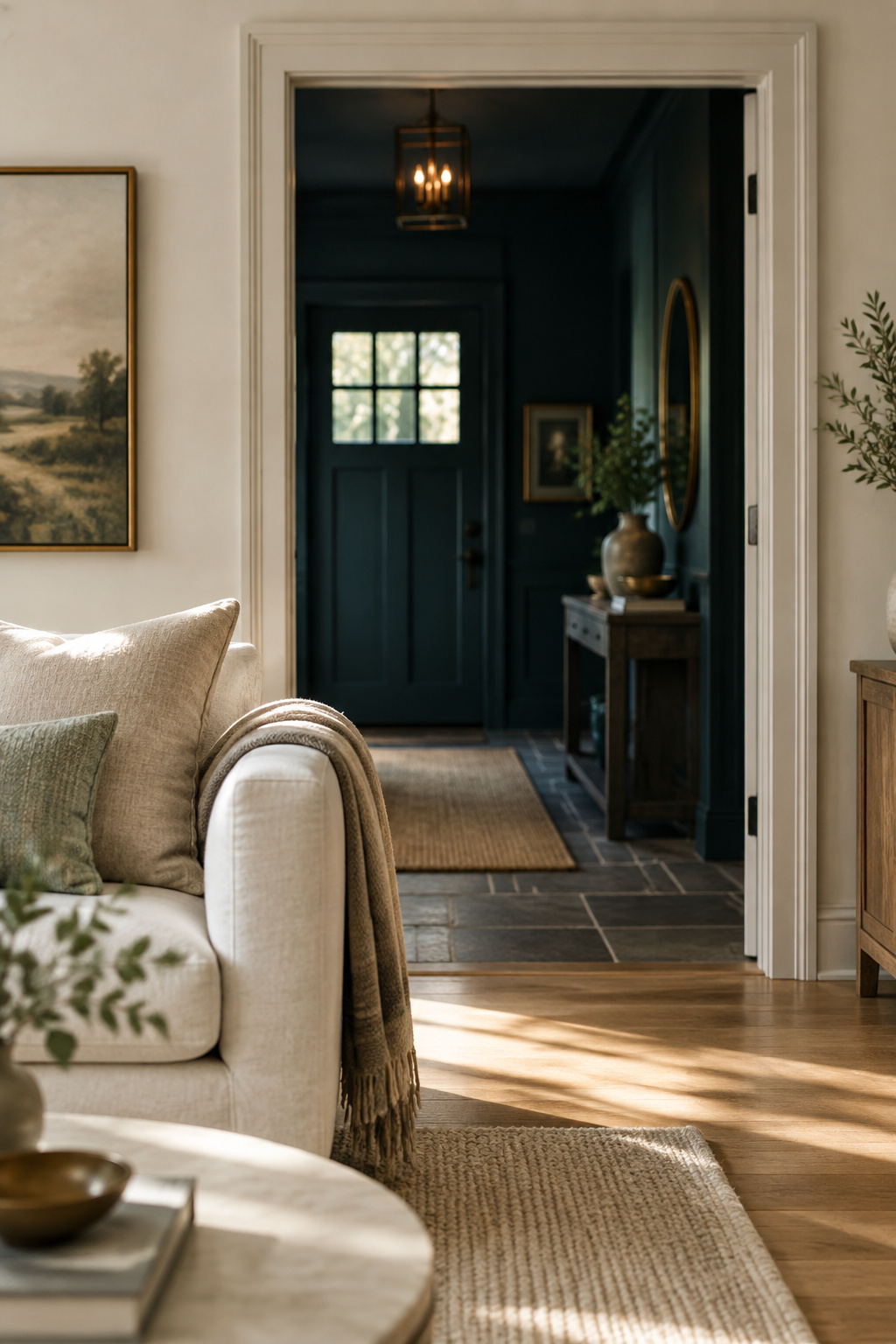
Now the question is whether the two rooms agree. Warm colors carry red, orange or yellow undertones, and cool colors carry blue, green or gray. Mixing temperatures between adjoining rooms creates a faint dissonance even when each looks fine alone. The painters’ rule is to keep roughly 60 percent of the visible surfaces in one undertone temperature.
That is trade advice, and good trade advice, but I found no study measuring how an adjoining room’s color changes the way another space is perceived. Treat the 60 percent as a rule of thumb, not a finding.
Interior designer Melissa Vickers frames the choice as a cohesive thread or a deliberate contrast, not a rule that both rooms must match. Once the front door closes, one warm source usually lights the entry, and in that light undertone becomes the dominant impression. So match temperature and let depth differ. A warm green entry beside a warm white living room is a considered pair; a cool navy beside the same room is a small argument at every glance.
If a full wall feels like too much, a two-color split, dark below a rail and lighter above, eases the step into a brighter room. It is a separate decision with its own proportions.
Sheen as an Optical Decision, Not a Durability One
Sheen is usually chosen for cleaning. In an entry it also decides what the open door does to your wall.
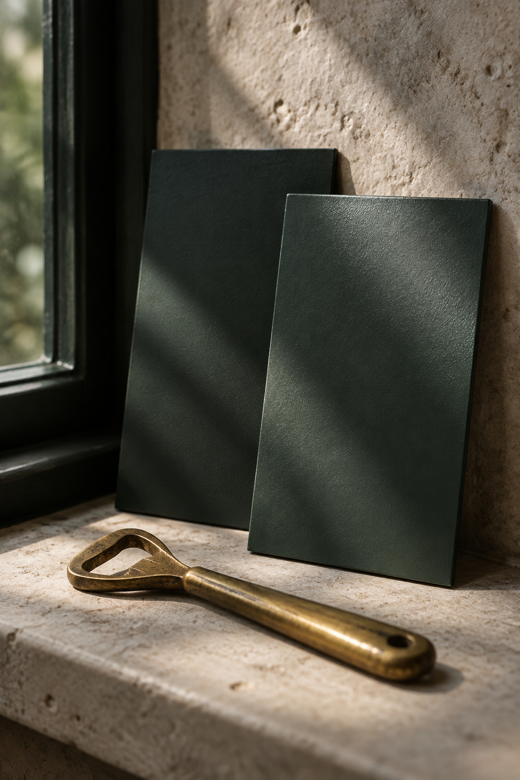
Finishes reflect light in known bands: flat or matte 0-5 percent, eggshell 10-25, satin 25-35, semi-gloss 35-70, full gloss above 70. On dark colors the matte-to-eggshell gap is visible, and the same paint in eggshell looks measurably lighter. Sheen changes how dark a color appears without changing its LRV.
At the door, a higher sheen throws daylight back as a bright band crossing the wall. A flatter finish absorbs it and keeps the color uniformly dark where the light lands. It is a choice about how much the daylight moment should show. I lean flatter, because I would rather the light belong to the doorway than to the paint. Which finish survives boots and bags is a separate question, answered in the site’s coverage of black entryway walls.
Sampling It at the Door Before You Commit
A chip under store light is no reliable test for a dark color. The standard method is a large board, and an entry needs one step that method leaves out.
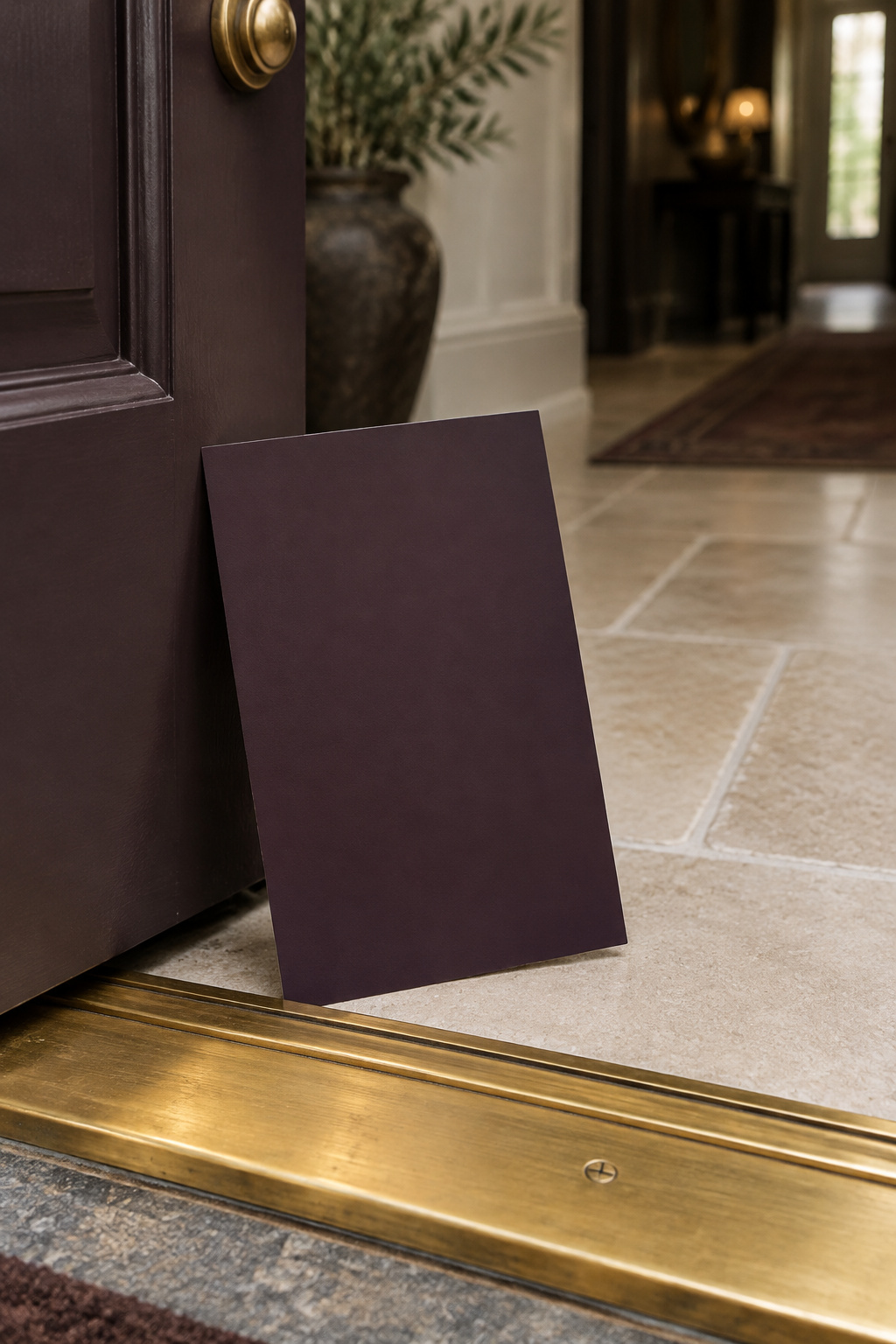
- Paint a full sheet of lining paper or white poster board, at least A2 size, with two coats, and let it dry for 24 hours. Do not paint the wall itself.
- Leave it up for at least three days and look at it morning, midday, late afternoon and under evening lamps.
- Move it between a wall that gets direct sun and one that does not.
- Hold it against the trim, the floor and the color of the room seen through the doorway. Undertone only shows itself in comparison.
- Then the entry step: stand the board where the wall will actually be seen, open the door wide on full daylight, and look again. Standard sampling guidance leaves this out because it is written for rooms that are not also thresholds.
That is the decision rule: a dark entry color has to pass the open door and the view back. A color that fails either is the wrong color, however good the chip looked.
Once it passes, the color sets up the rest of the entry; see how the color fits the whole dark entry. The door is the next boundary. It is the largest single surface seen against your wall, so choosing the wall is already half of the front door’s own color decision. Before paint goes on, settle whether the color stops at the walls or covers every door and frame. That question is not mine to answer here.
FAQ
Should the entry be darker or lighter than the room beyond it?
Depth can differ; undertone shouldn’t. Harmony from the next room comes down to temperature: keep the entry’s warm or cool undertone in line with roughly 60 percent of what’s visible beyond it. A warm dark beside a warm room feels considered, while a cool dark beside the same room looks like a small argument at every glance.
What color should trim be with a dark entryway wall?
White is the safest trim color against any dark wall because it works with every hue family without competing for attention. Darker, contrasting trim is a growing alternative, but choose it deliberately rather than by default, since dark-on-dark changes how much contrast the entry shows at the door.
Does a dark entryway work with a north-facing front door?
Yes, if you shift your pick. North light is the coolest and least generous of any orientation, so choose a warm-undertoned dark from the higher end of the “dark” LRV band, such as Forest Green or Hale Navy, rather than a cooler color like Hunter Green, which tends to go gray and flat once daylight crosses it.