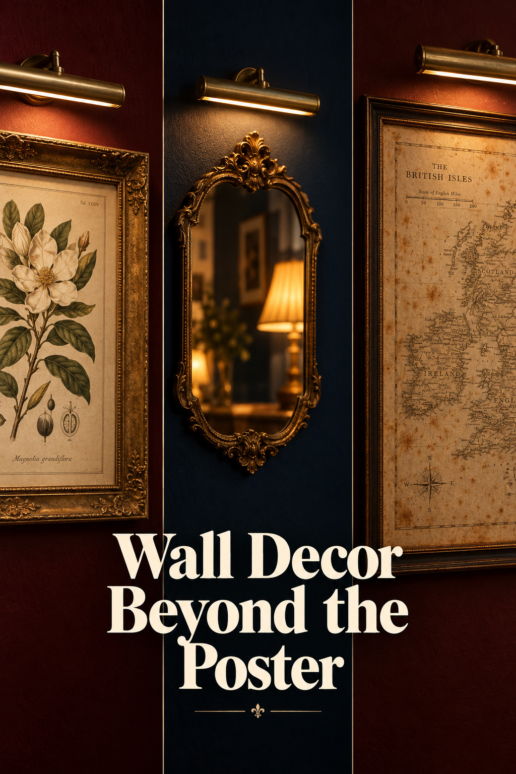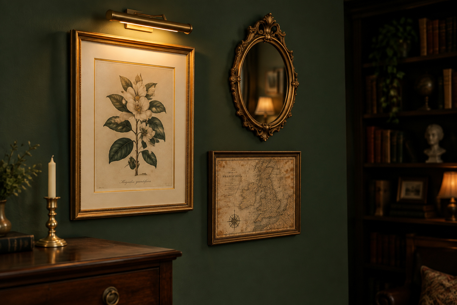

No figure exists for how much of a wall should carry art. I went looking for a code or a trade convention, and the absence is real. Nothing tells you whether a given print deserves a frame either. That gap is why dark academia wall decor is the flooded category it is, where every shop sells the same three sepia-filtered botanicals and calls it scholarship. What you can assemble yourself is a working standard: honest sources, framing choices, hanging heights, and what light does to paper over time.
TL;DR
- Four sources carry this look honestly: public-domain prints, maps, mirrors and personal documents. Their terms differ: the Met, the Smithsonian and the NYPL release images under CC0, while the Library of Congress and David Rumsey make you verify each item.
- Framing does the aging: a 2–4 inch mat in cream rather than stark white, and glazing blocking 97% of total UV, the Professional Picture Framers Association’s threshold for the label.
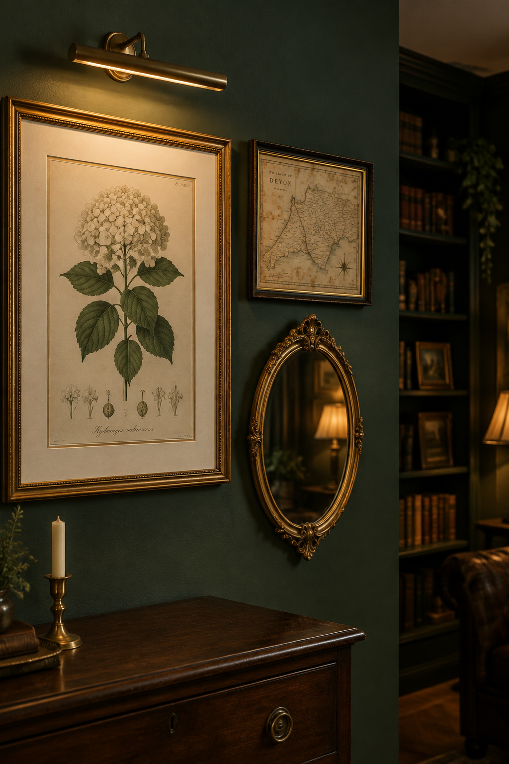
- Height follows two conventions: 6–10 inches above a headboard, and a 50–55 inch centerline above a desk with 4–6 inches clear above the tallest thing on it. Neither is a published standard.
Cutting through the poster aisle: four sources of dark academia wall decor
“Public domain” is a legal status, and institutions people treat as interchangeable apply it in genuinely different ways. First, work out which of four places your piece comes from. Each behaves differently on price, credibility, and what the frame must do.
| Source | Rough cost | How convincingly it reads old | What the frame has to do |
|---|---|---|---|
| Public-domain prints from museum collections | Paper and ink, if you print it yourself | High — the file is a photograph of a real object | Most of the work: mat, molding and glazing carry the age |
| Maps and charts | Free to licensed, depending on the collection | Highest — plate lines and period typography do the talking | Least; a plain dark molding is often enough |
| Mirrors | The widest range of the four | Entirely a function of the frame | All of it |
| Personal or family documents | Free, or unbuyable | Binary — it is old, or it isn’t | Protects rather than persuades |
The first row is where the legal status bites. Three major collections independently landed on the same design: CC0, no permission request, direct download. Two other obvious destinations have not.
| Collection | What its terms actually say |
|---|---|
| The Metropolitan Museum of Art | Over 492,000 public-domain images under CC0 — download, share and remix, no permission, no fee |
| Smithsonian Open Access | More than 5.1 million 2D and 3D items from 21 museums, nine research centers and libraries: “download, share, and reuse… right now, without asking” |
| New York Public Library Digital Collections | Over 180,000 items confirmed public domain at the highest resolution available: “No permission required. No restrictions on use.” |
| Library of Congress — caution | Does not own rights to its material and cannot grant or deny permission; a “no known restrictions” note is its best information, and you are told to verify independently |
| David Rumsey Historical Map Collection — caution | Licensed, not blanket public domain: only maps with a visible download button are cleared, credit is required, and post-1929 maps may still be in copyright |
The other two categories run on judgment rather than terms, and both judgments are mine. A mirror reads the part through its frame alone: gilt or dark wood on an ordinary modern mirror belongs; a chrome-edged one fights everything beside it. Documents run on authenticity instead: sheet music with somebody’s pencil fingering on it is old because it is old, while an aged reproduction with no history behind it reads as staged.
Framing and matting: making a ten-dollar print read like an old one
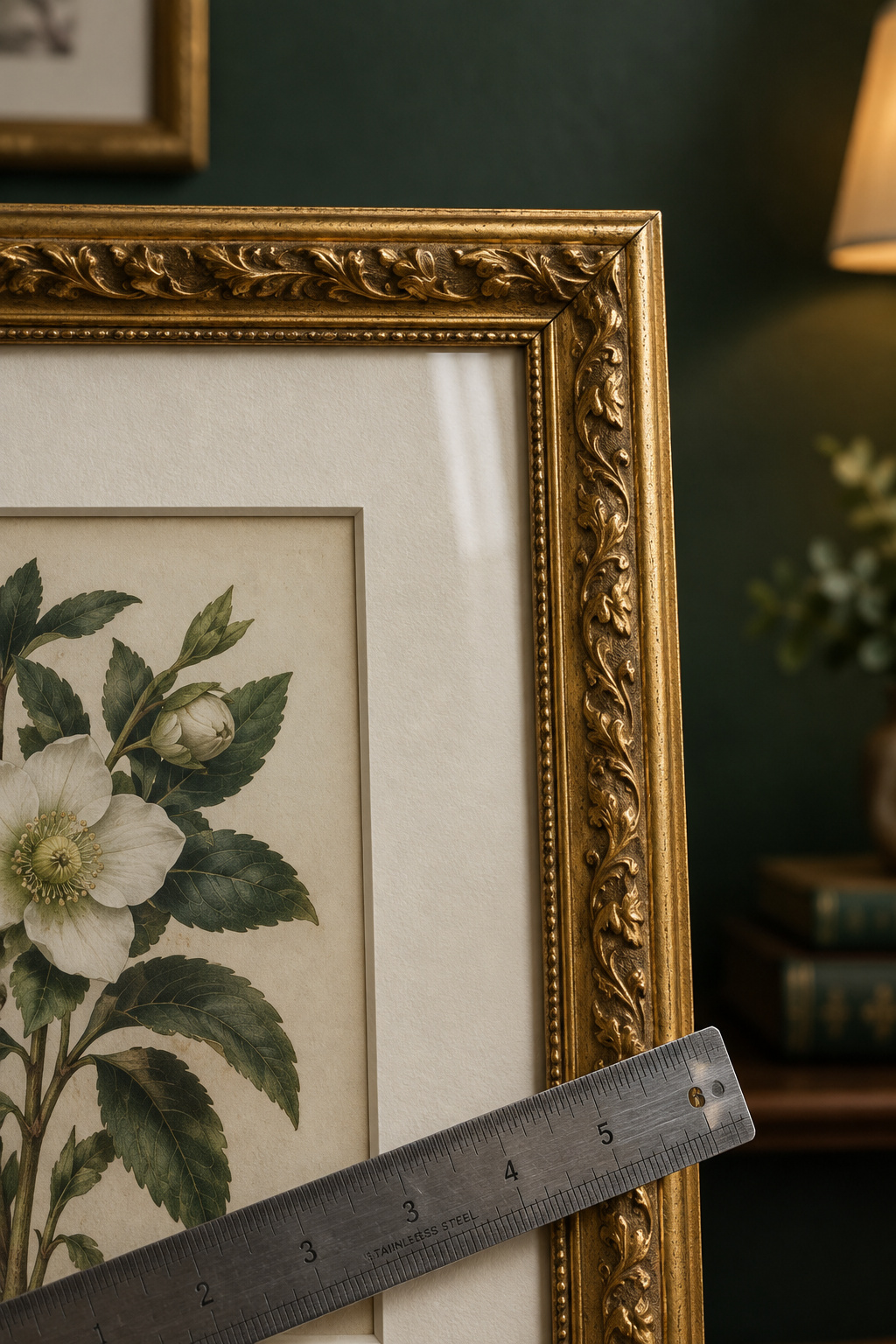
What gives an inexpensive print away is almost never the print. It is a mat cut too narrow, a molding chosen for its finish instead of its profile, and whatever glass was in the frame on the shelf.
Mat width and color
Professional framers converge on a 2–4 inch border, narrower on small work and wider on large. Behind it sits the rule of thirds: the minimum is roughly a third of the artwork’s smallest dimension. An 8×10 inch print gives 8 ÷ 3 = 2.67 inches, usually rounded up to 3. Go narrower and it costs you: borders under an inch and a half carry a documented higher damage rate.
Conservation sets its own floor: the American Institute for Conservation’s Book and Paper Group calls for at least two inches of matboard every side, bottom border deeper than top. The Professional Picture Framers Association classifies matboard quality, separating preservation-grade boards from decorative ones. That classification is a trade discipline, separate from color. On a dark wall choose cream or bone over stark white; a mat too close to the paint lets the piece sink in.
Glazing: glass vs acrylic
This detail changed how I buy frames. Ordinary soda-lime picture glass already absorbs about 97% of UVB, but it passes UVA, which fades paper just as happily. Everything you pay for in “UV glass” is therefore the UVA half of the spectrum. To carry the label under the PPFA’s definition, glazing must block at least 97% of total UV; Tru Vue’s Conservation Clear reaches 99% across 300–380nm.
Glass or acrylic is then a humidity question. Glass will not warp when humidity differs across its faces but vents nothing out of a sealed package; acrylic warps toward the damper side yet breathes enough to cut condensation, which wins in a humid room. Its shatter resistance settles it for an irreplaceable document.
- Mat: 2–4 inches, never under 1.5, cream rather than white
- Molding: profile before finish; depth is what catches a lamp
- Glazing: at least 97% of total UV, or the UV claim is empty
Hanging height above the bed: reading as one composition with the bedding
Art above a bed is judged against the headboard, not against the generic furniture-clearance chart most bad advice comes from. A headboard stands 40–55 inches tall against a sofa back’s 30–36, so a gap copied from a living room lands at a completely different height. From the doorway, the headboard, the bedding and the frame arrive as one block.
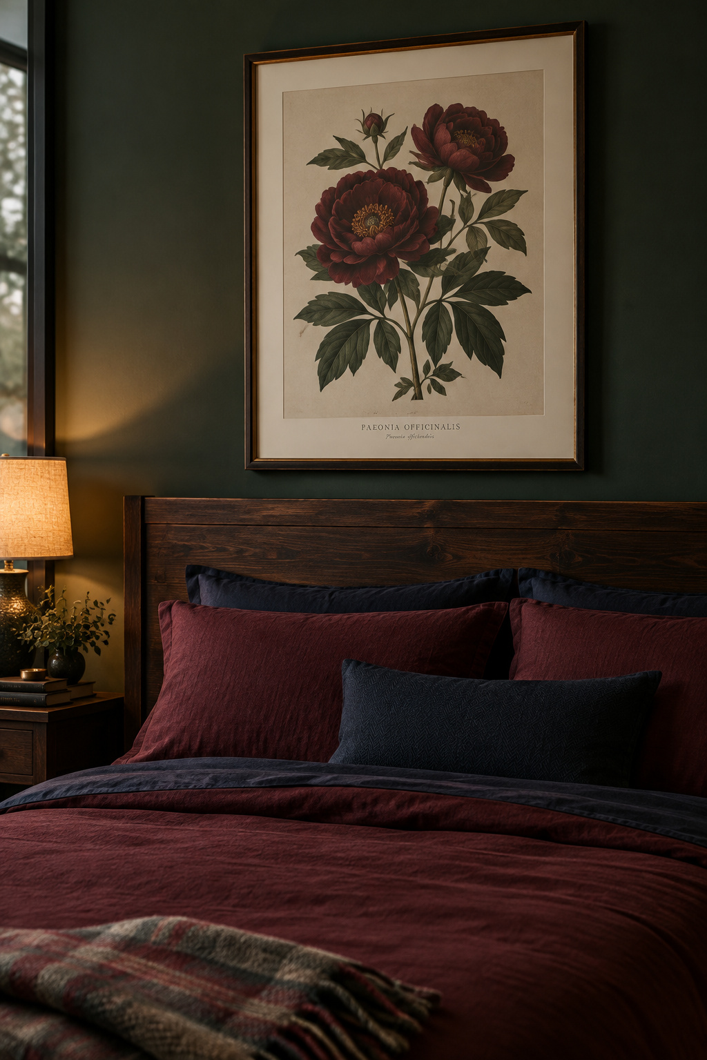
So measure from the headboard, never the mattress or the floor. Six independent design sources converge on 6–10 inches between the top of the headboard and the bottom of the art, with 4–12 inches as the honest outer bound, and a fallback of 14–16 inches above the mattress when there is no headboard. Keep the top edge six inches below the ceiling, and size the piece, or the grouping’s footprint, at 50–80% of the headboard’s width.
None of that is a published standard. No code body issues a headboard figure, because the question is decorative. Six trade sources landing inside one narrow band is the evidence I have, and I’d rather say so than dress a convention up as a rule. What sits below the art is half the decision, so judge the frame against what’s already covering the bed.
Hanging height and glare above a desk
Sit down and your eye drops to roughly 44–48 inches from the floor, against about 63 standing. That one fact moves the formula: the familiar 57–60 inch centerline comes down to about 50–55 inches above a desk, so it lands in your sightline looking up from the screen.
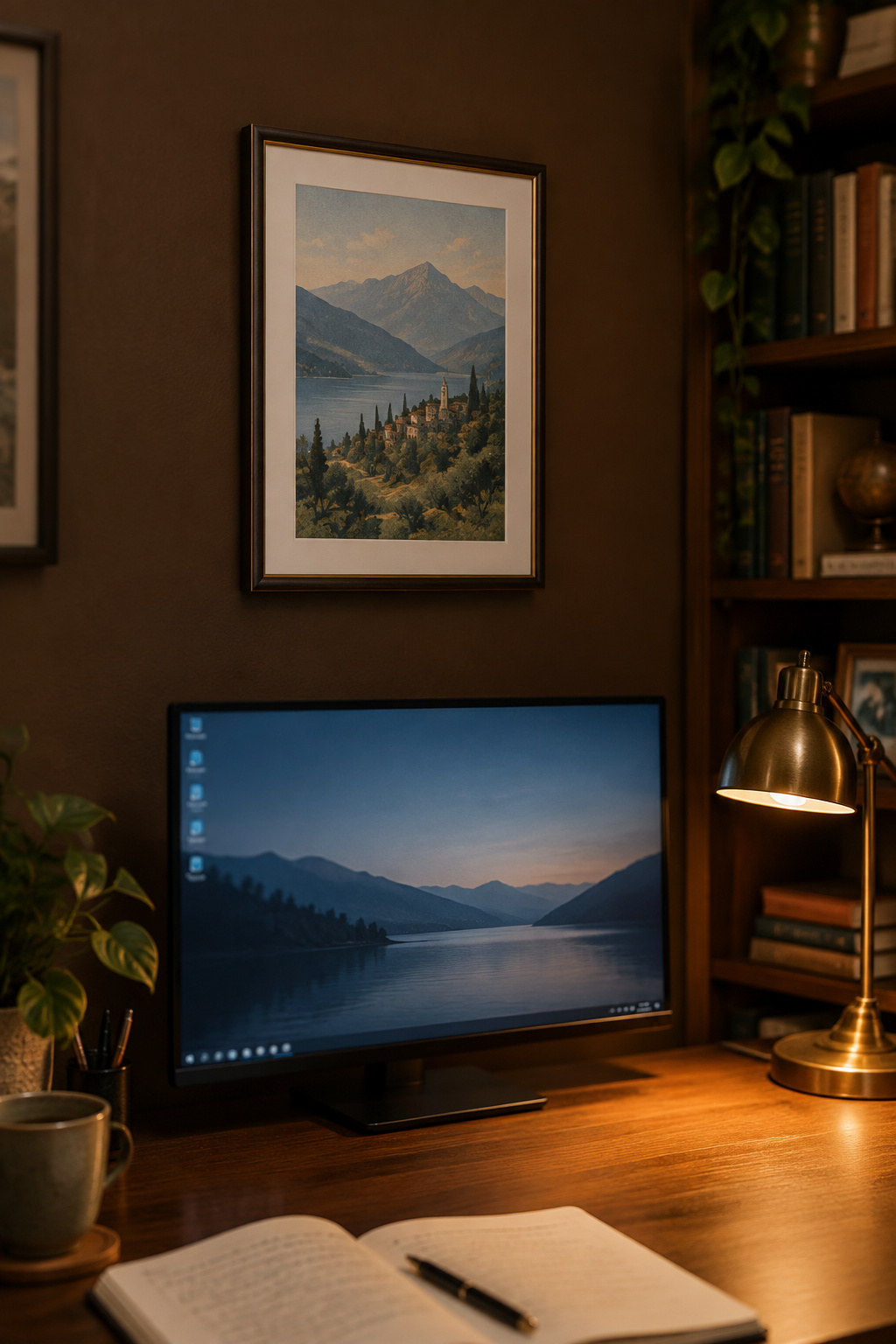
Then a desk adds a constraint no bed or sofa has to solve. Leave 4–6 inches of clear wall above whatever sits tallest on the surface (monitor or lamp), and 6–8 inches above the desktop, taking whichever pushes the frame higher. Sources differ on that second figure, one saying 8–12 inches, and the resolution is the higher position, not an average nobody measured. This is trade convergence as well, the same standard of evidence behind the bed figure: four independent sources agreeing.
Glare is a placement problem before it is a glazing one. Keep the piece out of the direct line between a window or lamp and where you sit, and tilt any source down onto its subject rather than letting it strike the glazing square-on. The rest of the corner belongs to the desk setup this art hangs above.
What light does to paper over years
This is where I stop being the expert and start being the librarian who knows whom to ask. I am not a paper conservator. My record is shelving and reading rooms. I know the sound a print makes sliding out of a flat file, and the handling rules I trained under, not the chemistry of ten years on a wall. Everything below is cited.
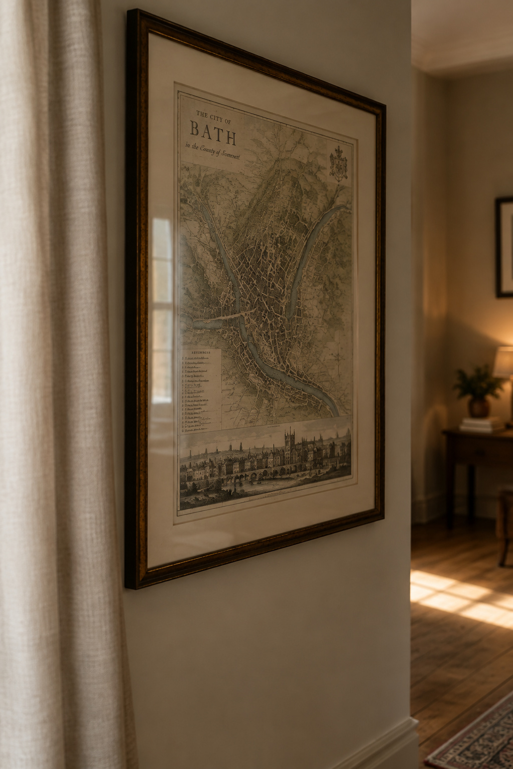
The Northeast Document Conservation Center puts most collection material at 50–150 lux for three to four months of display without visible fading, sensitive material lower, with roughly 50,000 lux-hours a year as a cumulative ceiling. For scale, home evening lighting runs about 50 lux and direct sun about 30,000. The Smithsonian’s National Museum of Asian Art caps its most fugitive categories at 50 lux and three months of display per five years; the Conservation Center for Art and Historic Artifacts lands independently in the same place.
Three institutions land in one band. The mechanism is reciprocity, documented in the American Institute for Conservation’s Book and Paper Group Annual: damage is a dose, lux multiplied by hours, so six months at 50 lux produces the same color change as three months at 100. Dim lighting only slows the damage. None of it reverses.
UV, direct sun, and foxing
UV drives the photodegradation (fading, yellowing, embrittlement), which is why the glazing decision above is the direct defense against this one. Foxing is a different animal, worth naming precisely because so many people take it for proof of age. That reddish-brown spotting is neither age nor light. Conservators attribute it to fungal activity and metal-induced degradation from trace iron or copper in the sheet, with humidity, temperature and pH deciding how badly it shows, so the reprint you bought last month can develop it too in the wrong room. The marking everybody wants is, technically, a condition you can catch.
One caveat: those figures were written for institutions rotating objects on tracked schedules, so applying them to a bedroom is an analogy. Keep irreplaceable paper off a south-facing wall and out of the sunbeam; a fifteen-dollar reprint is replaceable.
Building the wall as a whole
Stand in your doorway and look at the wall you have in mind. The rule that survives this article runs in order, because each answer constrains the next. Name the category first (print, map, mirror, or document), since that sets the framing budget, the mat and glazing, and how much light the thing can take. Then frame it, then measure from the furniture it belongs to, then find where the sun crosses that wall in July.
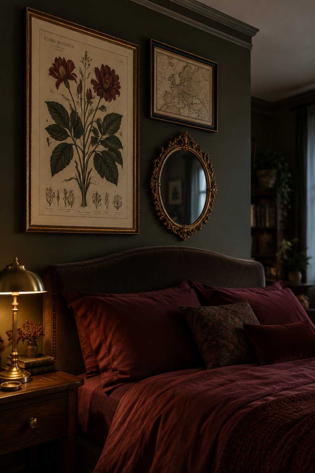
Light is the only one of the four that compounds silently. The others you can watch go wrong and fix on a Saturday; a print in the wrong sunbeam spends its lux-hours whether or not you are home. Get the order right and a wall stops being a run of separate purchases and becomes one argument about what its owner reads, which is the point of the wider dark academia bedroom plan.
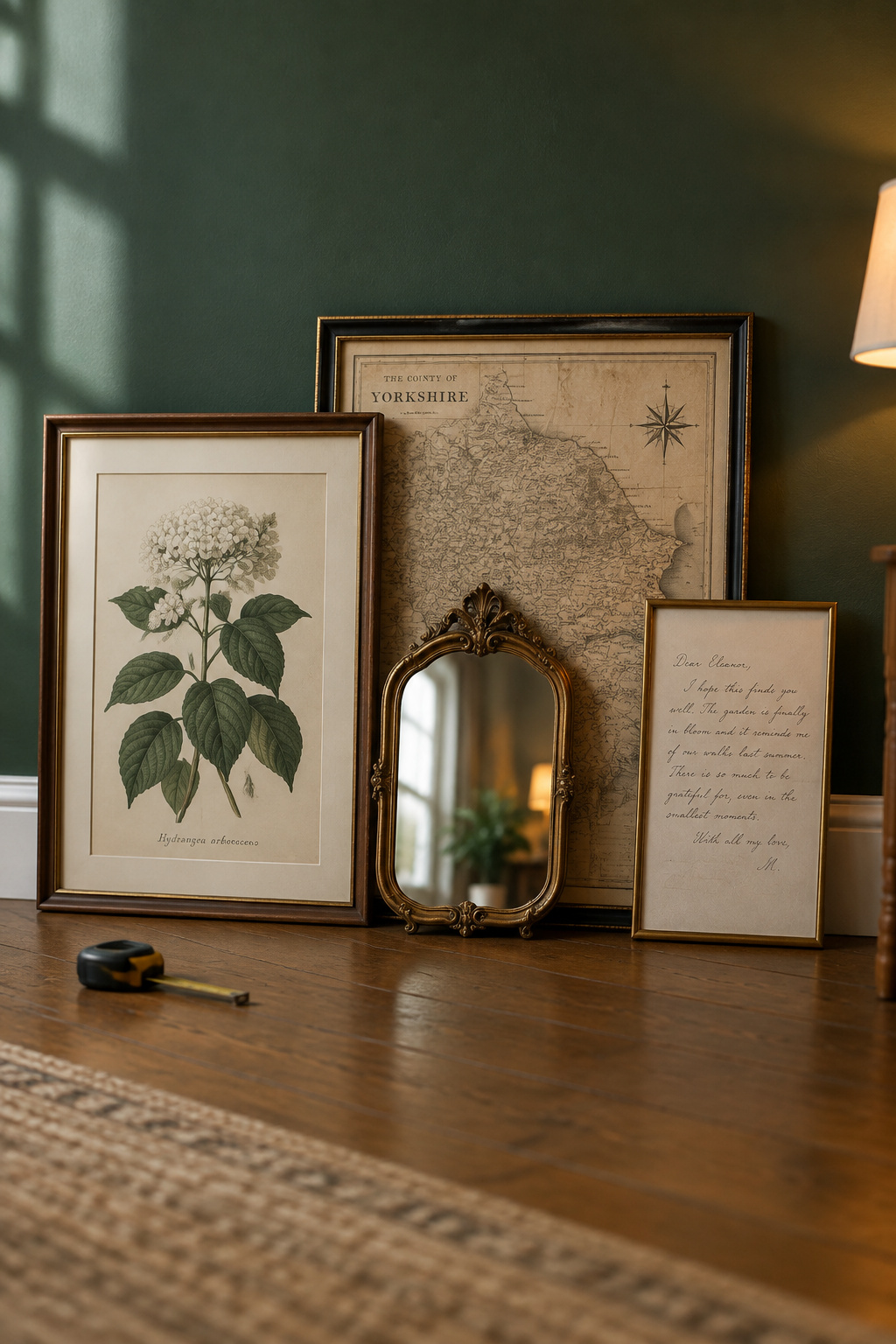
The piece leaning against the wall already belongs to one of those four categories. Naming which one is the judgment; hanging it is carpentry.
FAQ
Can you do dark academia wall decor without frames?
You can, but you give up the glazing, which is the main defense against UV fading and embrittlement. That trade is fine for a cheap reprint and poor for an old document. Unframed options that still look deliberate: a map pinned to a slim-framed corkboard panel, or a print on rigid board.
Is it okay to mix maps, portraits, and mirrors on the same wall?
Yes. Mixing is the norm here, not the exception. What holds a mismatched group together is a consistent framing standard instead of matching subjects: a repeated mat color, or moldings in one tonal family. The one boundary is a mirror sold on a claim that it enlarges a room by some percentage.
How do you hang art on a dark wall so it doesn’t disappear?
Mat color is the lever. A cream or bone mat holds its own against dark paint where a dark mat merges into it, so the contrast happens inside the frame before the wall is involved. A dim room is not the problem either; the Northeast Document Conservation Center notes that eyes adapt.