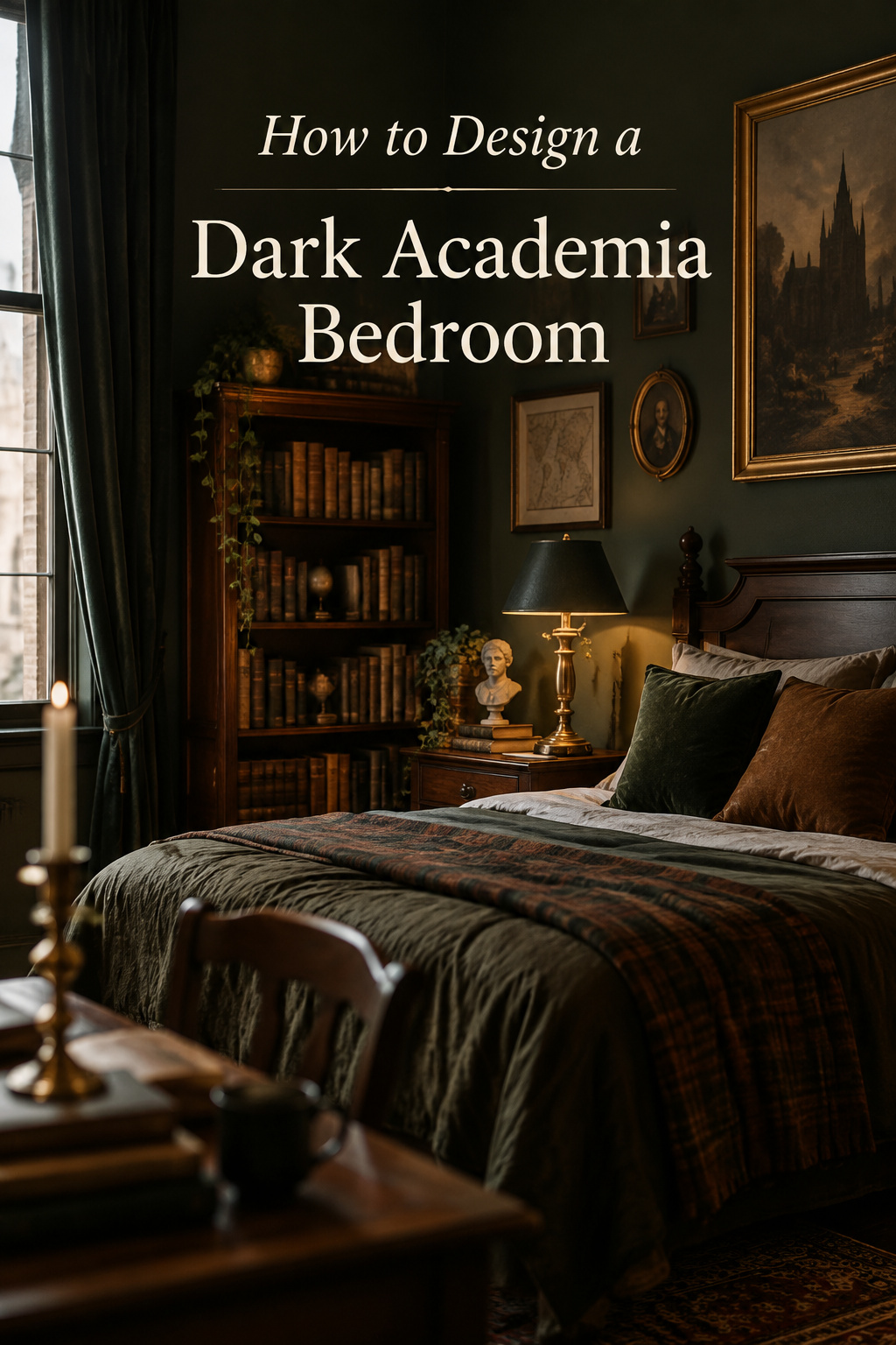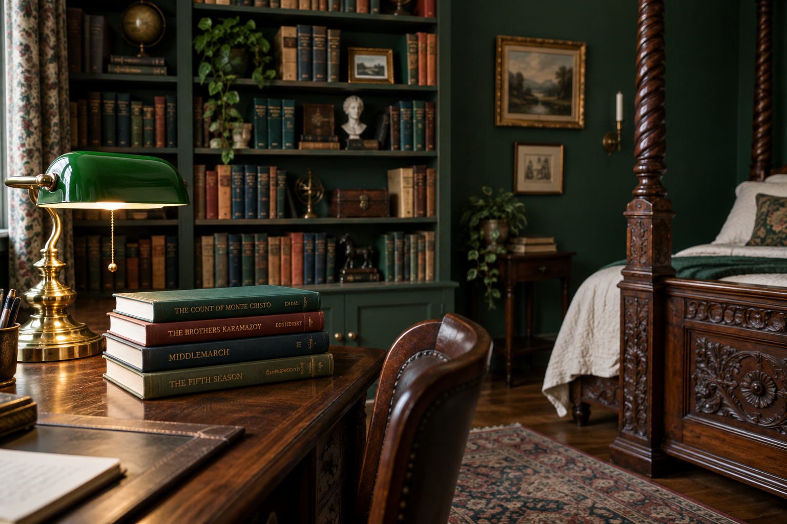

The chair I read in is fifteen years old and has been re-upholstered twice: once when the arm gave out, and once when the seat had gone soft in the one spot I actually sit, which after a decade is a dent shaped like a person. Both times the upholsterer asked, kindly, whether it might be cheaper to start again. Both times I paid to keep a frame I already knew would hold me upright for three hours without complaint.
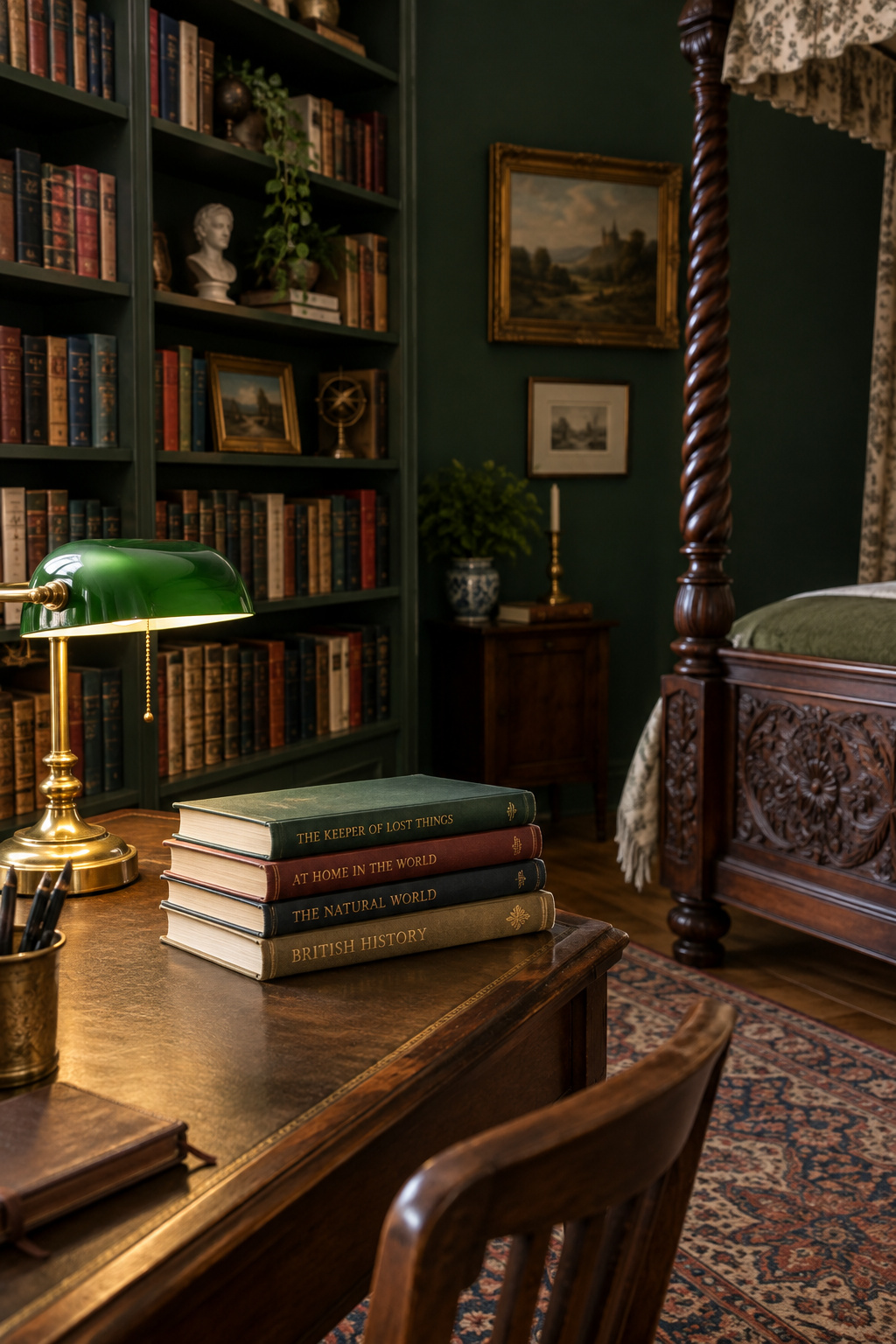
That chair is why I am wary of most photographs of a dark academia bedroom. Many of those rooms are lovely, but they were assembled to be looked at once. This aesthetic makes a claim about how somebody lives: there are books here that get read, a desk that gets worked at, a chair worth paying for twice. A room that makes the claim falsely reads as costume the moment anybody sits down in it.
The look is easy to like and hard to pin down, so the boards you have saved arrive as a pile of disconnected objects, and copying them object by object produces a room that is merely dim. Underneath, the room is eight decisions, each leaning on the others. This page maps them: what each decision is, why it matters, and the one article that goes deep on it.
The room’s foundation: wall color and surface depth
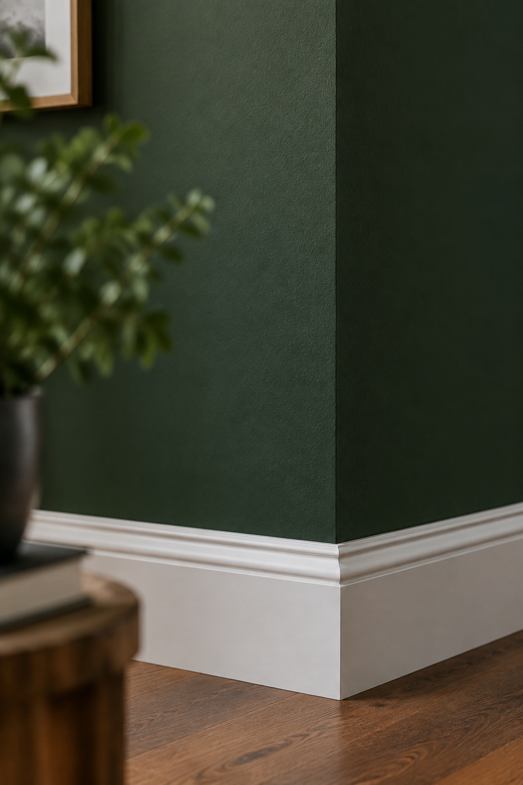
Finish decides more than hue does. Kent Painting & Finishing, a trade outfit that treats this look seriously enough to publish on it, puts the whole foundation in one line: use a good paint in matte or eggshell, because that soft, velvety texture is what the moody effect depends on. Get the sheen wrong and a well-chosen color turns clinical. The same pigment, in the wrong film, stops absorbing light and starts bouncing it.
Hue is a family decision, and the family is small. The colors that carry this room cluster tightly: dark green, rich brown, deep burgundy, warm grey, deep blue, muted purple. Any dark color on the rack will not do, and the brief gets narrower once you count. A workable room holds three to five hues including its neutrals, distributed roughly sixty per cent dominant (walls, floor, the big furniture), thirty per cent secondary (upholstery, rug, fabric at the window) and ten per cent accent (ceramics, art, the small things). Go past five hues and the room loses the control that makes this look coherent.
Depth is also a texture question, which most guides skip. Wainscot panelling and textured wallpaper add what the design trade calls refined depth to a wall, whatever color that wall is. A matte field broken into proportioned sections gives the eye a line to read; an unbroken slab of saturated color gives it nothing. Heavy drapery does similar work. Velvet, usually forest green or burgundy, is the one material that announces this room from the doorway whatever is painted behind it.
Which shade, which sheen, and whether the trim breaks to white or disappears into the wall all follow from that. They are settled properly in choosing the wall color and trim, along with the test method that stops you committing a whole wall to a two-inch chip.
Lighting a dark-walled room
Will I actually be able to see in here? I get asked that about a dark-walled bedroom more than anything else. You will, provided you stop thinking about light as one switch.

Dark surfaces give back very little of what lands on them. A pale room can run on a single ceiling fixture and get away with it; a bottle-green room with a walnut floor cannot. When people decide such a room is simply too dim, the real fault is almost always too few layers of light, and adding brightness alone will not fix it. There are two separate jobs here, and one lamp cannot do both. Ambient light is a low, even wash on a dimmer that sets the register of the room after dark. Task light is an actual pool of working light aimed at a page or a desk, close enough to the work that it does not have to brighten the whole room to reach it. A third layer, accent, is optional and does the atmospheric work. Candlelight belongs here as a reference, though a wall sconce or an uplighter does the job more reliably.
One complication to plan for before you build the corner: a lit screen against near-black walls creates a contrast problem more than a brightness one, and the fix is often to turn the display down instead of turning the room up. That takes its own discipline, and it belongs to setting up a desk you can actually work at, which carries the standards, the lamp position and the numbers I am deliberately leaving out here.
Furniture: which pieces are worth judging
The most common mistake is shopping by finish color. Dark stain is the cheapest thing on a piece of furniture and the easiest to apply last, so it tells you nothing about what you are buying. Construction does, and the tells are easy to check once you know where to look:
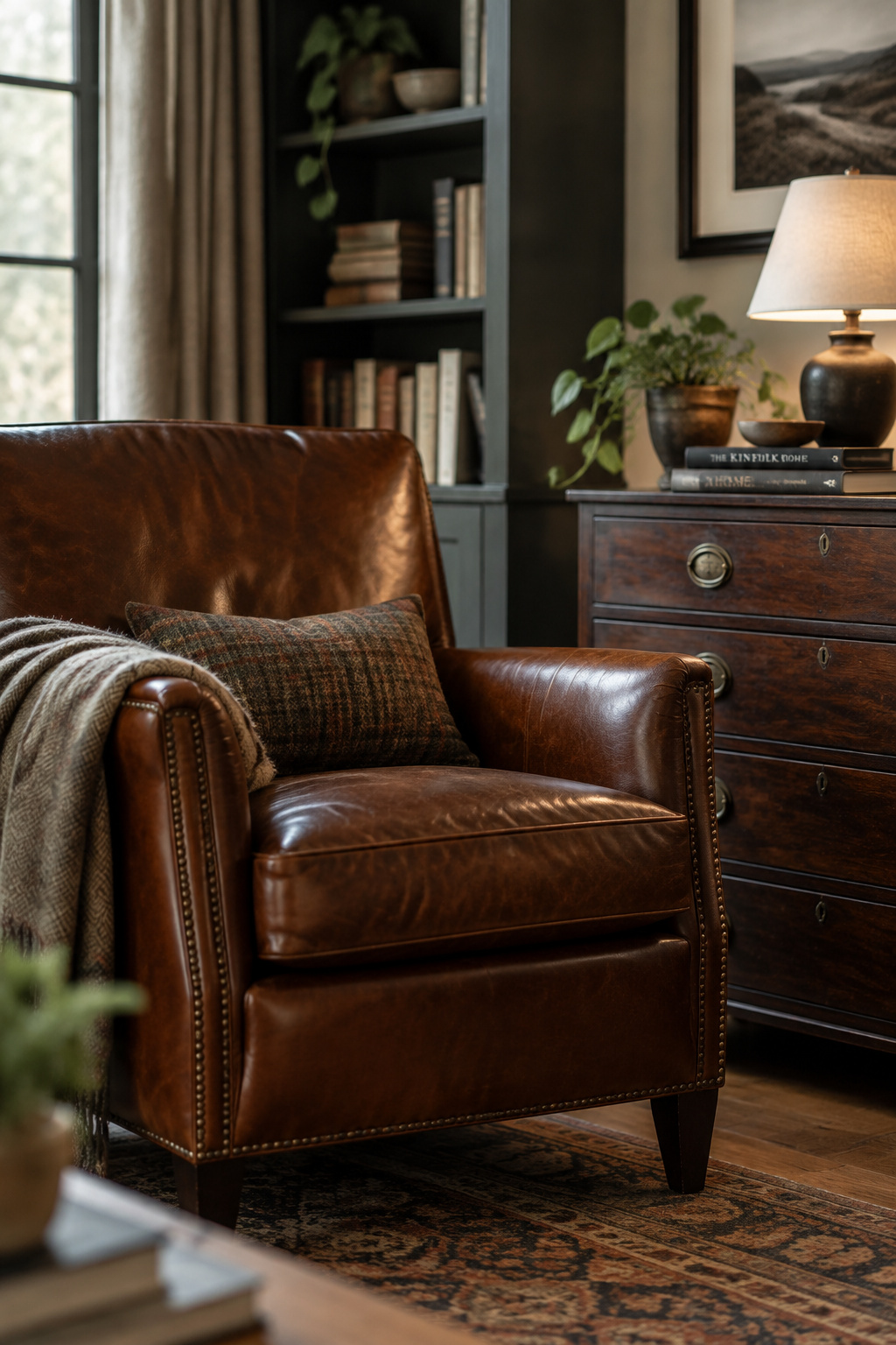
- Look at the joints. Cut joinery and wooden pegs, instead of screws driven into board, mark a piece built to be taken apart and repaired rather than replaced.
- Check the material on an unfinished surface, such as a drawer side or the underside of a top. You want solid hardwood, not veneer over particleboard.
- Look for marks: a maker’s mark, a carpenter’s signature or a manufacturer’s stamp on a base or a recessed surface. Dennis Berard, the antiques expert at This Old House, treats these as among the most reliable tells available to a buyer, largely because nobody bothers to fake them.
- Read the patina. Real age produces a warm, variable surface that is hard to replicate, and it lands where hands and feet actually go. Applied distressing produces marks spread evenly by somebody who was not there for the forty years.
Two practical consequences follow. Genuinely old case pieces are often shallower than their modern equivalents: antique dressers commonly run sixteen to eighteen inches deep against twenty to twenty-two for a new one, and a Victorian dresser at roughly seventy-one inches high by thirty-six wide behaves differently in a small bedroom than the thing the catalog calls the same. Then there is the chair, the piece most often bought for how it photographs. The test that matters is whether you can sit fully back in it, feet flat, for an hour instead of ten minutes.
Everything above is the decision-level version. The dating evidence (dovetail angles, saw marks, secondary woods, and what a dark finish is doing to a piece you might want to reverse) belongs to judging the furniture itself.
The book wall: building the room’s centerpiece
Stand in front of a full run of shelves and you are looking at two things at once: the largest single visual field in the room, and a structure holding several hundred pounds of paper against a wall. The two don’t conflict, but different disciplines answer them, and the structural one has to go first. Depth, span, anchoring and clearance cannot be revisited once the run is loaded and screwed down.

At survey level, most rooms get one thing backwards: the shelf should be sized to the collection, and the wall comes second. Measure the deepest volume you own rather than the average one. Group the books the way your hand reaches for them, by author, series or subject, and resist any scheme that looks orderly in a photograph and costs you the ability to find anything. If you cannot retrieve a book from it, the library is just a wall treatment. Keep the shelves out of direct light and away from damp, which is ordinary collection care. A real collection also grows in ones and twos, so the system has to absorb new arrivals without a wall-length reshuffle.
The numbers behind all of that (the load a linear foot of books puts on a board, the span at which sag starts, the depth ladder by book type) are in building and styling the book wall, along with a verdict on turning spines to the wall that I won’t spoil here.
Where the look came from
Almost every article about this aesthetic opens with the same origin story: Tumblr in the mid-2010s, TikTok in 2020, some enormous view count. I went looking for the citation behind it, expecting it to fall apart the way these things usually do. The lineage turned out to be real and traceable, and better documented than the people repeating it seem to know. The number did not hold up.
Start with the book. Every source I could check names Donna Tartt’s The Secret History, published in 1992, as the aesthetic’s ur-text: an encyclopedia, a specialist culture outlet and four peer-reviewed papers. Simone Murray, writing in English Studies in 2023, catalogs how uniformly commentators say so. The novel is variously the movement’s staple text, its true bible, its inception point and its primal scene, a remarkable degree of agreement for something nobody appointed. Murray also defines the thing itself usefully, as a vibrant online subculture centered on readers’ performances of bookishness. That describes what these rooms are doing more honestly than any decorating brief.
The literary roots go back further than one novel. The scholar Jeffrey J. Williams separates the campus novel, which follows students and belongs to the coming-of-age tradition, from the academic novel, which follows faculty. The British novelist David Lodge, whom Williams calls perhaps the leading author of the genre, describes the campus novel as a literature of escape and a version of the pastoral: an academic manor sealed off from ordinary life. Two more peer-reviewed papers corroborate and extend that genealogy, one tracing the Gothic strand back through Wuthering Heights. The romance of the sealed scholarly world is a couple of centuries old, and only the mood board is new.
The platform path holds up too. Britannica records a studyblr community first, then the aesthetic emerging on Tumblr, a move to Twitter, a shift around 2017 to the image-led platforms Pinterest and Instagram, and mainstream visibility on TikTok during the pandemic in 2020. Murray’s paper reaches the same sequence independently and in similar detail. I write “the mid-2010s” instead of a year on purpose. Britannica says by 2014, and a peer-reviewed 2022 paper says the fandom developed in 2015. Both agree on the platform and the source text, so I treat the one-year gap as a variance to state, with nothing to settle.
The statistic is where the folklore fails. Reporting in October 2020, after TikTok’s own UK editorial lead said the team had first seen the trend that summer, Refinery29 cited the platform’s then-displayed figure: 93.1 million views on the hashtag and 200,000 posts on Instagram. That number is six years old, and I am printing it only as a dated historical marker, because there is no current measure to print. TikTok removed the public per-hashtag view count from its Discover interface in February 2024, and independent technology reporting has established that even where such counts appeared, they were non-resettable lifetime totals that could never be meaningfully compared between hashtags or across years. Every decor post quoting a different billion-view figure is repeating something no live source can confirm.
The source everybody assumes is authoritative has nothing to say. The Aesthetics Wiki’s Dark Academia page has no origin section at all. There is no history and no timeline, only a note that the clothing borrows from 1940s prep-school uniforms and a credit to one Tumblr user for the subcategories. So the received wisdom was roughly right and entirely unsourced. The people repeating it had the lineage correct and had read none of the work that proves it, which I find the most interesting part.
The bed: frame first, bedding second
The bed is decided twice, and most people do it in the wrong order. The frame is a furniture decision, with silhouette and wood tone settled alongside the dresser and the desk. What goes on top of the mattress is a textile decision made afterwards, against a frame that already exists. Choose the duvet cover first and you spend the next year trying to make a frame agree with it.
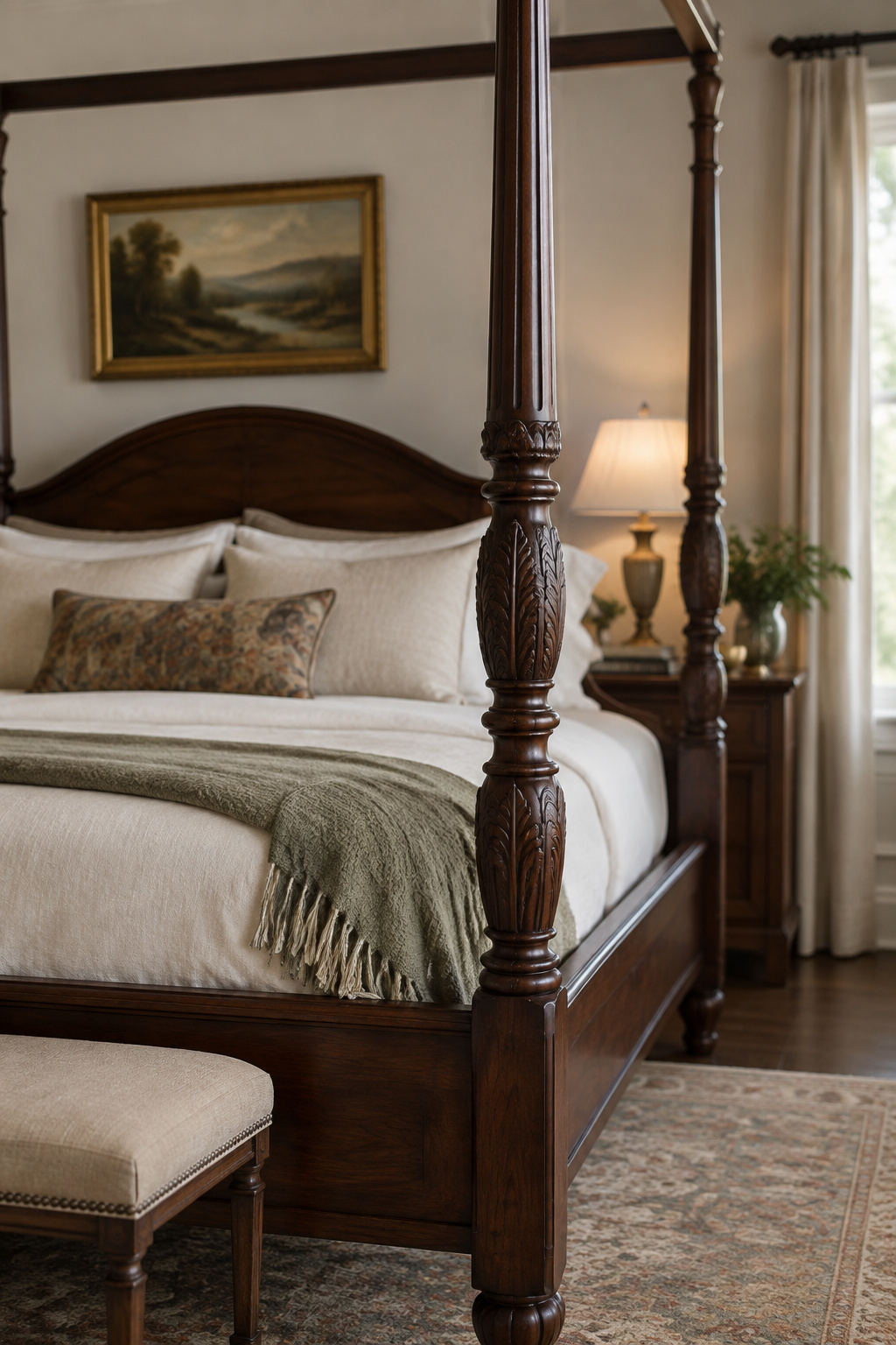
Three silhouettes recur, and each is its own proposition. A four-poster or canopy frame with carved posts or a worked headboard makes the strongest statement and asks the most of your ceiling height. A sleigh bed trades that for curved, elegant lines that read old-world without dominating a small room. A vintage or blackened iron frame is the third route, giving an industrial, scholarly note where wood would feel heavy, provided the metal stays dark. Bright or polished metal is the one wrong answer here. The warm-dark logic behind the walnut, mahogany and cherry tones of wooden frames applies to metal ones too, and a chrome finish fights everything in the room.
Once the frame is settled, the bed becomes the largest block of color in the room and the largest area of fabric touching a body, and those two pull in different directions more than a photograph suggests. That decision, covering fiber, warmth, and how a saturated dark behaves against skin as well as under a lamp, is what to put on the bed.
The walls beyond paint: art and small objects
A brass-cased barometer, a foxed county map, a globe with a country on it that no longer exists. Objects like these suggest accumulation, a habit of picking things up over years, and a single themed order cannot fake that. The most reliable way to make a wall look bought is to buy all of it at once.
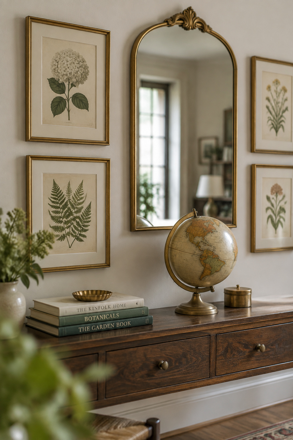
Three categories cover nearly everything worth putting up.
| Category | What belongs in it | What it is doing |
|---|---|---|
| Framed art | Maps, charts, botanical plates, and pieces with a historical or literary subject, in brass or wooden frames rather than modern metal or acrylic | Carries the wall; the frame and mat do more of the persuading than the image |
| Curios and instruments | Globes, old scientific instruments, specimen cases, small bound ephemera | Signals a collector’s habit rather than a themed purchase — the hardest quality to buy in one go |
| Mirrors | Framed wall objects in their own right, judged on the frame | Reflects the lamplight the room is short of; nothing more, and no claim about making a room look bigger |
The frame matters more than the image, and that is worth knowing before you spend: a competent print in a good molding with a generous mat outperforms an expensive print in whatever glass came in the frame. Where those pieces come from, how to mat and glaze them, and the two hanging heights (art above a desk and art above a bed are different problems) are all in sourcing, framing and hanging the art, including the one thing light does to paper that nobody undoes.
Renting or living in a dorm
You cannot paint. That seems to disqualify the whole look, and it does not. Every decision above still applies. What changes is the material each one is solved with, and reversibility becomes part of the specification from the start.
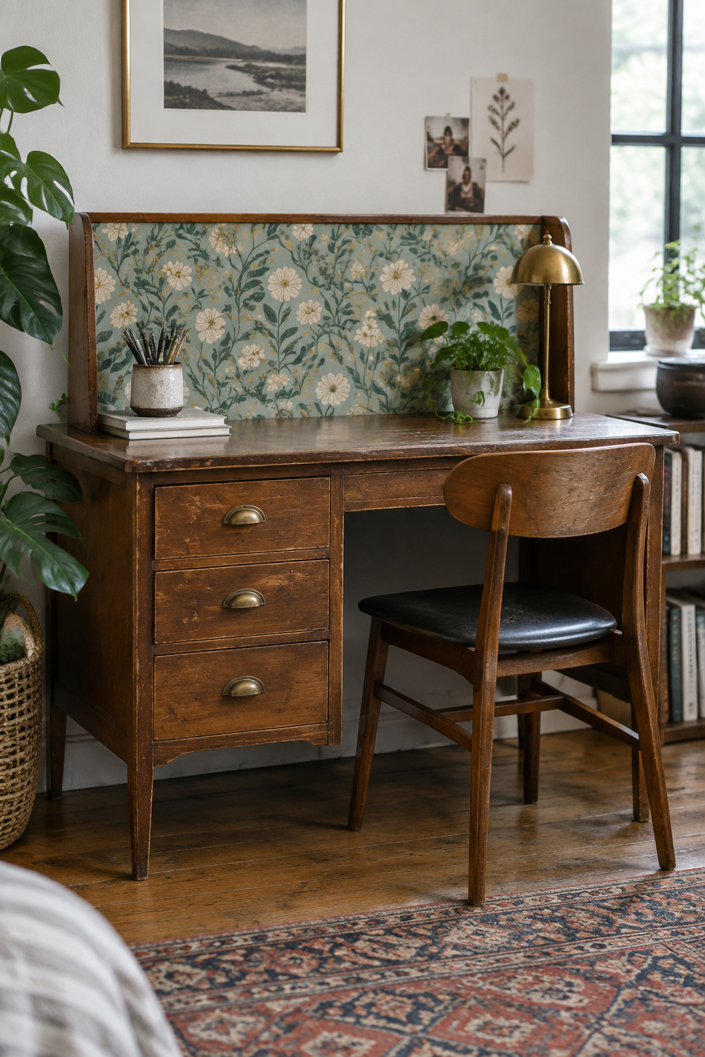
Removable peel-and-stick wallpaper handles the wall-depth decision, on one surface instead of four. Adhesive hanging hardware handles the art decision in place of nails, and it is the real constraint of a no-holes room. The rated capacity is modest to begin with and drops further in a warm, humid room or on matte paint, so planning near the limit is how things come off the wall in August. The furniture decision survives intact and is arguably easier: a secondhand wood desk with some age and a warm finish is a better foundation than a new flat-pack one at the same money, and it lets you do the furniture judging inside a room you do not own. Textiles carry more visible change per pound than anything else you can carry up a staircase.
Institutional rules do not travel. Campus and shared-housing fire codes restrict wall coverage, candles and extension-cord loads, and they differ enough between institutions that treating a friend’s residence hall as a guide is risky. The cited rundown, the hardware ratings and the packing-it-down-in-May version of all this belong to the dorm and rental version, which is a full version of this room in its own right.
What a whole dark academia bedroom costs
The useful question is a category, and the number follows from it: are you redecorating or renovating? Andrew Suvalsky, a New York interior designer, puts it well: when the bones of a space work, redecorating is often the smarter choice, and many people discover they do not actually dislike their home, they dislike outdated finishes and poor lighting. That describes this project almost exactly. For most bedrooms, this look is a decorating job on walls and floors that already exist.
| What you are actually doing | Rough order of magnitude | What decides where you land |
|---|---|---|
| Styling with what the room already holds — textiles, books, lamps, rearrangement | Hundreds | How much of the furniture you already own can stay |
| Furnishing the room properly, sourced secondhand — paint, a shelf run, one real piece | High hundreds into the low thousands | Where you buy; a specialist vintage platform can ask three to five times a marketplace price for a comparable piece |
| Renovating — flooring, fixtures, wiring, moving walls | $20,000–$50,000 and up, per 2026 remodel data | Not this project; listed only so you can see how far away it is |
Those bands are deliberately loose, and the third is a different kind of number from the first two. It comes from remodel data scoped to structural, flooring and electrical work, and it sits here as a boundary, not a quote. The itemised, sequenced version, with what to buy in which pass and the arithmetic shown, is what the whole thing costs. That article is more precise than anything on this page because precision is its job.
What I will commit to is the ordering principle, and it is the one place I argue with the way this aesthetic is usually shopped. Buy once on the things that take your weight and hold your possessions (the chair, the desk, the case pieces) and buy freely and reversibly on everything else. Textiles can be swapped, paint can be repainted, and a print can be reframed for the price of a takeaway. A frame that holds a person for three hours cannot be improvised, and the secondhand market is full of them because their first owners underestimated them.
Which brings me back to the chair. It has outlasted two flats, a house, and nearly everything else I have bought since. Two re-upholsteries cost me more in total than the chair did new, and it was still the cheapest furniture decision I have ever made, because the alternative was buying four adequate chairs over fifteen years and never sitting properly in any of them. The rest of the room runs on the same logic. You now have all eight decisions and where each one is settled in detail: color depth, light, furniture, the book wall, the bed, the art, the rented version and the money. Buy the chair you intend to keep.