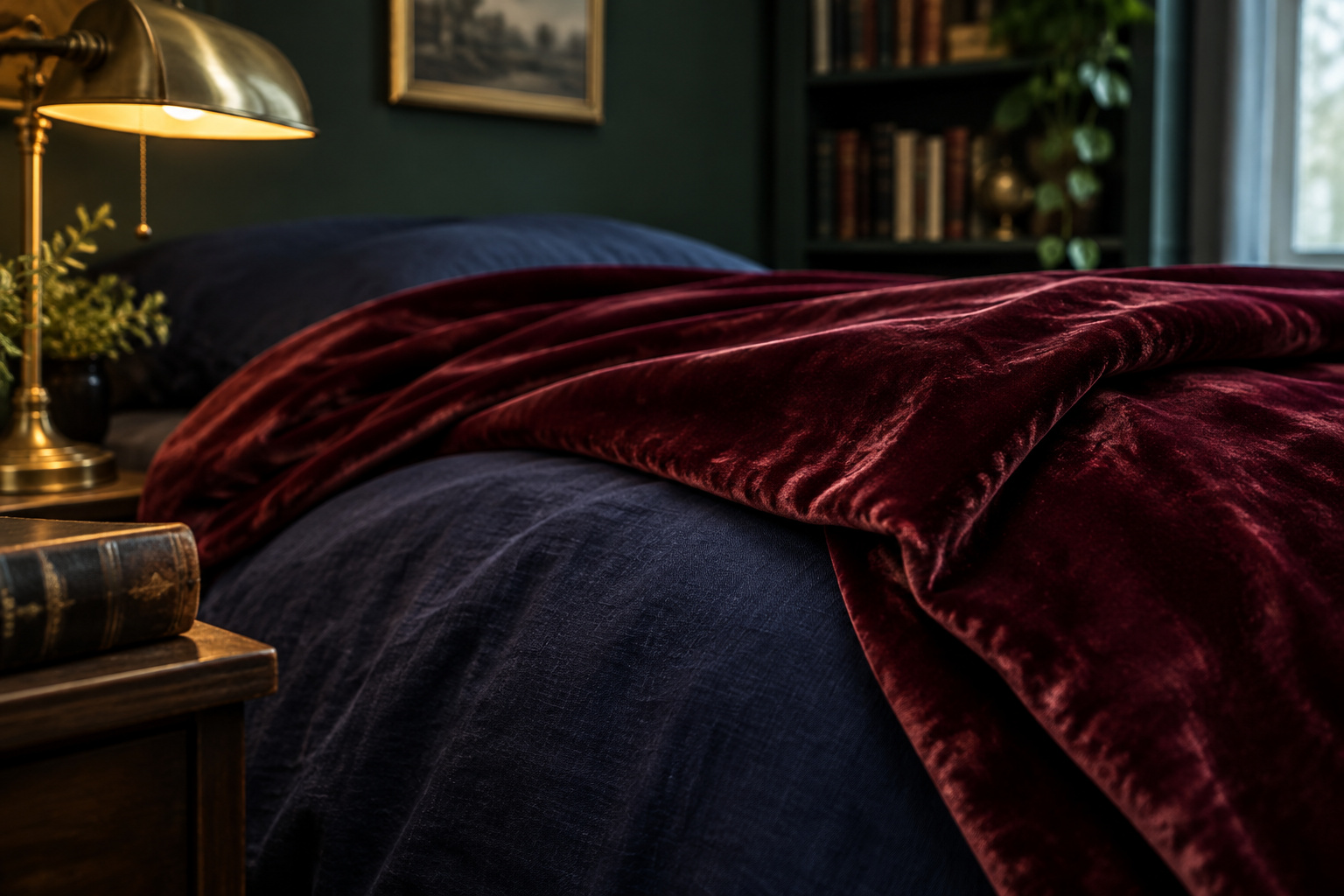

At eleven at night, do you want the bed to look like the photograph, or do you want to fall asleep in it?
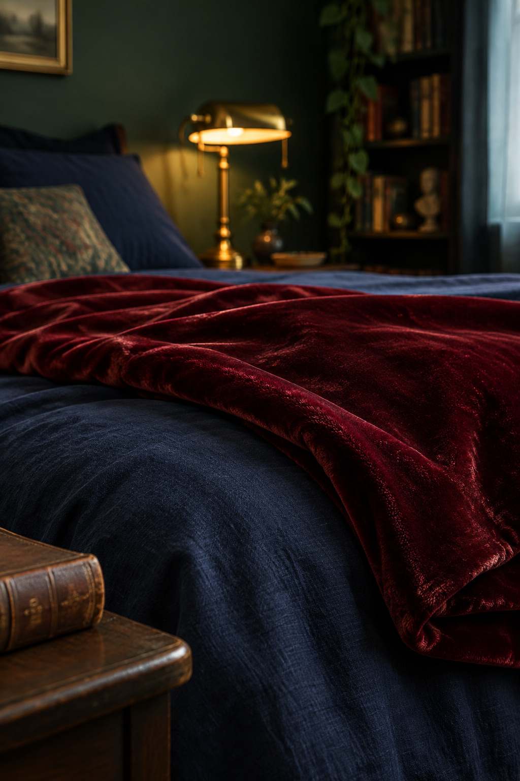
Most advice on dark academia bedding answers only the first question: buy the darkest cover you can find, then keep adding weight. I understand the instinct, and it explains why so many of these rooms photograph beautifully and sleep badly. Darkness and warmth look like one decision only in a lit photograph.
TL;DR
- Velvet looks right and feels wrong against skin, because the upright pile that catches lamplight also holds still air against your body. Keep it as a folded throw and off the sheets.
- Linen and cotton percale carry the palette’s saturated darks without making you hotter. Sateen looks richest and holds the most heat, which the Sleep Foundation says suits cold sleepers.
- Choose layers for the warmth a room at 65 to 68°F and 30 to 50 percent humidity needs. UK retailers sell duvets in 1.5-tog steps from 3.0 to 16.5, and most bedrooms want nothing near the top.
Why more and darker bedding isn’t cozier
Everything below judges bedding by one standard: a bed should quiet you before it impresses anyone. Moodboards are built for the second half of that sentence.
The research doesn’t back the piling instinct. A randomized cross-over sleep-lab study comparing wool, cotton and polyester-adjacent bedding found no significant sleep benefit from thickness and thermal resistance alone, at either 17°C or 22°C ambient, even though its polyester samples ranged from 8.3mm to 27.2mm thick. The differences it did find came from fiber and construction. Li and Chow’s 2024 review of nine studies in the Journal of Sleep Research reached the same conclusion: the effects are specific to each fiber, and weight, darkness and volume predicted nothing.
So there is no number to hit. Dark academia is a community aesthetic that nobody has codified, and any rule that comes with a number attached was invented by whoever is offering it. Tonight, put a hand under the fabric closest to your skin and notice whether it feels damp or dry.
Dark academia bedding fabrics and what they do against skin
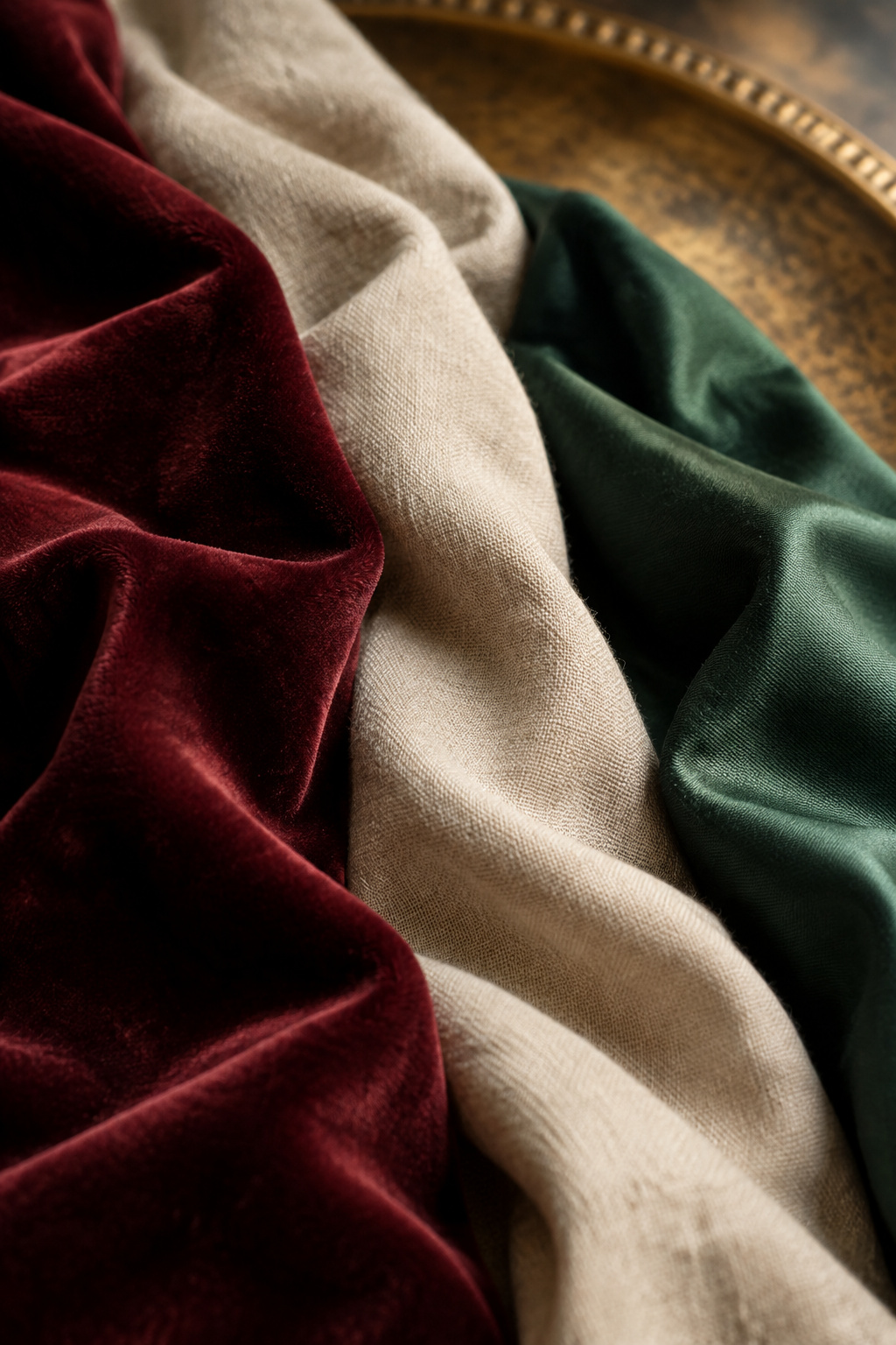
Lay an oxblood velvet swatch, an unbleached linen and a bottle-green sateen under a raking lamp and the velvet wins instantly. It is still the wrong answer for most of the bed, and the reasons show up in the same light that flatters it.
| Fabric | Breathability and moisture | Warmth | Hand against skin | How it carries a dark color |
|---|---|---|---|---|
| Velvet (pile) | Poor in the polyester and viscose piles common in home textiles; wicks liquid rather than buffering vapor | High — pile holds a deep layer of still air | Warm, dense, nap direction noticeable under sustained contact | Best in the palette; light reflects off the cut pile tips, giving depth flat weaves cannot fake |
| Linen | Best of the group; moisture regain near 12%, widest and fastest vapor diffusion | Moderate, with real insulation for its weight | Cool at first, slubbed, softens with every wash | Very good; matte surface reads deep rather than glossy |
| Brushed cotton (flannel) | Moderate; cotton’s own regain, slowed by the nap | Warm, from air trapped in the brushed nap rather than from mass | Soft immediately, can feel stifling to a warm sleeper | Good, though the nap slightly dulls saturation |
| Cotton sateen | Lower than percale; long floats pack tightly | Warmest of the flat weaves; the Sleep Foundation calls it prone to heat retention | Silky, slightly stiff at higher thread counts | Excellent; the sheen gives near-blacks visible depth |
| Cotton percale | High; one-over-one-under weave breathes freely | Temperature-neutral | Crisp, cool, hotel-like | Adequate; flat and matte, so deep colors read solid rather than rich |
Velvet: right to the eye, wrong against skin
Velvet is a construction rather than a fiber. It can be woven from silk, cotton, viscose, polyester or blends, and polyester and viscose dominate in home textiles.
The glow comes from optics. Light reflects off the cut tips of the upright pile instead of a flat surface beneath, which is why the same dye looks darker or lighter depending on which way you brush it.
The same pile is what makes it hot. A fabric insulates more as it gets thicker and denser, because a denser pile holds a deeper layer of still air against the body; corduroy and fleece run warm for the same reason. When the pile fiber is polyester, moisture adds to the heat. Synthetics absorb almost no water vapor and release very little warmth when they do, roughly 5 to 7 joules per gram against cotton’s 46, so a polyester velvet neither breathes nor buffers sweat.
The direct evidence on velvet is thin. A 1996 wearing-comfort study by Cho, Ryu and Lee measured significant differences in skin temperature and thermal sensation between velvet fiber combinations, but it tested acetate and rayon piles rather than today’s polyester, and nobody has put a bedding-weight velvet duvet cover through a sleep lab overnight. So the verdict is my own, drawn from pile-insulation physics and the fiber-and-sleep research: velvet is good to look at and wrong to sleep under if you run warm, sweat at night or have reactive skin.
That is a reason to move velvet, and you can keep it in the room. A folded throw at the foot of the bed touches skin briefly and rarely needs washing, which is a job velvet does well.
Cotton sateen and brushed weaves that still look rich
Sateen is the compromise. Its weave runs one thread under and three or four over, against percale’s one-over-one-under, and those longer floats give the sheen that makes a near-black look expensive. The Sleep Foundation spells out the cost: sateen retains heat and suits cold sleepers, while percale stays temperature-neutral.
Brushed cotton gets misjudged more often. Its warmth comes from air held in the nap rather than from the weight of the fabric, so a well-brushed mid-weight can sleep warmer than a heavier, poorly napped one. A wholesaler’s guide puts standard flannel near 170 GSM, though that is trade convention and not a certified figure.
Choosing color without losing the bed to the wall
The mistake happens at checkout. A duvet cover matched to a paint chip under a shop’s overhead lighting can visibly clash with that wall under the lamp you actually read by.
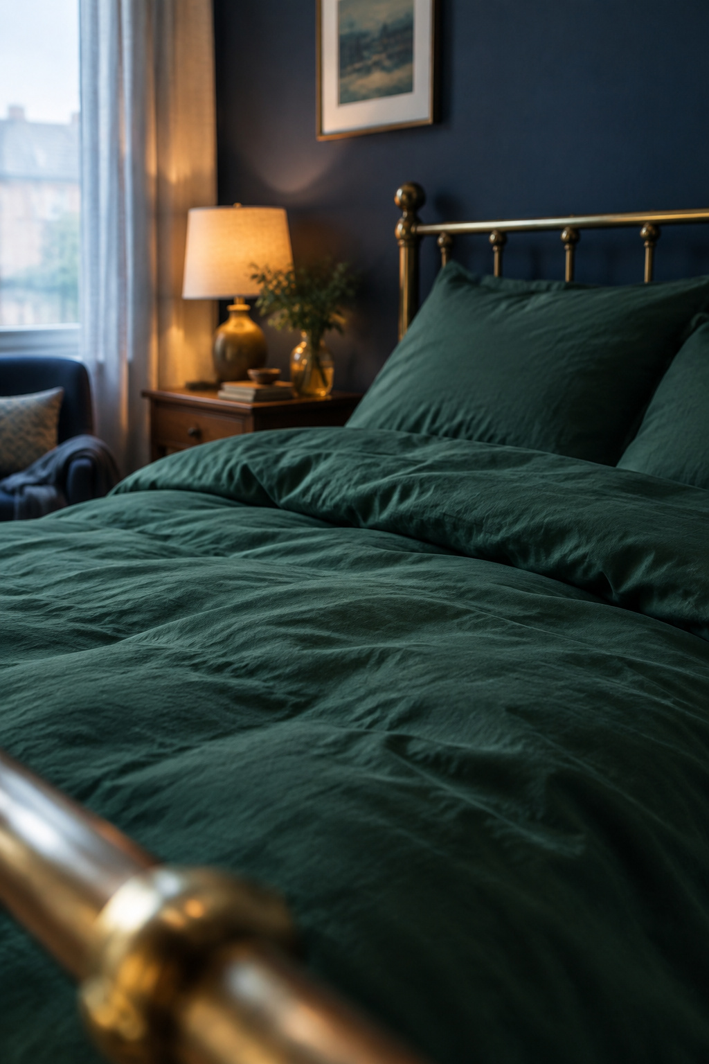
The effect is called metamerism, and it is a documented textile-dye phenomenon: two colors that match under one light source look mismatched under another, because light sources differ in spectral power distribution and dyes respond differently to that difference. Mills control for it with spectrophotometers, because the eye cannot judge a dark match across lighting conditions.
I think this palette is more exposed to it than most. Oxblood, bottle green, ink navy and tobacco brown are not true carbon blacks. Each carries an undertone from whatever dye reached that depth, and this room is lit warm and low by design. Those are the conditions where a mismatch no product photo showed you turns up, three nights in.
The bed is the largest block of color in the room, so it either settles against the wall or argues with it. That makes which dark wall colors actually read scholarly the other half of this decision. Before you commit to either, carry the swatch into the bedroom after dark.
How much layering is enough
A tog is a real unit of thermal resistance, equal to 0.1 square-meter-kelvin per watt and measured under British Standard BS 4745 on a togmeter descended from the 1940s Shirley apparatus.
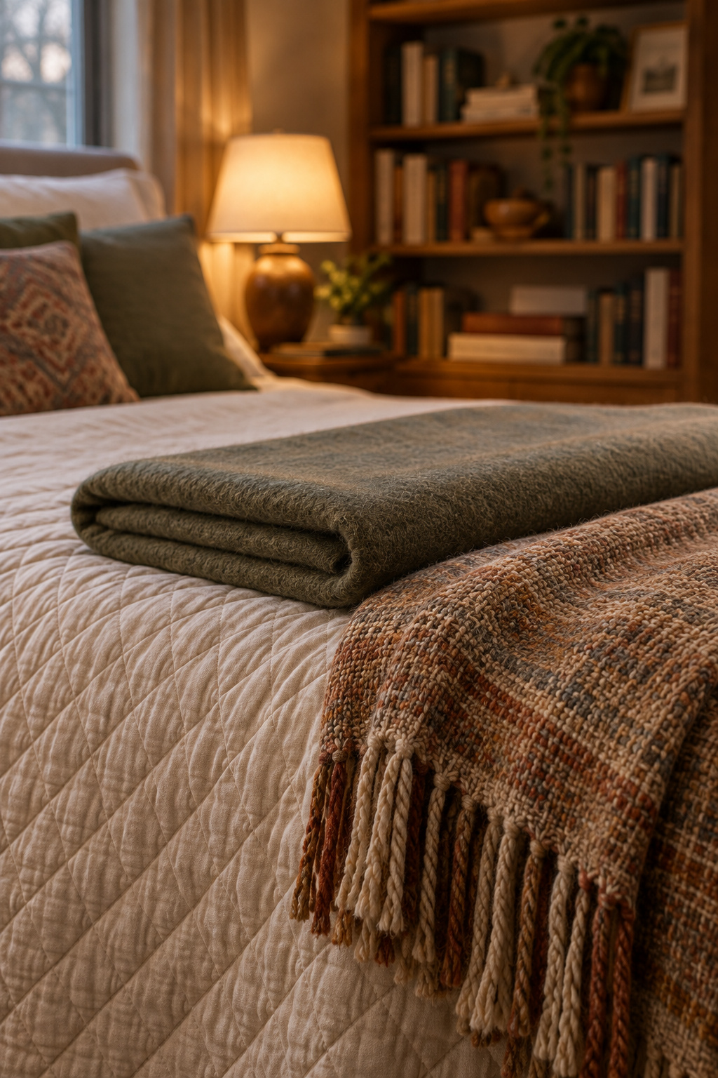
UK retailers conventionally sell duvets in 1.5-tog steps, from 3.0 for summer up to 16.5 for extra-warm. I’m naming the British market on purpose, because the season-to-tog mapping is retail convention; BS 4745 governs only how tog is measured.
Your room decides where you land in that band. The ideal sleep temperature is 65 to 68°F (18.3 to 20°C), with relative humidity between 30 and 50 percent and 60 percent as the agreed ceiling. A bed carrying a heavy coverlet, a wool blanket and a warm duvet overshoots that, and it looks overdressed as well, because the eye registers excess before the body does.
You can get visual depth without the extra warmth. Variation inside a narrow tonal range, such as an ink-navy duvet under a bottle-green coverlet with both left mostly flat, gives the eye somewhere to travel without adding thermal load. Arranging the pieces is a separate skill, and How to Layer Bedding covers it. Check your thermostat before you fill a cart.
A sensory audit for what stays on the bed
Years ago I finished a meditation room for a client who worked in tech. Everything in it was right, and she never once used it. The reason turned out to be a wall clock, hung where her eye landed the moment she settled. We took it down, and she started sitting the following week.
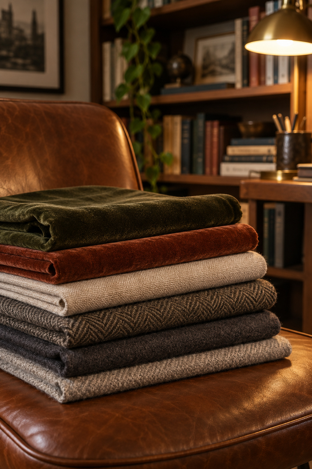
Beds do this all the time, with less obvious culprits. A velvet-look sham, a throw bought for the photograph or a sheet that runs slightly too warm can stop the room working, however good the rest looks. Take things off before you add them, and run each candidate through three tests.
The temperature test can’t be rushed. Sleep under the textile for a full night at the room’s real temperature, because the moisture-buffering gaps between fibers only appear under sustained body heat. A daytime touch test tells you nothing about hour six.
Weight means two things that people tend to mix up. A fabric that looks heavy is not necessarily heavy on the body: a tightly woven dark sateen can match a wool blanket’s presence while sitting far lighter across the chest. If heavy bedding feels restrictive to you instead of comforting, that gap decides it.
Texture takes patience. Run the back of a forearm across the surface that actually touches skin (the underside of the duvet cover, not its decorative face) and hold it there for ten seconds. Sensitive skin reacts cumulatively, so a quick touch won’t tell you much.
Anything that fails moves to a job with less skin contact and stays on the bed. Bedding is forgiving in a way paint is not: a fabric can be swapped or returned, and a wall has to be repainted. That also makes bedding the highest-impact change you can make in a room you can’t paint. Pick the textile you added last and never tested, and audit it this week.
What the bed teaches you about the rest of the room
How dark a thing looks and how it behaves against a body are separate settings that only appear fused in a photograph. Velvet shows the split most sharply, but it runs through paint sheen, upholstery and every other textile you choose.
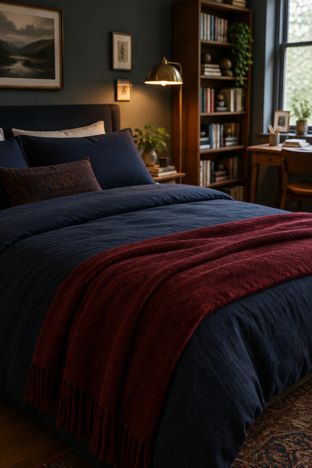
Li and Chow’s review found no universal best fabric, only fibers whose effects hold within a type and don’t generalize. The same applies here: there is no single correct dark academia bedding, only the one that suits your skin and your room’s real numbers.
The bed is the largest single fabric decision in the room, and once it is settled the same method works for the rest. The rest of the plan is in a dark academia bedroom that still sleeps well. Tonight, stand in your doorway, name the one thing on that bed you have never properly slept under, and start there.
FAQ
Does dark academia bedding have to be black?
No. The palette is low-key saturated color (oxblood, bottle green, ink navy, tobacco brown, bitter chocolate) rather than true black, and dyed near-blacks almost always carry an undertone from the dye that reached that depth. No published style standard fixes a palette, so treat any “must be” claim as preference rather than rule.
What thread count actually feels right for dark academia bedding?
Compare thread counts within a weave instead of chasing one high number. Percale sits around 180 to 200, sateen around 250 to 600, and linen around 80 to 140, where the metric means little anyway. Roughly 200 to 800 covers the span across weaves, and the weave matters far more than the count.
Can you get a dark academia look with washable, everyday bedding?
Yes. Cotton percale and cotton sateen in the palette’s saturated darks both hold up to the washing sheets need, which the Cleveland Clinic puts at once a week. A velvet-look sham or wool blanket gets laundered far less often, so keep those decorative and let the washable weaves carry the color.