
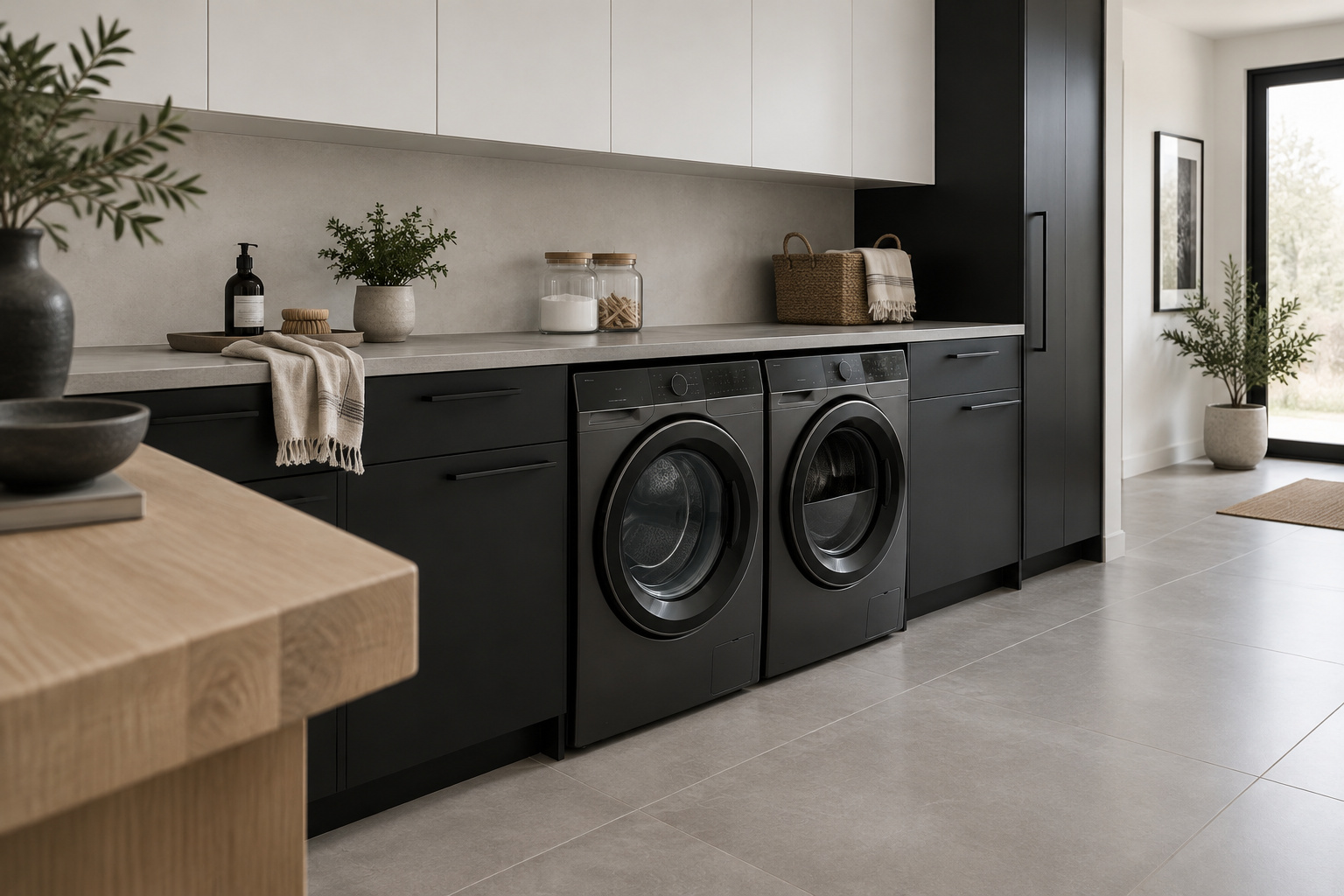

Black is not what makes a laundry room feel cold. Walk into a good black and white laundry room on a grey morning and notice what actually reaches you: the soft sheen on a dark lower run, a white wall holding the window light, the faint warmth of one wooden shelf, the dryer humming somewhere below the quiet. Nothing asks for your attention. The same two colors, spread differently, give you a hospital supply closet. The palette was never the difference. What matters is how much black you use, where it sits, what finish it wears, and the one warm material most people forget to add.
TL;DR
- Proportion: hold black to roughly a third of the room, with white or warm white dominant and one warm material as the last tenth, the 60-30-10 split and not an even half-and-half.
- Placement and sheen: keep black low, on hardware, or on one unbroken plane, and give a black wall in a steamy room satin paint, which Master Painters Institute gloss levels put at 35 units minimum against eggshell’s 10 to 25.
- Grout: on a white-grouted floor, epoxy grout is allowed about a tenth of cement grout’s water absorption under EN 12808, which is why it holds its color where cement goes grey.
How Much Black a Laundry Room Can Actually Take
Stillness comes before color.
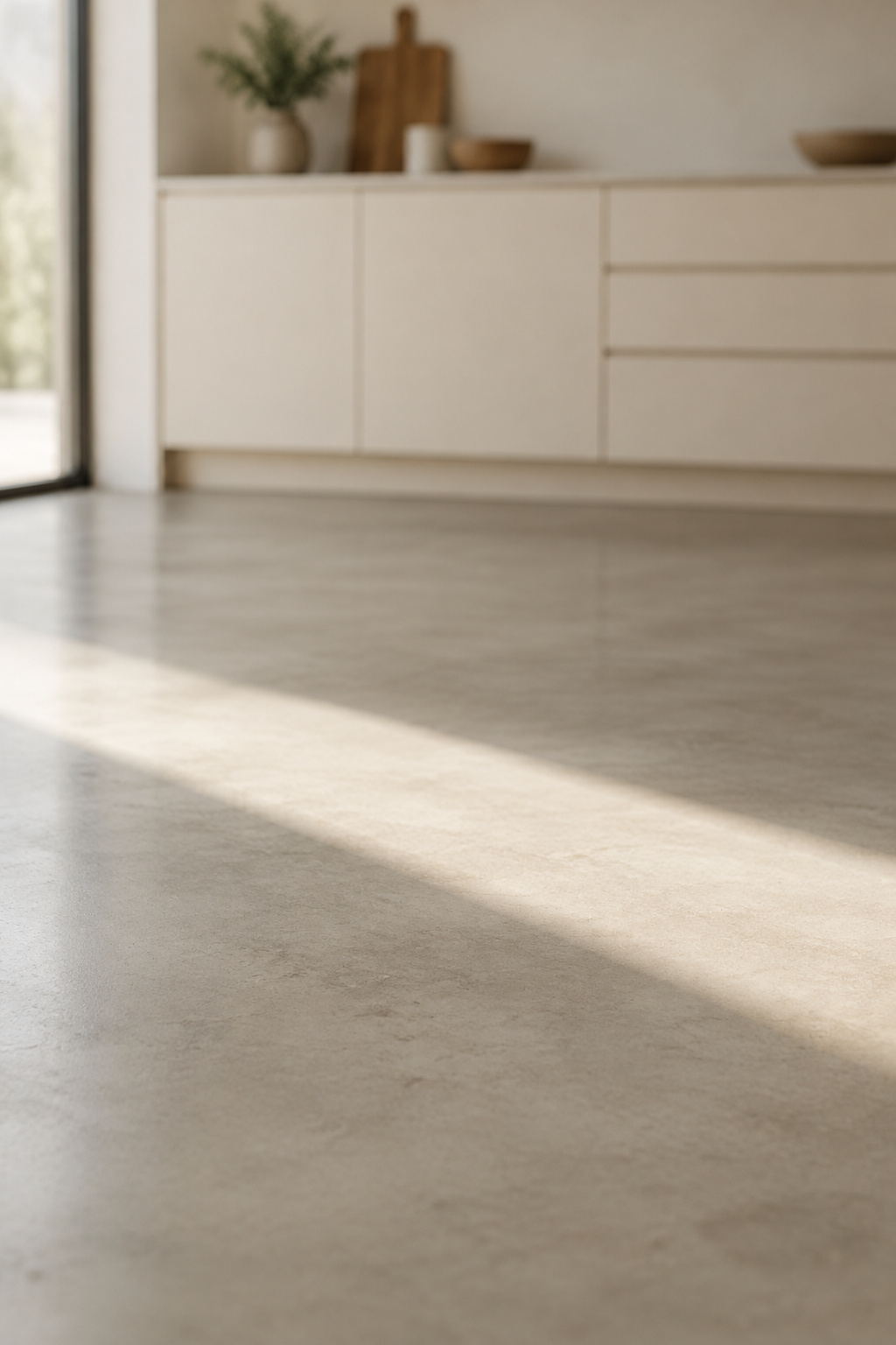
Part of my teacher training happened in Dharamshala, in a practice hall with bare plank floors and tall windows. Over a long day of sitting you could tell the hour by where the light lay, a pale block near the door at dawn, a thin stripe by the far wall by afternoon, and nobody wished for anything more. I carry that into every monochrome room. Calm comes from light moving across plain surfaces, and color only has to stay out of its way.
Split evenly, a black-and-white scheme gets in its own way, because attention flicks between the two halves and never settles. Designers use a ratio to fix that, the familiar 60-30-10 rule. “Roughly two-thirds of a space is comprised of one color, roughly one-third is a complementary color, and the last 10% is an offset,” says Alexis Readinger, founder of Preen Inc. In a laundry room I read it this way: white or warm white is the sixty, black is the thirty, and one warm material is the ten.
The white half needs as much care as the black. Designer Marie Flanigan warns that crisp, blue-undertone whites “can feel a bit clinical”, so a cold white can undo the room as surely as too much black does. Choose a white with a little warmth in it.
Today, stand in your laundry room doorway and guess what share of the surfaces you see would be black.
Where Black Goes: Low, on Hardware, on One Plane
Black feels intentional when it is contained. Start by taking it off everything above eye level, the ceilings, the upper cabinets, the wall you face while folding. Then give it one of three places to live:
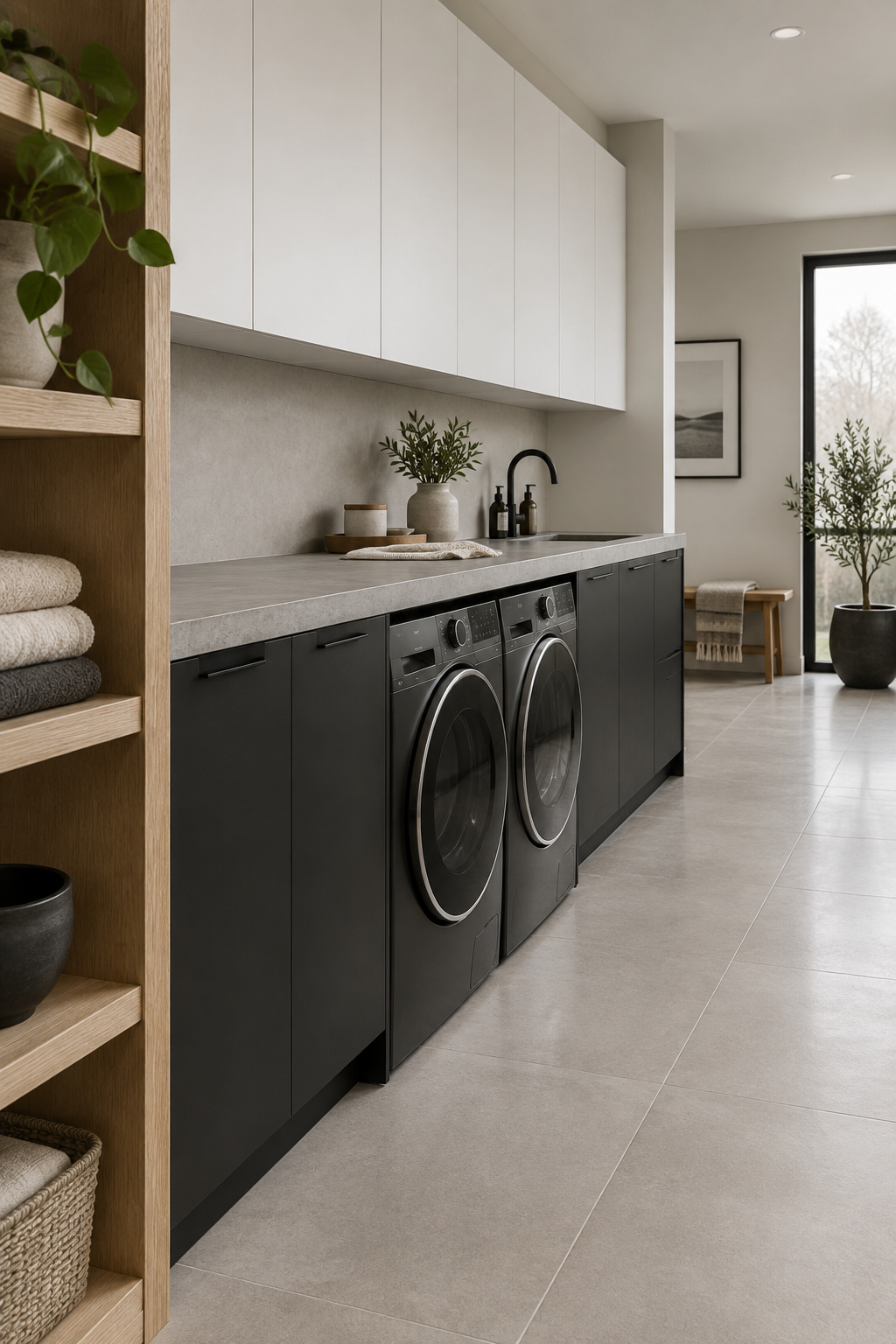
- Low. Black base cabinets or a black plinth, with white above, so the room’s visual weight settles at the floor instead of pressing down from overhead.
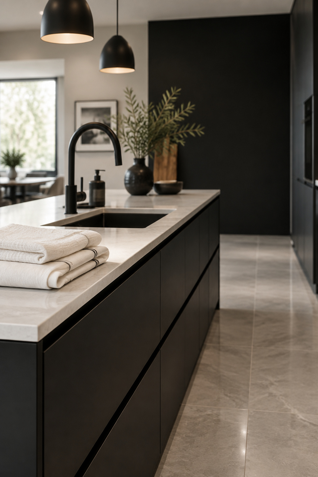
- On hardware and fixtures. A matte-black faucet, pulls, switch plates, one pendant. Small surfaces like these can go fully black without darkening the room. Three fixture makers agree on caring for matte-black PVD taps: mild soap and water, a microfiber cloth, drying after use, and no abrasives, bleach, ammonia or acidic cleaners. Extending that to powder-coated pulls is my inference, not theirs.
- On one plane. A single black wall, or one run of cabinets. The Design Confidential gives the standard advice for any dark wall color: one wall, not two, and it should be the wall your gaze lands on first, ideally unbroken by doors or windows.
Choose one. Black low, on the taps and across a wall all at once is how you get the supply closet.
LRV and Light: How Black Behaves in a Small Room
Light Reflectance Value tells you how much light a paint gives back. The scale runs from 0, full absorption, to 100, full reflection. It is formally standardized as BS 8493 and measured with a spectrophotometer. The bands designers work with are convention laid over that standard: white at LRV 82 to 94, off-white 73 to 81, medium 20 to 40, and dark, where a near-black laundry wall lives, at roughly 2 to 10.
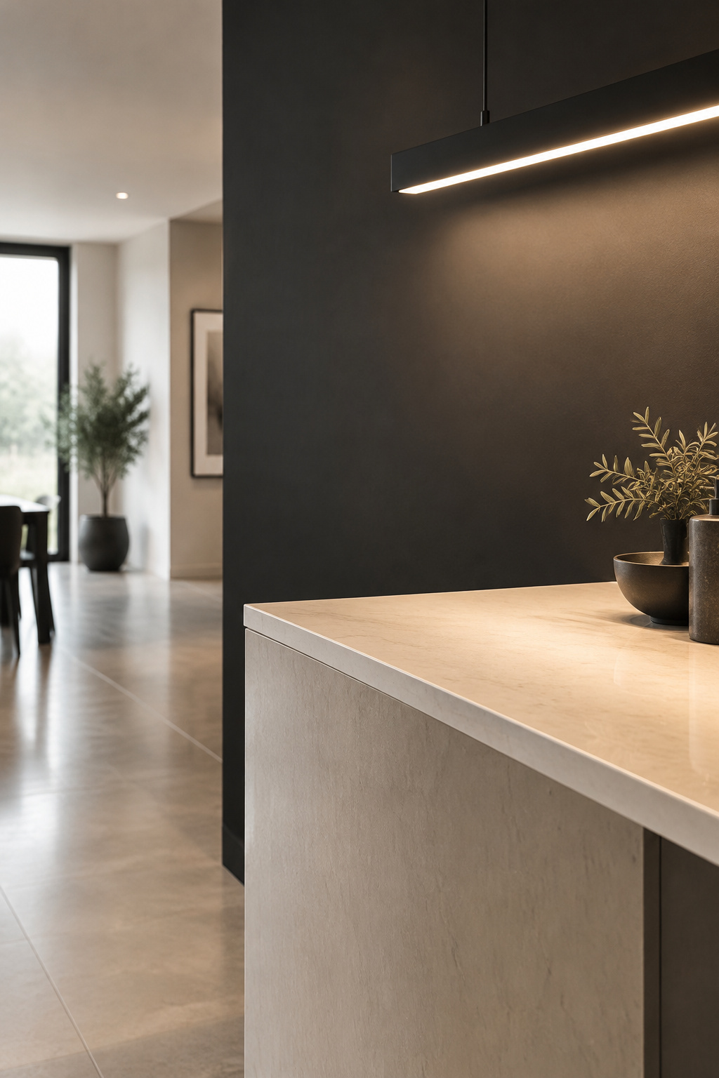
No published standard sets a minimum LRV for a home laundry room. Reflectance guidance exists for offices, schools and healthcare spaces, recommending walls as high as 50 to 70 percent and more, but those are other buildings entirely. Anyone quoting an LRV “minimum” for a laundry room is borrowing a number. What follows is design convention, not code.
The bands still tell you something practical. Every surface you move into the 2-to-10 band stops returning light, so a dark room has to be lit at the fixture. Before you commit to a black wall, work out how much light the room has to work with, because the lighting decides how much black you can carry.
Sheen, Grout and the Steam Test
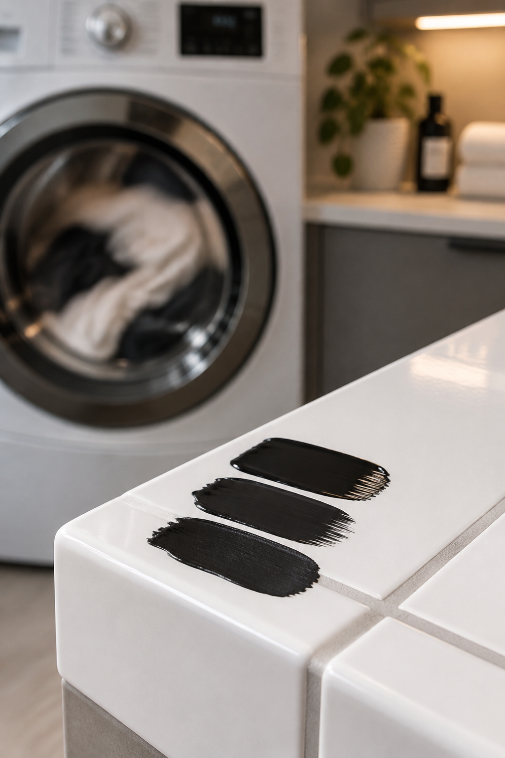
A black wall meets its harshest critic in steam, and a dark surface shows every finish flaw first. Farrow & Ball advises satin for a humid laundry room, since flat and matte finishes can absorb moisture and peel, and eggshell belongs only in a laundry closet that stays dry. The Master Painters Institute gloss levels, measured with a meter at a 60-degree angle, show how far apart the finishes sit:
| Finish | MPI gloss level | Gloss units at 60° | In a steamy laundry room |
|---|---|---|---|
| Flat / matte | Level 1 | 5 maximum | Absorbs moisture; can streak and peel |
| Eggshell | Level 3 | 10–25 | Only in a dry laundry closet |
| Satin | Level 4 | 35 minimum | The specification for a humid room |
Satin’s floor sits above eggshell’s ceiling, a real step up in how much light the wall bounces back at an angle. On a black wall that matters twice, for the steam and for the brightness. People fall for matte black, and in this room it fails first.
Grout Color and the Long Game
A white grout line looks crisp for a season. Fireclay Tile notes that white grout on a floor shows dirt faster and needs more cleaning than a darker shade, while a barely-there grey or warm neutral gives almost the same contrast with less visible wear.
The deeper reason a white joint goes grey is porosity, not color. In EN 12808-5, the capillary water-absorption test, cement-based CG2 grout may take up to 5 g of water over four hours. Epoxy (resin, RG) grout must stay under 0.5 g. By my arithmetic, 5 g ÷ 0.5 g = 10, so cement is permitted roughly ten times the water uptake of epoxy. In the abrasion test, EN 12808-2, cement may lose up to 1,000 mm³ of material against epoxy’s 250 mm³. Working it out, 1,000 ÷ 250 = 4, a fourfold gap. These are pass ceilings, not product measurements. Daltile’s own guidance goes further and claims epoxy absorbs “about 50-times less water.” Jim Whitfield, manager of Technical Services at Mapei, puts the wear in plainer words: epoxy “doesn’t wear down over time and become a tile gutter — like cement grout can — where all the dirt and liquid and junk collects.”
The tests covered tiled floors in general, so applying them to a checkerboard is inference, not something they checked directly.
On a white-grouted floor, choose epoxy or a high-performance grout, or plan to seal plain cement grout at installation and reseal it to hold the color.
The One Warm Material That Keeps It From Feeling Clinical
A monochrome room without warmth feels like it is waiting for someone.
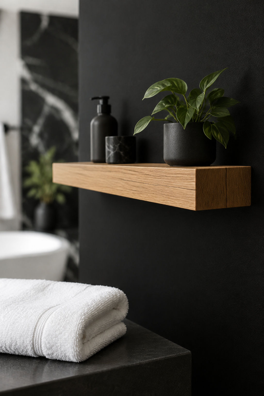
One warm material changes that, almost always wood: a shelf, a run of drawer fronts, a counter edge. This part is design logic, not measured fact. If white is the sixty and black the thirty, the warm material is the ten, the offset in Readinger’s ratio. A second color competes with that ten instead of supporting it, and the room tips out of monochrome into something else.
Designers who mix wood tones in one room usually stop at three, all sharing one undertone family. In a black-and-white laundry room I lower that ceiling to one. A single warm tone on a single plane softens the whole scheme, and two start a conversation the room did not need.
Choose the wood for how it looks against your black and your white. Then check whether the warm wood tone holds up as a working surface in a room full of steam before you commit.
A Black-and-White Laundry Room That Feels Calm, Not Clinical
Hold that room in mind: light on a white wall, a dark run kept low, one warm shelf doing its quiet work. Four decisions produce it: a 60-30-10 proportion, black in one of three places, satin on any black wall, and one warm material as the offset.
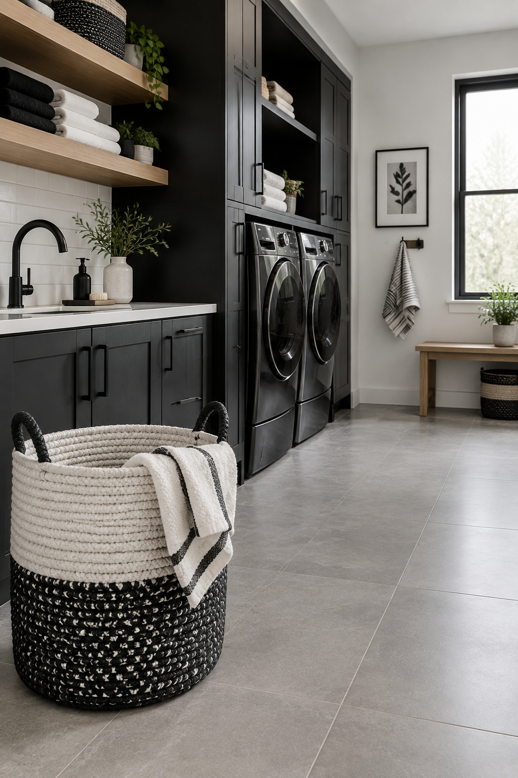
Then guard it. One high-contrast piece that the eye keeps returning to will undo a well-proportioned scheme faster than any paint mistake, so once the room balances, resist the one more black thing. For the room’s other choices, from cabinetry lines to layout, go to the complete modern laundry room guide.
My knowledge ends somewhere, and I should say where. The reflectance scale, the gloss levels and the grout tests belong to paint chemists and tile engineers, and I have only reported them. What I can vouch for is the quiet, how a room feels when nothing in it is asking for you.
FAQ
Is a black and white laundry room too cold or clinical-feeling?
Not if black is held to a proportion instead of spread evenly. Keep white or warm white dominant, black to roughly a third, and one warm material, usually wood, as the final tenth. Watch the whites as well, since designer Marie Flanigan warns that crisp, blue-undertone whites can feel clinical on their own.
What’s the best paint sheen for a black laundry room wall?
Satin. Farrow & Ball recommends it for humid laundry rooms, because flat and matte finishes can absorb moisture and peel. It also returns more light, which a black wall needs: on the Master Painters Institute scale, satin starts at 35 gloss units at 60 degrees, against eggshell’s 10 to 25.
Should laundry room cabinets be black, white, or both?
Both, in most rooms. Put black on the lower cabinets or plinth, keep white or warm white above eye level, and follow 60-30-10 instead of an even split. All-black cabinetry can work as the room’s one dark plane when a lighter counter, floor or wall balances it.