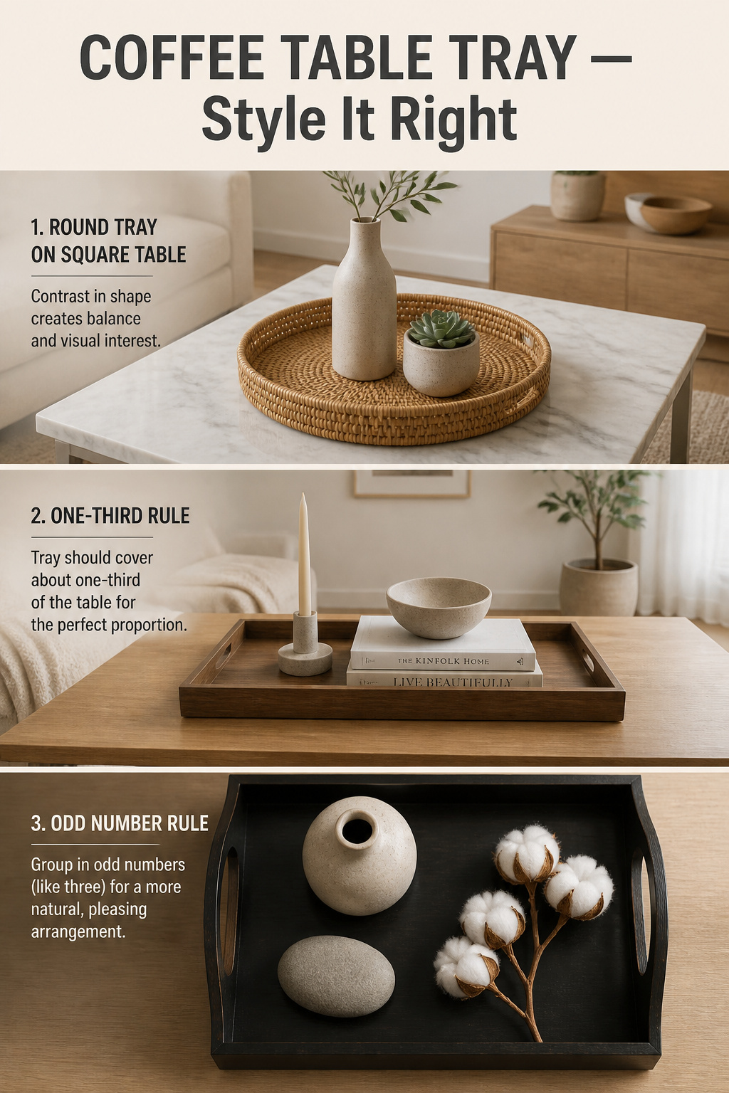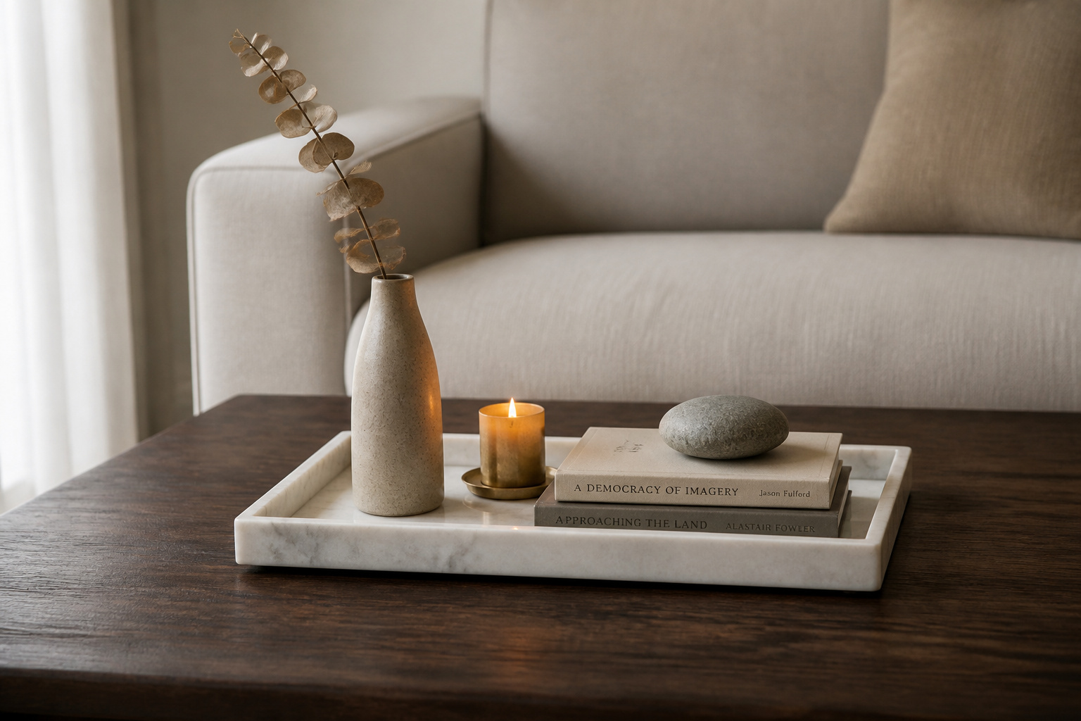

Most people believe any tray will do, and that the work is choosing what goes inside it. It is the wrong order. The tray is the decision; the objects are the easy part. Get coffee table tray decor right and a surface that felt scattered for years resolves in an afternoon — not because you bought more, but because you finally gave what you own a place to belong. That is how a Nordic eye works: draw a boundary, let everything inside rest.
TL;DR
- A coffee table tray should measure at least 18 inches and cover one-third to one-half of the table surface; anything smaller floats instead of anchoring.
- Contrast the tray against the table — a round tray on a square table, a woven tray on glass or marble. Matching shape or material makes the tray disappear.
- Style three objects inside it, never four, using height, filler, and a personal touch — and leave part of the tray empty.
The Tray Myth That Makes Every Coffee Table Look Off
The myth is that a coffee table looks messy because of the objects on it. Usually it is the tray, and usually it is too small. Designers who style tables for a living point to the undersized tray — the one that floats rather than anchors — as the single most correctable mistake.
Why most trays are too small — the 18-inch minimum rule
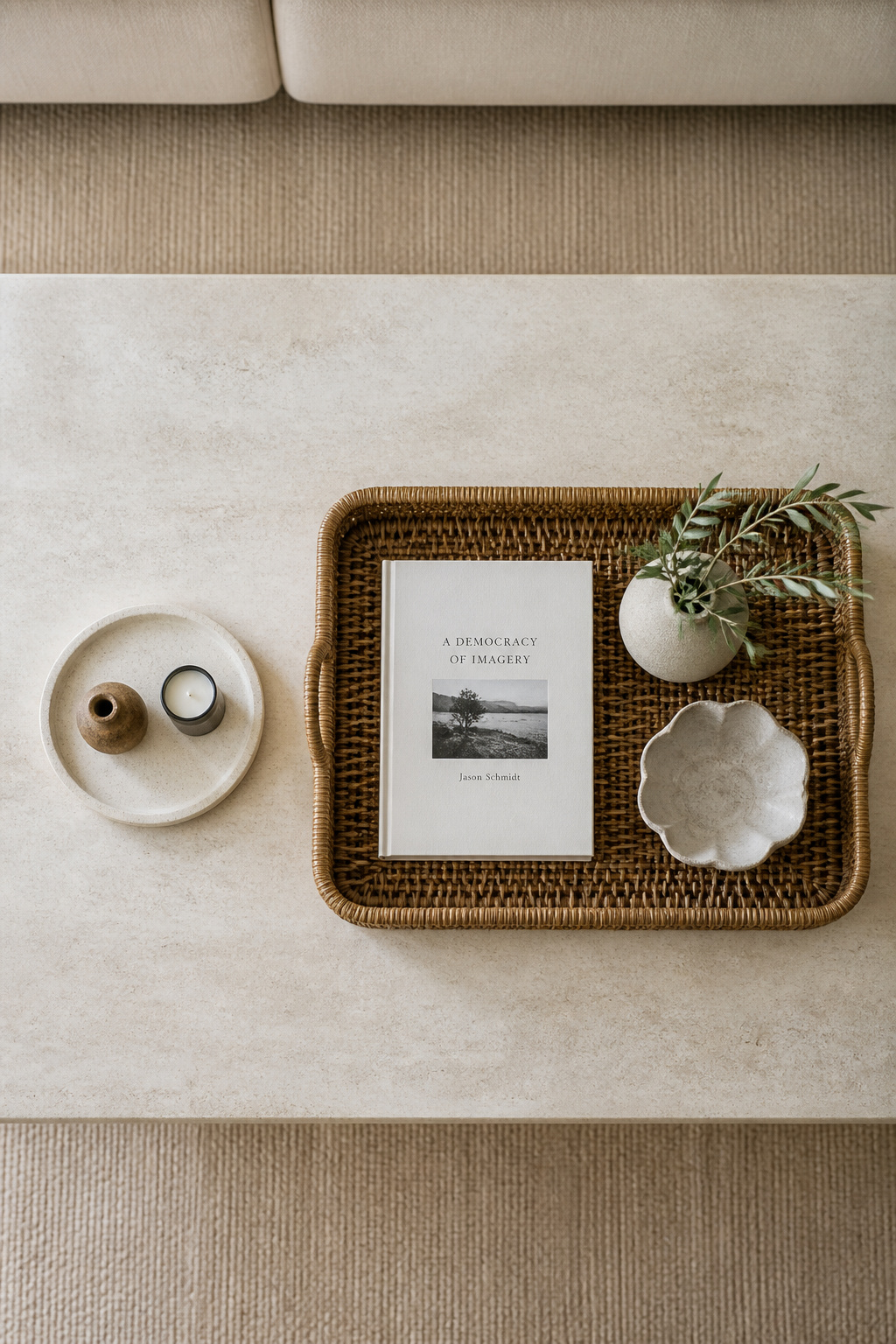
Start at 18 inches across. Below that, a tray holds barely two objects and never builds enough mass to corral them. Interior designer Jennifer Davis of Davis Interiors puts it plainly: “Scale is critical here. A tray should feel generous. When in doubt, go larger; it reads more architectural and less decorative.” Unsure between two sizes? Buy the larger one.
Size relative to the table surface: the one-third coverage target
Eighteen inches is the floor, not the answer. The tray should cover roughly one-third to one-half of your table’s surface — a useful cross-check is the two-thirds rule, where the tray’s length runs about two-thirds the length of the table. Below 25 percent coverage, it reads as a decorative afterthought rather than a foundation.
What a correctly sized tray does to the grouping inside it
A well-sized tray introduces hierarchy: it tells the eye what belongs together, which makes a room feel designed rather than decorated. It also lets you edit — styling one moment inside a frame, the heart of coffee table styling, rather than fussing over the whole table.
Choosing the Right Tray: Material, Shape, and Finish
Three variables decide whether a tray looks chosen or accidental: material, shape, and depth. Each runs on the same logic — contrast. Two elements that differ make each other more legible; two that match cancel out.
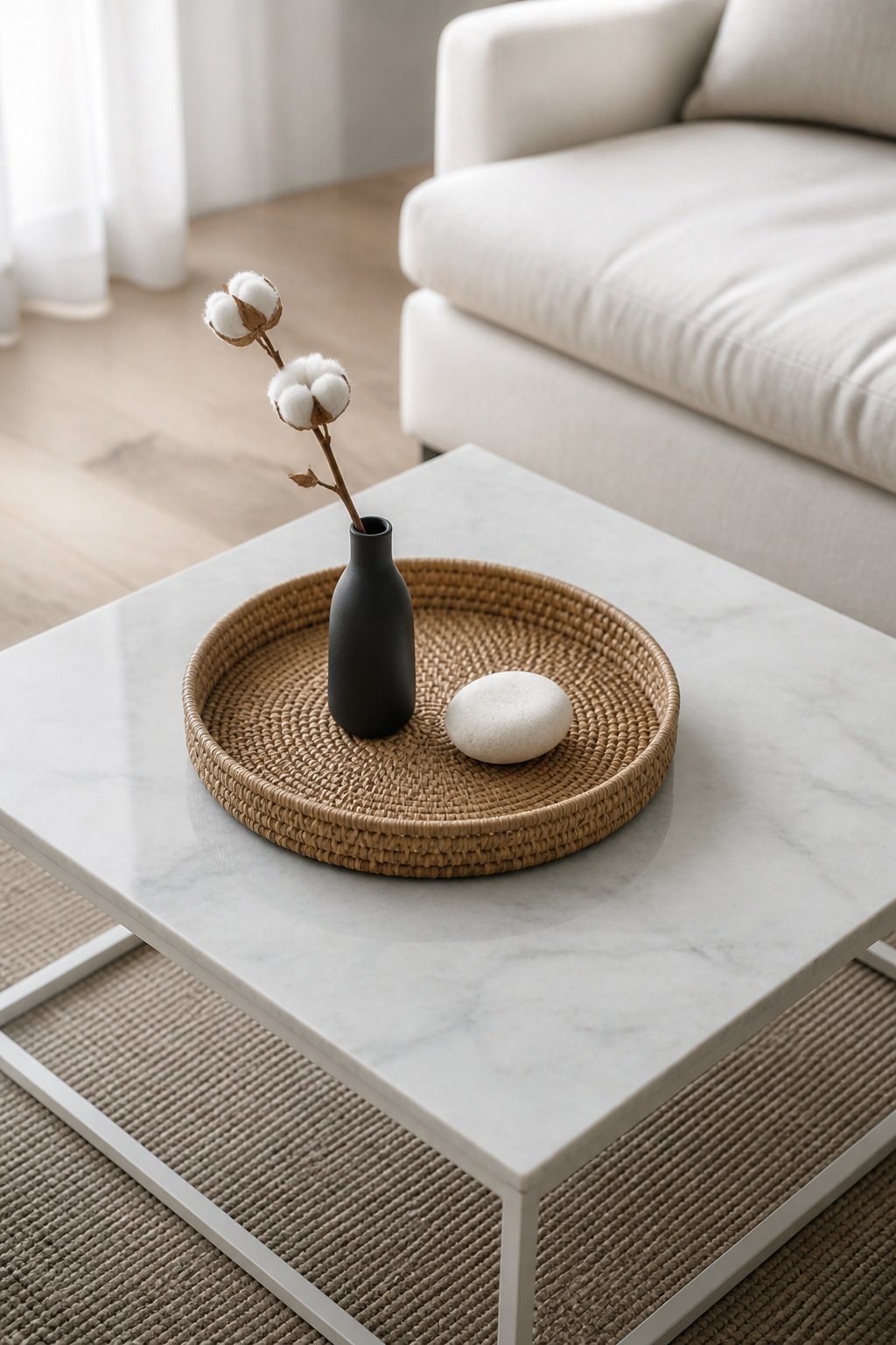
Material and finish: contrast the tabletop to create visual separation
A tray works best when its material differs from the table beneath it. A wood table calls for ceramic, stone, metal, or a woven tray; a glass or marble top gains warmth from wood or rattan. That tension between materials makes a table feel collected rather than catalogue-ordered.
Shape: round trays on square tables, why contrast works
This is where the principle earns its keep. Shape contrast creates visual tension — a deliberate difference the eye reads as intentional. A round tray on a square or rectangular table softens the right angles and becomes a focal point; a square tray on a round table does the reverse, straight lines popping against the curve.
The brain notices deviations from expected symmetry, so a curve inside a grid of right angles holds attention. A round tray on a round table offers no such deviation — it reads as safe conformity rather than a considered choice. One caution: keep the tray clearly smaller than the table so the two shapes do not compete.
Depth matters: lip height and what it corrals vs what it hides
Here I am offering practical observation more than a fixed rule. A shallow lip — half an inch to an inch — defines a zone without hiding what sits in it, which suits sculptural pieces meant to be seen from every angle. A deeper lip corrals small movable things: coasters, the remote, items that wander. A shallow tray displays; a deep one contains.
| Tray material | Tabletop it pairs with | Mood it creates |
|---|---|---|
| Woven rattan or seagrass | Marble, glass, dark wood | Warm, organic, unhurried |
| Matte ceramic or stone | Wood, lacquer | Calm, grounded, considered |
| Lacquer or polished metal | Matte wood, linen | Crisp, contemporary, deliberate |
The Height-Filler-Personal-Touch Formula Inside the Tray
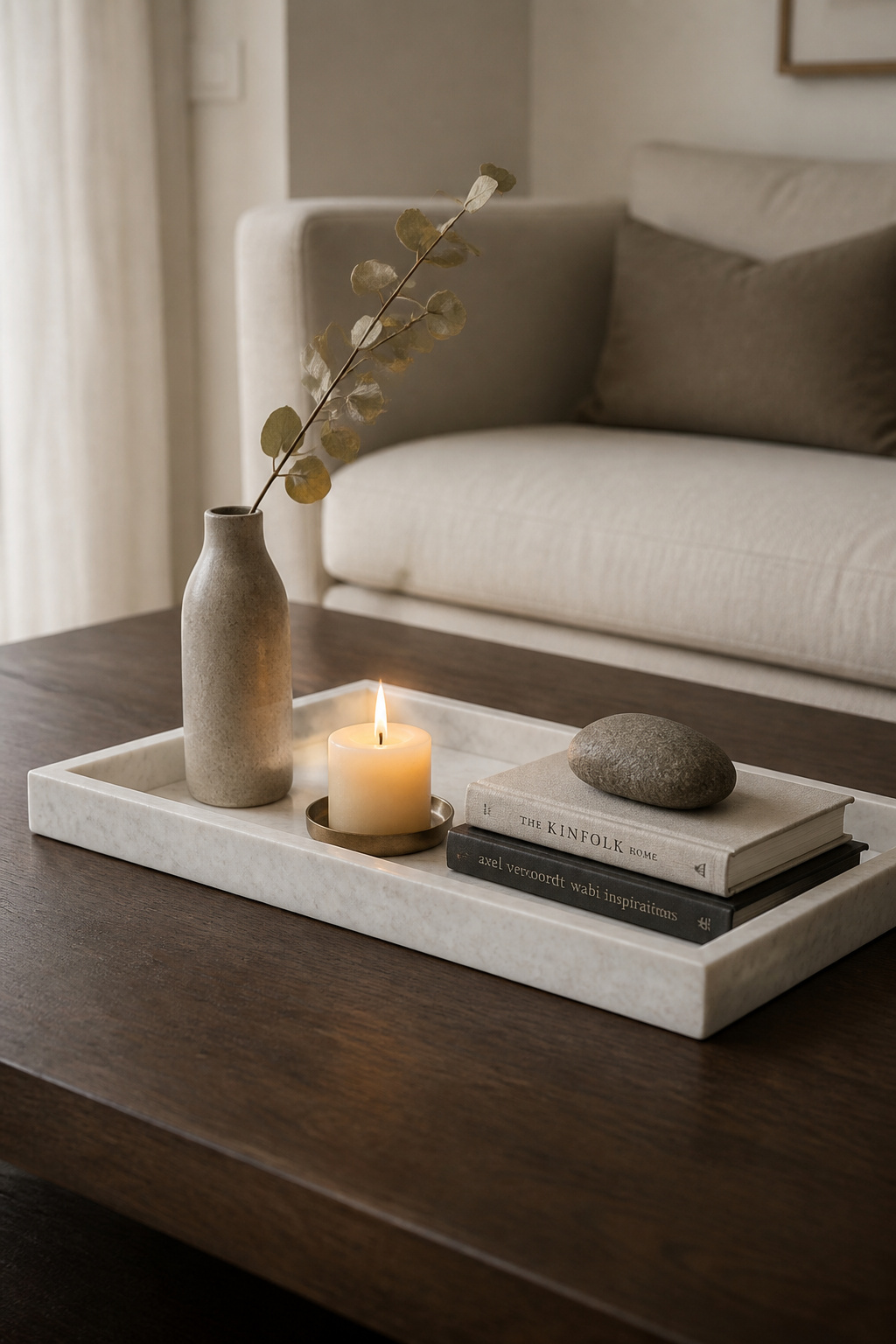
With the right tray chosen, what goes inside follows one formula. Alicia Meireles, creative director at OWN LONDON, puts it well: “I’ll choose a tall piece, a medium-height item, and a low accent. This creates a natural visual balance as your eye climbs, peaks, and then relaxes.” Tall, filler, personal touch.
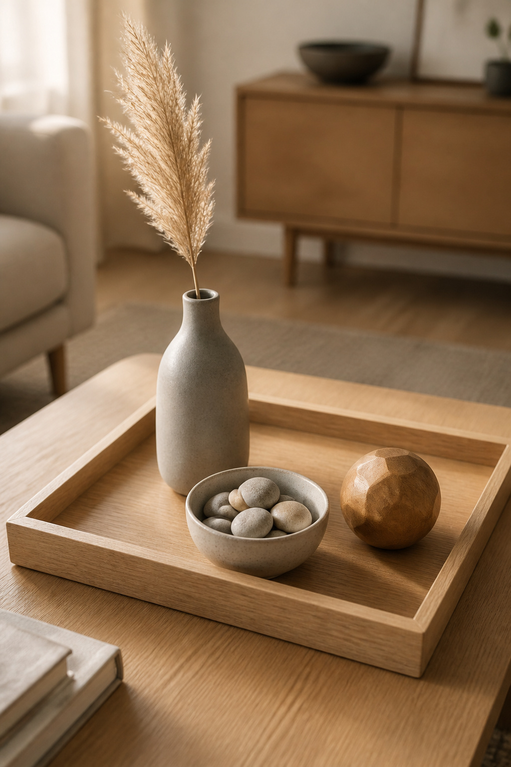
- Set the tall object. A slim stoneware vase with a single stem, a taper candle, a sculptural piece eight to twelve inches high. It should be clearly taller than the rest, but below seated eye level, so the eye climbs without losing the conversation across the table.
- Add the filler. Roughly half the height of the tall piece: a low ceramic bowl of stones, a small mounded plant, a short stack of coasters. In a Nordic arrangement I lean toward a single natural object that keeps the grouping calm and maintenance-free.
- Place the personal touch. The smallest object, and the only one that matters for the room rather than the rule. It need not be decorative — a worn paperback, a beach stone, a handmade ceramic. The test is whether it says someone lives here.
One firm rule: odd numbers. Three for most trays, five on a larger one, never four. Even groupings split into two tidy pairs the eye reads as staging; odd ones hold attention longer. Arrange the three not in a line but as a triangle — tall to the back, filler and personal touch forward and apart — so the grouping gains depth from the sofa.
Common Tray Mistakes and How to Fix Them
Four errors account for most tray arrangements that fail. Each has one fix.
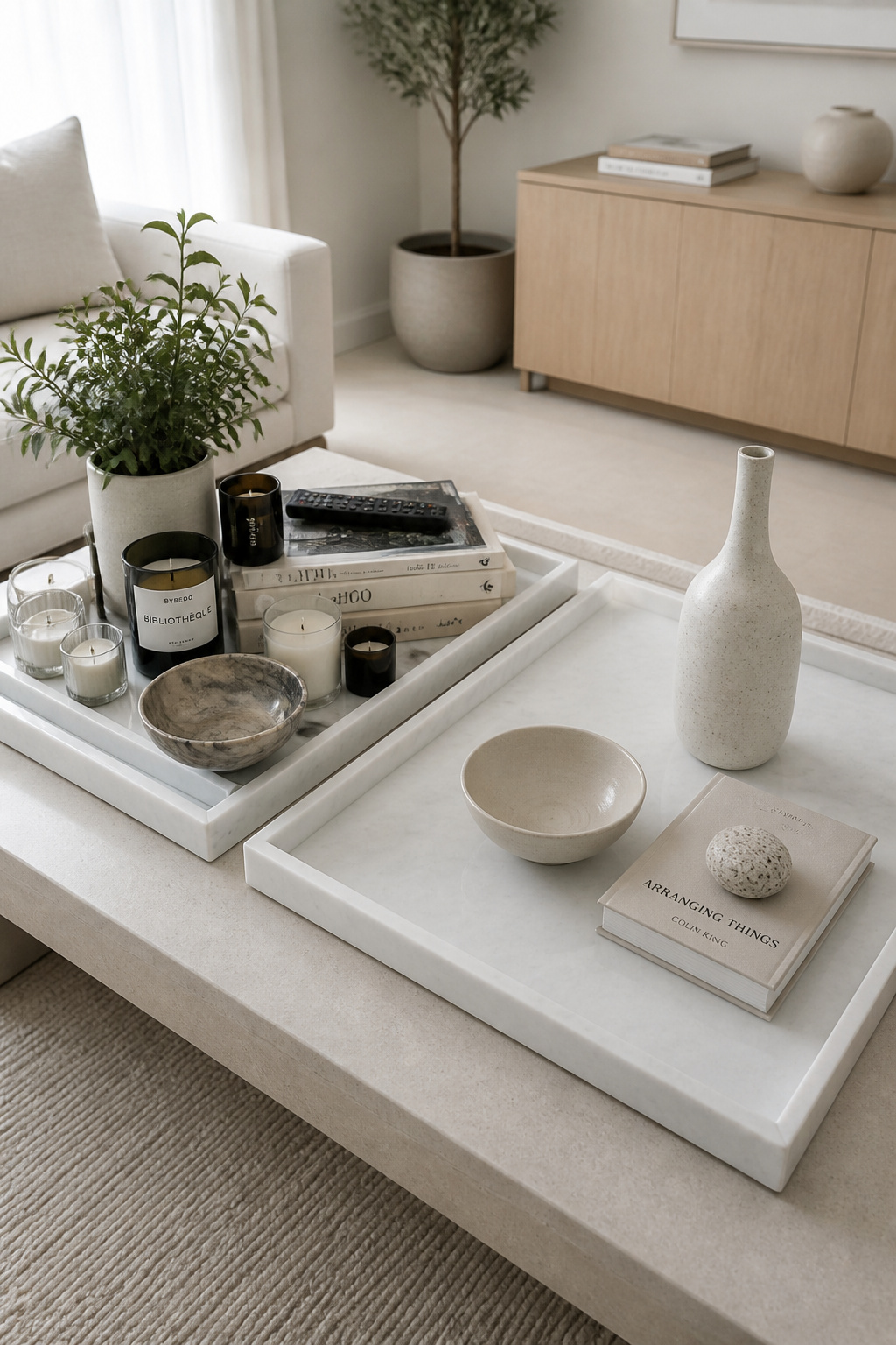
Overfilling. Packed to every corner, a tray stops framing and starts storing — the eye sees objects, not an arrangement. “Leave part of the tray empty,” Davis advises. “Negative space within the tray is just as important as what you place inside it. That breathing room signals confidence and restraint.” Remove one item; if the tray reads calmer, it was never needed.
Same-material monotony. When the tray matches the table too closely, it vanishes. The fix is contrast — and contrast means appearance, not category: a pale rattan tray on dark walnut works because rough weave plays against smooth grain, though both are wood-derived.
Underscaling. Covering less than a quarter of the table, a tray cannot hold objects in relationship; it reads as a thing placed on the table, not its foundation. When a table looks messy despite careful arranging, the tray is usually too small; sizing up is the most effective fix.
The lid-on-the-box problem. A tray is decorative and functional at once, so everything in it should stay usable. The test: can you light the candle, pick up a coaster, slide out a book — without rearranging? If every object is load-bearing, the tray is too fragile for daily life.
Coffee Table Tray Decor for Different Aesthetics
The principles do not change across styles — only the material and object choices do. Three registers cover most rooms.
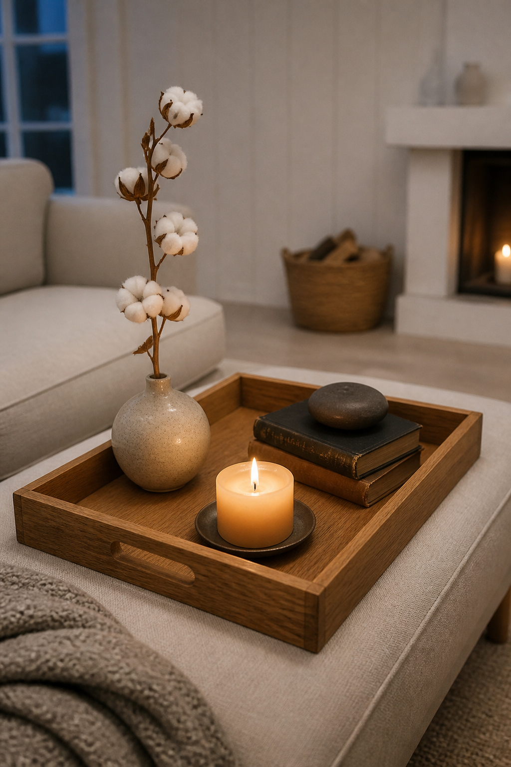
Minimalist: one tray, three objects, bare edges untouched
This is lagom in object form — only what is needed to feel content. One low tray, a sculptural vase, a candle, the rest of the tabletop bare on purpose. What stays empty is not leftover space; it is the frame that makes the three objects matter. The “remove one item” test is most revealing here, because minimalism is reached by subtraction — there is more in minimalist coffee table decor.
Hygge: warm textures, a candle, a small book stack
Hygge keeps the Nordic restraint but adds warmth through texture — and here I am writing from the tradition rather than a cited rule. Where minimalism uses a stone and a vase, hygge brings a beeswax candle, a knitted coaster, a book with a worn spine. A short book stack works as both filler and riser inside the tray — there is more on styling coffee table books if you want to build the stack properly. Keep nothing too perfect: the melted wax edge and the soft spine are what make it read as lived-in.
Natural and organic: a woven tray, a plant, a stone
Lead with the tray itself — rattan or seagrass, handwoven, in a light natural hue. Add one living element (pothos, succulent, air plant) and one grounding object (a smooth stone, a piece of driftwood). Texture matters more than colour here, and the plant adds a small unpredictability that keeps the grouping from looking frozen.
Placing the Tray on the Table: Position and Proportion
Where the tray sits is as deliberate as what fills it. On a rectangular or oval table, shift it off-centre toward the sofa side — exact centring reads as staged. On a round table, centring usually wins.
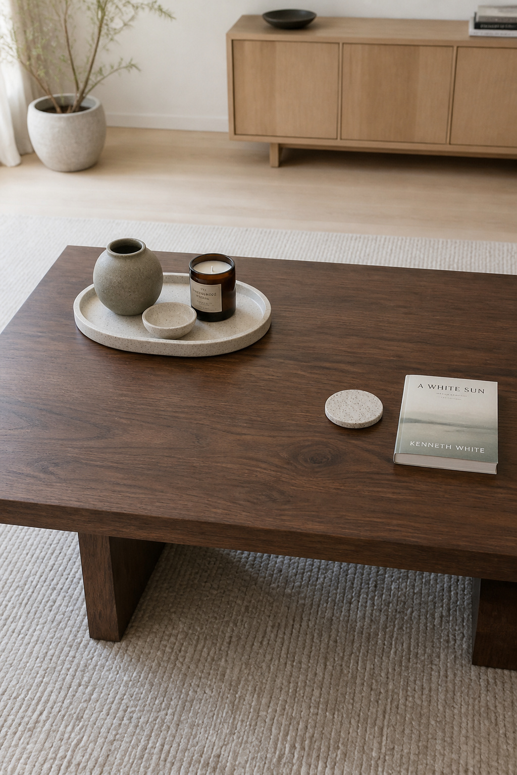
The tray and everything around it should cover no more than half to sixty percent of the surface; the rest stays open for a coaster, a book, a laptop. A table dressed only for a photograph is no use to anyone.
On a long table — sixty inches or more — reach for two trays instead of one oversized one. As a practical technique rather than a cited rule, I keep them doing different jobs: one holds the styled arrangement, the other the functional bits. A difference in material or shape keeps the pair from reading as shop-window symmetry.
Begin with the tray, always. Pick the right size, set it where the table shape wants it, and the objects inside almost arrange themselves.
FAQ
What size tray should I use on a coffee table?
Use a tray that covers one-third to one-half of the table’s surface — roughly two-thirds of the table’s length. As a minimum, choose 18 inches across, which fits more than two objects and builds enough mass to anchor them. As designer Jennifer Davis says, when in doubt, go larger.
Should a tray on a coffee table match the table material?
No. The tray should contrast the table so it reads as a distinct element rather than disappearing into the surface. Pair a wood table with ceramic, stone, metal, or woven trays; pair glass or marble with wood or rattan. Shape contrast works the same way — a round tray on a square table creates intentional visual tension.
How many items should you put in a tray on a coffee table?
Three for most trays — one tall, one filler, one personal touch — and five on a larger one. Always odd numbers; four reads as two symmetrical pairs. Leave visible tray surface around the objects, then run the editing test: remove one item, and if the tray looks calmer, it was not needed.