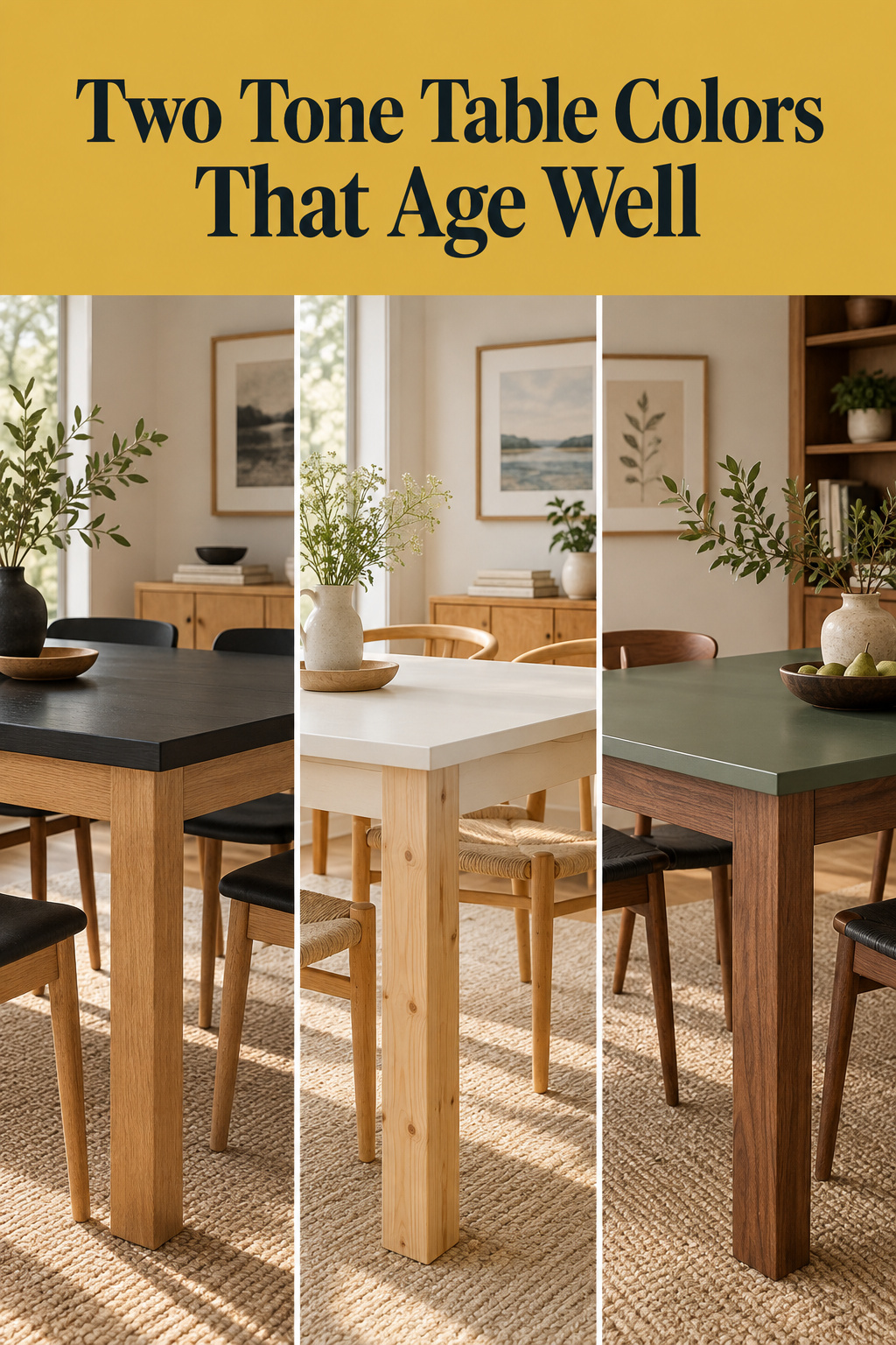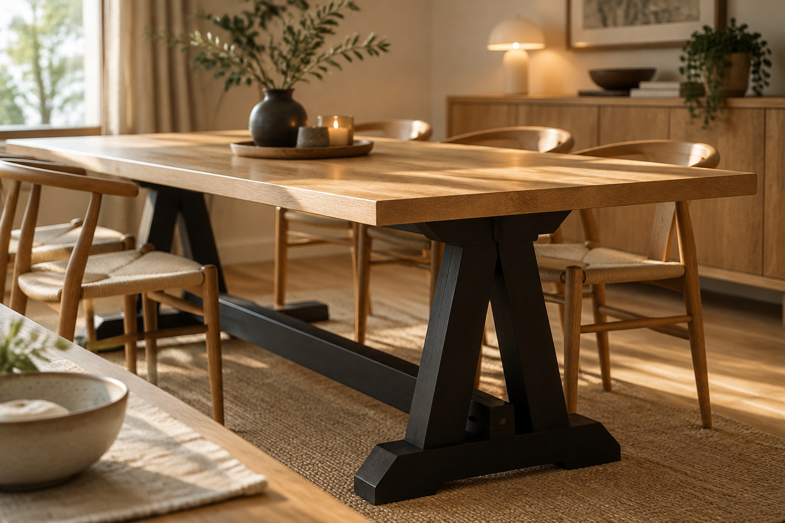

The photograph you saved is not evidence. It shows a base color that worked on one wood, under one window, over one floor, none of them yours. Of all the two tone table color combinations in circulation, only a handful survive the move from someone else’s room to yours, and they survive because the paint agrees with the wood’s undertone and with the light it will live in. Below I sort them by that standard, name the pairing I would choose first and the one I would not buy at all.
TL;DR
- Undertone decides, not color name. Hold the wood against plain white paper in daylight: yellow, gold or red means warm (cherry, golden oak); gray, blue or silver means cool (ash, maple, birch). Walnut and natural white oak sit near neutral.
- Black is the safest first base. It behaves like a neutral with no competing undertone, so it rarely clashes with warm or cool wood. This is my judgement, backed by designers, not a measured result.
- Stark cool white with heavy distressing dates fastest. Several named designers call stark white clinical and the chalk-paint farmhouse look past its moment. Warm, undistressed white does not carry the same risk.
What Actually Decides a Two Tone Pairing (It Isn’t Trend)
A pairing that looks right on a screen can look wrong at home because the photo hid three variables. The base color is not one of them.
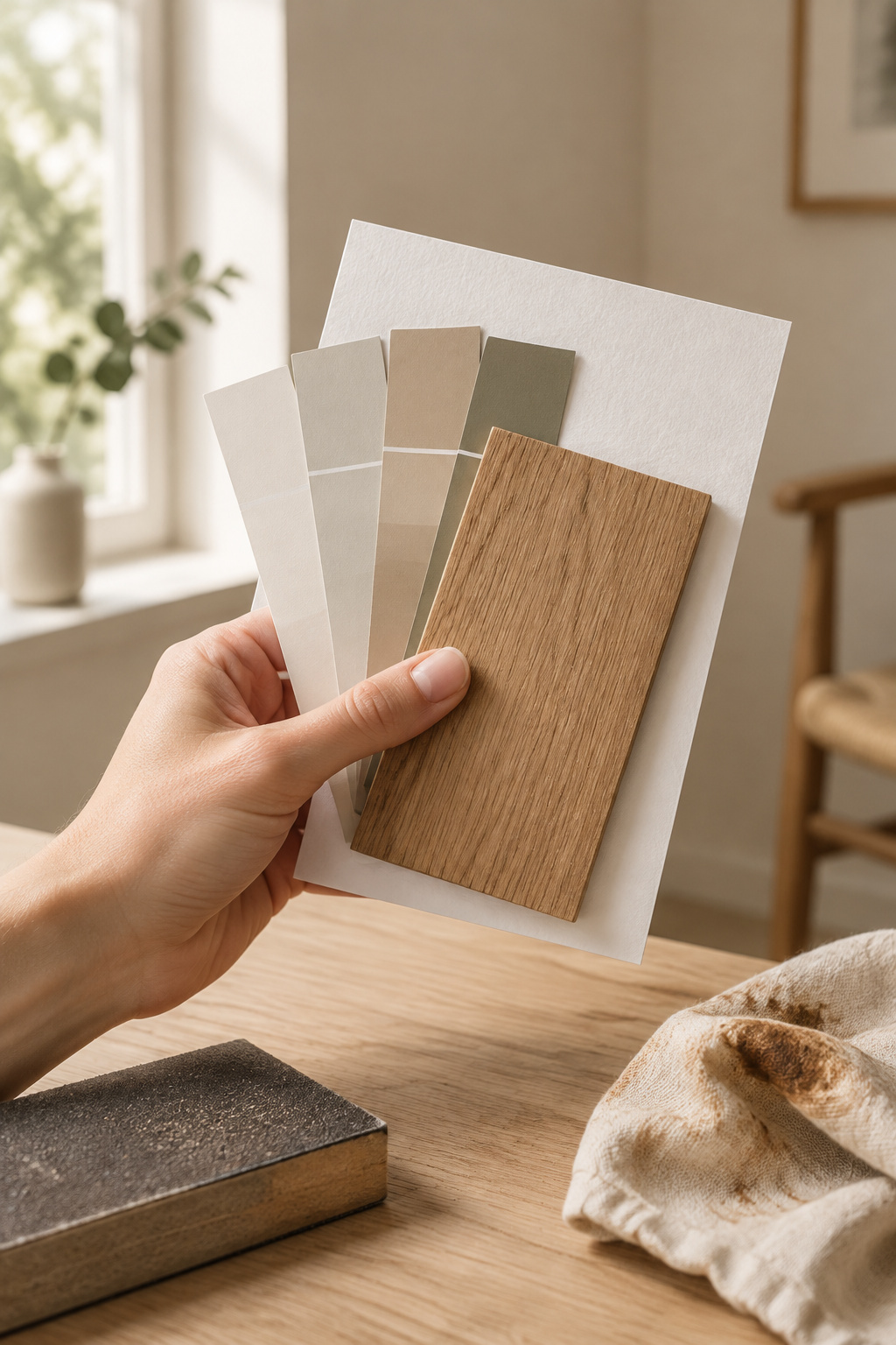
Undertone comes first. Warm colors carry red, orange or yellow beneath the surface, and cool colors carry blue, green or gray. Put the two in one piece and each half may look fine alone while the whole feels faintly off. Proportion fixes most of it: keep roughly 60 percent of the surfaces in one temperature and most of the tension goes. Color consultant Maria Killam makes a related point about neutrals, that a light color should take its undertone from what is already there. On a table, that is the wood.
Read the wood before you open a paint deck. Hold a sample against pure white paper in natural daylight, ideally by a north-facing window. I keep plain printer paper in my sample bag for this, and beside it the yellow in a pine board stops hiding. Cherry, mahogany, hickory and golden oak read warm; ash, hard maple, birch and bamboo read cool. Walnut and natural white oak sit near neutral and tolerate either side.
Light is the second variable. Northern light pulls out the cooler notes in any color, so a cool base can look colder and flatter than its chip. South-facing rooms stay warm through the day and forgive more.
The third is the floor, or whatever the largest surface is. Treat it as the baseline and choose a base that contrasts with it, never one that sits near it in lightness, because near-matches look accidental. The designers’ rule of three for wood tones runs on the same logic: base, contrast, accent, all in one undertone family. For how a two-tone table fits the rest of the room, the two tone dining table guide covers the whole decision.
Black and Wood: The Safest First Two Tone
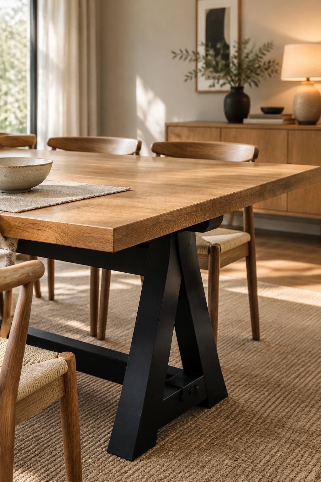
Black is closer to an absence of color than a choice of one, and that is the whole case for it. It carries no undertone of its own to fight, so it sits comfortably under warm wood and cool wood alike. Designer Jethro Huie of Huie Designs describes black accents as grounding a space, adding “depth and contrast while also adding a touch of sophistication.” The classic version is a warm cherry or oak top over a black base: the black gives the eye a place to rest and the wood does the work.
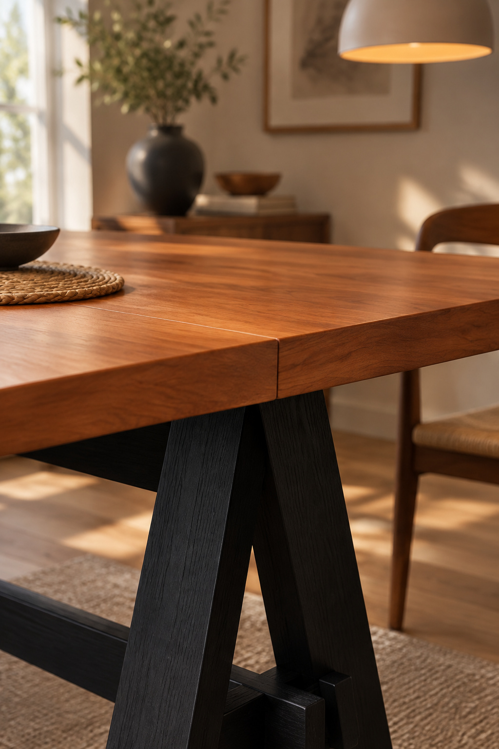
There is one condition. A black base beside a very cool, stark white wall can tip the room toward clinical, so keep the white around it warm and the pairing holds. If you are planning a genuinely dark room around the table, the site’s moody dining room ideas cover the palette; I am arguing only the table here. Sherwin-Williams Tricorn Black is a common trim black, and several light coats finish cleaner than one heavy one.
My call is a judgement, not a measurement: if you are unsure, start with black. It asks the least of the wood, the light and the floor, so you buy once and the table stays right for ten years.
White and Wood: Brighter, But Pickier About Undertone
White looks like the other neutral until it sits next to wood grain.
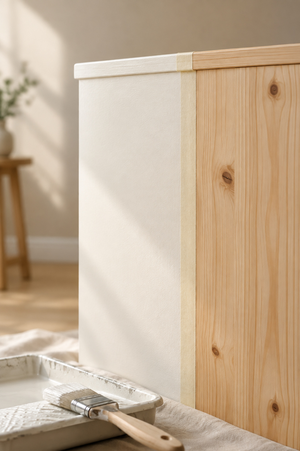
Against wood, white’s own undertone shows. A cream-leaning white agrees with warm timber, while a stark, blue-based white argues with it. White pairs most reliably with cooler or more neutral woods such as white oak, ash and hard maple. It is pickiest against honey-toned wood, where a cold white makes the grain look muddy instead of contrasted. Benjamin Moore Simply White OC-117 is the warm white most often recommended beside natural wood, since it stays inviting without turning yellow.
Two designers in the same recent roundup, working independently, reach the same verdict on stark white. Lyndsay Lamb of Lamb & Co. says bright white fails on warmth and on connection to natural materials, and that “we’ll see far fewer of them going forward.” Stacy Garcia calls it “purely clinical.”
An ambering oil-based clear coat has a catch too: over time it pushes a carefully chosen white toward yellow, so the topcoat has to stay pale.
White and wood is a good pairing in a bright room with a cool or neutral top. In a north-facing room with golden oak, choose black.
Green, Blue and Stain-on-Stain: The Pairings With More Rules
These pairings work inside a narrower window than black or white, and the paint’s name tells you little about which side of it you are on.
Take Benjamin Moore’s two deep greens. Forest Green 2047-10 has a light reflectance value of 7.58 and warm yellow-green undertones. Hunter Green 2041-10 has an LRV of 6.39 and cool blue-green ones. Same family, opposite temperatures. The Farrow & Ball blue-greens show the light problem. Green Smoke No. 47 looks warmer and more teal in south light and colder in north light, and Inchyra Blue No. 289 can drift between gray, blue and green as the day moves. Those are examples, and the principle holds for any brand.
The pattern is simple. Muted sage suits pale, cool woods, where the grain looks almost lit from within. Deeper olive or forest green suits medium warm woods like walnut, and navy against golden oak makes the oak look rich rather than orange. A cool gray on warm amber pine will always feel slightly off, however fashionable each half is. If you want a weathered gray top, pair it with cool or neutral company; the weathered gray finish itself has its own article.
| Base color | Wood undertone it needs | Room light it needs | Verdict |
|---|---|---|---|
| Black / near-black | Warm or cool | Almost any | Safest first choice |
| Warm white / cream | Cool or neutral | Check against a cool north room | Good, pickier |
| Muted sage green | Cool (white oak, ash, maple) | Check in north light | Good |
| Olive / forest green | Warm-medium (walnut) | Check the paint’s own undertone | Good |
| Navy | Warm (golden oak) | Test in your room | Good |
| Stark cool white | Cool only | Test in your room | Dates fastest |
Choose the black row unless your wood and your light clearly point to another one.
Dark Top, Light Base (and the Reverse)
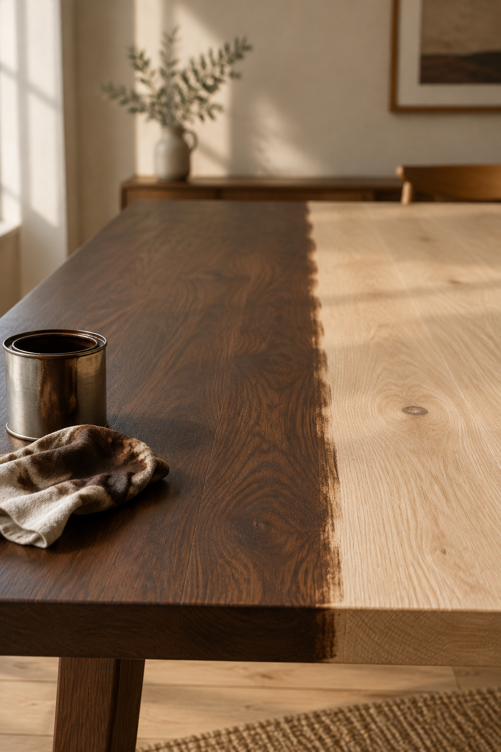
Stain on stain follows the same terms. One common shorthand says a light top over a dark base looks modern farmhouse and approachable. A dark top over a light base looks more formal and suits a smaller room, since the pale base keeps the piece from feeling heavy. That is one reading, not a settled rule, and I would put the light above it. Warm bulbs around 2700K to 3000K soften a dark base; cool light at 4000K and above makes the same base starker. The safest stain pairings keep the base neutral and let the top carry the warmth.
The Two Tone Table Color Combination That Dates Fastest
Stark cool white, heavily distressed, over a natural pine top dates fastest. That is my second committed judgement, and like the first it rests on converging professional opinion rather than any study, since nobody has measured how fast a pairing starts to look old.
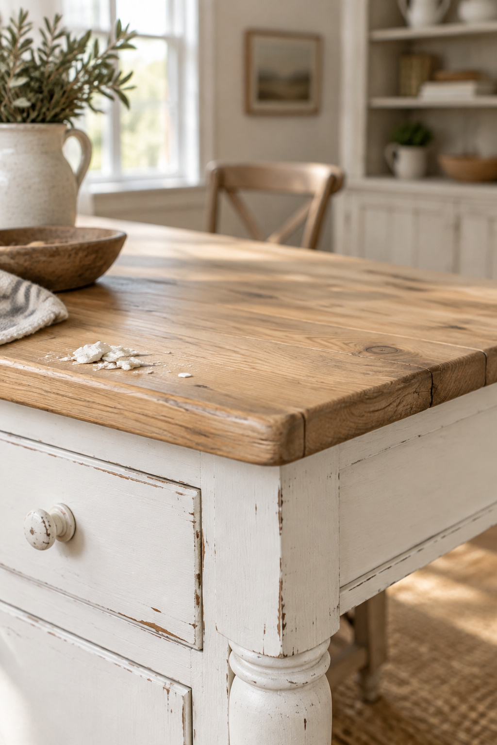
The reasoning starts with undertone. The stark white argues with warm pine and has the same clinical quality the designers above object to. The distressing ties the piece to one era: a furniture-flipping specialist who worked extensively in distressed chalk paint now says buyers want sleek, new-looking pieces over hand-distressed ones. The cool gray that travelled with that palette is going too, and designer Lindsey Jamison of Rumor Designs says gray “has become predictable and lacks warmth.”
Across the sources, what replaces it is always warm: green-leaning beiges, soft greiges, putty, creamy whites and muted caramel.
White is not the problem, and distressing alone is only a technique. The combination does the damage: a cold white roughed up to look old against a warm top ties a table to a single decade. A smooth, warm white carries none of that risk. Plan the table to last ten years and the choice makes itself.
Matching the Chairs to Your Two Colors
The rule the photographs never showed you is short: read the wood’s undertone, read the room’s light, then choose a base that contrasts in value and agrees in temperature. Black first if you are unsure, and stark white with heavy distressing not at all.
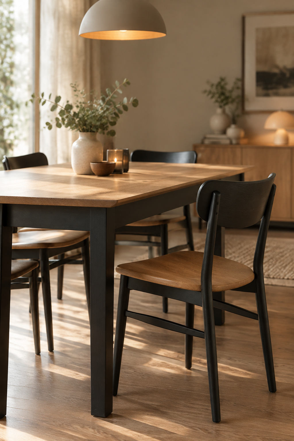
The chairs come next and answer to the same undertones. Maria Killam gives the broad principle: coordinated, not matching. Which chair finish goes with which half of the table is a question of where the eye lands next, and it has its own article on choosing chair colors for a two tone table. My part ends at the table’s edge.
FAQ
Does a two tone table go out of style?
The approach stays; specific combinations date. Two-tone tables remain a strong direction because the base-and-top structure adapts to almost any style. Undertone mismatches are what age badly, most often stark cool white with heavy distressing, so choose for undertone agreement over trend name and the pairing lasts.
Should the table base be darker or lighter than the top?
Either works, so let your light decide. A light top over a dark base tends to feel approachable and farmhouse, while a dark top over a light base feels more formal and lighter in a small room. Warm bulbs around 2700K to 3000K soften a dark base, and cool light makes it starker.
Can you mix warm and cool tones in a two tone table?
Yes, with more risk, so keep about 60 percent of the surfaces in one temperature; that resolves most of the tension. Crossing temperatures works best as a clear, confident contrast, such as a cool navy base under warm golden oak, and worst as an accident nobody meant.