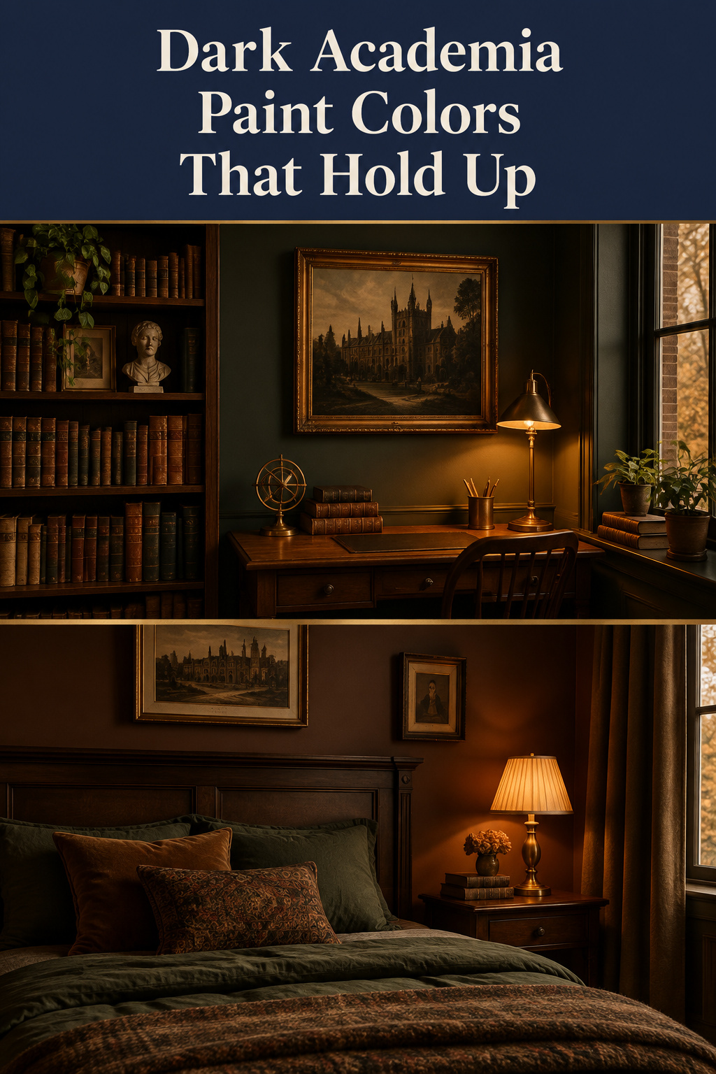
In the Victoria and Albert Museum’s catalog there is a girl’s ankle boot made for the Great Exhibition of 1851, and the museum’s own record describes its velvet as oxblood-colored. Oxblood was already a settled name for that exact dark red-brown a century and a half before anyone pinned it to a mood board. Most roundups of dark academia paint colors leave that lineage out, and it is what separates a color that reads scholarly from one that is only dark. You have arrived with thirty names off two or three brand lists. Undertone and sheen will narrow them down faster than the names will.
TL;DR
- Four families carry the look: oxblood, ink, bottle green and tobacco brown. They describe kinds of color rather than specific products, and in your room the undertone decides which one works more than the depth does.
- Sheen does more than the hue. Flat returns 0 to 5% of the light hitting it and eggshell 10 to 25%. Eggshell is the standard for a fully dark room, with satin as the fallback in a small or dim bedroom.
- Test first: two coats on a minimum A2 board, a full 24 hours to cure before you judge it at all, then three light moments, one of them after dark under the lamps you actually use.
The dark academia paint colors that read scholarly
Four families do nearly all the work, and each had a working past before it had a paint chip. Oxblood comes off polished leather: Victorian dress boots, worn well into the twentieth century. Bottle green comes off baize. Green was chosen for billiard tables because the game had moved indoors from a lawn, and in the gentlemen’s clubs of the period the billiard room and the library sat under one roof. Ink is the fountain-pen and manuscript association, with no marketed color behind it. Tobacco brown is leather again, warmed.
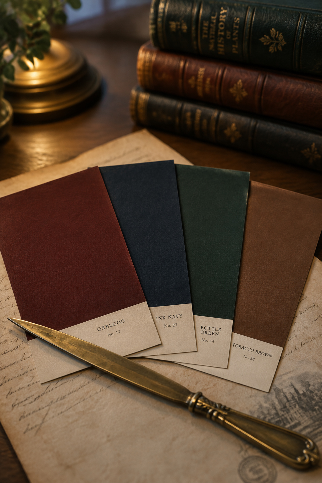
Treat that as a description of history. These are the families whose historical company was scholarly and whose undertones happen to hold up in warm, low light. If you say the undertone causes the scholarly reading, you are claiming more than anyone can demonstrate.
Undertone itself you can demonstrate. Sherwin-Williams is blunt about the method: undertone appears only against another color or the room’s own finishes, and more honestly on the mid-to-dark steps of a strip than on the palest chip. None of the families below has a canonical paint, either. The paints listed are documented stand-ins, and none is sold under the family’s name.
| Family | Undertone to watch | A documented stand-in | Where it slips |
|---|---|---|---|
| Oxblood | Red comes forward in afternoon west light; purple takes over in north light | Farrow & Ball Brinjal No. 222, LRV ~6.5 — deep aubergine-purple, the closest documented example, not an “oxblood” product | Cool north light, where the purple runs the room |
| Ink | Blue-leaning near-black rather than a warm neutral | F&B Hague Blue No. 30, LRV ~7 (navy, ultramarine or deep teal by light); Benjamin Moore Hale Navy HC-154, LRV 8, green undertone | Cold white light, where a navy turns corporate |
| Bottle green | Warm yellow-green versus cool blue-green | BM Forest Green 2047-10, LRV 7.58, warm, recommended whole-room; Hunter Green 2041-10, LRV 6.39, cool, accent only | F&B Studio Green, LRV ~7.2, is black in a dim corner and green by the window |
| Tobacco brown | An olive or charcoal undercurrent keeping the brown off orange | BM Silhouette AF-655, an espresso the brand describes as burnt umber woven with charcoal, shown matte wall-to-ceiling | Without that undercurrent it drifts to builder’s beige; SW Rookwood Terra Cotta, LRV ~14, is an accent for the same reason |
How that wall then sets up the bed, the shelving and the desk is a whole-room question, and it sits in the full dark academia bedroom guide.
Depth and sheen do more work than the hue
A flat wall gives back zero to five percent of the light that strikes it. Eggshell returns 10 to 25%, satin 25 to 35%. On a pale wall that is a texture decision. On a deep one it changes the color you end up with, because the identical paint reads measurably lighter in eggshell than in matte.
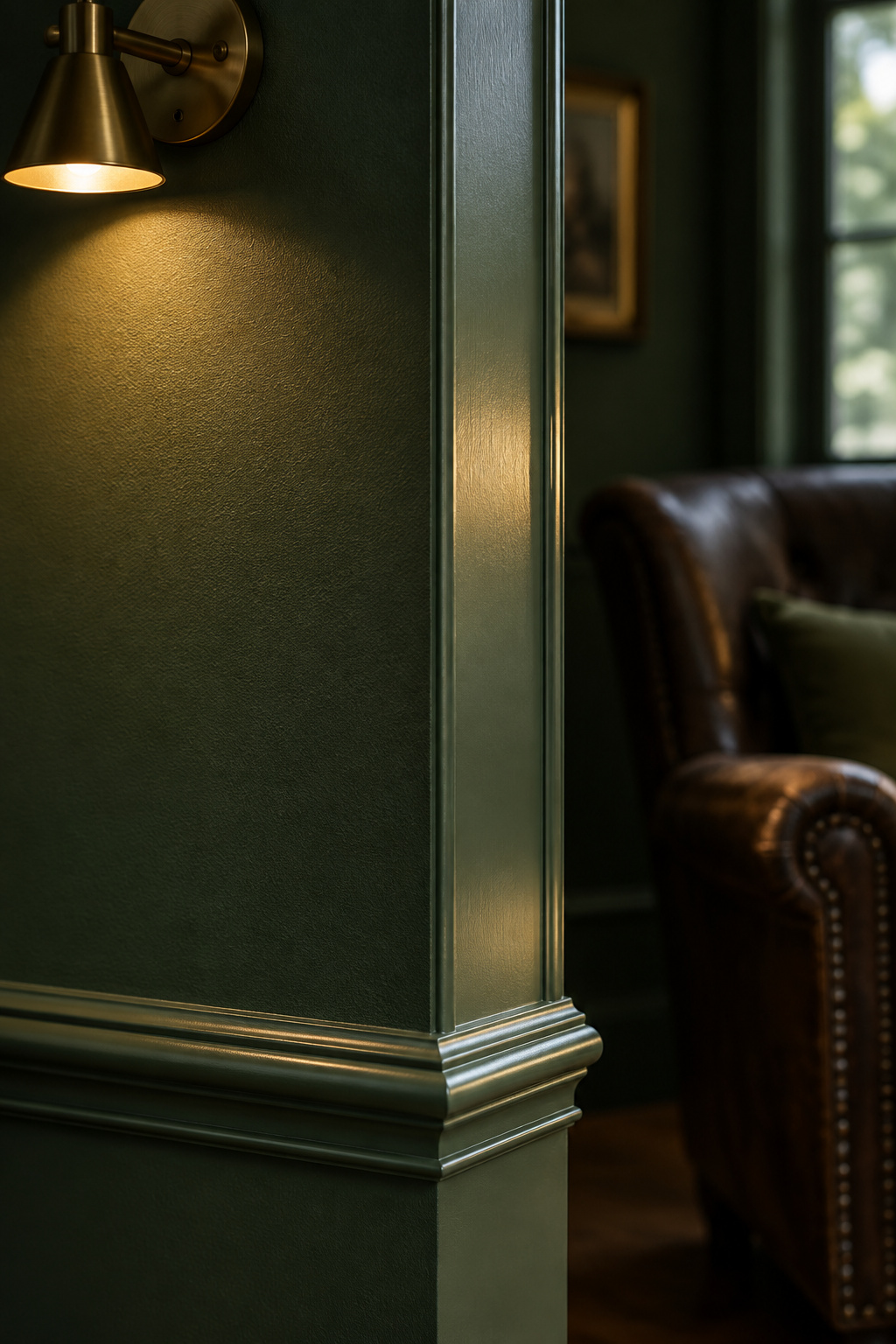
That is why the trade standard for a fully dark-walled room is eggshell, even though almost everyone reaches for flat first. Matte is what the reference photographs look like, and it is also what makes a deep color go dead in a room short of light. Satin is the documented fallback when the bedroom is small or genuinely dim. I settle the finish before anything else, and I’d give any beginner the same advice before they pick a color name.
Two conditions decide it in a bedroom. The first is that a bedroom is mostly seen after dark. Hale Navy’s green undertone gets stronger under warm 2700K incandescent light and candlelight, which is exactly the light a bedside lamp gives, so a color you approved at noon is a color you have not tested. The second is orientation. In a north-facing room with no direct sun, Farrow & Ball recommends pushing the target LRV 5 to 10 points higher than the color would otherwise call for, and favoring the warm undertone at that depth.
A note on that scale: LRV runs from 0 to 100 and is measured under BS 8493, which standardizes the measurement and nothing else. The familiar “dark is LRV 2 to 10” band is a design convention layered on top, with no codified cutoff behind it. Whether a dark color makes a room feel smaller is a separate question, covered elsewhere on this site.
How to test a dark color before you commit a whole wall
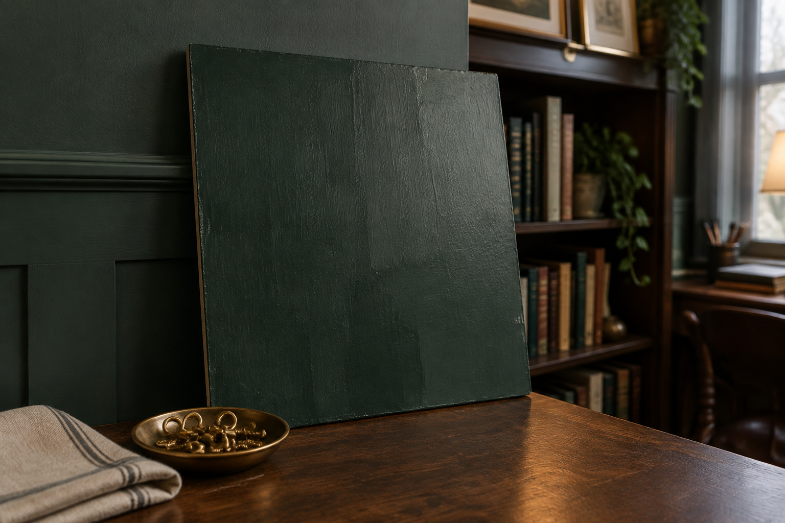
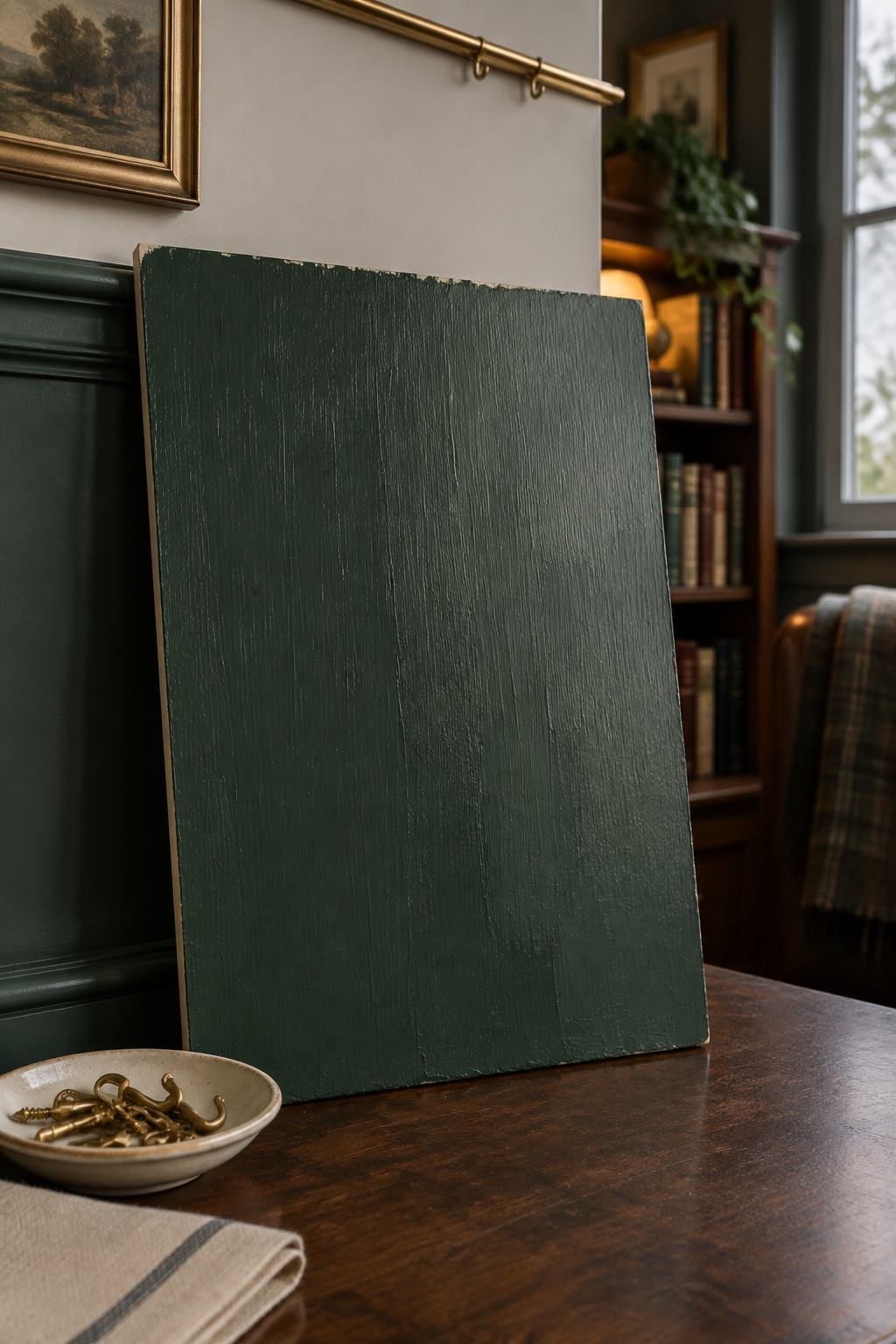
The most expensive habit here is approving a deep color from a paint chip under a store’s fluorescent tubes. I judge a board by tilting it until the lamp rakes across the brushwork, because the undertone surfaces in the drag lines before it surfaces in the flat field.
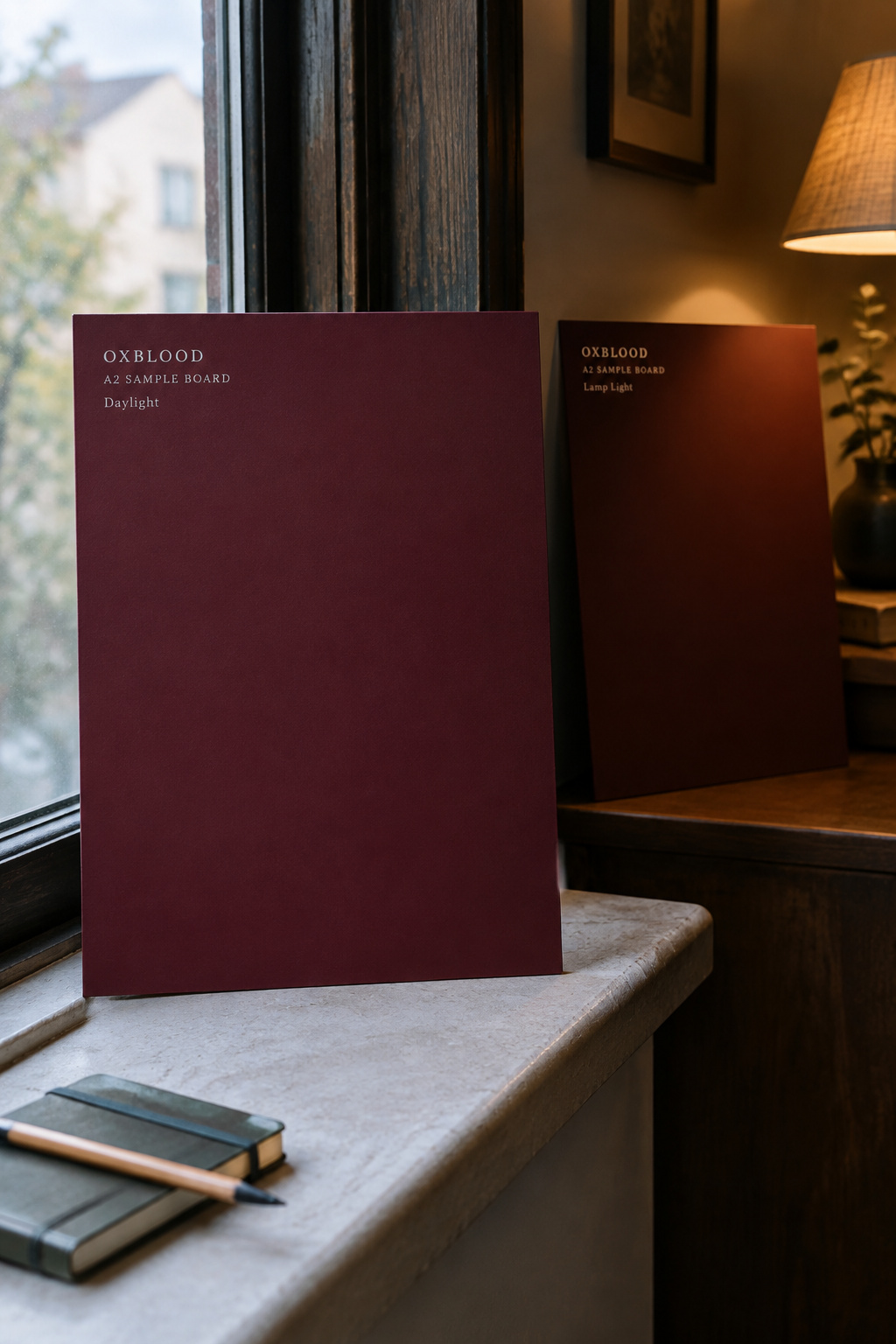
- Paint a minimum A2 board (lining paper or white poster board) with two full coats. Use the board instead of the existing wall, because the old color underneath will lie to you.
- Give it a full 24 hours to cure. That time only lets the paint film finish so the color is honest; the decision comes later.
- Move the board to at least two walls, one that gets direct sun and one that never does.
- Look at it at three separate light moments, one of them after dark under the room’s own bulbs.
- Judge undertone only by comparison: against the floor, the trim, or a second candidate board.
- Run three samples, up to five. One professional standard asks for three days on the wall before deciding. That is a longer window than the 24-hour cure, and it answers a different question.
On primer: for a jump this dramatic, KILZ recommends tinting the primer itself toward the topcoat, a shade lighter than the topcoat instead of an exact match.
Picture rails and paneling on a dark wall
The picture rail started as hardware. In Victorian and Edwardian houses it sat 300 to 500mm below the ceiling so residents could hang pictures and tapestries from a hook and wire instead of driving nails into plaster. The dado rail below it had an equally unromantic job. Set at the height a chair back brushes the wall, roughly a third of the way up, it stopped furniture wrecking the wall covering. The architect James Dixon notes that the rail survives today for proportion rather than protection, because it establishes a separate zone on the wall.
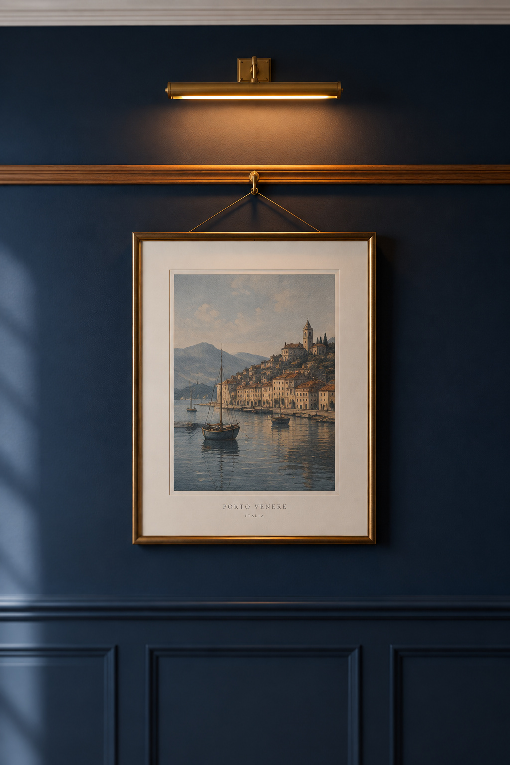
That zoning is what a deep color needs. A fully saturated wall is one flat plane unless something interrupts it, and a rail or a paneled dado breaks it into two or three proportioned sections. Color-drench the room (walls, ceiling and trim in one deep color) and every contrast boundary disappears into what the design press calls a jewel-box effect, leaving the joinery as the only line the eye can read proportion by.
A rail is also reversible. It is screwed on and can come off, and it hands the next owner a hanging system instead of a wall of patched holes.
Dark trim against a dark wall
So do you break to white, or run the trim in the wall’s own color? Whether dark-on-dark looks deliberate or unfinished comes down to the sheen step. Sherwin-Williams and Benjamin Moore, reached independently, give the same rule: the lower sheen on walls, matte or eggshell, and a distinctly higher one, semi-gloss, on trim, doors, cabinetry and wainscoting. That contrast holds whether the two share a color or break from it. Pair a matte field with a higher-gloss trim in the identical color and the result is muted without going flat. The light still picks out the trim, so the eye still reads it as trim.
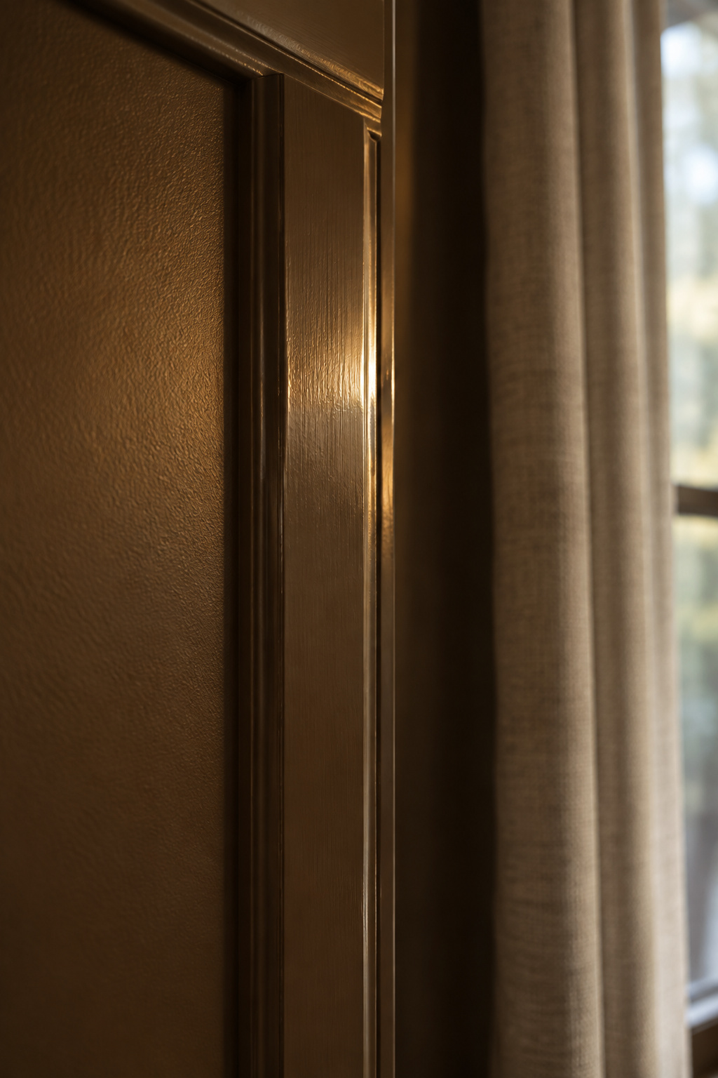
White trim is the high-contrast option. The paneled, picture-railed treatment simply tends to want the quieter one.
Once wall and trim are cured, the wall stops being a variable. It becomes the fixed backdrop every later decision is held against, starting with what goes on it, since a deep field changes how a frame and its mat read. That is the subject of hanging framed pieces against a dark wall.
Where the wall decision ends and the wood tone begins
Warm colors carry red, orange or yellow undertones; cool ones carry blue, green or gray. Mix the temperatures at random and you get a faint dissonance, even when every piece looks fine on its own. The working fix is to keep roughly 60% of a room’s surfaces in one temperature, and the walls are the largest surface you own, so once they are cured that 60% is spoken for.
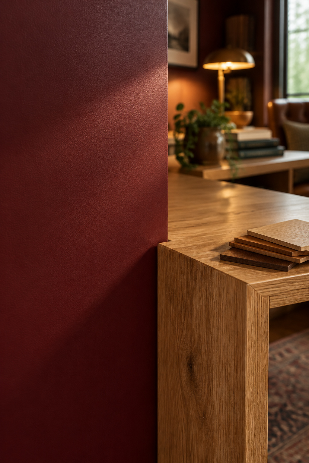
That settles the order of operations: wood tone gets chosen against a finished wall. You can carry a sample up to a cured surface and see the two together under the room’s own light, instead of guessing in a showroom under someone else’s bulbs.
By this point the wall is settled: one family, one sheen, a color watched through three light moments, and a trim call made on purpose. When the lamp goes on in the evening, the color on the wall is the one you approved under it. What the timber does against that backdrop is the next decision, and it belongs to choosing wood tones against a finished wall.
FAQ
Does a dark academia paint color work in a bedroom with little natural light?
Yes, with two adjustments. In a north-facing room with no direct sun, push the target LRV 5 to 10 points above what the color would otherwise call for and favor the warm undertone at that depth: Forest Green at LRV 7.58 over Hunter Green at 6.39. Then choose satin over eggshell, since it returns more of the light available.
Can I keep white trim, or does dark academia require dark-on-dark?
Neither is required. White trim is a standard high-contrast option. Running the trim in the wall’s own color removes the boundary entirely and produces what the design press calls a jewel-box effect. Either way, both major manufacturers put trim in semi-gloss against matte or eggshell walls.
How is a dark academia palette different from a general moody paint palette?
A moody palette can draw on any dark color. This one narrows to four families with a documented material history: oxblood from Victorian leather, bottle green from library and billiard-room baize, ink from the manuscript association, and tobacco brown from leather again. The general moody-color argument, scoped to living rooms, is in Moody Living Room Paint Colors.