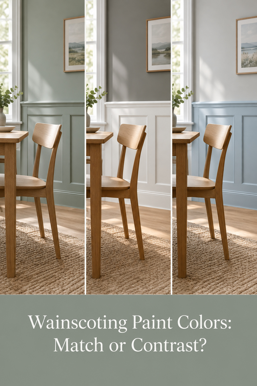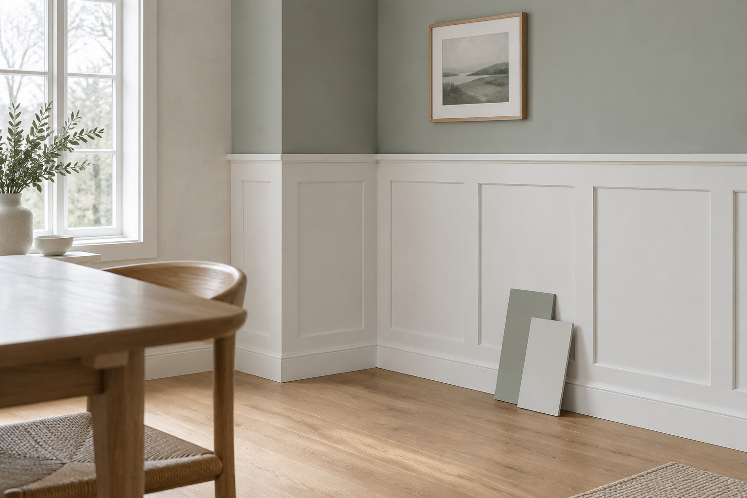
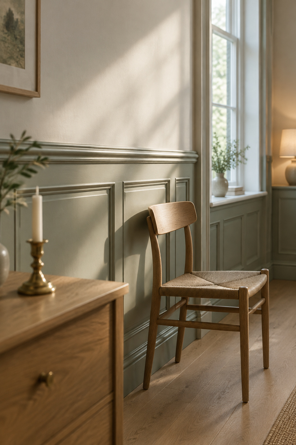
You pull out a chair and sit. The wainscoting paint colors were chosen as a pair: the panels at your back a soft chalk, the wall above them a quiet gray-green, and in the late light the cap throws a thin shadow along its edge. Someone is clearing plates in the next room. Nothing on the wall asks for your attention, so it goes where it should, to the table and the person across it.
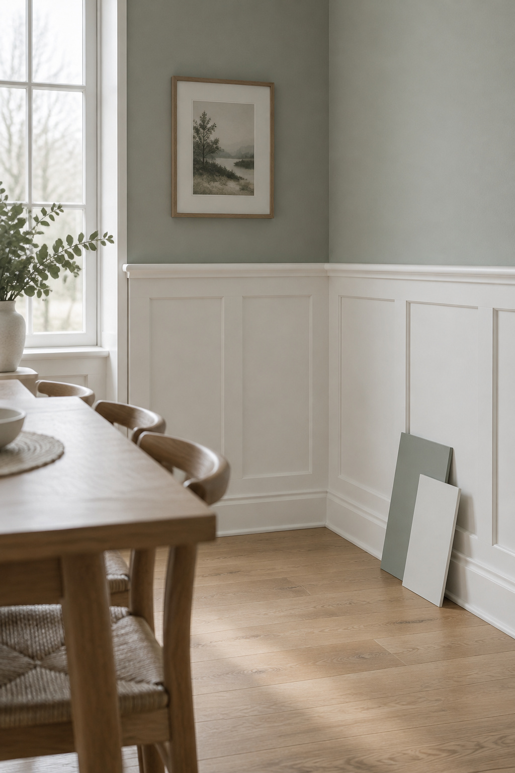
Most people start a long way from that room. They start with a dozen swatches taped to the drywall and two friends with opposite views on whether the panels should match the wall at all.
The swatches can come down. Panel and wall can relate in only three ways, and three questions pick between them.
TL;DR
- Every wainscoted wall is one of three relationships: one color top to bottom, a paler panel under a deeper wall, or a deeper panel under a paler wall.
- Benjamin Moore suggests pairings you can copy, such as Simply White panels (LRV 89.52) under Manchester Tan (LRV 63.24), a gap of 26.28 points.
- Choose by the feeling you want at the table, the light the room gets, and what you want the trim to do, then test the pair on painted boards over a few days.
Three Color Relationships Every Wainscoted Wall Falls Into
Calm, lively or grounded: each relationship gives a room one of those feelings before it gives it anything else. If you are still choosing wainscoting for the dining room as a whole, settle the panels first; color comes next.
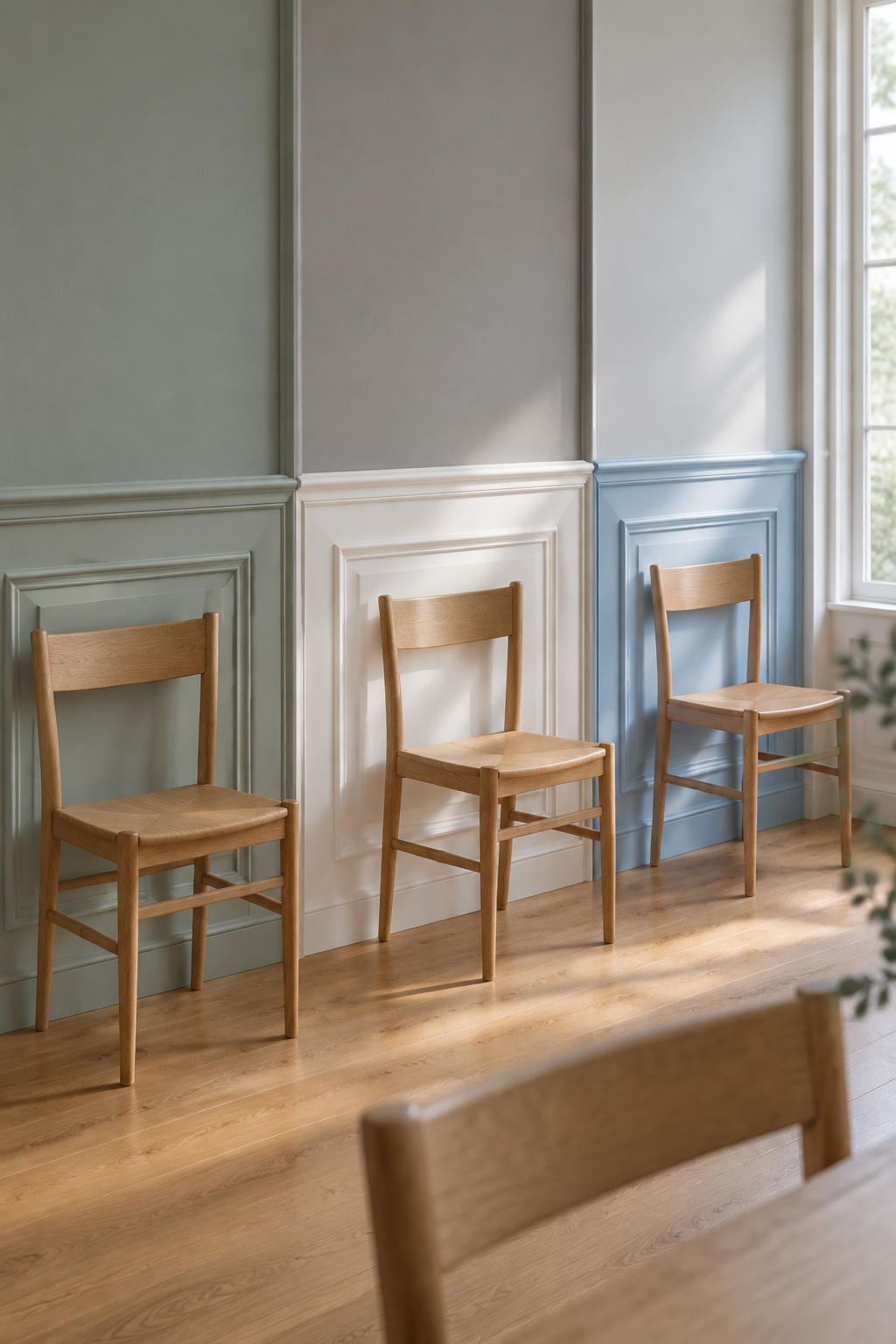
I name the three by what the panel does against the wall, because “dark over light” means opposite things to different people.
| Relationship | Feeling at the table | What the light does | What the trim does |
|---|---|---|---|
| One color top to bottom | Calm, enveloping | The molding shows by shadow, so side light helps | Disappears, or holds the same color |
| Paler panel under a deeper wall | Lively, current | Lightest surface sits beside the chairs; wants good daylight | Frames the panels in one consistent color |
| Deeper panel under a paler wall | Grounded, classic | The deep band absorbs light, so check the table is lit | Stays lighter and consistent around the band |
One number helps all the way through: LRV, or light reflectance value. It runs from 0 for black to 100 for white, and a color below about 50 absorbs more light than it sends back into the room. It lets you compare two swatches without arguing about what “greige” means.
One Color Top to Bottom: When Matching the Wall Is the Calm Choice
Start with what can leave. A white rail, a white cap, a white panel against a colored wall: each is a line the eye stops at. As one designer puts it, white trim cuts off the eye and is extra information to process. Take the contrast away and the wall reads as a single surface. The room stays put; the edges stop chattering.
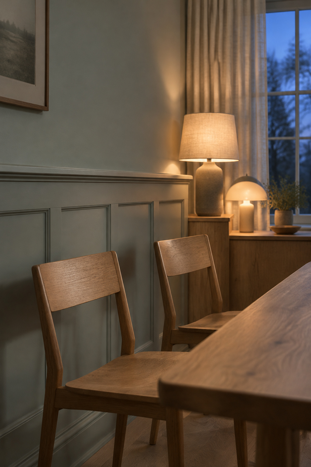
This is the relationship I’d choose for most dining rooms, and for nearly every busy household.
The other side deserves a fair hearing. Hunker advises against painting the wainscot exactly the wall color, and a matched room can feel flat. I see it differently, and here’s why. Panels don’t need color to be seen. They need shadow. A cap that throws a line, a raised profile, a sconce washing across the wall, a small difference in sheen: any one of those keeps the molding legible while the color stays quiet.
If one color feels too still, step one shade apart within the same family. Benjamin Moore lists Barren Plain (LRV 62.12) with Calm (LRV 75.83) as a monochromatic pair, 13.71 points apart; Barren Plain carries a hint of warmth and Calm a breath of lavender-gray. Tone-on-tone like this is where the slimmer, modern ways to panel a wall begin, if you are drawn that way.
Matching sets look calm in photos and fussy in life. A wall, rail, cap and trim each picked from a coordinated card tends to feel arranged. A loose color family, one hue at two depths, feels like it was always there.
Pale Panels Under a Deeper Wall, With Pairings to Copy
Here the lightest surface sits at table height, beside the people in the chairs, and the deeper color rises above eye level. The room feels awake. One flooring retailer’s guide calls it the more current version of two-tone and says it wants good natural light, which fits what I’d expect: in a dim room the upper wall closes in instead of wrapping.
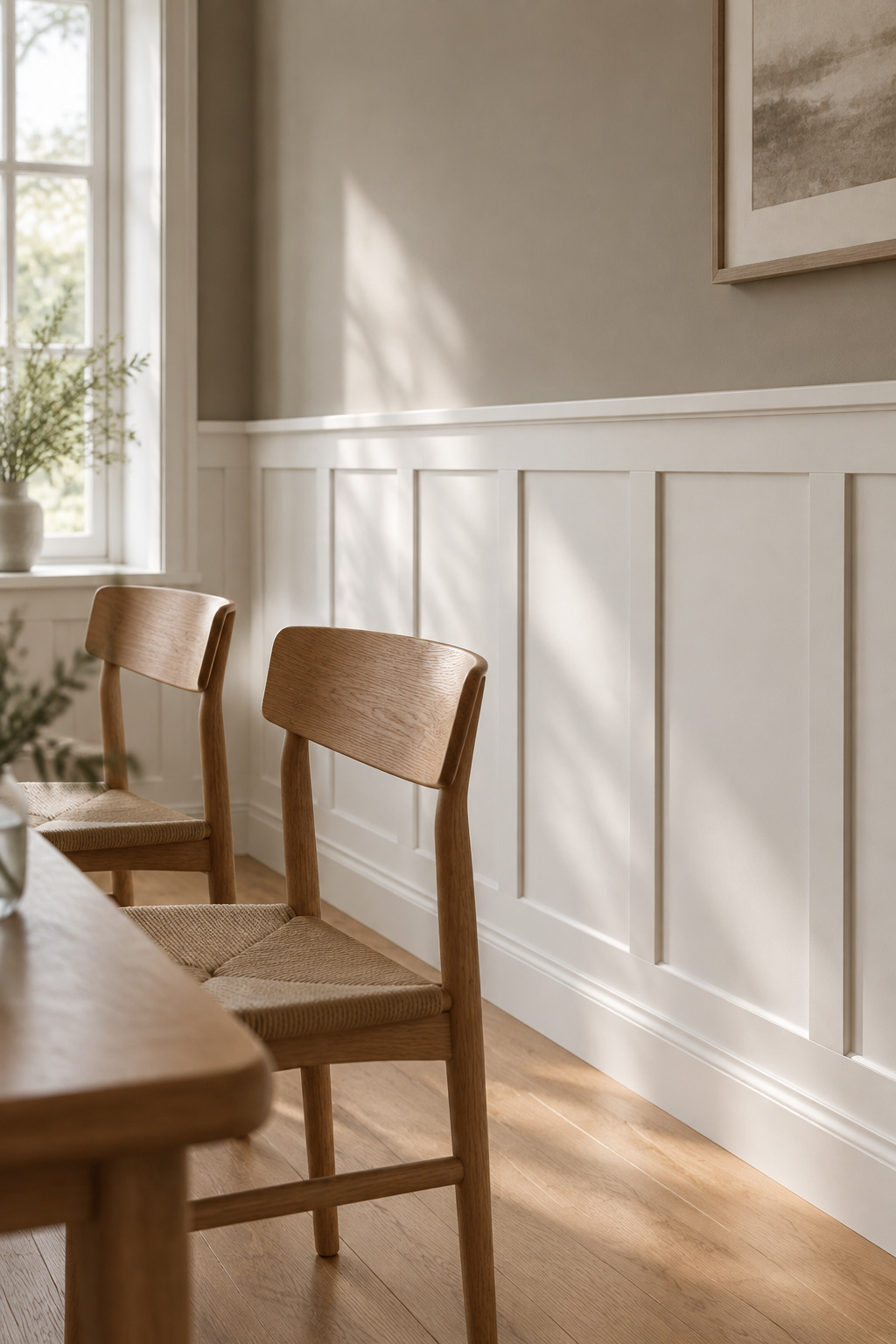
The quickest way past a field of lookalike whites is to borrow a pair someone has already balanced. Benjamin Moore suggests these on its wainscoting page, grouped under traditional rooms and entryways rather than dining rooms, so treat them as pairs to sample.
| Panel | Upper wall | LRV gap | Undertones |
|---|---|---|---|
| Simply White OC-117, LRV 89.52 | Manchester Tan HC-81, LRV 63.24 | 89.52 − 63.24 = 26.28 | Warm white with a fresh beige |
| White Wisp OC-54, LRV 78.4 | Coventry Gray HC-169, LRV 48.18 | 78.4 − 48.18 = 30.22 | Gently cool white with a neutral medium gray |
| Atrium White OC-145, LRV 85.08 | Chestertown Buff HC-9, LRV 52.88 | 85.08 − 52.88 = 32.20 | White with a touch of pink, honey-yellow wall |
There is no recommended gap between panel and wall. The figures simply show how far apart these pairs sit; the wider the gap, the more defined the band.
For a dining room I’d pick Atrium White under Chestertown Buff. A warm, yellow-based wall holds up in cool north light, and the pair is the warmest of the three. Whichever you try, watch the undertones: a cool white under a warm tan can quietly argue all through dinner.
Deep Panels Under a Pale Wall: The Classic That Needs the Most Care
This is the classic arrangement, and many designers treat it as the natural one. The color consultant Amy Krane explains it by how the eye reads weight: we are used to the darker ground at the bottom of what we see.
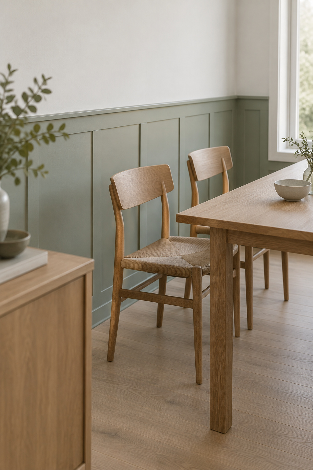
What needs care is depth and light. Benjamin Moore pairs Salisbury Green HC-139 panels (LRV 46.39, a gray-toned mid green) with Ice Mist OC-67 above (LRV 88.84). That is 88.84 − 46.39 = 42.45 points, the widest gap here. Ice Mist has a clear blue undertone, so set it against your floor in cool light before you commit.
Keep the trim, baseboard and crown one consistent, lighter color around a deep band. And look at the table after dark: a deep lower wall soaks up light, and the fixture you have may no longer be enough.
For anything darker than a mid-tone, decorfull’s moody dining room ideas go further than I would here.
Choosing Wainscoting Paint Colors by Feeling, Light and Trim
Three questions, in this order.
By the feeling at the table
Ask what the household wants dinner to feel like before you look at a single chip. My mother’s kitchen downstairs is crowded, loud and cluttered, and everyone loves being in it. It reminds me that calm isn’t the only good feeling a room can hold, so design for the feeling the people eating there actually want.
For a calm room, one color or tone-on-tone. For a lively one, a paler panel under a warmer, deeper wall. For something more formal, a wider gap between the two. None of this is measured; it is designers’ judgement, mine included, and your household outranks all of it.
By the light the room gets
North-facing rooms get cool light that grays out blue-, gray- and lavender-based colors, so choose warm undertones and lighter values there. South light is warm and strong; skip anything already very warm. East and west rooms change through the day, so choose for the hours the room is used.
A dining room often gets its use after dark. Warm bulbs warm the walls and cool-white ones cool them, and two colors that agree at noon can disagree under a lamp. Look at your pair under the dining light at dinnertime.
By what the trim does
Decide whether the trim frames or disappears. Farrow & Ball warns that rails painted white out of habit make a room busy, because the eye follows the white stripes; they suggest the rest of the trim’s color, a tone sympathetic to the wall, or the wall color itself. My pick: keep the rail with the rest of the trim, and never give it a third unrelated color.
Sample Before You Commit: A Board Method You Can Run in Your Own Light
Paint your samples on boards. A patch on the wall picks up the old color around it and misleads you about the new one.
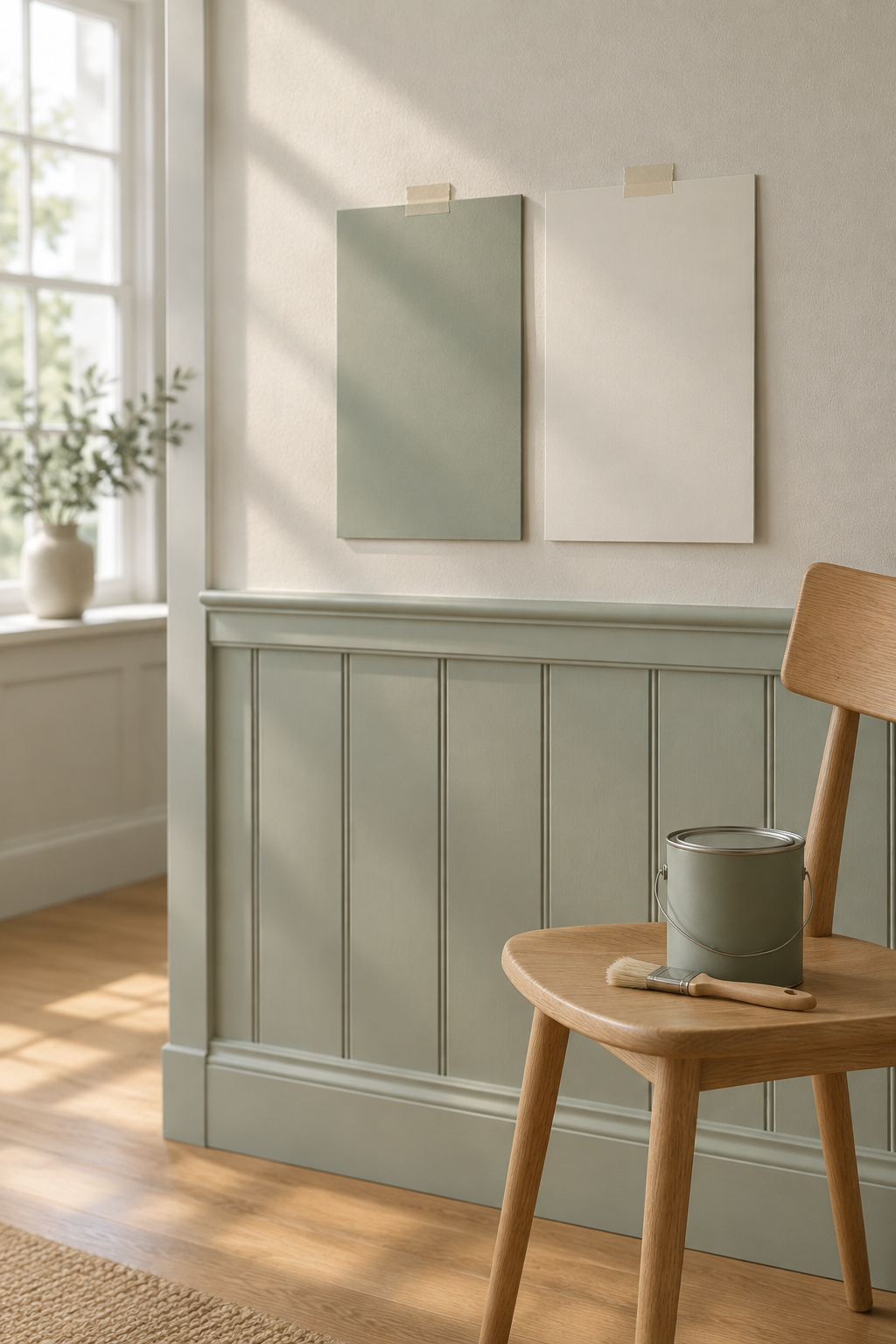
- Buy sample pots for the panel and wall colors, three to five contenders in all.
- Paint each on a white board at least A2 size, two coats, and let it dry for a day.
- Set each panel board directly under its wall board, so you judge the pair.
- Prop the pairs on two walls, one that gets direct sun and one that doesn’t.
- Look in the morning, at midday, late afternoon and after dark with the dining light on, for a few days.
- Hold the boards against the floor, the table and the chairs, since undertone only shows by comparison.
I do most of my site visits by bike, so a stack of A2 boards is the one thing I’d much rather a client painted than I carried. It also means the boards live in your room, in your light, which is the point. The depth you see at two coats is the depth you get only if the panels get the same. For the finish, use the sheen worked out for a chair rail on its own, where wiping and chair backs decide it.
Then picture the room from the start: the chair pulled out, the quiet wall, the shadow under the cap. It is a few boards and a few evenings away. One question stays open. Farrow & Ball’s curators say a darker band below opens a room up; ArchDaily says it makes walls look shorter. Sit with your boards for ten minutes and let your own room answer that one.
FAQ
Does the color of wainscoting change how big a dining room feels?
It changes how big a room looks, and opinions differ on which way. Matching panel and wall removes a boundary, so the wall reads as one surface; the room stays its size. Lighter colors tend to look more open. Whether a deeper lower band shrinks a room or opens it is still disputed.
Can you paint over stained wood wainscoting?
Yes, with preparation. Clean the wood, scuff it with 150-grit or finer sandpaper or use a deglosser, then apply a stain-blocking primer before two topcoats. Real wood tannins can bleed through lighter paint and discolor it over time, so the primer is the step not to skip.
How many paint colors is too many on a wainscoted wall?
There is no official limit, so this is judgement. Two tones plus trim is already a complete scheme. A rail in a third unrelated color can tip the wall into busy, and too many tones across walls, floor and fabrics can make a dining room feel unsettled rather than lively.