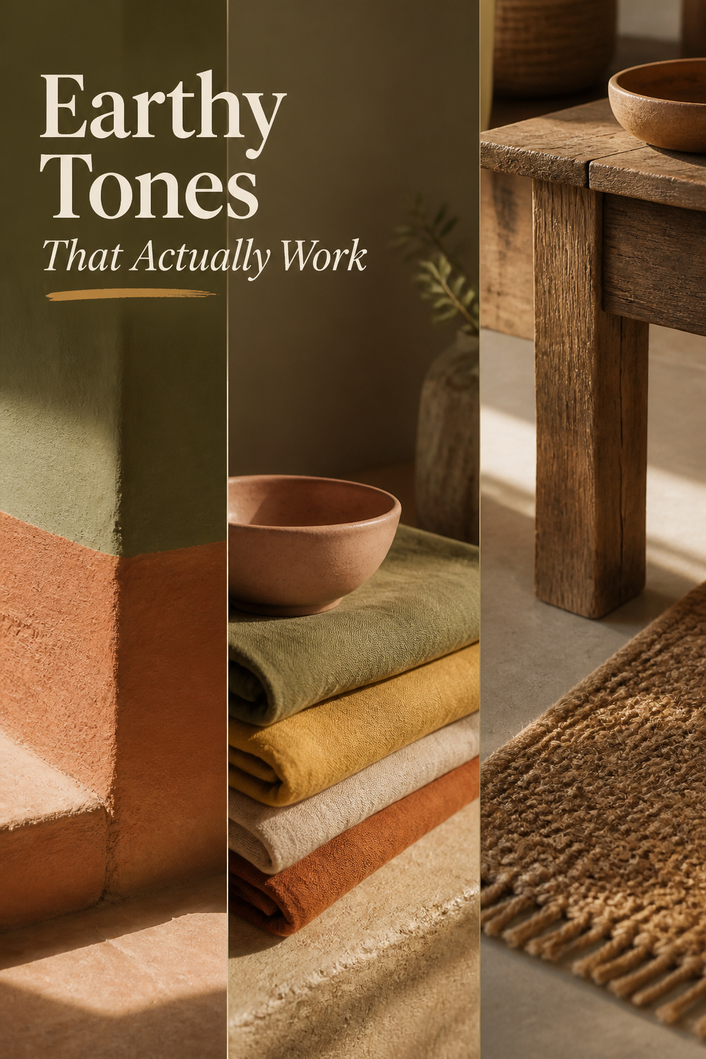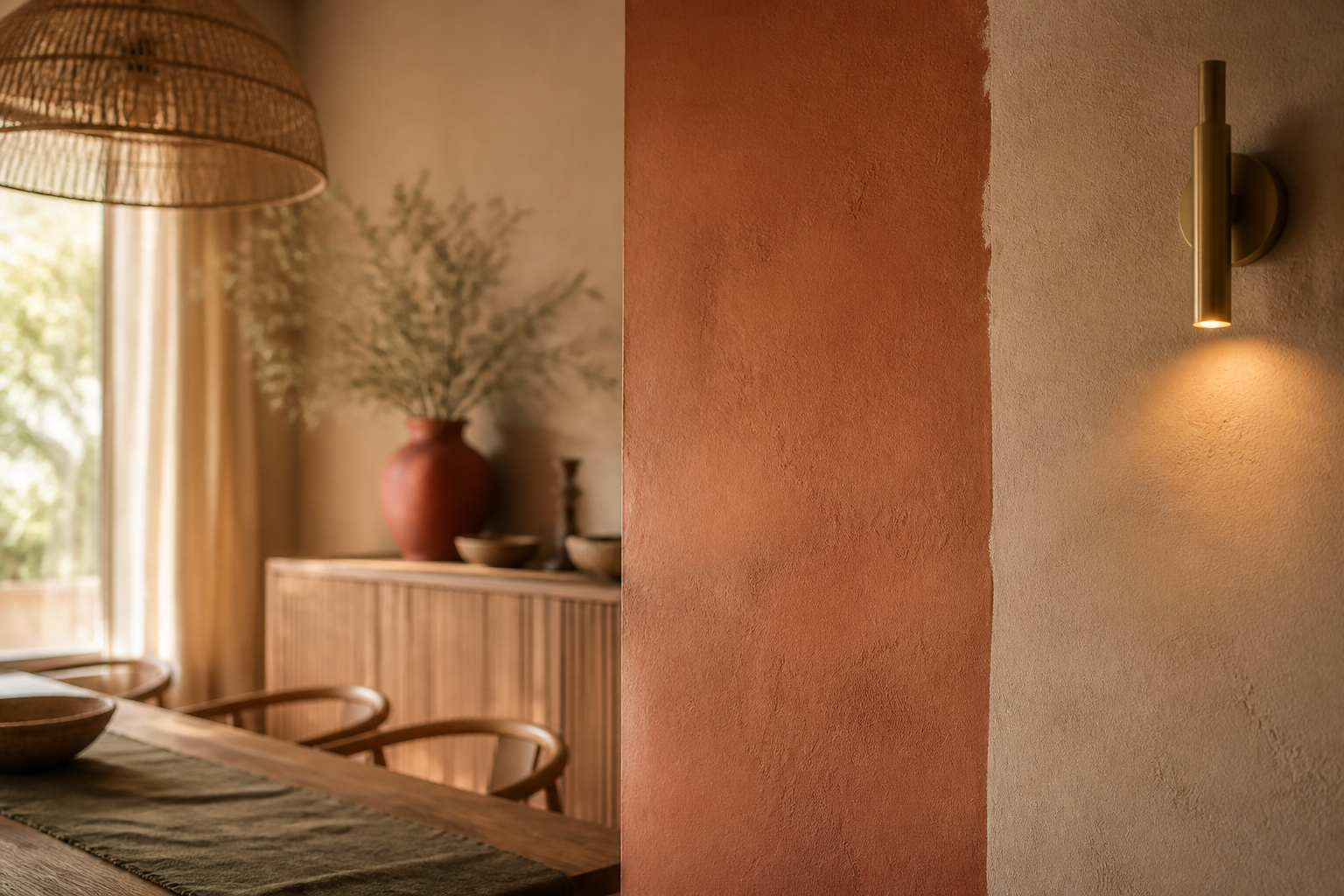

Two dining rooms can hold nearly the same earthy colors and feel like different places to sit. One settles you; the other keeps your eye moving, quietly restless, before you have named why. The difference is rarely the colors themselves — it is whether their undertones agree, the one detail that decides whether a boho dining room color palette reads calm or reads busy.
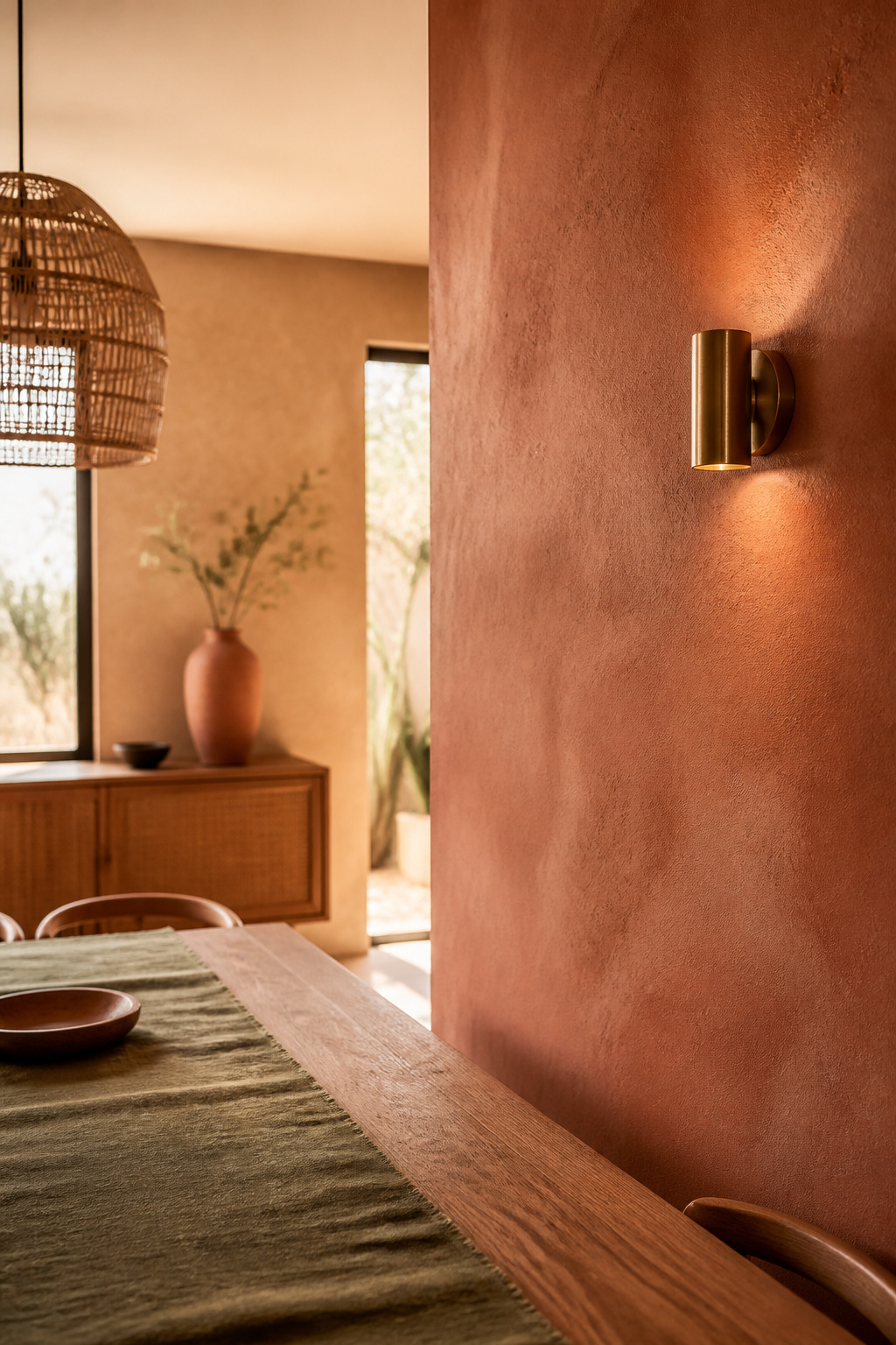
TL;DR
- Earthy colors harmonize when their undertones all lean warm or all lean cool — a warm ochre beside a cool sage clashes even though both are “earth tones.”
- Build the palette in layers: terracotta, sand or clay as the 60% base, then one or two accents (olive, ochre, dusty rose) at 30% and 10%, never four competing at once.
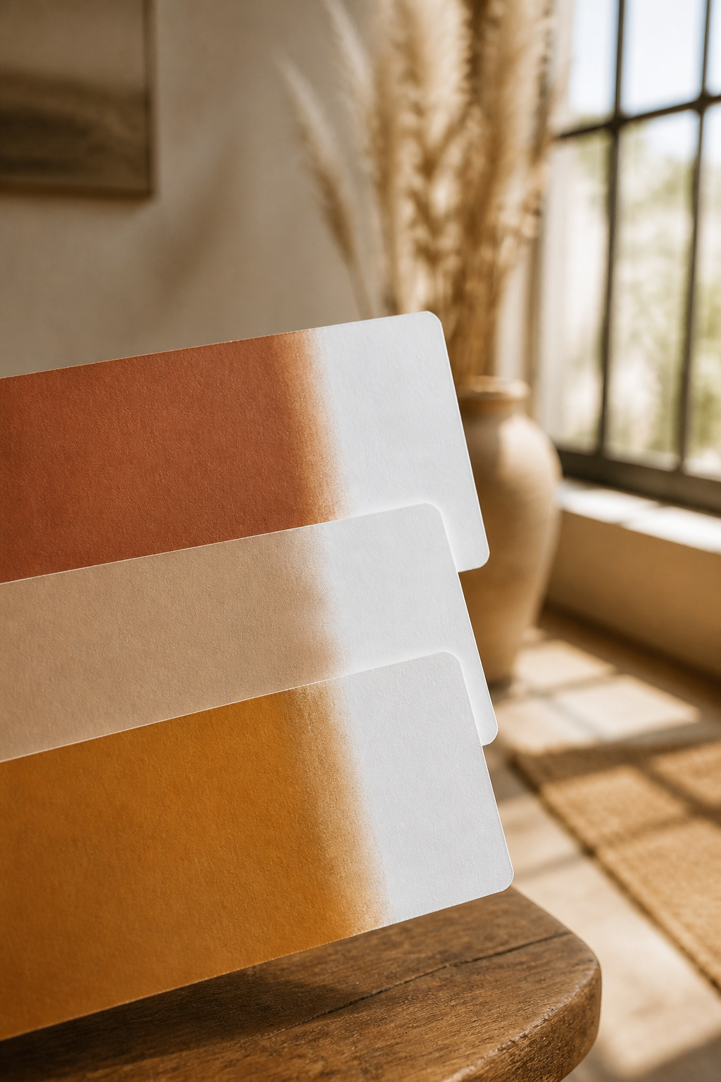
- Test any swatch against a sheet of pure white paper in the room’s own daylight; a warm sample shifts yellow-orange, a cool one shifts blue-grey — that single check reveals agreement or conflict before you spend.
Hold that thought — undertone runs underneath everything that follows.
Boho Dining Room Color Palette: Why Two Can Feel So Different
Notice, first, what a gathering space asks of your attention: arrive and stay, not scan the walls. That settling, or its absence, traces back to one thing.
The surprising variable that separates a calm boho room from a busy one
Two colors can sit on opposite sides of the color wheel and still feel harmonious, as long as their undertones both lean warm or both lean cool. The conflict arrives when a warm-undertone color meets a cool-undertone one, regardless of how alike they look alone — a warm ochre next to a cool sage reads as tension, even though a decorator would file both under “earth tones.” Decide first whether the room should read warm or cool, then let the dominant color hold that decision.
Undertone agreement, named plainly, before any color names appear
An undertone is the quiet hue living beneath a color’s surface. A cream with a yellow undertone reads warm; a grey with a blue undertone reads cool, even when casual conversation would call them the same thing. Your eye registers that buried hue before your mind names the color. When several undertones agree, the room feels of a piece; when they argue, the space feels subtly unsettled, and most people never locate the cause.
What settles and what unsettles the eye in a gathering space
This is not only taste. Elliot and Maier’s color-in-context research measured warm colors like red and yellow producing greater neural arousal than cool blues and greens, using QEEG brain-activity readings — a physiological reason warm rooms feel stimulating and cool ones feel calmer. Earth tones sit in an interesting place here: desaturated, they carry warmth without the alertness pure red triggers, which lets a warm palette settle rather than stimulate.
The Base Tones: Terracotta, Sand and Clay
The base is the 60% your eye rests on longest. Terracotta, sand and clay belong to the same warm family, which is why guides treat them as interchangeable, not three separate decisions.
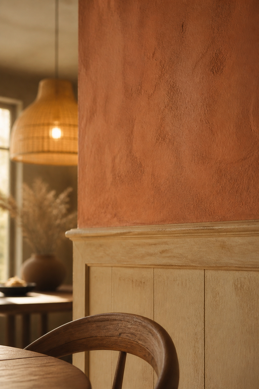
What each base tone brings to a dining room’s warmth and light
Terracotta carries a grounding, soil-and-fired-clay warmth that settles you and quietly invites conversation, one reason it recurs in dining rooms far more than bedrooms. It sits in a warm middle register, borrowing red’s energy and yellow’s ease without tipping into alarm. Sand and warm greige do quieter work: Benjamin Moore Edgecomb Gray (LRV 63) holds warmth in a dim room without turning cold, though zero daylight can still flatten it.
Reading a base tone’s undertone before committing to it
A warm greige can look neutral on a small chip, then reveal a grey-green or pink undertone once it covers a whole wall — the undertone grows more visible at scale. Sherwin-Williams Accessible Beige (LRV 58) is a good example: a warm greige with a whisper of grey-green that reads heavy or muddy in a low-light room and wants strong natural light. Test full-size boards, not chips, across morning, afternoon and evening light.
Where these tones work best relative to natural light in the room
Light is an input, not a backdrop. A north-facing room gets the coolest light of the day, so a warm base counteracts that chill, while a cool neutral only deepens it. A south-facing room already runs warm at midday, so a warm base there reads warmer than the swatch promised — some designers add a single cool accent to keep it from tipping hot. The bulb matters as much as the wall: 2700–3000K warmth animates terracotta and sand, while 3500K-and-up daylight bulbs grey the same tones into mud.
The Accent Layer: Olive, Ochre and Dusty Rose
If the base is where your eye rests, the accents are where it wakes gently — their job is to echo the base’s undertone, not contrast it, arriving in small, movable doses.
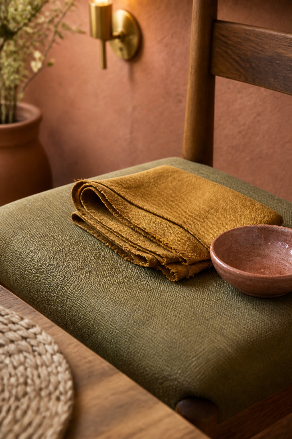
Choosing one or two accents rather than several competing ones
Three colors plus a neutral base is the working sweet spot for most rooms: enough variation to feel layered, not enough to feel busy, which argues against stacking four or five accents at once. Boho rooms get away with more color than this suggests, but only because they carry it through textiles, rugs and ceramics rather than paint — spreading the hues across materials instead of one wall.
How an accent should echo, not contradict, the base tone’s undertone
Warm-leaning greens like olive pull toward yellow, making them undertone partners for terracotta and ochre rather than a cooling contrast the way blue-green sage would be — green and terracotta trade warmth for freshness without canceling each other. Dusty rose adds a soft counter-note: its muted pink plays against olive’s green as a complement, but since both are heavily desaturated, the meeting settles into gentle tension, not clash. A truer, cooler accent can work, but only once and small.
Where accents belong: walls, textiles, or objects only
In the 60-30-10 rhythm, the 30% secondary layer lands on textiles — rugs, cushions, table linens — while the 10% accent shows up in ceramics and small objects, rarely asked to cover a whole wall. I trust this proportion because it holds up wherever I’ve seen it applied: olive and clay on the surfaces, camel textiles and brass in the objects. The materials change; the ratio does not.
Testing a Palette Against What You Already Own
A palette is never assembled in a vacuum. Your room already holds committed colors — the table, the floor, the woven pieces — and the palette has to agree with those first.
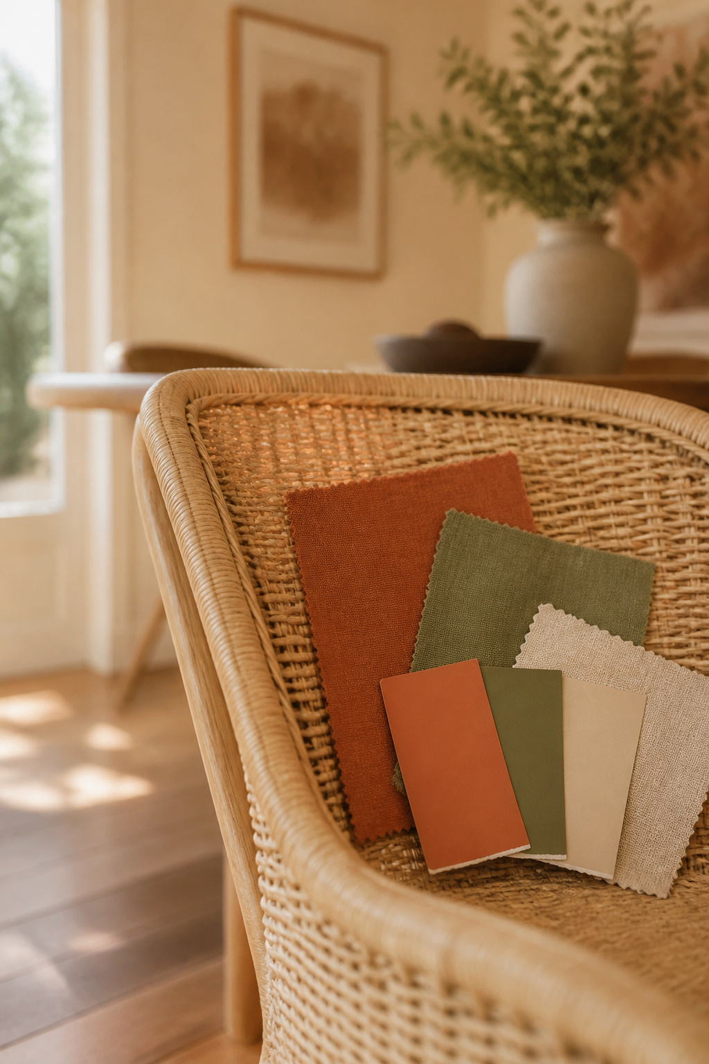
Holding swatches against existing wood tones and rattan pieces before buying anything
Terracotta pairs quietly with natural, walnut and oak wood, but it fights the orange-toned stains of past decades, so check your table or floor’s undertone against a terracotta swatch first. An unfinished wood table is the safest companion, neutral enough to compete with neither the base nor the accent. Notice the rattan already in the room, too: its straw-warm undertone works like a built-in accent color, so your palette should answer to it.
The undertone test: warm versus cool read in daylight versus lamplight
Hold a paint chip or fabric swatch beside a sheet of pure white paper: a warm sample shifts yellow or orange against the white, a cool one shifts blue or grey. Daylight tells the truth more reliably than a bulb, but check the swatch again under the room’s evening light, since a color that behaves at noon can drift once the lamps take over. The professional habit is leaving sample boards up for at least 48 hours before deciding.
When to walk away from a color that photographs well but doesn’t sit right in the room
Some colors are better lit in a catalog than they will ever be in your dining room. A palette that fails does so quietly: the tones cluster too dark and similar, and the room turns cave-like instead of cozy. Add a lighter base rather than another warm dark — one clearly light, one clearly dark, is what keeps an earth-tone scheme reading as intentional instead of muddy.
Letting the Rug and the Plants Carry the Palette Forward
Once the undertones agree, the palette stops being a wall decision and becomes a thread — and two elements carry it furthest, neither of them paint.
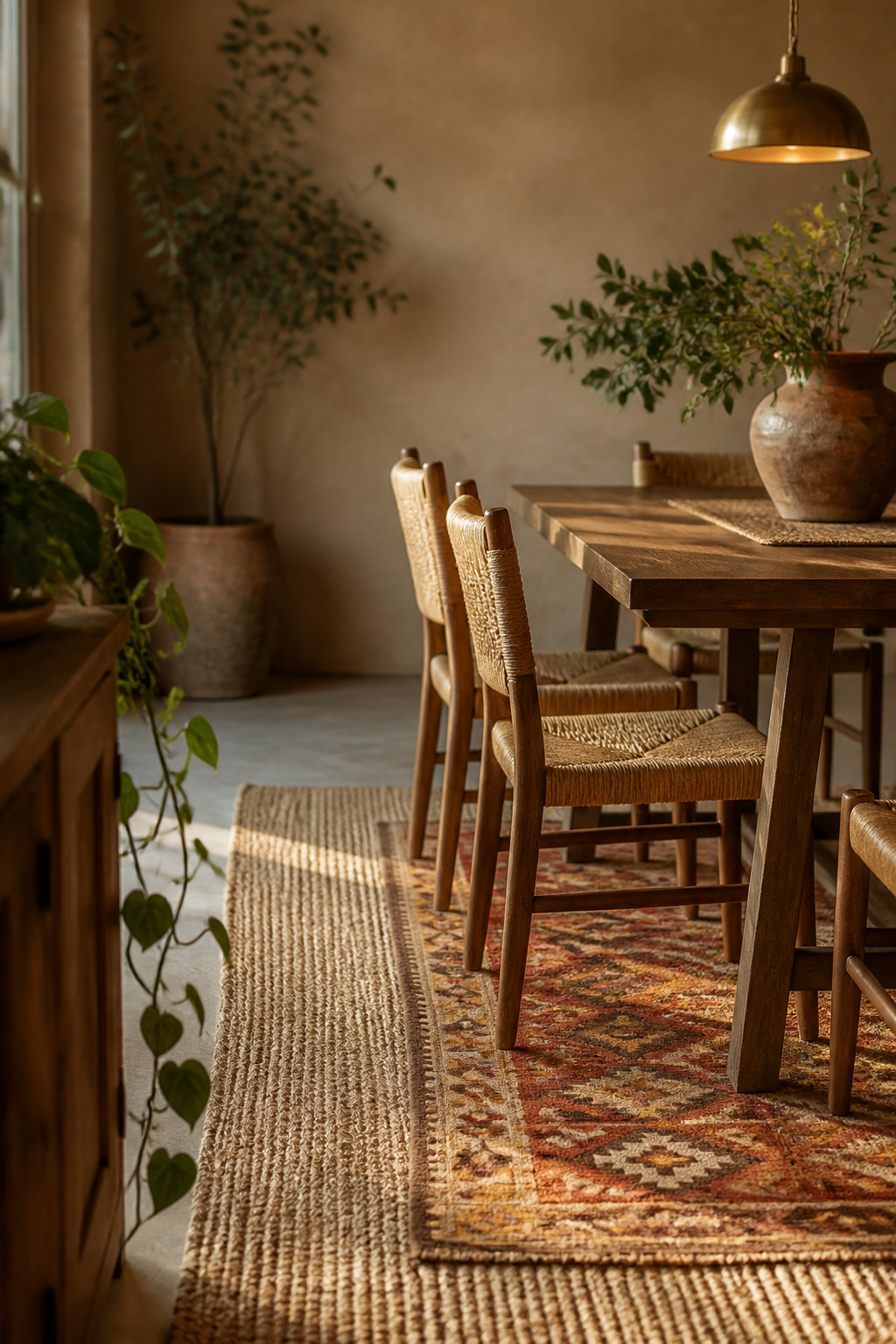
Why the rug is often the palette’s real starting point
I often start a room’s color at the floor, not the wall. A rug is large and low, and already shows which of its own woven tones sit together — a working model of undertone agreement you can see rather than guess at. Bring it into the room and read it in daylight and evening light before you finalize a wall color around it. This is the logic behind choosing a rug that fits your palette: the room is built to agree with the rug.
How greenery softens and extends an earth-tone palette once it’s set
Greenery carries the palette the last stretch. Live plant greens pair naturally with terracotta, trading warmth for freshness without canceling the base’s undertone. A warmer olive-green leaf stays inside terracotta’s family, while a cooler sage leaf adds a fresher contrast — and because living green is naturally desaturated and varies leaf to leaf, it rarely clashes the way one flat painted green might. That’s why adding plants to reinforce your palette softens a warm scheme rather than fights it.
A Room That Feels as Settled as It Looks
Return, now, to the question the room opened with: why do some earth-tone dining rooms settle you and others keep your eye moving?
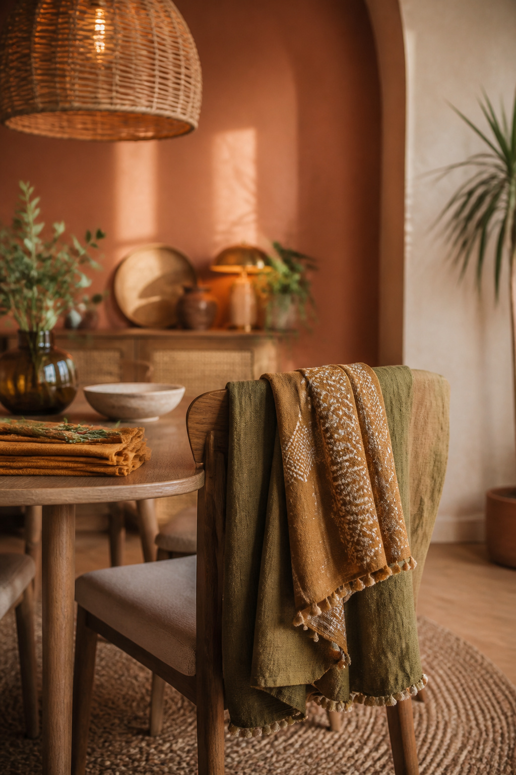
Returning to the calm-versus-chaos question with the undertone principle now in hand
You have the answer now, and it is testable, not a matter of taste. Warm-and-cool response is a consistent, measurable pattern across the research on color and psychological functioning, which is why undertone agreement behaves like a principle, not a preference. A warm-dominant room can still hold one cool accent and stay cohesive; the rule is choosing one temperature to lead, not banishing the other.
One small first test to try before repainting anything
Here is the practice, and it costs nothing: hold an existing rug, textile or paint chip against a sheet of pure white paper in your dining room’s own daylight, and watch which way it shifts.
Do that, and you will read your palette’s agreement or conflict before you buy a single thing — the same understanding you can carry into the wider bohemian dining room styling guide once the color decision is settled.
FAQ
Does a boho dining room need white walls as a base?
No. Boho dining rooms work equally well with neutral or white walls plus bold textile color, or with earth-toned walls like terracotta or olive as the base itself — design guides treat both as valid, not one as more correct. A deep olive wall with a relaxed approach to matching is just as boho as a neutral wall with colorful accents.
What color dining table works with a terracotta and olive palette?
Natural, walnut or oak wood tones pair well with a terracotta and olive palette, while orange-toned wood stains from past decades tend to clash with it. A neutral-to-warm, unfinished or naturally finished table is the safer choice — neutral enough not to compete with either the terracotta base or the olive accent.
How do you avoid a boho palette looking too brown or muddy?
Keep one tone in the palette noticeably lighter and one noticeably darker than the rest; that value contrast keeps a tonal earth-tone scheme reading as intentional rather than muddy. Muddiness usually comes from stacking too many similar-value dark tones, so adding a lighter base like sand fixes it more reliably than removing a color.