
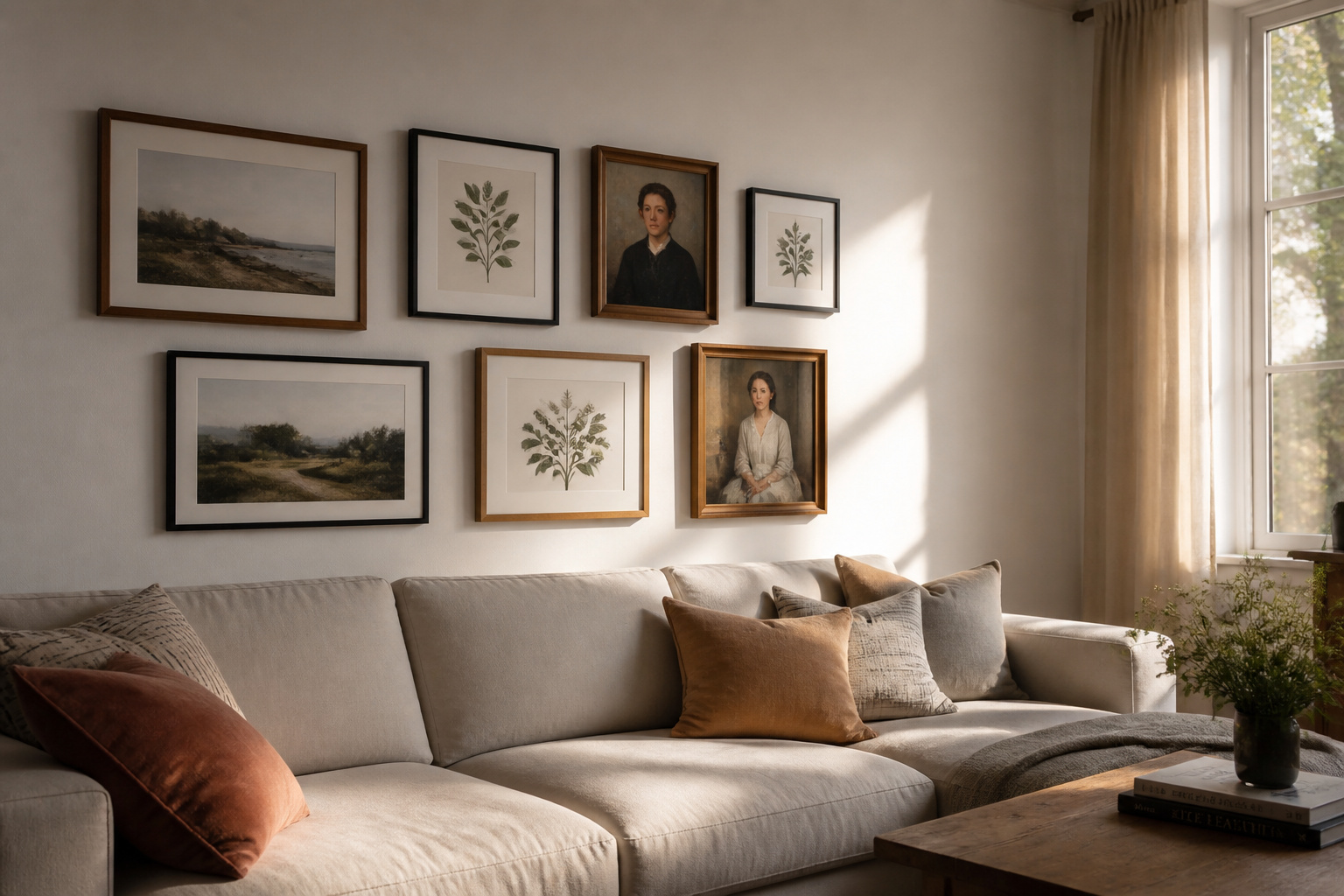

Almost every gallery wall above the sofa that looks wrong is wrong for one reason, and it is not the art. It is the width. A gallery wall above a sofa should span 60–75% of the sofa’s width, treated as a single shape — and most people never measure it, so they hang what they own and hope. The professionals who never miss are not buying better prints. They obey a number that takes two minutes to calculate and answers the first question the wall ever asks: does this art belong to this sofa, or is it just floating above it?
TL;DR
- Size the whole arrangement, not each frame, to 60–75% of the sofa’s width — an 84-inch sofa wants 50–63 inches of art, centred on the sofa rather than the wall.
- Hang the lowest frame 6–10 inches above the sofa back; 6–8 inches for a standard back, 8–10 for a low one, 4–6 for a high one.
- Lay the whole thing out on the floor first and photograph it — the camera shows the proportion problems your eye forgives in the room.
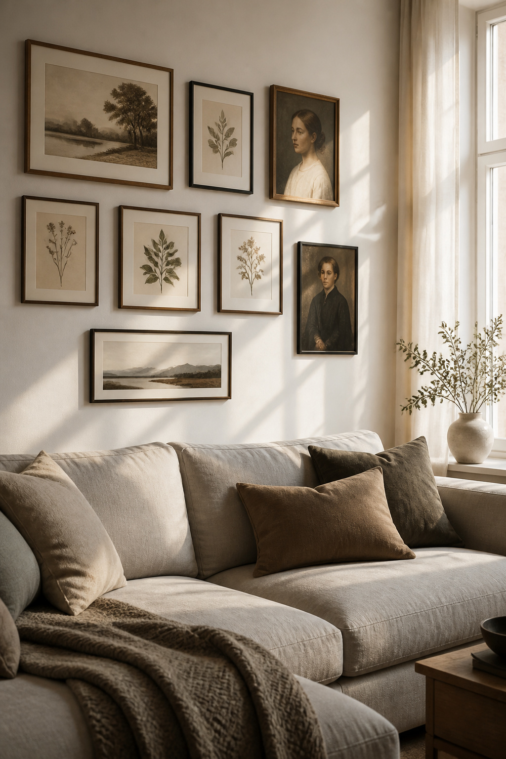
I think about a wall the way I think about any decision in a room: what do I want this to be before what do I want to put here. Above the sofa, the answer is nearly always the same — the art should feel anchored to where people sit, part of the same gesture as the furniture. Everything below follows from that intention.
The Number That Changes Everything: 60–75% of Sofa Width
Why most gallery walls above sofas look wrong — and the single measurement that explains it
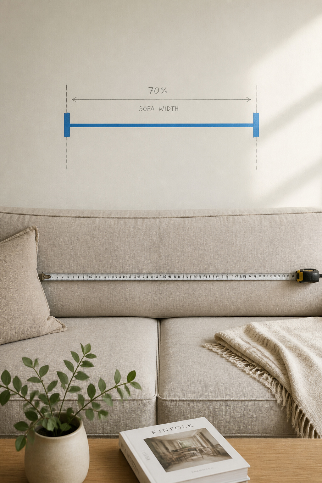
The gallery wall, treated as one combined shape, should span 60–75% of the sofa’s width — the most cited proportion principle in the trade. Narrower than 60% and the art reads as a postage stamp on a shipping box. Wider than 75% and the arrangement overpowers the furniture. The rule applies to the grouped footprint of every frame together, not to any single piece, so people size one print well and still get the whole wall wrong.
How to measure your sofa and calculate the target span
Measure the sofa from the outer edge of one armrest to the other. Multiply by 0.60 for the narrow end of your range and by 0.75 for the wide end. An 84-inch sofa gives 50 to 63 inches of total art width; a standard 87-inch three-seater gives 58 to 66. Then mark that span on the wall with painter’s tape, at the right height, before you buy or arrange a single frame. The tape decides the art, not the other way around — the opposite of how most walls get built.
What happens visually when art goes wider or narrower than this range
Below the range, the art floats: unmoored from the furniture, disconnected from the room. Above it, the wall competes with the sofa and the eye no longer knows where to settle. Aim for the upper part of the range — 65 to 75%, the confident end that editorial photographers favour. This is one move in a larger sequence, and the living room gallery wall design guide sets out the rest of it.
Clearance From Sofa to Bottom Frame: The 6–10 Inch Zone
Why this gap matters more than hanging height on an occupied wall
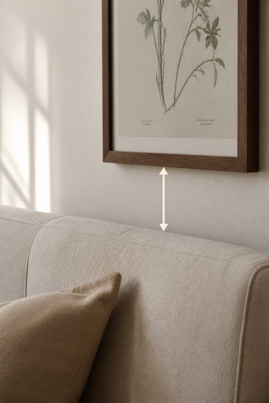
You may have read the 57-inch rule — hang art so its centre sits 57 inches from the floor. That rule is for empty walls. Above a sofa, the furniture is the reference, not the floor, and what matters is the gap between the top of the sofa back and the bottom edge of the lowest frame: 6 to 10 inches. Get that right and the visual midpoint lands near 59 inches anyway — eye level arrives on its own, and the art stays tied to the sofa.
Adjusting for sofa back height: low, standard, and high-back sofas
The right clearance depends on the back of your sofa — treat this as practical guidance rather than a fixed standard, since the numbers shift an inch or two between sources. A standard back, roughly 30 to 36 inches tall, takes 6 to 8 inches of clearance. A low back, under 30 inches, wants a little more — 8 to 10 inches — so the art does not look pressed onto the cushions. A high back, over 40 inches, needs less: 4 to 6 inches, because the tall back already separates seating from wall. Match the gap to the sofa, not to a single figure.
The test: can someone sit back without feeling the wall pressing in?
Numbers get you close; your body confirms it. Sit on the sofa, lean back naturally, and look up at the lowest frame. If you feel the wall pressing in — the art reading as overhead rather than in front of you — add two inches; if it seems to belong to the ceiling rather than the sofa, drop it two. From the 8 to 12 feet a visitor stands at, a single inch is invisible. You are chasing the anchored look, not a precise figure.
Layout Families That Work Above a Long, Low Sofa
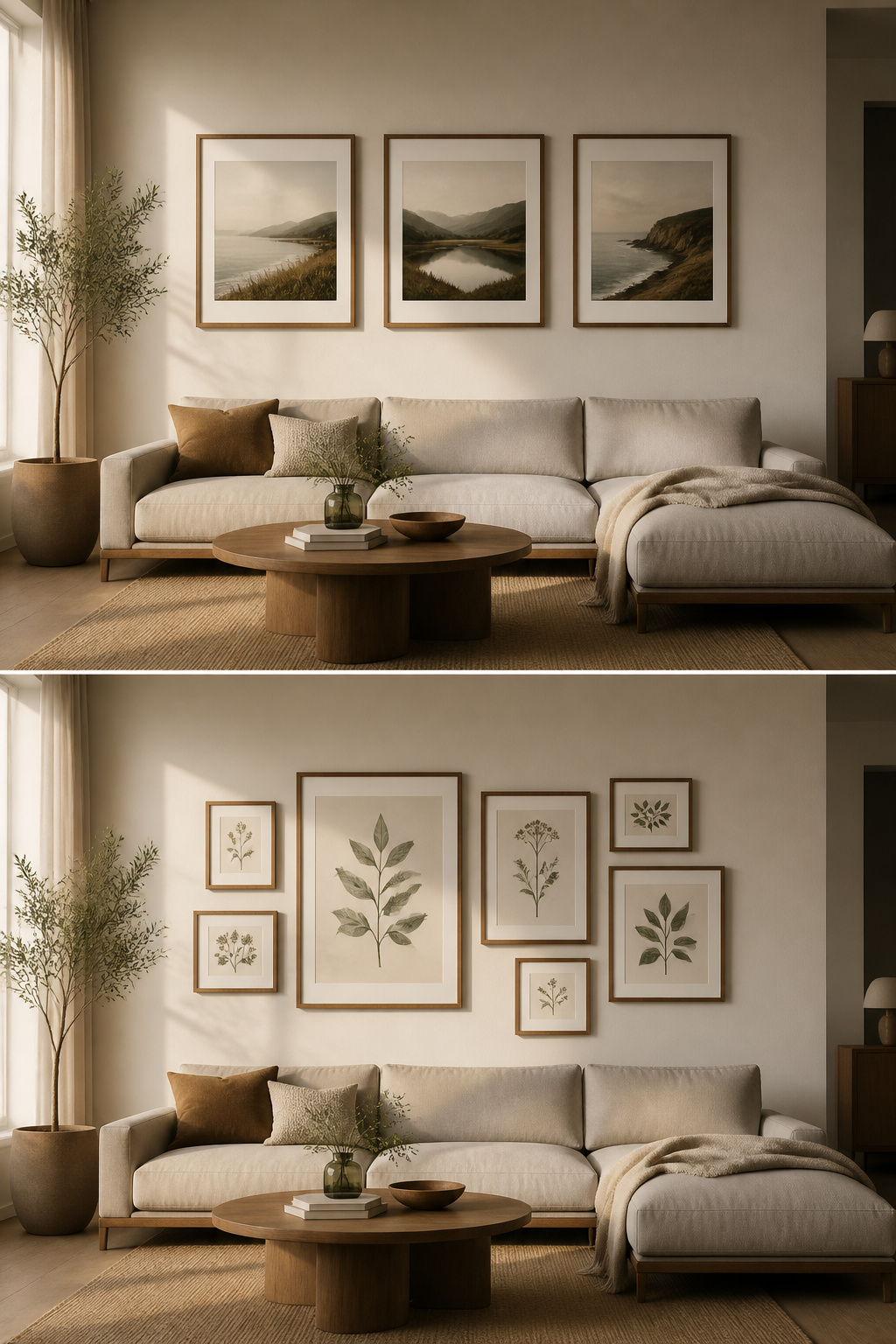
The wide horizontal arrangement: echoing the sofa’s low profile
A long, low sofa is a horizontal line, and the simplest good answer is to echo it: three identical landscape prints in a single row. Three 50×40 cm pieces with 5 to 7 cm between them span about 165 cm — well inside the window for an 87-inch sofa. The row reads as a sequence, so space the gaps a touch wider than in a tight grid; the eye wants small pauses between pieces. In a low-ceilinged room the layout earns its keep twice over, spreading sideways instead of stacking up.
The centred cluster: balancing visual weight for a standard three-seater
For a standard three-seater, a cluster of five to nine frames is the right density. Fewer reads sparse; more loses coherence without very tight spacing. Build it around one dominant piece — 60×80 cm or larger — set near the centre, with smaller pieces growing outward. Keep the gaps to about 5 cm so the group reads as one collection, and mix orientations and sizes. A hero, a few mediums, a handful of small accents: that variation is what keeps a cluster from looking like a product catalogue.
The asymmetric lean: when to break symmetry deliberately and when it breaks by accident
Asymmetry is the most personal of the three and the easiest to get wrong. Deliberate asymmetry needs a clear anchor: one piece, distinctly larger or darker or busier than the rest, sits off-centre, and smaller pieces balance it on the other side. That tension reads as collected and thoughtful. Without the dominant piece, off-centre is just off. Odd-numbered groups — five, seven or nine — naturally resist bilateral pairs. The test for accidental drift: step back to three metres and ask whether one side feels heavier with nothing meant to anchor it.
Sectionals and Corner Sofas: Where the Rules Need Adjusting
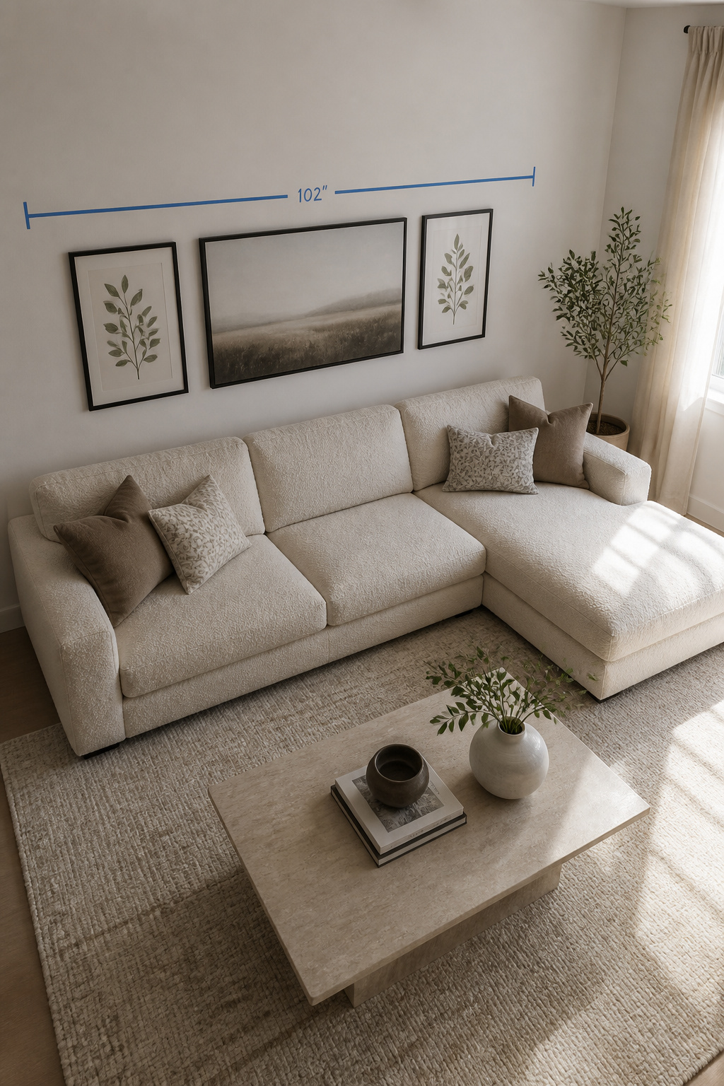
Measuring a sectional’s active wall face vs total length
A sectional breaks the width calculation, because part of the furniture turns into the room and stops sharing the wall. The fix is to find the active wall face — the main seating run that faces into the room — and apply the 60–75% rule to that alone; the chaise or return that projects forward is, from the primary viewing angle, functionally invisible. Size to the full L-footprint and you end up too wide for the usable wall above the seating you actually look at.
How to anchor the composition to the corner without splitting the wall
Where a corner sectional makes the visual centre awkward, do not centre rigidly over the junction. Shift toward the longer wall span — it carries more authority — and let a single large-format anchor piece sit at or just beside the corner. That anchor is the structural key: it pulls both wall runs into one composition instead of two competing galleries either side of an empty corner. Set a shared centreline around 57 to 60 inches and build out evenly from the anchor on each wall.
One layout family that almost always fails on a sectional (and what to use instead)
The symmetric bilateral grid — matched frames mirrored each side of centre — almost always fails on a sectional, because the furniture’s asymmetric footprint fights the symmetry and the eye reads the mismatch. When the furniture shape is already complex, let the art be simple. A single large horizontal piece above the primary seating often resolves it outright. Where one piece cannot, a horizontal run of three to five pieces flexes to the active wall face without leaving blank corners.
Visual Weight Distribution: Why the Eye Should Land in the Middle
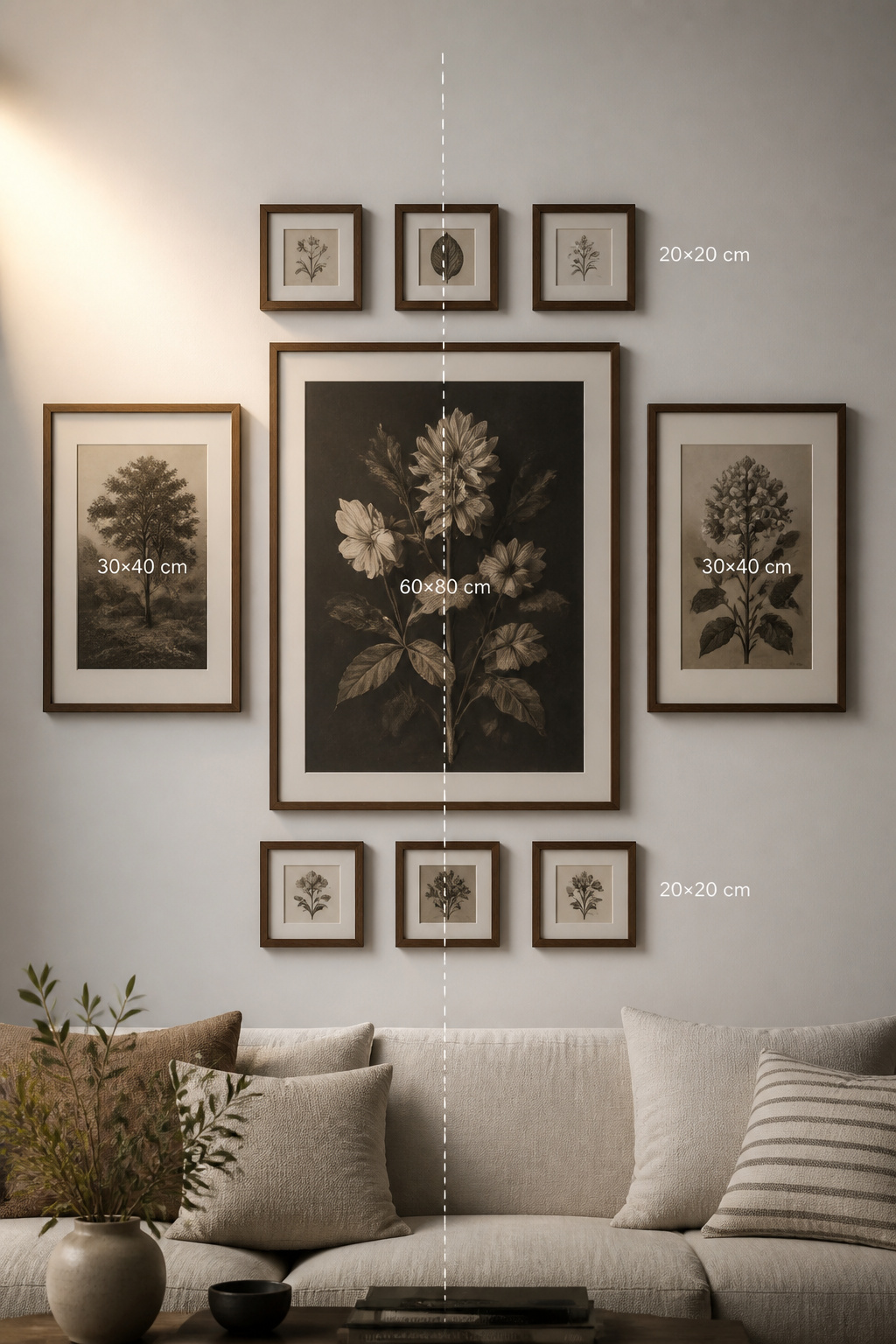
What visual weight means in practice: size, value, and density
A wall can be proportionally correct and still look wrong, and the reason is visual weight — the perceived heaviness of a piece. Three things drive it: scale (a larger piece pulls harder), contrast (a dark print on a pale wall outweighs a pale one), and density (a busy image outweighs an open, minimal one of the same size). The frame counts too — a thick dark frame on a small print can carry as much weight as a slim frame on a large one. Two same-size prints are rarely the same weight.
Distributing heavier pieces so the arrangement doesn’t tip left or right
Think of the arrangement as a see-saw across its centreline. The pieces to the left should balance those to the right in total visual weight — not in count or physical size. Two small dark prints can hold against one large pale one. When a wall feels lopsided, add a heavy element to the lighter side or move the heaviest piece toward the middle. Avoid clustering all the large or dark pieces on one side.
The pillar-piece rule: one dominant item anchors the whole composition
Place the heaviest piece first — at the centre, or in the bottom-centre position so pieces can build above and to the sides. Every other decision is relative to it. Get the anchor wrong and no amount of shuffling the supporting pieces will fix the imbalance; the anchor must move first. For a sofa wall, it should span at least a third of the total gallery width — 20 inches or more on a 60-inch arrangement. Undersizing the anchor is one of the proportion mistakes that shrink a wall.
From Measurements to Mockup: Testing Before You Hang
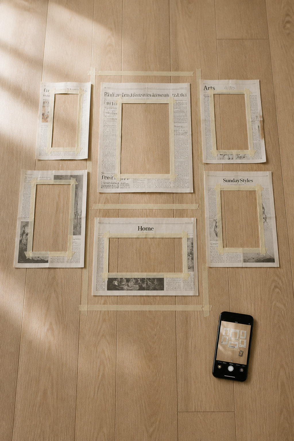
The paper-on-floor method: compose without committing a single nail
Before anything touches the wall, build the whole arrangement on the floor. Cut paper to the exact outer dimensions of each frame, lay the pieces out in a space matching your target span, and use painter’s tape strips as spacers. You can test a dozen configurations in minutes: whether the anchor is dominant, whether the footprint hits your 60–75% target, whether the spacing holds. A five-piece wall planned this way takes 45 to 60 minutes to hang; skipped, it usually costs two or three rounds of patch-and-rehang.
Photographing the mockup — the one check that reveals proportion problems
Now photograph the floor layout from standing height. The camera flattens the scene and shows proportion problems the eye forgives in context — chiefly whether the arrangement reads too narrow or too wide. Transfer the layout to paper templates on the wall, step back to three metres, and photograph again. That second image is what every guest sees first; if it feels off there, it is off.
Adjusting the composition before anything touches the wall
Leave the templates up overnight. Fresh eyes catch asymmetry and gaps that tired eyes miss. If the photo looks right but the wall feels wrong from three metres, the usual culprit is an anchor piece that is too small — large prints look smaller on a template than in life. When it is right, mark nail positions through the paper, take the templates down, and hang. Then the work is simply hanging the arrangement step by step.
Two numbers carry everything. Size the arrangement to 60–75% of the sofa, leave 6 to 10 inches above the back, centre it on the sofa. Anchor it with one dominant piece, test it on the floor before a nail is driven, and the gallery wall becomes part of where you sit — not just something you hung.
FAQ
How far above a sofa should you hang a gallery wall?
The bottom edge of the lowest frame should sit 6–10 inches above the sofa back. For standard sofas (30–36 inch backs), use 6–8 inches; for low-back sofas, 8–10; for high-back sofas over 40 inches, 4–6 is enough. This places the gallery’s midpoint around 57–60 inches from the floor while keeping the art anchored to the sofa.
How wide should art be above a couch?
Treated as a single unit, the gallery wall should span 60–75% of the sofa’s width. An 84-inch sofa wants 50–63 inches of total art; a standard 87-inch sofa wants 58–66. Below 60% the art looks like an afterthought; above 75% it overwhelms the furniture. Centre the arrangement on the sofa, not the wall.
Can a gallery wall above a sofa have an odd number of frames?
Yes — and odd-numbered groups of five, seven or nine are often preferred, because they avoid forced bilateral symmetry and read as relaxed and collected. The middle frame of an odd group also sits directly on the sofa’s centreline. Even numbers work reliably only in a strict bilateral grid, where the matched pairs are the intended design.