
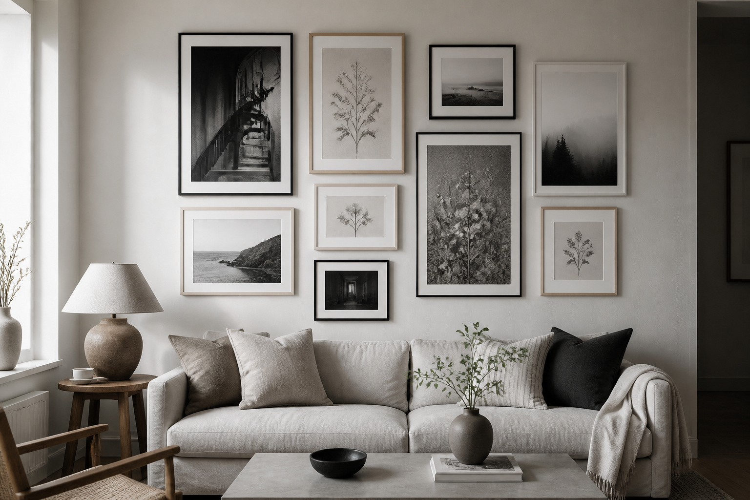

There is a point when the colour-sorted collection stops satisfying — when the matched seascapes start to look like a phase you have grown out of rather than a choice you made. A black and white gallery wall is usually the next move, and a telling one: it is the arrangement people reach for once their eye wants restraint instead of variety, and it is no accident that you notice it in the homes you most want yours to resemble. The scheme has a track record that long predates any trend, which is precisely why it cannot date.
TL;DR
- Colour removal is the strongest cohesion tool there is: strip out hue and a botanical etching, an architectural photograph and an abstract print read as one collection, because the eye is left to judge form and tone instead of colour.
- Tonal range — pieces spanning Ansel Adams’ Zone 0 pure black through to Zone 10 pure white — is what stops a monochrome wall going flat; a wall of mid-grey prints reads as a single grey plane no matter how good each image is.
- Keep mat width identical across every frame even when you mix finishes, and warm the scheme with two or three oak or brass accents so it never tips into cold.
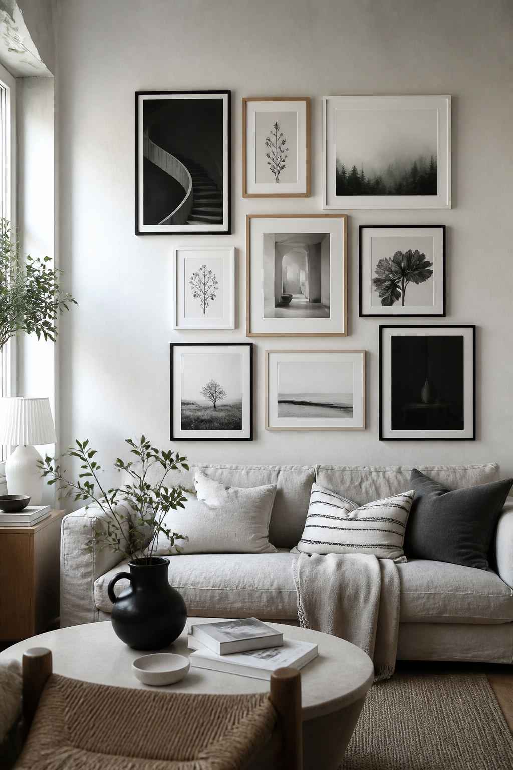
What follows is the design logic underneath the look — the few decisions that separate a wall with real depth from a flat grey rectangle. Get those right and the gallery wall layouts, sizing and styling in one guide handles the mechanics around them.
Why Monochrome Is the Most Forgiving Gallery Wall Scheme
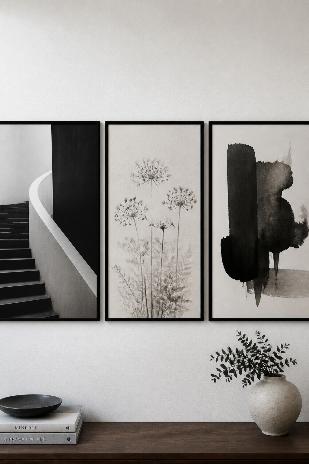
The one thing colour removal does: any subject coheres when the palette disappears
Strip colour out of a collection and you remove the single variable most likely to make pieces fight each other. What remains — form, composition, texture, the direction of the light — is shared across subjects that would otherwise have nothing in common. Black and white photography emphasises tonal contrast over colour, so the viewer reads each piece by its formal qualities rather than its palette. A still life, a portrait and an abstract all sit in that one register the moment hue leaves the frame, which unifies more reliably than any shared subject could.
Why black and white arrangements look designed even when they aren’t
Across the trade this holds as a working principle: because every frame in a monochrome scheme is effectively neutral, the arranger has more latitude in shape and placement, and the result reads as planned. Interior designer Katelyn Spacek of Curate Interior Designs puts it plainly — printing everything in black and white “gives a cohesive feel” however varied the subjects. Property stagers lean on the same effect: as framer Robert Mackintosh of First4Frames notes, monochrome art “feels expensive and intentional without being polarising.”
The ceiling this scheme doesn’t have
A colour scheme references a decade whether it means to or not — terracotta-and-sage will date the way millennial pink already has. A monochrome palette references none, so it cannot age that way. It also scales without rethinking, from a three-frame grid in a studio to a fourteen-piece salon hang in a double-height room. This is why it works as a first wall in a new apartment — it grows with the collection across eras and subjects without ever asking you to start over.
Tonal Range: Why a Monochrome Wall Goes Flat and How to Stop It
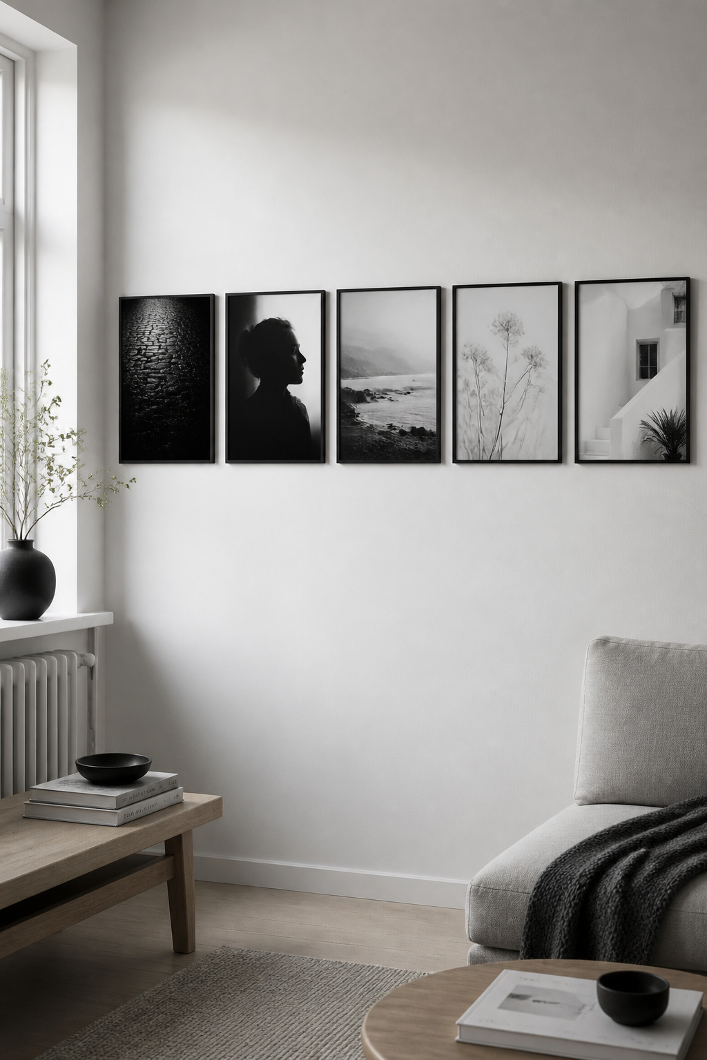
The tonal range principle: from paper-white through mid-greys to deep blacks
I have a habit of photographing rooms at seven in the morning in February — what holds up in the worst light of the year holds up always, and that grey northern light exposes a flat wall faster than anything. The cause is almost always the same: no true blacks, no true whites, only mid-greys. Tonal range — the gradient from black to white — is what gives an arrangement depth. Ansel Adams’ Zone System divides that scale into eleven zones, Zone 0 pure black to Zone 10 pure white. A well-made archival print holds detail in both deep shadow and bright highlight, and a wall wants pieces spanning the whole spectrum — not a row of Zone 4-to-7 prints that read as one grey plane.
How to read tonal range in a print before buying it
Before you buy, look for three distinct regions: a darkest shadow near pure black, a brightest highlight that still holds detail rather than blowing out, and mid-tones with clear separation between adjacent greys. If all three are present, the print will earn its place. One check most guides skip — decide early whether your blacks run warm (a slight sepia cast) or cool (blue-grey), and hold to it. Cool blacks suit a plaster-and-linen Scandinavian room; warm blacks suit a wood-heavy interior. Mixing the two at random produces the vague unease homeowners notice but cannot name.
Distributing dark, mid, and light pieces so the arrangement has depth
Selection is only half of it; placement is the rest. In a salon hang, let the high-contrast, deep-black pieces anchor the outer edges and corners and keep the lighter prints near the centre — that draws the eye inward rather than letting it escape at the edges. Vary the contrast deliberately, a punchy cityscape beside a misty landscape beside a mid-tone abstract, because that variety creates movement. A wall of nothing but stark blacks and whites is exhausting; the mid-tone pieces are the visual rest that makes the anchors land harder.
Frame and Mat Choices That Make or Break the Scheme
Black frames: authority and graphic clarity, and the risk of too-uniform
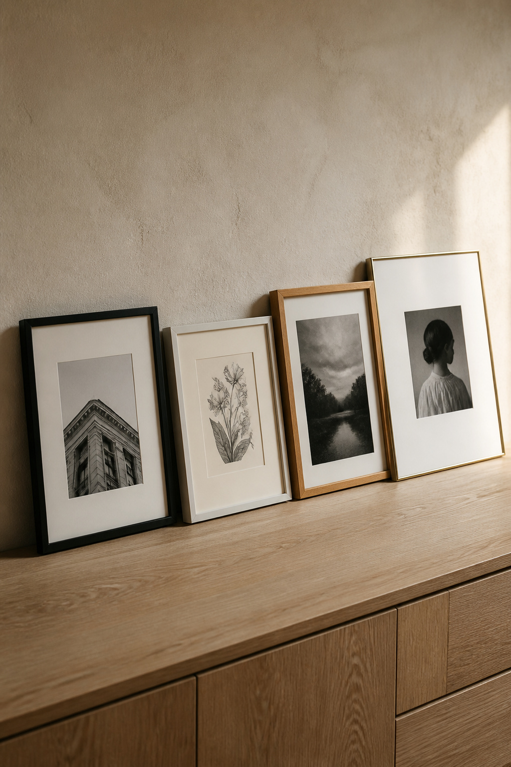
A thin black timber frame is the professional gallery standard for black and white work: a crisp boundary that directs the eye inward, reading as a continuation of the image’s deepest shadows rather than a border imposed on it. The risk is monotony — a whole wall of identical slim black frames can read as a monotone grid even when the prints have real tonal variety. The fix is one or two contrasting finishes, used with intent. One white frame in a field of black looks like a mistake; two or three look like a decision — any finish needs at least two appearances to read as deliberate.
White and off-white frames: how they push the art forward
A white frame acts as a visual pause between image and wall, earning its keep in pale, plaster-walled rooms where a dark print risks getting lost against a light background — the high-contrast boundary lifts the image off the wall and makes its shadow detail readable. One caution: match the frame’s white to the wall’s, or choose contrast on purpose. A bright white frame on a warm off-white wall sets up an accidental contrast between frame and wall instead of between frame and print.
Natural wood and brass accents: the warmth that stops monochrome going cold
This is where the Scandinavian answer differs from the gallery one. Oak bridges a graphic black-and-white wall to the wood furniture already in a Nordic room — one or two oak frames, or a floating oak ledge below the arrangement, reads as a warm anchor rather than a contrast, and suits landscapes, fog and organic texture. Brass does the same at smaller scale: a two- or three-piece accent in an otherwise black-framed wall stops the whole thing tipping into institutional severity. Warmth comes from material, not colour.
Mat width as a design variable: narrow for tension, wide for formality
The mat appears around every print at once — the most powerful cohesion tool on the wall. Standard home mats run 1.5 to 3 inches; widen to 2 to 4 and the mat registers as a design element, lifting a small print to the presence of a much larger one. Whatever you choose, hold it constant. Mackintosh calls identical mount widths across every piece the “Uniformity Rule” — the rhythm that guides the eye across the collection. Where frame finishes are mixed, constant mat width is the single thread holding the arrangement together.
Grid Versus Free-Form: Layout for a Black and White Gallery Wall
Why the strict grid reads differently in monochrome than in colour
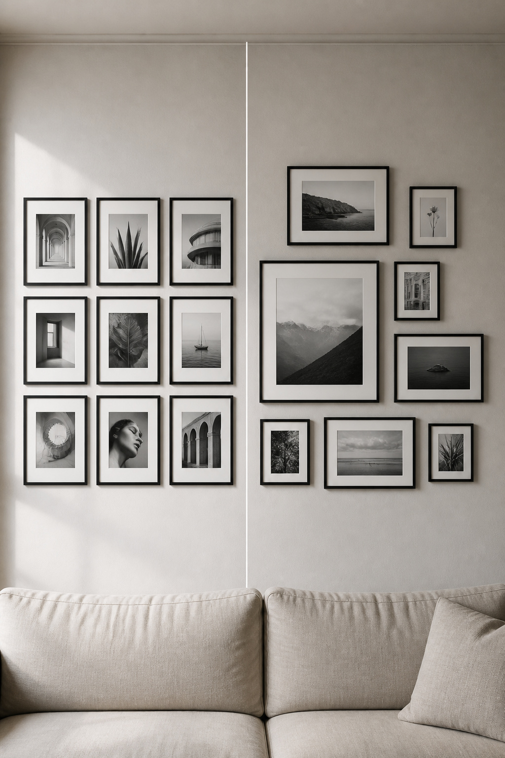
In a colour arrangement, the palette supplies a layer of cohesion that can paper over a loose layout. Remove colour and the structure is exposed. A grid’s geometry reads more cleanly in monochrome because nothing distracts from it, so the spacing becomes a design element: hold it at exactly 2 inches between frames for the tightest, most architectural effect, 3 inches for a little breathing room. The strict grid suits formal, minimal or architectural spaces. In a warm, lived-in living room, its rigidity can read as cold rather than ordered.
Free-form salon hang in black and white: the role of scale variation
In a salon hang, scale variation does the work colour would otherwise do — without it, the arrangement collapses into a wall of identically grey rectangles. A large near-black architectural print draws the eye first; medium botanical prints distribute the mid-tones; small portraits in the corners give intimate detail. Anchor with one large piece — typically 16×20 or 20×24 inches — and fill around it with medium (11×14) and small (8×10) prints, spacing varied between 2 and 4 inches for rhythm. Mixing portrait and landscape orientations breaks the monotony a single-orientation monochrome wall is prone to.
The mixed approach: a grid anchor with a looser outer edge
A middle path worth knowing: build an inner core of two to four identically framed, evenly spaced prints as an anchor, then let the arrangement grow outward less regimentally — varied sizes, slightly varied spacing. In monochrome this reads as designed but not rigid: the grid core signals intention, the softer edge signals personality. Place the largest piece first, slightly off-centre, and build around it; one frame finish carried throughout keeps a mixed-size arrangement from reading as chaotic.
Subject Matter: What Photographs and Prints Work in Monochrome
Why architectural and botanical subjects read so well without colour
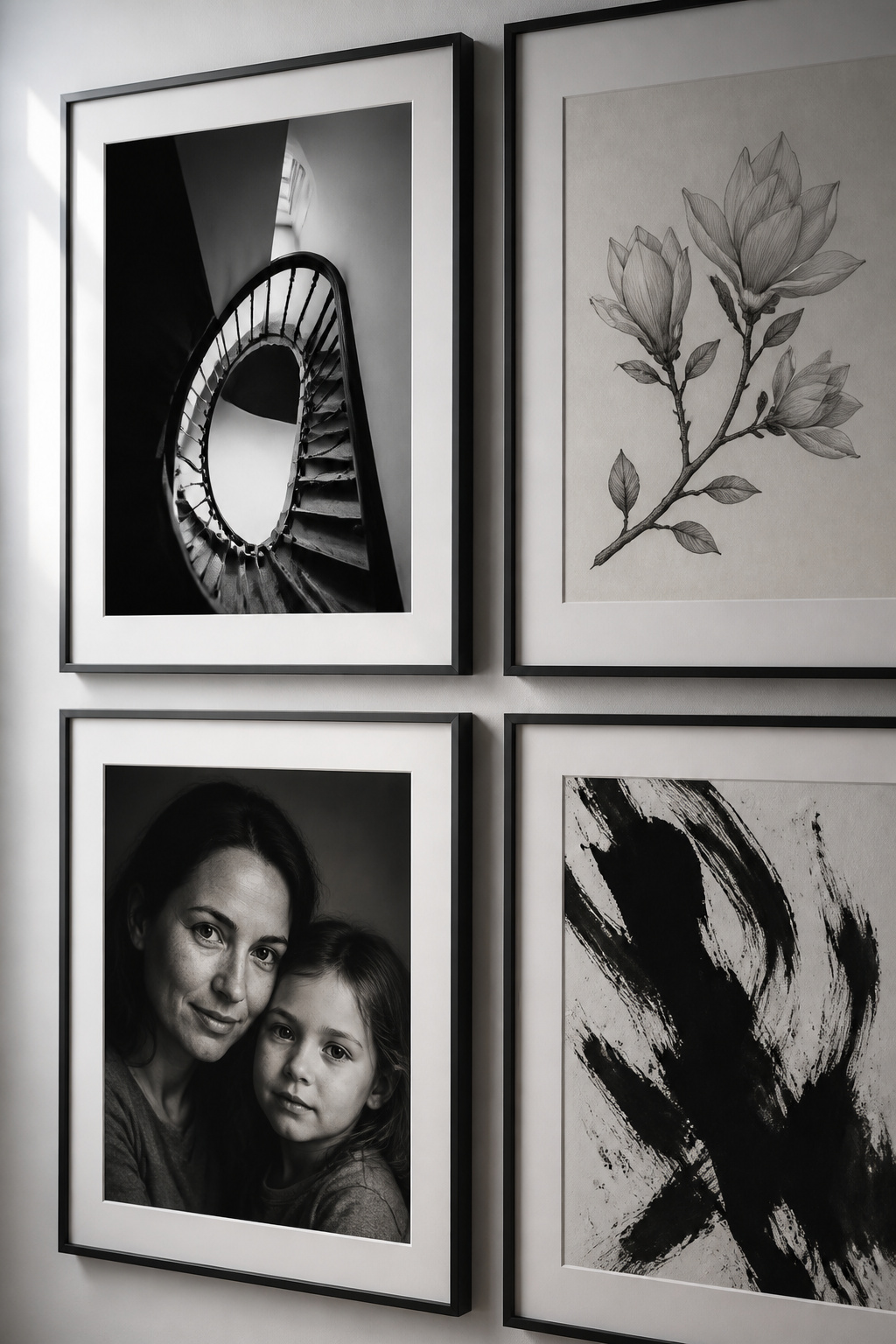
Some subjects do not merely tolerate the loss of colour — they gain from it. Architecture reads as pure composition: stairs, arches, window grids and column repetitions become geometry and shadow play. Botanical subjects convert just as well, their interest lying in form, line and texture rather than hue — a botanical print reads as graphic design as much as illustration, which is what lets it sit beside an architectural photograph. For landscapes, strong inherent contrast matters: bright snow against dark trees, coastal rock in fog. Soft, low-light scenes earn their place as the mid-tonal breathers that keep a wall from tipping too graphic.
Family and portrait photography in black and white: the unifying conversion
Converting personal photographs to black and white does two things at once: it lifts them toward fine-art presentation and erases the era-specific colour palette that otherwise dates them. A faded 1980s film print and a 2024 phone photo will not share a colour temperature, but printed in black and white they become one family — the heart of building the wall from family photos. Apply one consistent conversion across the whole set, and frame portraits warmly: cream matting with oak or white frames draws attention to expression rather than competing with it, where a heavy, ornate frame would pull focus from the face.
Abstract prints in monochrome: tonal contrast as structure
A monochrome abstract — a gestural ink wash, a geometric composition, minimalist line work — leans entirely on tonal contrast: deep black over crisp white, negative space doing the work. Carrying no representational content to compete with the photographs, it integrates more freely into a mixed-subject wall than a colour abstract would, read as tonal texture rather than a rival subject. One or two add variety without disrupting cohesion — provided you place each for its tonal value, not merely its shape.
Building the Scheme Around a TV or a Dark Focal Point
Why black and white is the natural answer to the TV-in-the-gallery-wall problem
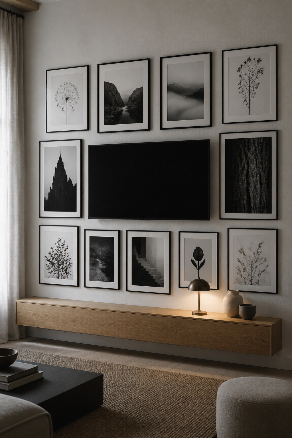
A flat-screen television is a large black rectangle — the single darkest object in most rooms. In a monochrome gallery wall full of dark tones, the screen blends into the composition rather than rupturing it: one element in a tonal field, not an intrusion. Coco Lapine Design frames the method well: surround the screen with black-framed art and play with rectangle sizes large and small, “it will look like an intentional piece within the framed artwork.” The TV becomes the largest frame on the wall.
Dark-toned art at the screen perimeter: making the black rectangle disappear
The placement detail makes it work. Position high-contrast, deep-black prints — architectural silhouettes, dark bark textures, shadowed still lifes — immediately around the screen so the contrast between screen and surroundings drops and the TV stops reading as a hole in the wall. Matte prints hold this better than glossy ones, which catch light against the screen. And hide the cabling: a cable run down the wall breaks the illusion of a composed surface faster than any framing error.
When one warm material saves the room from austerity
A living room built around a monochrome wall, with a black screen already in it, risks reading clinical. The correction is one warm material in the same sightline — an oak console, a warm-toned rug, a brass lamp base beside an oak-framed print. The formula is warm material plus muted tone: a vivid colour accent becomes the focal point and overrides the wall. If you want colour, keep it small — a single ceramic bowl punctuates rather than competes. The full integration method lives in working a TV into the composition.
Three principles carry the whole scheme. Build for tonal range, not just the absence of colour — Zone 0 through Zone 10, distributed on purpose. Let mat width be the constant even when the frames are not. And warm it with oak or brass so restraint never reads as cold. A wall built that way does not look minimal for its own sake; it looks composed — the wall of someone whose eye has arrived somewhere — and because it borrows from no decade’s palette, it stays that way long after the colour schemes around it have come and gone.
FAQ
What colours go with a black and white gallery wall?
Natural wood tones — oak, walnut, light ash — are the most compatible, because warm grain bridges the graphic wall to the room’s furniture without adding a competing colour. If you want accent colour, keep it to small warm-toned objects: aged brass, sage, dusty mustard or terracotta in vases, cushions or lamp bases. The monochrome palette is genuinely colour-agnostic and adapts to almost any room.
Should all frames match on a black and white gallery wall?
Not necessarily. All-matching frames are the professional standard for formal rooms, but deliberately mixing two or three finishes is equally valid and often more interesting. The rule is that any finish must appear at least twice, so it reads as intentional rather than accidental. If you do mix, keep mat width consistent across every frame — that repetition is what holds the arrangement together.
How do you make a black and white gallery wall look warm?
Introduce natural wood at several scales: one or two oak frames in the arrangement, an oak ledge or shelf below it, and wood furniture in the same sightline. Use cream rather than bright-white mats on portraits and botanicals for a subtler paper tone, especially under warm 2700–3000K lighting. Soft textiles at the base of the wall add the lived-in warmth that reads as comfort rather than gallery sterility.