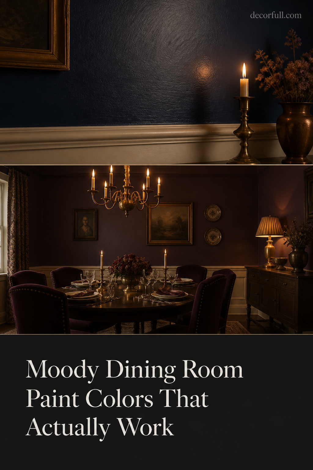
Stand in a paint aisle and the darks all promise the same thing: drama, intimacy, a room that feels considered. There are hundreds of them, and a four-inch chip under store light tells you almost nothing. The useful filter is which dark holds its character under the warm, low light a dining room actually lives in — and judged that way, the field narrows to four families: deep green, navy, charcoal-to-near-black, and the warm burgundies and aubergines.
TL;DR
- The four families that hold up under warm 2700–3000K dinner light are deep green, navy (green-undertone like Hale Navy HC-154, LRV 8), charcoal/near-black, and warm burgundy/aubergine (Farrow & Ball Brinjal No. 222).
- Warm-undertone darks outperform cool ones by candlelight: a burgundy or warm navy glows, while a purple-navy or cool grey-blue reads flat and cold.
- Use a matte or flat finish (0–5% light reflectance) for maximum depth; reserve eggshell for rooms with strong layered light, and never commit from a chip — paint a large board and check it at dinner.
How to Judge a Dark Paint Color for a Dining Room
Before any named colour, the criterion. A dining room is an evening room — mostly seen under warm artificial light around 2700–3000K, with candles. The question is not whether you like the chip, but how the colour reads at dinner.
The chip problem: why swatches lie under tungsten and candlelight
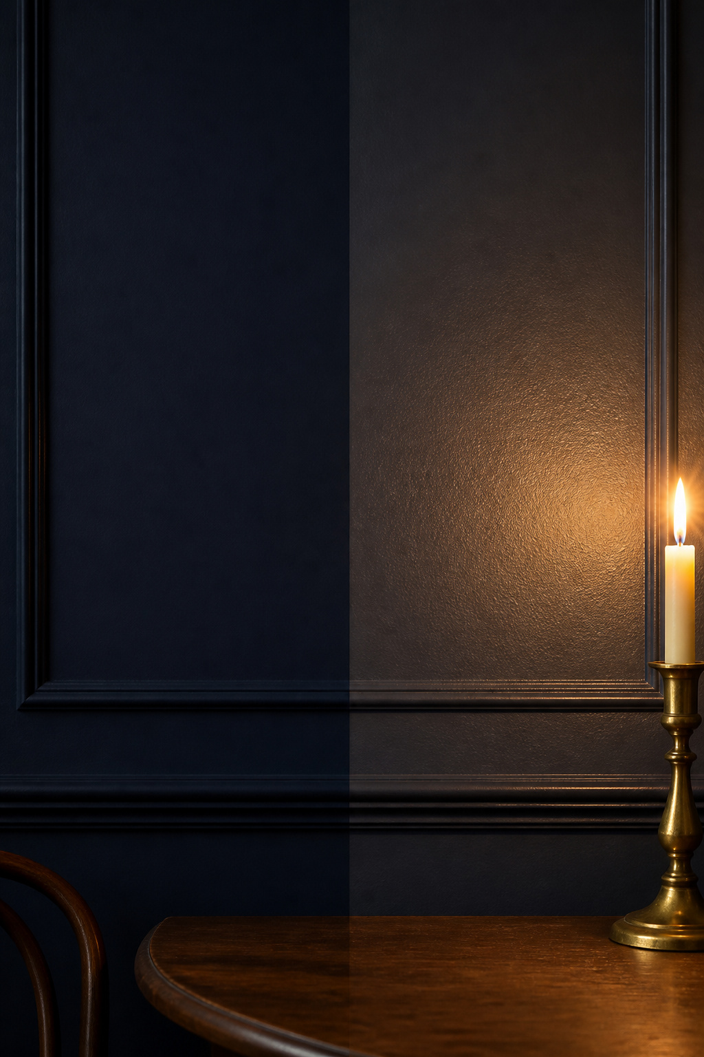
Paint chips are evaluated under cool 4000–5000K retail light, yet your wall lives under something far warmer. That gap shifts a colour across families: a dark green warms toward olive, a charcoal reads browner, a purple-leaning navy deepens toward murky violet. Approving a dark from a chip is the most common route to an expensive repaint.
Undertones and what warm light does to cool vs warm darks
Warm light at 2700K amplifies red and brown undertones and suppresses cool ones. Warm darks absorb candlelight’s wavelengths and reflect a reddish glow back; cool darks (blue-blacks, cool greys, purple-navies) simply withdraw. In a candlelit room, a warm-undertone dark almost always outperforms a cool one of equal depth.
Finish choice: matte depth versus semi-gloss reflectance
Flat or matte reflects roughly 0–5% of the light that hits it; eggshell sits around 10–25%, satin around 25–35%. The same navy in eggshell reads measurably lighter. Matte gives a dark its deepest saturation without throwing glare from candles; eggshell earns its place only where layered light is strong.
| Finish | Light reflectance | What it does to a dark in dining light | Best for |
|---|---|---|---|
| Flat / Dead Flat | ~0–5% | Deepest, most saturated read; no glare | Dim rooms; colour drenching |
| Matte / Estate Emulsion | ~5% | The standard moody-wall choice; rich and even | Most dark dining rooms |
| Eggshell | ~10–25% | Lifts the colour a touch; slightly luminous | Rooms with strong layered light |
| Satin / semi-gloss | ~25–35%+ | Hot spots wherever a flame reflects | Trim and moulding, not walls |
For most dining rooms, Estate Emulsion or a comparable matte is the answer — the moody dining room ideas guide shows how colour, light and architecture work together.
Deep Green: The Most Forgiving Dark on the Palette
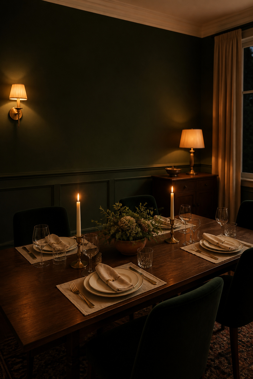
If you are nervous about going dark, start with deep green. Its link to the natural world keeps it from reading oppressive — an ease a flat black cannot match. Blue-greens lean cool and botanical; yellow-greens warm toward olive. Both flatter warm wood.
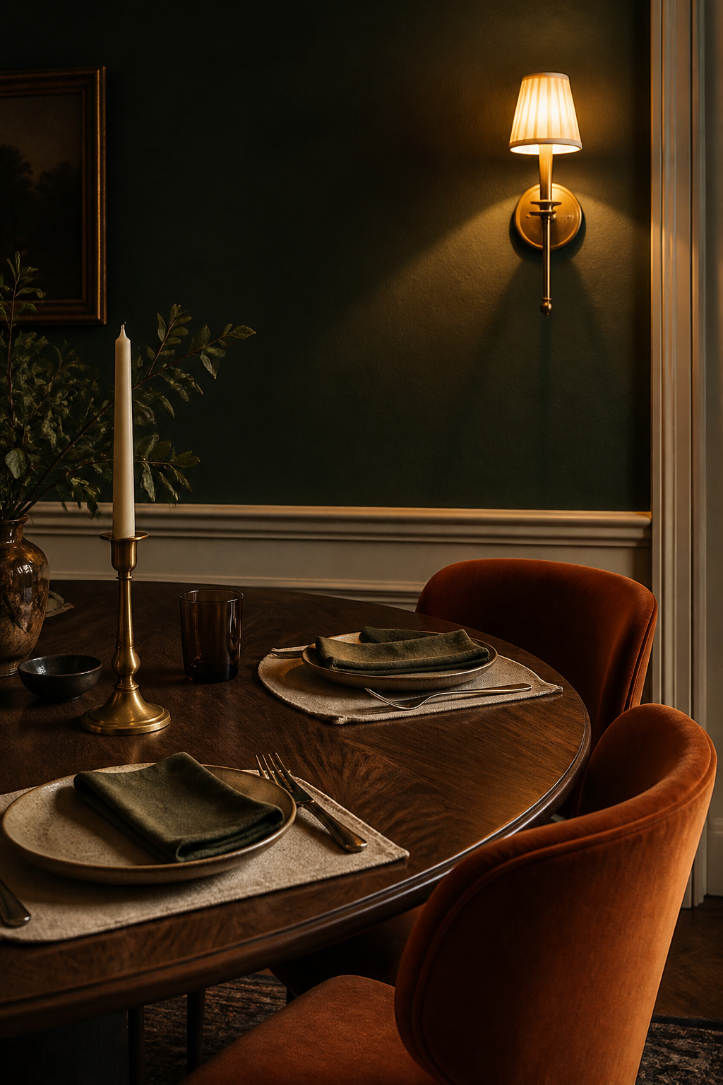
Blue-green vs yellow-green undertones at dinner
A blue-green like Benjamin Moore Hunter Green 2041-10 holds its greenness even in low light, staying unmistakably green where darker greens slide toward black. Farrow & Ball Studio Green No. 93 (LRV ~7) reads almost black until directional light draws the green out — mixed for their own studio for exactly that quality, ideal for a room that shifts from daytime lunches to candlelit suppers.
Where each named green sits on the spectrum
Starting points to sample, not endorsements — every colour earns its place on your wall, not on this list.
- Hunter Green 2041-10 (Benjamin Moore): blue-cool undertone, stays distinctly green in all light. The clean, classic choice.
- Boreal Forest AF-480 (Benjamin Moore): olive-grey undertone, LRV ~10–11. Subtler and more contemporary.
- Studio Green No. 93 (Farrow & Ball): cool greenblack, LRV ~7. The deepest — wants layered light, or it reads as flat black.
- Forest Green 2047-10 (Benjamin Moore): near-greenblack, LRV ~5.6 by third-party data (treat as directional). The very dark end.
What deep green pairs with
Deep green is the colour-wheel complement of dark brown — it sits naturally against walnut, dark oak and mahogany, the tension reading as richness. Warm brass pulls out the yellow-green; cool steel leaves it clinical. The furniture and textiles decision is an extension of the same pairing.
Navy and Midnight Blue: Depth Without Heaviness
Navy delivers drama without the full commitment of a near-black — which is why it’s the most-searched moody dining colour. The whole decision lives in the undertone.
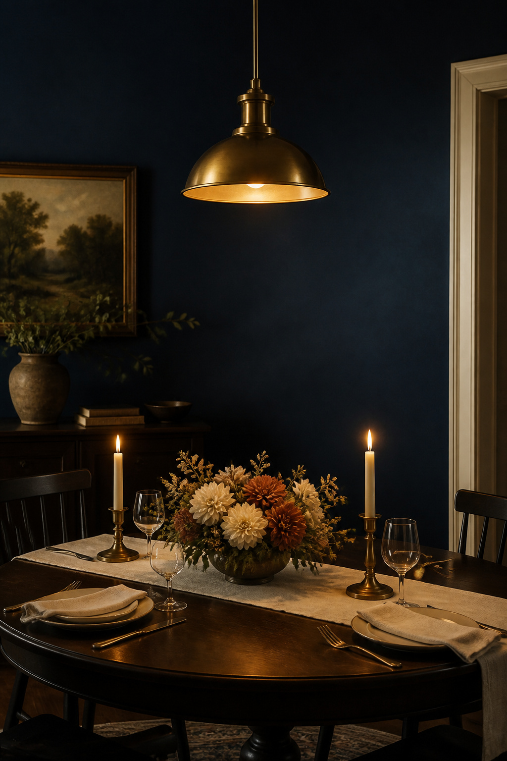
How navy reads under incandescent warmth
Green-undertone navies warm up under 2700K light. Benjamin Moore Hale Navy HC-154 (LRV 8) is the canonical example — subtle green gives it warmth without tipping teal, so under candlelight it reads jewel-like rather than collapsing to black. Farrow & Ball Hague Blue No. 30 (LRV ~7) carries stronger green, a bolder choice for rooms with some natural light.
The purple-navy trap in small rooms
The colours to watch are purple-undertone navies: under warm light their blue tips toward murky violet — cold and slightly dirty in a room short on natural light. The test: hold a grey card beside the chip under warm light. If the navy reads slightly warm, it is safe; if it reads cool or violet, be cautious in a room that depends on artificial light.
Named examples and light-reflectance behaviour
Sherwin-Williams Naval SW 6244 sits at LRV 4 — gorgeous in a well-lit room, cave-like in a small one. For most dining rooms, Hale Navy (LRV 8) outperforms the very dark midnight types because it keeps colour and depth visible even in low light.
Charcoal and Near-Black: The Most Committed Choice
Near-black rewards a deliberate hand. The working hierarchy runs Railings, then Off-Black, then true black — in order of demand on the room.
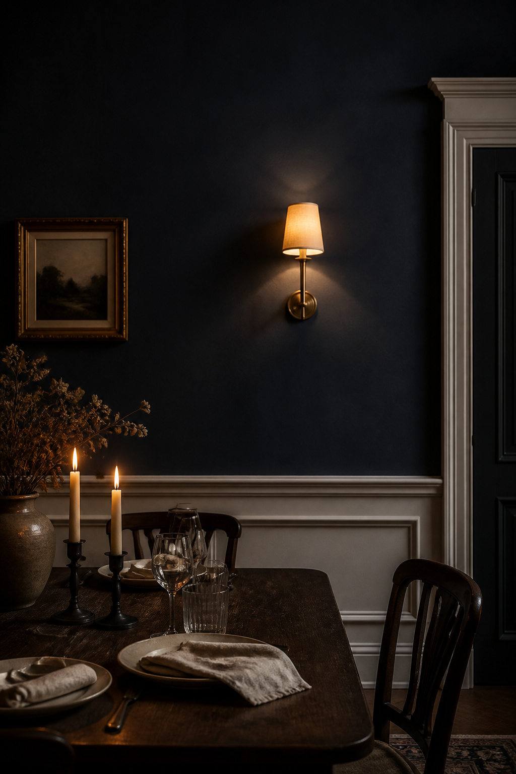
True black, off-black and dark charcoal
Farrow & Ball Railings No. 31 is the accessible near-black: “more blue than black,” a charcoal whose blue undertone reads almost navy in some lights. Its LRV is genuinely disputed across colour databases — I won’t pin a number. Designer Laetitia Laurent: “It looks black at first, but there’s this deep, almost inky blue undertone that gives it a softness.” Off-Black No. 57 is the darker, warmer sibling — near-black without a neutral’s coldness.
Why finish is most critical here
Farrow & Ball recommend Estate or Modern Emulsion for Railings on walls — not gloss. Full Gloss is for front doors; on a dining wall the same sheen throws every candle and pendant back as a hard hot spot. Matte absorbs evenly and feels cave-like only when lighting is inadequate. As Patrick O’Donnell describes Railings at night: “you will feel cocooned… and colors will pop against it.”
Railings, Off-Black and the trim decision
Trim is part of this decision: a crisp off-white keeps moulding legible; O’Donnell’s alternative is to “pull out the nuanced blue in Railings by teaming it with a lighter blue colour, like Borrowed Light.” Near-black needs architecture to read against — the wainscoting and dark walls decision belongs alongside the colour choice, not after it.
Burgundy, Aubergine and Plum: The Warmest Darks
The red-purple darks are the warmest choice and the ones with the deepest history. Victorian dining rooms used claret and plum because warm dark tones absorbed the smoke and soot of candle and gas light — the same red undertone glows under flame now.
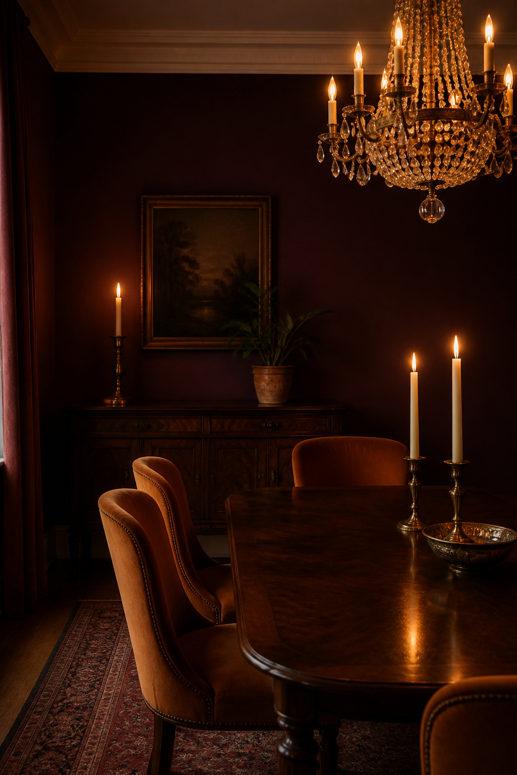
Why warm darks behave differently under candlelight
The canonical example is Farrow & Ball Brinjal No. 222 — named for the South Asian word for eggplant, introduced more than two decades ago. LRV approximately 6–7: “a nuanced, wine-like tone reminiscent of a ripe Pinot Noir.” Farrow & Ball recommend it for north-facing rooms, “where its red undertones introduce warmth” — the whole argument for warm darks in one line.
The red-purple range: wine-dark vs violet
Plums with a high blue proportion lose their warmth and read cold violet rather than wine-dark. Brinjal stays the right side of that line — settling into wine-dark aubergine under warm light where a cooler plum tips toward violet. Designer Luiza Anyszka, choosing it for a Warsaw pre-war tenement, found it “resonates so beautifully with the spirit of historical interiors” — the quality that made plum and claret Victorian dining staples.
Named examples
- Brinjal No. 222 (Farrow & Ball): wine-dark aubergine, LRV ~6–7. The most light-responsive warm dark; shifts between burgundy, plum and wine by aspect.
- Trim with Brinjal: Skimming Stone (a warm mid-neutral) for a heritage-romantic read, or School House White for a crisper, modern contrast.
Brinjal pairs naturally with unlacquered brass, velvet and earthy linens. Farrow & Ball’s Chromologist warns against heavy dark greens alongside it — they “can tip the scheme into something overly gothic” — and cool metals like chrome.
Matching the Colour to the Wall It Will Sit On
A colour choice is also a surface choice — the same dark reads differently on flat plaster, textured wallpaper or panel moulding.
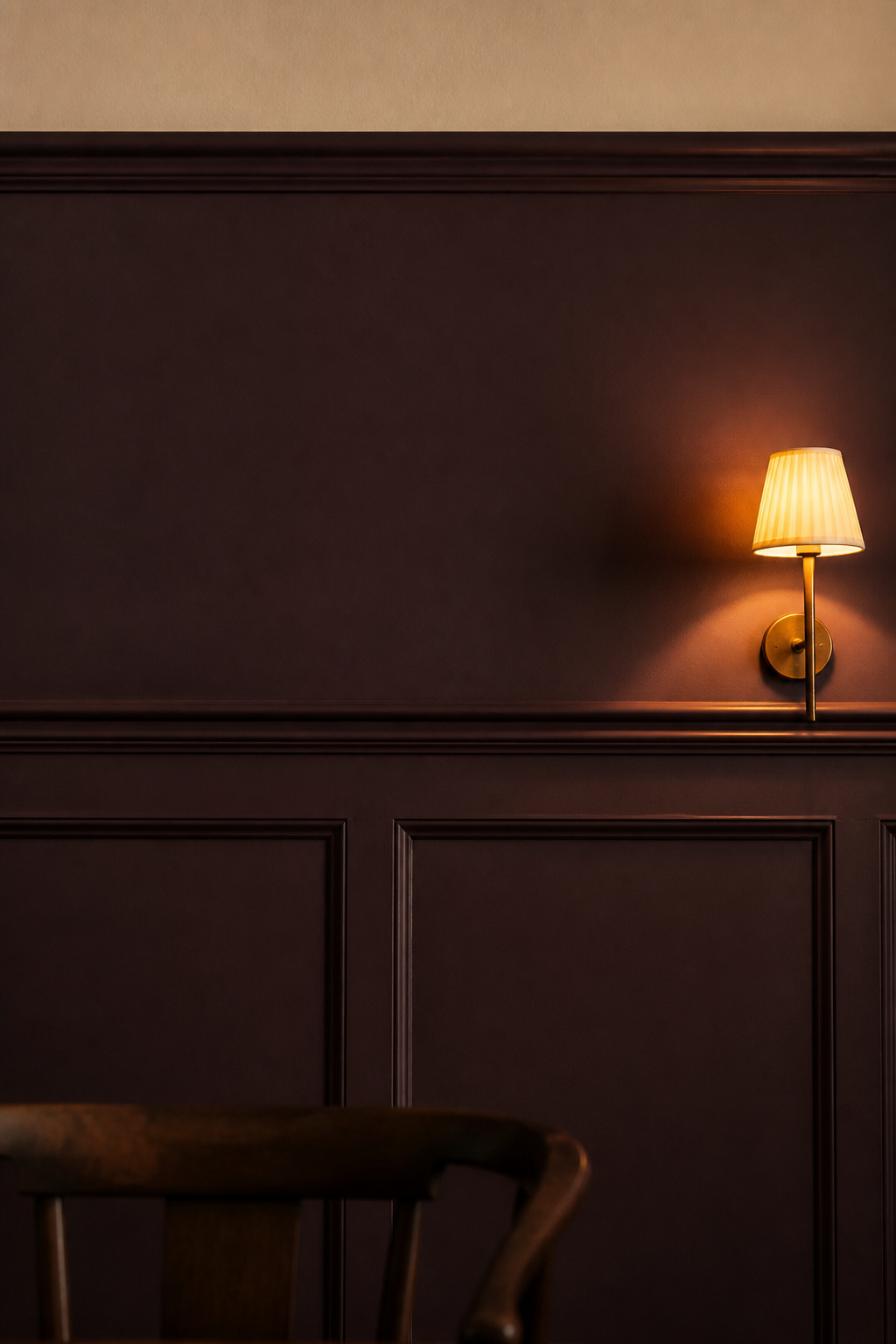
How surface affects the read
Flat plaster gives the most even, saturated read. Textured wallpaper adds micro-shadows that make a dark richer. Panel moulding draws shadow lines that keep the colour legible — especially important for near-blacks, which on unbroken plaster can read as an undifferentiated mass.
| Colour family | Best on | Effect | Finish note |
|---|---|---|---|
| Deep green | Flat plaster | Clearest expression of the hue | Matte — avoids a clinical sheen |
| Navy | Textured wallpaper | Weave gives the blue movement and depth | Matte to soft eggshell |
| Charcoal / near-black | Panel moulding | Shadow lines keep the dark legible | Flat — gloss throws hot spots |
| Aubergine | Flat plaster, colour-drenched | Seamless, maximally enveloping | Dead Flat on walls + woodwork |
Why the trim colour is part of the decision
Drenching the trim in the wall colour gives the most seamless result — strongest with aubergines and near-blacks. Off-white or cream reads as crisp contrast, suiting navies and deep greens. Either way, trim changes which undertone dominates. For the full treatment, see wainscoting and dark walls.
How to Test Dark Paint Before You Commit
No dark colour should be approved from a chip. A deep navy as a four-inch chip is a different colour from the same paint covering a full wall. Here is the protocol before buying a tin.
- Paint a large board, not a square. Use stiff foam-core, a foam roller, and at least two coats — three below LRV 7. Aim for 24×24 inches; 12×12 is the minimum.
- Fix it with white tack and move it around. Don’t tape — that lifts paint. Wrap it around a corner to read the colour on a lit wall versus one in shadow.
- Check it at three light moments. Morning reveals the undertone; noon shows the brightest case; the dinner hour is decisive. Leave it up at least 48 hours.
- Read it against fixed elements. Hold the sample beside the actual floor and table — a navy that sings over a mid-toned floor can lose definition over a dark one.
- Judge it in dinner light next to your key pieces. Benjamin Moore: “compare it with your key pieces — like your dining table or artwork — before painting the whole room.”
Once the colour is settled, how to create a moody dining room covers the lighting, walls and styling that turn it into a finished space.
FAQ
What is the best dark paint color for a dining room with no natural light?
A warm-undertone dark performs best — burgundy or aubergine (Farrow & Ball Brinjal No. 222), warm green (Boreal Forest), or a green-undertone navy like Hale Navy HC-154 (LRV 8). Their red or warm-green undertones amplify 2700K artificial light rather than reading cold under it, which is what a windowless room needs.
Do I need to use an eggshell or matte finish for a moody dining room?
Matte or flat is the standard choice — it reflects only 0–5% of light, giving dark colours their deepest read and avoiding harsh glare from candles and pendants. Eggshell works where you have strong layered light and want a jewel-toned quality. Avoid satin or semi-gloss on walls; reserve higher sheens for trim and moulding.
Can dark paint colors make a dining room feel smaller?
Not by themselves. Dark walls create a jewel-box, cocooning effect that can make a tight room feel intentional rather than cramped, and by softening the edges they can blur the boundaries and add depth. The shrinking effect comes from inadequate lighting paired with dark walls — so fix the light, not the colour.