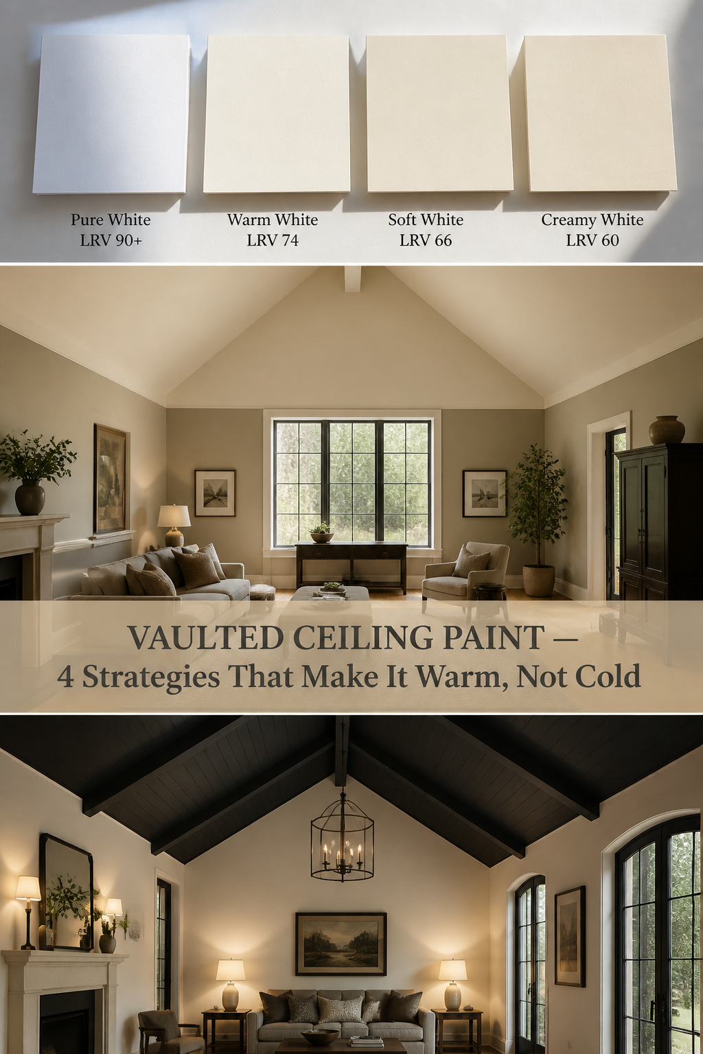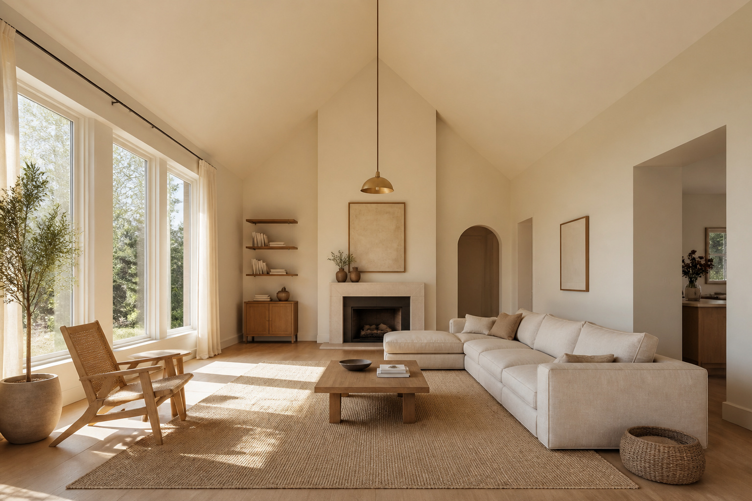

The standard advice for a vaulted room is to paint everything the brightest white you can find, because white opens up a space. In a tall room that instinct is wrong. A large expanse of cool blue-white at height does not read as airy. It reads as clinical. The volume you were given as a gift turns cold, and no throw or lamp fully fixes a temperature problem that lives in the paint.
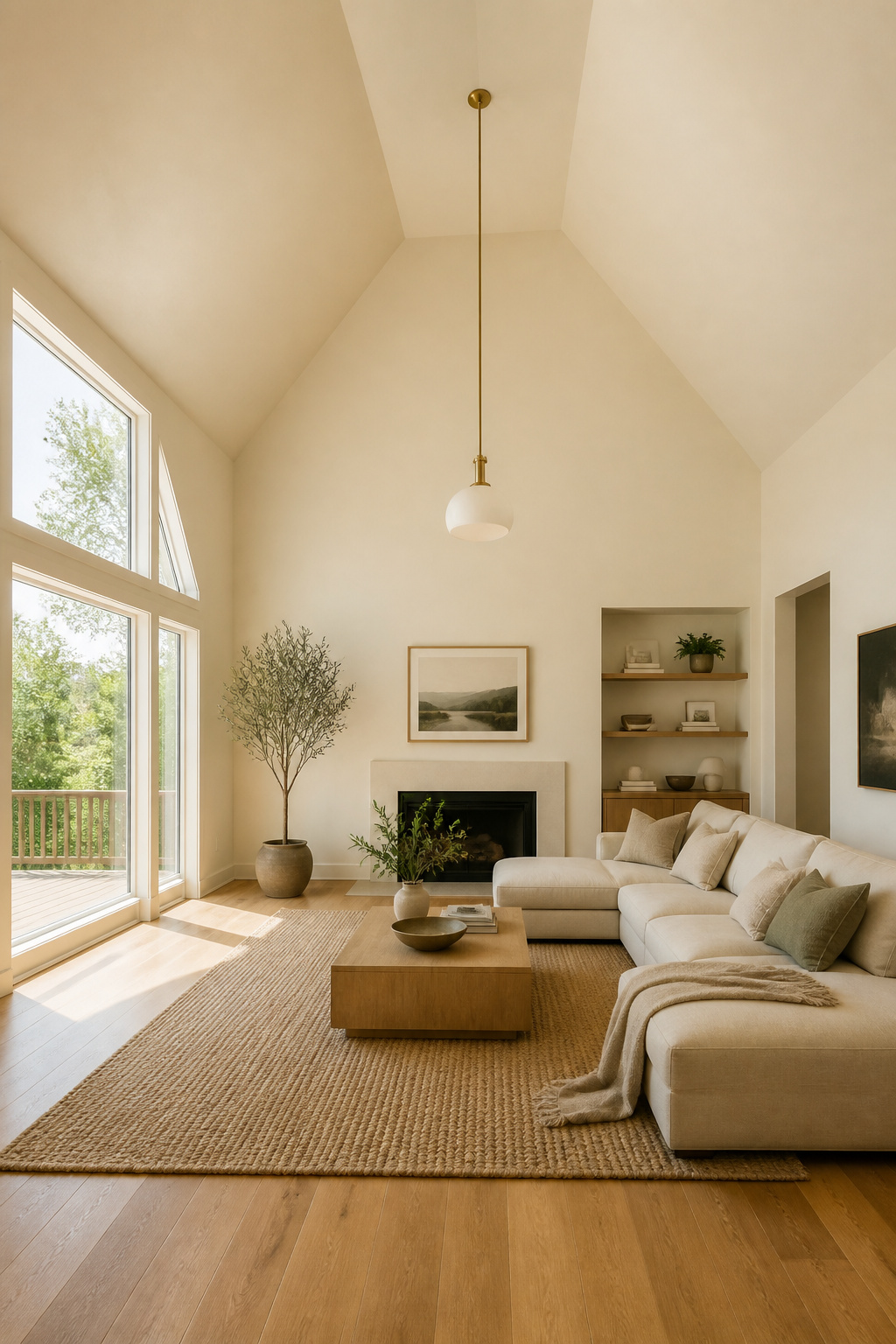
So the first question is not “which white?” but “what do I want this room to feel like?” Answer that, and the right vaulted ceiling paint colors follow — and most are warmer than you expect.
TL;DR
- Skip cool stark whites in a tall room. Warm whites with yellow-beige undertones in the LRV 75-85 range stay warm at height instead of bleaching to a clinical glare.
- To bring a too-tall ceiling down, run a two-tone wall: warm greige below (around LRV 60) and warm white above, with the break around two-thirds of the wall height.
- For deliberate intimacy, paint the ceiling a deep navy, charcoal or forest green in a matte finish — but only in a room with enough daylight, and use full-formula wall paint, not ceiling paint.
Why Bright White Makes a Vaulted Room Feel Colder, Not Bigger
Pure white with a blue or grey undertone is the default on the paint shelf, and at scale it is the wrong default. The reason is physical, not a matter of taste.
The psychology of pure white in a tall volume: why it reads clinical, not airy
A vault gives a cool white an enormous surface. That bright plane reflects light back flat and even, stripping warmth from the air below. Every white sits on a cool-to-warm undertone spectrum, and too many cool undertones make a space feel sterile — an effect a tall room amplifies rather than softens. One documented case makes it concrete: in a Black Forest, Colorado living room, bright white walls made the pine beams look “orange and harsh.” Repainted in a warm greige, the room “immediately felt more inviting, balanced, and calm,” with no change to the furniture.
How light reflects off a cold white at height and flattens the room’s warmth
This is where Light Reflectance Value matters. LRV measures how much light a colour bounces back, from 0 (black) to 100 (pure white). The colour consultant Kylie Mawdsley puts the rule plainly: the higher the LRV, the more light a colour reflects, so give it plenty of light and “it will look considerably lighter than expected.” A white above LRV 90 in a sunny vault does not glow; it bleaches to hard, clinical brightness. There is a second effect, too: a warm 2700K bulb bounced off a cool white returns cooler, while the same bulb off a warm white returns as real room warmth.
The one paint decision that matters more than any fixture or textile
Undertone is the decision. Get it right and you have warmth to build on; get it wrong and every lamp and wool throw works uphill. Keep walls and trim in the same warm family — both warm white — and the room resolves quietly. Mix a cool ceiling over warmer walls and you have built the clash people later call “cold.” Before any fixture, before any rug, choose the undertone. It is the vaulted ceiling living room design guide decision everything else hangs on.
Warm Whites and Soft Neutrals: The Reliable Starting Point
For most vaulted rooms with ordinary daylight, a warm white is the low-risk place to begin. It rarely disappoints, which is why it earns the starting slot.
What makes a white ‘warm’: undertones and LRV explained simply
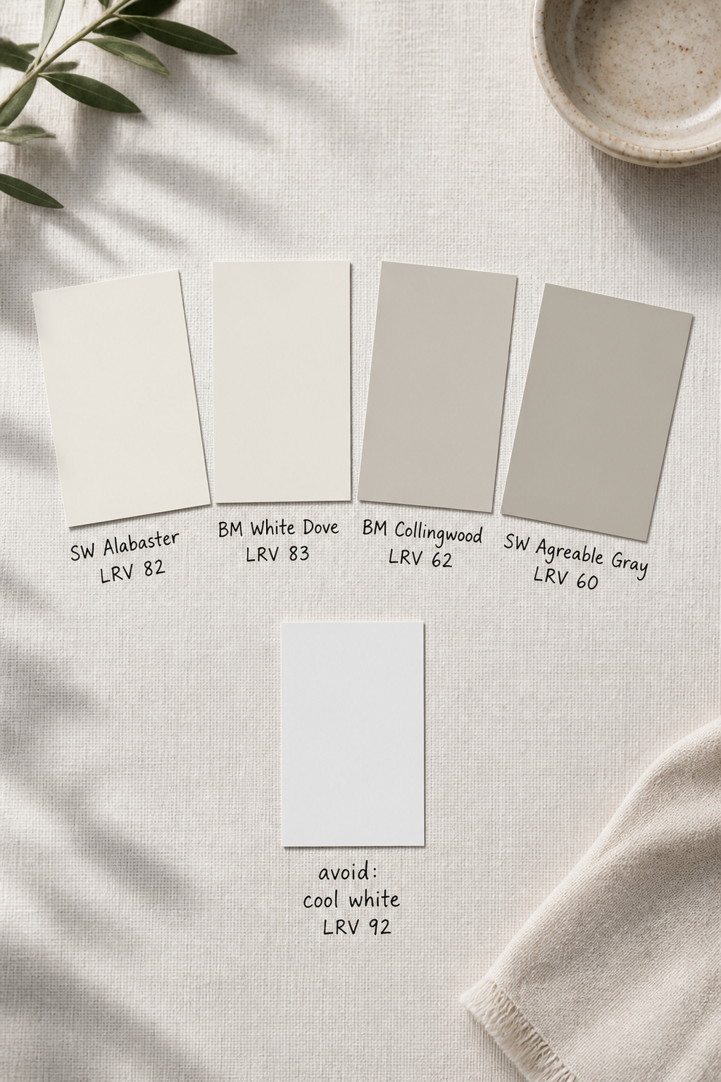
A warm white carries red, orange or yellow in its base. It looks creamy or softly off-white rather than blue- or grey-tinted. For a vaulted ceiling with daylight, warm whites in the LRV 75-85 range reflect enough to feel light without tipping into glare.
Recommended warm white and neutral families for tall rooms
A few names come up again and again. The table sets the ceiling whites beside the wall greiges that pair with them.
| Colour | Code | LRV | Best surface |
|---|---|---|---|
| SW Alabaster | SW 7008 | 82 | Ceiling, subdued-to-moderate light |
| BM White Dove | OC-17 | 83 | Ceiling and walls, with wood tones |
| SW Greek Villa | SW 7551 | 84 | Ceiling, for a warmer cream |
| BM Collingwood | OC-28 | 62 | Walls, holds depth at height |
| SW Agreeable Gray | SW 7029 | 60 | Walls, warm greige |
If you want one safe choice for the whole room, take White Dove — the steady whole-house warm white that sits well with natural wood. For walls below the apex, step down to a warm greige around LRV 60 in the same yellow-beige family, so the wall holds its depth where direct light would wash it out.
How the same colour reads differently on the wall vs the ceiling
A vault that peaks away from your main window reads a full shade deeper than the wall beneath it. The fix is simple: if the ceiling looks richer than you want, go one LRV step lighter on the ceiling only, keeping both in the same warm family. Or paint ceiling and walls the same warm white — this light-tone colour-drenching removes the awkward seam at the angled joint and reads as one serene, slightly larger room, especially in smaller spaces.
The Two-Tone Technique: Visually Lowering a Too-Tall Ceiling
When a ceiling is genuinely too tall for the room to feel human, two-tone walls bring it down with no structural work. A darker, grounding colour takes the lower wall; a lighter tone lifts above it.
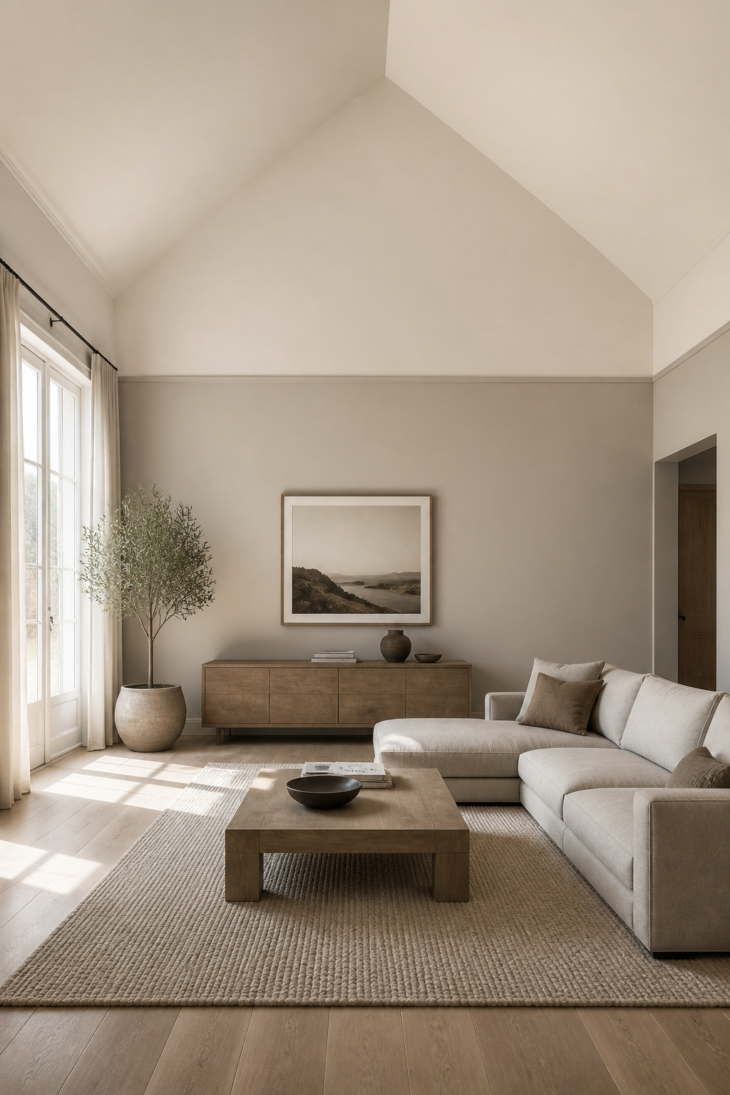
Where to draw the colour break: the picture rail line, the beam line, or an arbitrary height?
Let architecture decide where you can. If a picture rail or horizontal beam exists, draw the break there, so the transition reads as intentional. Without one, think in proportion, not inches: the break belongs roughly two-thirds up the wall, darker tone below. Avoid a 50/50 split, which cuts the room in half rather than grounding it. Because vaults vary so much in height, this is a proportional rule, not a fixed measurement — find the two-thirds line on your own wall and mark it there.
Colour relationship between upper and lower sections: how far apart in value to go
The eye expects darker ground below and lighter sky above; honour that and the room feels settled. For a tonal two-tone in one colour family, an LRV gap of 15-25 points reads clearly without becoming a stripe. Alabaster above (82) over Agreeable Gray below (60) is a clean 22-point difference. One trend worth knowing rather than rushing toward: “colour capping,” reported for 2026, runs a contrasting band across the top of the wall instead of grounding the bottom. In a vault it pulls the eye up toward the apex — the opposite of what most tall rooms need, so treat it as a trend to watch, not a fix.
When two-tone helps and when it divides the room instead of grounding it
Two-tone earns its place under three conditions:
- The ceiling is genuinely too tall for the footprint, so the height needs taming rather than celebrating.
- Both colours come from the same warm undertone family — different depths, not different hues.
- The break aligns with existing architecture or a true two-thirds line, never an arbitrary midpoint.
It divides a room when the tones clash, when the contrast runs past 40 LRV points, or when you wrap all four walls in an open plan. In a flowing vaulted space, paint two-tone on one wall only — the fireplace or focal wall — to anchor the zone without chopping the sight lines.
Painting the Ceiling a Color or Dark Shade for Intimacy
This is the most counterintuitive move and the most dramatic. A dark ceiling does not shrink a room; it makes it feel held. For a vault that reads cavernous, it can be exactly right.
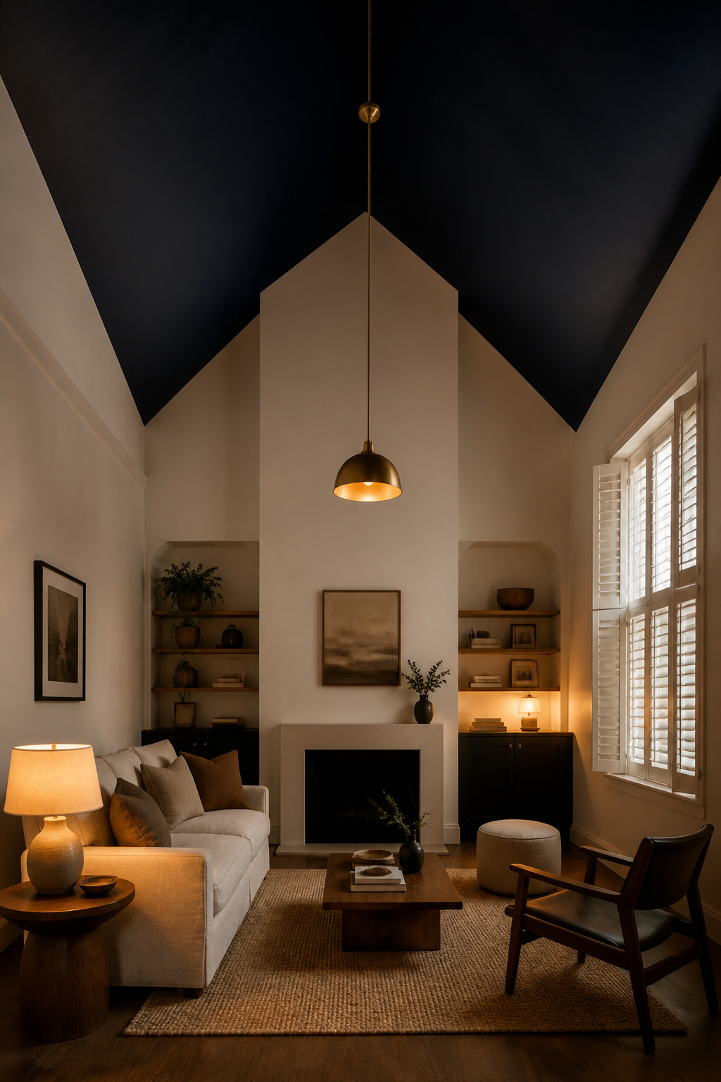
What a dark ceiling does to perceived height — and when that is exactly right
A dark colour absorbs the light a pale ceiling would bounce back down, so the plane reads lower than it sits. The designer Emma Deterding of Kelling Designs calls dark ceilings “transformative — they bring down the height and make a room moodier and much more atmospheric, whilst also adding a cosy and dramatic feel.” The effect suits rooms with enough daylight to read the darkness as drama. In a well-lit vault, a ceiling colour below LRV 40 settles into intimacy.
Colors that work on vaulted ceilings: deep blues, warm charcoals, forest greens
Deep navy and warm charcoal are the most-recommended dark ceilings for tall rooms — they contrast cleanly against lighter walls. Forest green earns a mention: its built-in warmth keeps a dark ceiling from feeling cold and imposing the way flat black or grey can. My own preference is the tonal route Kelling Designs recommends: choose a shade one or two values deeper than the walls rather than leaping from white walls to near-black, which avoids a circus-stripe look.
The light and ventilation requirements before you commit to a dark ceiling
A dark ceiling drinks daylight — more than people expect. So evaluate the room at its worst before you buy: stand in it on a grey afternoon with no artificial light on. If it already reads underlit, a dark ceiling will tip it into oppressive; if it holds depth at that moment, you are clear. Two technical points matter. First, standard ceiling paint cannot be tinted to deep colours, so use full-formula wall paint in a flat or matte sheen — matte hides roller marks and kills the glare satin throws back at height. Second, ventilate hard, because fumes concentrate near a high ceiling and dark colours often need extra coats. If you are coordinating a dark ceiling with exposed wood, the finish on those timbers changes everything — see the exposed beam options. A dark ceiling is also one of the strongest tools in the cozy-not-cavernous playbook when warmth is your real goal.
Vaulted Ceiling Paint Colors: Coordinating Wall, Ceiling, and Beam Tones
The real puzzle in a vault is not one colour but the relationship between three surfaces: wall, ceiling, and beams or trim. Get the relationship right and the room reads as designed, not decorated.
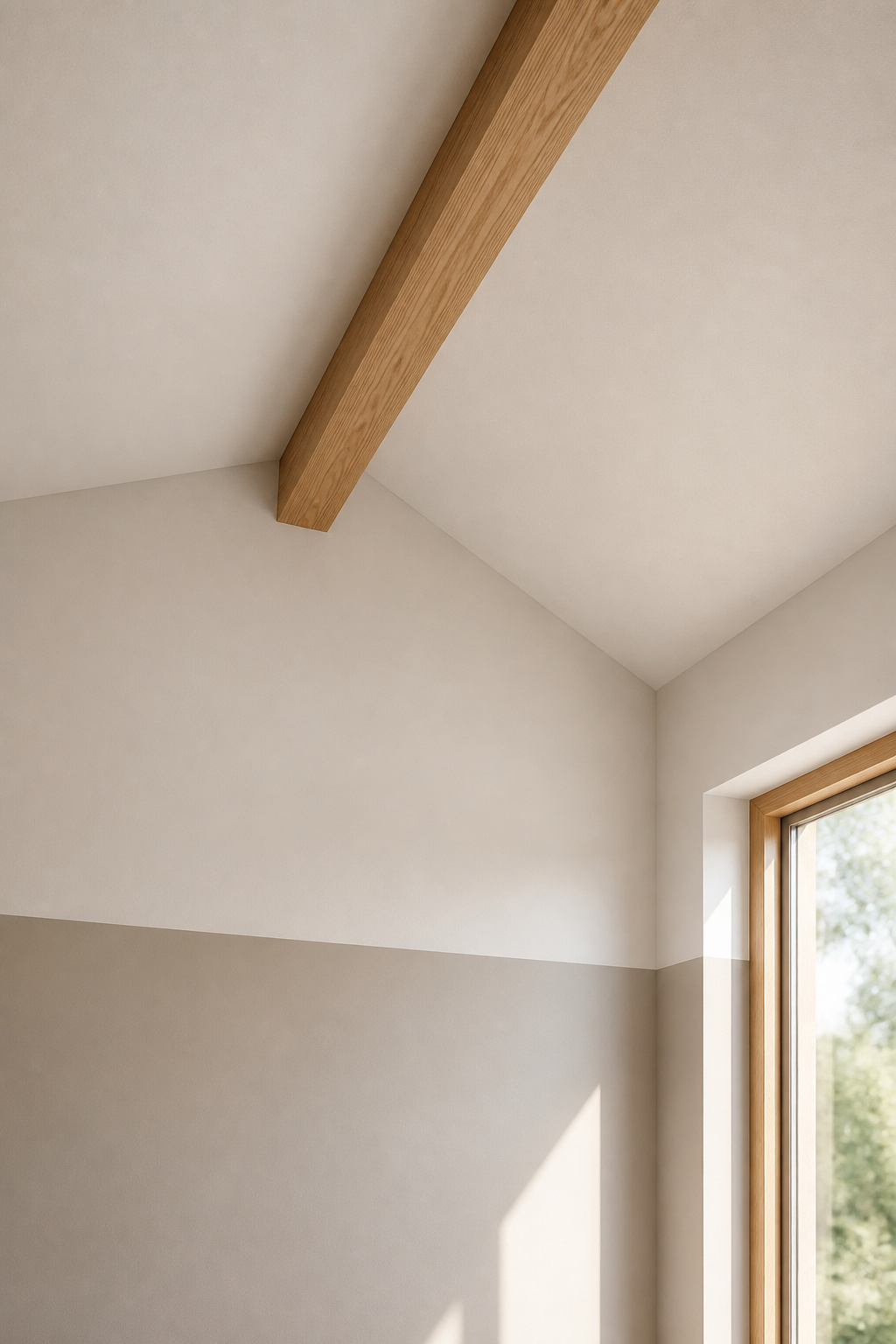
Monochromatic vs tonal contrast: when you want the beams to read and when you want them to recede
Decide first whether the beams should disappear into the ceiling or stand out from it. To make them recede, paint them within about five LRV points of the ceiling — they read as one calm plane, which suits a minimal Nordic room where the volume is the feature. To make them read, keep them in natural wood or a tone 5-15 points deeper for warm layering. For warm pine or oak, pair the walls with a warm greige in the same orange-yellow family; it bridges wood and textile and heads off the orange-harsh clash cool white walls cause.
Trim and beam finish types — matte, satin, eggshell — and what each does to a tall room
Finish does work that colour cannot. Matte on walls and ceiling absorbs light and hides the surface inconsistency scale amplifies. Eggshell or satin on beams and trim reflects a little more — enough to lift a beam off a matte ceiling without changing its colour. That is the quiet trick: same colour, two finishes, real depth. Avoid gloss anywhere in the ceiling plane; at 12 to 16 feet it catches every light source and throws back glare that fights the palette.
A decision framework: the four questions to answer before buying any tin of paint
Before you buy anything, answer four questions:
- How much light at its worst? On a grey day, bright rooms take LRV 55-65 on the walls; darker rooms take 65-75 to brighten. Ceiling: 75-85 either way.
- Warm or cool beams? Warm wood pairs with warm greige; weathered or cool wood can take a broader range, including warm grey.
- Taller or more intimate? A lighter ceiling than the walls feels airy; the same colour feels seamless; darker feels intimate.
- What finish? Matte walls with eggshell or satin trim and beams is reliable. Keep gloss out of the ceiling plane.
Answer those and you have your scheme. So here is the first concrete step: buy a sample of one warm white, paint two 12-inch squares — one at wall height, one as high on the vault as you can safely reach — and look at both in morning light and again in the evening. The colour that holds its warmth in both is your ceiling. Everything else follows from there.
FAQ
Should I paint the ceiling the same color as the walls in a vaulted room?
Yes, in most cases. Painting ceiling and walls the same warm light colour (LRV 75-85) creates a seamless look that reads larger and removes the awkward seam where wall meets ceiling at an angle. Keep to light, warm tones; a mid-to-dark drench can shrink a room without abundant daylight.
What is the best paint color for a room that feels cold and has high ceilings?
Start with undertone. A warm white or greige immediately fixes most cold rooms, because the light bouncing down then carries warmth rather than glare. For a bright tall room, try Agreeable Gray (LRV 60) on the walls and Alabaster (LRV 82) on the ceiling, then pair them with warm 2700K bulbs to compound the warmth.
Does painting a vaulted ceiling white make the room look bigger or colder?
It depends entirely on which white. A warm white with yellow-beige undertones (LRV 80-85) makes the room feel bigger and airy without coldness. A cool white above LRV 90 tends to read stark and clinical, because the large ceiling area amplifies its blue-grey undertone instead of neutralising it. Match the white to the walls.