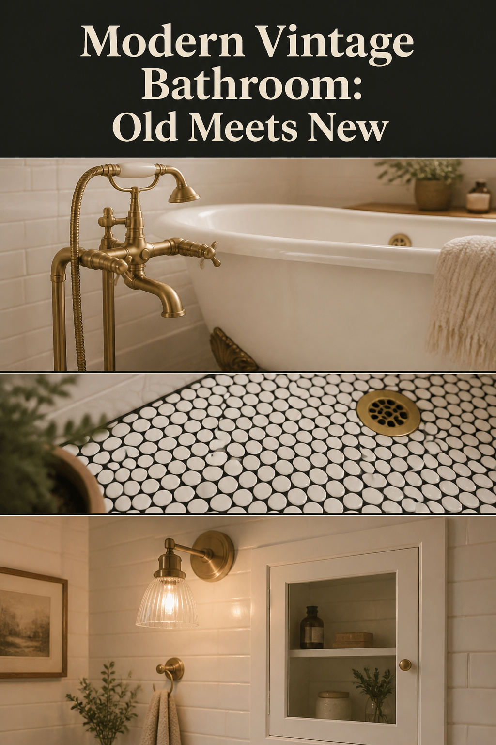
Before you choose a tap or a tile, ask one question: what do I want this room to be? A modern vintage bathroom is not a costume of the past. It is a room you live in, given the quiet character of older things. Answer that and the product choices follow.
TL;DR
- Mix one or two genuine old pieces with current function — update what is hidden (plumbing, ventilation, heating), keep what is seen (tile, tub, trim).
- Brushed brass beats chrome and matte black against period white tile: it warms the palette, patinas with use, and suits heritage rooms. Limit a room to three metal finishes, one dominant at 60–70%.
- Light it warm (2700–3000K), heat the floor under the tile (about $2,500 installed, near $0.89 a day), and stop adding when the counter is still bare.
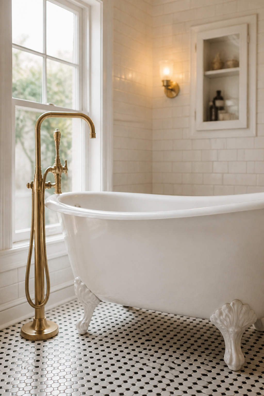
Old surfaces give warmth and history; new systems give the function a 2026 morning needs. This guide walks that balance facet by facet. For the wider picture, see designing a vintage bathroom.
The Difference Between a Themed Bathroom and a Timeless One
A room tips from charming to themed when every element points at the same decade. Nothing is left for the present to inhabit.
When a period reconstruction becomes a stage set
A vintage-style faucet, mirror, soap dish and floor mat — each fine alone, together a set you visit rather than use. Block Renovation: a good remodel “isn’t about recreating the past exactly as it was,” but blends timeless details with modern updates so the space “feels fresh, livable, and uniquely yours.” Choose one or two standout retro features and let the rest stay quiet.
Why old things should earn their place, not match a date
A thing earns its place by how it is lived with, not by how it reads. A cast-iron clawfoot tub is worth keeping not because it is “vintage” but because cast iron is durable, beautiful, and grows more itself with use. The Brownstone Boys: “letting the old details shine while updating everything behind the scenes so the space actually works for modern living.” Get the mix right, Jordan Slocum says, and “the bathroom feels both timeless and totally usable day to day.”
The question to ask before any purchase
Before anything enters: does this belong to the room, or only to an era? An object that solves a daily problem belongs; one added because it “looks vintage” is a prop. Anchor the room in one era, add one or two touches from another, and keep the palette consistent so the room feels chosen, not accumulated.
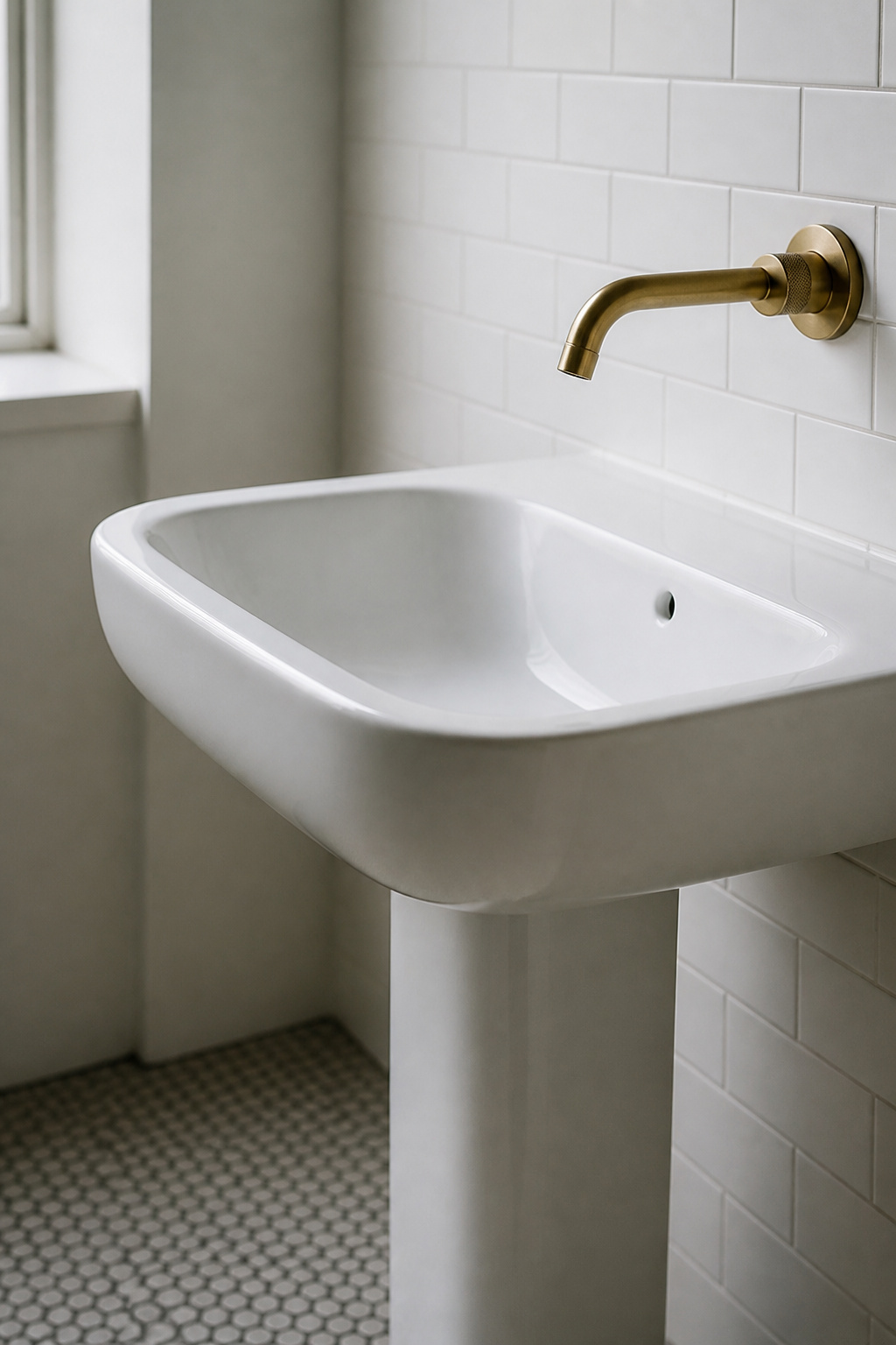
The Statement Vintage Fixture: Where to Anchor the Old-New Mix
One strong old piece carries a room better than ten. Pick it, keep what surrounds it simple, and the balance reads at a glance.
Why one piece does the work of many
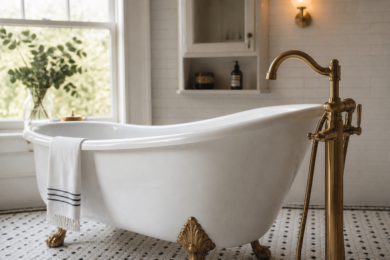
A clawfoot tub, with its sculptural legs and deep basin, becomes a focal point on its own while sitting in a modern space. The ball-and-claw foot comes from 18th-century furniture, so even a reproduction reads as character, not pastiche. In larger rooms the tub anchors everything; in smaller ones a pedestal sink does the same for less. The mix usually starts here, from a single statement fixture.
What modern fittings work alongside it
A floor-mounted freestanding filler keeps the pairing visible as a composition; a wall-mounted faucet is neater but needs plumbing roughed into the wall. Either way: match the faucet finish to the tub feet, the drain and the overflow. Mismatched metals fragment the picture.
Matte black or brushed brass: my answer
Brushed brass. Against period white tile it is the warmer choice — it pulls the palette toward stone, timber and textile, and develops a quiet patina that adds character rather than wear. Matte black is the bold alternative — high contrast, unambiguously contemporary — but it needs warm materials around it, or it reads industrial. One discipline governs both: pick one dominant finish for roughly 60–70% of the metal, allow one or two accents, and stop at three total.
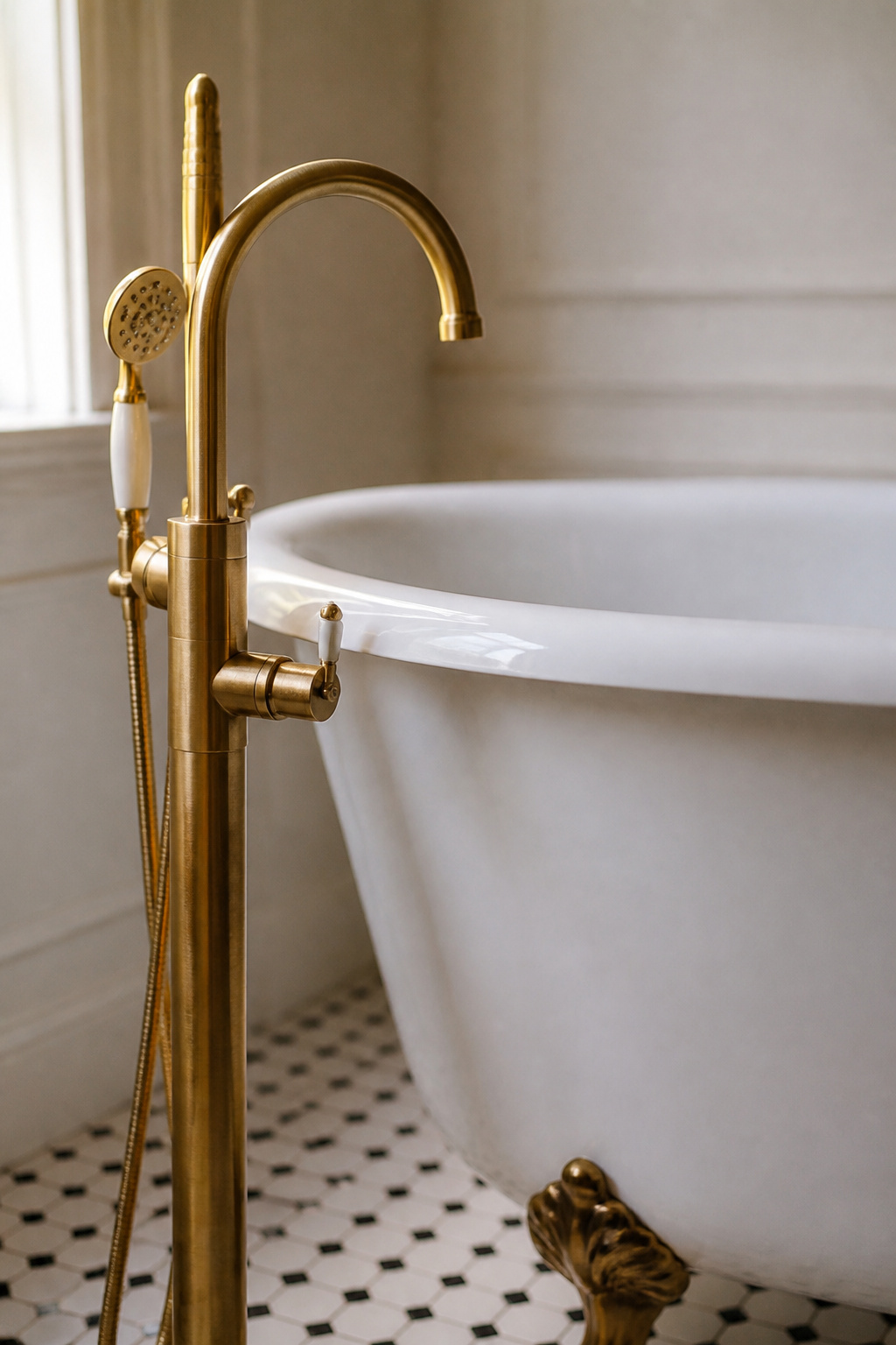
Period Tile With Modern Lighting: A Pairing That Holds Up
Period tile is structure — which is why it outlasts the trends that decoration follows.
Why period tile is the right floor
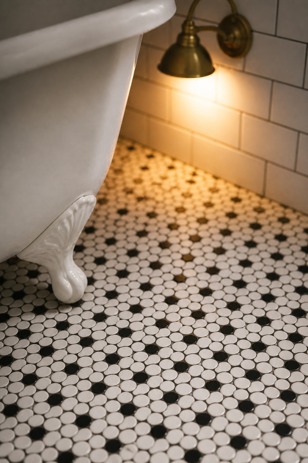
Penny rounds and hexagon mosaics draw the eye through small scale and defined grout lines, reading as both vintage and graphic at once. Black-and-white floor tile is among the clearest hallmarks of early-20th-century bathrooms. The professional pairing is glossy subway that bounces light on the walls, with something more textured underfoot — life without busyness.
Modern lighting that doesn’t fight the tile
Layer the light — ambient overhead, task at the mirror, accent at the wall. Set sconces at eye level, around 60–65 inches either side of the mirror, to kill the shadows a single overhead throws on the face. Colour temperature matters most: warm LEDs at 2700–3000K. Anything above 3500K greys out warm materials and strips the glow from brass and period tile.
The one modern move that updates the room
Add a frameless or thin-profile mirror with integrated edge lighting. The light source is fully modern; what the eye reads is the tile behind it. Warm sconces then do work the overhead never can — raking light across subway glaze and penny-tile grout, catching the variation that makes old tile feel alive.
Modern Function, Period Surfaces: Where Each Belongs
Update what you cannot see; keep what you can. Every row in the table below commits to one answer.
| Element | Keep vintage / update modern | Why |
|---|---|---|
| Tub and sink | Keep vintage | Cast iron and porcelain age well and anchor the character. |
| Floor and wall tile | Keep vintage (or period-style) | Penny, hex and subway outlast trends; the tile is the room’s identity. |
| Plumbing pipes | Update modern | Replace galvanised steel with copper or PEX for pressure and water quality. |
| Ventilation fan | Update modern | A silent unit behind a period vent cover; extraction is essential against mould. |
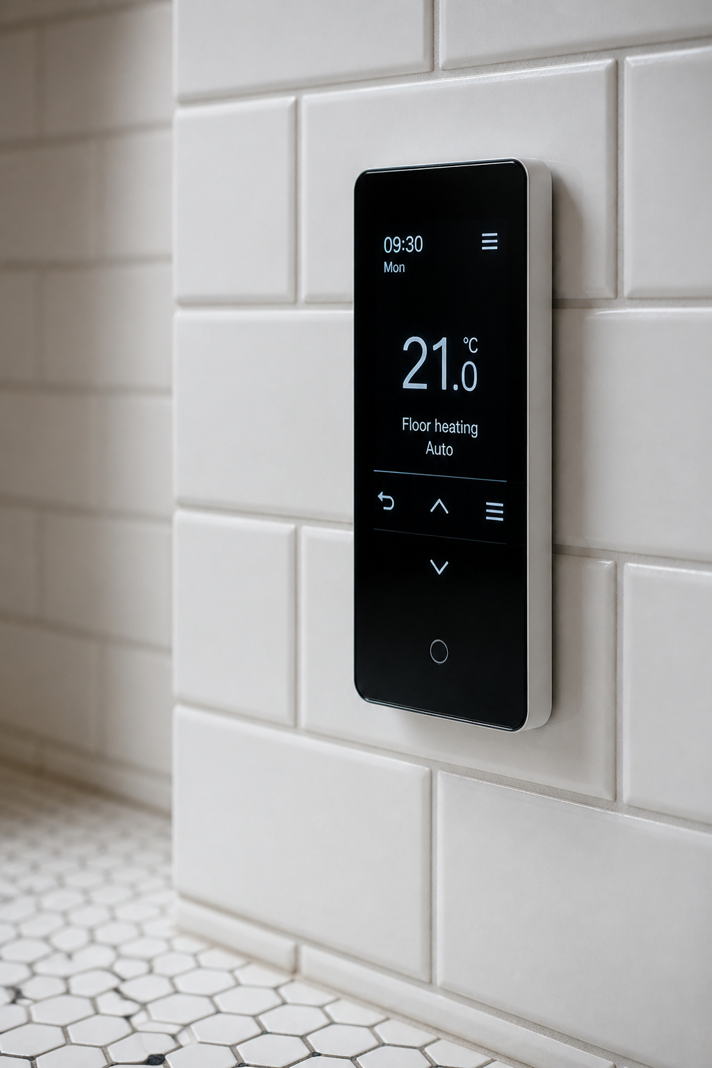
| Floor heating | Update modern | Electric radiant under the tile is invisible — about $2,500 installed, near $0.89 a day. |
| Toilet | Update modern (wall-hung) | A concealed in-wall cistern frees up to 9 inches of floor for the tilework. |
| Lighting | Update modern (warm) | Layered 2700–3000K light; the fittings can still read period. |
| Storage cabinet | Update modern (recessed) | A recessed cabinet keeps the wall flat; the open vintage shelf is the edited alternative. |
Where modern is the only responsible choice
Replace old galvanised pipes; corrosion eventually damages the tile around them. Heated floors are the most satisfying invisible upgrade. Tile installer Isaac Ostrom: a small-bathroom system “is usually in that $2,500-ish range installed, and it’s often under a buck a day to operate with a reasonable schedule.”
Concealing the modern fittings
Exposed chrome-plated copper supply runs are period-accurate — original bathrooms wore their pipework — so visible plumbing is a feature, not a failure. Otherwise, conceal behind tile; a fabric sink skirt is the renter-friendly alternative.
Storage: the cabinet against the open shelf
A recessed medicine cabinet disappears into the wall. The Nordic alternative: one open shelf in plain wood, holding only what is used daily. Three things on it signal confidence; twenty signal anxiety.
Restraint as a Design Tool: What to Leave Out
What you remove matters as much as what you choose. The over-decorated vintage bathroom tips into theme precisely because nothing was ever taken out.
The over-accessorised counter
If your fittings are brass, echo brass once or twice — a mirror frame, a towel ring — not in every object on the counter. Keep the installed metals — faucets, showerheads, light fittings — in one finish, and bring in a second only through small, swappable accents. The permanent decisions stay unified.
The edit test
One question: does this accessory solve a daily problem, or only read as “vintage”? An antique apothecary jar holding cotton buds earns its place; the same jar sitting empty is a prop. If you would not miss it, it was never doing any work.
Why a bare counter reads as deliberate
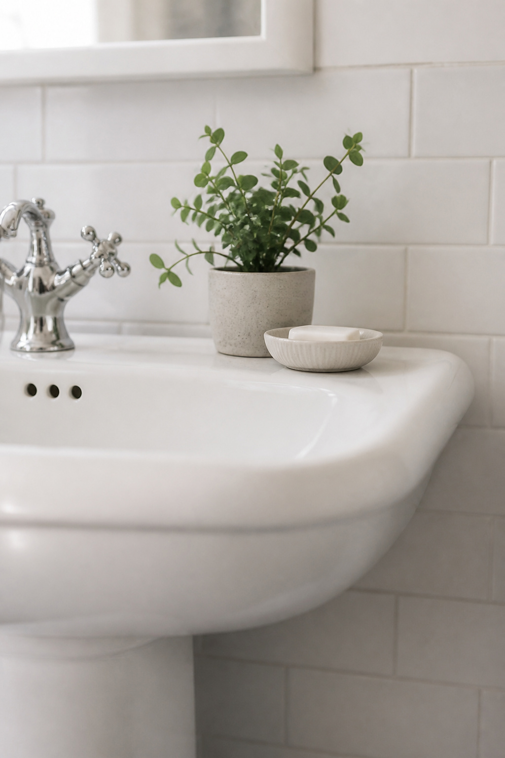
Empty space is not absence; it is what makes the remaining objects legible — rest for the eye, used on purpose. A soap dish, a plant and a folded towel communicate confidence. Eight items communicate worry. Sonas Bathrooms: hold the palette to three or four colours so the vintage pieces stand out “without clutter.” That is how most small vintage bathrooms get updated — fewer, better choices.
The Bold Wall: A Modern Vintage Anchor Without the Fixtures
When the fixtures are all new, a single wall can do the period work instead. A period floral or botanical paper is one of the cleanest bridges between old and new — the pattern carries the era while the clean plumbing and lighting read as current.
One wall, working against clean surfaces
Paper one wall — usually behind the sink or opposite the tub — and leave the rest plain. One bold floral or botanical wall against clean white tile carries the era tension a themed room smears across every surface. Today’s bathroom papers are far more moisture-resistant than older generations; with decent ventilation they are practical.
Patterns that read period without period fixtures
Choose patterns whose reference is cultural rather than architectural — they need no period plumbing to complete them. Botanical studies are a strong 2025–2026 direction; designer Kendall Rabun calls them “a dreamy blend of romance and science.” Faded florals and damask in dusty rose, powder blue or sage read as period-inspired without being locked to one decade, so they sit easily beside contemporary fittings.
When to stop at paint
If the room already has a strong vintage statement — a clawfoot tub, extensive period tile — it needs no wallpaper. Adding pattern to a room with an existing anchor risks tipping it from curated to themed. A single deep colour — navy, forest green, charcoal — earns a similar tension for less, and brushed brass reads beautifully against it.
Decide what the room should be, keep the one or two old things worth keeping, modernise everything behind the surface, and then stop. The room will not date in two years. It will simply be a good bathroom — warm, useful, quietly its own — and built to last.
FAQ
Can you mix matte black fixtures with a clawfoot tub without it looking wrong?
Yes. A white clawfoot tub with matte-black feet and a matching matte-black freestanding faucet reads as deliberately modern-vintage, not period-accurate. The key is matching the feet, faucet, drain and overflow in the same black; mismatched metals fragment the tub. Surround it with warm materials — timber, warm grout, a plant — so it never reads as industrial.
How do you make a vintage bathroom look modern without losing its character?
Update what is behind and beneath the surface — plumbing, ventilation, heated floors under the period tile — while leaving the visible surfaces original or period-sympathetic. Then add layered, warm 2700K lighting and a clear, thin-profile mirror above the sink. Both moves modernise the room’s mood without touching the tile, the tub or the trim that carry its character.
Is brushed brass or chrome better with period white tile in a modern vintage bathroom?
Brushed brass. Chrome suits a clean, minimalist scheme and recedes visually, but brass draws the palette toward warmer stone, timber and textile — more sympathetic to a heritage room. It also patinas with age rather than needing to stay pristine, which matches genuine period tile. For warmth, brass is the committed answer.