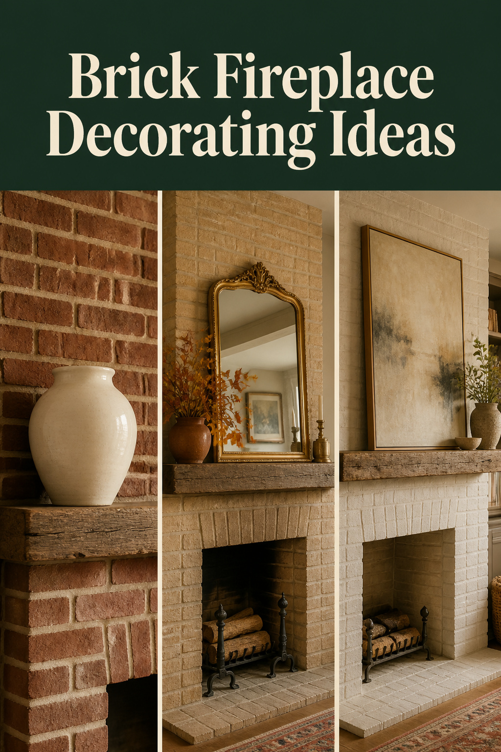
Brick talks, if you know what to listen for. The alternating stretchers and headers of a Flemish bond tell you the fireplace predates 1900 — built when a mason’s bond pattern was a mark of architectural ambition. The orange-red face of a Victorian brick carries a warm undertone that will fight a cool white wall and agree with warm grey. The pale mortar is a design lever most decorators never touch, even though it changes the whole character of the surround. Before any brick fireplace decorating ideas go on the mantel, the brick itself is the brief.
TL;DR
- Read the brick first: colour undertone, bond pattern, and mortar tone each shape which palette and which object materials read well against the surround.
- Objects on a brick mantel must be larger and smoother than on a plain wall — the brick’s repeating grid swallows small, fine, or textural items; one substantial anchor outperforms a grouped cluster every time.
- Painting brick is effectively permanent; limewash is the reversible option, removable by power washing within the first five days of application — after that window it weathers gradually rather than peeling.
Reading the Brick: What Colour, Age, and Bond Pattern Tell You About What Works
A brick fireplace is not one problem — it is several, depending on what century and what masonry tradition built it. The diagnostic comes before the decoration.
Brick colour categories: warm red-orange, buff/yellow, brown-grey, and what palette each accepts
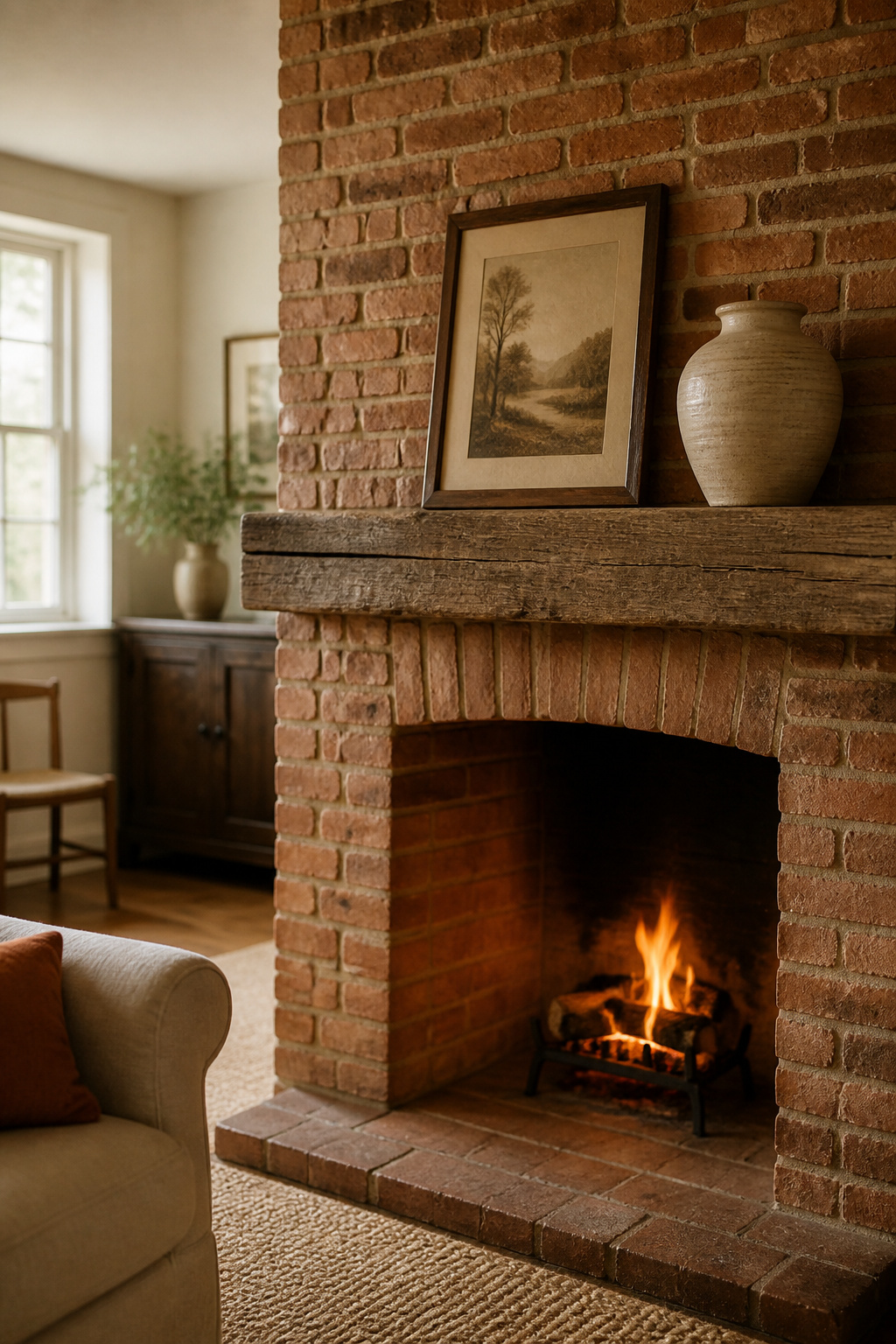
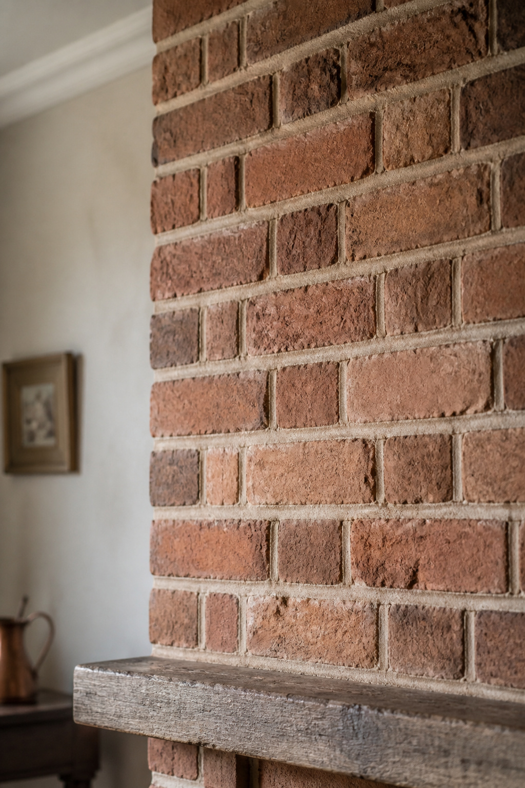
Red-orange brick with warm undertones pairs best with warm grey, natural tan, or cream walls. Avoid pure bright white or icy blue — those colours amplify the brick’s orange cast rather than quieting it. Red brick with purple or pink undertones suits lighter neutrals such as pale grey or greige (Benjamin Moore Collingwood OC-28 and Sherwin Williams Repose Gray are repeatedly cited). Buff and yellow brick is cooler-toned and accepts a wider range; Benjamin Moore Chelsea Gray HC-168 is recommended here because its brownish-violet undertones tame the warmth. Grey or tan brick is the most versatile category and blends into almost any scheme.
| Brick category | Undertone | Wall colours that harmonise | Wall colours to avoid |
|---|---|---|---|
| Warm red-orange | Orange | Warm grey, natural tan, cream | Pure bright white, icy blue |
| Red with purple cast | Purple / pink | Pale grey, greige (LRV 55–65) | Deep saturated red, bright coral |
| Buff / yellow / tan | Cool-warm neutral | Warm grey to deep charcoal | Vivid yellows, stark white |
| Grey / tan | Neutral | Almost any palette | Clashing brights |
Dating the brick by bond pattern: Flemish, English, stretcher — what era the wall is from
Flemish bond — alternating stretchers and headers within the same course — became popular in England during the 17th century and is strongly associated with Georgian and high-Victorian construction from roughly 1700 to 1880. English bond (alternating full courses of stretchers and headers) predates it, dominant from the 1450s to the late 17th century. Stretcher bond — all bricks lengthwise — signals cavity-wall construction from the 1920s onward. A Flemish-bond chimney breast from 1780 earns a careful, heritage-led approach; a stretcher-bond breast from 1935 offers more freedom. For the full styling your fireplace mantel framework — anchor sizing, grouping rules, layering — the pillar guide covers the underlying principles.
The mortar matters too: light mortar recedes, dark mortar advances — how to use that
Light or cream mortar makes the surround feel more modern — the joint grid recedes and brick faces dominate. Dark grey or charcoal mortar advances the joint lines and reads as more traditional. In Rachel’s view, period brick with pale mortar can look washed out; matching mortar to the darker edge of the brick’s colour range gives the surround the weight it earned. Mortar colour can be changed through tuckpointing or a mortar wash without touching the brick faces.
What to Put on a Brick Fireplace Mantel: Objects That Read Against Busy Masonry
A brick surround is the most visually demanding backdrop a mantel shelf will ever sit against. The correction is simple: go larger and smoother than you think necessary.
Why smaller, finer objects disappear against brick — and the scale fix
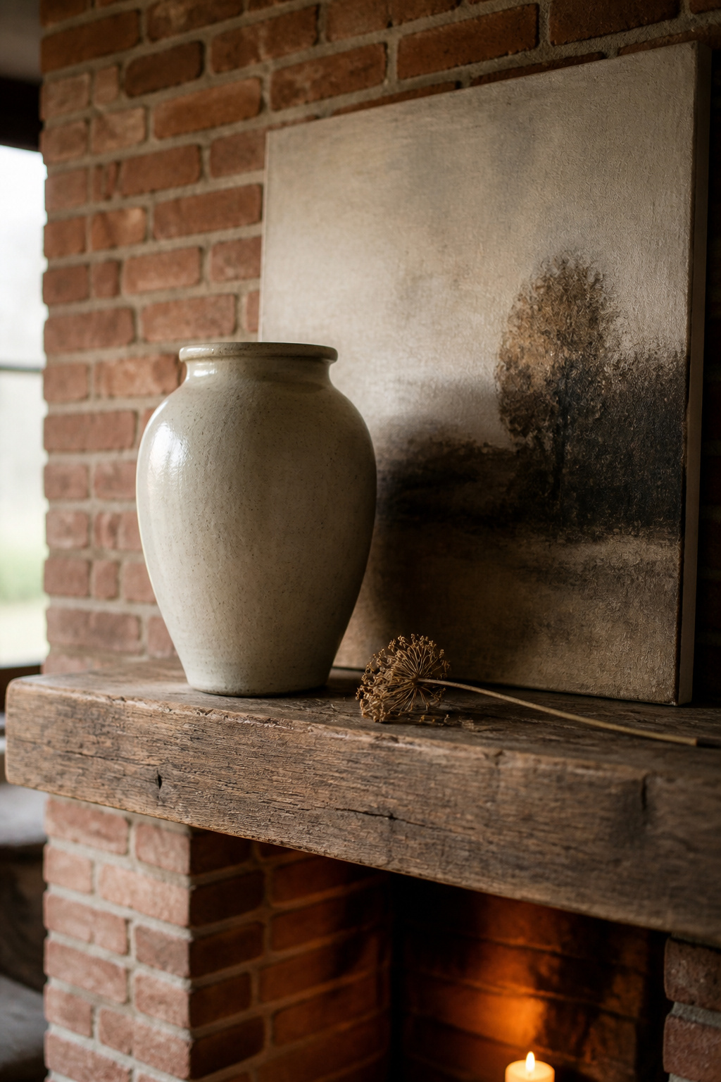
Brick’s repeating grid competes visually with anything placed in front of it. Objects smaller than roughly the height of two brick courses — approximately 5 to 6 inches — read as clutter rather than intention against that pattern. The antidote is scale: a vase at least 12 to 18 inches tall, a mirror at least 24 inches wide, or a canvas at 50 to 75 percent of the firebox opening width will register clearly. Vary heights dramatically — the differential between tallest and shortest objects should span at least one brick course, or everything merges into the wall behind.
Materials that contrast well: smooth ceramics, polished metal, pale wood, glass
Smooth, matte or glazed ceramics create maximum contrast against rough brick — the juxtaposition of different fired surfaces reads as intentional rather than busy. Polished or brushed metals (unlacquered brass, aged bronze, matte iron) catch light in a way matte natural materials cannot. Pale unfinished wood (light ash, bleached oak) contrasts on both colour and texture. Clear glass — decanters, blown vases — adds contrast through transparency; translucency against solid masonry reads well from a distance.
The one-large-object rule for brick mantels: why groupings compete and anchors win
Start with a single anchor piece — a mirror, artwork, or significant vessel — and build out from it. Against brick, that rule applies with more force: the background already provides abundant visual texture, and a grouping of three to five similar-scale objects becomes competitive and restless where a single anchor holds. Leaning large artwork against the wall rather than hanging it introduces depth without adding object count and keeps the composition readable.
The Wall Above a Brick Fireplace: Art, Mirrors, and the Texture Problem
The exposed brick chimney breast changes the rules for everything that goes above it.
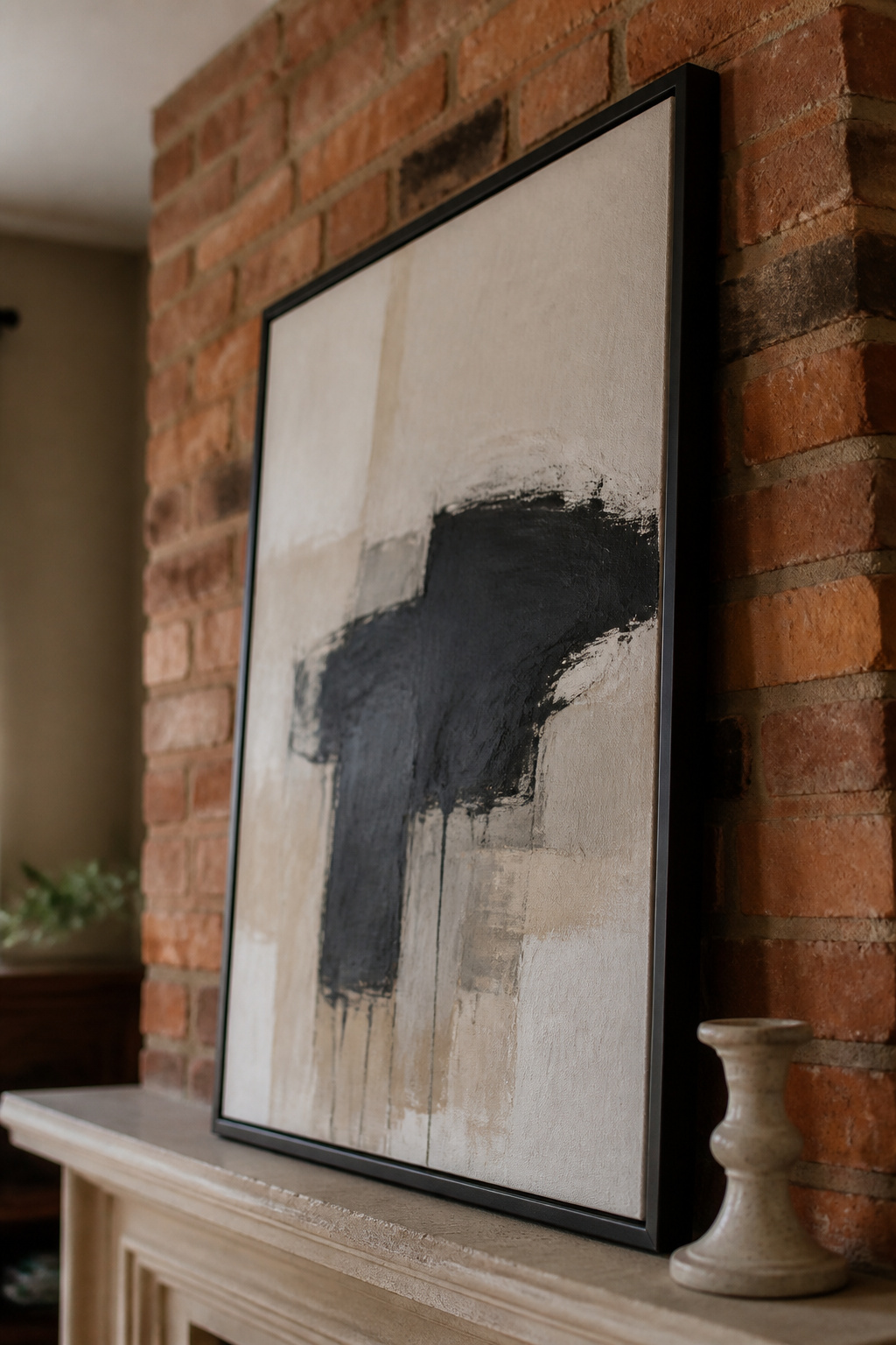
Why most mirrors look wrong above an exposed brick chimney breast (and the ones that work)
Ornate mirror frames with heavy gilding or carved detail add another layer of visual complexity to an already busy surface — the two compete. Mirrors that work best against brick have simple, architecturally honest frames: thick dark iron, unadorned aged timber, plain blackened metal. An arched mirror works particularly well — the curved form contrasts with the rectangular brick grid and echoes the firebox opening’s own geometry.
Art above brick: what scale, frame finish, and subject land against a textured wall
Scale is the primary variable: the piece should span 50 to 75 percent of the firebox opening width. Simple frames in matte black, raw iron, or unstained hardwood maintain contrast against brick without adding a third competing texture. Abstract art and large botanical prints read better than detailed figurative work — detailed imagery risks becoming unreadable against an already complex visual ground.
For those who cannot drill: brick clips — spring-steel hooks that grip the face of a brick — support up to 30 lbs per clip with no drilling and no adhesive, provided the brick face sits at least a quarter inch proud of the mortar joint. For ideas for an empty firebox — screens, stacked wood, plants, and candle clusters — the full range of firebox options is covered there in detail.
The case for leaving the brick wall above bare: when nothing is the right answer
Pre-1900 Flemish-bond brickwork with its inherent pattern variation and aged patina is an architectural asset in its own right. The most resolved answer in a heritage room is often to leave the wall completely clear. A bare breast shifts all the compositional weight to the shelf — and that sets a higher bar for the objects on it, not a lower one.
To Paint or Not to Paint: The Limewash and Whitewash Decision
This is the most consequential choice available to a brick fireplace owner, and the one most worth pausing on.
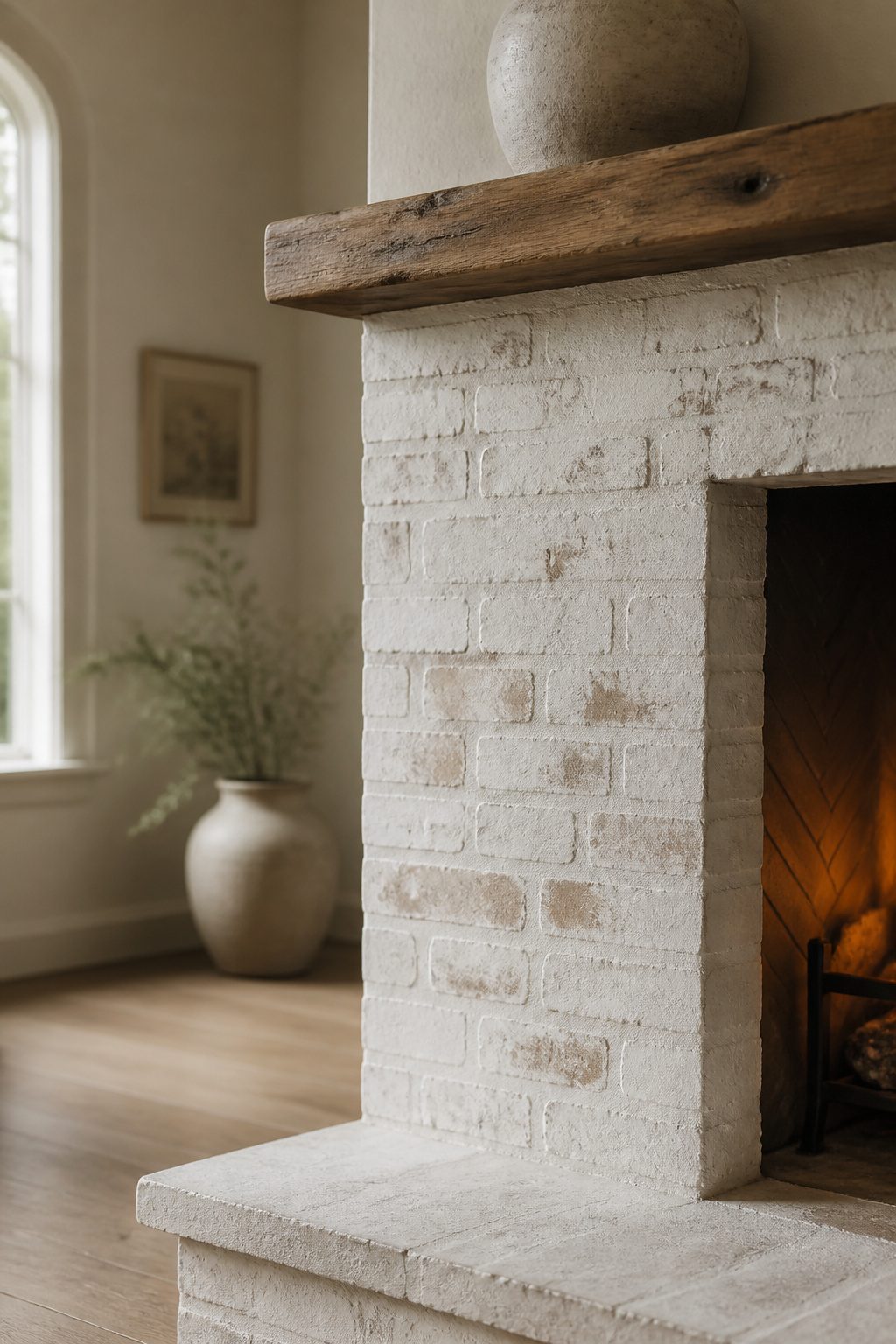
What limewash actually does vs what whitewash does — the material difference
Limewash is slaked lime (calcium hydroxide) mixed with water. It penetrates the fibres of the brick, develops a matte chalky texture, and is the historically authentic masonry finish. Whitewash is a 1:1 or 2:1 mixture of latex paint and water — it mutes the brick’s colour while allowing some texture to show, but the paint vehicle forms a surface film rather than bonding into the masonry. One critical constraint: limewash cannot be applied over previously painted brick, making whitewash the only semi-translucent option for an already-coated surface.
The reversibility question: can you come back from painted brick?
Reversibility governs Rachel’s position on this question. Limewash applied within the first five days can be removed with power washing; once cured, it has penetrated too deeply to wash off — but it weathers gradually rather than peeling. Whitewash lasts 20 to 30 years on interior brick and is removable only by damaging the surface. Painting with latex or alkyd is effectively permanent: removal using gel strippers and wire brushing is caustic, expensive, and frequently damages brick faces. Owners who strip painted brick often discover the underlying surface is darker or more irregular than expected.
When to leave it: the cases where unpainted exposed brick is the right answer
Pre-1900 Flemish-bond or English-bond brickwork carries irreplaceable historical character. Leaving it exposed preserves both the visual interest and the material record. Where dust and soot are a practical concern, a clear breathable masonry sealer — silane or siloxane-based — consolidates the surface invisibly and is far more reversible than any paint. Full painting is legitimate for post-WWII stretcher-bond brick with limited inherent character; for anything earlier, adjusting the room palette to work with the brick is the honest first move.
Styling the Hearth and Firebox: The Surround From Floor to Mantel
The mantel will look disconnected if the hearth and firebox below are ignored.
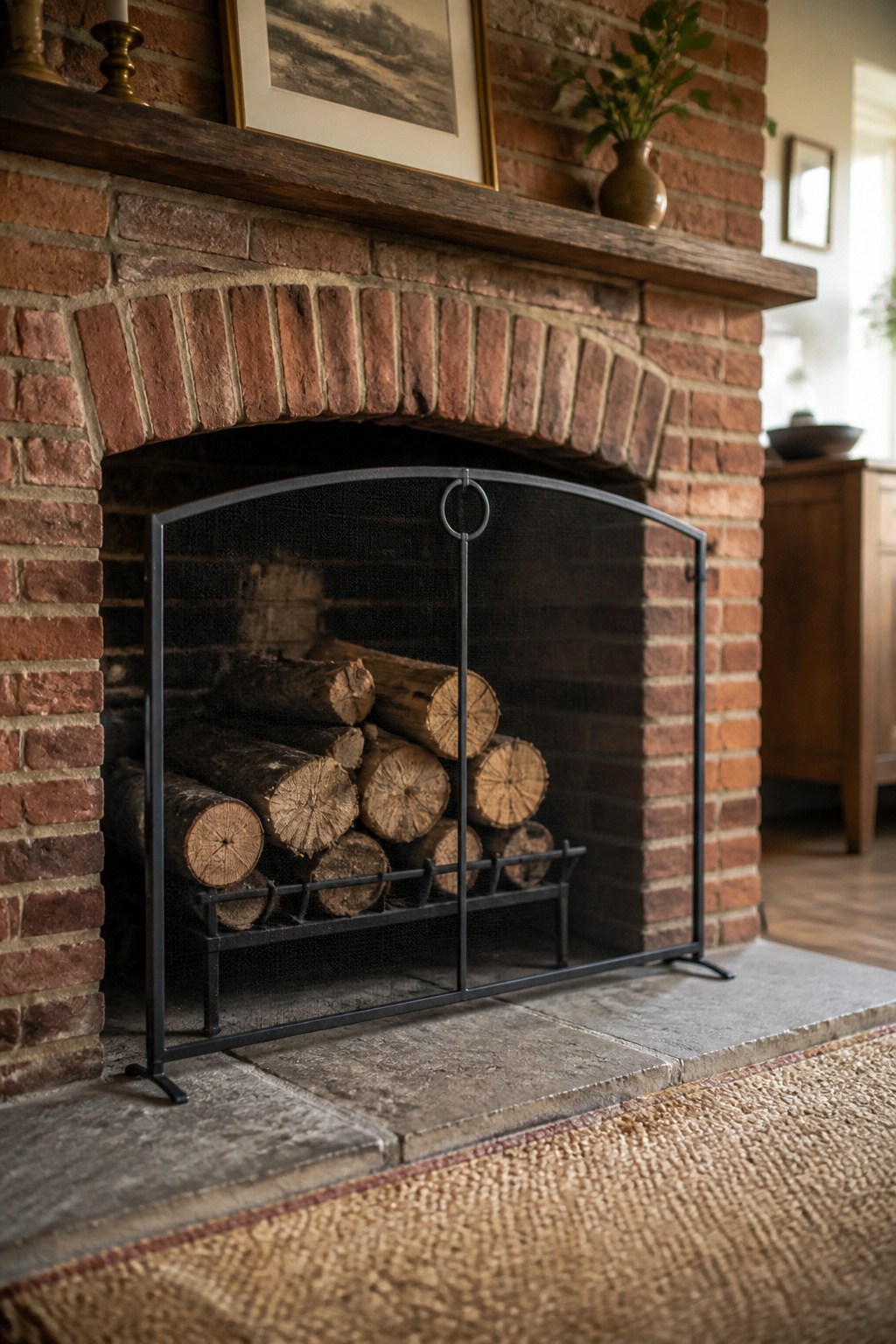
The hearth floor: brick, stone, tile, and the object that sits on it
A hearth rug placed in front of the fireplace opening grounds the composition. When the fireplace is in use, it must be made from fire-resistant materials — wool, fibreglass-blend, or treated synthetic. For a brick hearth that is itself patterned or textured, choose a solid-colour or flat-weave rug; two competing grids at floor level create visual noise. Objects on the hearth floor should be proportioned to the firebox opening — anything narrower than half the opening looks stranded.
The firebox opening on a brick surround: screen, empty styling, or stacked wood
The main options for an unused brick firebox are:
- Decorative screen: brass wire mesh suits Georgian-era brick surrounds; matte-black powder-coated panels work with modern brick or limewashed finishes.
- Stacked logs: varying diameters from thick trunk sections at the base to smaller branches above creates visual rhythm and suits the brick’s rustic palette.
- Candle clusters: a mix of candlestick heights, lanterns, and votives on a tray transforms the dark opening into a warm focal point and adapts easily across seasons.
- Plants: ferns and trailing pothos suit the depth and shade of a firebox and bring contrast against the dark opening.
For styling a small mantel in a tighter room, the firebox screen choice matters as much as the arrangement above — that article covers the small-room proportioning question in full.
Keeping the whole surround coherent: how the hearth, firebox, and mantel read as one
Colour coherence — hearth rug, firebox styling, and mantel objects sharing two or three tones — is what separates a surround that reads as a single feature from three separate decisions. The material language should connect too: if the mantel carries smooth ceramics and pale wood, the hearth should echo pale and smooth. Tall firebox openings call for tall mantel objects; squat, wide openings suit compositions that spread horizontally.
Seasonal Decorating on a Brick Fireplace: What Changes and What Can’t
Seasonal decorating on a brick surround requires working with the brick’s colour temperature, not against it.
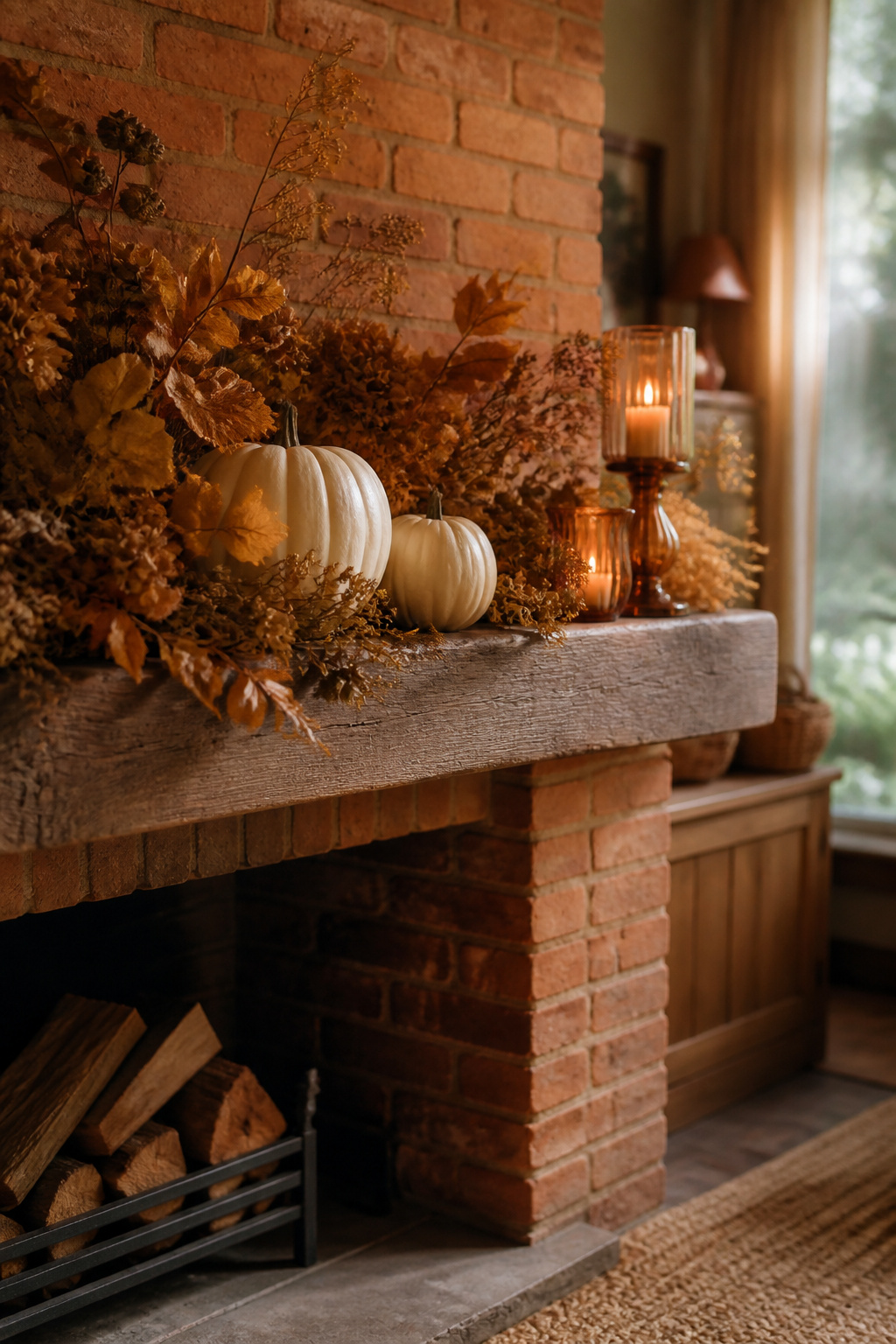
The winter and Christmas mantel against brick: which decorations and which colours hold up
Traditional red-and-green Christmas decor competes with warm red brick — the palette is too close in temperature. The effective alternative is whites, creams, aged golds, and soft greens (sage, eucalyptus). Cream pillar candles, pine branches, neutral ribbon, and simple brass candleholders are the lowest-risk winter palette on any brick surround.
Autumn and harvest: when the warm brick palette is an advantage
Autumn is where warm red brick becomes an asset. Its orange-red aligns naturally with gold, amber, burnt orange, and deep burgundy. White or off-white pumpkins create contemporary contrast more cleanly than orange ones, which echo the brick too closely; foliage in deep golds and rustic browns reinforces the warmth rather than fighting it.
Spring and summer lightness against heavy masonry: the contrast and layering strategies
Spring and summer require deliberate contrast: pale, cool, or translucent objects — white sculptural vases, clear glass, blue-green or sage botanicals — offset the brick’s inherent warmth most effectively. Fresh greenery provides the strongest available contrast; living green against fired-earth orange is a complementary-colour relationship that reads bright and clean. A mirror becomes especially valuable in summer — the reflective surface brings in light and counteracts the brick’s visual weight.
FAQ
What colours look good with a red brick fireplace?
Warm grey, natural tan, and cream are the most reliable wall colours alongside red brick — they harmonise without amplifying its orange cast. For mantel objects, pale neutrals, natural linen, deep forest green, and aged brass provide contrast without clashing. Avoid cool bright whites and icy blues, which increase the brick’s perceived warmth rather than quieting it.
Should you paint a brick fireplace to make it easier to decorate around?
Painting brick is effectively permanent — removal requires caustic gel strippers and wire brushing that risk damaging brick faces, and should be treated as a one-way decision. Limewash is the better option: mineral-based and breathable, removable by power washing within the first five days of application. Pre-1900 brickwork in Flemish or English bond carries heritage value that painting permanently destroys.
How do you hang things above a brick fireplace without damaging the brick?
Brick clips — spring-steel hooks that grip the face of a brick with recessed mortar joints — hold up to 30 lbs per clip with no drilling or adhesive. For heavier pieces, drill into the mortar joint rather than the brick face; mortar is softer and easier to repair. Leaning large artwork against the wall avoids the drilling question entirely.