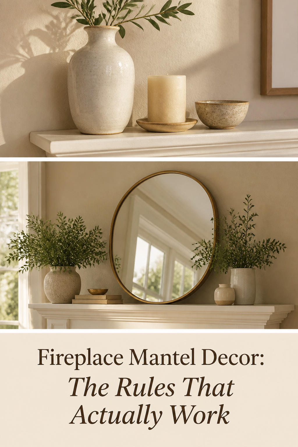
The chimneypiece began as the most ornamental feature of a room for a reason that still holds: it is the one surface the whole room is built to face. In a Georgian sitting room, the fireplace was the fixed point around which classical proportion organised every other piece of furniture and wall treatment. Sit down in almost any room with a fireplace today and the same thing happens — your seating points at it, and the mantel becomes the surface you look at more than any window, wall, or built-in. That inherited authority is exactly why fireplace mantel decor is so easy to get wrong. A shelf this important punishes a careless arrangement, and the generic rules that float around online tend to fail because they ignore the one thing that governs everything else: scale.
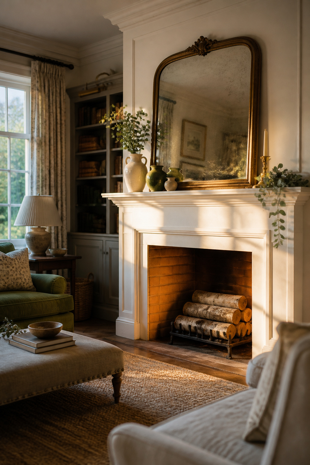
This guide teaches the framework that actually holds — the anchor-piece sizing, the grouping rules, the layering that gives a flat shelf depth — and then maps you to the right deeper path, whether that is decided by your style, your season, or your fireplace’s particular quirks. Master the principles here once and you will read every mantel you ever style the same confident way.
Why the Mantel Is the Room’s Most Demanding Surface
A mantel asks for two things at once that pull against each other. It must carry enough visual weight to anchor the room, yet stay light enough that it never tips into clutter. Most failed mantels fail on that balance, not on taste.
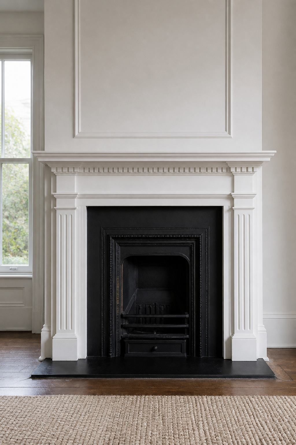
The architectural focal point: why everything in the room answers to the mantel
The mantel earns its difficulty honestly. It started in medieval great halls as a functional hood that caught smoke and stopped sparks reaching the walls, then evolved over centuries into a room’s primary display surface — a place where stone carvings, plasterwork, and coats of arms announced a household’s standing. The Gray Group International design firm calls it “the architectural accent that separates a room with presence from one that merely exists.” That history matters now because the mantel still inherits the eye. When seating arranges itself to face the fire, the shelf above becomes the most-looked-at plane in the house. Style it as the focal point it already is, not as a spare ledge.
What makes a mantel ‘finished’ vs cluttered — the visual weight principle
A finished mantel moves the eye; a cluttered one stalls it. Houzz contributor Vanessa Brunner frames the goal as creating “a look that allows the eyes to travel and focus on more than one object” — not cramming in every knickknack, but giving the gaze a path. The mechanism behind that path is negative space. Designers recommend leaving at least 40 percent of the shelf surface visibly bare, because that emptiness is not dead space but breathing room that makes each object read as chosen rather than incidental. Two or three well-spaced pieces can read as luxury; the same shelf packed edge to edge reads as cheap. The number of objects matters far less than their relationship to the empty space around them.
How to read your mantel: shelf depth, surround style, and what they allow
Before you place a single object, take two measurements and one honest look. A standard mantel shelf runs only 6 to 8 inches deep, with larger ones reaching 10 to 12. A 6-inch shelf physically holds a single front-to-back row; an 8-inch shelf allows minimal layering. That constraint is a built-in editor — it tells you the shelf cannot carry a console table’s load. Then read the surround. A plain painted surround accepts any register, while an ornate Georgian or Victorian one with carved pilasters wants objects that respect its period seriousness or contrast it with real confidence. A Victorian overmantel, with its built-in shelves and mirror backing, changes the brief again: it removes the need for a separate anchor above but asks you to fill several fixed shelves without losing coherence.
The Anchor Piece Rule: Sizing the Hero Object
If you fix one thing on your mantel, fix this. The anchor piece — a mirror, a piece of art, or a clock — sets the scale for everything else. Getting its size right does more for the composition than any other single decision. This is the question of what to hang above the fireplace, and that spoke carries the full firebox-by-firebox math; here is the rule you need to start.
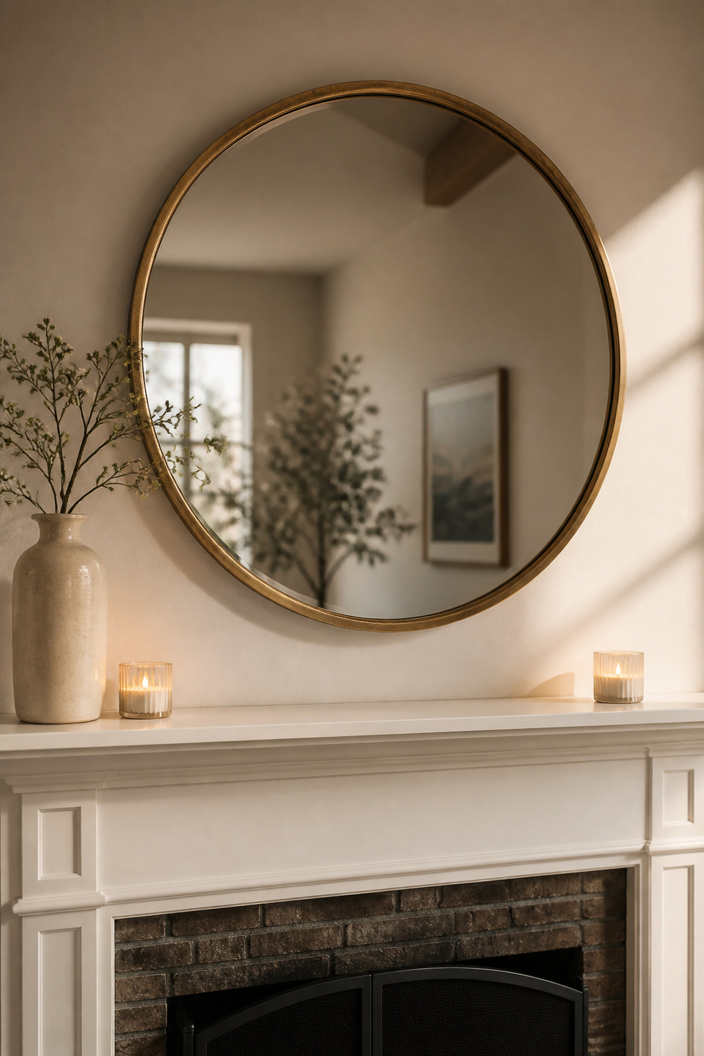
The two-thirds rule: why your anchor should span most of the mantel width
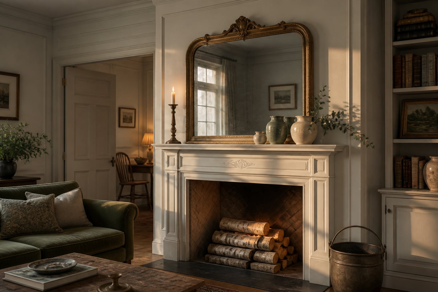
The most reliable sizing guideline cited across design publications is this: your anchor piece should measure about two-thirds the width of the mantel shelf it sits above. ArtworkCanvas.com’s editors put it plainly — an artwork or mirror “should be about two thirds the size of the fire surround and mantel over which it hangs,” and they add a sharp caveat: “resist the urge to use a piece that lines up with the edges of the mantel,” because something slightly narrower or wider reads as a deliberate feature rather than an extension of the architecture. Because the shelf typically overhangs the firebox by 3 to 6 inches on each side, two-thirds of the mantel width usually lands at roughly 50 to 75 percent of the firebox opening — the two framings resolve to the same object. An anchor narrower than half the shelf is the single most common mantel mistake there is; it floats, unanchored, and drains the whole arrangement of authority.
Mirror vs art vs clock: choosing by room light and ceiling height
Sizing decides how big; light and proportion decide what kind. The honest comparison sits below.
| Anchor type | Best room context | Sizing sweet spot | Common mistake |
|---|---|---|---|
| Mirror | Low-light or small rooms; low ceilings | Two-thirds of mantel width | Hanging it to reflect a blank wall, losing the light gain |
| Art | Well-lit rooms; high ceilings (9 ft+) | Two-thirds of mantel width | Skipping sconce lighting on a dark wall, so it disappears |
| Clock | Traditional and period surrounds | Narrower; carries height, not width | Treating a small clock as the whole anchor on a wide shelf |
| TV | Rooms where the screen must live here | Sized to the wall, not the firebox | Mounting it too high for comfortable seated viewing |
A mirror is the most flexible choice and the right one for a north-facing or small room, because it bounces both daylight and lamplight to make the space feel larger — provided you position it to reflect a window or chandelier rather than a bare ceiling. In a low-ceilinged room a large mirror draws the eye upward; in a tall room (9 feet or more), a vertical piece of art does the same without the reflective distraction. A clock remains the traditional anchor for a period surround, offering vertical height and the tactile interest of mechanical movement, with historical precedent stretching from the Georgian era through the Edwardian.
Hang height: 4–12 inches above the mantel shelf, and why that range exists
Height is the other number that makes or breaks the look. Position the bottom of the frame 4 to 12 inches above the top of the shelf — a range, not a single figure, because it does two different jobs. The Direct Fireplaces design team recommends roughly “6 to 12 inches above the mantel,” noting it “keeps the art visually connected to the fireplace while protecting it from heat exposure.” A tighter 4-to-6-inch gap reads intimate and connected, tying the anchor directly to the shelf display below. An 8-to-12-inch gap lifts the eye and lends perceived ceiling height. Cross the 12-inch line, though, and an awkward void opens up: the piece detaches from the mantel and reads as a separate wall decoration. For a standard 8-foot-ceiling room, a 6-to-8-inch gap is the dependable midpoint.
Grouping Rules That Actually Work: Odd Numbers, Height, and Texture
With the anchor sized and hung, the supporting objects are the next problem — and the rules here are the ones readers search for most after sizing. They reduce to three: group in odd numbers, vary the heights, and mix the textures.
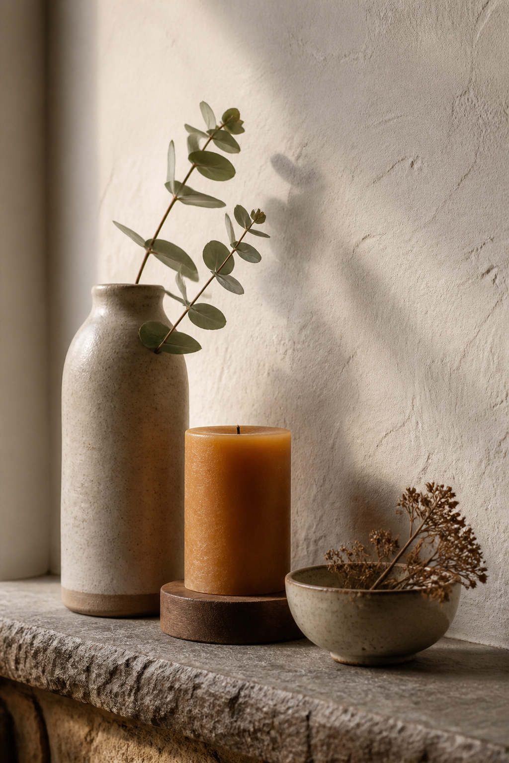
Why three objects beat two: the odd-number principle and its limits
Three is the magic number, and not by superstition. House Digest’s Marco Rossi explains that a grouping of three “looks more natural, less forced, and perfectly balanced” — odd numbers create depth and interest because the eye keeps moving around the group instead of settling into a static, mirror-like pair. Three is the sweet spot: the fewest objects needed to make a pattern without overwhelming a shallow shelf. On a wider mantel of 60 inches or more, the same logic scales to five or seven. But the rule has one hard limit. If all three objects share the same height, material, and colour, it collapses — there is nothing for the eye to differentiate. Number alone does nothing; contrast is what activates the group.
Varied heights: building a visual triangle or staircase
Height variation is what gives an odd-numbered group its life. Place a tall object, a medium one, and a low one so the eye traces a triangle from tallest to shortest and back. Roomtodo’s editors are blunt that this matters more than colour: “if all three items are the same height and colour, the odd-number effect is lost.” A working guideline is that your tallest piece should reach at least twice the height of your shortest; pieces within 20 percent of each other read as the same height and kill the movement. You do not need to buy your way to height, either — a stack of two or three hardcover books under a small vase or bowl lifts it to mid-level and builds a stepped staircase across the shelf for free.
Mixing textures without noise: wood, ceramic, metal, and greenery
The reliable formula for texture is a three-category minimum: something matte (a ceramic vessel or flat stone), something reflective (a brass candleholder or metal frame), and something organic (eucalyptus, dried stems, pinecones). Those three — matte, reflective, organic — keep a shelf from reading either cold or chaotic. The contrast between glazed ceramic and a grainy wood shelf is one of the most dependable pairings in the discipline, and greenery is close to non-negotiable: it adds life and a colour that reads neither warm nor cool against the harder lines of the surround. One restraint keeps it from tipping into noise — hold all your metals to a single finish rather than mixing brass and chrome on the same shelf. This collected, material-rich layering is the heart of warm rustic mantel styling, where genuine age and texture carry the whole look.
Layering and Depth: How to Make a Flat Shelf Read Three-Dimensional
A 6-to-8-inch shelf gives you almost no natural depth, so three-dimensionality has to be built on purpose. Three techniques do the building: stage objects front to back, anchor the composition from its edges, and — when you choose it — let emptiness do the work.
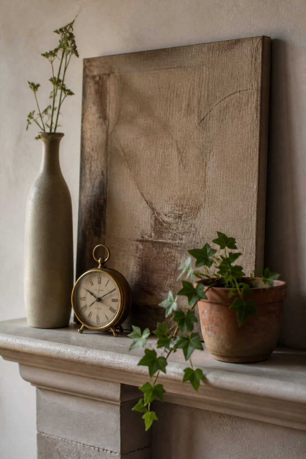
Front-to-back staging: leaning, layering, and what goes on the wall vs the shelf
The three-layer formula puts an anchor on the wall behind the shelf, dimensional objects in the middle (leaning art, stacked books, tall vases), and small objects at the front edge — three distinct planes on a surface only inches deep. Leaning a frame against the wall instead of hanging it is the workhorse move here, because it lets you overlap a smaller frame in front at a slight angle, and two overlapping frames signal distance between planes in a way one hung piece never can. Reach upward, too: tall branches, elongated vases, and candlesticks that rise from the shelf into the wall zone bridge the gap between shelf objects and the wall anchor, so the arrangement reads as one composition rather than two separate displays.
Framing with bookends: anchoring the composition from the edges
Bookending means placing a tall or visually heavy object at each end of the shelf so the eye has something to stop against instead of sliding off the edges. The two objects need not match — they need to read as similar in visual weight. Matching candlesticks or topiaries signal formality and tradition; an asymmetrical pair, say a tall vase against a book stack topped with a small object, reads casual and contemporary while still containing the composition. Bookends matter most on wide mantels of 60 inches or more, where a central cluster looks marooned without anchors at the ends to define its boundaries.
The empty shelf as a choice: when negative space is the point
The most advanced version of layering is leaving most of the shelf bare on purpose. Homes and Gardens reports that designers use negative space to “draw attention to showcase pieces” — leaving 40 percent of the mantel bare highlights a standout sculpture or artwork far more effectively than a crowded display. Empty shelf does the same job as white space on a page: it rests the eye and makes the active section feel intentional. The discipline of pulling a mantel back to one sculptural object and a single sprig of greenery is its own skill — the case for a pared-back minimalist mantel is exactly this confidence that not every surface needs filling. The other end of the layering question is what changes through the year, because the base composition is also the foundation for decorating your mantel for every season.
Mantel Styling by Style: Which Direction Fits Your Room
The same principles serve very different looks. Three style directions account for most of what readers are reaching for, and the difference between them is usually editing — which objects you keep — more than buying an entirely new set.
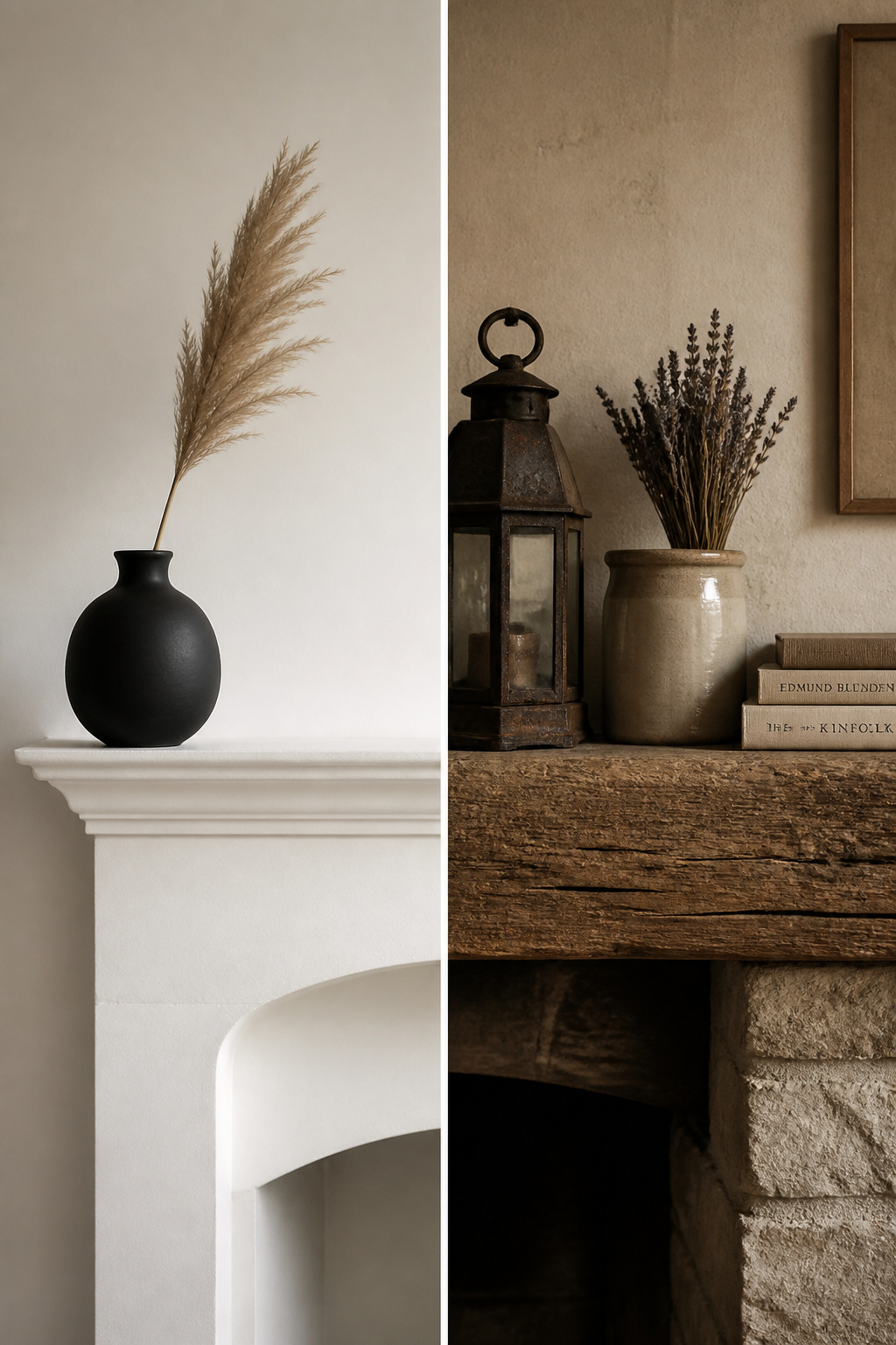
Modern and minimalist: the case for two well-chosen objects
Minimalist styling argues that the surround’s own line, proportion, and material are interest enough, so objects exist to complement the architecture rather than compete with it. The target is two or three pieces of strong individual character with real negative space between them. Reduction is the strategy: fewer colours, fewer textures, fewer heights. Abstract art in a clean frame, a single sculptural vessel, or two or three objects in one material (all white, all matte black) outperforms an eclectic mix — and any metallic accents should hold to a single finish. If your instinct is toward calm and restraint, follow the deeper case for a pared-back minimalist mantel.
Rustic and farmhouse: reclaimed wood, vintage objects, and earned warmth
The rustic register is built on material that carries a record of its own use — a reclaimed beam shows nail holes, grain variation, and a colour depth no new timber can fake. The mistake is reading rustic as maximalist; the best farmhouse mantels use a restrained palette of neutrals with two or three accent materials (dark iron, beeswax, woven jute) applied to objects that have genuine age. A salvaged ironstone vase or a worn dough bowl will always outperform a new object distressed to look old, because authentic wear reads differently from manufactured wear to anyone in the room. Layering is more welcome here than in minimalism, provided a clear anchor and the odd-number rule still hold. The full material-led approach is warm rustic mantel styling.
Traditional and period: proportions, symmetry, and matching the surround era
Traditional styling rests on classical proportion and bilateral symmetry: a central anchor flanked by matching objects at each end. This is not timidity — it is the direct inheritance of Georgian design logic, where symmetry was the governing principle. Victorian taste diverges in one respect: it collects more, layering transferware, small watercolours, and figurines around a central clock, the étagère instinct applied to the shelf itself. Matching the decorating era to the surround’s era is not a law, but it is the lowest-risk start — a Georgian surround wants restrained symmetry, a Victorian one accepts richer collections, and an Arts and Crafts surround calls for handmade objects, tiles, and natural materials. Read the joinery and the cornice profile before you choose; the architecture will tell you which register it was built to carry.
Decorating for Every Season Without Starting from Scratch
Seasonal styling is the single most-searched corner of this topic, and it has one efficient method behind it. You do not rebuild the mantel four times a year. You keep a permanent base and swap a small top layer.
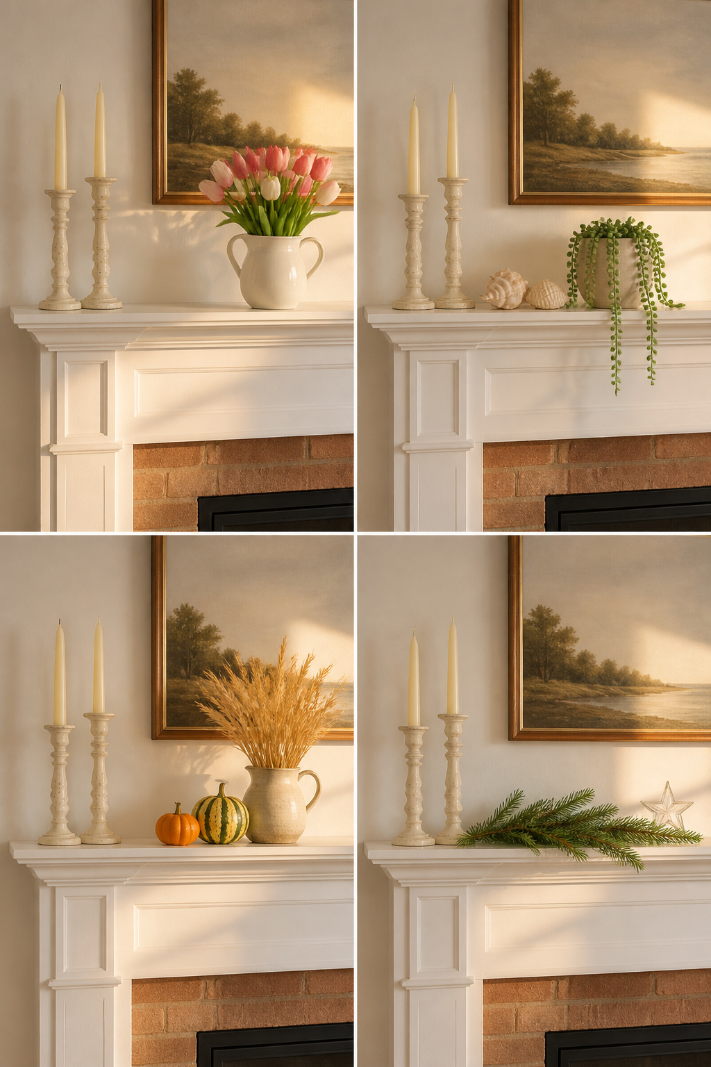
The base-layer system: what stays year-round and what swaps
The base layer is everything seasonally neutral: your anchor mirror or art, a pair of candlesticks in a permanent material like brass or stone, and one or two vessels. Those never leave the shelf. The swap layer is the two or three objects that change — fresh or dried botanicals, a seasonal candle, one small seasonal accent. The payoff is cost control. A full swap of every object can run $50 to $200 a season, while a targeted two-or-three-piece change of botanicals and one accent runs roughly $15 to $40, and the base amortises over years.
The four seasonal moves: spring, summer, autumn, and winter at a glance
Each season is a light edit of that base. Spring trades winter’s evergreen and deep burgundy for tulips, blossom branches, and soft terracotta. Summer goes lighter and airier — shells, sea glass, linen, succulents — and is the season to style the firebox below as a feature rather than leave it a dark void. Autumn, the most-searched season of all, brings warmth and organic texture: dried stems, gourds, pinecones, and aged copper. Winter and the holidays lean on evergreen and candlelight, executed anywhere from a single sprig and white tapers to abundant stacked greens. The base stays put through all four.
What to store and what to reuse: the one-bin rule
A simple discipline keeps this from sprawling: limit each season’s accents to one storage bin. That forces the editing decision at storage time rather than at decorating time, which is what prevents the overflowing-holiday-bin look when everything comes out at once. Invest your money in the base — candlesticks, vases, and vessels are worth buying well, because they hold different things across seasons without being replaced. Spend little on garland and season-specific greenery, since autumn leaves cannot play Christmas and evergreen cannot play spring. The full calendar method, season by season, is laid out in decorating your mantel for every season.
Special Situations: Brick Surrounds, Narrow Shelves, and Empty Fireboxes
Some fireplaces change the first decision before any object is chosen. Three situations come up again and again, and each has its own primary move and its own dedicated guide:
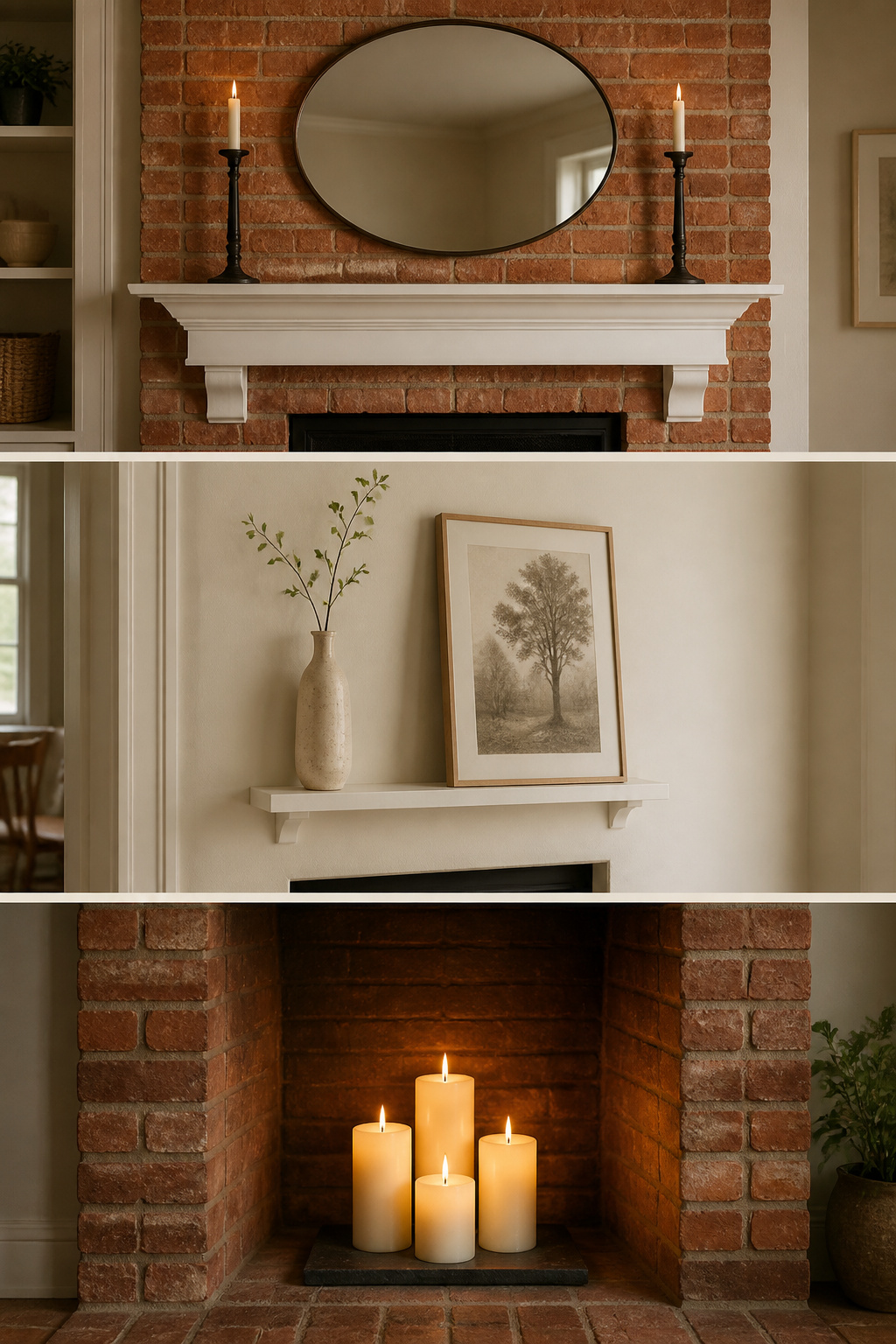
- A brick or stone surround. Red brick reads warm and busy, so it pairs with calm, warm-toned objects — cream, white, iron-black, woven texture, vintage mirrors — rather than chrome, glass, or graphic modern art. A white-painted shelf gives the display a neutral base to sit against so it does not compete with the masonry pattern behind it. The full approach to working with a brick fireplace surround treats the backdrop as an asset.
- A narrow or shallow mantel. On a shelf 48 inches or less, size the anchor to the lower end of the rule — about half the width — so it does not overpower a small room. On a shelf under 6 inches deep, go vertical instead of horizontal: a single tall vase or a leaning print creates interest without demanding shelf footprint. The dedicated method for decorating a narrow or shallow mantel is built on scale and proportion.
- A non-working firebox. A dark empty opening below the shelf undermines even a well-styled mantel, because the eye drops to the void. Fill it — a candle cluster on a tray, stacked birch logs, a decorative screen, a large plant, or art leaned inside the opening. The complete set of options for styling a non-working firebox addresses the zone below the shelf.
What Not to Do: The Most Common Mantel Decorating Mistakes
The fastest way to a better mantel is often subtraction, not addition. These three mistakes account for most of what goes wrong, and each has a fix that follows directly from the rules above.
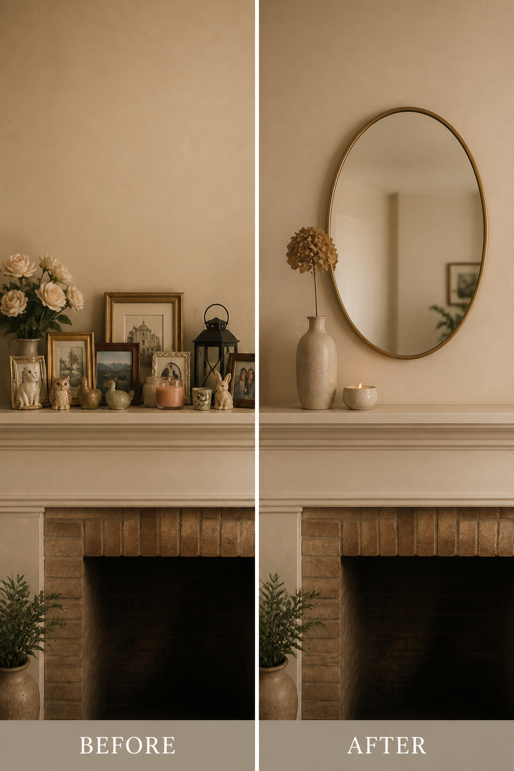
- Going too small with the anchor. An undersized mirror or piece of art looks lost above the shelf and leaves the arrangement, as the DIY Playbook puts it, feeling “like it has no center.” The fix is to measure before you shop: note the shelf width, calculate two-thirds, and hold the piece up against the wall before committing. If it covers less than half the shelf, it is too small.
- Matching everything. A set of identical objects — same colour, same finish, same material — reads as a merchandise display because the eye has no contrast to rest on. Do not abandon cohesion; change the kind of it. Unify by palette or by theme instead of by matching, pairing one natural material, one ceramic, and one metal so the group coheres through tone rather than through sameness.
- Overcrowding. LivingEtc warns against the “gold, wood, glass, art, mirrors, ceramics, a piece of driftwood and a hockey trophy all on one mantel” instinct to display every treasured thing at once. Run the edit-down test: remove one object, and if the composition looks better, remove another, stopping only when a removal makes it worse. Then stand 10 feet back — if you cannot pick out a clear anchor, a secondary point of interest, and real empty space within three seconds, it is still overcrowded. The holidays are the most common trigger, so hold the 40-percent-bare rule even then.
The whole framework comes back to three decisions made in order: size the anchor to two-thirds the shelf, group the supporting objects in odd numbers with varied heights and mixed textures, and protect the negative space that makes it all read as intentional. Get those right and the style, the season, and your fireplace’s particular quirks become a matter of which deeper path to follow — not a question of whether the mantel will hold together. It will.