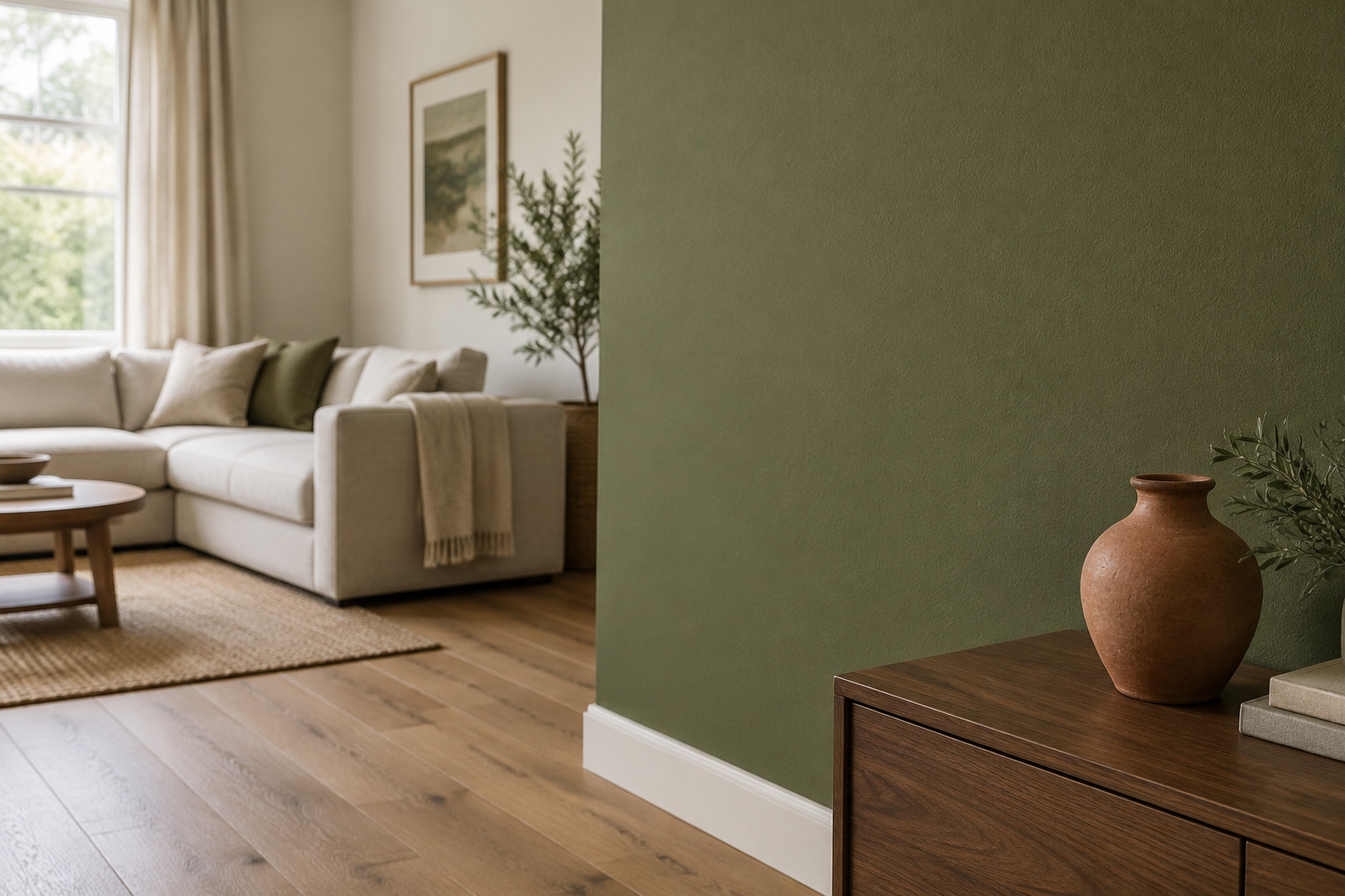

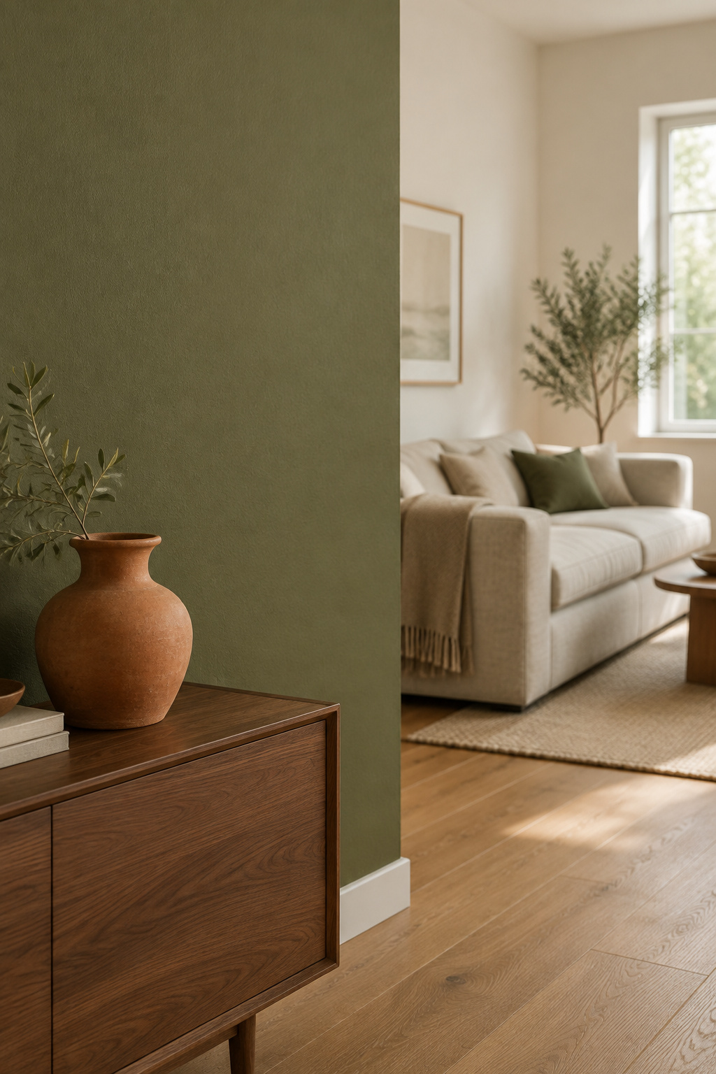
The most useful thing I know about what colors go with green walls is that the answer lives in undertone, the second hue sitting beneath the one you can see. Two greens that look like siblings on a chip can want opposite partners. A pairing a mood board swears by will still go muddy once it is up, and almost nobody tests for it.
TL;DR
- Read the undertone first. A warm shift wants cream, camel, terracotta, oak and brass; a cool shift wants crisp white, charcoal, navy and walnut.
- Pairs that hold: Sherwin-Williams Rosemary SW 6187 with cream and camel; Benjamin Moore Black Forest Green HC-187 with Sherwin-Williams Naval SW 6244.
- Keep clay in the accent tier of the 60-30-10 split: ceramics, a cushion, a throw.
Why ‘Earthy Tones’ Isn’t an Answer
You have a green wall you like and a list of suggestions you cannot act on. The gap is vocabulary.
The mood-board vocabulary that sounds specific and isn’t
Wayfair’s pairing guide runs on blanket families (brown, beige, blue, gray), as though each works with any green. Even the guides that name real products justify the choice with adjectives: this creates sophistication. None of it can be checked against your wall.
The real variable behind every pairing that works: undertone
A paint’s undertone is a secondary hue beneath its visible mass tone. As Sherwin-Williams puts it, the closer the undertone sits to the mass tone, the truer the color appears. Warm bases are red, orange or yellow; cool bases blue, green or gray.
What this guide gives you instead of adjectives
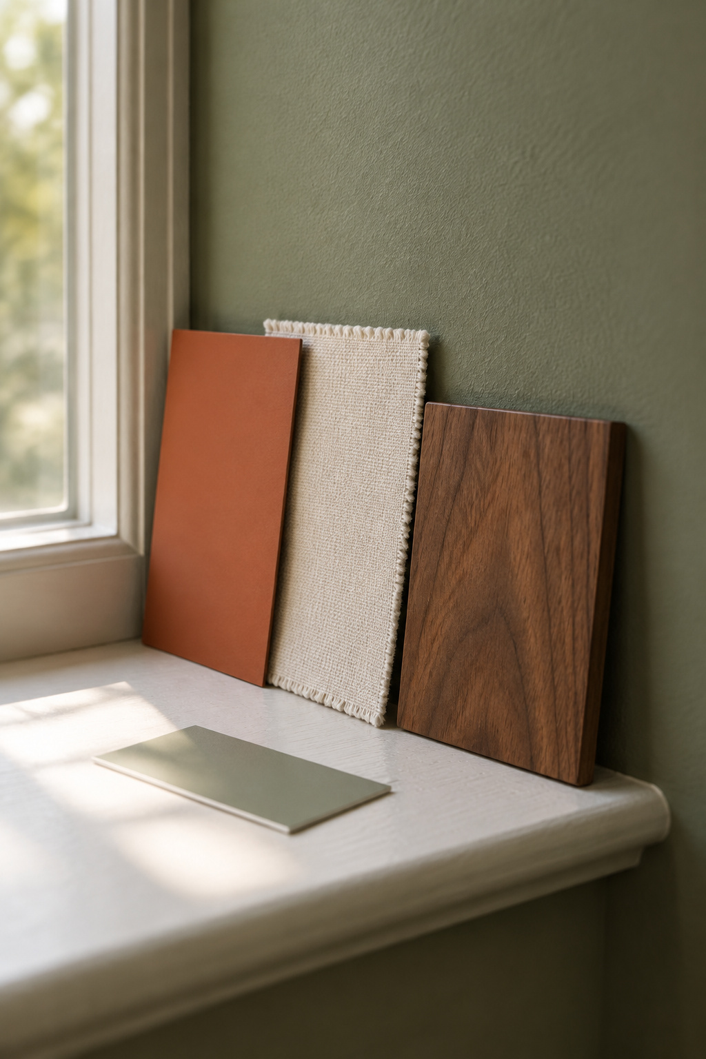
Each pairing below names a paint code or a material, so your own sample has a specific comparison. Shade names are not evidence. Do the white-paper test today, before you shop.
What Colors Go With Green Walls: The Named Pairs That Hold
Six pairs, split by temperature.
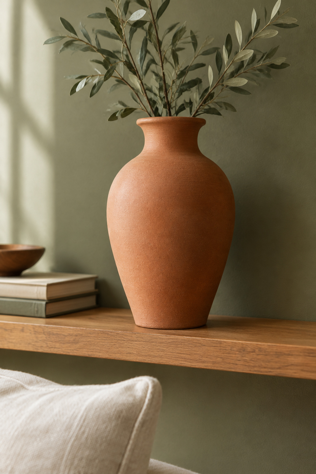
Warm greens paired against warm partners
A yellow or brown base settles when the room repeats it back.
| Green on the wall | Named partner | Why it holds |
|---|---|---|
| Sherwin-Williams Rosemary SW 6187 | Cream trim, camel upholstery | Both repeat its yellow-brown base |
| Benjamin Moore October Mist 1495 | Sherwin-Williams Rookwood Terra Cotta SW 2803 | Both warm-olive; colder orange fights |
| Any olive | Unlacquered brass, matte black hardware | Brass lifts the gold; black gives edges |
Cool, gray-leaning greens against cool partners
Cool greens carry blue or gray underneath.
| Green on the wall | Named partner | Why it holds |
|---|---|---|
| Sherwin-Williams Evergreen Fog SW 9130 (LRV 30) | Crisp blue-based white trim | Creamy off-white goes muddy |
| Benjamin Moore Black Forest Green HC-187 | Sherwin-Williams Naval SW 6244 | Two saturated cools, one family |
| Farrow & Ball Studio Green No. 93 | Sherwin-Williams Peppercorn SW 7674 | Both cool darks; chocolate would clash |
If what you have is a sage on the walls, how much gray it can carry before it stops looking green is a separate question.
Reading the table against your own green
The white-paper test tells you which half is yours. Match levels as well as temperature: a pale sage against a near-black partner fails on intensity even when both are cool. Room orientation shifts the read, and the light-direction guide in this series carries those numbers, so re-test there before you blame the partner.
Terracotta, Clay and the Warm Accent That Almost Always Works
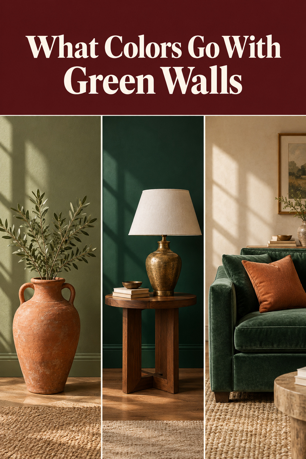
Start with a single terracotta bowl on an oak shelf, set against a sage-olive wall in side light from a window.
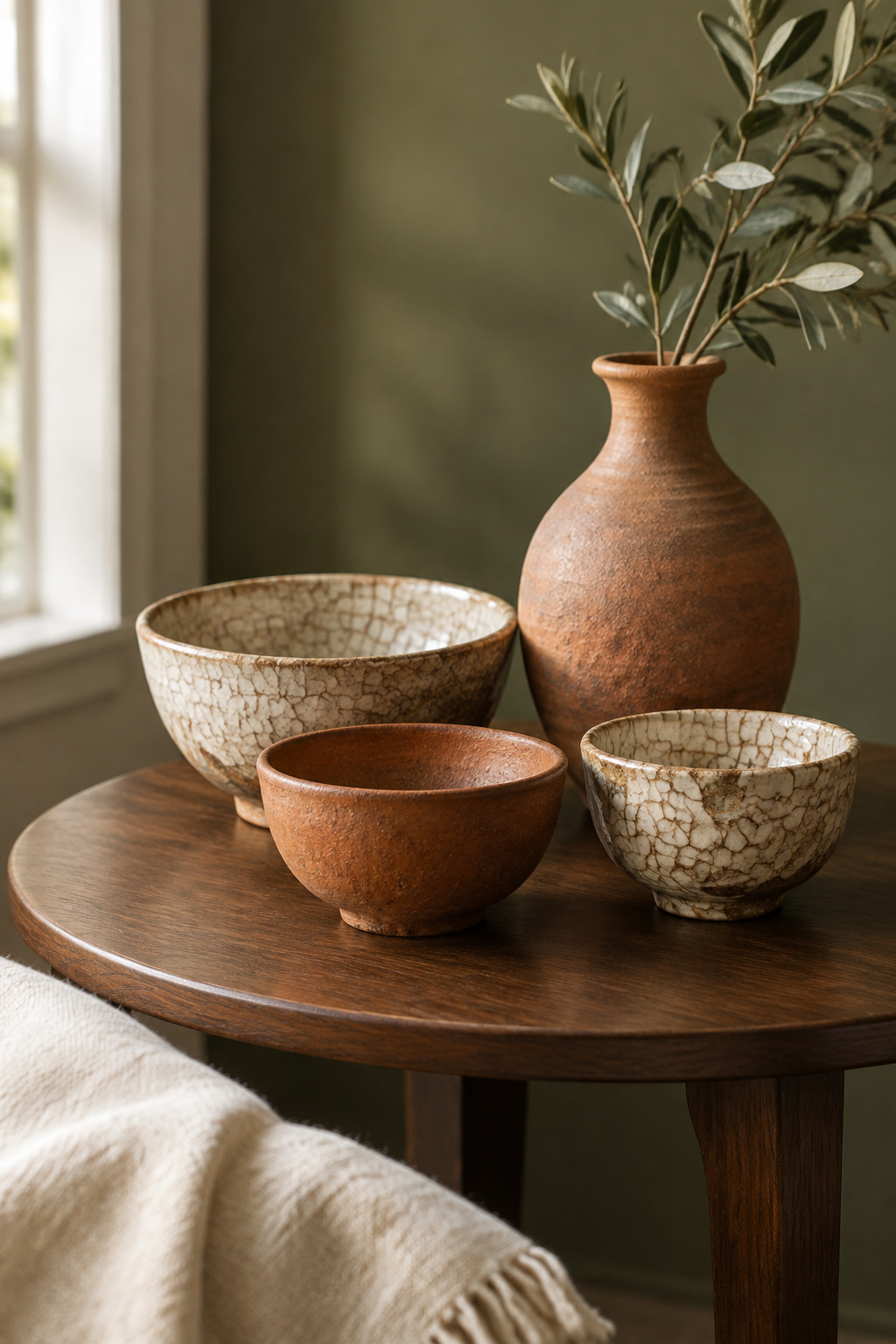
Why a warm clay or terracotta accent flatters nearly every green
Green and clay sit close to opposite on the wheel, which gives a soft complementary contrast rather than a collision, and keeping both muted stops it turning nursery. Sherwin-Williams Rookwood Terra Cotta SW 2803 belongs at accent scale, not on a whole room. Redend Point SW 7695 is the softer clay for a cooler green.
How much to use before it competes with the wall
Here 60-30-10 earns its keep. Sixty parts go to the dominant tier, the green wall and its neutrals. Thirty go to the secondary, usually the large upholstery. Ten go to accent, and clay belongs there, in ceramics and small objects. On the sofa it would take the dominant tier.
Ceramic and textile: the right scale
Keep it to vessels, a cushion or a folded throw, decorative rather than structural. A handmade zellige in a clay-red glaze does the same at hearth scale, though tile costs belong elsewhere in this series. Buy one clay object and live with it before adding more.
Two Material Pairings That Decide the Room
Floor, table, lamp and hardware already carry color, whether you chose it or not, and they fill more of your view than any cushion.
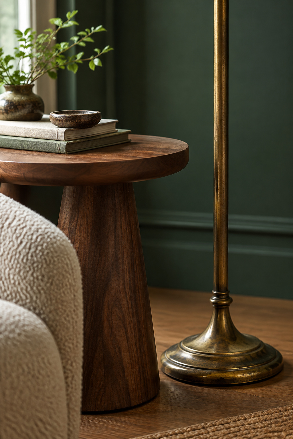
| Material | Which greens it suits | Why |
|---|---|---|
| Warm oak, honey to golden | Olive, warm sage | Repeats the yellow base |
| Walnut | Deeper, cooler bottle greens | Holds up where oak looks thin |
| Unlacquered brass | Warm, olive-leaning greens | Patina pushes the gold forward |
| Matte black | Sage or olive looking washed out | Definition instead of drift |
Which wood tones sit with which greens
Natural wood is close to a free win: oak for the warm half, walnut for the deeper cool greens. Walnut needs one clarification, because the wood trade’s own explanation gets repeated badly. Freshly milled black walnut heartwood runs greenish before oxidation and steaming even it out to chocolate. That describes raw stock at the sawmill, not the finished piece on your floor.
Brass against black metal — which one your green wants
Warm metals push a green’s yellow content forward, and that decides the call. Brass does most for warm, olive-leaning greens. Against a blue-leaning green the same brass can leave a wall looking faintly sour, where matte black would have held it. New York designer Barry O’Brien’s rule is one main finish and maybe one accent.
Why these two calls matter more than any accent color choice
Cap a room at roughly three material tones in one temperature family, and every later paint or textile choice becomes forgiving.
The Pairing That Fails Most Often
A client of mine, in tech, had a meditation room finished exactly as she imagined it and could not use it. The trouble was a wall clock. She would settle, her eye would go to it, and the sitting was over. I took the clock off the wall and the room worked that afternoon. One object can hold a whole room hostage, and in a green room it is usually an undertone problem in disguise.
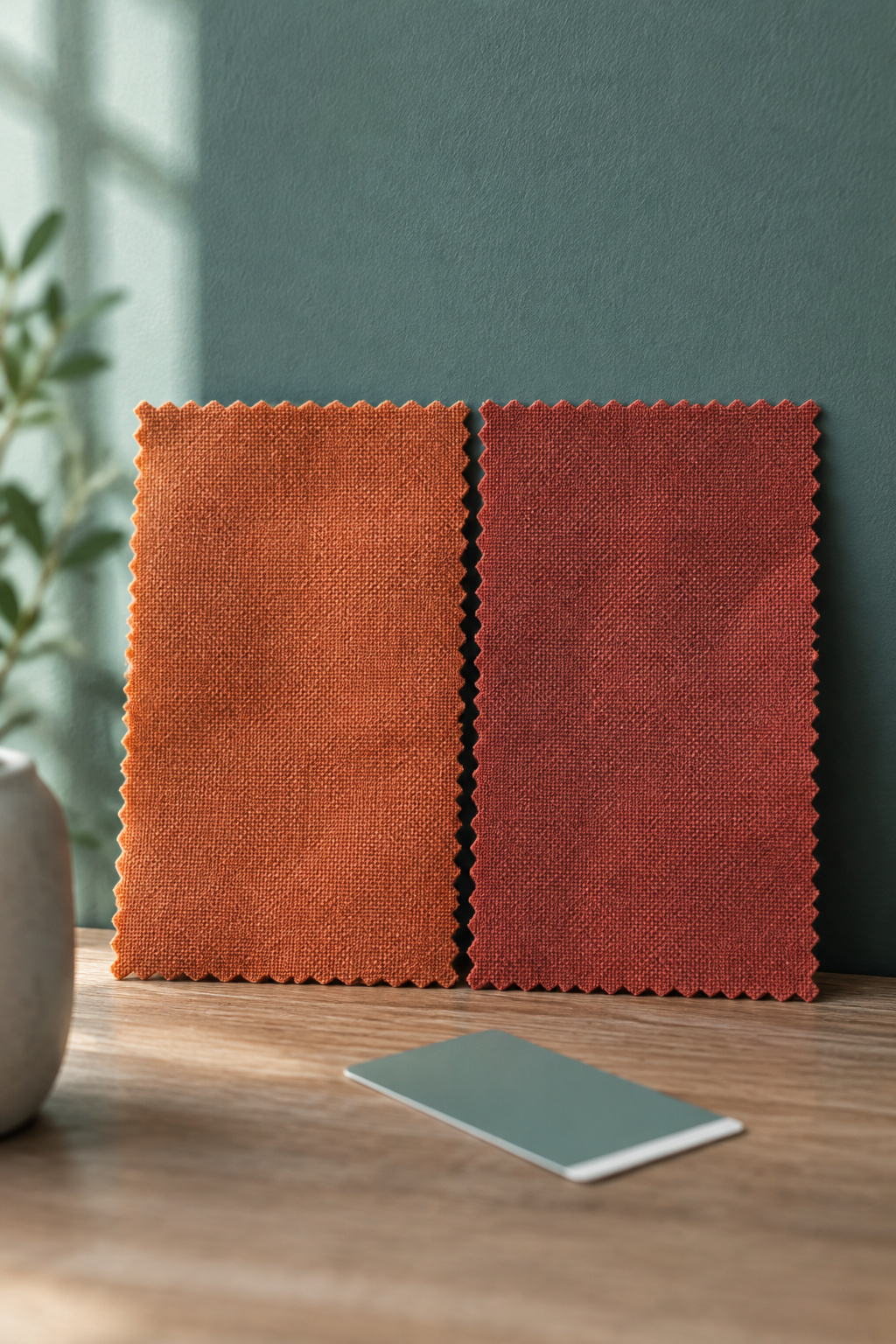
The mismatch that looks fine on a mood board
The failure runs both ways along one rule. The common half is a warm, orange-heavy terracotta against a cool, blue-leaning sage. Its mirror is a cool gray or icy blue-white against a warm olive, which drains the olive’s vitality.
Why it’s an undertone clash, not a taste failure
Set both swatches against a pure white reference and the bases show. A green that read neutral in a bright showroom can reveal a cool blue-green base on the wall, and that is when a warm terracotta starts to fight it.
How to catch it before you commit
Test both samples together, at full size, in the room’s own daylight. If the pair looks muddy instead of rich, you have the clash. The fix is a swap within the same temperature, a cooler brick-red in place of an orange-heavy terracotta.
If Your Green Is the Sofa, Not the Wall
Some of you have read this with a sense it doesn’t fit. If your green arrived as furniture, you are right.
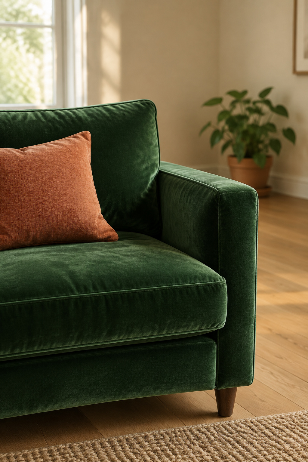
Why this guide’s logic assumes green paint, not a green sofa
Everything above assumes green is the dominant tier of 60-30-10, which is what a wall is. A green sofa sits in the secondary tier, so the wall becomes the dominant decision and the proportions invert.
Where the inverse question gets answered
That case gets its own guide, organized by the sofa’s shade instead of wall-pairing logic: if your green is the sofa, not the wall. If you haven’t chosen the green yet, the wider survey of green living room ideas sets the decision order first.
Undertone decides the pairing, and a shade name decides nothing. Read your green against white paper, take the matching half of the table, and match levels as well as temperature. Settle wood and metal into one temperature family before you think about cushions. When a room will not come together, look for the one object pulling against the wall before you add anything — subtraction is faster than correction.
FAQ
What color curtains go with green walls?
White or off-white is the safest pairing, because it scatters light and keeps brightness in check against a bold wall. Match intensity inversely. Pale greens take darker brown or tan curtains, and a dark green wall wants lighter, more reflective neutrals. For olive, muted gray works well.
Does green go with gray furniture?
Yes. Sage with gray is a calming combination, especially alongside natural wood and texture. It depends on matching intensity: pale sage suits a mid-gray sofa, while a deeper, more saturated green needs a darker, almost-black gray beside it to hold its own.
What color rug goes with a green living room?
Follow the undertone of the green already in the room. Warm, yellow-based greens like olive take beige, terracotta, rust and brown rugs. Cool, blue-based greens like emerald take gray, blue or crisp white, and ivory or light gray keeps things airy. Darker greens want a lighter rug.