
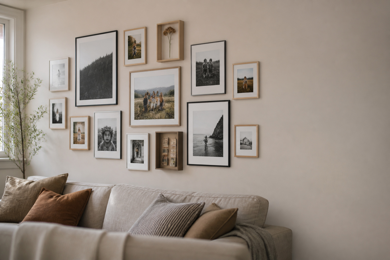
Most walls in a home are decorated with things you bought. A family photo wall is the rare one decorated with things that happened to you — and that difference is why the best family photo wall ideas have almost nothing to do with layout and almost everything to do with what you choose to hang. A bought print asks to be looked at. A photograph of your own people asks to be lived with, which is harder to design well and more rewarding to get right.
TL;DR
- Edit hard: 10–15 photographs make a clearer wall than fifty, and the editing is the design work — do it on the table, not on the wall.
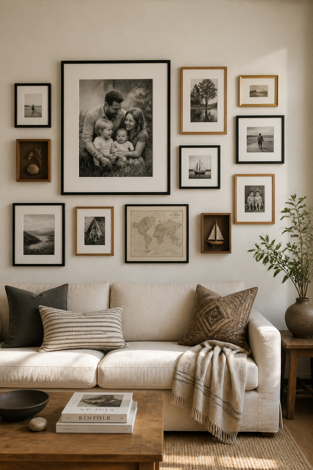
- Unify the treatment so a diverse collection coheres: one or two frame finishes, a consistent white mat, matte prints, and black-and-white conversion to erase the colour gaps between eras.
- Build the wall to grow — picture ledges or a rail, 3-inch gaps, an off-centre start — so next year’s photos join in five minutes, not a renovation.
The question to begin with is not where the nails go. It is quieter than that: what do I want this wall to say about how we live? Designers have a name for the direction this thinking has taken in 2026 — the memento wall — but the instinct behind it is old. The full gallery wall guide, from layout to hanging covers the mechanics; this is about the content those mechanics serve.
The Wall That Belongs Only to You: What Makes Photo Walls Different
Why personal photos in a living room do something no bought print can
A framed photograph is always present in a way a phone gallery never is — it works on you all day without being summoned. Psychologist Geoffrey Beattie described displayed family images as a social binding device: they spark conversation and give a household a shared visual language. Researchers studying the home call them social snacks — small, constant reminders of the people you love that quietly hold loneliness at bay. No bought poster, however beautiful, does that work.
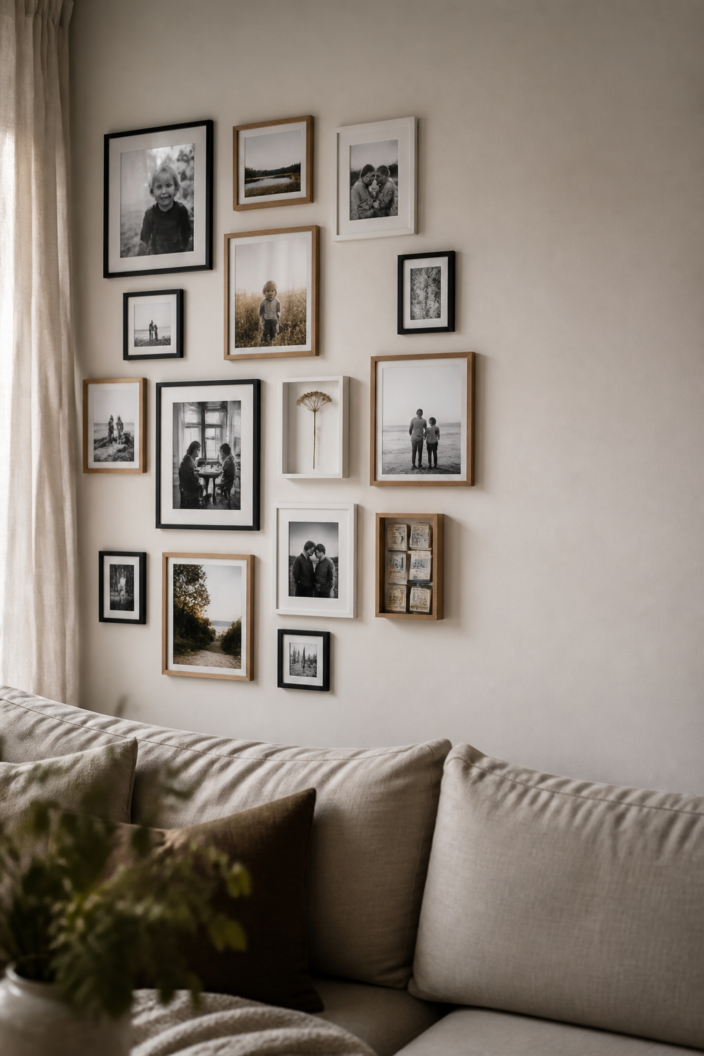
The 2026 memento-wall direction: from matched prints to collected biography
The trade has noticed. Writing in Homes & Gardens this February, Charlotte Olby framed the memento wall as the gallery wall’s replacement — “less about perfectly-picked artwork and more about decorating with meaning and memory.” In April, Ideal Home reported Etsy naming “Everyday Exhibits” a key 2026 trend, with gallery-print searches up 80%. People are leaning into “a collected over time look,” as Etsy’s Dayna Isom Johnson put it, rather than matched frames and symmetry.
The design question to ask first: what story do you want this wall to tell?
Before layout, before frames, ask what feeling or period of life this wall should hold. That answer is the filter — it decides which photographs earn a place and which stay in the box. Designer Julia Zajac of Camden Grace Interiors treats the wall as a living scrapbook: “If it tells your story and brings you joy every time you pass by, it’s working.” It is the rare design brief you already know the answer to.
Editing the Collection: Why Fewer Photos Make a Better Wall
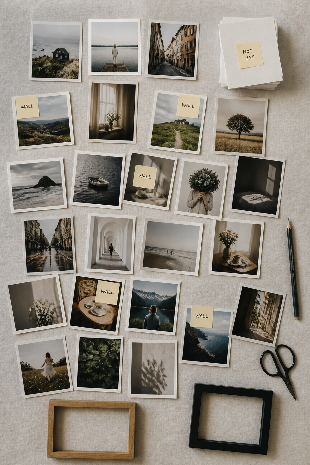
The curation principle: what a wall of sixty photos says vs a wall of twelve
The Nordic habit here is lagom — not too much, not too little, the right amount — and it applies to photographs as cleanly as to furniture. A wall of sixty competing snapshots says nothing in particular; a wall of twelve says these are the moments that mattered most. The editing is the design work. Ten to fifteen photographs is the workable range for a full wall, and odd numbers — three, five, seven, eleven — sit more naturally than even ones.
How to select: the narrative thread that earns a photo its place
My own rule is a single question asked of every print: does this photo earn its place by what it shows, or only by nostalgia? Nostalgia alone is not enough — a moment that means everything to you may read as nothing to the room. Favour candid frames over posed ones: a child mid-run, a face caught unaware, ordinary life. And crop tight at the printing stage, so the expression fills the frame rather than floating in it.
The editing process — what to rotate out so the wall stays alive, not archived
A wall that never changes stops being seen — the photographs recede into wallpaper, and the eye walks past them. So design for movement. Choose three to five anchor photographs that stay permanently, and leave two to four positions as rotating slots, refreshed yearly or after a milestone. Designer Sean Symington’s advice is to start small and let the wall grow — which it cannot do if every slot is already fixed.
Consistent Treatment: Printing, Matting, and Finish
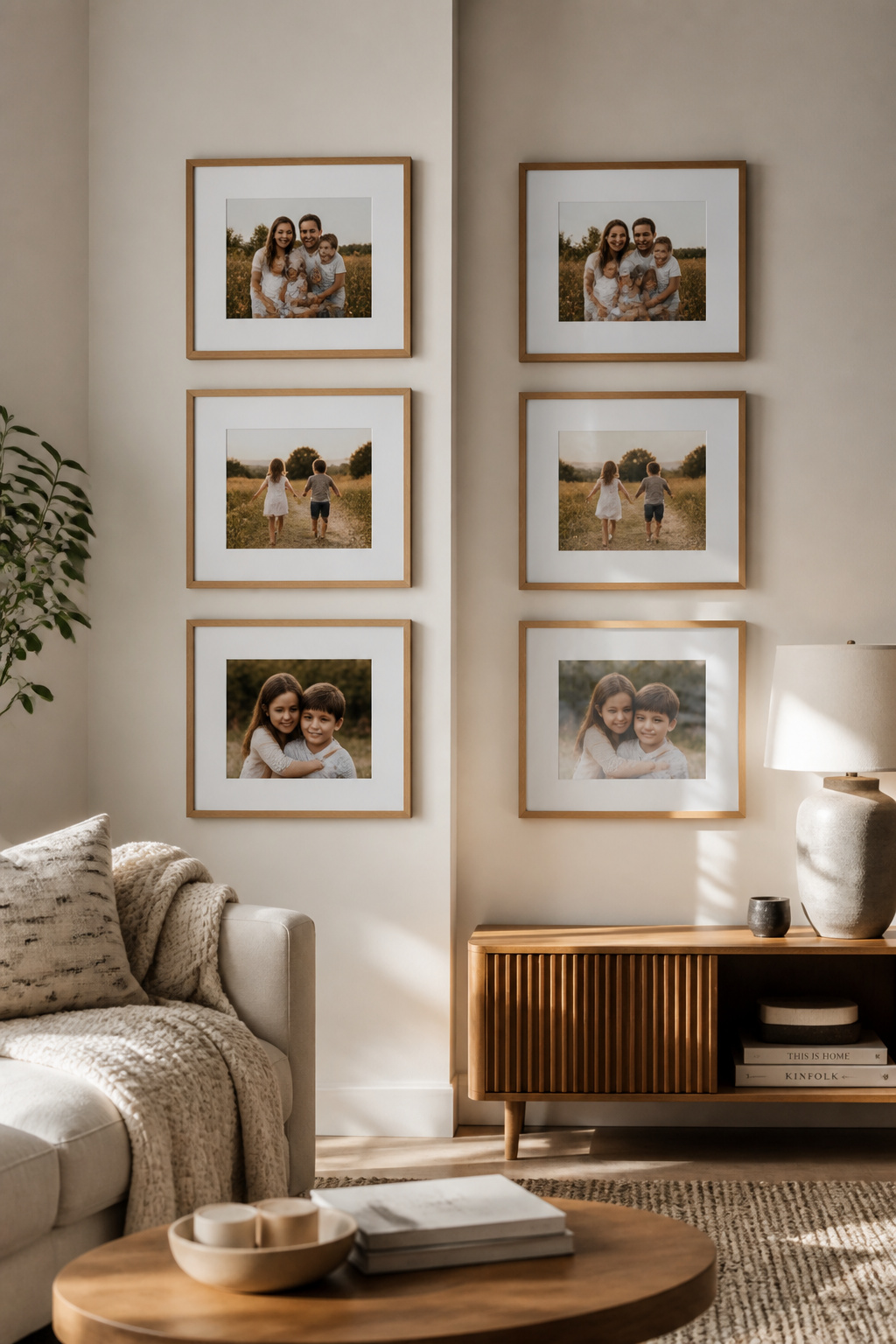
Print finish choices and what each does to the wall’s reading
This is the step most family walls skip, which is why most look accidental. For a mixed collection in a living room with real daylight, matte is the cohesive choice: zero glare from any angle, the highest tonal purity, and a surface that reads consistently across photos of different ages and colour casts. Lustre saturates more but catches light behind glass; metallic shimmers in a way that breaks a mixed wall apart. For black-and-white prints especially, matte holds the tonal gradations.
The case for consistent mat width even when frame sizes vary
A consistent white mat is the great equaliser. Use roughly 1.5–2 inches on small frames (4×6, 5×7), 2–3 inches on medium ones (8×10), 3–4 inches on larger pieces — so the mat scales but the language stays the same. A wide mat floats the photograph rather than letting it fill the frame, the gallery presentation that lifts a snapshot to considered art. Keep the colour neutral; a coloured mat pulls the eye to the border instead of the face.
Converting mixed-era photos to black and white: the fastest way to unify a collection
The single biggest inconsistency in a family collection is colour temperature — a 1980s film print and a 2024 phone photo do not share a palette. Remove colour and they become one family. Monochrome also forgives grain, casts, and soft exposure, turning technical flaws into texture. Apply one consistent conversion across the whole set, not photo by photo, and order it from a proper lab rather than a phone desaturation. The case for running the photos in black and white goes deeper still.
Mixing Photos With Mementos and Objects
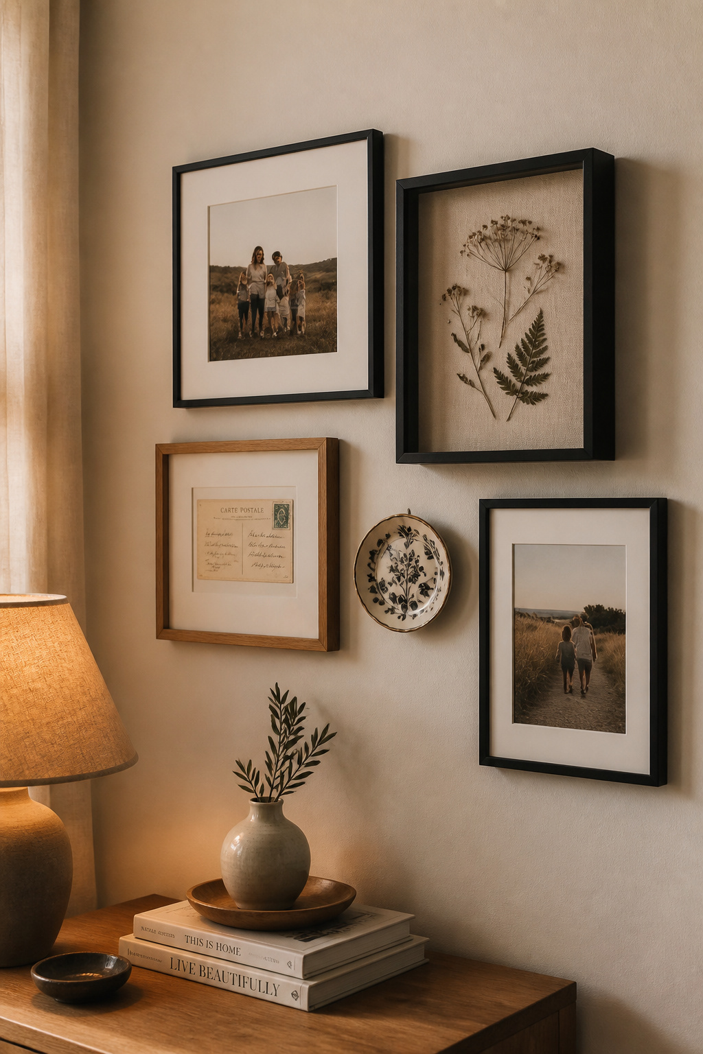
What qualifies as a memento for the wall: objects with story vs objects with personality
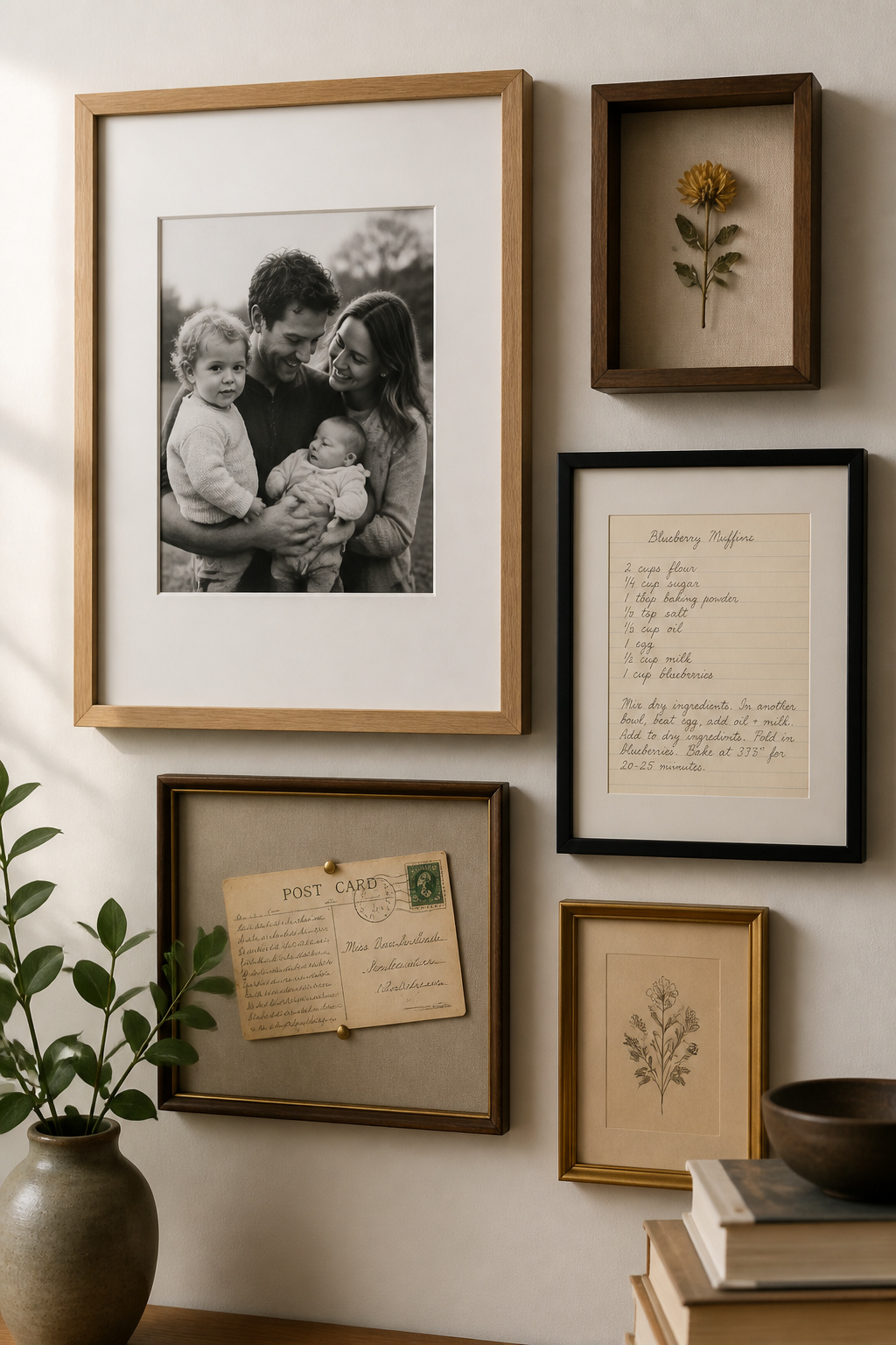
The test is specificity. A vintage postcard bought for its look is decoration; a postcard sent to you, from a particular place, by a particular person, is a memento — and the wall reads differently to the people who live with it when everything on it carries a precise story. The Homes & Gardens coverage lists the territory: framed letters, pressed flowers, matchbooks, tickets, a handwritten recipe in a loved one’s hand. The frame turns the keepsake into wall art.
Scale and projection: how three-dimensional objects sit in a flat composition
A shadow box brings depth onto a flat wall. Match its depth to the object: roughly 1 inch for flat items like pressed flowers, 2 inches for small objects like matchbooks or a shell, 3–4 inches for anything bulkier, plus a little room so nothing presses the glass. A linen or cotton backing suits most things; velvet flatters metallics. In your floor plan, treat a shadow box as the visual weight of a medium frame, not a small one.
The rule for mixing: one category of object per wall
Here is the discipline that keeps a memento wall from becoming a flea market: limit yourself to one category of non-photo object. Paper mementos, or framed textiles, or ceramics on plate hangers, or objects in shadow boxes — but not all four at once. Photographs plus one memento category plus a consistent frame family reads as designed; add plates and mirrors and sculpture on top and it reads as chaos. As Etsy’s Dayna Isom Johnson notes, the best walls feel “collected, not coordinated” — and one object category is what holds the collection together.
Keeping the Wall Updateable as the Family Grows
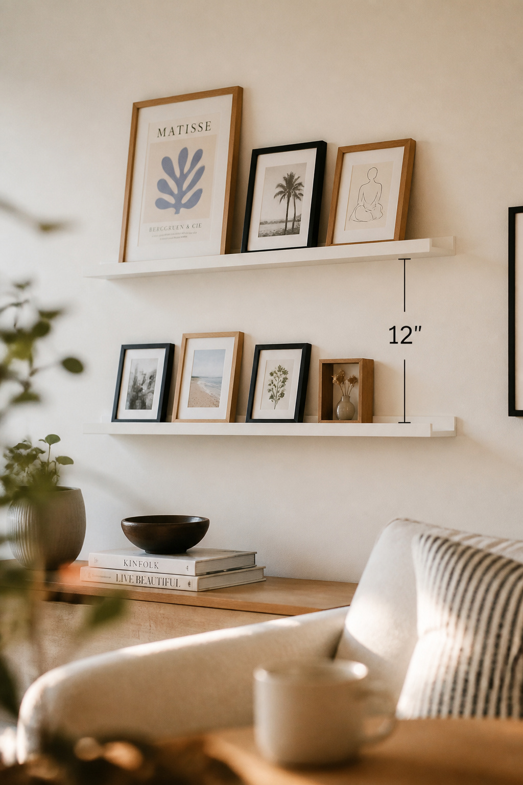
The hanging system that makes updates easy: ledges, rails, or removable hooks
A family photo wall is permanent but never finished, so choose a system built for change. Picture ledges are the most practical start — IKEA’s MOSSLANDA holds up to 11 lbs at 21¾ inches and 16.5 lbs at 45¼ inches, and frames lean rather than hang, so swapping one takes seconds with no wall damage. A rail system like STAS Cliprail (rated to 55 lbs per metre) is the more designed option: drilled once, then everything after is adjustment. Avoid fixed individual hooks — each change means new holes.
How to add a new year of photos without dismantling the composition
When you first hang the wall, build in two or three breathing positions at its edges — places whose content is lighter or newer by design. A new photograph that earns its place goes into one, and the photo it displaces rotates to storage or a quieter spot. Keep a small stock of frames in your existing finish and size, so a new print joins the wall the same week rather than waiting on a sourcing decision. The arrangement stays intact; only the contents move.
The spacing approach that leaves room to grow
Standard gallery spacing is 2–3 inches between frames; for a wall meant to grow, start at 3, so adding one frame doesn’t force the whole arrangement to shift. Place the initial group off-centre — toward one edge of the wall — leaving a clear expansion zone to one side; a strong off-centre composition reads as intentional, not unfinished. Start with four to six frames and let it build; a wall that begins full has nowhere left to go. For walls that change often, hanging photos without wall damage matters most of all.
Family Photo Wall Ideas: Layouts Beyond the 4×4 Grid
The chronological arc: time moving left to right
The grid is not wrong for family photos — it is simply the least forgiving for a collection that grows. One alternative is the chronological arc: oldest photographs anchoring the upper left, the present filling the lower right, so the wall reads as a timeline the way the eye already reads a page. It grows by its own logic — each new year joins at the right edge — and it leans hard on consistent treatment, since black-and-white conversion is what lets a 1975 print and a 2025 one tell one story.
The family-branch arrangement: one zone per person or era
A second approach organises the wall into zones — one per person, generation, or branch — rather than one continuous sweep. Each zone needs a visual anchor, usually its largest photograph, with smaller prints and mementos orbiting it; the anchors need not match in size, which builds natural variety. It suits intergenerational collections especially, where the zone structure spares you the collision of a 1950s portrait set hard against a contemporary phone snapshot.
The salon mix: photos and prints and objects at salon scale
The salon hang is the memento-wall direction at full expression: a wall densely filled with mixed sizes, mediums, and depths, anchored by one genuinely significant photograph set off-centre. Apartment Therapy‘s formula holds — there is almost always one piece bigger than the rest, best placed a little off-centre rather than dead middle, earning the dominant spot by mattering most rather than by being largest. The salon hang demands the most planning of any layout, so map it on the floor first and expect to move pieces around for the better part of an hour. The effortless look is a product of that hour.
It returns to where it began. A family photo wall is the one surface in the house built entirely from your own life — so edit it like it matters, treat it so the pieces cohere, and hang it so it can keep growing alongside you. Do that, and the wall stops being decoration. It becomes the most personal thing in the room: a quiet, daily record of who you are and where you come from, hung where you live.
FAQ
How do I make a family photo wall look less cluttered?
Reduce the count to 10–15 photographs — a wall of twelve edited images reads far cleaner than fifty. Convert the whole collection to black and white to remove colour differences between eras, keep a consistent 2–3 inch gap between frames, and limit yourself to two frame finishes, such as matte black and natural oak.
What size frames work best for a family photo gallery wall?
Use a range of three to four sizes rather than all the same: one large anchor (11×14 or 16×20), several medium frames (8×10), and a cluster of small ones (4×6, 5×7) grouped in threes or more. Variation creates visual rhythm; matching sizes read as a grid. A wide mat also makes a small print read larger.
How do you mix black and white and colour photos on the same wall?
Group rather than scatter: keep the black-and-white photographs together and the colour ones together within one arrangement, so each reads as a distinct section. Use the same white or cream mat across both to link them, and edit the colour photos to a warm, natural white balance so they don’t clash with the monochrome tones.