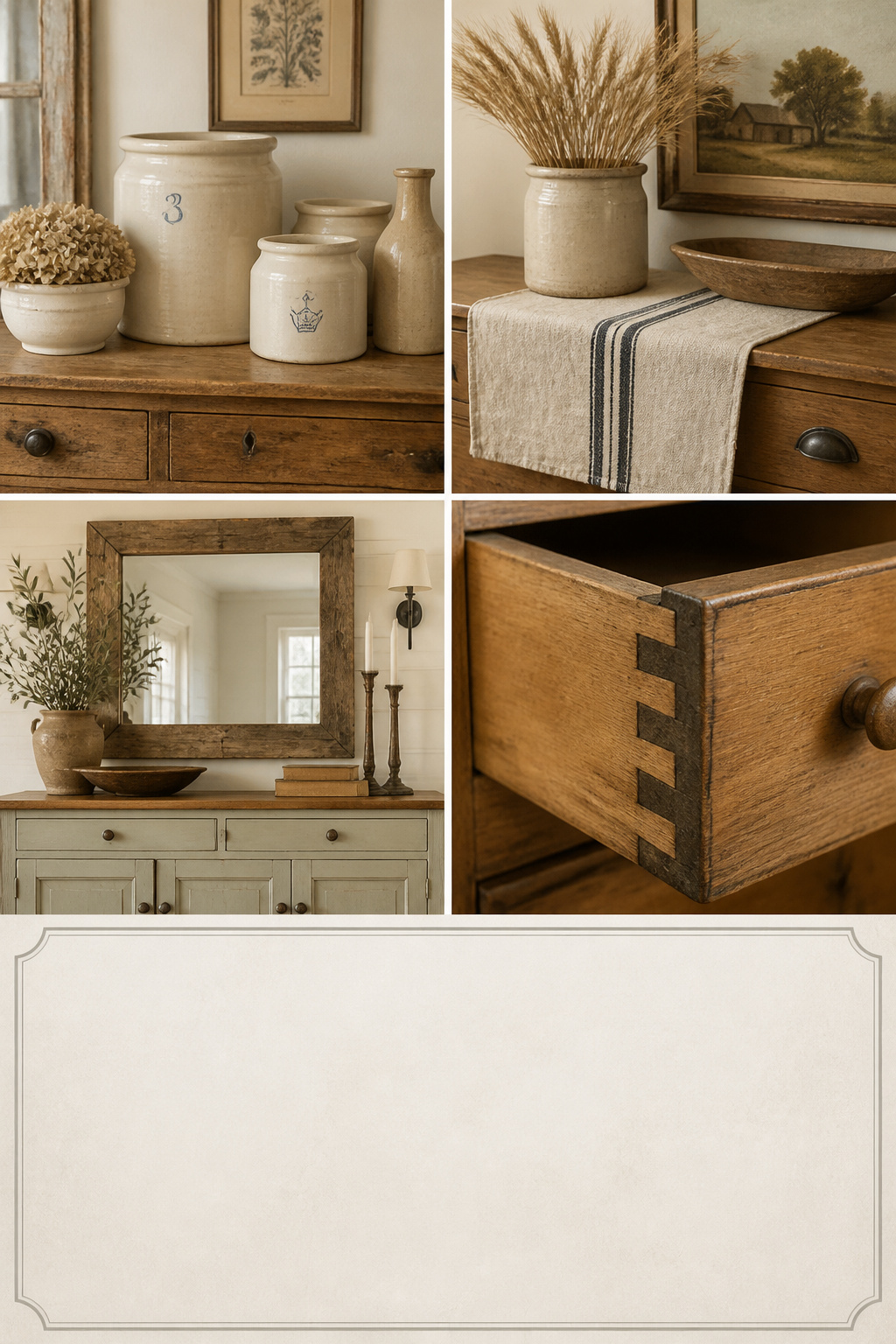
The farmhouse sideboard did not begin as a look. It began as a working piece, built from solid pine in the agricultural households that German and Scandinavian settlers brought to America in the 1700s — frames made for decades of handling, painted bodies that wiped clean and wood tops that took the wear of serving. That practicality is the whole brief for farmhouse sideboard decor. Then, around 2010, a second thing arrived wearing the same name: farmhouse chic — distressed veneers, applied “aging” and white paint over everything. So good farmhouse sideboard decor now asks one quiet question of every piece on the surface: does it have a material truth, or is it only dressed as one?
TL;DR
- Genuine farmhouse furniture shows hand-cut dovetails (slightly irregular), turned feet, mortise-and-tenon joinery and old-growth grain; applied distressing puts wear where use never would.
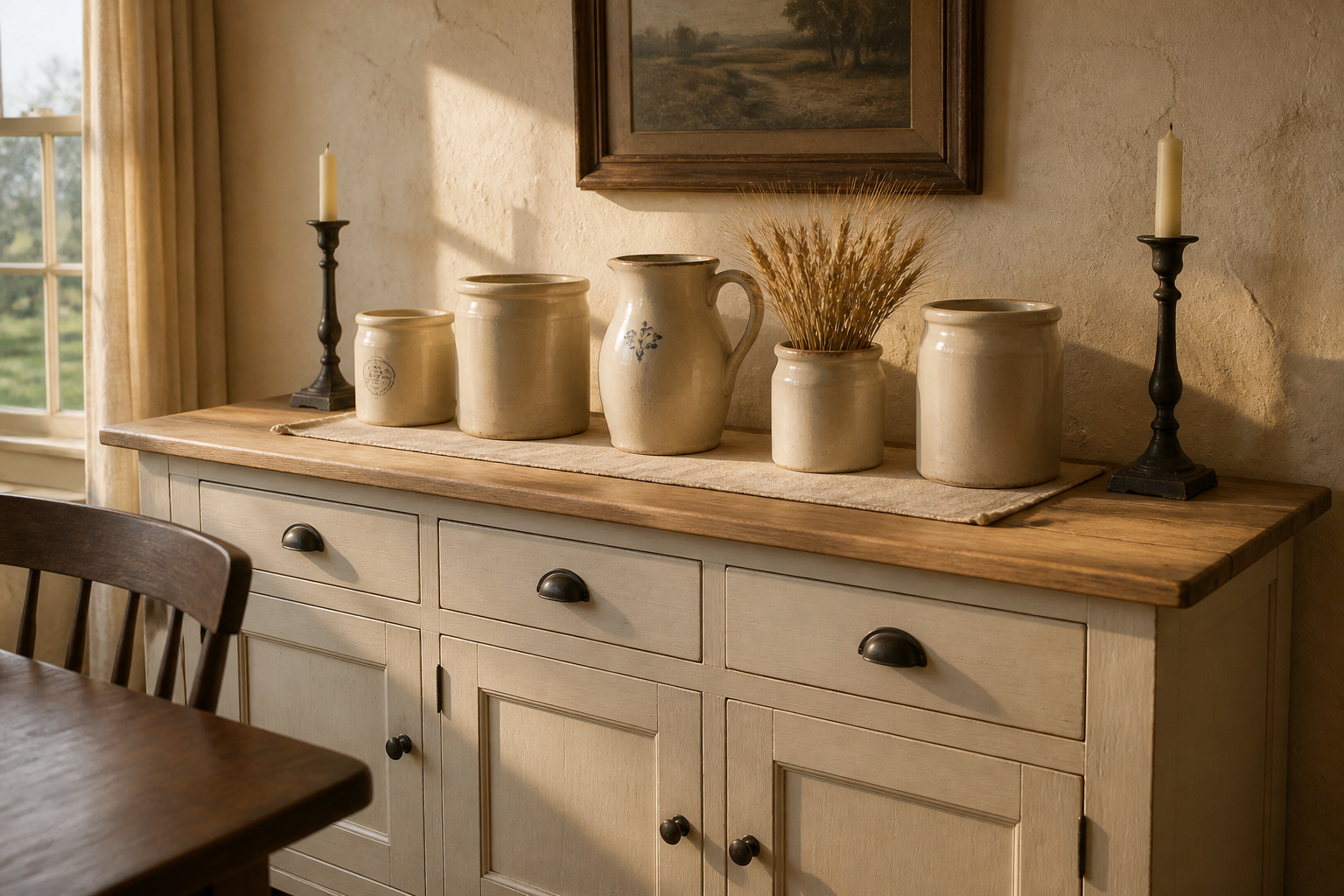
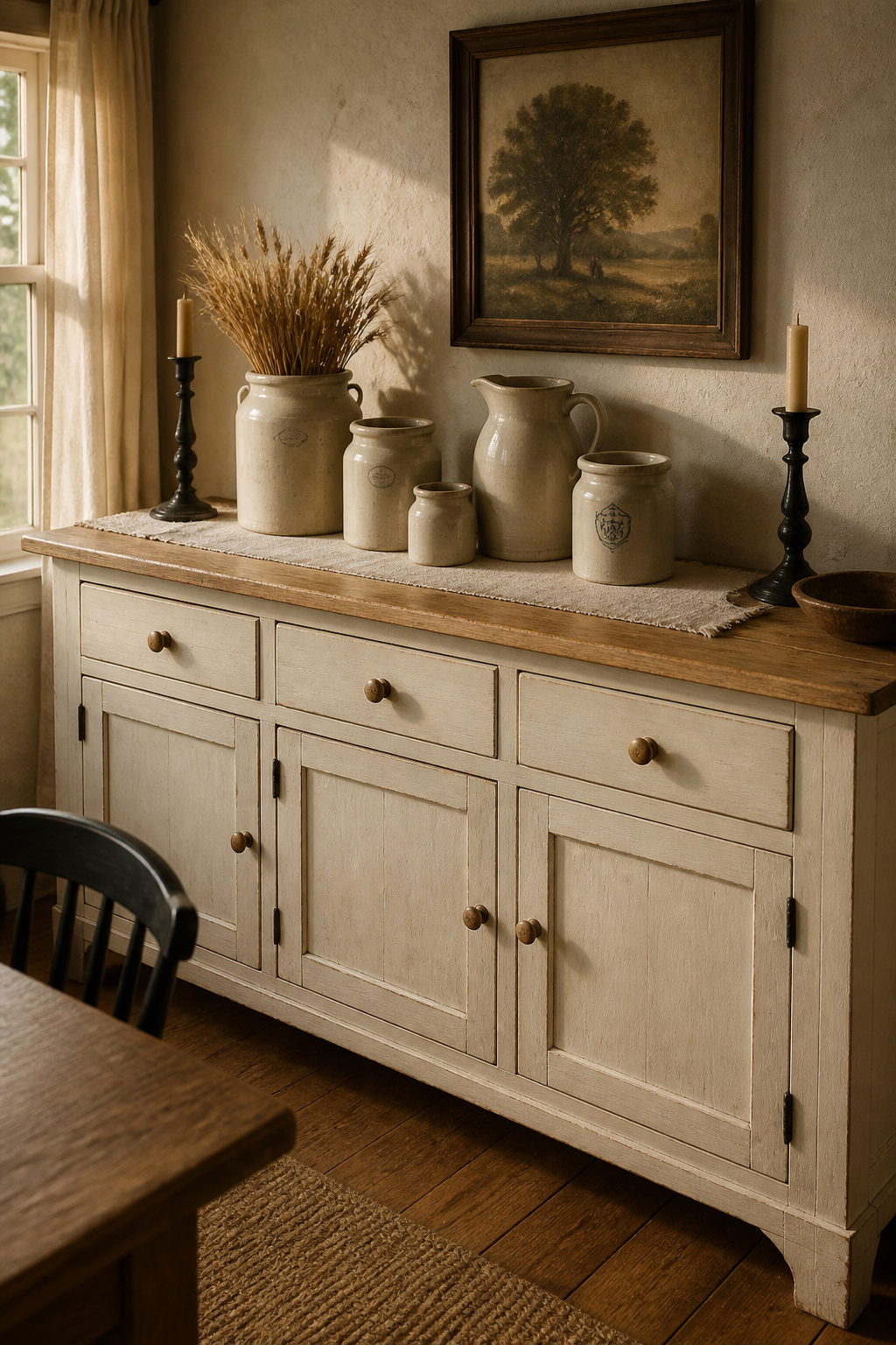
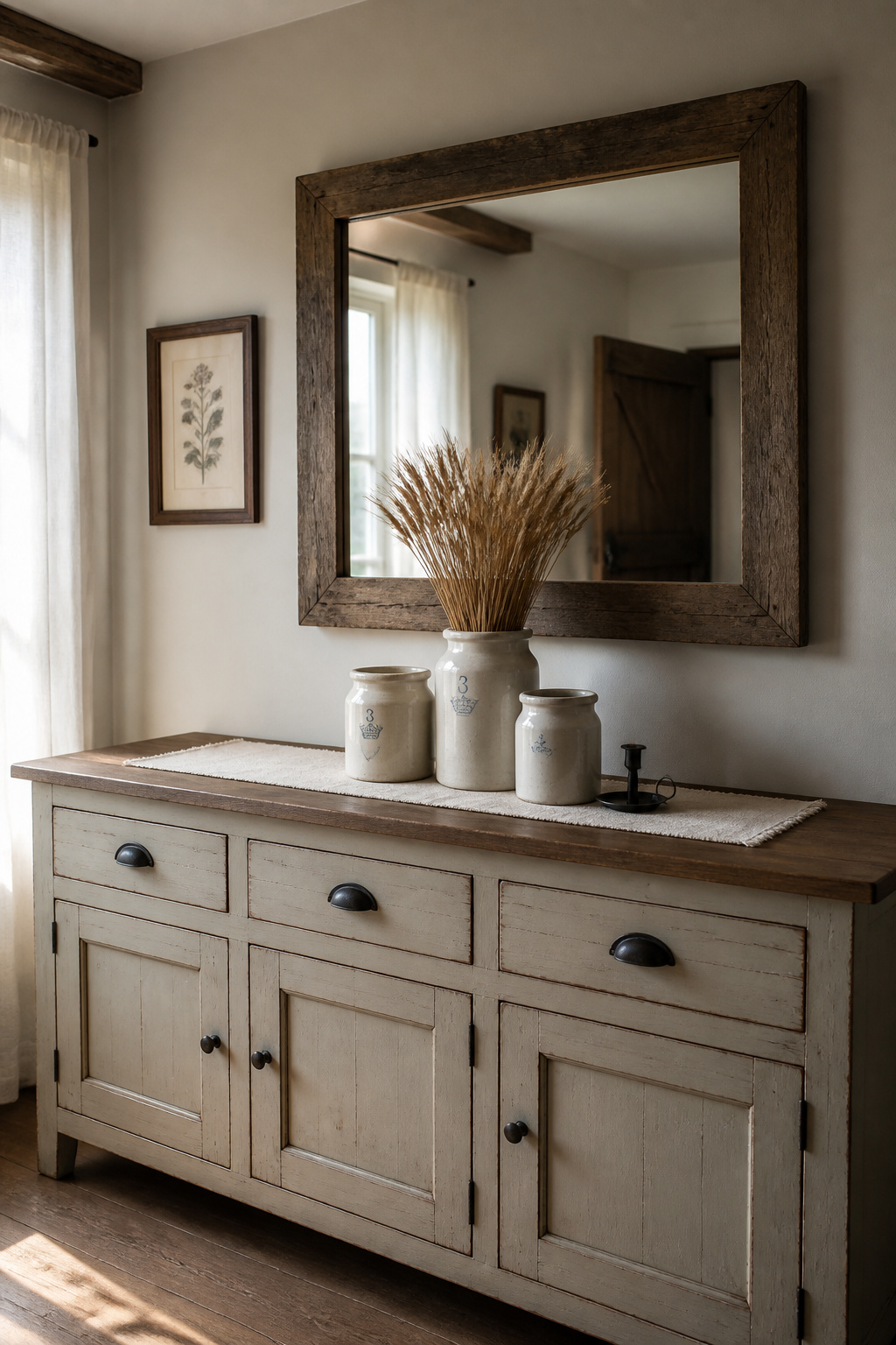
- Build the surface around vintage ironstone (patented 1813) and salt-glazed stoneware in graduated heights, on a single linen runner, spanning 60–75% of the sideboard width.
- Keep two or three material categories at most — one botanical, one textile, one metal finish (black iron, aged brass or galvanized) — and edit out anything that is a prop rather than a piece with provenance.
What Farmhouse Actually Means on a Sideboard (and What It Doesn’t)
The material tradition: painted-and-wood two-tone pieces, turned feet, mortise-and-tenon construction
Authentic farmhouse furniture keeps a tight material palette: solid pine or oak, mortise-and-tenon joinery for the frame, and turned feet rather than the tapered legs of Shaker or Federal work. Those joints — first developed in the later Middle Ages to address the shrinkage problems that came with nailing wide boards — are a sign of considered construction, not speed. For the universal arrangement principles underneath all of this, the complete guide to styling a sideboard has them; here we stay with what makes a piece read as farmhouse.
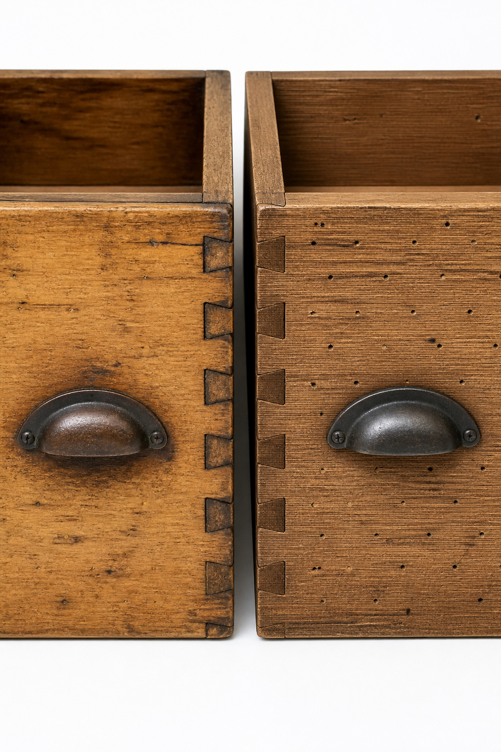
Real wear vs applied distressing — how to read the difference
Real patina takes decades. It comes from oxidation, the oils off hands, smoke and cleaning, and it concentrates where you would expect — drawer pulls, door edges, the fronts of legs — in a soft glow that sprayed stain cannot fake. Applied distressing gives itself away by its logic: the scuffing sits where use would never cause it, spreads uniformly, and often repeats like a pattern. The quick test: compare a drawer’s protected interior panel against its worn face — genuine age shows believable contrast; a costume shows the same finish everywhere.
Why ‘farmhouse chic’ and farmhouse are not the same brief
I learned the difference between finish and damage the hard way. At nineteen I stripped an oak chest with the wrong solvent and burned straight through a century of patina in an afternoon — the kind of soft, earned surface no can of “antiquing” glaze will ever sell you. That is the line between the two briefs. Farmhouse is material-honest: sturdy wood, neutral tones, objects that earned their place through use. Farmhouse chic overlays shiplap, faux signage and “vintage” props; the test is always whether an object has a functional or material claim.
The Sideboard Itself: What Makes a Farmhouse Piece
Before you style anything, read the piece carrying the display. Four signals — joinery, wood, feet and secondary materials — tell you whether a sideboard has genuine age. No single tell is proof; you build a weight of evidence, as any antique dealer does.
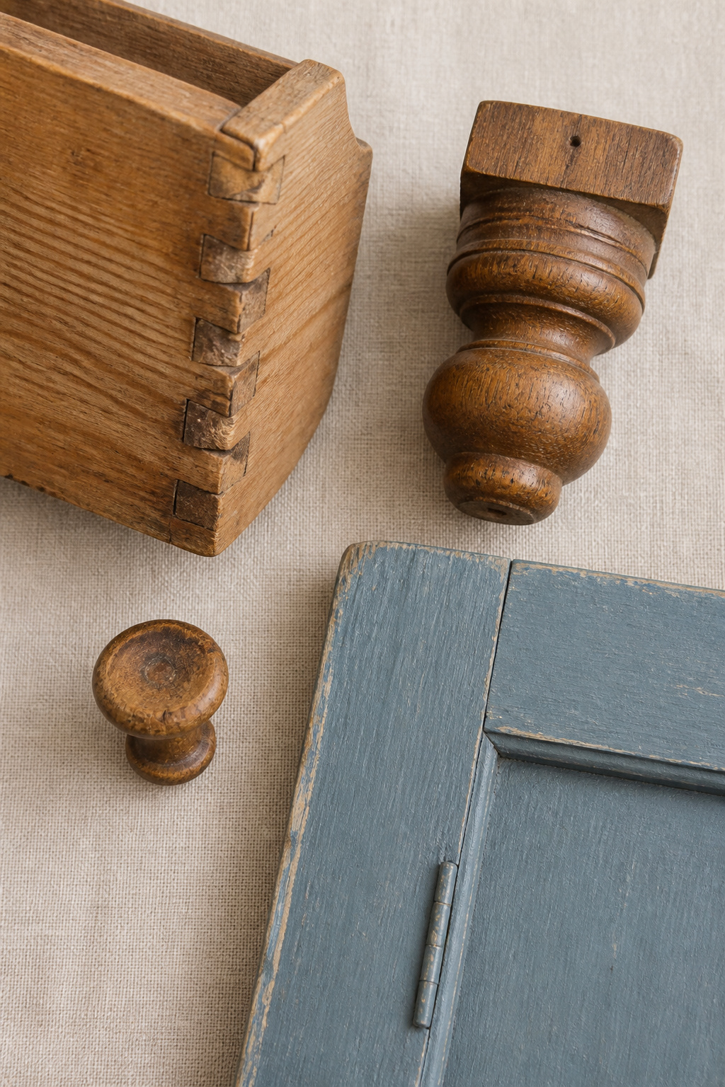
| Component | The farmhouse tell | What it means |
|---|---|---|
| Dovetail joints | Slight irregularity in angle and spacing | Hand-cut; perfect uniformity points to later machine work |
| Wood grain | Tight annual rings, knots, colour variation | Old-growth pine or oak, slow-grown and dense |
| Feet | Turned or bun profiles | Period-correct; tapered legs are Shaker or Federal |
| Secondary wood | A different, local species inside drawers and back | Practical period construction; same wood throughout signals modern make |
Construction tells: hand-cut dovetails, old-growth grain, turned feet vs tapered
The surest tell is the one buyers skip: plane marks and slight unevenness inside the drawer openings. Factories sand even the parts nobody sees; a hand-built piece never did.
Paint-and-wood two-tone: the original colour logic and what it means today
In my reading of period pieces, the two-tone finish was never decorative first. Painted doors resisted moisture and grease in a piece used for food service, while the top — set back from the spills — received the wood finish. In period pieces that paint was typically a regional milk paint: flat and chalky, made from milk protein, lime and pigment, a look modern chalk paints replicate well. The classic pairing is an off-white body with a natural pine top; a high-gloss body reads as country French rather than English or American farmhouse.
Sourcing genuine farmhouse furniture vs contemporary reproductions
Estate sales, antique dealers and auctions remain the surest route to a piece with real age. Check the secondary wood inside the drawers and on the back, inspect the dovetails for hand-cut irregularity, and look for an ink stamp or paper label in a drawer bottom. Where period stock is out of reach, honest reproductions built with real mortise-and-tenon joinery are a legitimate choice — not applied-distressing trend pieces.
Displaying Vintage Crockery and Stoneware: The Centrepiece of Farmhouse Styling
Crockery on display is not a styling invention. It descends from the open-dresser tradition of eighteenth- and nineteenth-century farm kitchens, where everyday ceramics lived within reach.
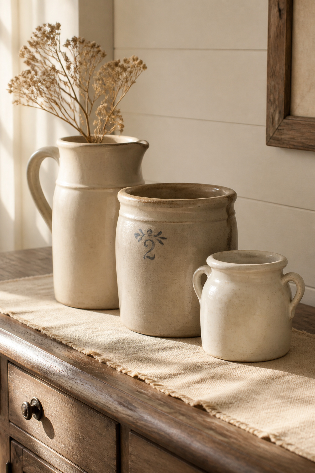
Which pieces earn display space (everyday crockery vs decorative collecting)
Ironstone is the definitive farmhouse crockery. Developed in Staffordshire as a tougher, cheaper alternative to porcelain and patented by Mason in 1813, all-white ironstone was selling in quantity to North American households by the 1840s. The pieces that earn display space are the ones genuinely used — pitchers that carried water, crocks that stored salt-preserved food — which gives them more authenticity than ceramics bought purely for display. The categories that sit together comfortably:
- White ironstone — the neutral field colour, the safest mass display
- Salt-glazed stoneware — heavier, more rustic, the natural anchor pieces
- Transferware (blue or mulberry print) — pattern, used sparingly as accent
- French confit pots and saloirs — strong in a massed, single-form display
Height and grouping: how to stack and arrange ceramics without clutter
Odd numbers do the heavy lifting. A group of three — tall pitcher, medium crock, small jar — reads more naturally than two or four pieces at matching heights. Use the pieces’ own sizes to vary it: a pitcher at 12 to 16 inches, crocks at 8 to 10, a small bowl at 4 to 6, stepped from back to front into a graduated triangle. Let the grouping span 60 to 75 percent of the width. Fill the surface and it reads as storage; keep it under 60 percent and it looks lost.
Mixing stoneware, ironstone and transferware — the palette logic
Each ware carries a different visual weight, which gives you a hierarchy: stoneware is heaviest and most rustic, so it anchors; ironstone is bright and refined, so it carries the field; transferware adds pattern, so it stays an accent of one or two pieces. If you use transferware, hold to a single pattern family — five blue-and-white patterns at once reads as a collection, one pattern at three scales as intention. Where ceramics share the surface with candle holders or greenery, keep the crockery dominant.
Metal, Turned Wood and Textile Accents: Restraint Over Clutter
Accents are where a farmhouse display tips into costume fastest, because every catalogue sells “farmhouse” trinkets that share nothing but the label. The discipline is material coherence.
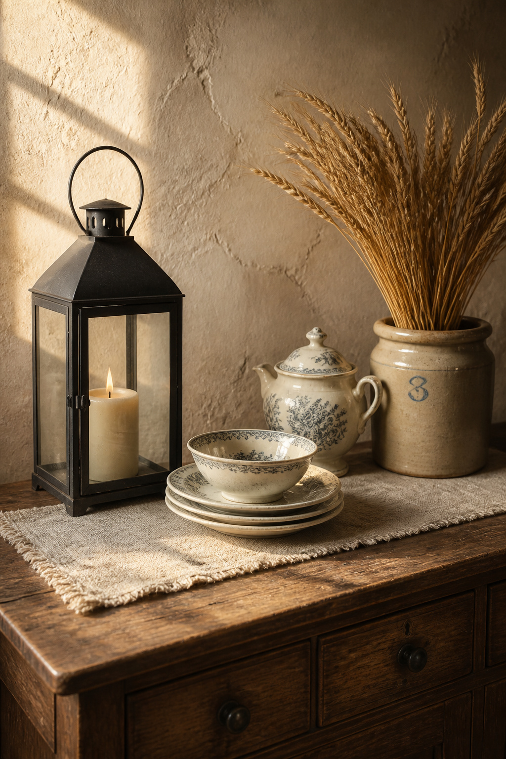
Metal finishes that read as farmhouse (black iron, aged brass, galvanized) vs those that don’t
Three metal finishes have a real farmhouse claim. Matte black iron is the most versatile — it appears in original hinges and latches, and works against both white paint and natural wood. Aged brass, a warm dull yellow-gold rather than a mirror finish, reads domestic rather than industrial. Galvanized metal is the third, rooted in working farm buckets and tins. The finishes to avoid:
- Chrome and polished nickel — contemporary kitchen and bath hardware, no farmhouse precedent
- Brushed stainless steel — reads modern, undercuts the material story
- Hammered copper — handsome, but Southwestern or Arts and Crafts, not farmhouse
Textile placement: linen runner, grain-sack cloth and where they anchor the display
A single textile under the grouping does structural work: it separates the objects from the bare wood and gives the display a stage. For farmhouse, that means natural undyed or off-white linen, roughly a third the sideboard depth. Grain-sack cloth is the other honest option — a coarse striped weave with agricultural roots, used in nineteenth-century households for storing grain and flour. Choose one, not both; layering the two tips straight into clutter.
The one-botanical rule: dried flowers, wheat or eucalyptus — choosing one over three
Dried botanicals fall into three characters: grain stems (wheat, barley, rye), grey-green stems (eucalyptus, sage, lavender), and seed or flower heads (sunflower, pampas, cotton). Use one category and it looks considered; mix all three and it looks gathered. Dried wheat has the strongest provenance — grain was the product of the farm, so a bundle in a tall stoneware crock is both powerful and honest. The rule is one botanical, one material, one vessel; add lavender and eucalyptus to the wheat and you have left the farmhouse brief for a floral arrangement.
The Wall Above a Farmhouse Sideboard: What Belongs and Why
The wall is part of the composition, and farmhouse asks two things of it: the right proportions and the right material story. The proportions are measurable. The single most useful number: a mirror or artwork above a sideboard should be two-thirds to three-quarters the width of the furniture below — for a 60-inch sideboard, a piece in the 40-to-45-inch range. Hang it 6 to 10 inches above the surface, erring low in a dining room where people view it seated.
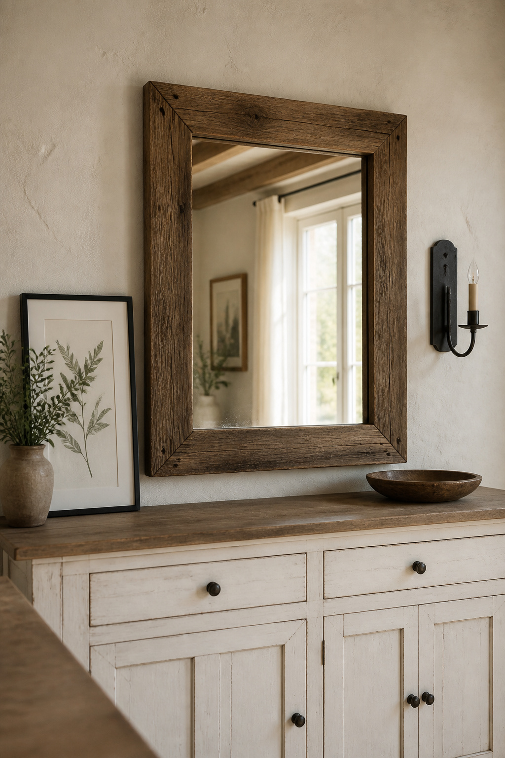
For content, farmhouse rewards pieces with their own heritage: botanical prints in thin black or natural wood frames, or period needlework samplers. A wood-framed mirror often beats artwork when the room lacks light or the opposite wall holds something worth reflecting — keep the frame in the family (barnwood, reclaimed oak, painted pine), because ornate gilt reads as French country or Victorian. Mind the scale trap, too: a 16×20 print is dwarfed above a 60-inch sideboard, so flanking a small piece with black-iron or aged-brass sconces reaches the two-thirds line while staying within the farmhouse palette.
When Farmhouse Becomes Clutter: The Edit That Keeps Character Without Chaos
Farmhouse is the style most prone to overcrowding, because its aesthetic tolerates — even celebrates — the accumulation of character objects. The edit that separates earned character from trend sampling rests on one honest test.
The most common farmhouse overcrowding mistakes
Three errors do most of the damage. The first is treating every inch as display space, so nothing stands out — leave negative space at each end and along the front. The second is reaching for many small objects instead of a few significant ones; five trinkets accumulate into clutter where two or three real pieces hold the eye. The third is piling on farmhouse signals at once — paint, distressing, galvanized metal, shiplap, grain sack and signage in one display, every object a different cliché, the whole thing costumed rather than earned.
The two-category rule: keep what has provenance, remove what is prop
Run each object through one question: does it have material truth — genuine age, craft or material — or is it a prop styled to look farmhouse without any claim? Ironstone, solid wood and hand-forged iron pass. A sign reading “FARMHOUSE” or a mass-produced “aged” clock fails — your first candidates for removal. As the steward of a piece you may one day pass on, that restraint protects the furniture as much as the look.
How a small dining room changes what the farmhouse sideboard can hold
A small room intensifies every rule above. Leave at least 36 inches of clearance around the sideboard for movement, which often caps the piece under 60 inches wide and so caps the surface. On a sideboard under 50 inches, hold the grouping to the central 30 to 35 inches with clear ends that double as serving space, and let a taller, pitcher-anchored arrangement of 12 to 15 inches buy back the interest that width can’t. If proportion is your real puzzle, the narrow sideboard ideas guide goes deeper on small surfaces; and if the farmhouse palette feels heavy, weigh it against cleaner modern sideboard styling.
Read those signals — joinery, wood, finish, and the objects on top — and you can build a display that earns the farmhouse label rather than borrows it. The character you are after was never bought; it was kept.
FAQ
What objects go on a farmhouse sideboard?
The most authentic objects carry material truth: vintage ironstone crocks and pitchers, salt-glazed stoneware, a natural linen runner, dried wheat in a stoneware vessel, and black iron candle holders. Arrange one tall anchor, one mid-height piece and one low accent in an odd-number grouping, and avoid faux signage, distressed clocks and chrome.
How do you style a farmhouse buffet without making it look cluttered?
Apply the two-category rule: keep objects with genuine age, material or craft, and remove purely visual props. Leave both ends clear so the grouping occupies the central 60 to 75 percent of the surface. Use a few larger objects rather than many small ones, and limit yourself to two or three material categories at most.
What is the difference between farmhouse and rustic sideboard decor?
Farmhouse centres on painted or chalk-finished furniture in light neutrals, with refined display objects like ironstone, turned wood and linen. Rustic uses rawer, unfinished or reclaimed wood in darker tones with heavier textures. Farmhouse is essentially a subset of rustic — same love of natural materials, but painted, lighter and more domestically polished.