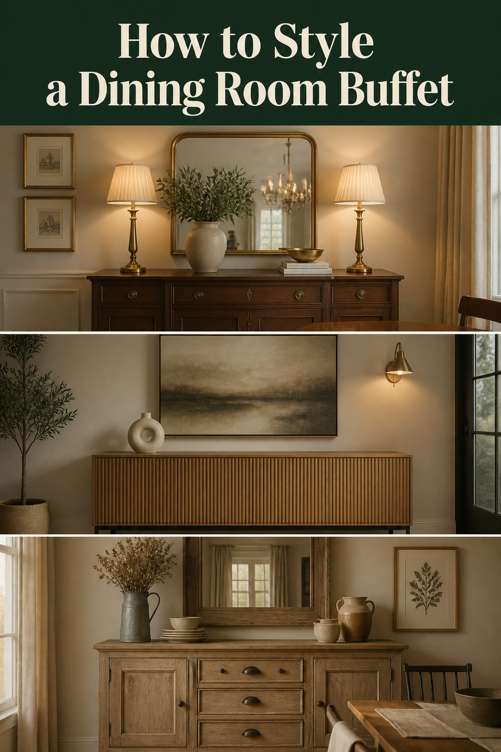
Ask the internet how to style a sideboard and you will be handed a contradiction within the first three search results. One source insists on odd numbers; the next arranges everything in matched pairs. One says fill the surface so it looks generous; another says leave it half empty and call the emptiness intentional. The advice is not wrong, exactly — it is unsequenced, a pile of rules with no order of operations, which is why a reader standing over a cluttered or stubbornly bare buffet ends up more paralysed after reading than before. Dining room buffet decor is not short of tips. It is short of a sequence. What follows is the order I would give a friend who wanted to style their sideboard once and stop guessing: anchor first, then height, then the rule of three, then the wall and the light — chosen for their room, their style, and their season rather than borrowed wholesale from a photograph.
Why a Buffet Surface Is the Hardest Horizontal in the Dining Room
A sideboard is an awkward thing to style well, and the awkwardness is structural. It is wide enough to swallow a dozen objects yet too shallow to organise like a tabletop, so it punishes both the underfiller and the maximalist. Most sideboards fail in one of three predictable ways, and naming yours is the first useful move.
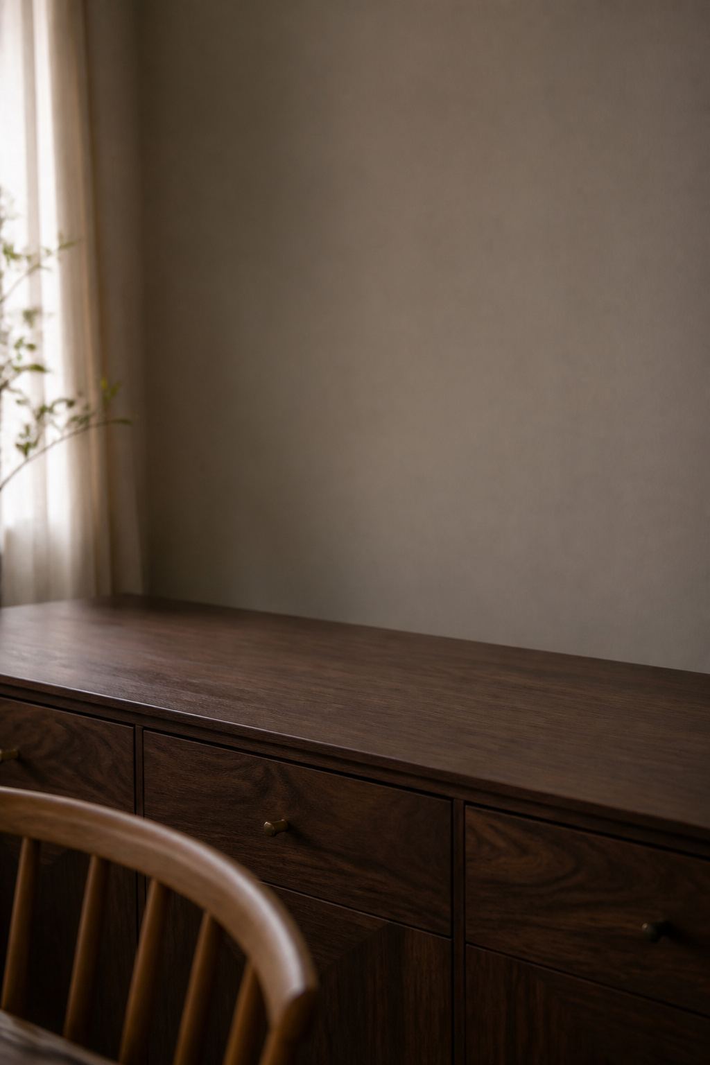
The three failure modes: overcrowded, underwhelmed, and unstyled
Overcrowding is the most common, and it has a simple cause: objects get added and nothing gets removed, so the surface accretes rather than composes. The professional consensus is that less is genuinely more — a few key pieces with room between them beat a surface packed edge to edge. The opposite failure, the underwhelmed buffet, is quieter: it is filled, but with objects too small to register from across the room, each one competing and none winning. As Homes and Gardens notes, larger items produce more impact than a scatter of trinkets. The third state is the most common of all — the buffet that was never styled, holding the post and a stray fruit bowl, reading as scattered because it has no focal point to organise the eye.
What styling a buffet actually means (serving versus display)
Before you touch an object, settle one question: is this surface a permanent display, or does it also serve food when you entertain? The answer changes everything downstream. A purely decorative buffet can be styled freely and left alone for a season. A serving buffet needs a styling that lifts off cleanly — and the practical trick there is a decorative tray that acts as a corral, holding the small accents as one unit so the whole arrangement moves in a single gesture when the platters come out. Decide the intent now and you will not have to re-solve it at every dinner party.
How to read your own surface before adding anything
Styling, like cataloguing a collection, starts with an honest inventory of the space you actually have. Standard sideboards run 30 to 36 inches tall, 16 to 24 inches deep, and 40 to 72 inches wide, and a well-proportioned one sits at 60 to 75 percent of the dining table’s length — anything shorter reads as a side note rather than a considered piece. Note your depth especially: a shallow 16-inch surface cannot stage objects front-to-back the way a 24-inch one can. Then accept the figure that unsettles most people: professional stylists aim to leave 40 to 50 percent of the surface empty after styling. That is not under-decorating. That is the breathing room that lets the chosen pieces read.
The Anchor Piece: Start Here, Not With the Accessories
Every well-styled buffet has one object that organises all the others, and the single most common reason a display looks arbitrary is that it was built without one. The anchor is the first decision, not the last — the centre of gravity everything else gets positioned against.
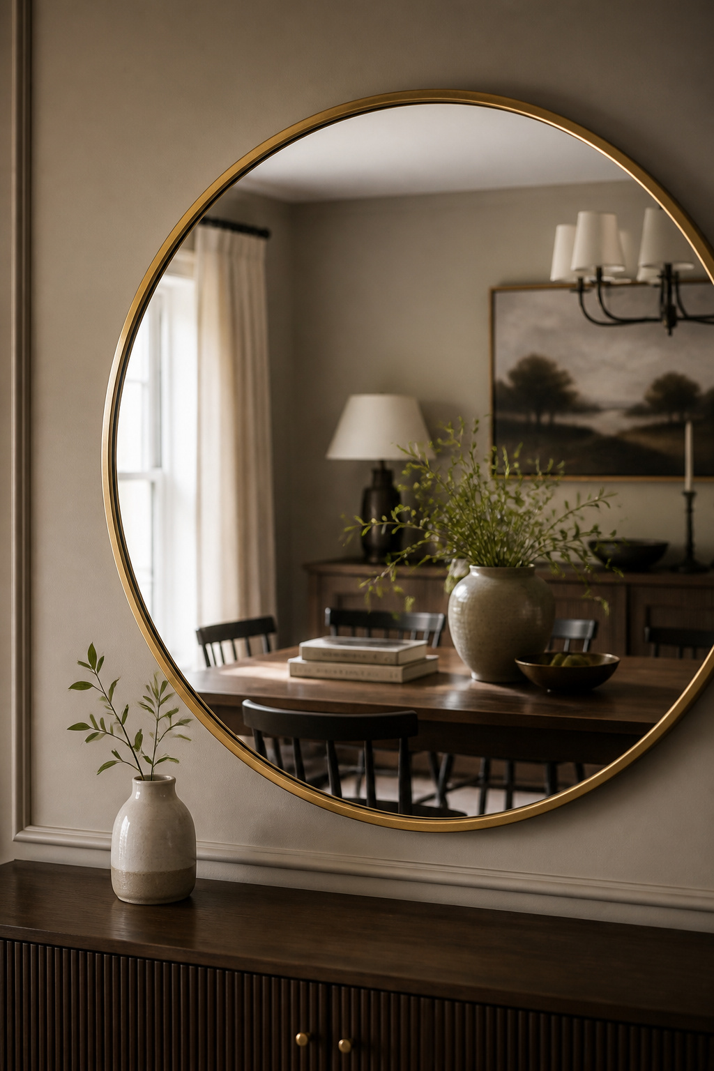
What qualifies as an anchor
An anchor earns the role through scale and visual weight, not sentiment. It is the largest, most singular element in the composition: a generous mirror, a large piece of art, an oversized vase, or a tall buffet lamp. The rule of thumb from Angie’s Roost is blunt and correct — the bigger the buffet, the bigger the anchor it needs. A piece that anchors a 48-inch console will look stranded on a 72-inch one. And the anchor most often lives on the wall above rather than on the surface itself, which keeps the tabletop free for the arrangement beneath it.
Mirror, artwork, or sculptural object — choosing by room scale
Which anchor depends less on taste than on what the room lacks. A mirror is the stronger choice in a small or dark room: it reflects light, expands the perceived space, and lets the objects below stay the visual interest rather than competing with a busy image overhead. Artwork is stronger where the room needs a colour story — the tones in a painting can tie together upholstery, rug and tableware that otherwise read as separate purchases. And where the wall already carries architecture — a built-in, exposed brick, a structural beam — a sculptural object on the surface itself can anchor instead, since a hung piece would only fight the wall. This is a survey of the choice; the full decision logic, the gallery-wall case, and the measurable rules belong to the dedicated guide on what to hang above your buffet.
Why the anchor goes in first
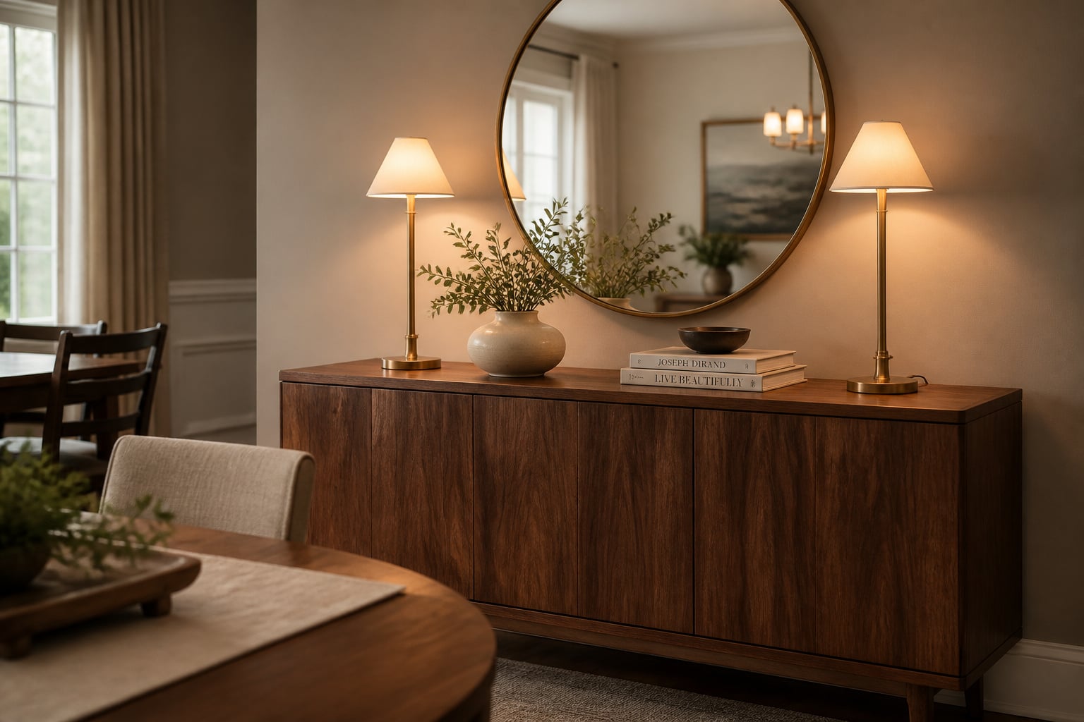
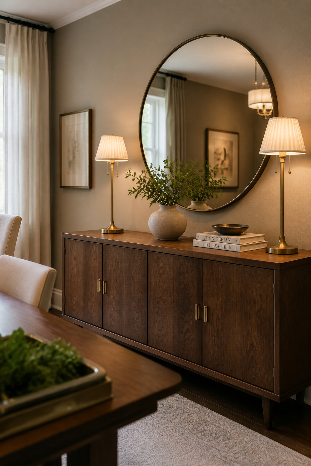
Place the anchor before anything else and every subsequent object has something to relate to — lamps, vases and books all get sized and sited against it rather than floating independently. On a long sideboard the sequence that reliably works is anchor centred on the wall, one tall item to either side on the surface, then infill grouped in threes between them. When the anchor is a mirror, the lamps flanking it become visual extensions of the frame, their verticals repeating its lines and stitching the wall zone to the surface. Skip the anchor and you are arranging accessories around a hole.
Height, Balance and the Rule of Three: The Core Arrangement Principles
Underneath every style — farmhouse, modern, traditional — sit four arrangement principles that do not change. Master these and you can style any surface in any idiom; ignore them and no quantity of beautiful objects will save the display.
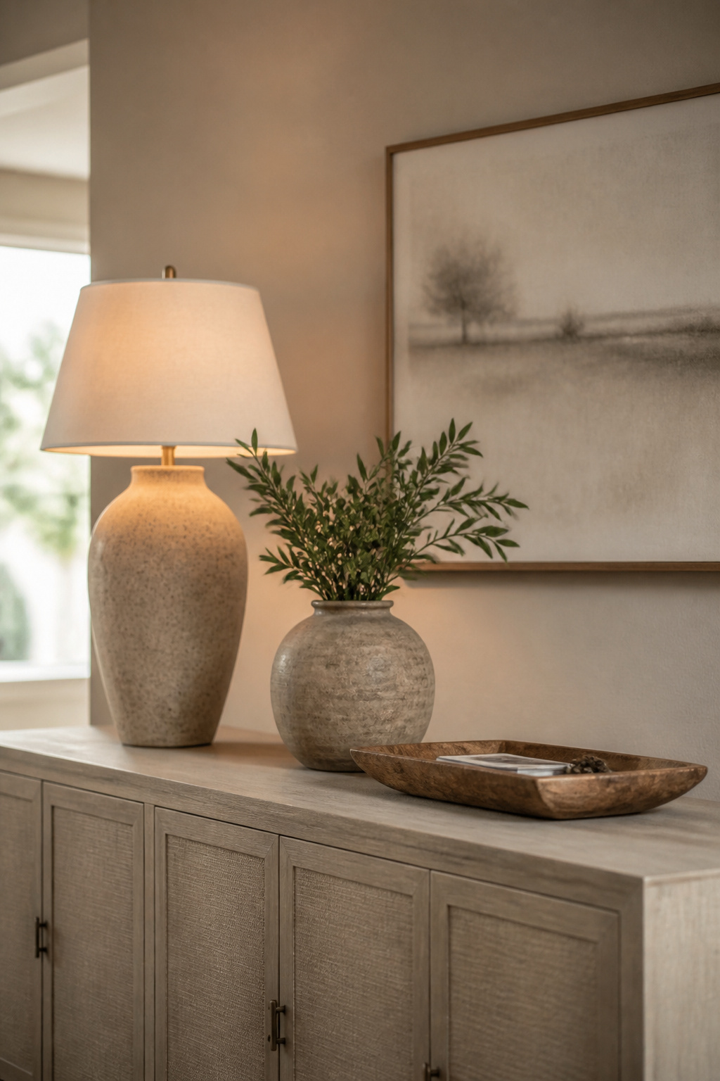
Layering height: the three-tier rule
Varying height is the single most impactful move in sideboard styling, and the failure to do it is why a surface of lovely objects can still look flat. Think in three tiers: tall items at the back (a lamp, a tall vase, propped art), medium items in the middle (a sculptural bowl, a framed photo, a low plant), and low items at the front (candles, a tray, a stack of books to ground the group). The natural form this produces is a visual triangle — the eye climbs from the lowest piece to the tallest and travels back down, which is what makes an arrangement feel composed rather than lined up. Let one object slightly overlap another, a lamp just ahead of the art behind it, and you add the depth that turns a static row into a vignette.
Symmetry versus asymmetry — when each wins
Symmetry reads as formal and ordered: two matching lamps, a centred mirror, elements mirrored across the surface. It suits traditional rooms where order is the design language. Asymmetry reads as natural and collected: height and mass balanced across the surface but the elements differing side to side, building a focal point at one end. Jane Rockett of Rockett St George makes the case that asymmetry is particularly strong on a sideboard precisely because it creates movement, where a mirror image is read quickly and abandoned. The deciding factor is the room itself: symmetrical windows, matched chairs and a centred chandelier call for a symmetrical surface; a room of varied features carries asymmetry better.
The rule of three, and when to break it
Odd numbers are the most consistently cited principle in all of surface styling, and the reason is perceptual — an odd grouping gives the eye a middle to rest on and prevents it settling into the static rhythm an even one produces. But the rule is about the overall count, not literal trios shoulder to shoulder: three height tiers, three zones across a long buffet, three objects in a cluster. The classic exception is the matched pair — two identical lamps or candlesticks flanking a centred anchor — which works because the pair functions as one visual element, not as two competing objects.
Negative space as an active choice
The hardest principle to trust is the one about doing less. That 40-to-50-percent-empty target is not a confession of an unfinished job; it is the design choice that lets everything else read. Restraint looks more intentional than occupation — a sideboard styled with half the objects it could hold reads as considered rather than sparse. Negative space matters most on shallow sideboards, where limited depth forces the breathing room into the horizontal spacing instead. The table below sets the four principles against what each one actually does, which is the quickest way to diagnose a display that feels off.
| Principle | What it does | The common failure |
|---|---|---|
| Height layering (tall/medium/low) | Builds a visual triangle the eye can travel | Everything at one height reads flat |
| Symmetry | Signals formality and order | Lazy symmetry reads static and is skimmed |
| Asymmetry | Creates movement and a collected look | Balance lost — one side visually heavier |
| Rule of three | Gives the eye a middle to settle on | Even groupings read as static pairs |
| Negative space (40–50% empty) | Lets the kept pieces breathe and register | Treated as space still needing to be filled |
What to Actually Put on a Dining Room Buffet
The literal question — what objects? — is better answered by category than by shopping list, because a category tells you the job an object has to do, and an object with no job is the one quietly overcrowding your surface.
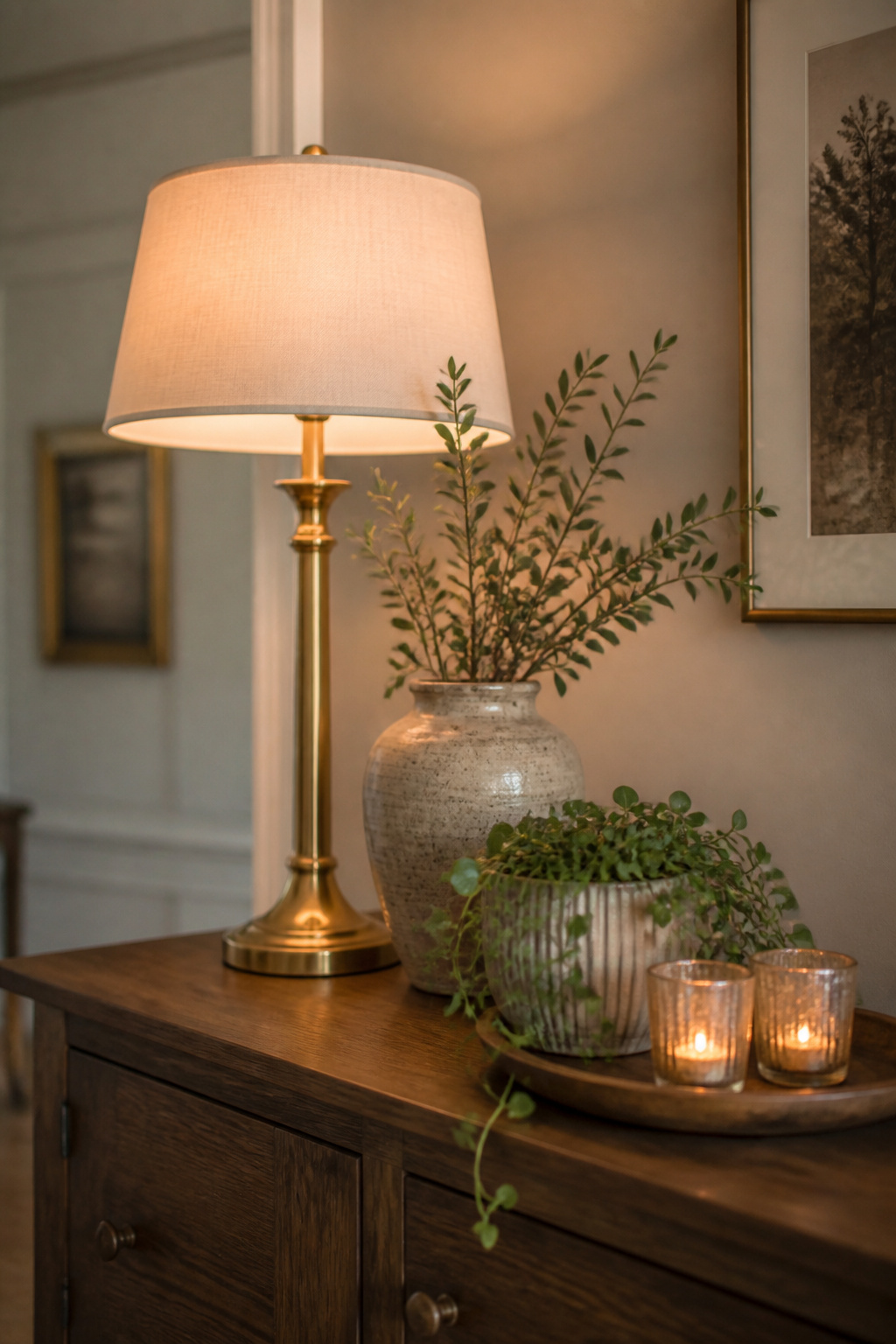
Object categories that earn their place
Most well-styled buffets draw from four working categories, and a useful arrangement has one of each rather than five of one:
- Height-builders — buffet lamps, tall vases, propped art. They supply the top tier and the vertical lead for the eye.
- Texture pieces — sculptural ceramics, stoneware, a carved-wood object. They carry visual weight and tactile interest.
- Greenery — fresh stems, a potted plant, or convincing dried botanicals large enough to register. They soften the furniture’s hard lines and make the surface read as inhabited rather than staged.
- Cohesion-makers — a tray that corrals three or four small things into one organised element, plus grounding pieces like a low stack of art books.
Candles deserve a mention of their own: designers name them repeatedly as a strong dining-room choice for the height, the evening ambience, and the quiet elegance they bring to the table’s neighbour.
The objects that almost always overcrowd
The reliable overcrowders share a profile — small, low, and lacking weight at viewing distance. A figurine that charms on a shelf reads as clutter on a 60-inch buffet, because scale is the discipline of knowing how an object looks from ten feet, not from six inches. Anything under about six inches in every dimension is a candidate for the cupboard. And when the surface looks wrong, resist the universal instinct to add a fixing object; the correction to both clutter and the underwhelmed look is almost always subtraction. Lining everything up at the same height, choosing objects for their beauty in the hand rather than their presence at distance — these are the patterns the common sideboard styling mistakes guide takes apart fix by fix.
Mixing materials: the two-material rule
Mixing finishes adds the sensory richness that same-material groupings cannot — smooth against rough, matte against glazed, warm against cool. As a practical guideline rather than a law, hold the surface to two or three materials beyond the sideboard itself. Wood, ceramic and brass read as curated; add linen, glass and stone on top and the eye can no longer settle anywhere. The strongest pairings tend to set one warm material against one cooler: warm wood with matte stoneware, brass with cream linen, bleached oak with dark iron. Repeating one of those materials elsewhere in the room ties the sideboard into the larger scheme rather than letting it run its own.
The Wall Above: Mirror, Artwork or Gallery
The surface and the wall above it are not two projects but one composition, and a bare wall above a styled buffet makes even a good arrangement read as incomplete. The vertical zone obeys two measurable rules, and they are worth knowing even at survey depth.
The gap, and the width ratio
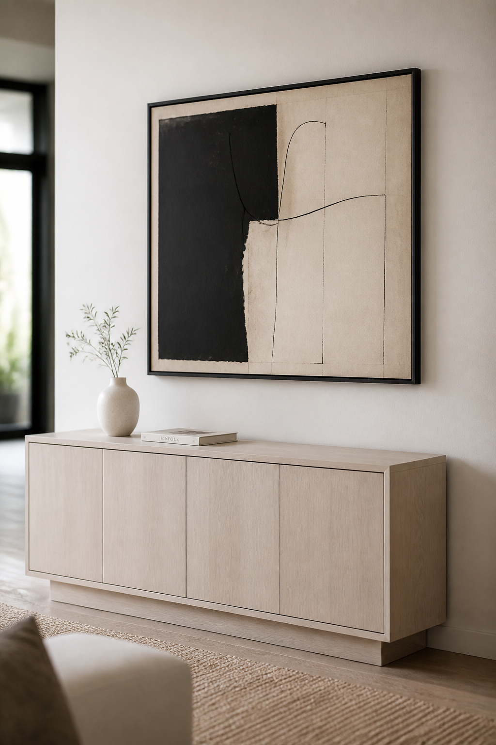
The bottom edge of a hung piece should sit four to six inches above the sideboard for a mirror, and six to ten inches for artwork, which needs a little more breathing room from the objects beneath it. Too small a gap and tall surface objects appear to crash into the frame; too large and the piece floats off as a separate wall decoration. The width matters as much as the gap: a mirror or artwork should span two-thirds to three-quarters of the furniture’s width and never exceed it. A 60-inch buffet wants a 40-to-45-inch piece; a 72-inch one wants 48 to 54. When in doubt between two sizes, the larger almost always looks more intentional.
Mirror versus artwork versus gallery — the quick guide
The decision order is light first, colour second, preference third. Choose a mirror when the room is small or dim — positioned opposite a window, a mirror can add a perceived 25 to 35 percent of depth to a compact room. Choose artwork when the room needs a colour anchor to pull its furnishings together. Choose a gallery wall when personal narrative matters, but size and hang the whole grouping as one shape against the furniture below, not frame by frame. That is the overview; the gap rules for galleries, the propping options and the full mirror-or-art reasoning all sit in the guide to what to hang above your buffet.
Buffet Lamps and Lighting: How Illumination Changes Everything
Of all the styling tools, lighting is the most under-deployed, because the buffet lamp does two jobs and gets credit for neither clearly. It is a height-builder and a perimeter light at once — and a sideboard with no lamp is both a styling problem and an evening one.
Why the lamp is the underused tool
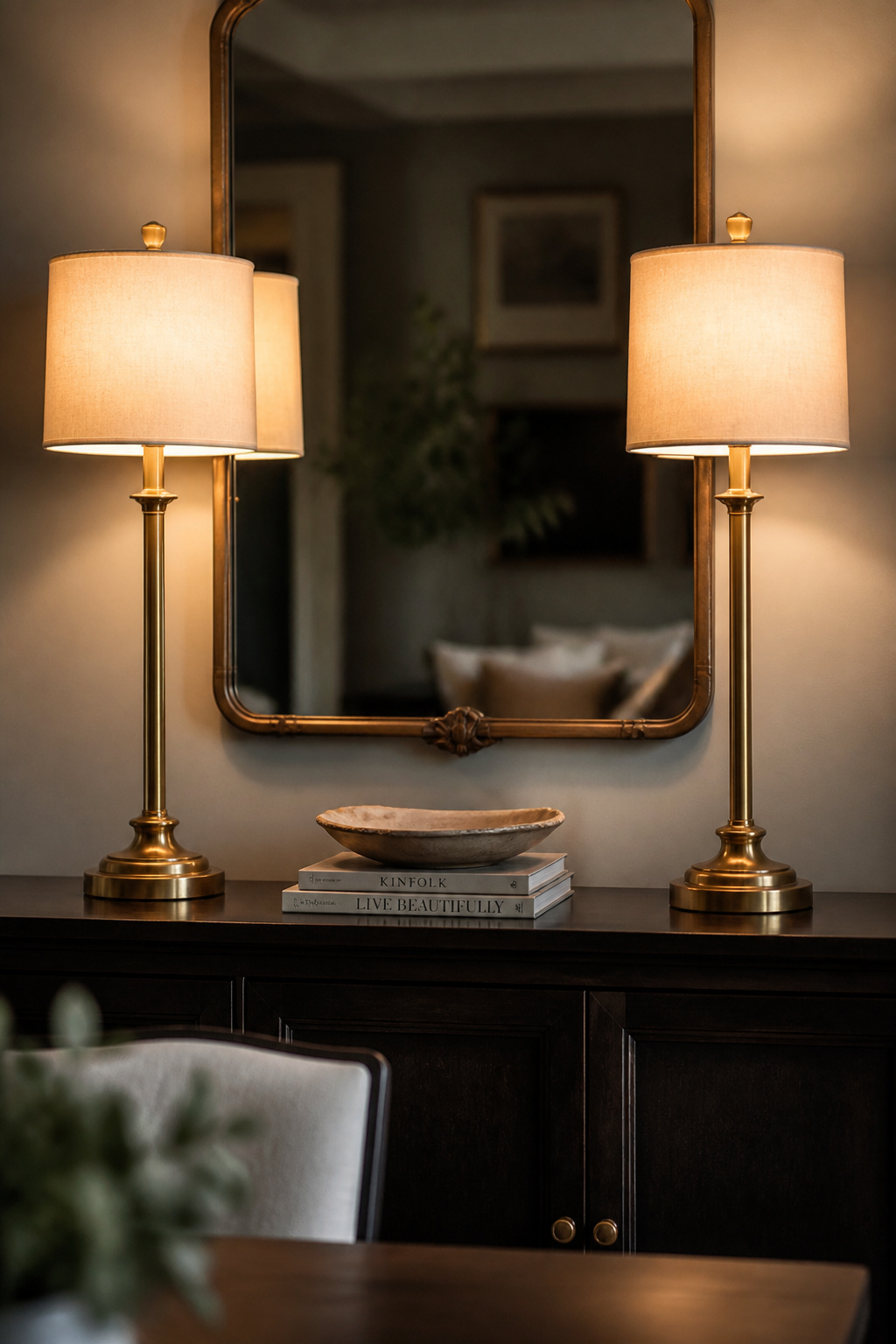
A buffet lamp builds the top tier of the height layering and, after dark, supplies the warm perimeter glow that overhead light cannot. Watch a well-lit dining room in the evening and the warmth has migrated to the lamps and sconces at the edges. A matched pair flanking a mirror also repeats the thin verticals of the furniture’s legs, a continuity the eye reads as deliberate.
The 32-to-36-inch guideline
Buffet lamps run taller than table lamps by design — 32 to 36 inches from surface to shade top, against a table lamp’s 24 to 30 — so they clear the objects around them rather than getting swallowed. Combined with a standard sideboard, that lands the top of the shade at a comfortable 58 to 64 inches, high enough to spread light without glaring at seated diners.
Pair or single — choosing by width
A symmetrical pair suits formal, wider sideboards of 60 inches and up. Modern and transitional rooms read better with balanced asymmetry — one lamp answered by a tall object, or a single statement lamp paired with a wall sconce rather than a second lamp. On narrow surfaces under 48 inches, a single lamp toward one end reads cleaner than a pair crowded together. The heights, finishes, lumen levels and dimming that complete the picture are the territory of the full guide to buffet lamps and lighting.
Style Contexts: Farmhouse, Modern Minimalist and Small-Space Buffets
The four core principles do not change between styles; what changes is which variable does the heavy lifting. Here is how the same logic translates into three common contexts, each treated in survey and handed to its dedicated guide for the full account.
Farmhouse: material honesty over applied character
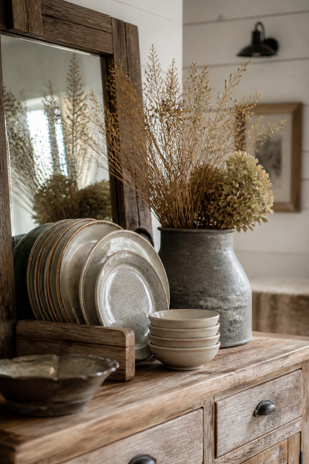
Farmhouse styling rests on material truth — genuine wood grain, real stoneware, metal in bronze or aged iron — where the charm comes from authentic material rather than decoration sprayed on after the fact. The style tips into clutter more easily than most, because its character objects (crockery, vintage finds, seasonal pieces) are naturally numerous, which makes restraint the governing discipline. Stoneware displayed rather than stored, a galvanised vessel of dried stems, turned-wood holders, pieces that carry genuine use-history: that is the farmhouse surface. My colleague Rachel Blackwood, who restores period pieces for a living, draws the full line between authentic age and costume distressing in her guide to farmhouse sideboard decor.
Modern minimalist: texture and negative space doing the work
Where farmhouse uses object variety, minimalism uses material texture and deliberate emptiness. The clean-lined credenza is typically styled with a single large artwork above, one or two carefully chosen objects on the surface, and significant negative space on both — the restraint is the aesthetic, not a stage left unset. The palette stays tight by design, two or three neutrals, with texture variation doing the work colour does elsewhere. Henrik Larsson, our Scandinavian-design specialist, develops the case for that restraint at full depth in his guide to modern, minimalist sideboard styling.
Small and narrow buffets: proportion over decoration
On a narrow or shallow sideboard, the depth constraint does the deciding. A 12-to-16-inch surface cannot stage objects back-to-front, so depth has to come from height variation alone, and the fewer-but-larger principle matters here more than anywhere — one statement lamp and one grouping of three beats four scattered groupings every time. The full proportion-first method for styling a small or narrow sideboard carries the measurements and the edits.
Seasonal Refreshing: Changing the Display Without Restyling From Scratch
A styled surface that never changes is one the eye stops registering within a few weeks. The fix is not a quarterly shopping trip but a two-layer method: a permanent base that stays year-round and a thin accent layer that swaps. Get the base right and every seasonal change is a five-minute job rather than a rebuild.
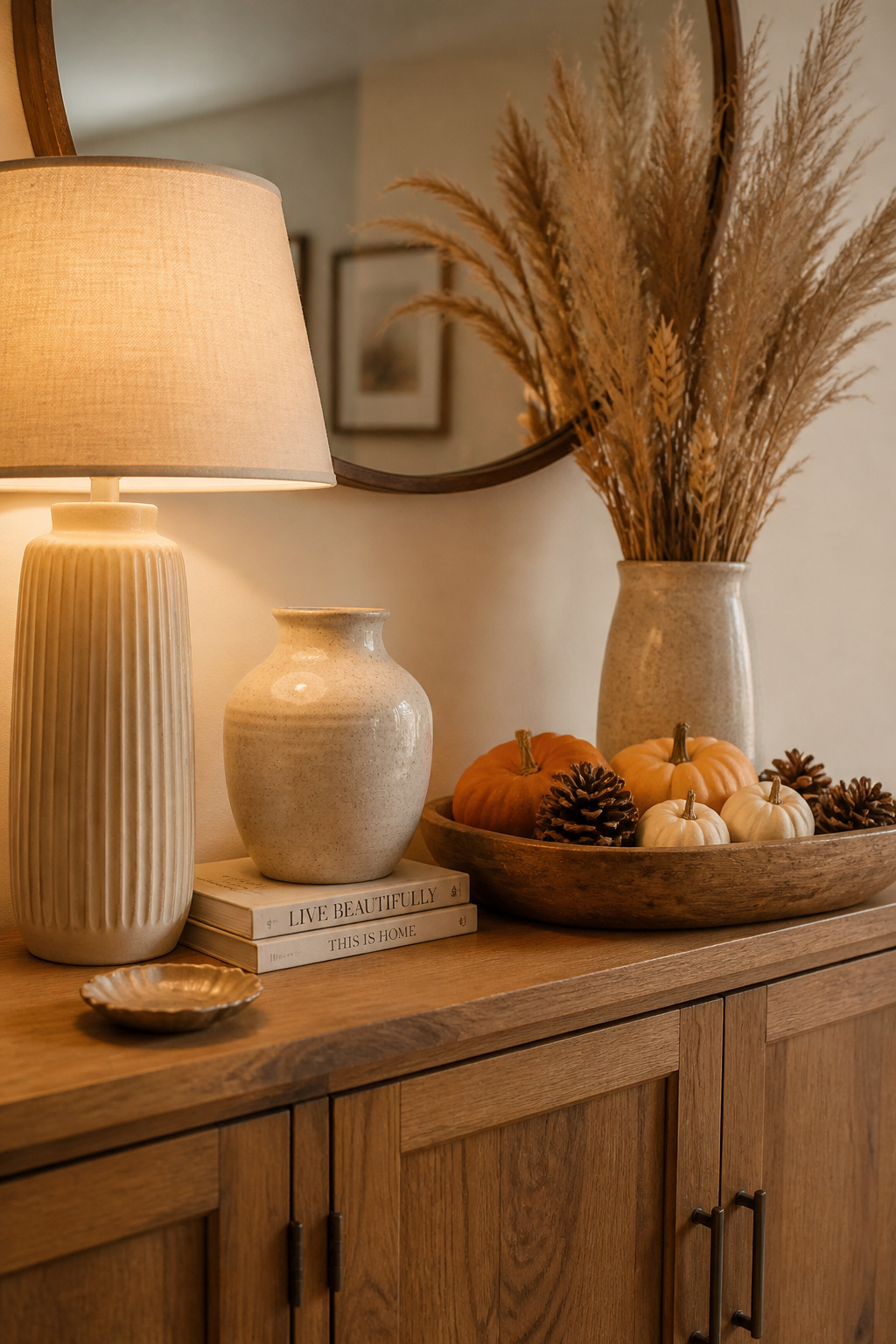
The permanent layer is defined by neutrality and scale — objects large enough to anchor the composition and neutral enough that any season’s accents can change around them without clashing. A lamp is the most universal permanent anchor; a neutral vase, a mirror or artwork above, and a personal stack of books round it out. The rotating layer carries the season’s character, and the refresh follows a simple sequence:
- Leave the permanent anchor layer in place — lamp, large vase, books, the piece above.
- Remove every rotating accent from the surface.
- Establish the season’s palette by placing one or two key seasonal objects first — dried stems and warm tones for fall, pastels and fresh blooms for spring, metallics and greenery for the holidays.
- Add greenery or organic elements last, to soften the arrangement.
Store the off-season accents in labelled boxes by season and the whole swap takes one sitting rather than a fresh haul. The full seasonal schemes — spring through the winter holidays, with the specifics on garland, candlelight and dried botanicals — live in the guide to refreshing your sideboard by season.
The Mistakes That Make a Buffet Look Unfinished
The fastest way to learn the sequence is to see what happens when it is skipped, so here are the recurring errors compressed into a diagnostic. Stand at the far side of the room and check the display against them.
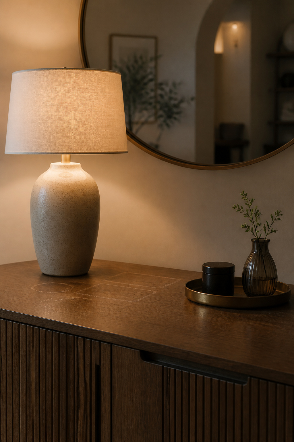
- Everything the same height — the flat-display problem; fix it by making at least one object decisively taller than the rest.
- No anchor or focal point — the surface reads as scattered; install the anchor before returning any object.
- Too many small objects — collections under six inches read as clutter at room scale; choose quality over quantity and leave space between.
- Art or mirror too small or hung too high — the most common wall error; size to two-thirds the furniture width and keep the gap under ten to twelve inches.
- No lighting layer — overhead light casts downward shadows that flatter nothing; a buffet lamp corrects it.
The thread running through every one of these is that the fix is subtraction or correction, not addition. An underwhelmed buffet is usually a scale problem — the objects are there but none is large enough to anchor — so the answer is fewer, larger pieces, not more small ones. And the single fastest transformation is almost always the wall: swap a too-small mirror for a correctly sized one and the buffet’s apparent status in the room changes immediately. Each of these gets its full before-and-after treatment in the common sideboard styling mistakes guide.
I keep a private benchmark for all of this. When my grandfather died he left me 2,400 books — a working farmer who read every night of his life — and I spent a winter cataloguing them, learning as I went that a collection is never a heap to be filled into shelves but a sequence of decisions about what sits next to what. A buffet is the same problem at smaller scale. You are not filling a surface; you are deciding what earns a place on it and in what order the eye should meet them. Run the sequence once — anchor, height, the rule of three, the wall, the light — and you will have a decision rule you can carry to any surface in the house, in any style, in any season. That is the whole of it, and it is yours now.