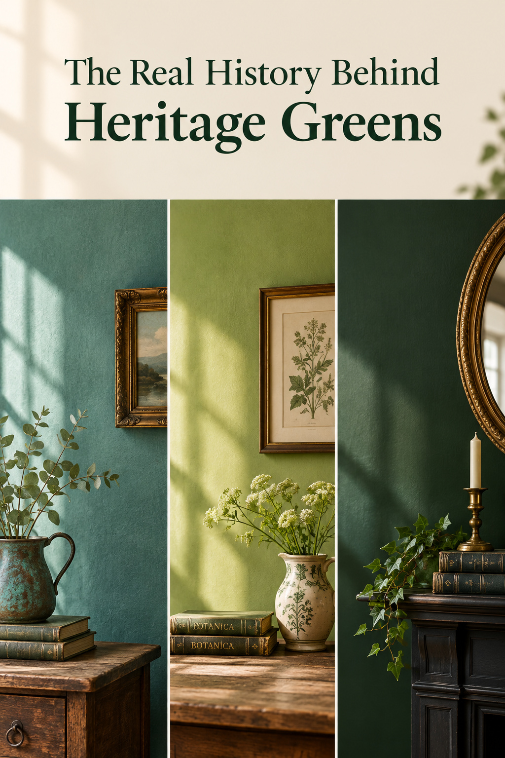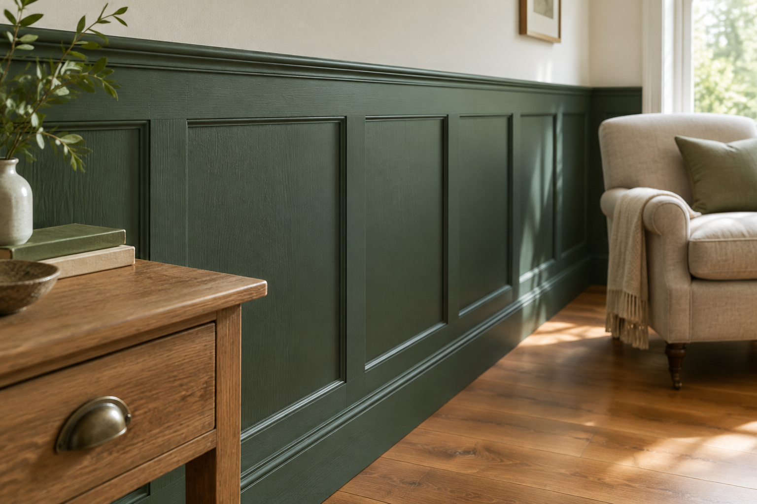

Pull a green off a heritage paint card and it often looks wrong at first: too deep, slightly murky, stranger than anything in a modern deck. Historic green paint colors were made from corroded copper, arsenic salts and chromium oxide, and each behaved its own way on a wall. The names survived and the chemistry did not. Knowing which pigment produced which look tells you which modern line to shop and how the color will land in your own house.
TL;DR
- Three pigment families: copper verdigris, which blackens; the arsenical Scheele’s green (1775) and Paris green (1814); and chromium oxide green, stable and commercial from 1838.
- Period lines mostly reproduce the chrome-era greens, and every reproduction is an optical match, not a chemical one, with no arsenic in a modern can.
- A green matched from an 1820s room reads lighter and flatter in a house built in 1990. That is my reading, so sample it first.
Why Historic Green Paint Colors Don’t Look Like Anything in a Modern Fan Deck
When the archival color looks nothing like the swatch card
Paint research on a period property turns up the real color, and it is usually stranger than the card the owner had already chosen.
What’s different: pigment chemistry, not just fashion
Every historic green was a distinct compound: verdigris is a basic copper acetate, Scheele’s and Paris green are copper arsenites, and chrome green is chromium(III) oxide, Cr2O3.
The three pigment families ahead
CAMEO, the Museum of Fine Arts Boston’s conservation database, holds all three as chemically separate groups. Take them in that order: copper, arsenic, chromium.
Verdigris: The Copper Green That Started It
How verdigris was made: copper encouraged to corrode
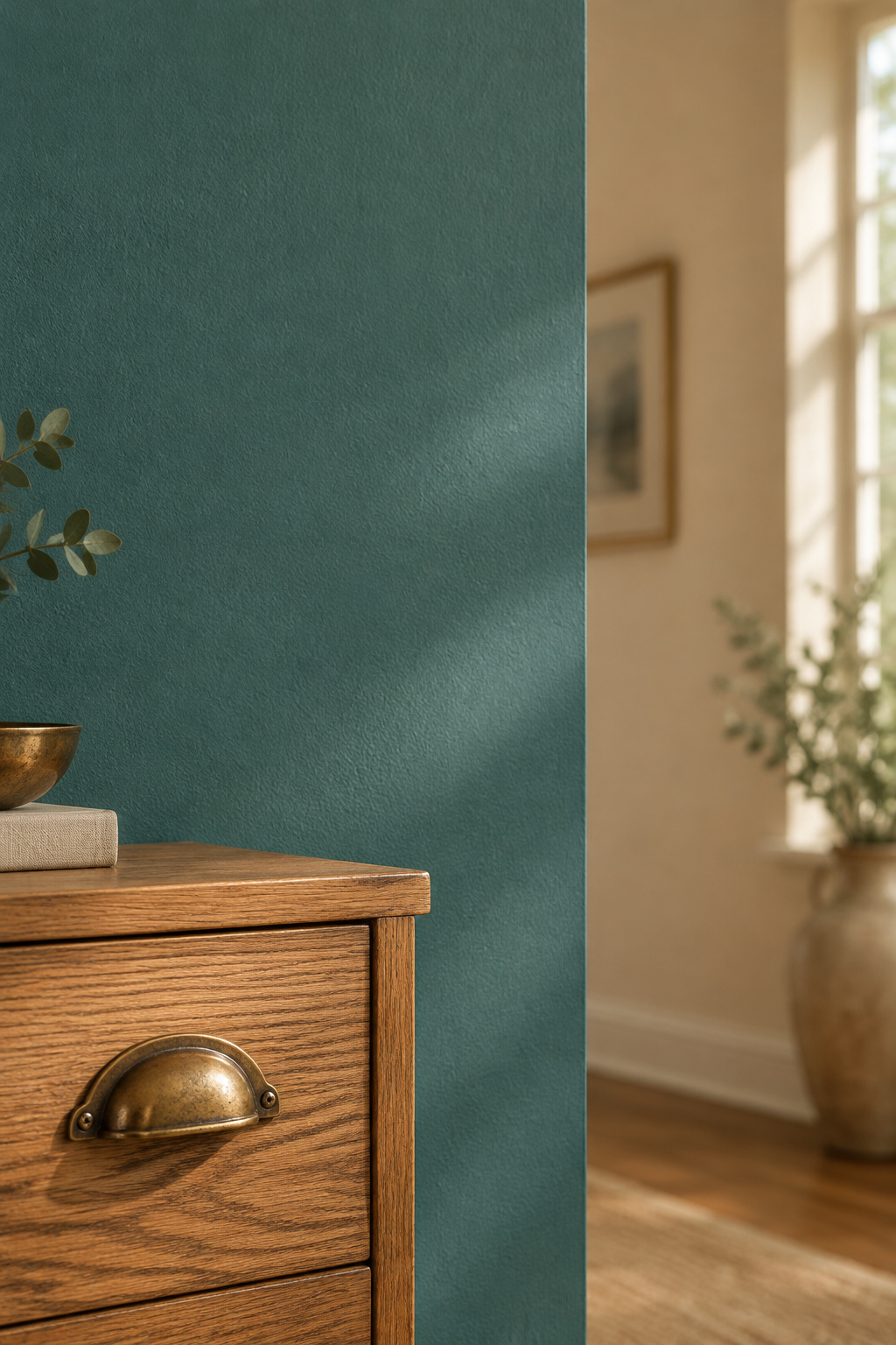
Copper plates were stacked over vats of fermenting grape skins and left. Acetic acid vapor attacked the metal, and the blue-green crust that formed was scraped off as pigment: Cu(C2H3O2)2·2Cu(OH)2.
The blue-green it produces, and where it survives
Verdigris is pleochroic: one crystal shifts from pale green to dark blue with the viewing angle, which is why it looks alive beside a flat modern green. Because it discolored badly in oil, much surviving verdigris work is really copper resinate, the pigment dissolved in resin.
Why it was prized despite being genuinely unstable
It blackens in oil, reacts with sulfur and decomposes with heat, giving off acetic acid fumes. Period decorators accepted all that because nothing else gave them the color. Salvaged copper hardware in my own stock does the same thing in the seams a cloth never reached.
Scheele’s Green and Paris Green: Beautiful and Genuinely Dangerous
How an arsenical pigment became the era’s most fashionable green
Carl Wilhelm Scheele found his green in Sweden, and Paris green followed as the more stable successor. Scheele’s stayed in manufacturers’ catalogs until 1898, per a 2024 paper in npj Heritage Science.
| Pigment | Chemistry | First made |
|---|---|---|
| Scheele’s green | Copper arsenite | Discovered 1775, published 1778 |
| Paris green (Schweinfurt, emerald) | Copper acetoarsenite | 1814 |
What made them so vivid, and so hazardous indoors
Britain was producing over 32 million rolls of wallpaper a year by 1874. One 1858 estimate put roughly 100 million square miles of arsenic-colored paper on British walls, prompting the chemist Alfred Taylor’s line that “wallpaper now furnishes arsenic to the millions.” The physician Thomas Orton traced a household illness that killed four children to the family’s green wallpaper.
Why they were phased out
No law ever ended it, because neither government legislated, so consumer demand and “arsenic-free” marketing did the work. Woollams & Co of London stopped making arsenical papers as early as 1859, and Jeffrey & Co followed with an arsenic-free range by 1884.
Here the record disagrees. Smithsonian Magazine has William Morris personally off arsenical colors by 1885. Oxford University Press’s Journal of Victorian Culture has him a major shareholder in Devon Great Consuls, one of the world’s largest arsenic mines, dismissing the concern as “witch fever” while competitors advertised arsenic-free ranges. The trade moved ahead of one of its most famous names, so read any 1885 date as his firm answering the market, not a change of mind.
The Chrome Greens That Industrialized the Color
So why does nothing in a modern period collection descend from either family?
How chromium made green cheaper and more stable
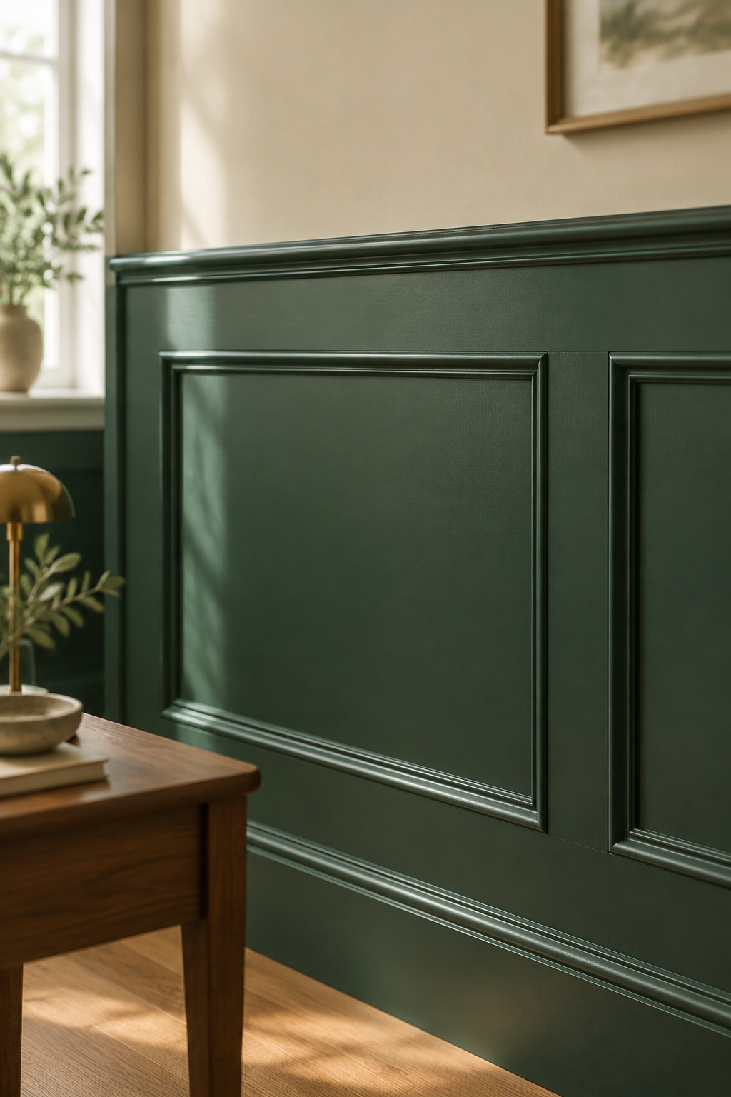
Louis Nicolas Vauquelin identified chromium in 1797, and by 1838 Pannetier and Binet were selling chrome oxide green (chromium(III) oxide, Pigment Green 17) in Paris as a stable commercial pigment.
The shift from artisan-mixed to factory-consistent green paint
Chrome oxide green carries the top lightfastness grade, a mark neither verdigris nor the arsenical greens came near, so green stopped being a craft variable and became a stock item.
Industrialization is also where the shade names came loose. The old ones named the chemistry or the source, Scheele’s for the chemist, Paris and Schweinfurt for cities selling one pigment. When factory pigments replaced them the names floated free, and today’s forest, hunter and bottle are catalog labels, not colorimetry. Benjamin Moore sells both Forest Green 2047-10 and Black Forest Green HC-187, one word apart with opposite undertones, so the code matters more than the name.
Why heritage lines reproduce this era’s greens
Chrome oxide green has no arsenic and no blackening, and became the factory base for the deep bottle and forest greens that fill today’s period palettes. How far to take one of them in a real room is a separate argument: how the deep heritage greens behave now.
Matching a Period Line to Your Room
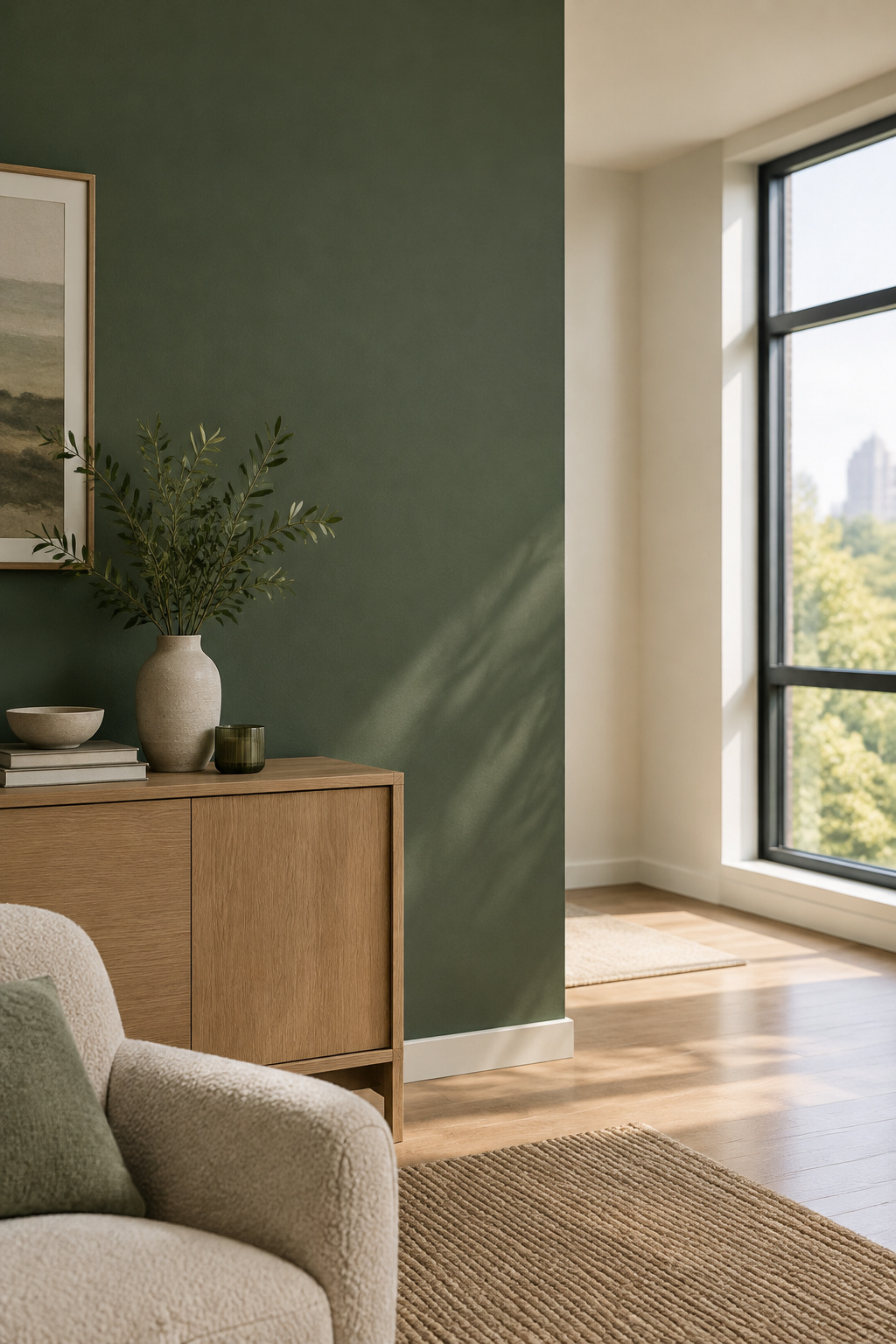
Three brands sell period ranges, and each defines “period” its own way.
Which named period collections reproduce which era’s green
| Collection | Organized by | Named greens |
|---|---|---|
| Little Greene Period | Era: Georgian to 1970s | Grouped by era |
| Benjamin Moore Historical | HC-1 to HC-191; 18th- and 19th-century America | Newburg Green HC-158, Louisburg Green HC-113, Essex Green HC-188 |
| PPG Historic Colors | Style: colonial, Tudor, craftsman, farmhouse | Olive Sprig, Globe Artichoke, Pine Forest |
Each era claim, though, is a brand’s account of its own range, not conservation-grade analysis.
How a color matched to an 1820s room behaves in a house built in 1990
An 1820s room had small windows, single glazing and lime plaster. A 1990 room has larger double-glazed openings, smooth drywall and cooler bulbs. More light reaches the wall, so the same green reads lighter and flatter than its historic reference did. That is my reading, not documented fact; no study treats the comparison directly.
Reading your own house’s period first
Most of my reclaimed stock comes off barn demolitions and estate sales across three counties, and the eye that dates a drawer by its dovetails will date a house by its moldings and window sashes. Take the palette from what you find. On a protected building, paint is the reversible choice, which is what Standard 10 of the Secretary of the Interior’s Standards asks for.
Where a Heritage Green Earns Its Place in a Modern Room
People rule these colors out because their own house is not old enough, and that is the wrong test.
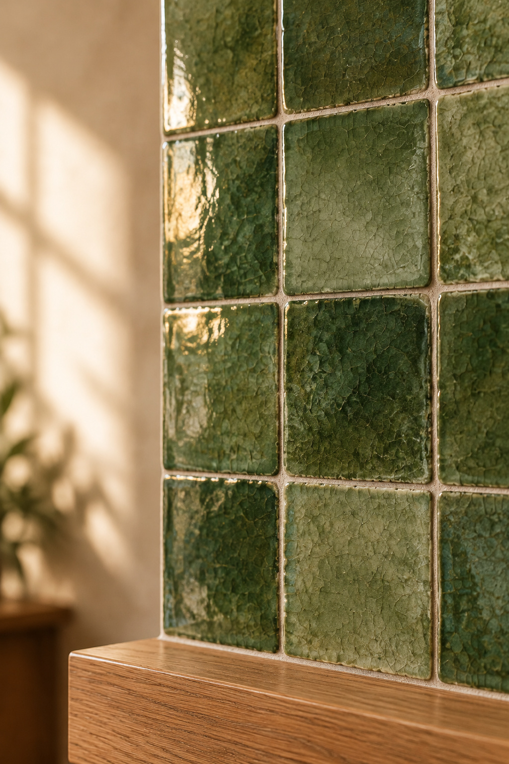
Rooms that aren’t restorations but still suit these colors
Match the era’s saturation, not its architecture. Arts and Crafts designers, following Morris, pushed their palette into tertiary colors, so green became olive, and an olive suits a bungalow-era room. In a plain house, one heritage green against a warm-white field reads as a decision rather than a costume.
These greens as glazed tile, not just paint
These greens also exist as fired glaze on handmade tile, which is permanent where paint is repaintable. The same greens in glazed tile get costed one article over.
What a paint chip never tells you
Verdigris was unstable, the arsenical greens dangerous and chrome green reliable. So shop by brand, name and code, and expect a reproduction to match the look, not the chemistry. If you are still working out where a green belongs in a living room, start a step back from the history.
FAQ
Is it safe to use a reproduction of Scheele’s green paint today?
Yes. Modern reproductions of Scheele’s green and the arsenical-era colors are optically matched, not chemically reproduced, so they contain no arsenic. Copper arsenite is now regulated for use only as a rodenticide, insecticide, fungicide and wood preservative, and every current line meets VOC and lead-safety rules.
What’s the difference between a heritage green and a regular dark green paint?
Heritage lines use higher pigment concentrations and a chalkier, more light-reactive finish that shifts through the day, where mid-tier paint stays flatter. The color also has provenance. A named heritage green is matched from an archival paint scrape or old catalog, not formulated by eye.
Do heritage green paint lines cost more than standard paint?
Substantially, yes. A heritage line such as Farrow & Ball runs roughly $120 to $175 per gallon in the US, against roughly $35 to $95 a gallon for mainstream mid-to-premium brands like Benjamin Moore, Sherwin-Williams and Behr, which top out nearer $110 even at premium tier.