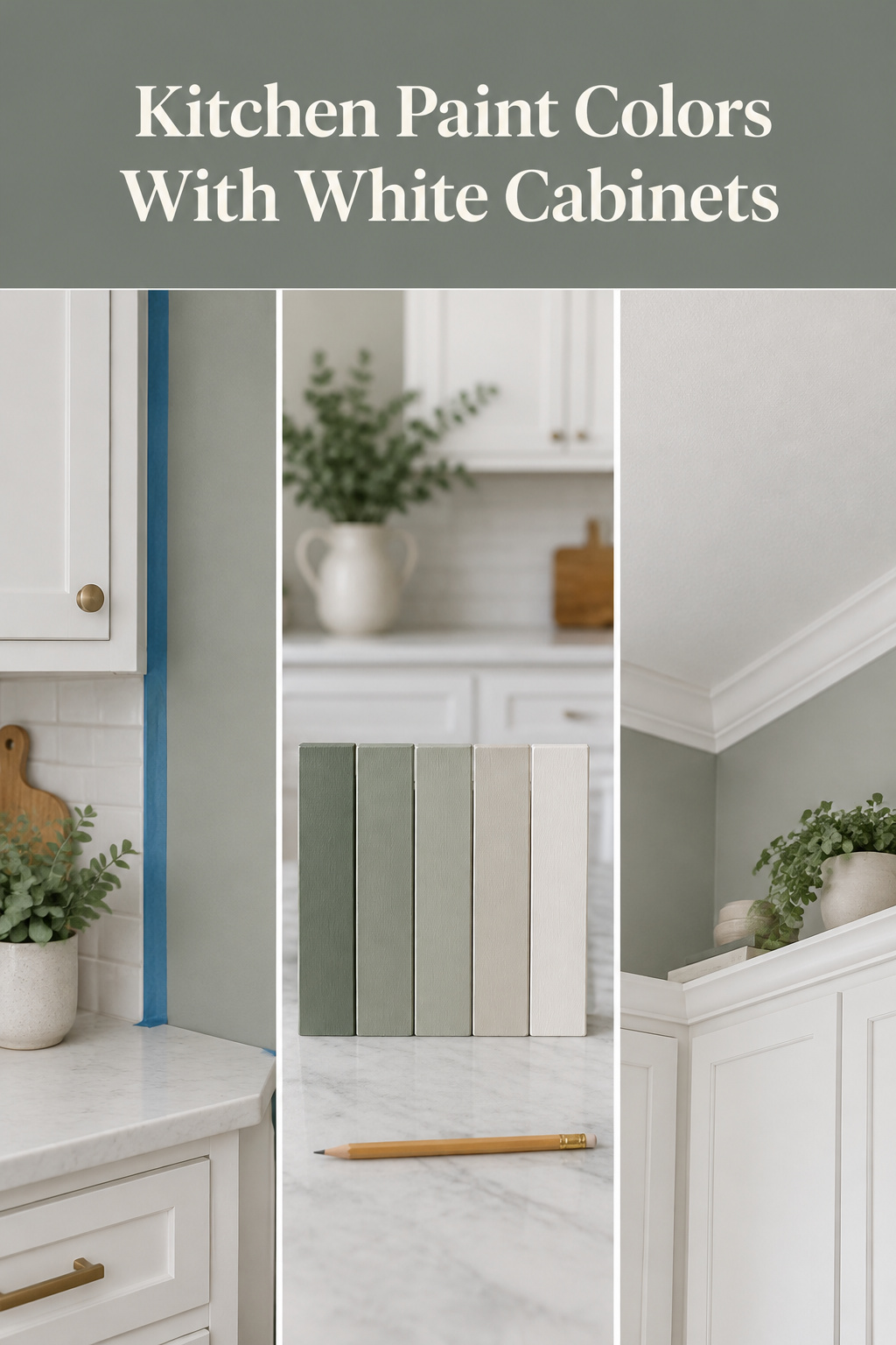
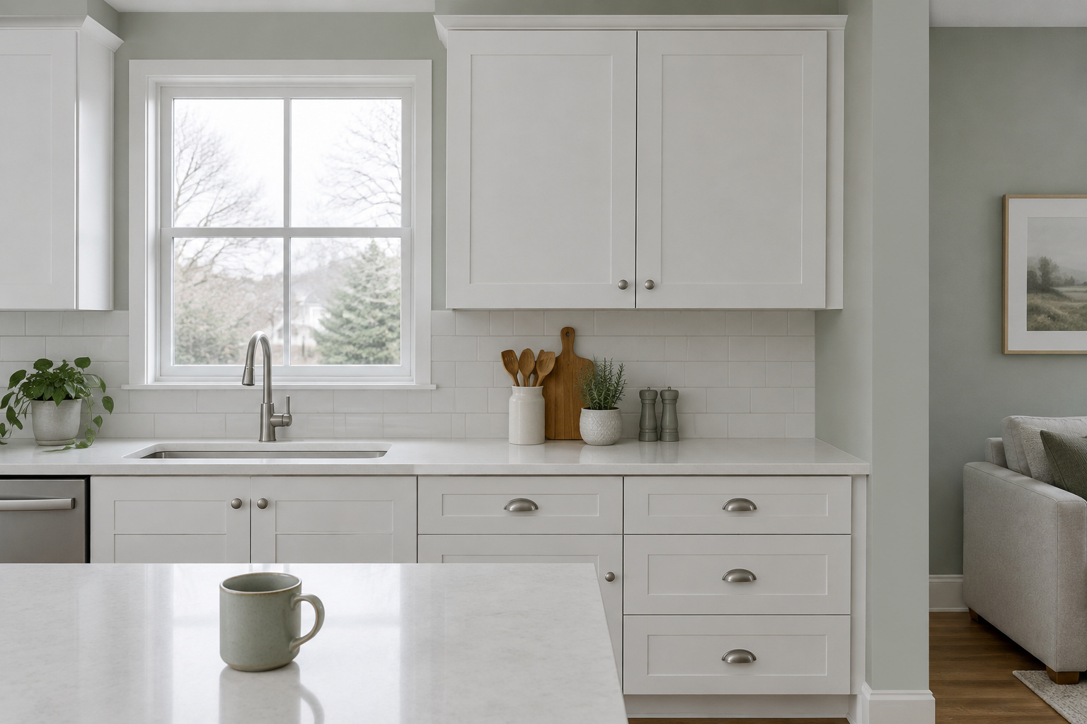
Before you choose kitchen paint colors with white cabinets, do one small sum. Say the cabinet wall behind your sink runs 10 feet under an 8-foot ceiling, uppers end to end and no window: 80 square feet, the canvas the roundups seem to picture when they hand you fifteen colors. Now take the cabinets away. The counter sits at 36 inches, the usual gap above it is 18, and 30-inch uppers carry you to 84 inches, leaving 12 inches of wall on top. If tile fills the gap, 12 inches by 120 inches is 10 square feet of paint on that whole wall: one-eighth of it.
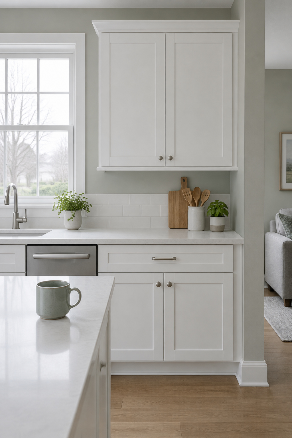
The decision you’ve been dreading is smaller than it feels, and it can be made last.
TL;DR
- On a 10-foot wall under an 8-foot ceiling with 30-inch uppers, about 10 square feet takes paint when the backsplash is tiled and 25 square feet when it’s painted, so plan the wall color as a small dose.
- Let the counter, floor and the room next door choose the wall: cool-veined stone pulls toward a cool gray, golden oak toward a warmer neutral, and a busy surface asks for a quieter wall.
- Five Benjamin Moore colors, each tied to the kitchen it suits: Gray Owl (LRV 64.51), Revere Pewter (55.05), Edgecomb Gray (63.09), Quiet Moments (60.73) and Pale Oak (68.64).
Your Kitchen Wall Is Mostly Strips: Measure What Actually Shows
A kitchen should feel settled. You walk in to make tea, and nothing pulls at your eye. White cabinets do most of that work; the wall only has to hold the edges.
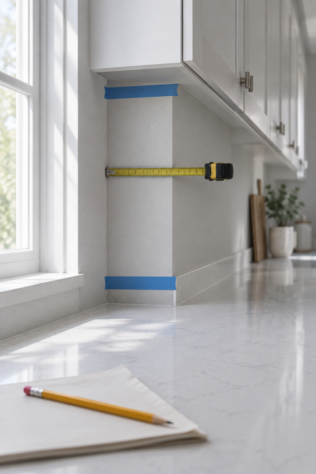
In most white kitchens I walk into, the wall color is the last thing I notice: a band above the uppers, a sliver beside the window. Yet that thin band is what people agonize over, holding chips against a wall that will mostly disappear behind boxes.
The heights in that sum are typical trade figures. No standard fixes them. With 36-inch uppers you’d have about 6 inches above; with 42-inch uppers, none. Leave the gap painted and the wall shows 30 inches by 120, which is 25 square feet, still under a third. At 350 to 400 square feet per gallon, that’s about 0.07 of a gallon per coat.
Nobody has surveyed how much wall a typical kitchen shows, and a window changes the count, so measure your own. The bigger decisions (door, white, finish) come first, in the white kitchen ideas; the wall can wait for them.
Let the Counter, Floor and Next Room Choose the Wall
What can’t change? Start there. The counter, the floor, the backsplash and the room you can see from the sink are already decided, and each one asks the wall for something specific.
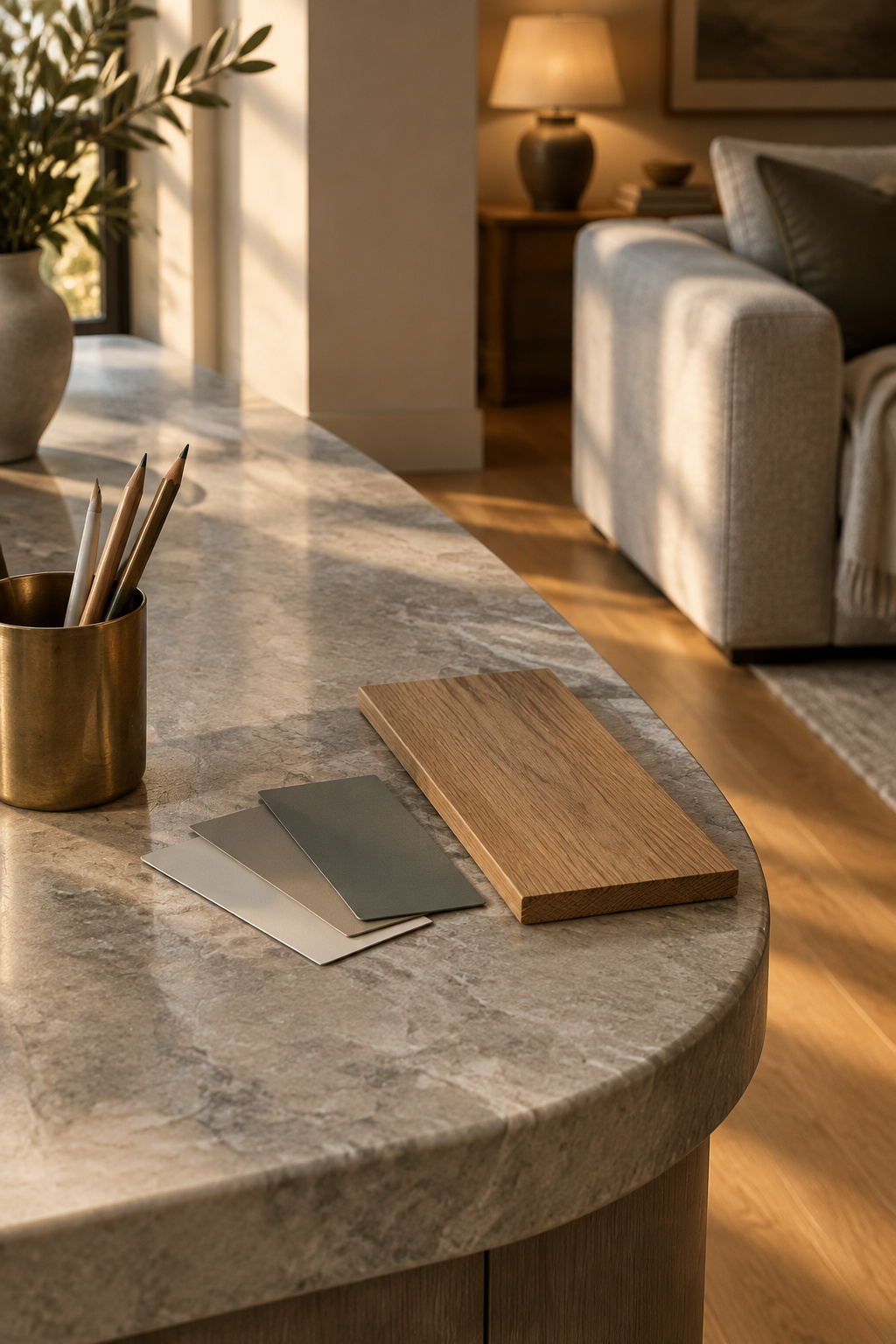
Stone veining is the loudest voice. Marble or quartz with blue-gray veins pulls the kitchen cooler; quartzite or limestone with creamy movement wants warmer neutrals. Oak floors can bring golden undertones (flooring for white cabinets has its own guide). If the counter is busy, let it be the feature and keep the wall quiet.
Then the next room. In an open plan the kitchen wall sits close to another room’s sofa, brick or wood floor, and a wall that looks right beside the counter can still argue with the living room.
The cabinet white is the other fixed input; choosing the white on the cabinets themselves comes before the wall.
A chip can’t show you any of this. Undertone only appears when a color sits next to something else, so hold large samples against the counter and floor, never a blank white wall.
This week, lay a sample beside your counter and your floor before you look at a single swatch name.
Tonal or Contrast: Should the Walls Disappear Into the White or Frame It?
Before any swatch, choose a family. A white kitchen wall either melts into the cabinets or frames them, and the fixed finishes usually tell you which.
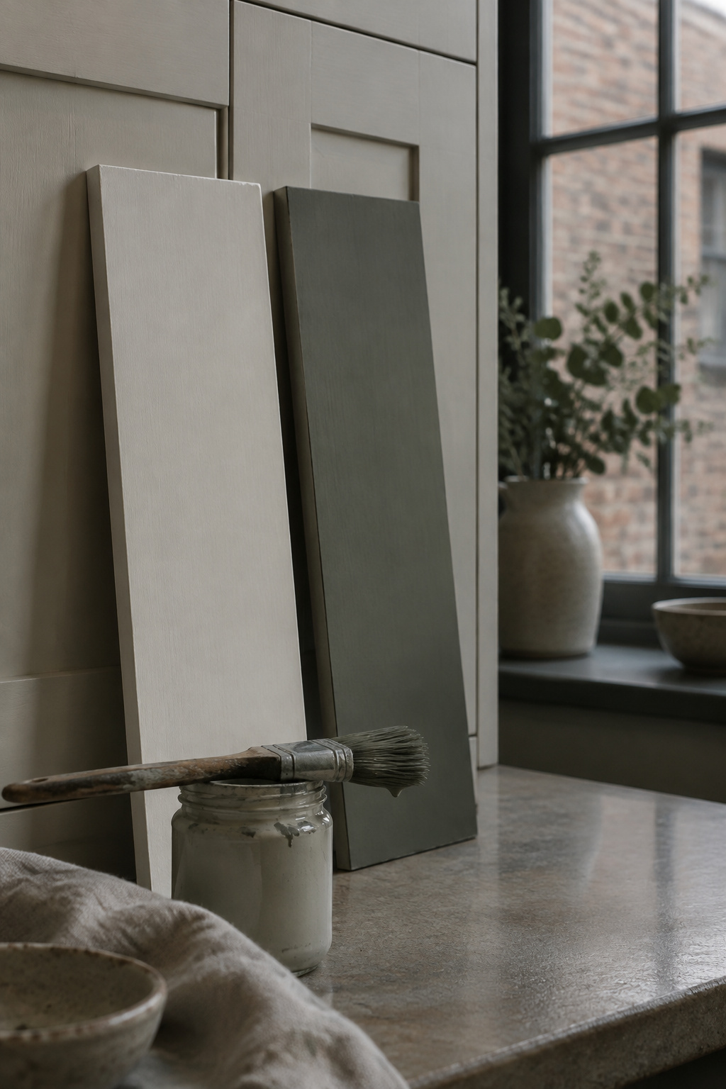
Tonal walls quiet the room
A tonal wall shares the cabinets’ undertone and steps down gently from them, so the eye stops tracing where one ends and the next begins. Patrick O’Donnell of Farrow & Ball says of ceilings and walls that tonally aligned colors can give the illusion of more space, because the eye is less drawn to where one surface stops. Tonal suits a small kitchen, a dim one, or one open to the living room. For north-facing rooms, Sherwin-Williams advises a warm undertone and a lighter color.
Contrast walls frame the white
A contrast wall brings a different undertone or a clearly deeper value, so the white stands out as a crisp shape. It suits a bright kitchen with real open wall, or a counter plain enough not to compete.
My rule of thumb: small, dim or open to the next room, go tonal; bright, with real wall to show, go contrast. Decide that first and the swatch fan shrinks.
Five Kitchen Paint Colors With White Cabinets, Each Tied to the Kitchen It Suits
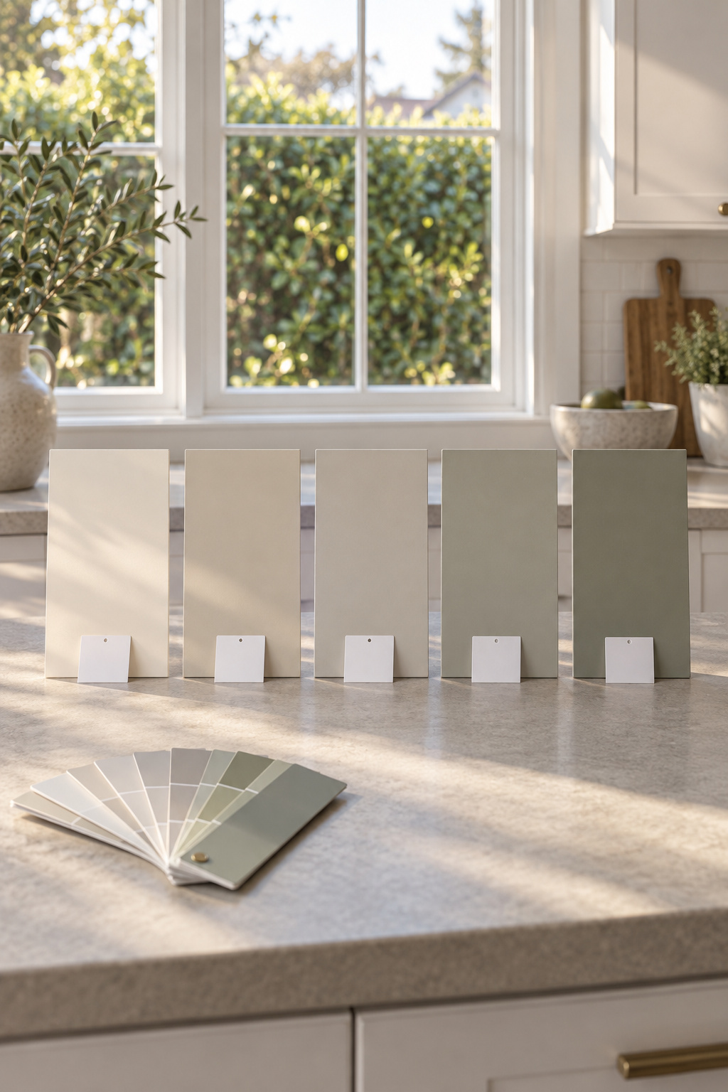
The roundups hand you fifteen colors; five, each matched to one kind of kitchen, are easier to choose from. All five below are Benjamin Moore, with the LRV from the maker’s own color page; the pairing to each kitchen is my judgement.
| Color | LRV | The kitchen it answers | Family |
|---|---|---|---|
| Gray Owl OC-52 | 64.51 | Cool-veined marble or quartz counter | Tonal |
| Revere Pewter HC-172 | 55.05 | Warm wood floor, golden oak | Contrast |
| Edgecomb Gray HC-173 | 63.09 | Busy or dark counter or backsplash | Contrast |
| Quiet Moments 1563 | 60.73 | Next room already blue, gray or green | Contrast |
| Pale Oak OC-20 | 68.64 | Dim, north-facing kitchen | Tonal |
LRV, light reflectance value, is a scale that runs from 0 for black to 100 for a perfect white. Revere Pewter is the deepest of the five, which is why it can frame white against a golden floor. Edgecomb Gray is a neutral that can lean gray-green, and the maker calls it warm and welcoming, which is calm beside a pattern. Quiet Moments is a blue-gray the maker says “inspires quiet meditation.” I’m hardly going to argue.
Pick the row that matches your counter, floor or next room, and put the others back.
One Kitchen, Start to Finish: How the Choice Actually Gets Made
Take a typical kitchen: a 10-foot cabinet wall, 30-inch uppers, an 8-foot ceiling and a tiled backsplash, so about 10 square feet of paint above the uppers plus the strips by the window. The counter is quartz with blue-gray veining, the floor is golden oak, and the room opens into a living room.
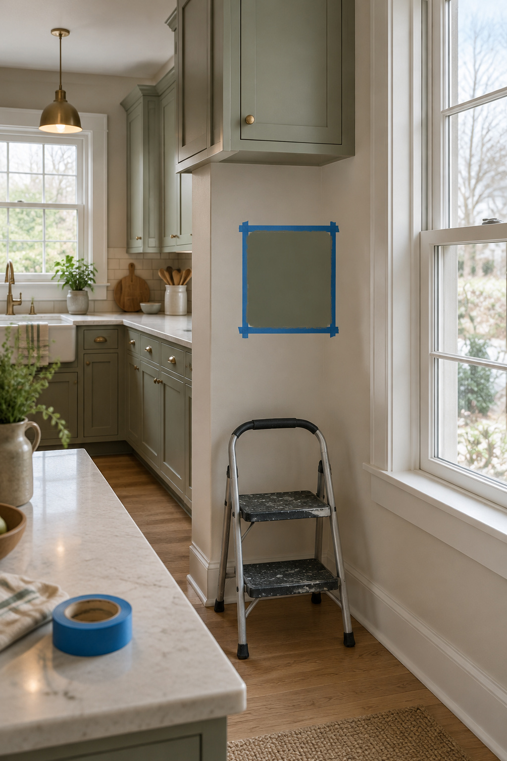
Small and open, so the family is tonal. The counter points to Gray Owl, and the chip looks perfect against the veins.
Then the sample. Paint a large poster board with two full coats, never the old wall, and move it between a sunny wall and a shaded one. Beside the counter, Gray Owl is fine. Down by the oak floor it turns cold and a little blue.
So Pale Oak goes up instead. Its warm gray sits easily between cool stone and golden floor, and it stays tonal with the cabinets. Last, carry the board to the darker end of the room in the evening, under the lamps you actually use. Most rooms are too bright in the evening, and dim lamps at different heights beat one ceiling fixture.
Pale Oak stays. It cost two boards and a week of glancing at them while the kettle heated. My kettle is cast iron, kept on the stove mostly for the sound it makes.
Ceiling, Trim and a Small Dose of Wall Color You Can Live With
Ceiling and trim belong to the same small dose, so settle their white alongside the wall. Skip the stark brilliant white. A white that shares an undertone with the wall softens the line where they meet, while cool trim beside a warm wall makes the wall look dull. A light ceiling is the safe choice in a low kitchen, since lighter ceilings make a room seem taller.
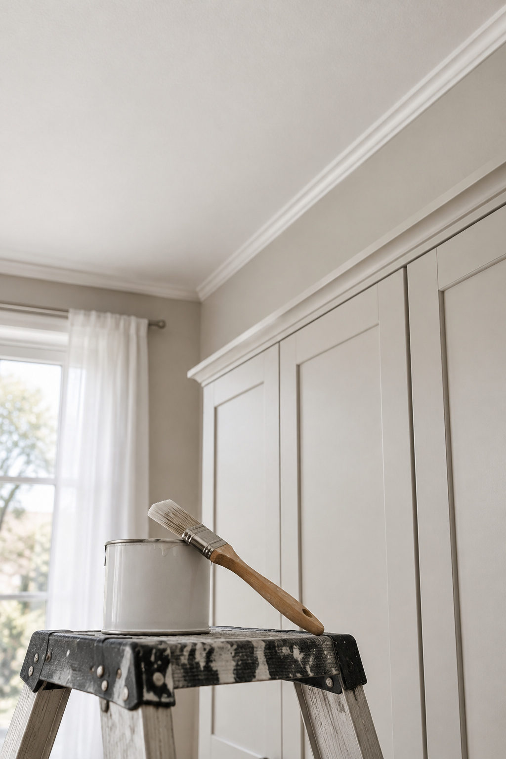
Paint in order: ceiling, then walls, then trim, so drips don’t land on finished work. The next question is how the white fronts hold up, which is where keeping a white kitchen clean day to day comes in.
What you’re after is the kitchen from the start: you walk in for tea and nothing pulls at you. The counter, floor and next room narrow the choice, tonal or contrast narrows it again, and one row of the table finishes it. On a 10-foot wall under an 8-foot ceiling, with 30-inch uppers and a tiled backsplash, about 10 square feet takes this color. Let it be small.
FAQ
What sheen should kitchen wall paint be?
Makers don’t agree, so there’s no single rule. Sherwin-Williams’ sheen guide says semi-gloss for kitchens in its text, yet its own table lists matte through pearl for kitchen walls. Elsewhere the advice runs from eggshell to semi-gloss, and eggshell or satin sits comfortably in the middle of that range.
Should I paint the kitchen walls before or after installing new cabinets?
It depends whom you ask. Painting first is easier with new cabinets, since nothing is in the way and nothing will splatter. Painting last makes it easier to match the color to the installed counter and tile. Either way, choose the color only after the fixed finishes are chosen.
Is an accent wall a good idea in a small kitchen with white cabinets?
Opinions split. The Spruce advises against accent walls in small rooms because they can break up the space and make it feel smaller, while a cabinet seller says yes, using the backsplash wall or a galley’s end wall and going lighter if there’s no window. A cabinet-lined kitchen rarely has a clear wall to accent anyway.