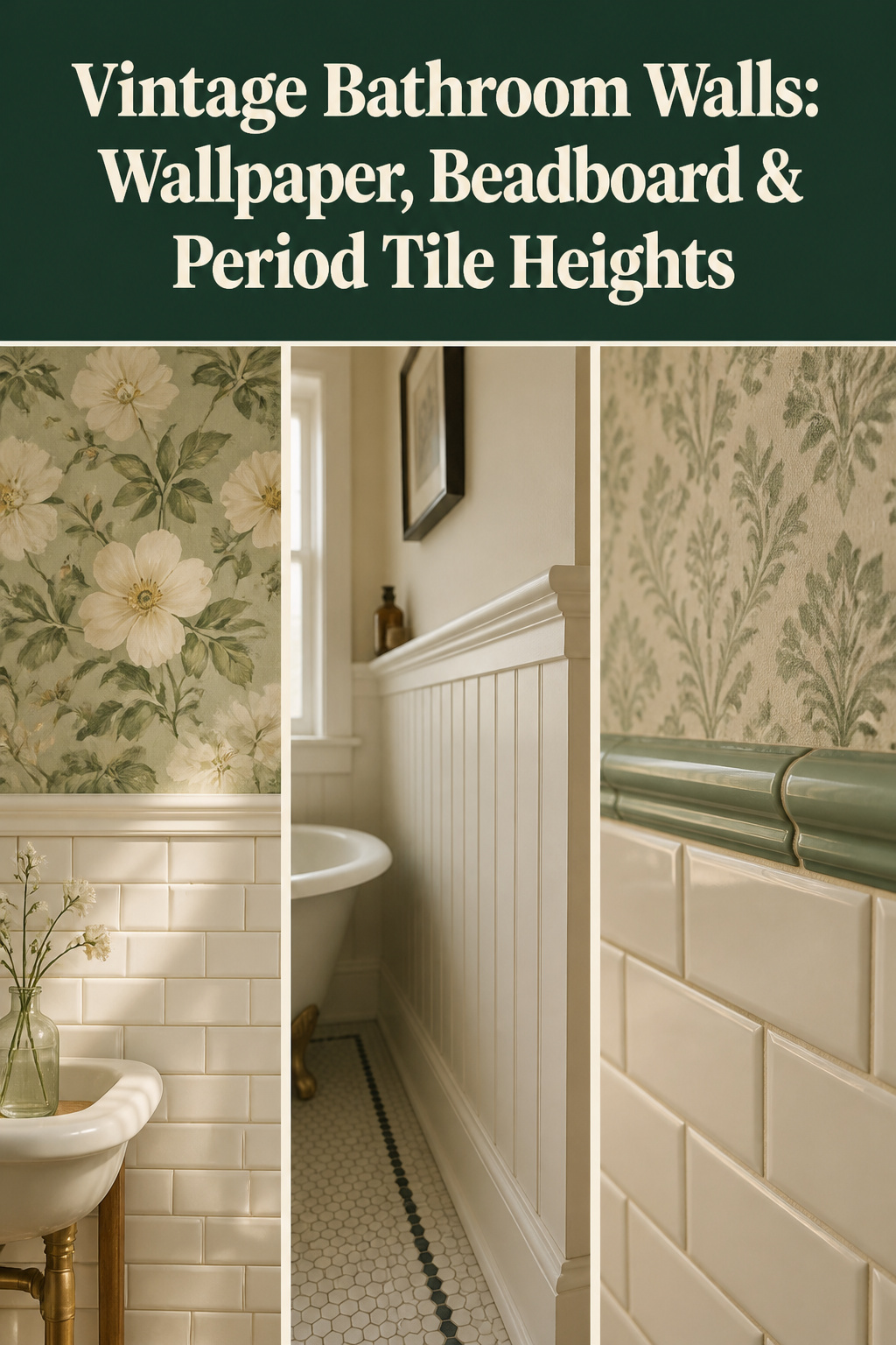
Step into a pre-war bathroom on a bright morning and the first thing you notice is not the tub. It is the wall above the tile. A soft botanical paper catches the light and shifts as you move, the pattern lifting from highlight to shadow the way a painted wall never can. Your hand finds the cool ceramic of the wainscot, then the warmer plane of paper above. That mood — domestic, not clinical — comes almost entirely from the upper wall. Vintage bathroom wallpaper is buildable, and the choices that make it survive a damp room are fewer than you fear.
TL;DR
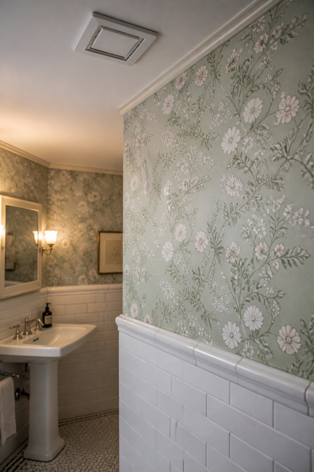
- Run tile as a wainscot to 48-54 inches (period standard), capped by a bullnose or border tile, with wallpaper or paint above — not the modern 36-inch height.
- Choose vinyl-coated, solid vinyl or non-woven paper, never traditional cellulose; prime with a mould-resistant primer and hang with fungicidal paste.
- Ventilation makes or breaks the install: fit an exhaust fan at 1 CFM per square foot (a 50 sq ft room needs 50 CFM), vented to the exterior.

What a Well-Papered Vintage Bathroom Actually Feels Like
The appeal of a papered wall is sensory first and technical second, so it helps to know what you are reaching for.
Pattern, warmth, and the difference from a painted room
A bathroom is mostly hard surfaces: enamel, vitreous china, glazed tile, mirror glass. Wallpaper softens all of it. The repeat gives the eye somewhere to rest, and the pattern shifts with the daylight in a way flat paint cannot. Through the 1920s to 1940s, period bathrooms were frequently papered above the wainscot.
Why the wall sets the mood, even when the fixtures are beautiful
The clawfoot tub or pedestal sink is the biggest commitment, but the wall decides the room’s register: spare and sanitary, or warm and atmospheric. As the Old House Journal notes, period homeowners were eager to perk up blank walls with fresh paper, since a whole room could be papered for pennies. The fixture anchors the room; the wall gives it feeling.
The promise: a wall treatment that survives a bathroom
The usual fears — peeling, mould, moisture damage — are all preventable. They come down to three decisions: the right material, proper preparation, and adequate ventilation. This article walks the wall as a whole, and the wider room it belongs to lives in the complete vintage bathroom guide.
The Tile-to-Wall Transition: Getting the Height Right
Where the tile stops and the wall begins is the first decision; it sets the proportion for everything above.
Period convention: tile to dado height, then wall above
Before the 1950s, tile ran as a wainscot, reaching higher only around the tub; full-height tile is largely a post-war development. The classic wainscot spans 34-54 inches. The modern average is 36 inches, aligned with vanity height — but pre-war bathrooms ran to 48-54 inches, treating the upper wall as a distinct surface for paper or paint. Set a period wainscot at 36 inches and it reads too low for the room’s age.
The rail or border that marks the join
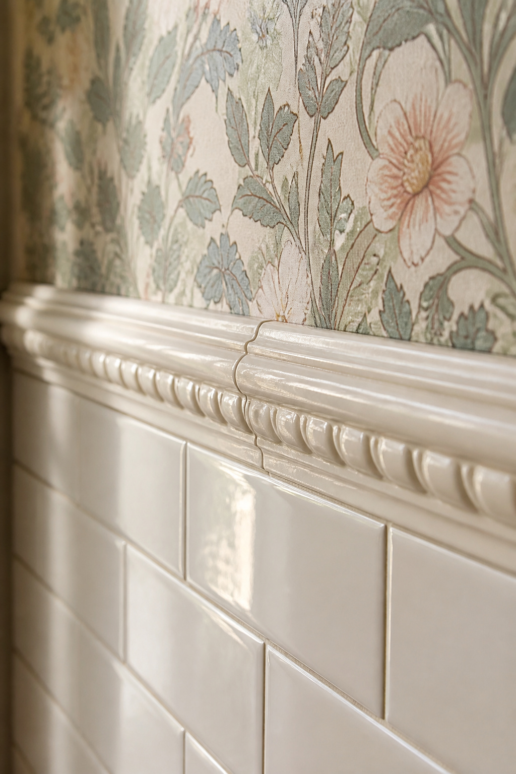
The transition was never a raw tile edge. Period bathrooms capped the field tile with a decorative trim: a chair-rail-style bullnose with a rounded, projecting edge, or a border of moulded tile — bas-relief garlands and shells in soft pastel glazes. The 1920s-30s Art Deco rooms used a narrow one-inch pencil border instead, as a crisp horizontal divider. That cap is the full-stop between two surfaces.
When to break the rule
Both extremes have precedent. Full-height tile suits a mid-century bathroom — the 1928 American Standard catalogue already showed fully tiled rooms as aspirational. An all-wallpaper room with no wainscot suits a powder room or half-bath, where water contact is minimal.
Period Floral Wallpaper: Pattern Scales, Motifs and the Right Era
“Floral” spans two decades that read very differently, and the decade of the house decides which is authentic.
| Era | Motif | Scale (repeat) | Colour base | Room it suits |
|---|---|---|---|---|
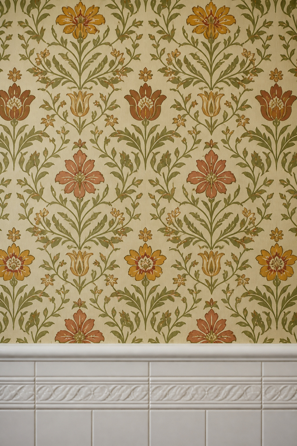
| 1900s-1910s | Flat, stylised botanicals | Large, 18-27 in | Olive, terracotta, ochre | Arts and Crafts bungalow |
| 1930s-1940s | Loose watercolour florals, toile | Medium-large | Cream, Wedgwood blue, sage | Inter-war / Colonial Revival |
| 1930s alt. | Line / abstract papers | Fine, near-plain | Single muted tone | Restrained period rooms |
Arts and Crafts florals: the flat, stylised patterns of the 1900s-1910s
William Morris produced fifty block-printed papers stylised from British native plants — the ancestor of every Arts and Crafts bathroom wall. The defining quality is flatness: the motifs read as pattern, not trompe-l’oeil foliage. The palette is tertiary: green becomes olive, red terracotta, yellow ochre. That desaturation is what reads as antique, and what cheaper reproductions miss by reaching for brighter primaries.
1930s-40s pastoral papers: loose watercolour florals and toile
By the late 1920s, chintz-inspired florals took over: loose, multi-coloured prints on warm ivory grounds, evoking the British country house. The quintessential 1940s Colonial Revival paper was Wedgwood blue or green with white sprigged flowers. Toile-adjacent pastoral prints — single-colour figures on white — suit smaller rooms a bold all-over print would overwhelm.
Pattern scale in a small room: why large often beats small
The instinct in a tight bathroom is a small, dainty print. Resist it. A large botanical repeat of 18 inches or more presents complete motifs and reads as curated, while a small ditsy pattern dissolves into visual noise. A large repeat also forgives low ceilings, drawing the eye upward.
Vintage Bathroom Wallpaper That Survives Steam and Moisture
This is the question that stops most people committing to paper. Survival rests on material, preparation and ventilation.
Vinyl-coated, non-woven, or traditional: what each tolerates
| Wallpaper type | Best for | Limits |
|---|---|---|
| Solid vinyl (Type II) | Full bathrooms with daily shower use | Heavy; limited vintage print availability |
| Vinyl-coated paper | Powder rooms, low steam exposure | Less durable than solid vinyl |
| Non-woven | Bathrooms with good ventilation | Not waterproof; keep away from direct spray |
| Traditional cellulose | Not for wet bathrooms | Absorbs moisture, delaminates |
Preparation that matters: priming the wall
The wall must be dry, clean, smooth and evenly absorbent before any paper goes up, because every imperfection telegraphs through the finish. Apply a mould-resistant primer before paste — it smooths the surface for adhesion and prevents mould behind the paper. On the bare plaster common in period houses, a universal wallcovering primer stops the paste absorbing unevenly.
Ventilation as part of the installation
Ventilation is part of the wallpaper, not separate from it. Excess moisture weakens adhesive and causes peeling, so the exhaust fan is structural to the install. Size it at 1 CFM per square foot: a 50-square-foot bathroom needs a minimum 50 CFM fan, vented to the exterior, never into an attic. The EPA target is 30-50% indoor humidity, impossible to hold in a shower room without it. As Wallpaper Boulevard puts it, paper won’t peel faster than in any other room when ventilation pulls the dampness out within minutes. Under-specify the fan and even the best vinyl fails.
Beadboard and Wainscoting: The Panelled Wall Alternative
Paper is not the only period wall. Where you want texture rather than pattern below the dado, a panelled wainscot does the same job — and pairs happily with paper above.
Beadboard, flat-panel, or raised-panel: the period each reads as
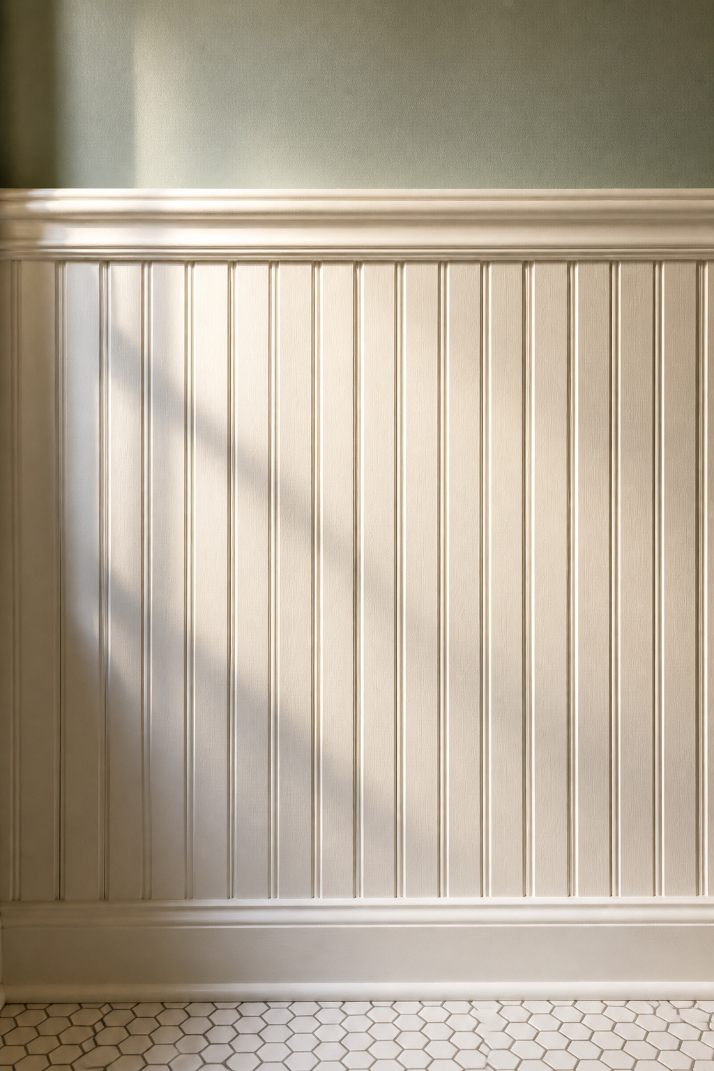
Beadboard — narrow vertical planks parted by a small bead — gained huge popularity in the Victorian era and ran through the inter-war years, reading as cottage and vernacular Victorian or Edwardian rather than formal Georgian. Flat-panel wainscoting reads Craftsman, suiting a 1910s-20s bungalow; raised-panel is the most formal, at home in Georgian and colonial revival rooms. Choose the panel style to the decade, as you would the paper above.
Height conventions: dado panels with painted or papered wall above
For the cottage look most readers want, beadboard sits at 32-42 inches. For Victorian accuracy, 48 inches — four feet — is the documented height, leaving the wall half panelled and half papered. The 36-48 inch range also shields against the worst splashing; in a tall 9-10 foot room, push to 48-54 inches. A bold period paper above a panelled dado is a common anchor of a modern vintage look.
Painting beadboard so it survives humidity
The paint is the difference between beadboard that lasts and beadboard that yellows. Use an interior acrylic-latex in gloss or semi-gloss — water-based, moisture-resistant, and hard enough to wipe clean without dulling the bead. A latex made for humid rooms carries a mildewcide. Skip oil-based gloss: the traditional woodwork choice yellows in bathroom humidity, whatever its merits elsewhere.
Coordinating the Wall with the Palette and Accessories
A wall is read against the floor, the fixtures and the objects in front of it — the whole should look designed, not assembled.
Matching the wall to the floor tile
The principle is simple: one pattern, one plain. A patterned paper wants a plain tile field — a whimsical paper above a black-and-white hex or penny floor is a classic period composition. If you build the room from one colour, pick tile and paper in different shades of the same family: a darker subway below, a lighter paper above.
Choosing paper when the fixtures are already a period colour
When a pink tub or green basin is fixed, build the palette around it. Warm neutrals — beige, soft grey — make paper grounds that enhance a coloured fixture without fighting it. Where the fixtures are white or cream, a deep forest green or midnight blue paper becomes a scenographic background that highlights fixture detail and brass.
Layering the wall: mirror, shelf and textile
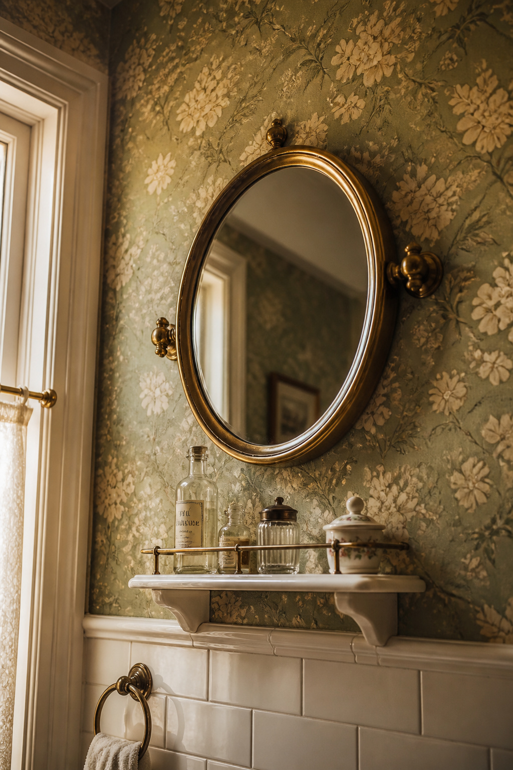
A papered wall is a backdrop that makes objects look chosen. Brass accessories and warm lighting pick up the olive and ochre of an Arts and Crafts paper, or the cream and sage of a 1930s pastoral. But restraint is the rule: three well-chosen pieces read better than twelve, since the wall is already doing the decorative work. For the gilded mirrors, apothecary jars and fringed textiles that finish it, see styling the wall.
A vintage bathroom wall is not one decision but a small, ordered set: the height the tile climbs to, the cap that marks the change, the era the paper belongs to, and the fan that lets it survive. Make those choices in order and the morning light does the rest — the pattern shifting on a steam-warmed wall, the room reading as a place that was lived in.
FAQ
Can you put wallpaper in a bathroom with no window?
Yes, but mechanical ventilation becomes non-negotiable. A windowless bathroom without a working exhaust fan cannot hold safe humidity (30-50% RH), so any paper will eventually fail. Choose vinyl or non-woven, never cellulose; prime with a mould-resistant primer; and run the fan for at least 20 minutes after every bath or shower.
What type of wallpaper paste is best for a steamy bathroom?
Use a fungicidal, mould-proof paste for any bathroom — standard paste cannot resist sustained humidity, and the fungicide stops mould forming in the adhesive layer itself. For vinyl or Type II papers, pair it with a heavy-duty adhesive made for humid conditions, and apply extra paste under any seams that sit near the shower.
How high should beadboard wainscoting be in a period bathroom?
For Victorian accuracy, 48 inches (four feet) is the documented height — taller than the modern 32-36 inch default, which reads as contemporary. In practical terms, 36-48 inches clears most splashing from basin and bath. In tall 9-10 foot period rooms, push the beadboard to 48-54 inches so it keeps its proportion to the wall.