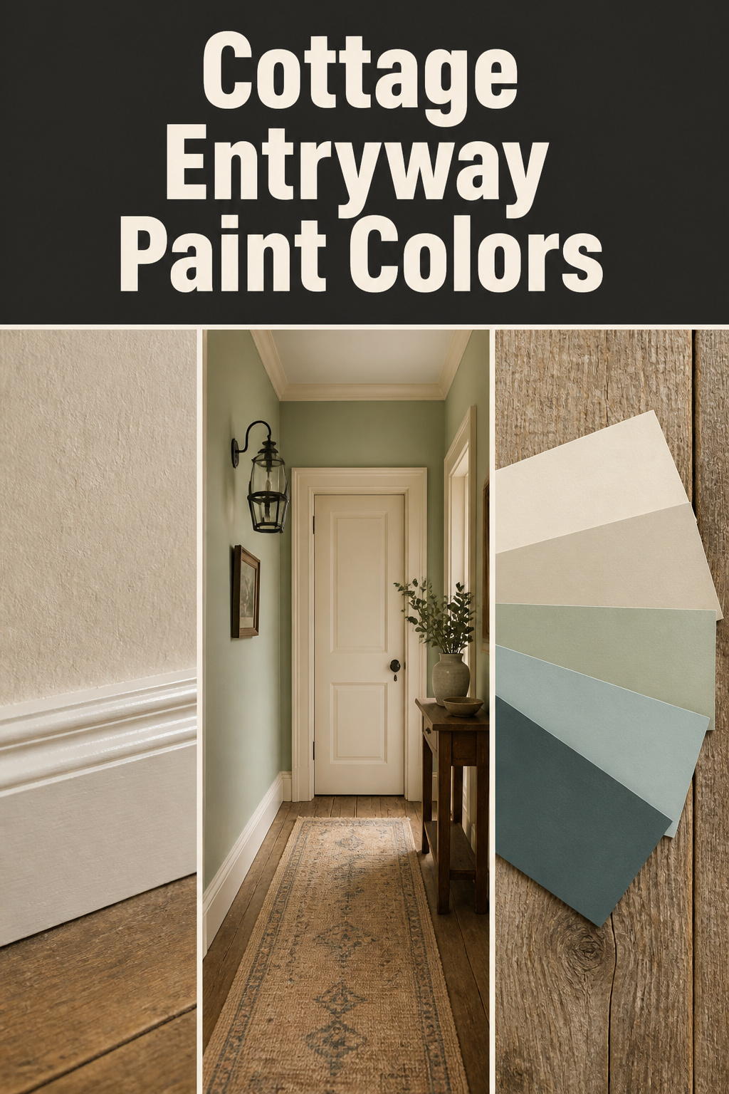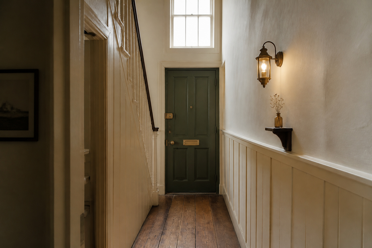

The warm neutrals we now call “heritage colour” were never a style decision. In a Georgian or early Victorian cottage, the entry was painted with whatever the local plasterer could mix cheaply: a stone-white or warm buff, tinted with yellow ochre, raw umber, or lamp black. Those earth pigments explain why a saved image can feel authentically warm while your own freshly painted hall reads as a beige box. The right cottage entryway paint colors have a chemistry behind them, and once you can see it, you choose with confidence instead of guessing.
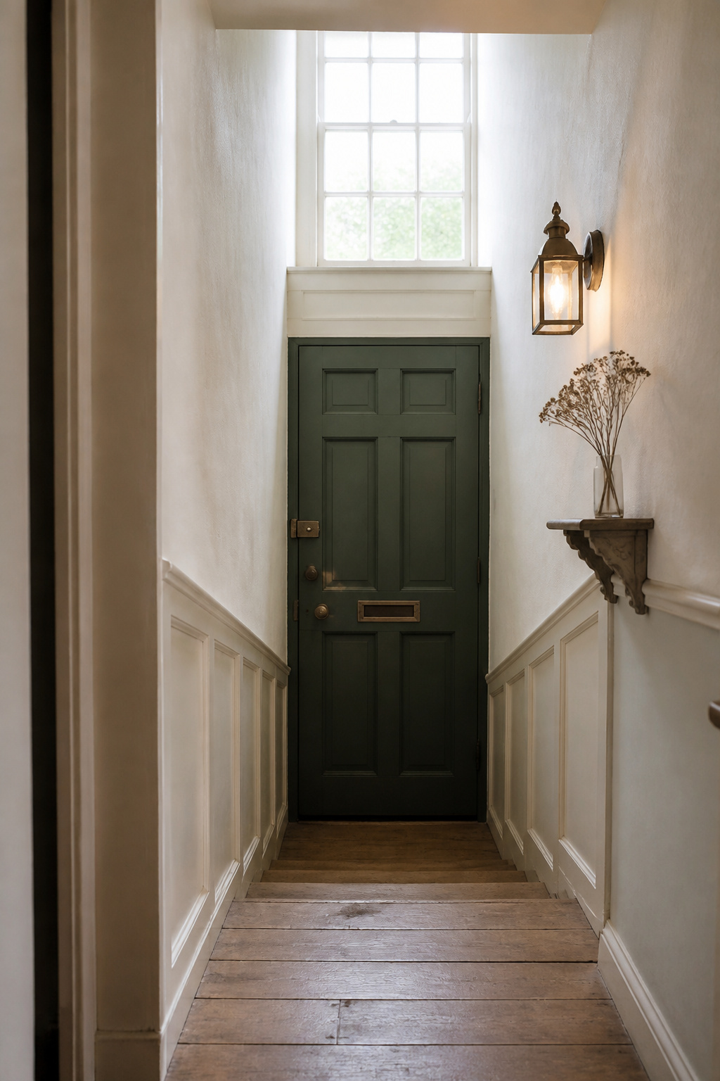
TL;DR
- The cottage palette runs from warm whites (Benjamin Moore White Dove, Swiss Coffee) through mineral greiges (Edgecomb Gray, Pale Oak) into muted heritage greens — all earth-pigment-derived, never cold titanium-based beige.
- Use eggshell on walls and semi-gloss one level up on trim; flat paint fails in a high-touch entry.
- Sequence the decision floor tone first, wall second, trim third; test a 2-foot sample on the wall over 24–48 hours in both daylight and evening light.
Why Cottage Entryway Color Has a Provenance Worth Knowing
Georgian walls were muted and sophisticated — a stone-white softened with earth pigment and carbon black — and cottage households followed that plain palette because specialist pigments cost money the artisan classes could not spare. The cottage entryway ideas guide sets the whole palette in context.
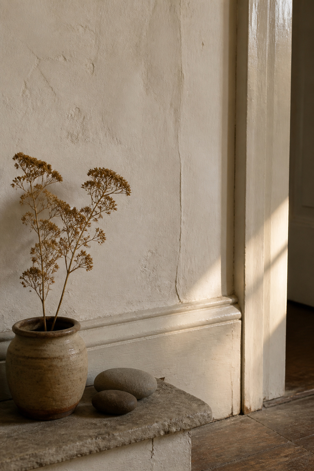
How Georgian and Victorian cottage interiors settled on the warm neutral palette
Victorian paint could be bold — coal-tar dyes made deep Brunswick greens affordable by mid-century — but the influential voices pulled the other way. Andrew Jackson Downing championed natural tones from sand, clay, straw, slate, and stone, and a cottage entry stayed close to that quieter end. Little Greene’s Georgian collection, recreated from historic paint analysis, preserves names like White Lead and Orangerie — exactly what the period reached for.
What early pigment chemistry produced — and why those tones still work
Soft distemper, the dominant interior paint until the early twentieth century, was pulverised chalk bound with animal-glue size — its colour range narrow: ochre, sienna, umber, terre verte, lamp black. Applied in thin coats, each wash let the one beneath show through. That layered translucency is the key difference: a genuine heritage cream has depth; a modern beige is opaque and dead-flat, starting from cold titanium dioxide. Creams that come closest draw their warmth from yellow and raw-umber pigments, exactly as the old plasterer’s did.
Cottage Entryway Paint Colors: The Heritage Neutral Palette
The core cottage band runs from warm white through off-white into mineral greige — each shade holding a warm undertone that keeps an entry from tipping cold.
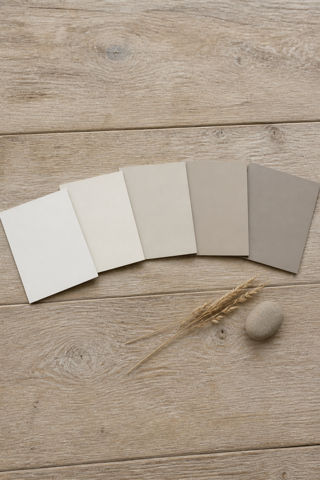
Benjamin Moore White Dove, Swiss Coffee, and their period character
Benjamin Moore White Dove OC-17 (LRV 83.16) is the most widely recommended warm white for entries — warmth without too much yellow, balanced by a touch of grey so it never reads stark. Swiss Coffee OC-45 (LRV 82) feels warmer, its invisible green-leaning undertones giving depth that holds out of direct sun. The rule: White Dove for an entry with some natural light and a warm floor; Swiss Coffee for north-facing or low-light entries.
| Colour | LRV | Undertone | Best light |
|---|---|---|---|
| BM White Dove OC-17 | 83.16 | Warm, grey-balanced | Some natural light; warm floor |
| BM Swiss Coffee OC-45 | 82 | Warm, green-leaning depth | North-facing or low-light |
| BM Pale Oak OC-20 | ~70 | Warm beige, grey-modified | South- or west-facing |
| BM Edgecomb Gray HC-173 | 63.09 | Warm greige, green-leaning | Lower-light, but not zero |
| SW Agreeable Gray SW 7029 | 60 | Earthy warm greige | Rooms with natural wood tones |
Warm greiges — why mineral undertones hold in low and artificial light
Edgecomb Gray holds in a dim hall without turning cold, though it can flatten with no daylight at all. Agreeable Gray reads genuinely warm beside tawny oak and pine; lighter Pale Oak wants some sun. In a north-facing entry, favour the warmest of these and nudge your target LRV up five to ten points.
Colour-matching the existing trim and woodwork before choosing wall colour
A cottage entry shows more woodwork per square foot than any other room — skirting, architrave, dado, newel post, panelled door — all reading against the wall at once. A cold-white trim against a warm-cream wall creates a dirty cast by contrast. The cleanest answer: paint trim and walls the same colour, and let sheen do the separating.
Beyond Warm Whites: Heritage Shades With More Depth
Cream is the safe centre, not the whole story. The heritage palette runs into muted greens and chalky blue-greens — a cottage entry is small enough to carry a richer colour well.
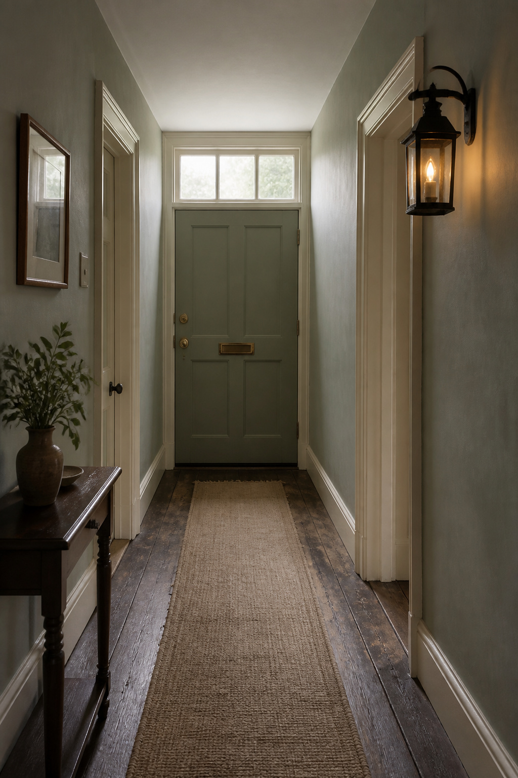
Sage and muted green-greys with historical cottage precedents
Farrow & Ball Mizzle is the reference — a grey-green named for West Country mist and drizzle that shifts between grey and green as the light changes. Designer Sarah Karon notes clients reach for it because it doesn’t announce itself as green. Vert de Terre is lighter, drawn in spirit from terre verte, the green-earth pigment that coloured old distemper. Both keep their grey modifier — what makes them read as heritage rather than as a feature wall.
Chalky blue-greens and their coastal and rural cottage roots
Duck-egg blue is the long-standing cottage choice, lovely against white trim and floral paper. F&B’s Duck Green swings with the light — bluer in a north-facing morning, greener in afternoon sun — while Ancona Blue comes into its own in Estate Emulsion, whose very matt finish forgives uneven old plaster. Pigeon, a cosy blue-grey, is what F&B recommends for cloakrooms and boot rooms — small, dim entries where a richer colour makes atmosphere instead of compression.
When darker, richer colours work in a small entry — and when they fight it
A dark entry can feel enveloping rather than oppressive when colour-drenched in one deep shade across walls, trim, and door — but it needs layered artificial light, a ceiling of at least eight feet, and a floor that absorbs rather than fights the wall. Without those, the same shade closes the space in.
Sheen, Trim, and the Light Your Entry Actually Gets
Selection is half the job. The finish and the light you choose it in decide whether the colour survives real life.
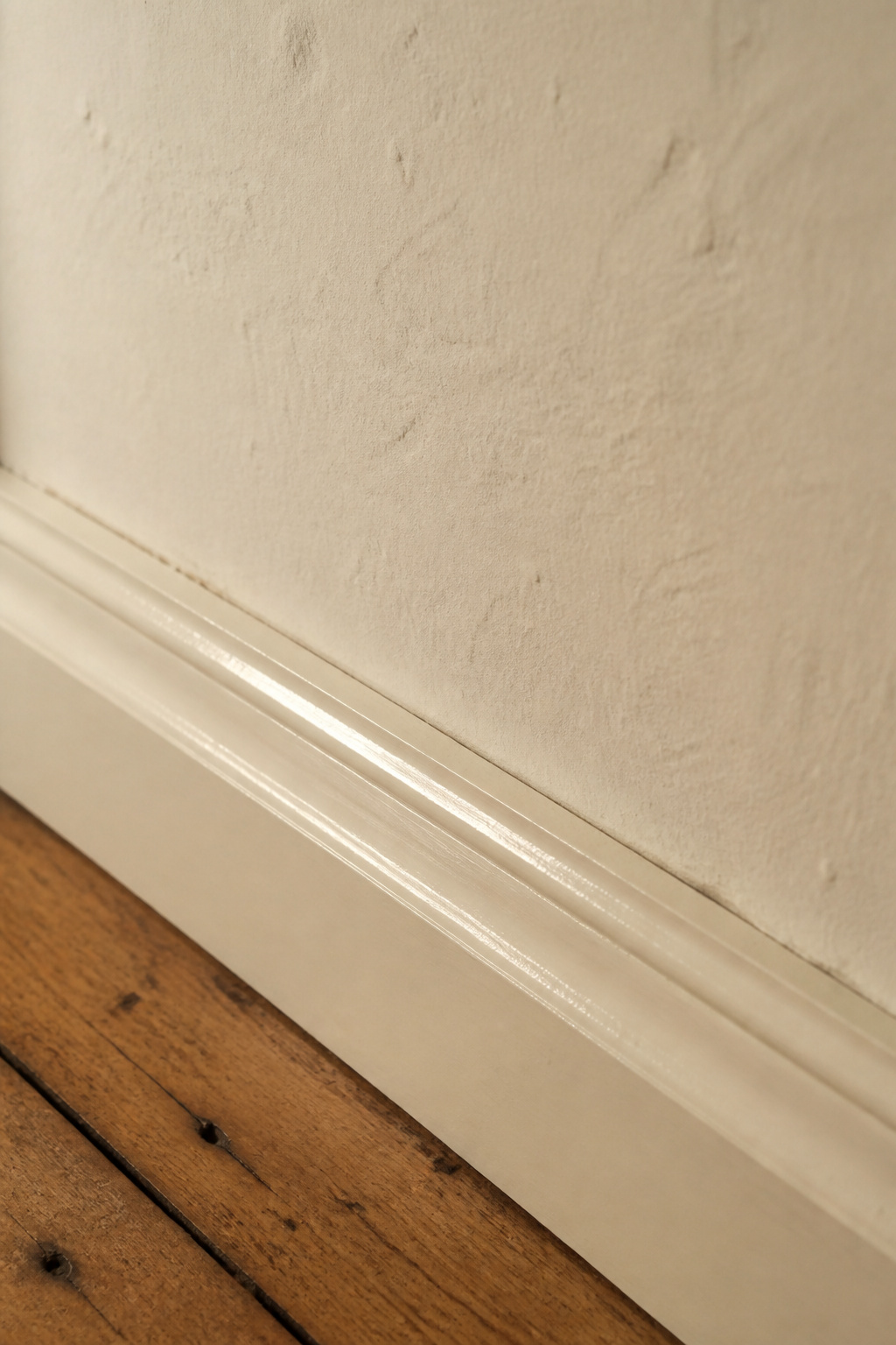
Eggshell vs flat vs satin for walls in a high-touch entry
The professional consensus:
- Eggshell (10–25% reflectance): the safer choice for textured plaster — cleanable, with a chalky quality that stays period-appropriate.
- Satin (25–35%): more washable and tougher, the better pick for smooth modern walls, but it amplifies imperfections in older plaster.
- Flat or matte: not for an entry. It absorbs moisture, marks at every touch, and won’t scrub clean.
The trim-and-wall sheen relationship that reads as period-appropriate
Trim always sits one sheen level above the wall: eggshell walls take semi-gloss skirting and architraves — historically accurate, since Georgian and Victorian joiners painted timber trim in oil-based gloss. When wall and trim share a colour, the sheen difference does the work: semi-gloss White Dove skirting beside eggshell White Dove wall looks resolved, not flat.
How north, south, and artificial light change every colour you test
North light is cool and even, pulling the cool note out of any colour. Farrow & Ball’s guidance for north-facing rooms: avoid blue- and grey-based colours and favour yellow-based ones that bounce the available light. South light runs warm but can push a cream too yellow. The same cream reads differently under a 2700K bulb than a 4000K one, so getting the right entryway lighting settled is part of choosing the colour, not a separate job.
Wallpaper in a Cottage Entry: When It Earns Its Place
Wallpaper earns its place when it gives the entry something paint cannot — pattern, texture, or historical reference. In a small hall with little room for furniture or art, that character does real work.
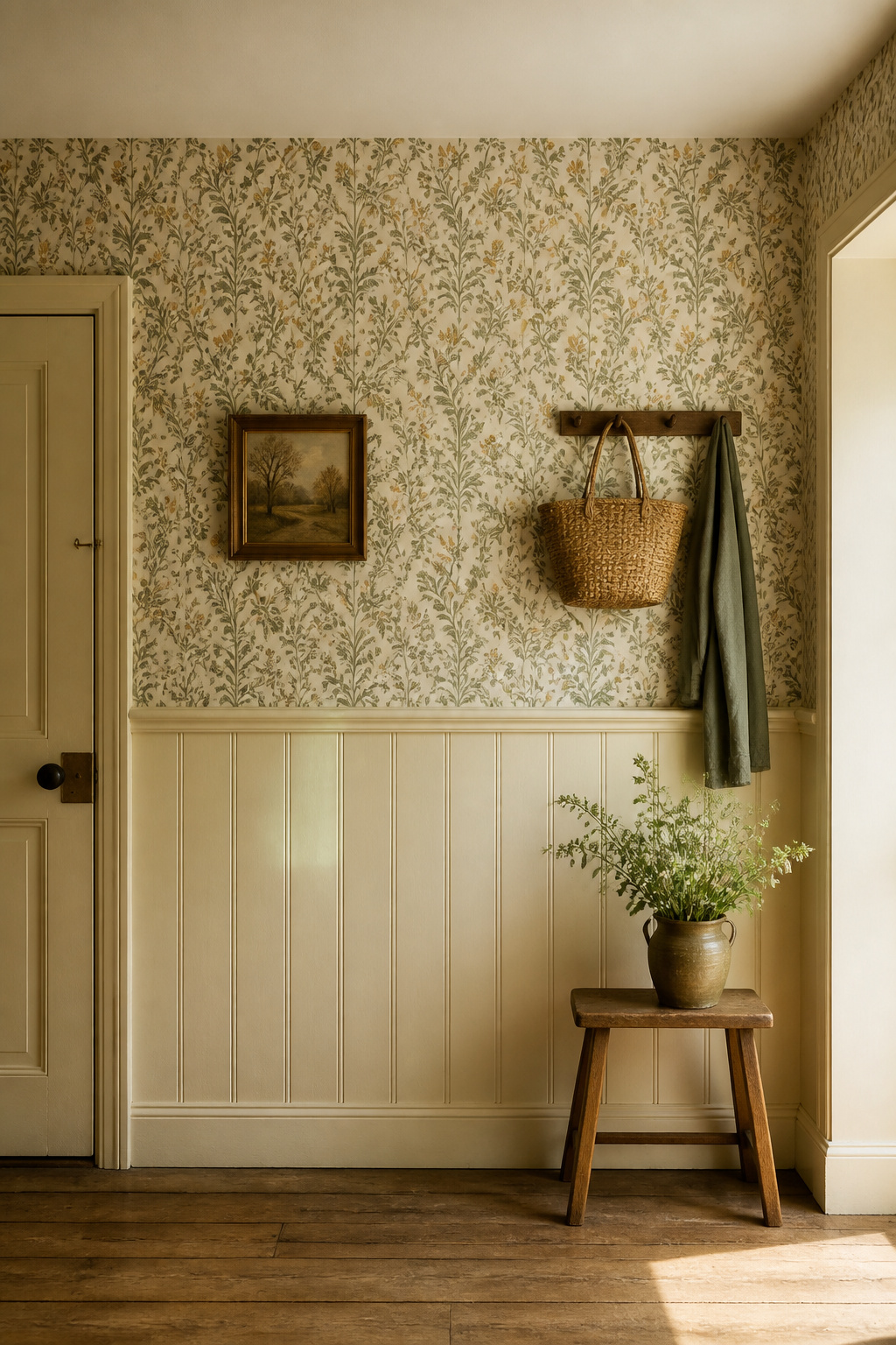
Period wallpaper patterns that suit a cottage entry — florals, small prints, stripes
Reach for patterns that read as genuinely period: a small repeating floral in muted tones, a William Morris-adjacent botanical in sage and ochre, or a narrow two-tone stripe. A large statement print may never repeat enough in a tight entry to read as a pattern; a small repeat or vertical stripe draws the eye up and lends apparent height to a low hall.
Half-panelling and wallpaper above the dado: the heritage combination
The most resolved cottage treatment: panelling or relief paper below the dado, pattern above it. Victorian halls used Anaglypta below the rail to cover uneven walls, painted a deeper tone — a zone that is, as The Victorian Emporium notes, almost indestructible. Set the dado around 38–40 inches for an eight-foot ceiling, paint it a deeper tint of the wall colour, and let the paper carry the character above — a backdrop ready to style the console against.
Practical considerations: washability and humidity tolerance
Choose wipeable or vinyl-coated stock — bag corners, wet umbrellas, and winter condensation demand it. Traditional paper-backed stock delaminates in a poorly ventilated entry. Paste-the-wall non-woven papers suit cottage work especially well: no soaking table, minimal stretching, and a backing that pattern-matches forgivingly on uneven period walls.
The Professional’s Colour-Selection Process for a Cottage Entry
Most people skip what professionals never do — and the process is short and repeatable.
- Fix the elements first. Floor, woodwork, and radiator are the most permanent and costly to change; the wall colour serves them.
- Sequence floor, wall, trim. A warm oak or pine floor invites cream, sage, or warm greige; stone or quarry tile runs cold and needs a strong warm white.
- Read the undertone properly. Hold any warm white against plain printer paper — its peach, yellow, or grey character becomes obvious. Never trust the chip under store lighting.
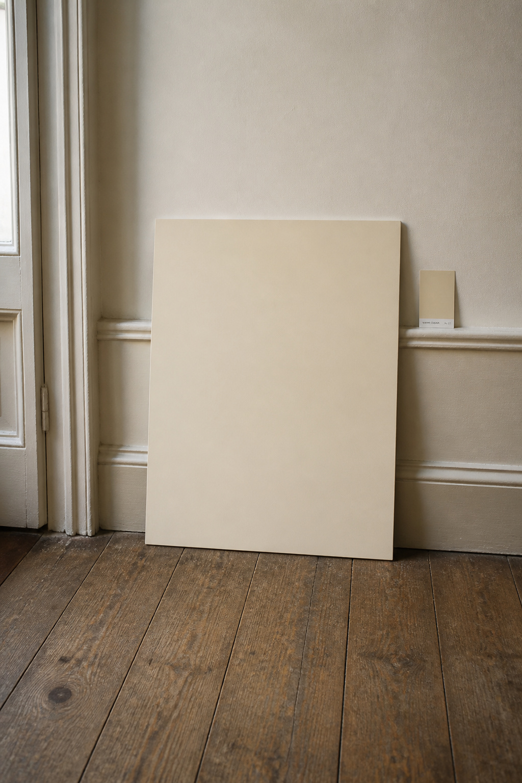
- Test at entry scale. Paint at least a 2-foot square on the actual wall, or on poster board held against it beside the floor and skirting.
- Watch it for a full day. Leave the sample 24–48 hours and observe morning, midday, and evening. The evening test is the one most people skip and most regret.
The palette has a logic — earth pigments, warm undertones, a wall-and-woodwork conversation — and once you can read it, the difference between a hall that reads as heritage and one that reads as dated stops being a mystery. Choose the floor-led palette, give it the right sheen, and test it in your own light.
FAQ
What is the most popular paint colour for a cottage entryway?
Benjamin Moore White Dove OC-17 is the most widely recommended warm white for cottage entries — their top-selling white, warm but not creamy at LRV 83.16. Swiss Coffee OC-45 is the other frequent pick, with more depth for low-light halls. Among heritage greens, Farrow & Ball Mizzle and Vert de Terre lead.
Should you use the same paint colour in the hallway as the rest of the house?
No rule requires it, but continuity reduces visual choppiness in a small open-plan cottage where the entry connects to the living space. Using the same warm cream or greige throughout keeps a narrow home cohesive. Since the entry is transitional, it can also carry a slightly bolder colour than a sitting room.
Is wallpaper a good idea in a small entryway?
Yes, with the right paper. A small-repeat floral, botanical, or narrow stripe scales better than a large print and draws the eye upward. Choose wipeable or vinyl-coated stock for the contact an entry takes, and consider half-panelling below the dado with paper above so the lower zone absorbs the wear.