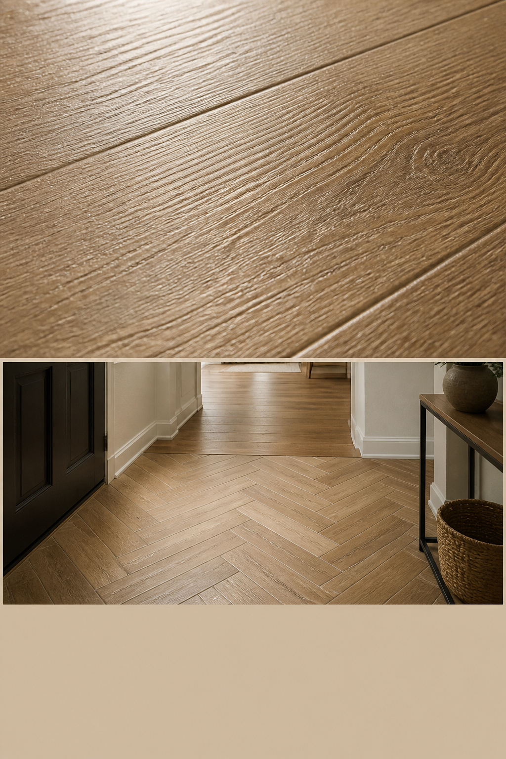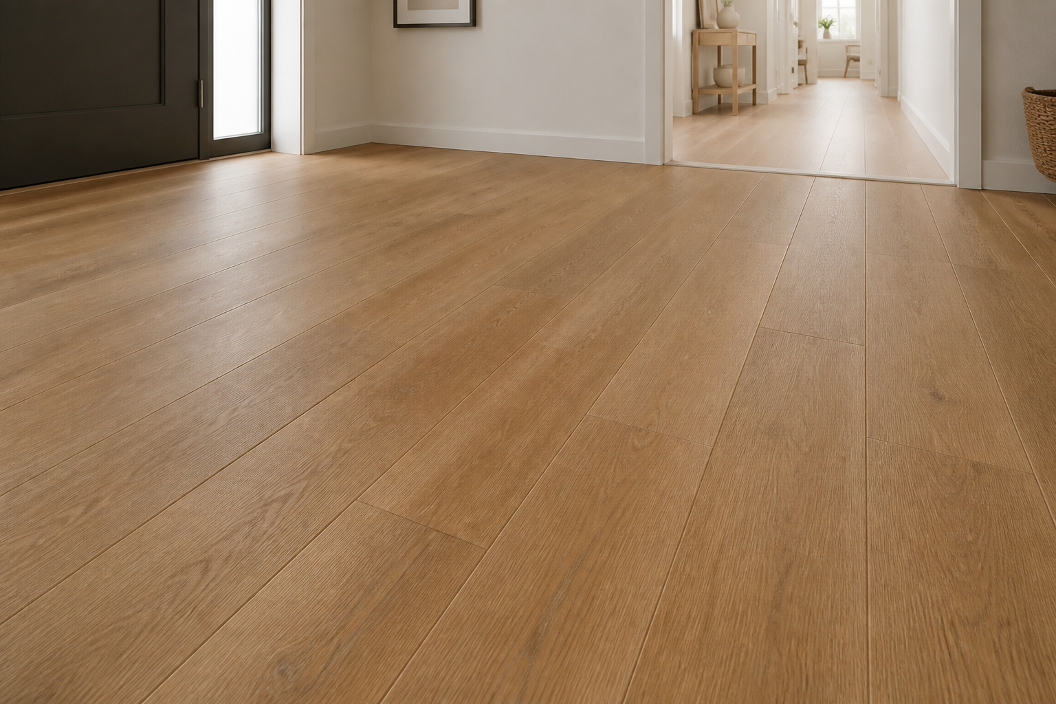
Step through the door onto a floor that looks like warm oak boards running away down the hall. Your eye follows the grain, finds the knots and the colour shift from plank to plank, and reads wood. Then a wet boot lands, grit drags underfoot, and nothing happens — no swelling, no dull worn patch by spring. That is the promise of a good wood-look tile entryway: the warmth and texture you actually wanted at the door, on a surface that treats a puddle as a non-event. The catch is that cheap wood-look tile gives itself away instantly — shiny, repetitive, wrong proportions, white grout. The whole job is knowing which choices keep the illusion and which break it.
TL;DR
- Real wood fails at the door — wet boots drive cupping and grit wears the finish, with a 5–7 year refinishing cycle in a busy entry. Porcelain at ≤0.5% water absorption removes that failure entirely.
- Four cues make a plank read as wood: a matte, embossed (EIR) surface, a 4:1 or greater length-to-width ratio (think 6×36 or 8×48), V3–V4 colour variation, and grout matched to the tile’s darkest tone — never white.
- Lay it in a 33% running bond (the ANSI maximum offset for tiles with any side over 15 inches), and join it to adjacent hardwood at the door sill, matching species tone so the two floors read as one.
The Entry Floor Most People Actually Want — and Why Real Wood Fails There
Ask people what they want underfoot at the front door, and most describe wood. The problem is that the entry is the one room wood handles worst.
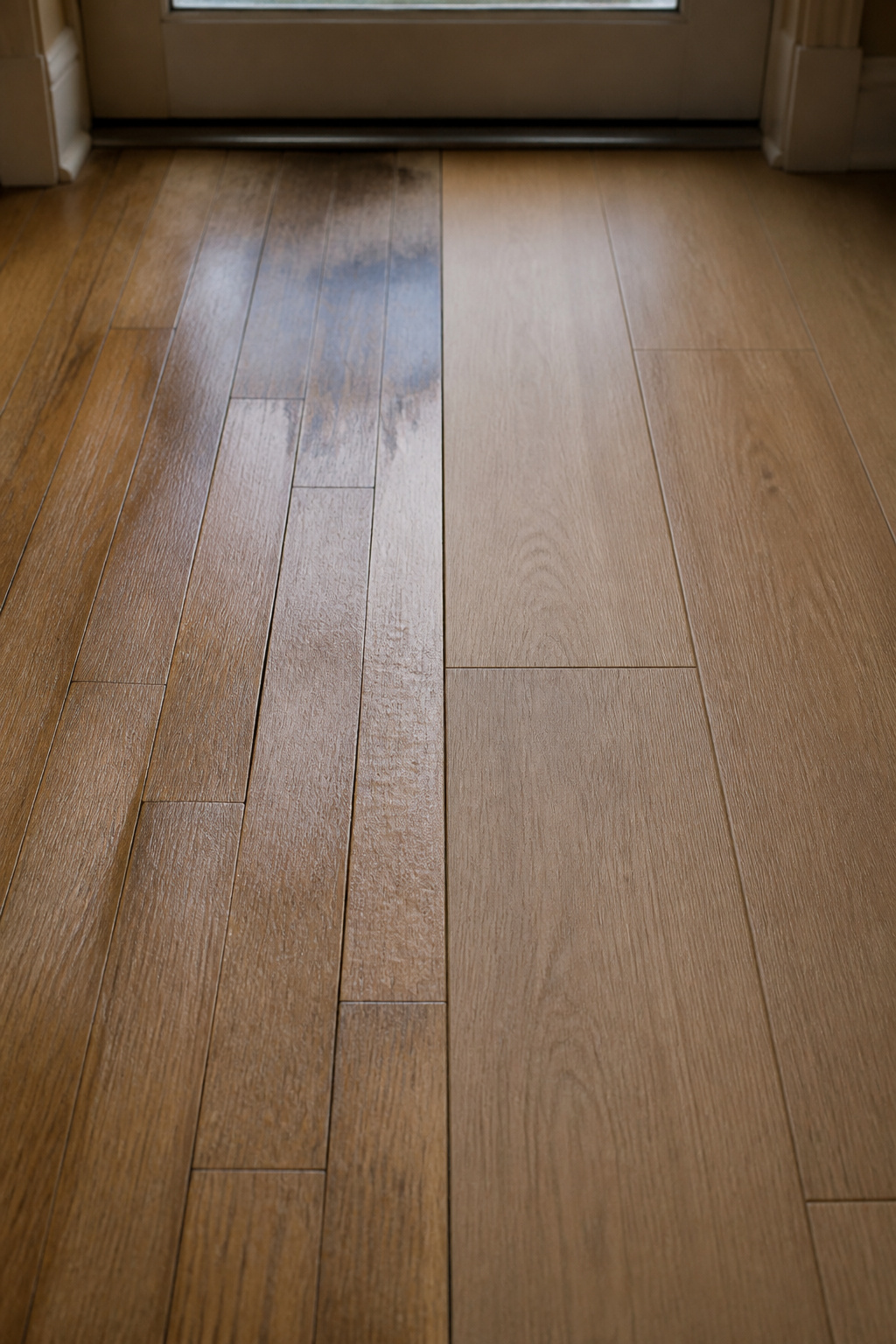
What real wood does under wet boots and grit
Wood moves with moisture. When the underside of a board takes on more water than the top — exactly what happens under a dripping boot — the edges rise above the centre and the plank cups. Industry guidance says you keep indoor humidity between 30 and 50% to avoid this, a condition no doorway can promise. Grit makes it worse: tracked-in sand acts as an abrasive, scratching the finish until the wood near the door goes dull and grey while the rest of the floor stays bright. The fix is refinishing, and in a busy entry that cycle runs roughly every 5–7 years rather than the usual 7–10 — an approximate figure, but the direction is not in doubt. At $3–$8 a square foot, and $6–$8.50+ where heavy wear and cupping require specialist repair, the entry quietly becomes the most expensive few square feet in the house.
What porcelain gives you instead
Porcelain sidesteps the whole mechanism. Fired dense and classed as impervious under ASTM C373, it absorbs 0.5% water or less, so the cupping cycle simply cannot start. What changed is that it now feels like wood too. Embossed In Register printing — EIR — aligns the raised surface texture exactly with the printed grain, so the ridges your hand feels match the lines your eye sees. For an entry that meets wet boots, specify at least a PEI 4 wear rating and a DCOF of 0.42 or higher under ANSI A326.3. If you change only one thing, change the finish: choose matte and textured, never gloss. Gloss is the single loudest tell — real wood does not have a mirror sheen, and a shiny plank announces “ceramic in costume” before anyone notices the grain. This is the first of several places where wood-look porcelain stands among the durable options worth weighing for an entry; for the wider survey, see the full range of entryway floor tile ideas.
Choosing a Convincing Wood-Look Tile: The Four Realism Cues
A wood-look tile entryway lives or dies at the showroom, not the install. Four product attributes decide whether the floor reads as timber, and you can check all four against a single sample before you buy.
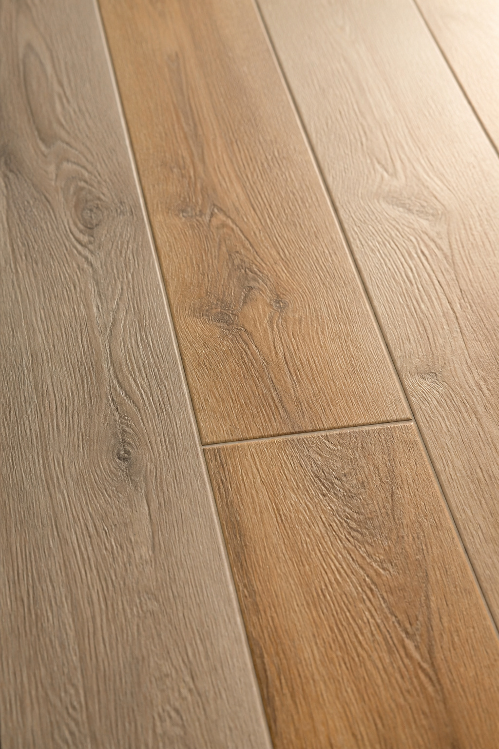
Surface texture: embossed matte over flat gloss
Texture is what your hand confirms and your eye trusts. EIR embossing gives the surface real grain, knots and check marks, with the relief lined up to the print. Run a palm across it: a convincing plank has the slight drag of timber, not the slick of glaze. The print alone is never enough — without surface relief, even a good image reads flat and fake.
Plank proportions: why 6×36 reads as wood and 12×24 reads as tile
A real board is long and narrow, so a tile that wants to pass as a board needs the same proportions. The trade consensus is a length-to-width ratio of at least 4:1; 6×36 and 8×48 sit at 6:1 and are the most popular realistic formats for 2025–2026. A 12×24 carries the same grain print but reads as a large floor tile, not a plank — the brain files a 2:1 rectangle as tile regardless of what is printed on it.
Colour variation: V3 as the minimum
Real wood never repeats. The tile shade scale runs V1 (uniform) to V4 (substantial variation), and for wood-look you want V3 at the least, V4 on a larger floor. Below that, the digital print repeats every few tiles, and in a small entry that repeat is glaringly visible. Open three or four boxes at once and spread the lighter and darker planks across the floor as you set them.
Here are the four cues in brief, with the committed choice for each:
| Realism cue | What to look for | What to avoid |
|---|---|---|
| Surface | Matte, EIR-embossed grain | Any gloss or flat-printed glaze |
| Proportion | 4:1 ratio or greater (6×36, 8×48) | 12×24 and other near-square formats |
| Variation | V3 minimum, V4 on large floors | V1 or V2 (visible print repeat) |
| Grout | Matched to the plank’s darkest tone | White or high-contrast joints |
My single recommendation, if you want one line to brief a supplier: matte, V3 or better, 6×36 or 8×48. The grout choice gets its own section because it undoes everything else when it goes wrong. As one product team put it, modern printing is now so good that durability is the only honest difference left between the tile and real wood — though that holds only when all four cues are right. Wood-look porcelain also earns its place among the materials on pure toughness; that is covered in detail in how it compares on durability.
Plank Layouts: How You Lay It Changes How It Reads
The same plank can read as a calm hardwood floor or as an obvious tile grid depending on the offset. Layout is not only an aesthetic choice here — for long planks it is a technical one.
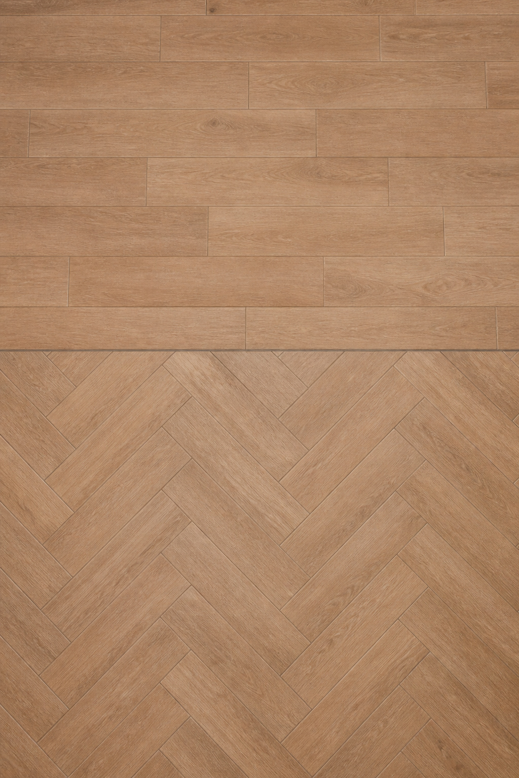
Running bond at 33%: the default that avoids lippage
Use a third-offset running bond. ANSI A108.02 caps the offset at 33% for any tile with a side over 15 inches, and the reason is physical: long planks bow slightly, and a half-bond offset puts the high centre of one plank against the low edge of the next, exaggerating lippage — the ridge where one tile sits proud of its neighbour. A 33% offset spreads the bow across several planks instead. Levelling clips and wedges hold the edges flush while the mortar cures and are worth the small cost on any plank floor.
Herringbone: the effect and the waste
Herringbone turns a plank floor into directional movement, which suits a small square entry well. Plan for 15–20% extra tile against 10% for running bond, and expect a labour premium — backsplash data puts herringbone at roughly 15–30% above straight-set, a fair guide for floors even if not a floor-specific figure. Use a shorter plank such as 4×16 or 6×24; running 8×48 at 45 degrees produces large triangular off-cuts at every wall and pushes waste past 20%.
Mixed widths: the random-board look
Mixing plank widths echoes reclaimed flooring, where no two boards match, and reads as character rather than manufacture. Open several boxes at once and distribute lighter and darker planks deliberately, keeping end joints at least one plank-width clear of the row beside them.
These three options compare cleanly:
- Running bond (33%) — calm, continuous, like traditional hardwood; ~10% waste.
- Herringbone — directional energy for a square entry; 15–20% waste, higher labour.
- Mixed widths — salvaged-board character; standard waste, careful pre-laying.
Grout Colour: The Most Underrated Decision in a Wood-Look Floor
You can get the plank, the proportion and the layout right and still ruin the floor with grout. Real wood has no joints, so the goal is to make the joints vanish.
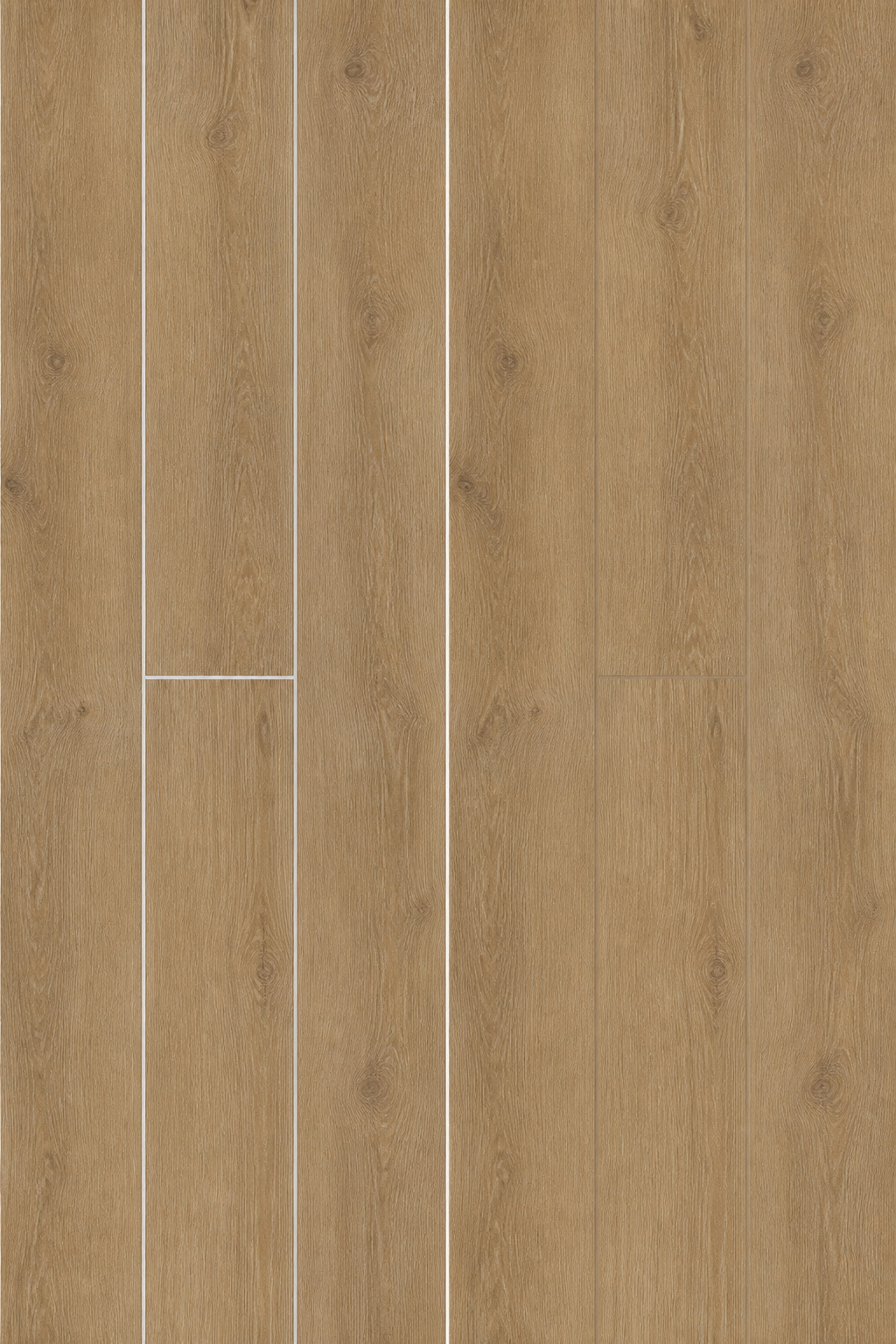
Why white grout breaks the illusion instantly
White grout outlines every single tile. Against a warm oak plank it draws a bright grid over the floor and tells the eye “tile” at a glance, defeating every other choice you made. It also ages badly in an entry: light grout darkens unevenly as grit and traffic soil work into it, so the grid grows more visible over time, not less.
Match grout to the plank’s darkest tone
The professional rule from Daltile’s product team is to match grout to the darkest colour in the tile, not the average. Grout darkens in service, so starting near the deepest tone keeps the joint from creeping into view over the years. In practice that means taupe or light brown for warm oak and walnut planks, and a mid-tone warm grey for cooler ash or driftwood. A medium beige also hides everyday entry dirt.
Joint width and grout type
Most wood-look plank wants a 1/8″ to 3/16″ joint — 3/16″ for a running bond — and you cannot skip the joint: the tile needs it to absorb subfloor movement without cracking. For joints at 1/8 inch and wider, sanded grout is the correct call; unsanded is only for joints under 1/8 inch and is too weak to hold in a floor joint under foot traffic. For an entry specifically, epoxy grout earns its higher cost and fiddlier application: it absorbs approximately 50 times less water than cement grout, resists staining and never needs sealing. It cures fast and hazes if you are slow, so it rewards an experienced hand.
Where Wood-Look Tile Meets Real Wood: The Join That Makes or Breaks the Floor
The entry tile almost always meets a different floor a few steps in, and often that floor is real wood. When the two are related materials, the join can become the most satisfying detail in the room — or the most jarring.
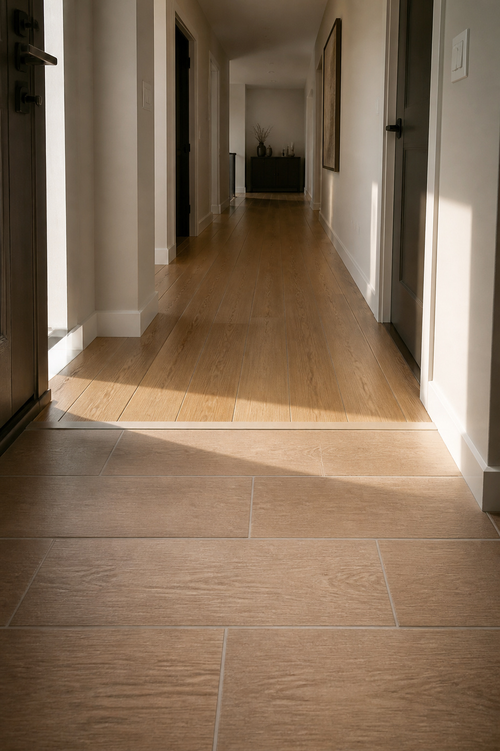
The visual logic when the materials are related
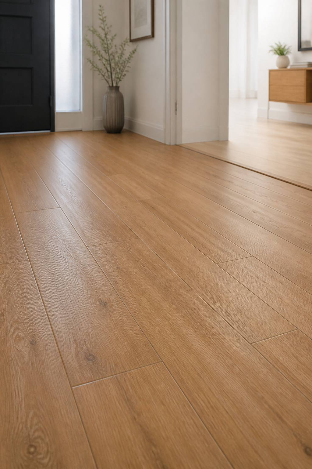
If the tile and the hardwood share a colour temperature — both warm oak, or both cool grey — the eye reads one continuous floor interrupted at the threshold, not two floors competing. Align the direction too: run the planks and the boards the same way across the join, and the eye follows a single line through. The groundwork is levelling, getting the two finished heights within 1/4 inch so there is no trip and no shadow line.
Matching plank species tone to the adjacent hardwood
The most common error is an undertone clash — warm tile against cool-grey wood. Match the family instead: golden or gunstock oak tile against warm-finished oak, pale blonde tile against white-oiled European oak, a cooler driftwood tile against grey-stained ash. Get the undertone right and both surfaces ease into each other.
Threshold or near-invisible join
Where heights differ up to 1/4 inch, a T-strip bridges them; a threshold milled from the same species as the hardwood disappears better than any metal. Where tile and wood share an almost identical tone and sit level, a thin flush Schluter strip is all you need. Put the join at the natural wet–dry boundary, ideally under the door, so tracked-in water stays on the tile and never reaches the wood. The technical detail of strips, heights and thresholds belongs to the spoke on transitioning to real wood.
Wood-Look Tile Entryway Maintenance: What It Actually Costs Day-to-Day
You have chosen the plank, the layout, the grout and the join. The last honest question is what the floor asks of you once it is down.
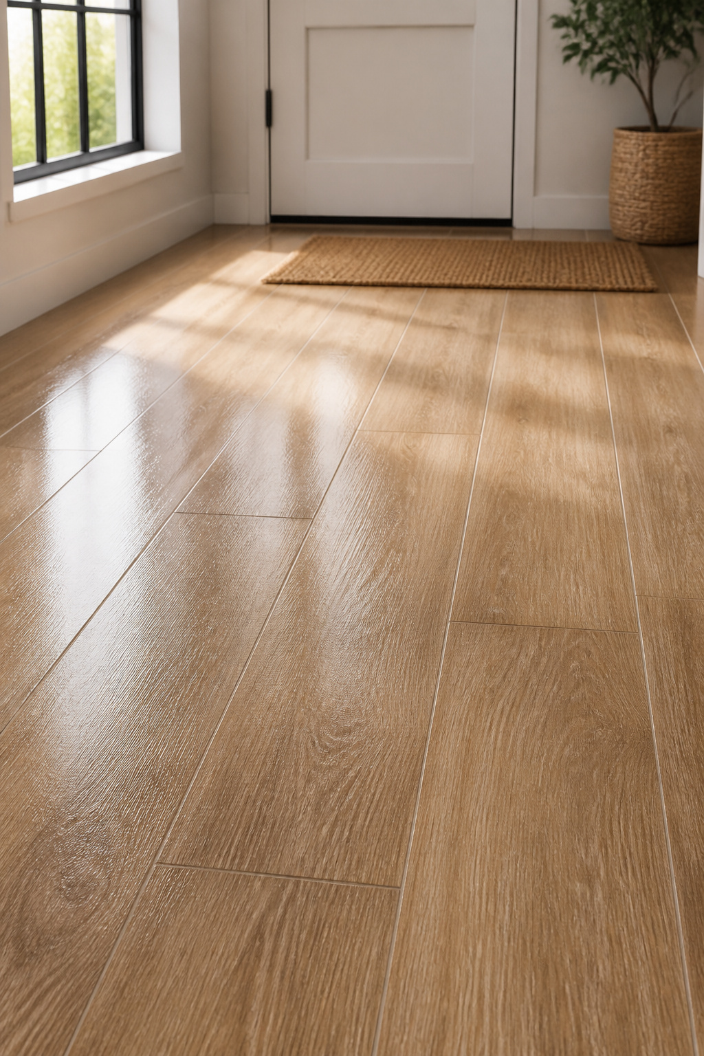
Day-to-day care
Wood-look porcelain wants almost nothing. Sweep or vacuum to keep grit off the surface, then damp-mop a few times a month with a pH-neutral cleaner. It needs no sealing, no refinishing, and it holds colour under sunlight that would yellow or grey wood. Avoid acidic cleaners — they degrade cement grout over time. Epoxy grout needs no sealer at all; only cement grout wants periodic sealing.
What hardwood would ask in the same spot
The same entry in real wood is a standing commitment. Mopping it risks damage, because the cleaning water it needs to look good is the water that damages it. Add the refinishing cycle — every 5–7 years in this traffic by a reasonable estimate, at $3–$8 a square foot and more where heavy wear and cupping require specialist work — and the warmth you wanted comes with a recurring bill and a daily caution. Porcelain gives you the same look without that trade-off. That is the whole case, in one sentence.
FAQ
Does wood look tile feel like real wood underfoot?
Not quite — wood-look porcelain is harder and cooler than timber because it is a fired ceramic, and that hardness is the trade-off for its durability. EIR embossing now gives it genuine wood-like grain and texture by hand. Radiant underfloor heating, compatible with most porcelain, resolves the coolness and is the usual upgrade where barefoot comfort matters.
What is the best grout colour for wood look tile?
Match the grout to the darkest tone in the tile, not the average — grout darkens in service, so starting near the deepest colour keeps the joint from becoming more visible over time. Use taupe or light brown for warm oak and walnut, and a mid-tone warm grey for cool ash or driftwood. Never use white, the most common wood-look grout mistake.
Can you use wood look tile in a wet entry or mudroom?
Yes. Porcelain wood-look tile absorbs 0.5% water or less under ASTM C373, so it will not cup, split or suffer finish damage from tracked-in water the way hardwood does. For a wet entry, specify a minimum PEI 4 rating and a DCOF of 0.42 or higher; matte, textured finishes deliver that slip resistance and look most like real wood anyway.