
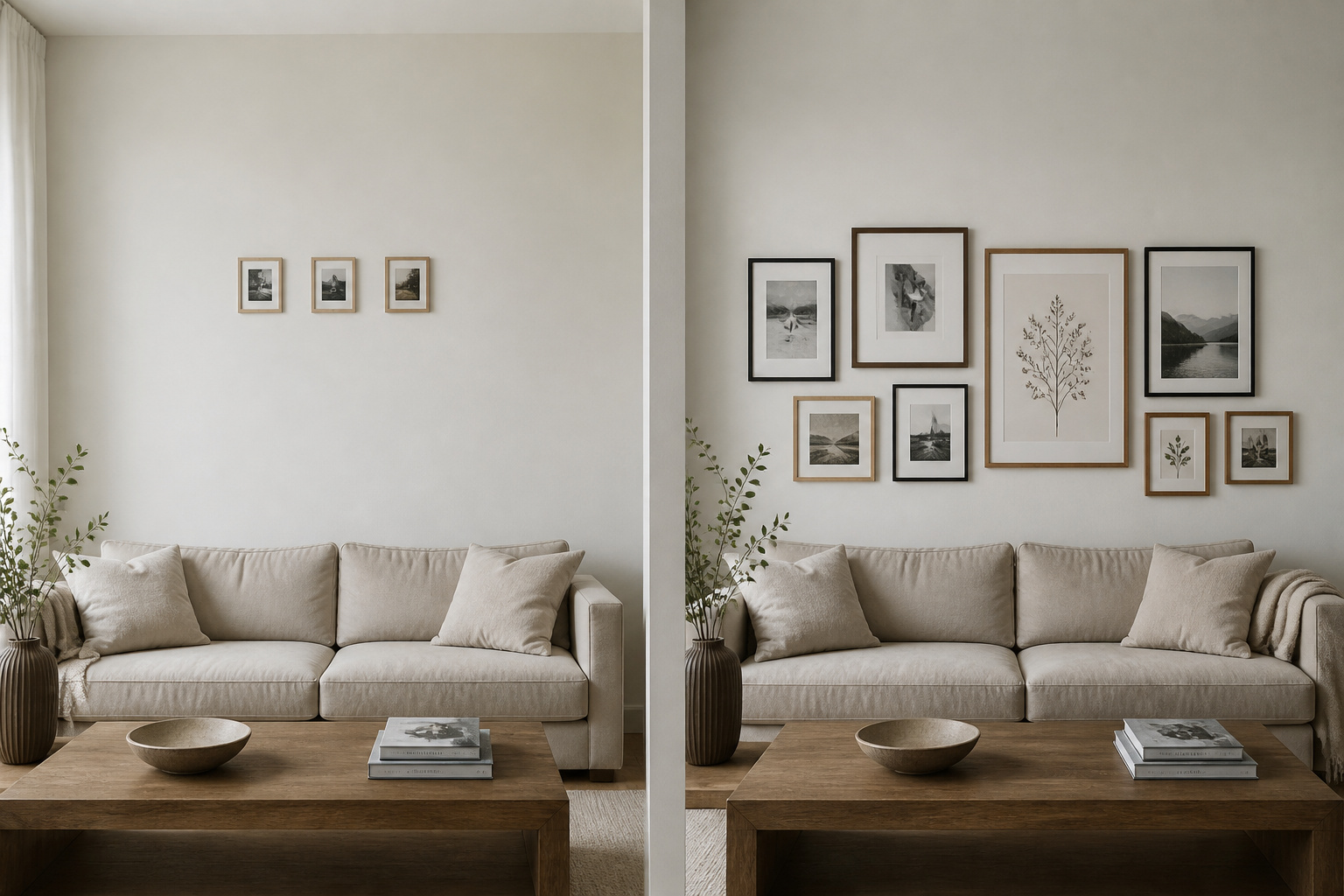

I have stood in front of enough gallery walls to know that the ones that fail almost never fail for interesting reasons. The art is usually fine. What goes wrong is a small set of repeated errors — seven of them, really — and once you can name them, a wall that felt vaguely off becomes a wall with a specific, fixable problem. These are the gallery wall mistakes I see again and again, ordered from the most common to the most overlooked, each with the design principle behind it and the cheapest way out.
TL;DR
- The two errors behind most failed walls are scale and height: size the whole arrangement to 60–75% of the furniture below it, and centre it near 57 inches from the floor rather than pushing it up to give it “space”.
- Keep gaps between frames consistent at 2–3 inches, give every piece one shared thread (frame finish, mat colour, or a recurring colour), and lay the composition out before any nail goes in.
- Almost every fix is cheap — a larger anchor print, a tube of spackle, a set of matching mats, or simply moving the heaviest piece toward the centre.
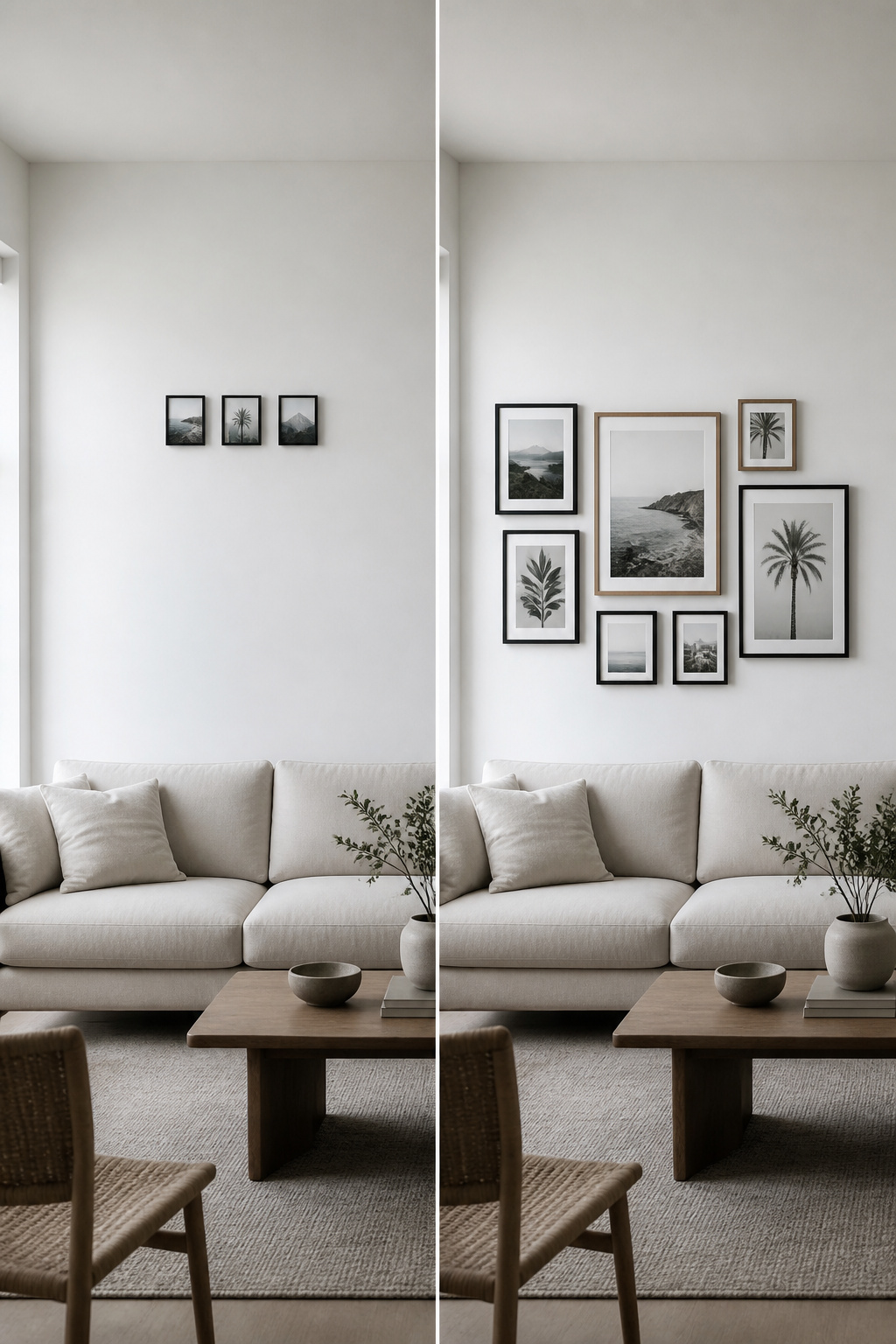
None of these mistakes require a designer to undo. Most need a tape measure, a few minutes of honest looking, and the willingness to take one frame down and move it. The Nordic instinct here is useful: do less, but do it on purpose.
Mistake 1: Art That’s Too Small for the Wall
Why undersized art reads as an afterthought, not a choice
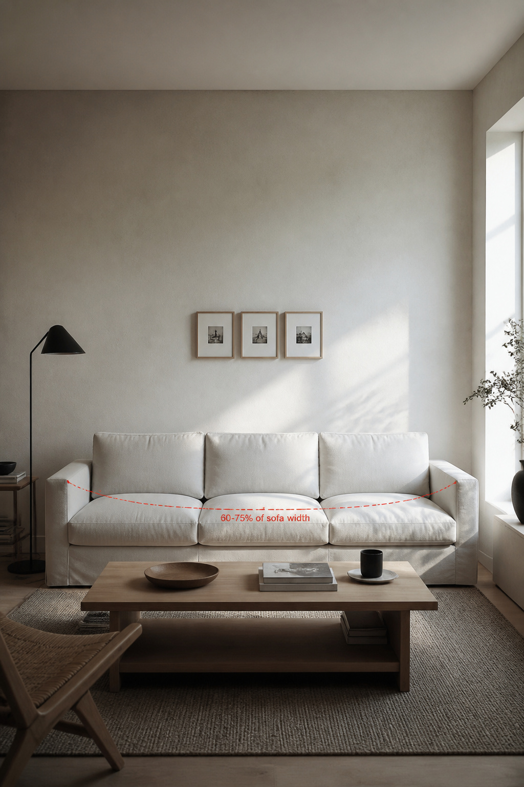
This is the most cited mistake in the trade, and the reason is simple: scale signals intention. A small cluster lost on a wide wall does not read as restraint — it reads as art someone hung and then forgot to finish. The professional standard is that the arrangement, treated as one combined shape, should span 60–75% of the furniture below it. Below that, the eye registers the whole wall as unaddressed, the art unmoored from the room.
The diagnostic test: the 60–75% span rule applied to what’s already on the wall
The test takes two minutes. Measure your sofa arm to arm, multiply by 0.60 for the low end and 0.75 for the high end, then measure your current arrangement’s total footprint. An 87-inch three-seater wants 58 to 66 inches of art; a wide sectional over 110 inches wants 72 to 83. If your footprint falls short of the 60% figure, the wall is too small — and the same proportional thinking covers getting sofa-wall proportions right in full.
The fix: adding scale without replacing everything
The fix rarely means buying everything again. Add one larger anchor piece — a single print of at least 16×20 inches — and rebuild the smaller frames around it, or extend the arrangement outward with one or two pieces at the edges. As designer Bilal Rehman puts it, “it’s really, really hard to create an impact when everything is the same size.” A visible size hierarchy — one hero, a few mid-size, a handful of accents — gives the composition a centre of gravity, which is the first thing to get right in how a living room gallery wall should come together.
Mistake 2: Everything Hung Too High
Why the 57-inch centre-height rule exists and what breaks when you ignore it
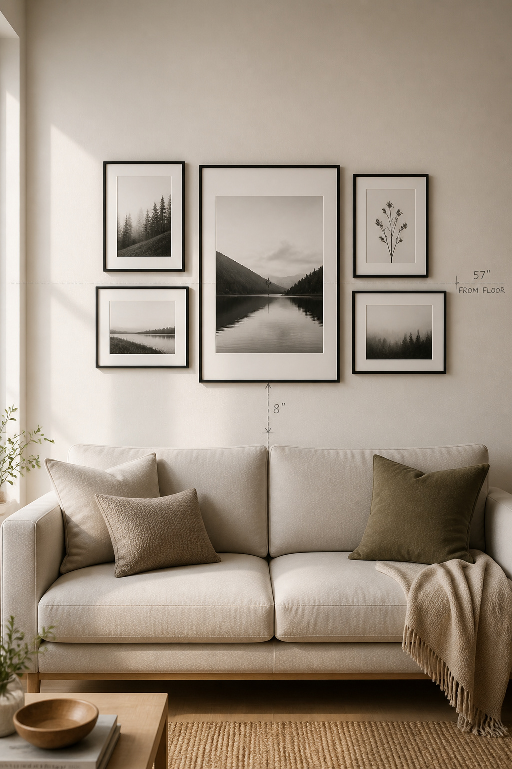
People instinctively push art upward to give it room to breathe, and that instinct is almost always wrong. The gallery and museum standard centres artwork at 57 inches from the floor because that approximates standing eye level. Treat the whole grouping as one unit: the centre of the entire arrangement, not any single frame, sits at 57–60 inches, with half the total height above that line and half below. Ignore it and the art floats free of the room.
The seated-viewer test: how to check your wall from the sofa
In a living room you mostly look at the wall sitting down, and from a standard seat, eye level lands around 42–48 inches. So sit on the sofa and look at the arrangement honestly: if you have to lift your chin to reach its centre, it is hung too high. Several designers drop the centre to 54–57 inches when the primary view is from a sofa. The bottom row should read clearly without anyone craning upward.
Re-hanging a wall that’s gone too high — when to fill and move vs add a lower row
If the wall is badly high, move the whole arrangement down as a unit and fill the old holes — a tube of lightweight spackling costs under $10, and a handful of relocated nail holes rarely threatens a rental deposit. If it is only three or four inches too high, the cheaper move is to add a lower row of smaller frames that extends the composition downward, pulling the visual centre back toward 57 inches without touching the existing nails.
Mistake 3: Inconsistent or Invisible Spacing
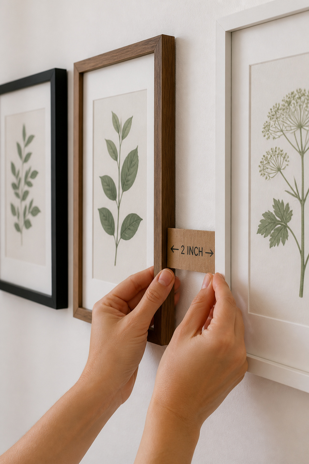
What ‘gallery wall spacing’ actually means: between frames, not around the composition
Spacing trips people up because they apply it to the wrong gap. Gallery wall spacing means the distance between neighbouring frames — not the margin between the arrangement and the wall or furniture around it. The standard is 2–3 inches between frames: close enough that the wall reads as one composition, open enough that each piece keeps its own breathing room. For a formal grid, hold it at exactly 2 inches; for a looser salon layout, 2–4 inches gives rhythm, but always within a set range.
The two spacing failure modes: gaps too wide (wall leaks through) and too tight (crowded)
There are two ways to get this wrong. Too wide, and the frames stop reading as a group — the wall leaks through between them and they become random photos floating in space. Too tight, under an inch, and they merge into one overwhelming block with no dialogue between pieces. The quieter failure is inconsistency itself: a one-inch gap beside a six-inch gap in the same wall signals, plainly, that no one was paying attention.
The consistent-gap fix: the cardboard spacer method
The fix is a piece of cardboard. Cut a rectangle exactly 2 inches by 6 inches, hang your largest anchor first, then hold the spacer against each hung frame before marking the next nail. Every gap comes out identical without measuring twice. As designer Kati Curtis notes, spacing “can either make or break the visual balance” of the wall. For an existing wall, find the most common gap and reset every frame to it — a spacer and a small tube of spackle is all the hardware required.
Mistake 4: No Unifying Thread Between Pieces
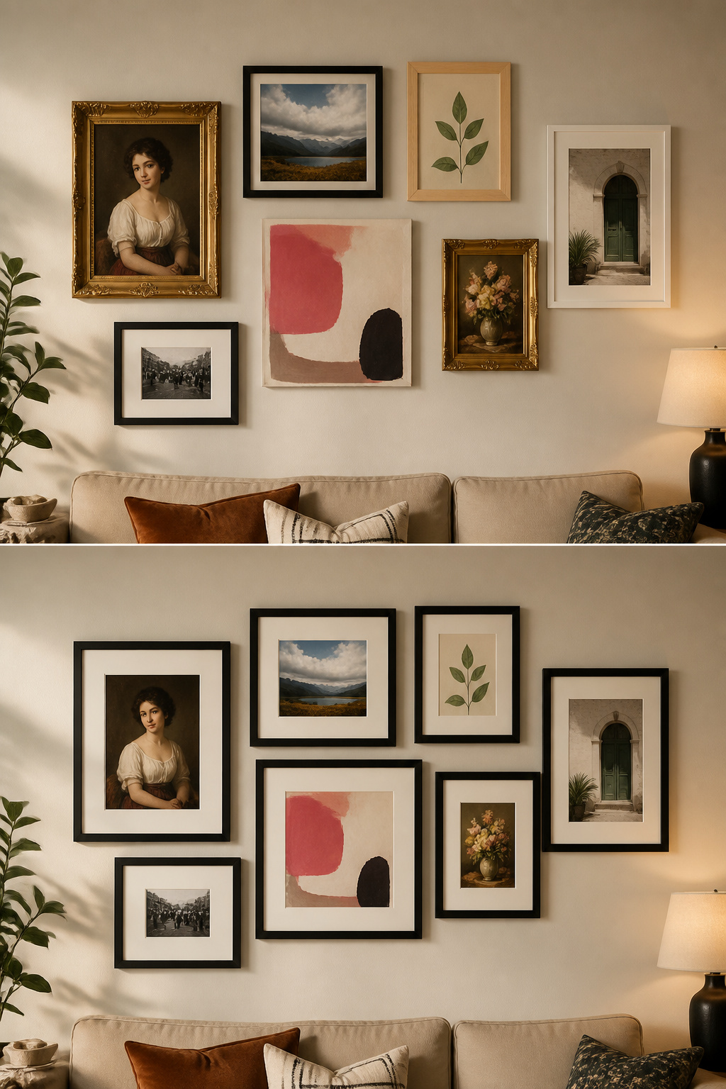
What makes a collection of different objects read as a composition rather than clutter
This is the hardest mistake to diagnose, because the wall just feels off without an obvious cause. The principle is that wildly different art can still cohere — but only if one thread runs through every piece. Without a single common element, the eye has no way to group the objects into a composition, so it reads them as clutter. Designer Victoria Holly calls it sticking to “at least one common ground”: frame finish, art medium, colour, or style.
Choosing one unifying element: frame finish, colour family, subject, or mat style
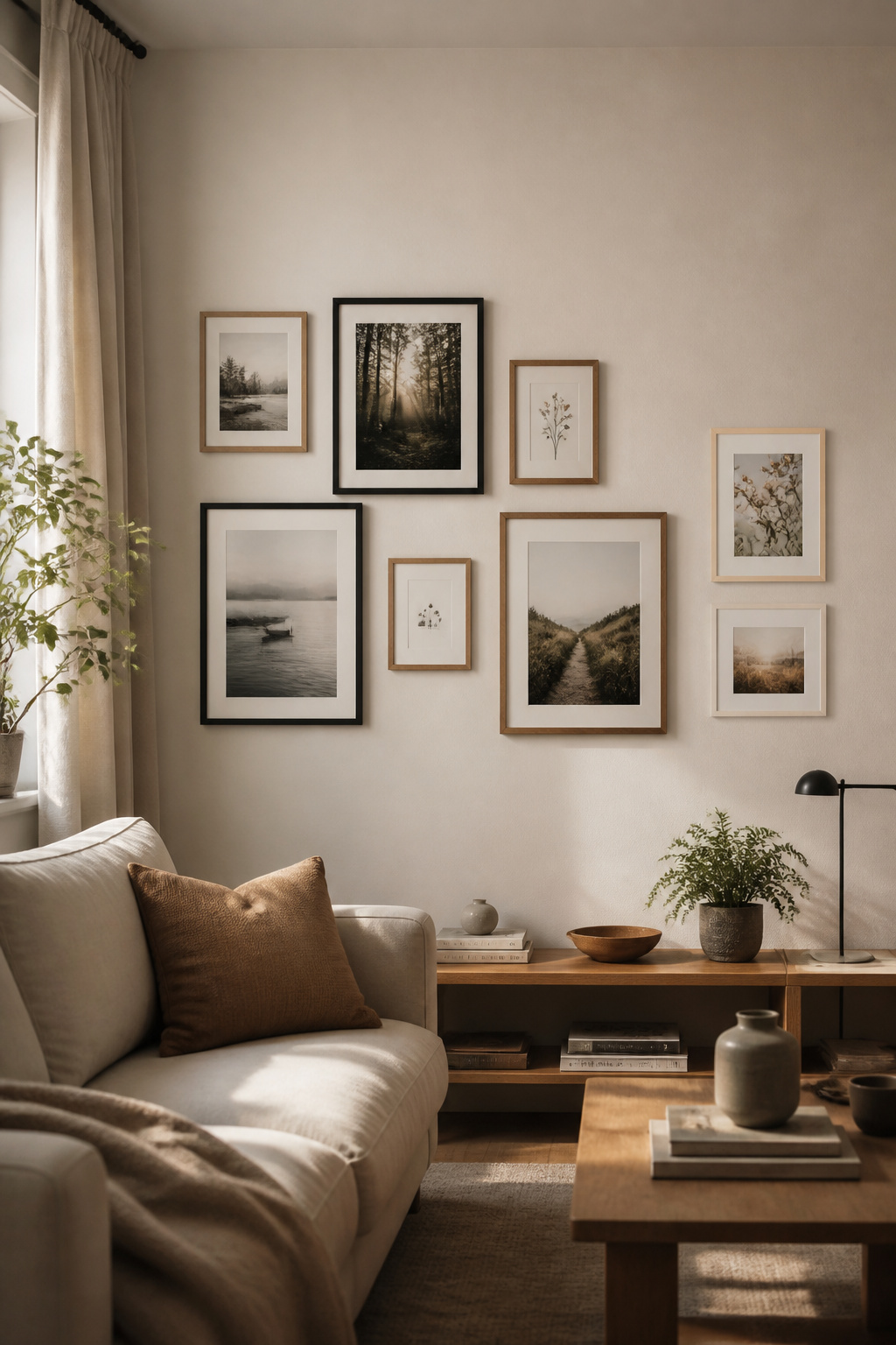
Pick one thread and commit. Frame finish is the most visible — black with natural oak, matte black with brass, white with natural wood, used in a roughly 70/30 ratio of dominant to accent. Consistent matting is the great equaliser: identical off-white mats at the same 2–3 inch width connect frames that share nothing else. Or pull a single recurring colour from every print. Marie Flanigan’s advice is to keep the framing “sleek and streamlined” and avoid anything overly ornate.
The retrospective fix: the quickest single change that creates visual cohesion
For a wall that already exists and refuses to settle, the cheapest single change is consistent mats — a framer can recut them to fit your existing frames. If that is beyond budget, spray-painting every frame one colour (matte black is the most forgiving) for $20–$30 will unify the most chaotic arrangement; sand lightly, two thin coats. The lesson is simple: commit to one thing. Not two or three things. One constraint, held across every piece without exception.
Mistake 5: The Arrangement Ignores the Room’s Balance
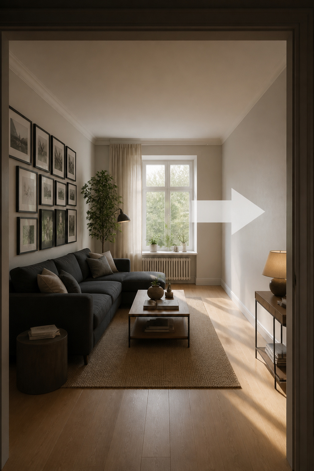
How a gallery wall can tip the room’s visual weight to one side
A gallery wall is never a standalone project — it has visual weight, and that weight pulls on everything else in the room. Visual weight comes from size, contrast, and density, so a dense cluster of dark frames concentrated on one wall becomes a heavy anchor point. If the opposite side of the room is light or sparse, the whole space tilts and reads as unresolved. The wall can be perfectly composed in itself and still throw the room off.
Reading the room: furniture placement and the wall’s relationship to it
Before hanging, I stand in the doorway and ask where the weight already lives — the large sofa, the dark bookcase, the bold rug. A heavy gallery wall placed directly above an already-heavy sectional compounds the imbalance rather than resolving it. The arrangement should answer the room’s existing weight, not duplicate it on one side. And balance need not mean symmetry: twelve small frames can hold their own against one large armoire if their combined visual weight is similar.
The fix: when to extend the arrangement vs when to counterbalance with something off the wall
The fix runs in one of two directions. If the wall is correctly sized for its own space but the room still feels one-sided, counterbalance off the wall — a tall floor plant, a standing shelf, or a lamp with a generous shade on the underweighted side adds weight without adding art. If the arrangement itself is lopsided, move the heaviest, darkest pieces toward the centre and redistribute. This becomes most acute when composing around a television, where one dark rectangle dominates everything.
Mistake 6: Skipping the Mockup and Going Straight to Nails
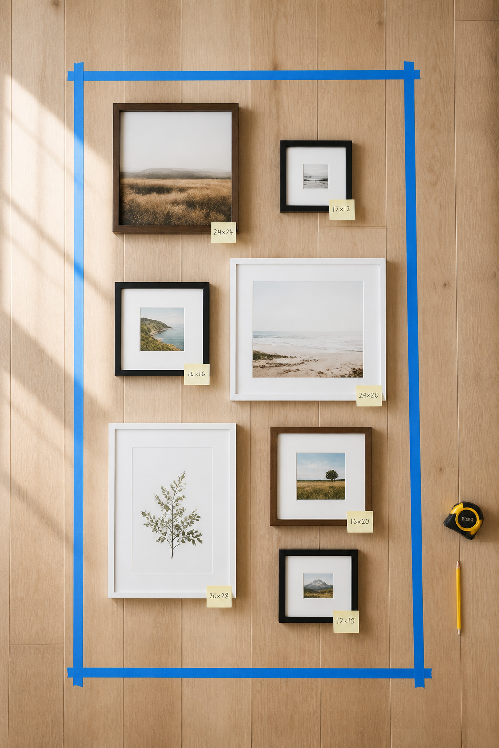
Why the floor-layout step is the only professional shortcut that costs nothing
Every designer I respect lays the wall out before touching a nail, and the reason is plainly economic. Moving a frame on the floor takes seconds; moving a nail takes a spackle kit and a day of drying time. As Kathy Kuo puts it, “the biggest mistake you can make when putting up a gallery wall is not measuring and mapping it out first” — eyeballing it feels faster but rarely is. Tape your wall’s footprint on the floor, arrange every frame inside it, and confirm the composition before any hardware appears.
What the mockup catches that mental visualisation misses
The mockup catches what the mind reliably edits out. Mental visualisation underestimates the stacked height of a composition and quietly smooths over clustering errors — three vertical frames bunched together, or all the large pieces drifting to one side. On the floor, those are immediately visible. Ginger Curtis warns that freestyling “can end up with a lot of extra holes in your wall and ultimately create more work for yourself.” The composition you imagine is almost never the one you would have hung.
Getting the composition right before any hardware goes in the wall
From the floor layout, move to paper templates: trace each frame onto kraft paper, mark the hanging-hardware point on every one, tape them to the wall with painter’s tape at your 2–3 inch spacing, and live with the arrangement for a few hours before committing. Then drive the nails straight through the templates at the marked points — the nail lands exactly where it belongs, with no separate measuring and no extra holes.
Mistake 7: Treating the Wall as Finished
Why a gallery wall is a living arrangement, not a permanent installation
The last mistake is a mindset one. The best gallery walls are not installations — they are arrangements that improve with editing over time. Designer Kim Lemmon says it well: “you want it to look like it was added over time, and that’s part of the charm of it.” A wall that begins with an irregular, asymmetric edge is open by design, ready to grow horizontally or vertically. A rigid rectangle, filled to its corners, leaves no natural place for the next piece.
How to update one section without dismantling the whole wall
You do not have to take a wall apart to change it. Swap pieces at the outer edges, not the centre — the anchor pieces carry the composition’s weight, and pulling them disturbs everything. To replace a frame, remove it, fill the hole with lightweight spackling, let it dry an hour or two, touch up the paint, and rehang on the same hook where the hardware aligns. Refresh two or three peripheral pieces a season while the centre of gravity stays put.
The one thing to keep consistent when adding new pieces over time
When you add pieces over the years, one element must never change: whatever unifying thread you chose at the start. If the wall is all matte black frames, every new addition matches that finish; if the thread was off-white mats, every new piece gets one. Beyond that, resist the urge to fill every gap. Empty space left on purpose is not an unfinished wall — it is room for the wall to keep becoming what it is, which is most of its value.
Seven mistakes, and you will notice the cure for nearly all of them is the same instinct: decide what the wall is for, size and place it honestly against the room, choose one thread and hold it, and stop before you overfill. A gallery wall that has been measured against the sofa, hung at the right height, spaced with a piece of cardboard, and left a little room to grow does not look like a project you completed. It looks like a part of the room that was always going to be there. That is the only standard worth working to — and every fix above is a tape measure and an afternoon away.
FAQ
Why does my gallery wall look too small?
Most often the arrangement spans less than 60% of the furniture below it. The 60–75% rule treats the whole composition as one unit — measure the sofa arm to arm and multiply by 0.60 for the minimum. A secondary cause is too many same-size frames with no scale hierarchy; adding one substantially larger hero piece makes the whole wall read bigger.
How do I make my gallery wall look more cohesive?
Choose one unifying element and hold it across every piece: a single frame finish, one mat colour at identical width, or a recurring colour in the art. One thread is enough — matching frames and mats and subjects simultaneously produces monotony, not cohesion. Having off-white mats recut to fit all frames typically runs $15–$30 per frame.
Is it okay to mix frame colours on a gallery wall?
Yes — it is both common and effective. The professional approach limits the mix to two colours in a 70/30 ratio, with combinations like matte black and natural oak, or black and warm walnut. The key constraint is tonal relationship: keep both warm or both cool. A warm gold frame beside a cool chrome one usually clashes.