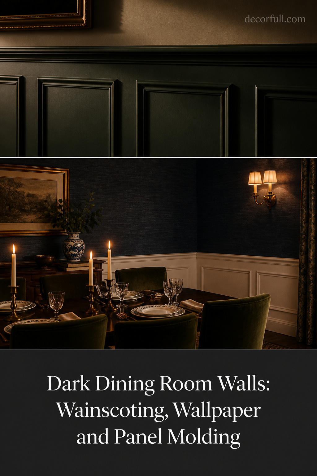
The Victorians lit their dining rooms with gas and candle, yet still built walls that read as rich and layered after dark. They managed it by treating the wall as architecture, not as a painted plane: a dado below, a patterned field above, a narrow band beneath the cornice. That tripartite system is the inheritance behind every good dark dining room wall idea worth its name, and it explains why flat dark paint so often disappoints. The colour was never the hard part. The surface was.
TL;DR
- Standard dining-room wainscoting sits 32–36 inches off the floor — one-third of an 8-foot wall, the chair-back height the dado rail was invented to protect.
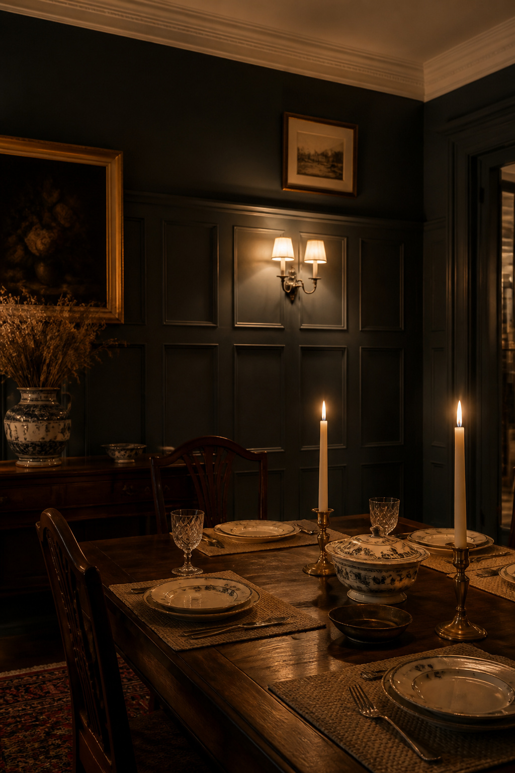
- Raised-panel wainscoting, picture-frame molding and embossed wallpaper cast their own shadow lines in raking light, so a dark surface reads as depth rather than a flat void.
- Match trim to wall for an enveloping heritage effect; keep trim off-white when you want the molding profile to read clearly as architecture.
This article stays on the walls — the surface treatments that build depth into a dark dining room; ceilings are their own decision, outside the scope here. For the colour itself and how the whole moody-room system fits together, work back to the moody dining room design guide.
Why the Best Dark Dining Room Wall Ideas Start With the Victorians
Dado rails, frieze bands and the layered wall: what the Victorians were solving for
The dado rail began as a working detail. Chairs were drawn back against the walls between courses, and the rail sat at chair-back height to stop those backs scuffing costly wall coverings. From that function grew the layered wall — darker dado, mid-tone patterned field, lighter frieze — tones lightening upward to keep high-ceilinged rooms from feeling top-heavy.
How Lincrusta, Anaglypta and Morris wallpapers created shadow without electricity
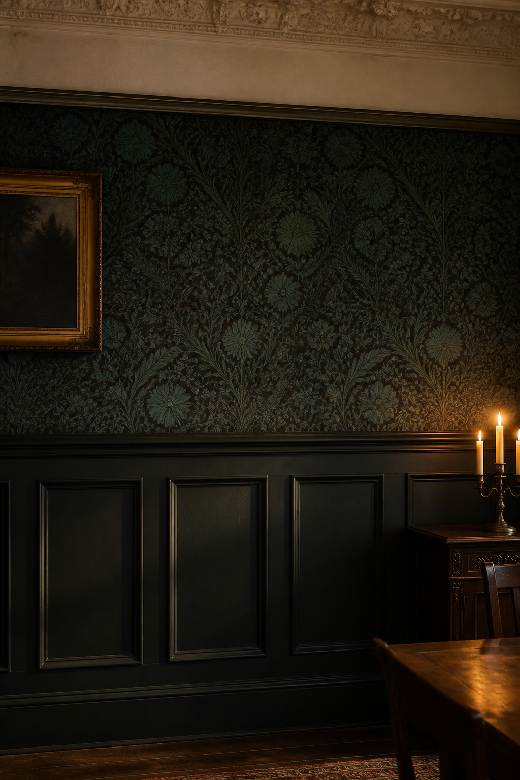
The Victorians also solved a problem we still face: how to make a dark wall look alive in dim light. Frederick Walton’s Lincrusta, patented in 1877, was the first washable wallcovering; John Palmer’s Anaglypta followed in 1888. Painted in dark oil colours, both cast micro-shadows in candlelight because the relief was genuinely three-dimensional. William Morris reached the same end through tonal contrast inside the repeat itself.
What their principle teaches us about modern dark-wall execution
A single unbroken dark field reads as a void, not a presence. The tripartite wall avoided that by giving the eye three registers to read. Any applied texture — raised panel, picture-frame molding, embossed paper — casts shadow without directional light, so the pigment looks richer than the same colour laid flat.
Wainscoting in a Dark Dining Room: The Case for Panel Molding
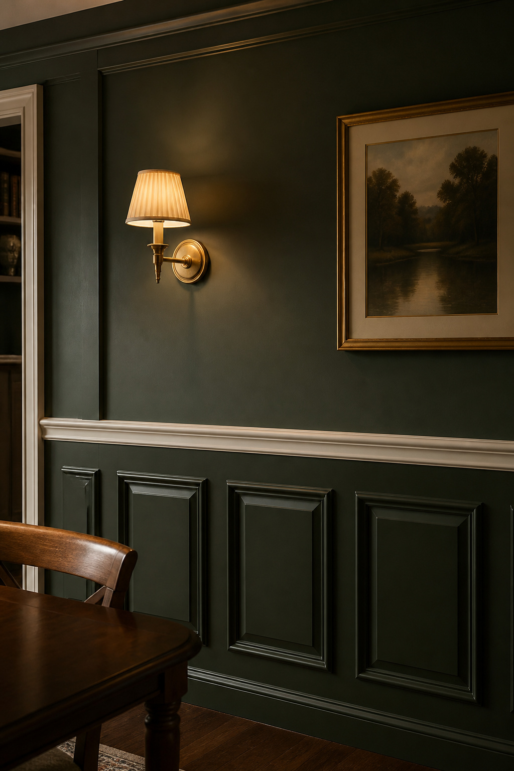
Painting wainscoting a saturated dark colour rewards order. Here is the sequence I work in.
- Clean every surface with warm soapy water and dry fully. Cooking grease lifts fresh paint straight off, primer or no primer.
- Scuff-sand with 120-grit to dull existing sheen. Sand MDF panel edges to close the grain before priming.
- Prime with an oil-base stain-blocker over stained or sealed wood — non-negotiable. Tannin bleed shows as yellow halos under dark paint within weeks. Tint toward the finish colour and you usually drop from three coats to two.
- Cut in the profiles with a 1.5–2 inch angled brush, then roll the flat fields with a 3/8-inch nap. Pull tape while the last coat is still slightly wet — dried dark paint chips at the edge.
For a new install, prime and first-coat before the panels go up, then finish-coat after nail holes are filled and caulked.
Standard dining-room wainscoting runs 32–36 inches from the floor — one-third of an 8-foot wall, level with a dining chair’s back — extending to 36–42 inches for 9–10-foot ceilings. Taller two-thirds-height paneling reads emphatically Victorian but needs at least a 9-foot ceiling. The profile dates the work: a raised panel reads as period, flat or beadboard as contemporary.
The trim question is binary. Match cap rail, stiles and baseboard to the wall and the room becomes one chromatic environment — the molding showing itself through shadow alone. Keep trim off-white and the panel geometry reads immediately as architecture; a navy field with crisp white crown can feel formal in the best way. The catch is over-chopping: in a room broken up by several doors and windows, white trim makes the eye bounce from bright line to bright line. Plan the wall alongside the furniture in front of it.
Picture-Frame Molding and Panel Detail: Building Shadow on a Flat Wall
Picture-frame molding — shadow-box molding, by its more honest name — gives a flat plaster wall architectural depth without a full raised-panel assembly. The principle is pure Lincrusta: a three-dimensional profile throws shadow lines at any light angle, sharpest under a sconce or candle. This Old House describes the working profile as one that “provides enough depth to cast attractive shadows without protruding too far from the wall surface” — shadow is what you are buying.
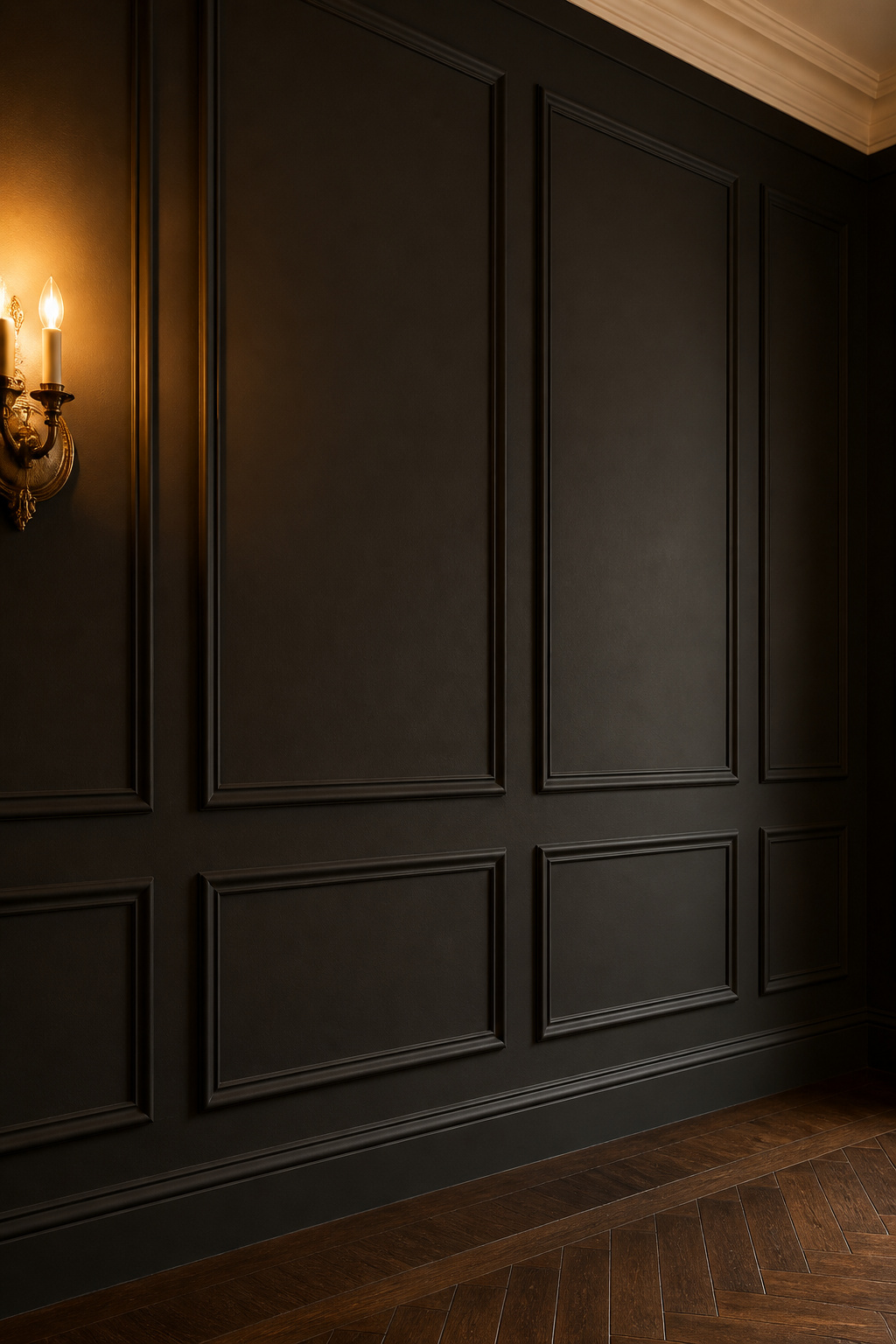
Hold boxes 3–4 inches off the baseboard, crown or cap rail, and keep 2.75–4 inches between them. Consistency matters more than the exact figure — tape the outlines first and adjust at dining-table distance before cutting a single length.
The profile itself carries a period accent, worth knowing when the molding should read as heritage.
| Profile | Visual effect in raking light | Period association |
|---|---|---|
| Ogee (cyma reversa) | S-curve casts a complex double shadow — concave throws shade, convex catches light | Georgian / Victorian; the heritage restorer’s default |
| Astragal bead | Half-round with flat fillets — a single crisp shadow line, restrained | Broad: Greek, Roman, Georgian, transitional |
| Colonial chair-rail cap | Stepped section; at 1.5 inches or taller, reads as a deliberate line, not a strip | Colonial through transitional |
One workshop rule: the cap profile should run at least twice the panel’s thickness, so a 3/4-inch panel wants a cap of about 1.5 inches.
Dark Wallpaper: Patterns, Textures and the Inset-Panel Move
Which wallpaper categories hold up in a dining room
A dining room asks more of wallpaper than most rooms: steam, migrating grease, chair backs against the lower wall. The professional answer is a super-washable Type II vinyl on a nonwoven base — it shrugs off steam, lets you scrub dried sauce, and strips cleanly later. Reserve premium non-vinyl papers — Farrow & Ball or Morris & Co handprints — for the field above the dado, where chair backs and grease do not reach.
Pattern scale and the dark-room rule
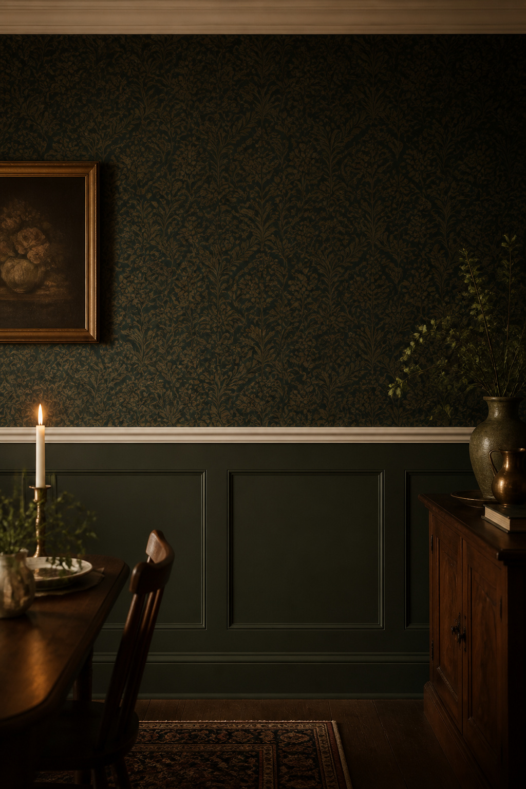
Pattern scale behaves counterintuitively on a dark ground. In my experience, large-scale prints tend to vanish in low light when the pattern sits only marginally lighter than its background — dissolving into the dark field at candlelight. Fine-to-medium repeats hold up better; density lets the pattern read as texture even when motifs blur. Morris’s Golden Lily in Midnight does exactly this. Test any paper at full scale under the warm light you will actually dine by, never on a bright shop chip.
The wallpaper-inset-in-wainscoting technique
The move worth the trouble: wallpaper inset above wainscoting. Paint the wainscoting first, then hang the paper in the field above the cap rail, which gives a straight, durable edge to trim against. Visually it restores the tripartite logic: the painted dado as architectural frame, the patterned field as the panel it contains. Dark navy grasscloth above a painted dado is the cleanest modern translation. These are also the walls your art and mirrors for dark walls will hang against, so leave room for them.
One Accent Wall vs Four: Making the Commitment Decision
Whether to darken one wall or all four is an architectural decision. Four dark walls cocoon — the room becomes total immersion, and the candlelight and glassware become the visual interest. A single dark wall reads as bold decor rather than a designed room. Colour-drenching, wall and woodwork in the same hue, carries that logic to its end.
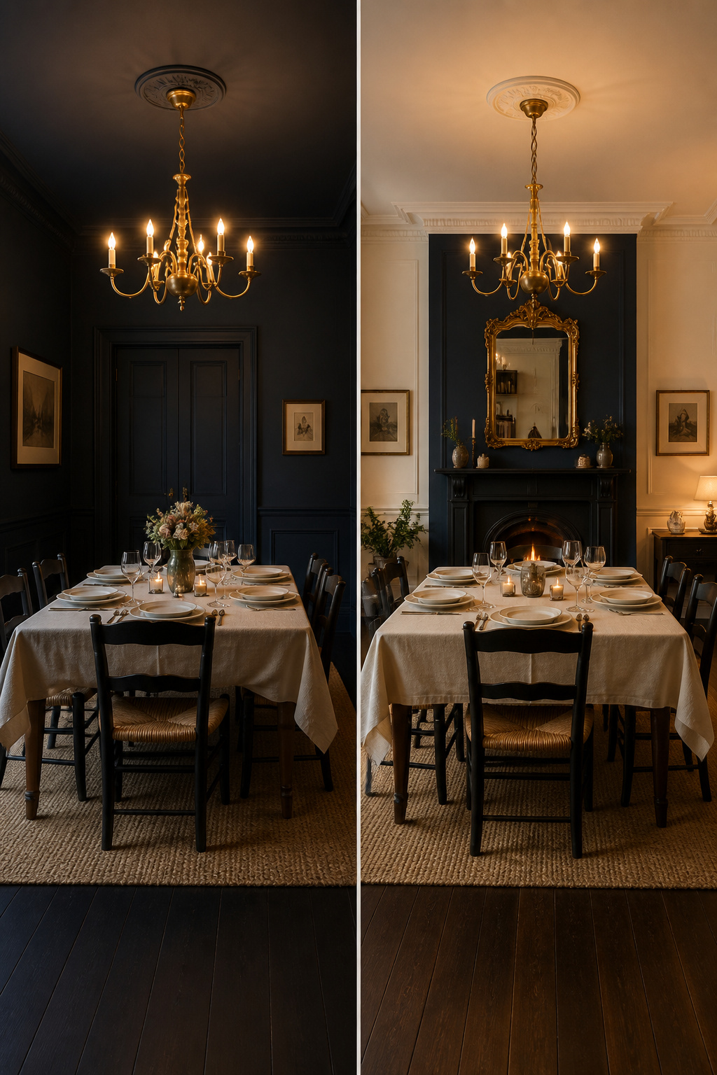
The accent wall earns its place when the goal is to frame a feature, or when the room is too small or under-lit to wrap in dark. Choose the wall the eye meets first — usually the one facing the entrance — and know that dark accents want ambient light: in a dim room, a lone dark wall reads as a patch.
| Approach | Best when | Effect |
|---|---|---|
| Four walls (or full drench) | Enclosed, intimate dining room; you want immersion | Jewel-box envelope; the room itself recedes at dinner |
| Single accent wall | Bright room; one feature to frame; commitment uncertain | Framed, theatrical focus against a lighter room |
| Chimney breast / alcove | A defined architectural edge already exists | Dark terminates at structure — no arbitrary stop |
The chimney breast is the most natural candidate: its edges contain the colour so it never stops mid-wall. Darken the breast to draw the eye to the fire and mirror; darken the flanking alcoves instead and they recede. Either way the dark ends at a real boundary, which spares you the “why did it stop there?” problem of a flat accent wall.
Execution Notes: What Goes Wrong and How to Avoid It
Dark paint forgives less than any other colour, and matte forgives least of all — a flat finish suppresses reflectance so the eye reads the wall surface directly. Most failures trace to three sources:
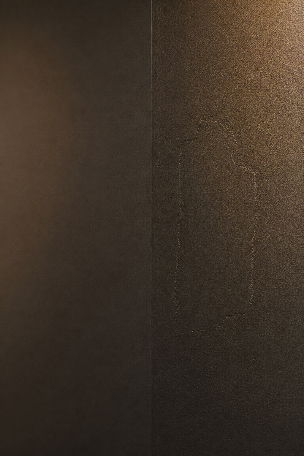
- Skipped prep. Fill and sand every hole, then skim-coat patched or rough plaster before priming. Dark matte acts like a mirror; raking light finds every unaddressed dent.
- No tinted primer. Without it, the finish “doesn’t look like the swatch when done.” Tint the primer to within two or three shades of the colour and the wall arrives true.
- Uneven panel spacing. Mock the boxes in tape and view from 6–10 feet — the distance you actually sit. Shadow lines magnify every measurement error.
A fourth point I name as my own position: I run a reversibility audit on every wall choice — any treatment that needs power tools or chemical strippers to undo fails the test. Strippable vinyl on a nonwoven backing peels away cleanly; picture-frame molding fixed with construction adhesive does not — removal tears the plaster. In a rented room, that distinction separates an experiment from a commitment you cannot walk back.
Putting It Together: The Wall Treatment That Earns the Paint Colour
How the surface and the colour are decided together
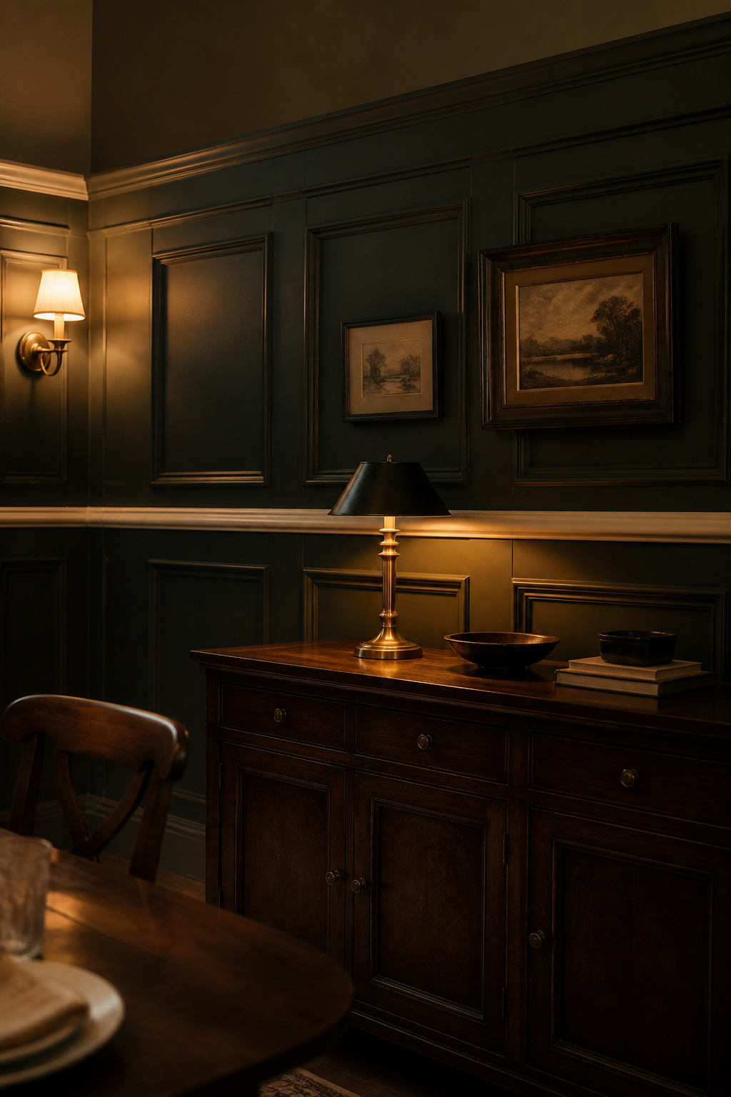
The surface and the colour are one decision, not two. Raised-panel wainscoting adds shadow lines that do some of the visual work, so a slightly less saturated colour reads as richly on panelling as a deeper one does on flat plaster. A near-black on articulated molding stays legible because the profile reveals structure; the same near-black on bare plaster risks reading as a flat mass.
A staged approach if you cannot do it all at once
Stage it. Live a dining season with the colour alone — the flat dark will show exactly where panel articulation earns its keep. Then picture-frame molding goes over the existing paint cleanly, and wallpaper can join the field later.
What the finished wall should feel like
At dinner the wall should recede, throwing the candlelight and glassware forward — the molding noticed as craftsmanship up close, never as a graphic element across the table. Settle the hue for how it reads on this surface, then stage the furniture in front of it and let the wall do its quiet work behind it.
FAQ
Do I need to install wainscoting before painting walls dark?
No, but the order matters. Prime and lay the first coat on every surface, install the wainscoting, fill all nail holes and caulk the gaps, then apply the final coat over everything. This hides the seams, which show far more under saturated dark paint than under lighter colours. Adding molding to an already-dark wall reverses the sequence.
What type of wallpaper works best in a dining room?
A super-washable Type II vinyl on a nonwoven base is the professional choice. The vinyl skin handles grease splatter and the steam from serving dishes, while the nonwoven backing holds seams stable and strips cleanly later. Basic washable Type I is not enough here. Premium non-vinyl papers work only in the protected field above a dado rail.
How high should wainscoting be in a dining room?
Standard cap-rail height is 32–36 inches from the floor — roughly one-third of an 8-foot wall, and level with a dining chair’s back, the height the dado rail was made to protect. For 9–10 foot ceilings, extend that to 36–42 inches. Taller two-thirds-height paneling reads dramatically Victorian but needs at least a 9-foot ceiling to stay balanced.