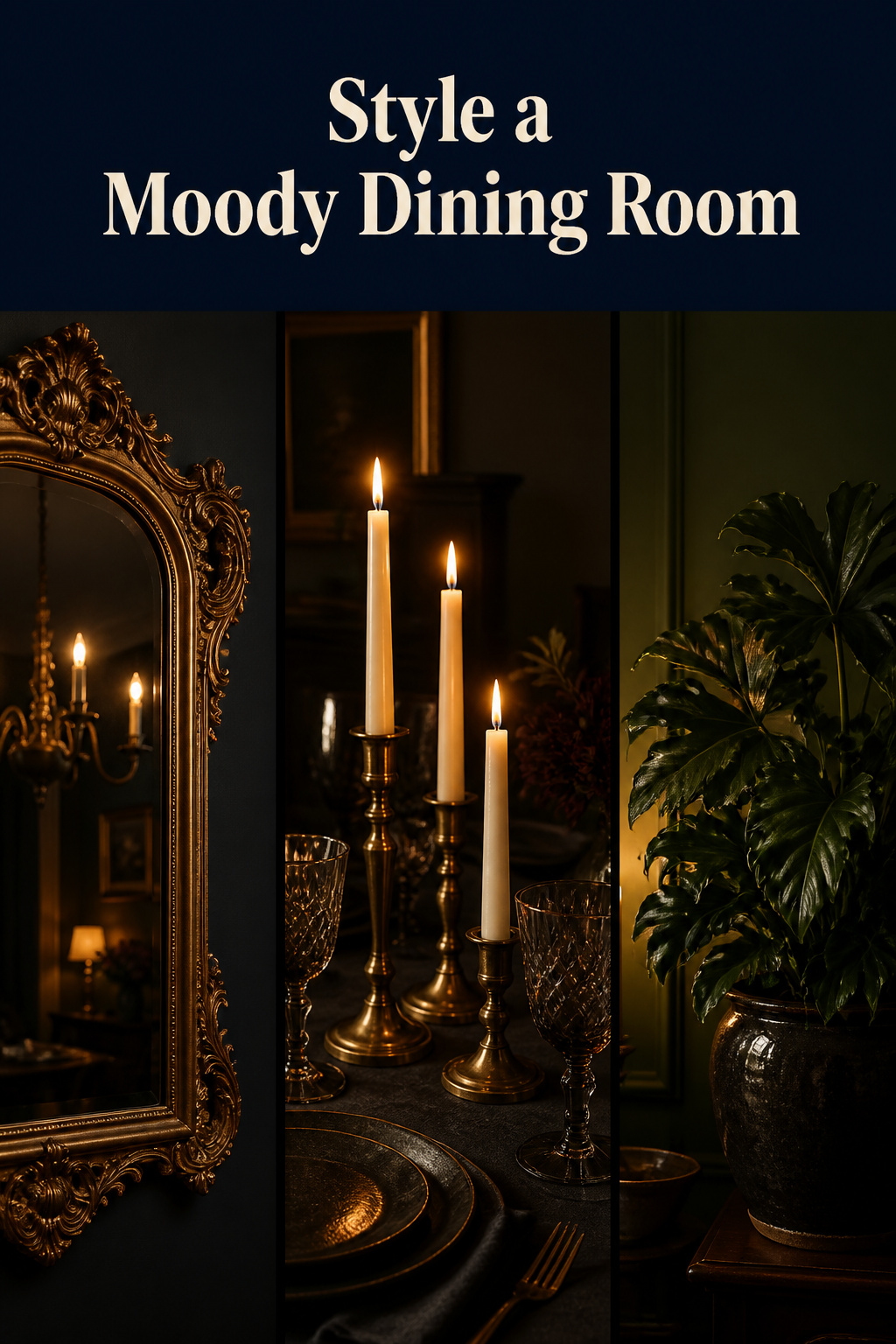
You have done the hard part. The walls are deep and committed, the table is in, the colour reads the way you hoped after dark — and still the room feels like a held breath rather than a finished thought. That gap, between dark walls and a room you would happily seat eight people in, is closed by the styling layer. Moody dining room decor is the difference between a space that looks deliberate and one that looks unfinished. The people whose rooms you have admired did not get there with paint — they got there with what they hung, set out, and left bare.
TL;DR
- A dark wall absorbs light instead of reflecting it, so accessories must contrast to register — reach for gilt, pale ceramics and natural green, and reserve dark objects for dark walls only when they bring real texture.
- Style in layers: walls first (gilt-framed art and mirrors sized to roughly 60–75% of the furniture below, centred at 57 inches from the floor — or 57–60 inches in rooms with higher ceilings), then warm metals on a 70/30 dominant-to-accent rule, then the table.
- Group table candlesticks in odd numbers at three staggered heights, keep the tallest clear of seated eye level, and edit hard — a dark room reaches its clutter limit faster than a light one.
Why Moody Dining Room Decor Makes or Breaks the Look
A dark wall absorbs the light that hits it rather than bouncing it back, and that single fact governs everything that follows.
The contrast imperative
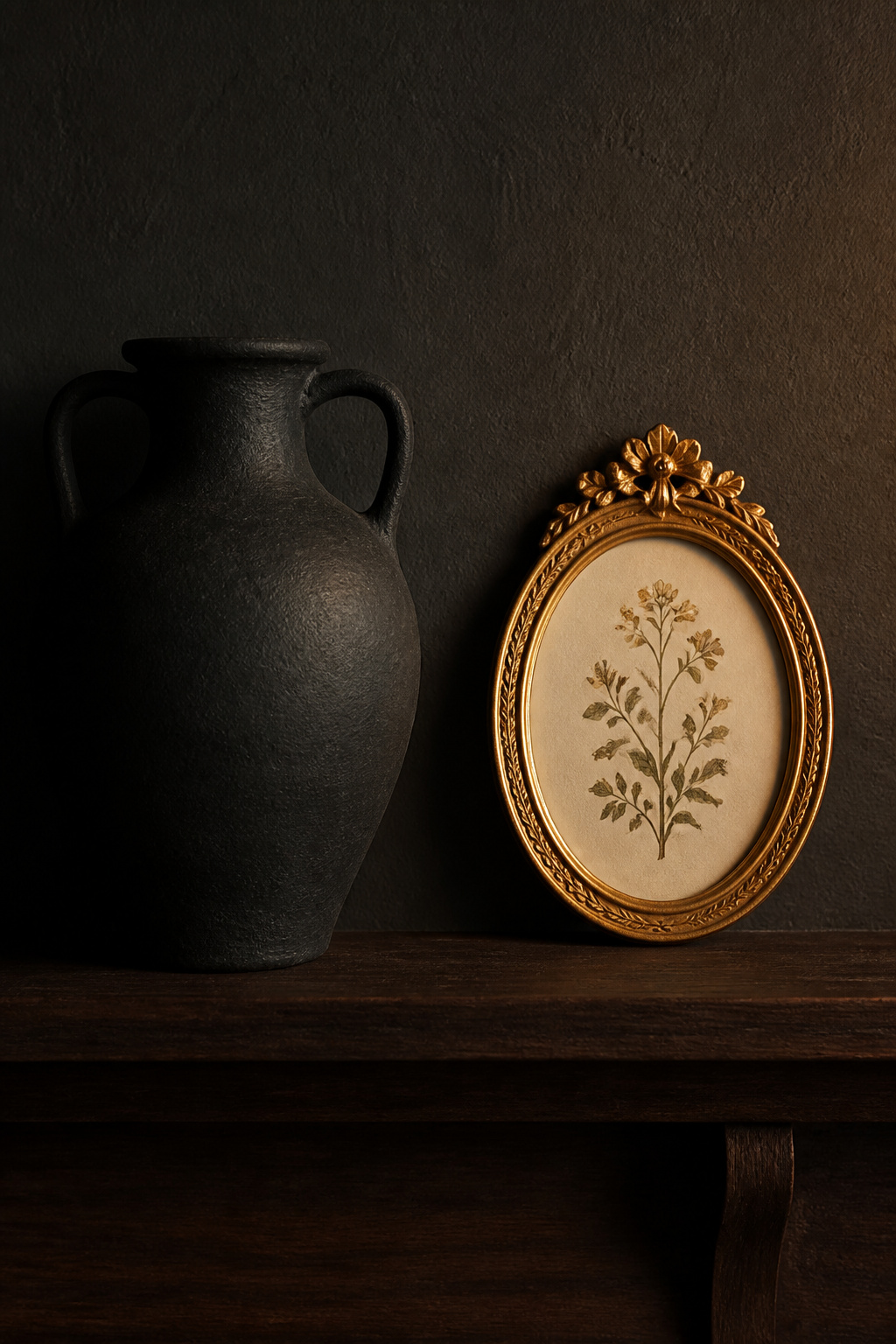
A dark frame on a dark wall vanishes; gilt, cream ceramic and living green carry the tonal difference the wall refuses to provide. So the instinct here is counterintuitive — reach for objects lighter and warmer than you think you need. Three categories do the work: light-catching metals (gilt, brass), organic textures (ceramics, stems, linen), and reflective surfaces (mirrors, smoked glass). Charcoal pottery and black frames only add to the heaviness.
Walls first, then the table, then the touches
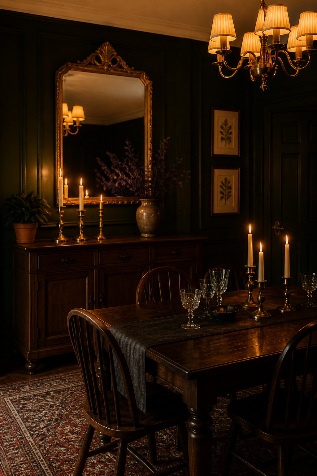
The sequence matters as much as the choices. Settle wall colour and treatment, then furniture and textiles, then accessories — and within that final phase, work the vertical surfaces before the table. The sideboard is the hinge, carrying the mirror above and the candlesticks on top.
What separates finished from unfinished
An unfinished dark room lacks a light-catching focal point on the main wall — dark paint, dark furniture and nothing reflective reads as dim, not atmospheric. Finished rooms share one trait: warm light at table level, a lit zone within the dark.
Wall Art in a Dark Dining Room: What to Hang and Where
Gilt frames earned their place in Georgian and Victorian dining rooms for a practical reason: gold leaf against deep paint caught what little candlelight there was and threw it back. Subject matters as much as frame — botanical prints became a staple precisely because their cream grounds contrasted hard against dark panelling, while any image with a predominantly dark background simply disappears. A few principles carry the section:
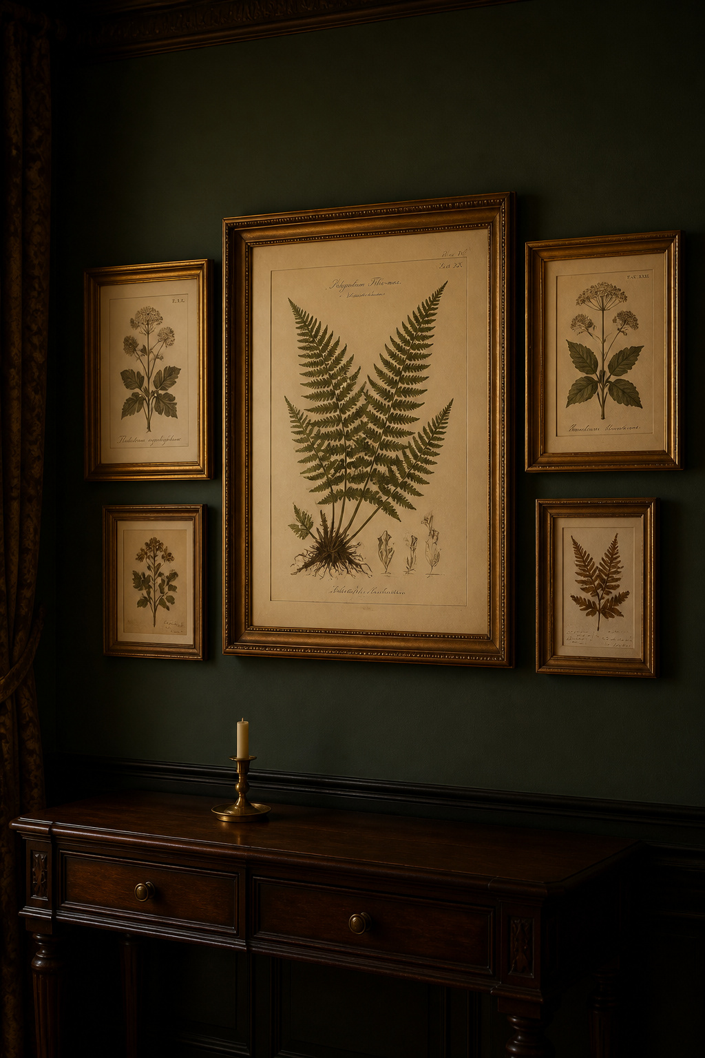
- Frame for contrast. Gilt for jewel-tone walls and maximum light-catch; dark wood for charcoal rooms and a restrained effect.
- Scale to the furniture. A piece or grouping above a sideboard should span roughly 60–75% of the furniture’s width to feel intentional, not stranded.
- Hang to the eye. Centre art at 57 inches from the floor — 57–60 inches under high ceilings. Above a sideboard the clearance rule takes over — 6–10 inches between the furniture’s top and the frame.
- Group tight. Keep neighbouring frames 2–3 inches apart; wide gaps let the dark wall show through and fragment the grouping. Anchor a salon hang with one or two large frames and fill in with smaller ones.
Treat the whole arrangement as one object — that, more than any single print, is what reads as collected.
Mirrors: Reflection as a Deliberate Tool
A mirror in a bright room borrows daylight. After dark there is none to borrow, so the mirror amplifies the warm sources already lit: opposite a chandelier it doubles the fixture’s weight, behind a candlescape it doubles the flames. This is not a modern trick — the Georgian pier glass was a deliberate answer to lighting a room with nothing but fire, sited to multiply one strong source.
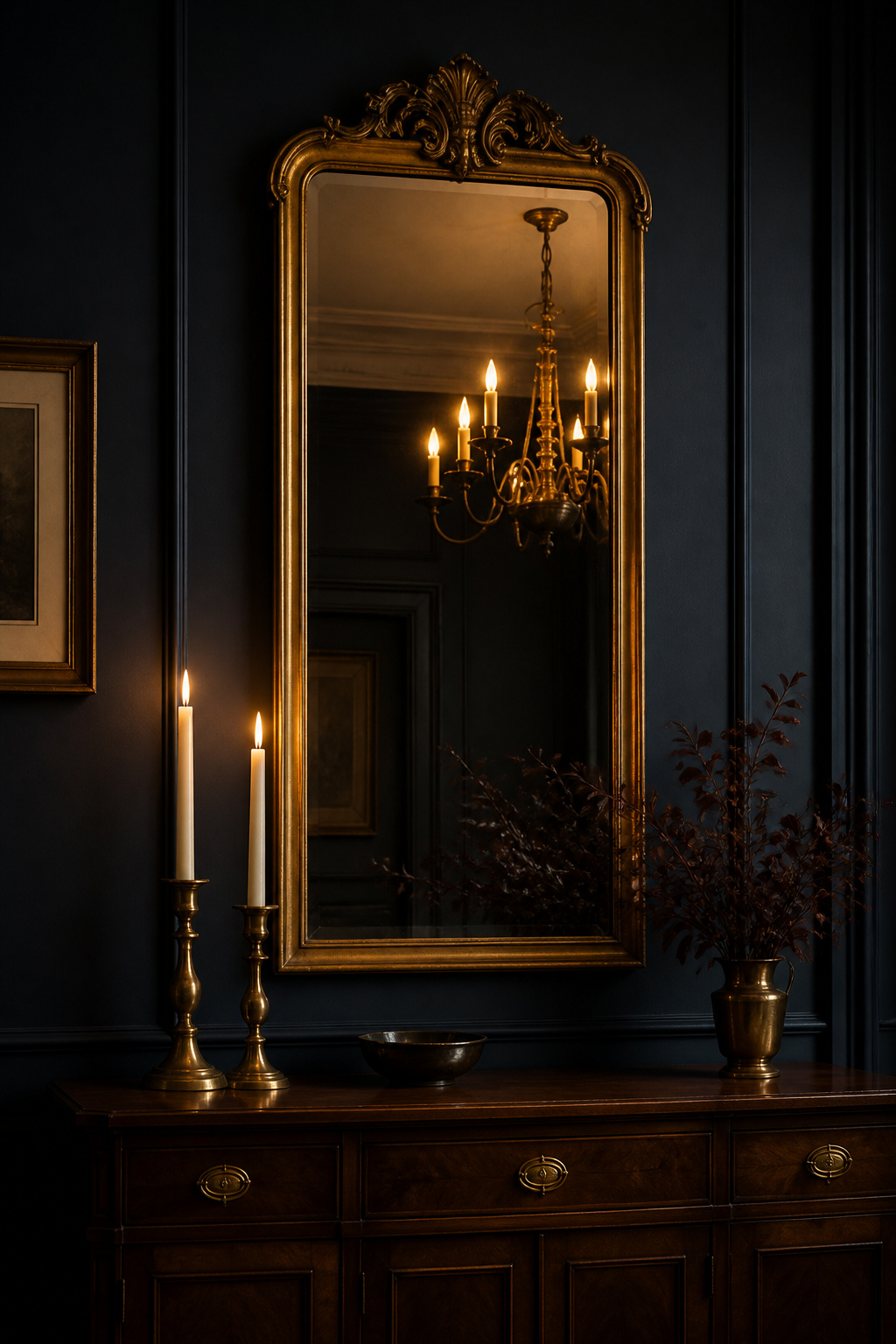
Frame choice signals provenance. Gilt gives maximum warmth against deep paint — the most historically grounded mirror for a moody dining room. Ebonised wood sits closer to the wall’s tone where gilt would read as too precious; aged iron leans industrial and cooler. Smoky grey glass flatters darker palettes because it catches light softly rather than throwing a hard reflection.
Two placement rules, then one strategic one. Size the mirror to roughly 60–75% of the sideboard’s width — a six-foot sideboard wants approximately 43 to 54 inches — because one generous mirror beats several small ones. Centre it at 57–60 inches from the floor, with 6–10 inches of clearance above the sideboard. Then decide what it reflects: the chandelier, a candlescape or a window — never the kitchen pass-through or the backs of diners’ heads. An intentional reflection doubles something beautiful; a careless one adds noise. These mirrors hang on the same deep walls the architecture builds, which is where the complete moody dining room guide ties the whole system together.
Metals and Hardware: Brass, Bronze and the Warm Accent Layer
Warm metals are the most reliable accent in a dark room because they double as light. Brass, aged bronze and antique copper absorb the warm 2700K glow from candles and chandeliers and re-emit it, becoming small secondary sources against a wall that gives nothing back. Cool metals fail here — polished chrome and brushed nickel throw light as sharp, cool points that read as a mismatch. Unlacquered brass, left without its coating, patinates over the years, darkening where hands touch it most — for a room with period ambition, the more honest choice.
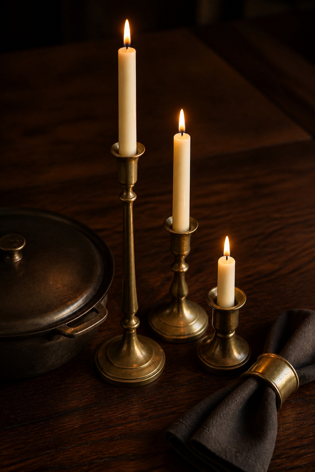
Where the metal goes matters as much as which. Brass candlesticks earn their keep twice — display objects by day, active light by night — and picture-rail hooks in brass carry the warmth up the wall, tying the table to the art above. The rule is repetition: a finish needs to appear at least twice to read as intentional, so a brass mirror frame and two candlesticks read as considered where one stranded object does not.
| Finish | Warmth in a dark room | Role |
|---|---|---|
| Aged / unlacquered brass | Highest — patinates and deepens with use | The dominant metal |
| Oil-rubbed bronze | Warm, matte, restrained | The secondary 30% |
| Matte black | Neutral — carries warm metals without competing | A safe third accent |
| Polished chrome / nickel | Cool, sharp — reads as a mismatch | Avoid here |
Mix on the 70/30 rule: one dominant metal at 60–70% of your accents, a secondary at 30–40%, sharing a warm undertone. A third finish is safe only when neutral — matte black qualifies, a third warm metal like copper does not, because three finishes competing for the warm anchor produce confusion, not richness.
Greenery and Botanicals Against a Dark Wall
Green reads more intensely against a dark wall than a pale one — the saturated foliage gains relative luminosity when the ground behind it is deep, so a single plant shifts the tonal register of the whole room. Designers treat greenery as close to mandatory in deep green and navy rooms, and glossy-leaved plants do a second job by reflecting warm candlelight. (That contrast effect is an extrapolation from how colour behaves rather than a measured standard, but it holds up in practice.)
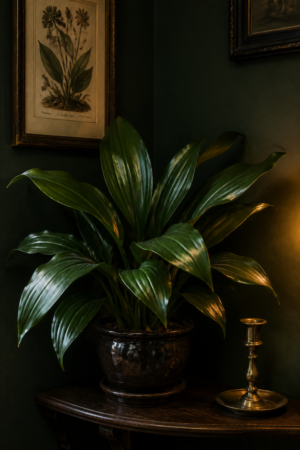
The plant has to survive a low-light room. The cast iron plant, Aspidistra elatior, is the historically grounded choice: it reached Europe in the 1820s and became the defining Victorian dining-room plant precisely because it shrugged off low light, gas fumes, dust and neglect. The ZZ plant is described as even more tolerant of dim conditions than the cast iron plant, with glossy leaves that shimmer in lamplight. For a room with no natural light at all, lean on these or skip live plants entirely — framed botanical prints deliver the organic line with no care and the same Victorian provenance. And the vessel is part of the composition: a plastic nursery pot undercuts a heritage wall, while a dark-glazed ceramic or aged metal pot completes it.
Tablescaping: Atmosphere at the Table Itself
The table runs in two modes. The everyday table needs a standing layer that always looks finished — a dark linen runner with bare wood either side and a permanent grouping of candlesticks. The dressed table builds on that rather than rebuilding: more candle height, smoked glassware, folded napkins, fresh stems in a dark vase. Candlelight does the most work, making brass glow — the warm-zone-within-dark-room effect that candlelight and layered lighting creates on a room scale, the table creates in miniature.
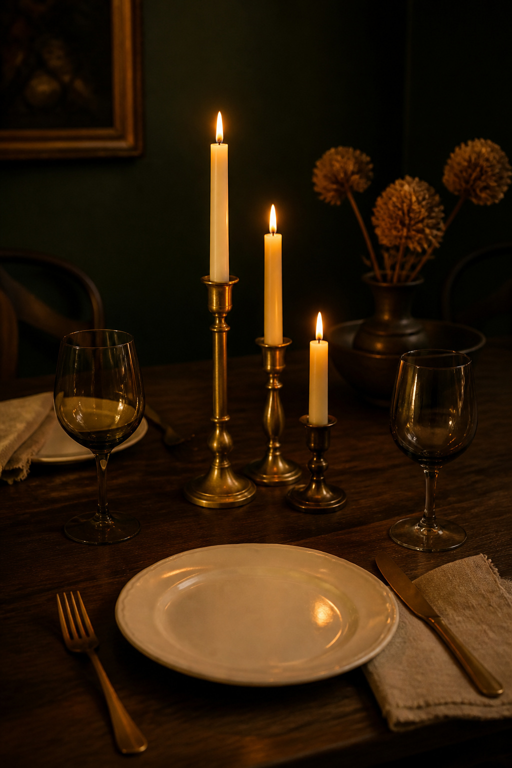
To dress a moody table:
- Lay the base. A dark linen runner — charcoal, slate, deep navy — over bare walnut, with white or cream plates as the one bright note the setting needs. Avoid near-black plates; like dark art on a dark wall, they vanish.
- Build the candlestick grouping. Set three holders in odd numbers at staggered heights — tall (10–12 inches), medium (7–9), short (4–6) — for a triangular composition. Odd numbers read as styled, even numbers as stiff.
- Mind the sightline. Keep the tallest taper either below seated eye level or well above it; candles at mid-height across the centre block conversation, the most common tablescaping mistake.
- Add the glass and metal. Smoked grey glasses hold candlelight as an amber pool; brass or gold flatware carries the warm metal from wall to table.
Choose ivory or beeswax tapers — their warm cream tone flatters brass and suits 2700K room light, where black tapers read heavy against already-dark linen. (That candle-colour guidance comes from candle retailers rather than independent editorial sources, so treat it as a useful starting point rather than gospel.) Where a stripped-back register suits you better, the modern moody look carries the same table principles with fewer, bolder pieces.
The Finished Room: When to Stop Adding
The last styling decision is a subtraction. In a dark room clutter reads more aggressively than in a light one, because the eye has fewer tonal resting points and objects compete harder against the deep ground. The signs are specific: more than three distinct frame styles in a gallery wall, more than two warm metals without a clear dominant, too many shapes crowding the sideboard. When a room feels heavy rather than rich, the fix is rarely rearrangement — it is removal. A useful rule is to take one item out each time you bring a new one in. Negative space is a material in its own right, even when that space is dark.
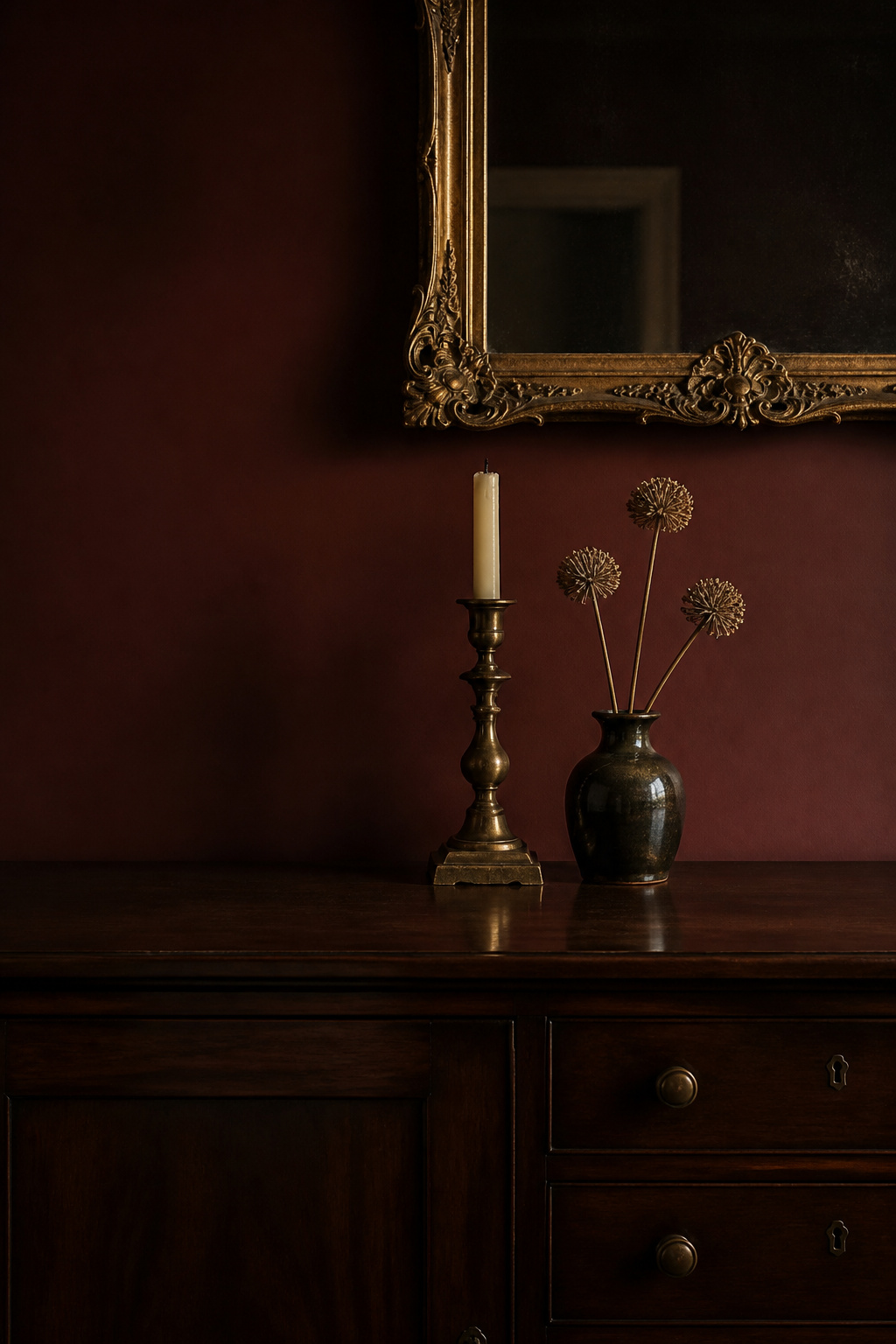
The deepest mark of a finished moody room is that it looks gathered over time rather than bought in a single trip. Let the metal, art and botanical layers accumulate at a pace that lets you choose well, and let the unlacquered brass find its patina. The room you started with — dark walls and a held breath — becomes the room you pictured not when the last object goes on, but when you trust yourself to leave the next off.
FAQ
What wall art looks best in a dark dining room?
Gilt-framed botanical prints, scientific illustrations and oil-style still lifes work best — their cream grounds give maximum contrast, and gilt frames catch light against deep paint. Avoid art with predominantly dark backgrounds, which disappears on a dark wall. Centre pieces at 57 inches from the floor (57–60 inches in rooms with higher ceilings), or 6–10 inches above a sideboard.
How do I style a sideboard in a moody dining room?
Use a simple formula: one large reflective element above it — a gilt mirror or art sized to roughly 60–75% of the sideboard width — one or two warm-metal candlesticks at varying heights, and one organic element such as a botanical stem. Leave 6–10 inches of clearance under the mirror, and treat empty surface as part of the composition.
What colour candles work best in a moody tablescape?
Ivory and beeswax tapers are the safest, most flattering choice — their warm cream tone complements brass holders and 2700K room light, contrasting gently against dark linen. Black tapers read dramatic against pale cloths but go heavy on dark linen, so use one or two at most. Group tapers in odd numbers at staggered heights.