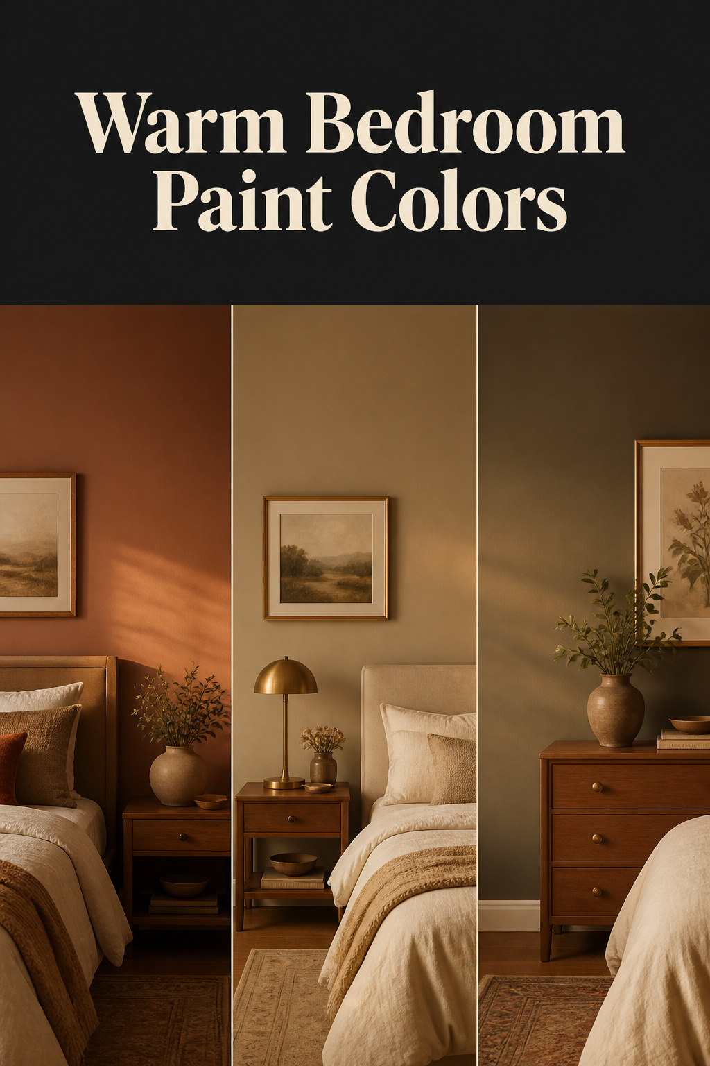
Two paint chips labelled “warm greige” can sit side by side in the store, identical. Bring them home and one glows on the wall while the other turns muddy by noon. That gap is the real trouble with warm bedroom paint colors: the name on the chip predicts almost nothing about how a colour behaves on your wall, in your light. Two things decide it, and the aisle hides both — the colour’s undertone, and the light your room actually gets. Read those, and hundreds of near-identical “warm neutrals” shrink to a short list.
TL;DR
- Undertone and your room’s light decide whether a colour reads warm, more than the chip’s name. A lower LRV (a terracotta near 20, a charcoal near 13) feels cosier than a warm white at LRV 83.
- Four families cover most bedrooms: warm whites (Benjamin Moore White Dove, LRV 83), soft terracottas (Sherwin-Williams Cavern Clay, LRV 20), warm sage (Sherwin-Williams Rosemary, LRV 14) and moody deeps (Kendall Charcoal, LRV 13-14) — keep the saturated ones to one accent wall.
- Never commit from the chip. Sample it on the wall, check it morning, midday and evening, and buy only if it still looks warm in the room’s weakest light.
What Makes a Color Read “Warm”
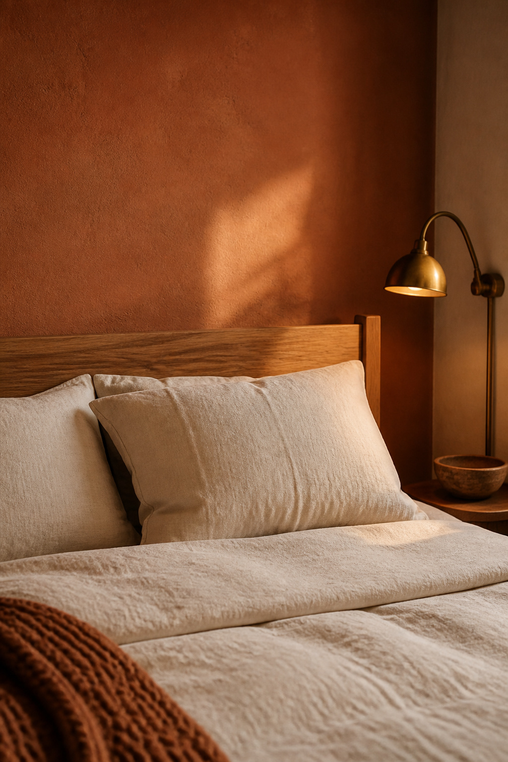
“Warm” is really three variables we fold into one word — undertone, LRV, and the room’s own light. Get those straight and every palette below is easy to judge.
Undertone versus hue
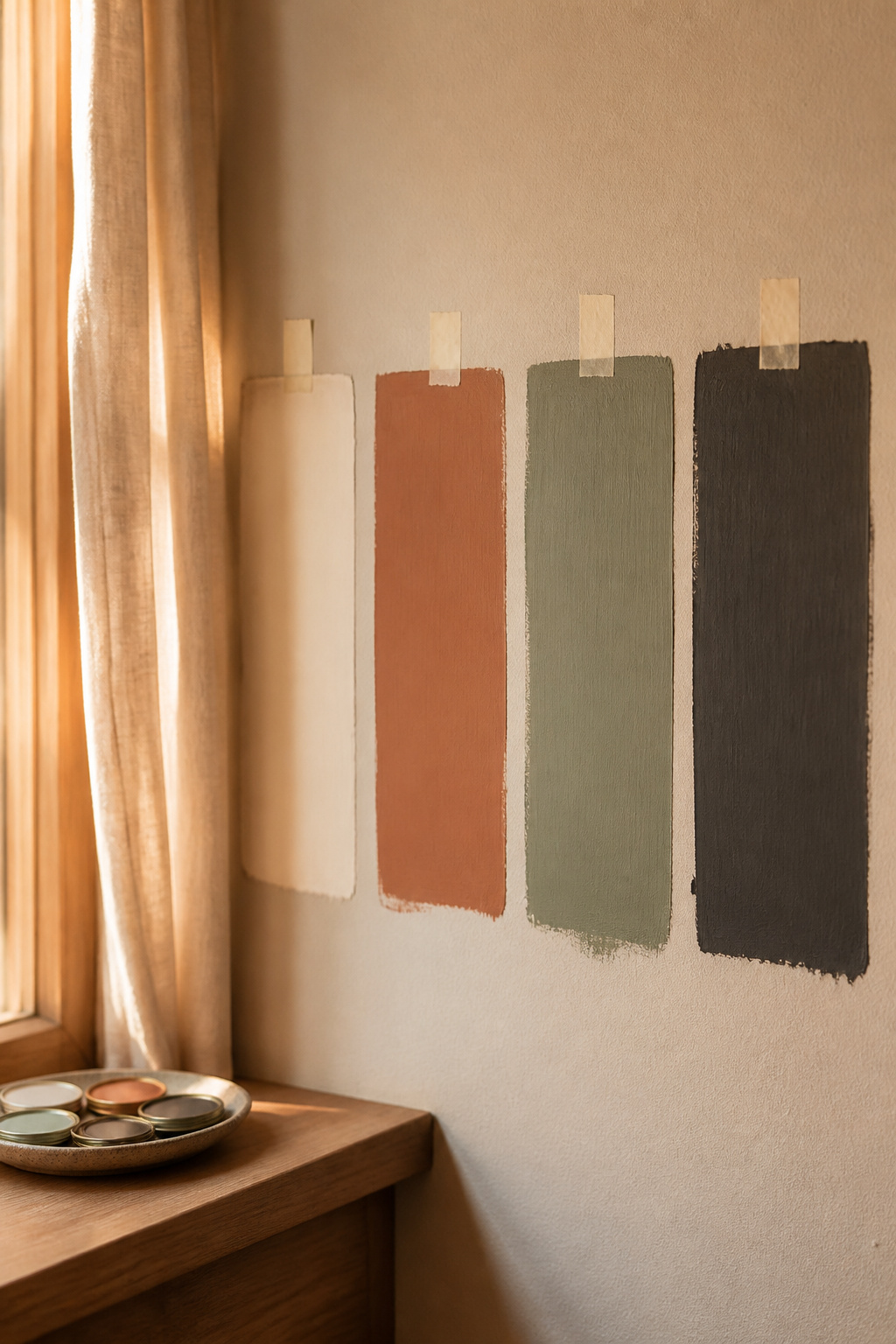
Undertone is the colour family beneath a paint’s visible hue: yellow, orange and red bases read warm; blue, green and violet read cool, whatever the chip is called. Spot it by comparison — set two “warm whites” side by side, or hold a swatch against white paper in daylight, and one shifts gold while the other goes icy blue.
Why LRV changes how cozy a color feels
LRV measures how much light a paint reflects, from 0 to 100 — white sits at 82-94, dark at 2-10, and it tracks light, not hue. That is why a warm white at LRV 83 and a terracotta at LRV 20 are both “warm” yet feel nothing alike: the low number wraps the room, the high one opens it.
The counterintuitive part: light changes the color, not just its brightness
Daylight changes temperature by orientation — north light is cool and flattens warm undertones, while south light is golden and deepens them. So a north-facing bedroom needs a warm colour to counter that cool cast; cool grays or blues there only make it feel doubly chilly. In winter countries you learn to read a room’s light or live badly in it.
At a glance, four warm families with one reliable example shade each:
| Family | Example shade | LRV | Use it as |
|---|---|---|---|
| Warm white / greige | Benjamin Moore White Dove | 83 | whole room, any orientation |
| Soft terracotta | Sherwin-Williams Cavern Clay | 20 | one accent wall |
| Warm sage | Sherwin-Williams Rosemary | 14 | accent wall |
| Moody deep | Benjamin Moore Kendall Charcoal | 13-14 | accent wall first |
Earthy Neutrals and Warm Whites
The widest family, LRV 58 to 84 — so the shade matters far more than the label “warm white.”
What separates a warm white from a cold one
A warm white carries yellow or red undertones; a cool white carries blue or green — same word on the tin, opposite feel on the wall. Benjamin Moore White Dove OC-17 (LRV 83) is my reference point, a soft warm white with a creamy yellow undertone; Alabaster SW 7008 (LRV 82) is the creamier alternative.
Best rooms and light directions for this family
Higher-LRV warm whites in the low 80s are safer for a north-facing bedroom — they need less daylight to avoid going flat. Mid-LRV greiges like Accessible Beige SW 7036 (LRV 58) and Edgecomb Gray HC-173 (LRV 63) hold warmth but turn muddy in low light, so save them for a room with steady sun.
Pairing with wood and brass
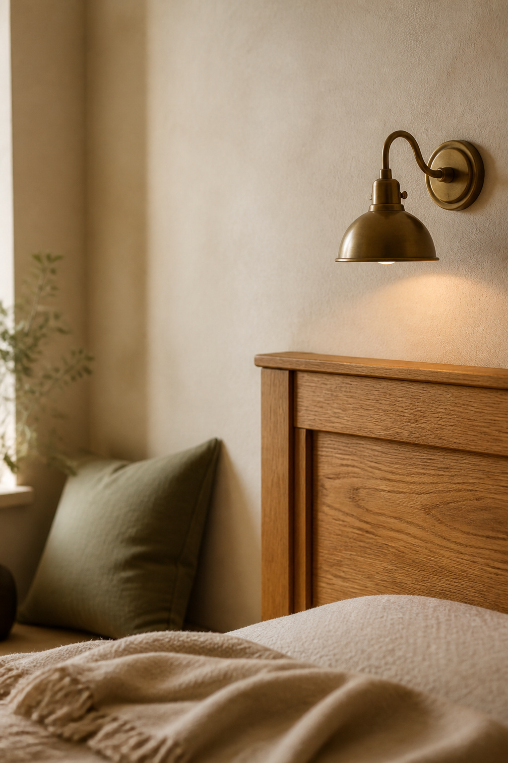
Warm whites with cream or honey undertones make brass glow, while a stark cool white leaves it cold; honey oak wants the same subtle-yellow white to echo its amber cast. So commit to one — for a north-facing room built on oak and aged brass, White Dove at LRV 83 does the most with the least risk.
Soft Terracottas and Clay Tones
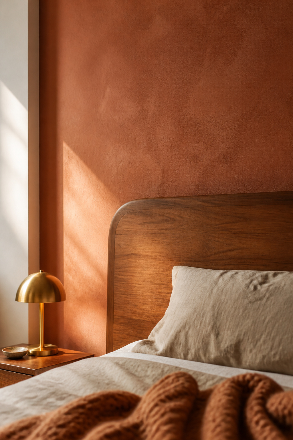
Terracotta rewards restraint — cosy as an accent, dated as a whole room, and worst against the wood this look often leans on.
Where terracotta reads cozy versus dated
Sherwin-Williams Cavern Clay SW 7701 (LRV 20) is the honest test case: brown and rust undertones over a red-orange base, earthy rather than pink. It clashes outright with 1990s honey oak trim and cool gray furniture, but looks current against dark walnut, matte black and creamy white — so check your wood tone first, since a cosy bedroom often runs on honey oak.
Balancing a saturated wall with the rest of the room
A low LRV looks intense, so terracotta belongs on one accent wall, not a whole room; the 60-30-10 rule casts a saturated clay as the 10 percent accent. One wall costs a fraction of a repaint and is easy to undo — choose the one your eye hits first walking in, usually behind the bed.
Undertones to avoid
The target is warm, muted and earthy: a candidate that looks more pink than orange, or more saturated red than muted clay, is drifting off cosy. Rookwood Terra Cotta SW 2803 (about LRV 14) shows the softer end — the check is whether it looks like fired clay or a fire engine.
Muted Sage and Warm Greens
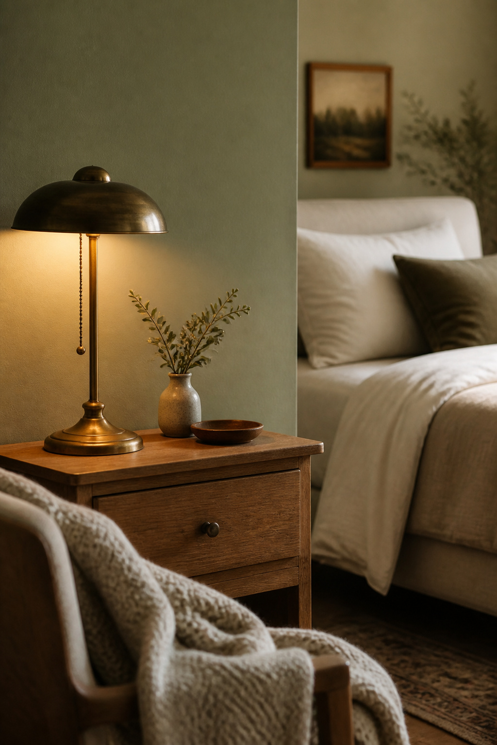
A green can be genuinely warm, and many popular “sages” are quietly cool — the difference is undertone, not the label.
Why green can still read warm
Sherwin-Williams Rosemary SW 6187 (LRV 14) is green-pigmented but carries a yellow-brown undertone that keeps it earthy, not minty. Evergreen Fog SW 9130 (LRV 30), by contrast, leans blue and smoky — crisper and less cosy than a truly warm green.
Pairing sage with natural materials
Rosemary comes alive next to saddle leather, which pulls its hidden yellow forward, and against unlacquered brass, which picks up a soft glow. To go deeper, Farrow & Ball’s Calke Green No. 34 (around LRV 9) is a darker botanical green in the same warm register.
Light conditions where sage goes cold
Rosemary’s warmth peaks in south sun and under warm 2700K bulbs; in cool north light the grey base takes over and the walls turn a moody charcoal-green. That is orientation, not a flaw — so test a warm sage on the actual wall, especially in a north-facing room.
Moody Deep Colors Done Right
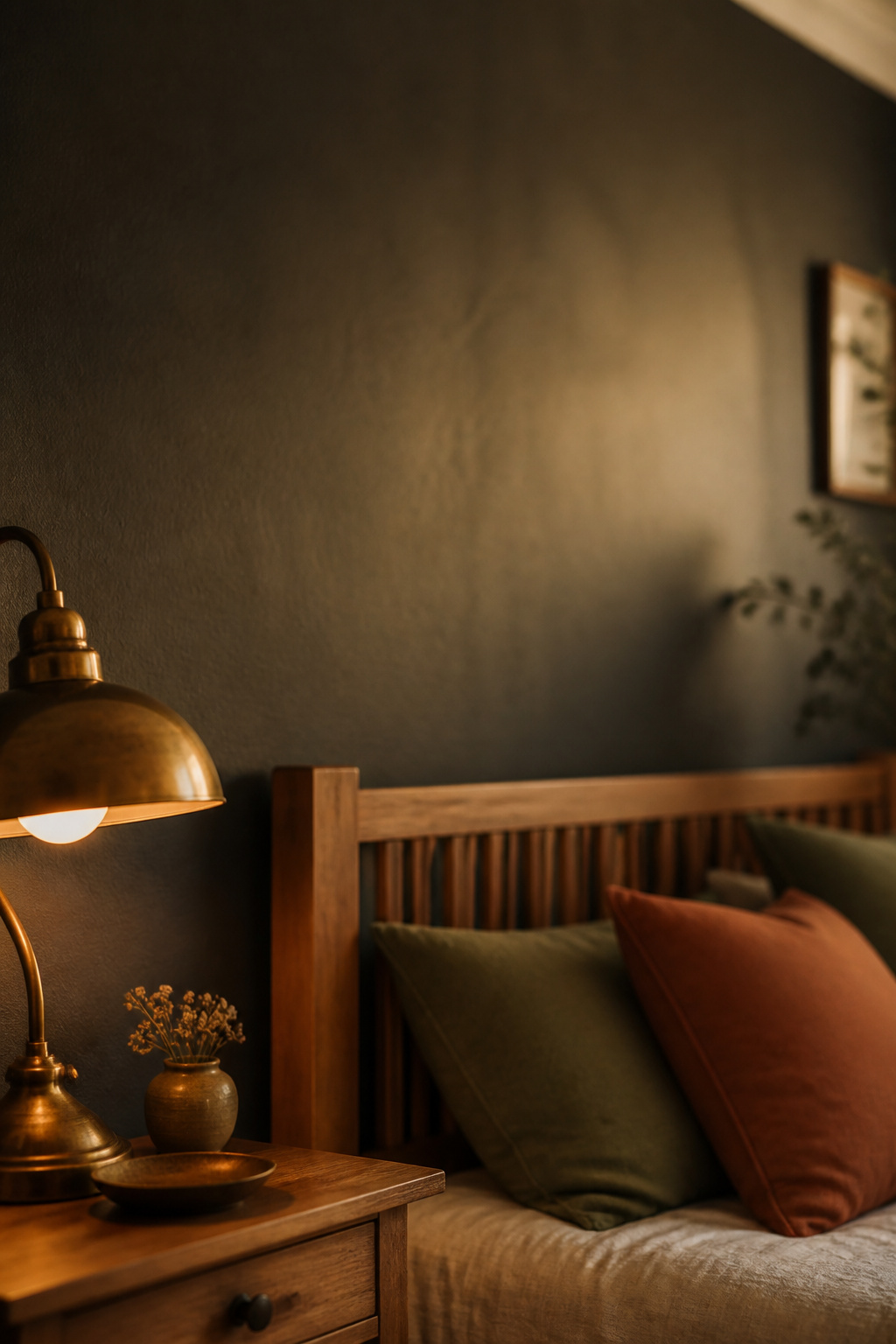
The darkest colours here, LRV 6 to 14, are the advanced choice — depth alone does not make a wall cosy, a warm undertone does.
Charcoal and forest green as accent walls
Benjamin Moore Kendall Charcoal HC-166 (LRV 13-14) is a dark stormy grey with mild green-brown undertones that keep it from reading as harsh black. Black Forest Green HC-187 shifts between black, green and teal with the light; against both, Iron Ore SW 7069 (LRV 6) is a genuinely cool dark — a reminder that not every near-black suits a warm palette.
Balancing a dark wall with warm light
Ginger Curtis of Urbanology Designs puts it plainly: deep blues, charcoal and forest green make cosy rooms in low light, but only paired with lamps and sconces, never a lone overhead. A warm-undertoned deep like Kendall’s takes 2700-3000K light better than a blue-based dark — the fix for a gloomy wall is more layered light, not a paler colour.
When a whole room in a deep color still works
Because Kendall Charcoal and Black Forest Green lean warm, they hold up full-room better than a cool dark like Iron Ore, which turns flat where daylight is scarce. A whole room in a deep warm colour works only with real daylight or a genuine lighting plan — unsure, start with the accent wall.
Testing Warm Bedroom Paint Colors in Your Own Light
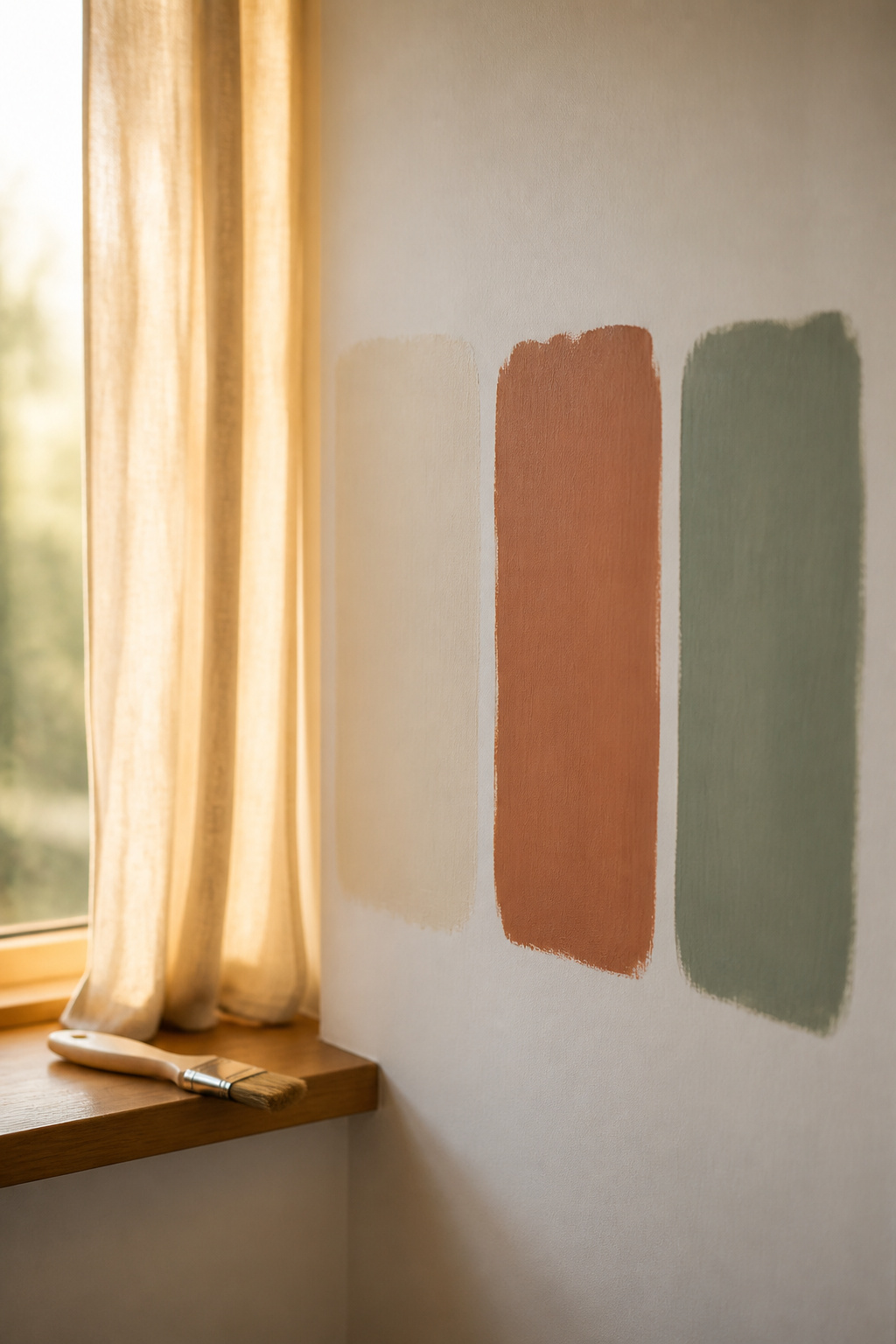
Every undertone warning above only matters if you test the colour where it will live — the step that separates a cosy result from an expensive repaint.
Sampling on the actual wall, not a board
Peel-and-stick samples in two coats of real paint, about 9 by 14 inches, beat poster board — you can move and reuse them without marking the wall. For a definitive read, roll the actual paint onto the wall in two coats; a swatch on an easel sits in different light than the wall itself.
Checking a swatch morning, midday and evening
Light changes temperature through the day, so check the same swatch three times:
- Morning, in the room’s first natural light.
- Midday, at its brightest.
- Evening, under the actual bedroom bulbs you will use.
That evening check matters most: a warm 2700K bulb can pull brown from a green like Rosemary, or rust from a terracotta, in ways daylight never shows. It is also when to coordinate the room — choose the wall colour while you plan a wood accent wall behind the bed and how to layer bedding, so paint, wood and fabric are one palette.
The decision rule to apply once you’ve tested
A few years ago a client kept apologising for her bathroom — barely eighteen square feet, one small north-facing window, light the colour of dishwater. The pale, airy white she wanted from a magazine went grey and cold every time we tried it on her wall. The room was not the problem: that cool light was the given, and once we chose a warm-undertoned colour to work with it rather than against it, the constraint became her clearest brief. Colour is the same discipline — design for the light you have, not the light in the showroom.
The rule has two moves. Match orientation to family first — north rooms need warmth and should avoid cool grays, blues and greens; south rooms can lean cooler. Then test for the weakest light, not the flattering hour: a swatch that still looks warm in a north room’s midday, or any room’s evening bulbs, holds everywhere else. A colour that only works at five o’clock is wrong for a room you live in around the clock.
That is the shortlist — undertone over name, LRV for how enclosed you want the room, one accent wall for anything saturated, and the same-light test before you buy a full can. Do that, and warming up your whole bedroom becomes a set of decisions, not a wall of chips to guess at.
FAQ
Do warm bedroom colors actually help you sleep better?
Not directly, and less than you might hope. The Sleep Foundation notes the research linking colour to sleep is thin, and any effect works through mood, not physiology. One survey even found blue — a cool colour — logged the longest sleep. Choose a warm palette for daily comfort, not a proven sleep cure.
Should the ceiling be painted a different color than the walls?
There is no single rule; designers split three ways. Ruth Mottershead of Little Greene paints walls, woodwork and ceiling one colour for a blanketed, intimate feel. Artem Kropovinsky keeps ceiling and walls one light shade in small rooms to lift height. A third route, darker walls under a lighter ceiling, also adds height.
What’s the best warm paint color for a small, dark bedroom?
Two opposite strategies both work. Victoria Holly recommends a bright white with sunny warmth, like Benjamin Moore Simply White, to bounce scarce light around. Alice Moszczynski suggests Revere Pewter, which reflects whatever light is available. Or embrace the dark with a deep charcoal or forest green plus layered lamps and sconces, as Ginger Curtis advises.