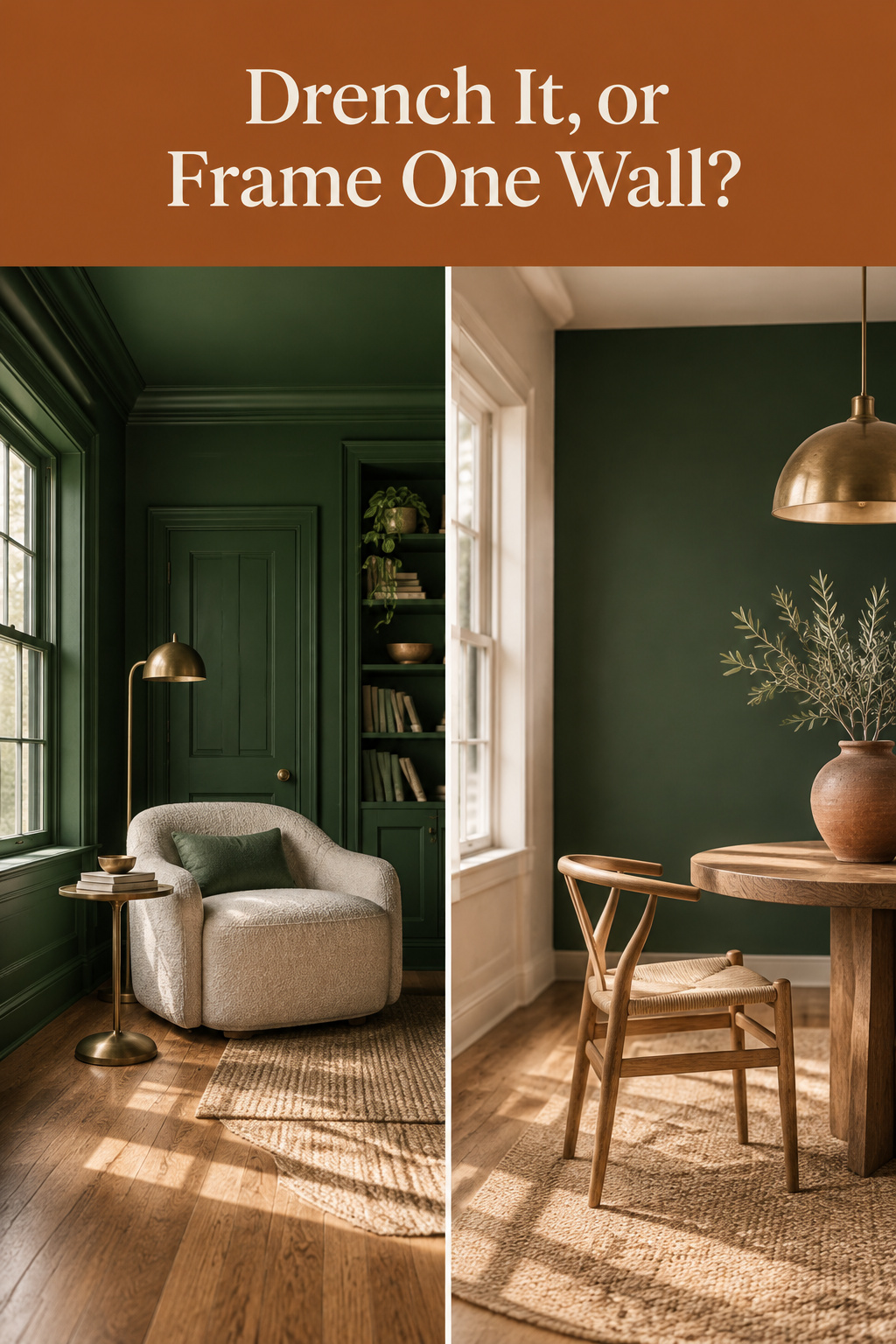
Search dark green living room walls and two very different rooms come back, sold as one idea. In the first, green has taken over the walls, trim, ceiling and even the radiator. In the second, one deep plane sits behind the sofa and the rest stays pale. Neither page tells you which your room can carry.
TL;DR
- Drench the room or hold one plane; both work. One dark wall against white trim and a white ceiling is the half-measure that looks cramped.
- Shade names carry no undertone. Benjamin Moore’s Forest Green 2047-10 leans warm and yellow, its Black Forest Green HC-187 leans cool and blue.
- Deep green returns very little light, so it wants layered lamps, dimmers and a matte finish.
The Decision Every Deep Green Room Forces
Why deep green living rooms split into two completely different looks
Color-drenching puts one shade across the walls, the trim and usually the ceiling, and it is not new. Farrow & Ball’s brand ambassador, Patrick O’Donnell, calls it “more of a technique” than a trend. The alternative is one saturated plane with everything else left pale.
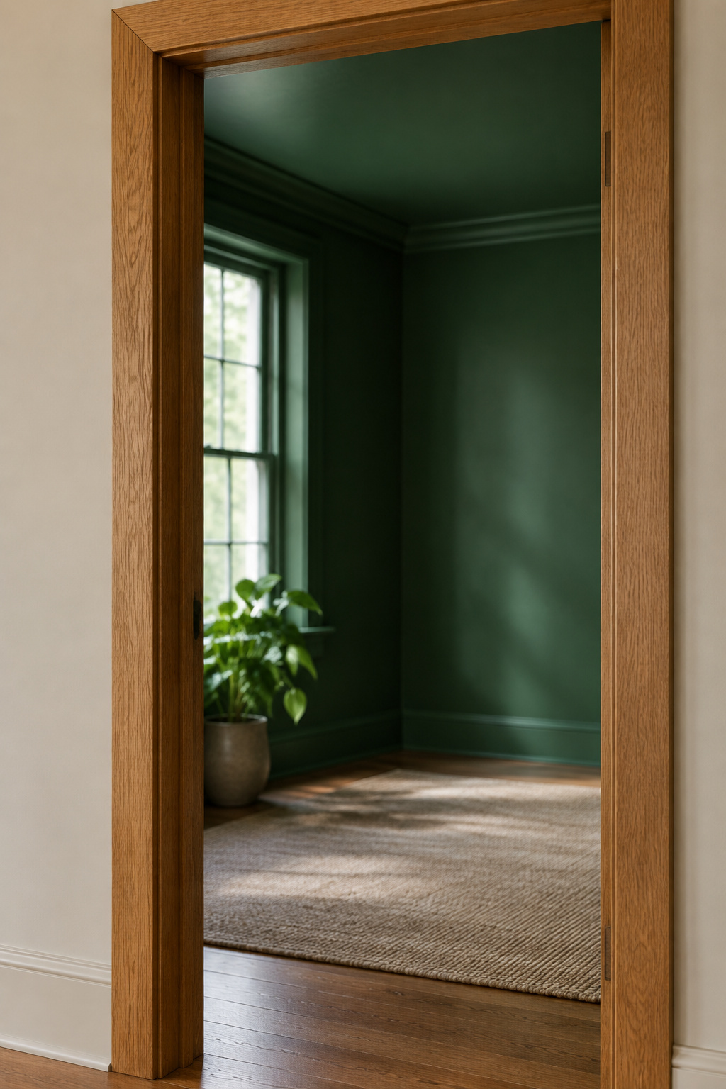
The question this guide answers instead of picking a side
Drenching features argue for drenching and accent-wall features for accent walls. Neither asks what the room in front of you can hold. A room should be allowed to be what it is, and a dim parlor drenched to look grand is still a dim parlor.
What your room already tells you before you buy a can
Two things decide it, and taste is not one of them: the daylight the room gets, and what it already wears. In an older house, the woodwork and a picture rail amount to instructions.
Color-Drenching: What Enveloping a Room Actually Does
Walls, trim and ceiling in one surface — how the technique works
One shade goes on three surfaces in a fixed order: ceiling, then walls, then woodwork and trim. Once every surface matches, the contrast lines disappear, and so do details you never liked. Radiators stop being radiators.
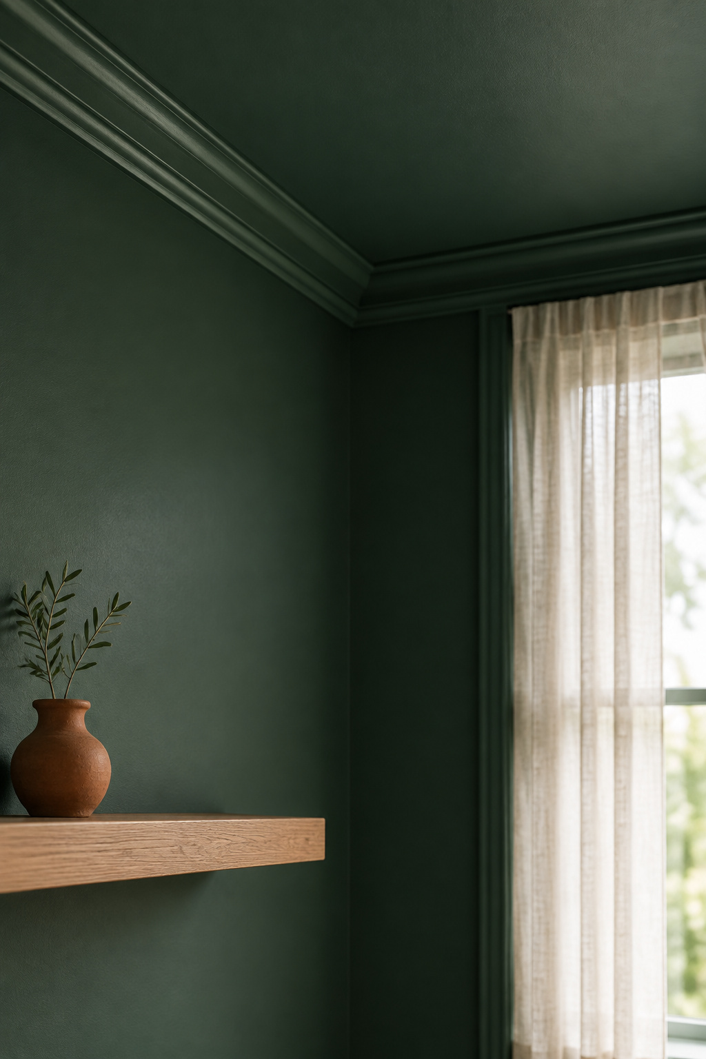
What a drenched deep green does to a room’s apparent size and edges
The sources split here, and I will not smooth it over. Helen Shaw, Benjamin Moore’s color consultant, argues that dark colors “absorb light, softening the contrast between walls and making the boundaries of a room appear blurred,” and Mylands’ Dominic Myland says immersive color makes a space appear larger. O’Donnell says the reverse where enlarging is the goal: steer clear of dark hues, which deliver elegance and intimacy instead. Envelopment and size are different purchases, and you only get one.
The rooms where drenching genuinely improves a space rather than shrinking it
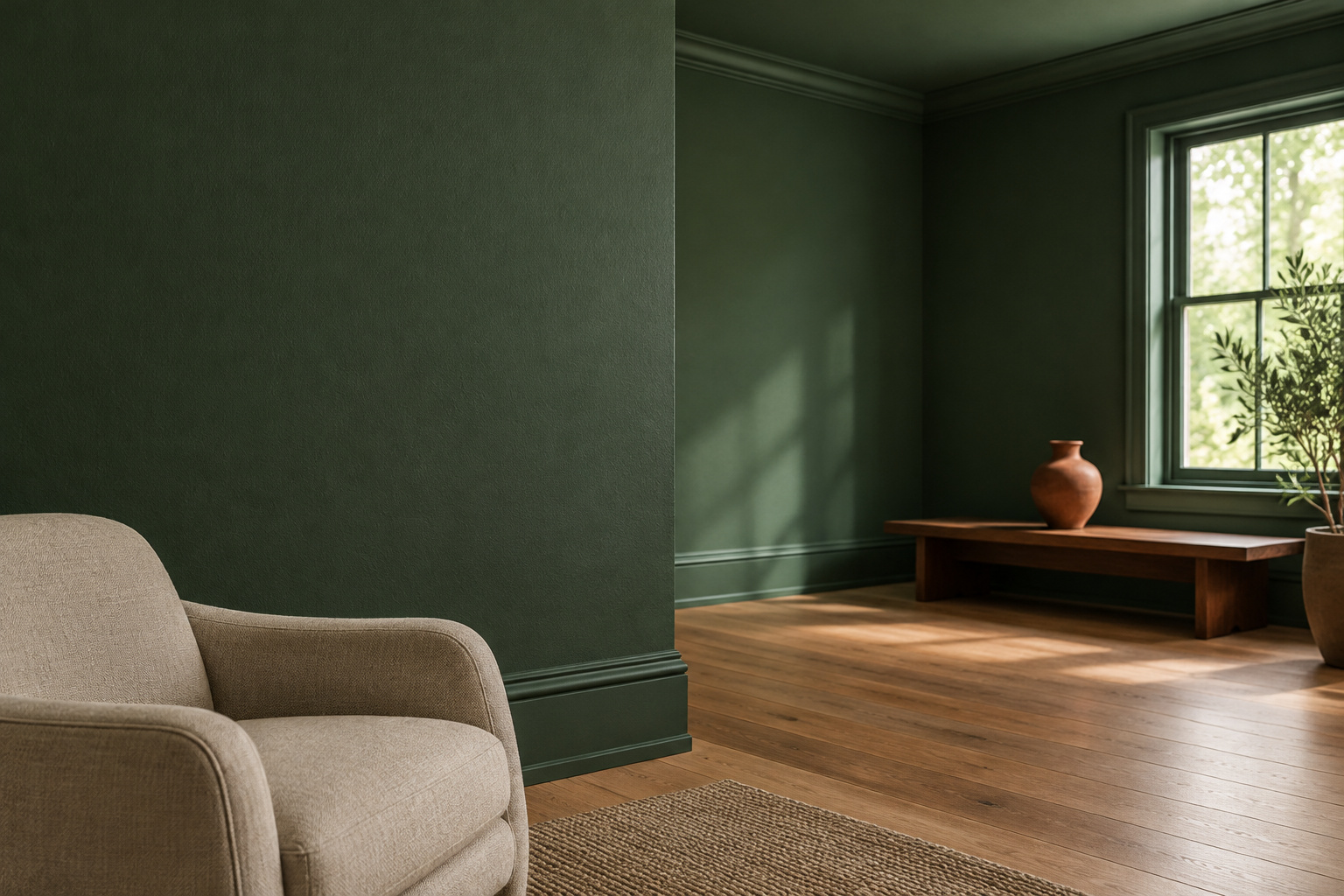
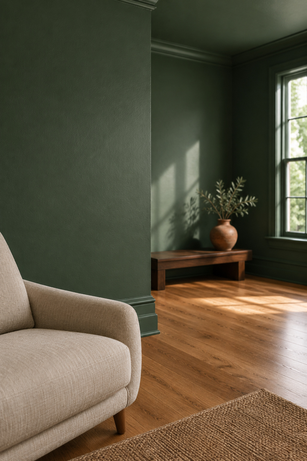
Drenching has to be total. One dark wall surrounded by white trim and a white ceiling produces the opposite effect. It also needs daylight to read as dimensional instead of merely dim.
Holding the Color to One Plane Instead
What a single feature plane gives you that drenching can’t
One plane gives you a focal break. Drenching is continuity, so the eye travels without stopping, while one plane tells it where to land.
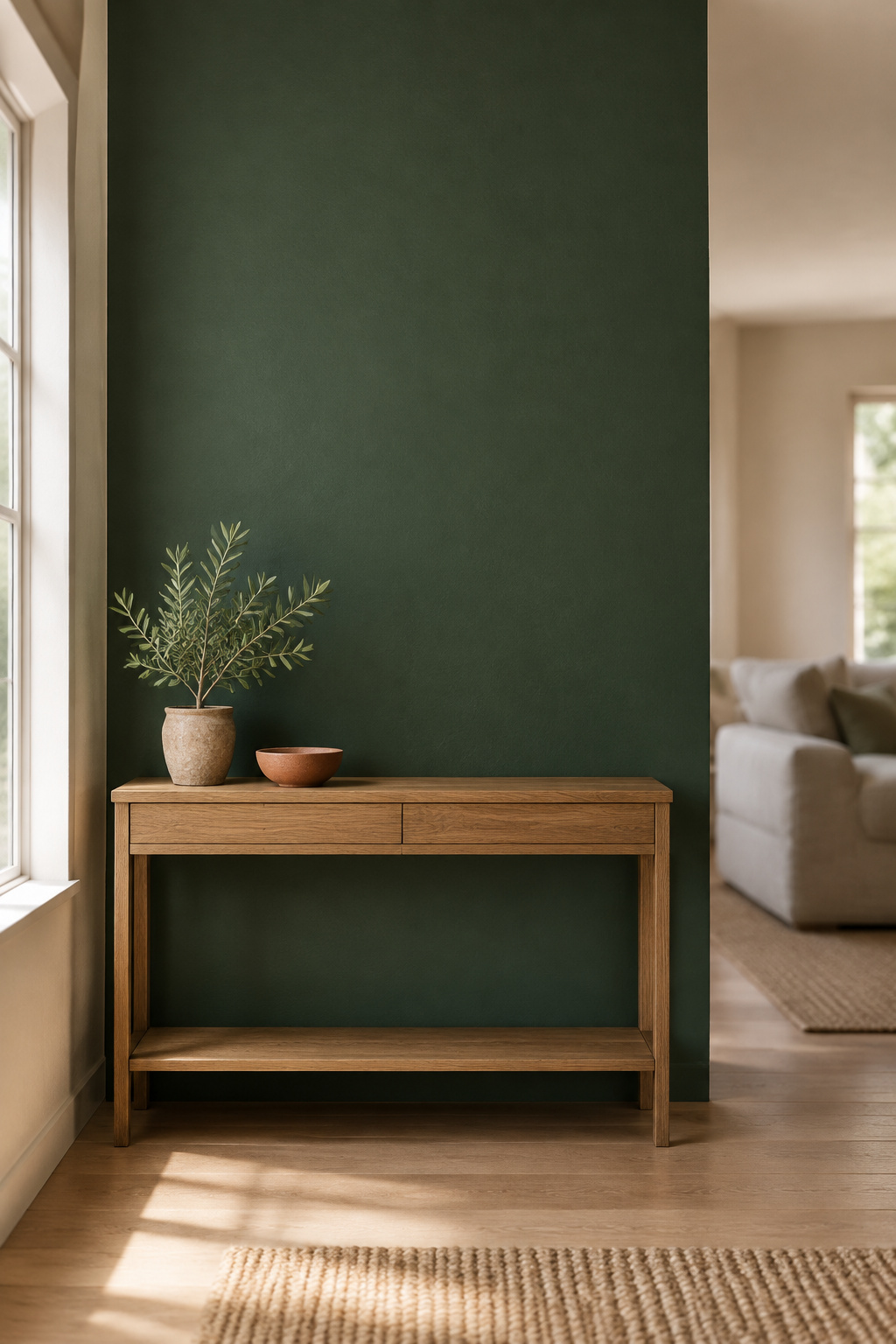
Why the rest of the room needs to stay genuinely pale for this to work
Accent walls get called disconnected, usually because the rest of the room was not quiet. A deep green plane needs pale surroundings, not merely lighter ones. The 60-30-10 distribution rule is a fair check: three to five hues, neutrals included.
Where to go for the specific wall and the paint math
The choice of plane, the coats over a pale wall and the cost of the cans sit elsewhere by design: holding it to one wall covers the wall choice and the arithmetic. Settle the scale first.
What Low Light Does to Dark Green Living Room Walls
Why the low-reflectance end of the range needs more artificial light back
A deep green returns very little of the light that reaches it, so the room has to be lit on purpose. Sherwin-Williams advises layered light and dimmers for dark rooms: table and floor lamps making pools, not one overhead fixture flattening everything.
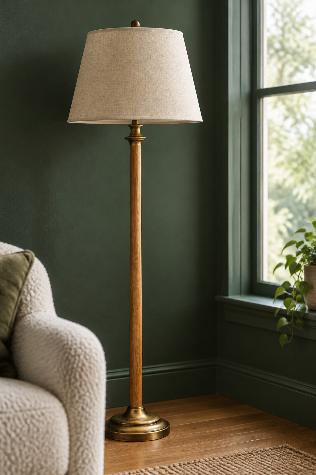
Evening light vs. daytime light in a fully drenched room
My workshop is a converted carriage house, and almost everything I bring back happens against its long end wall, which reads green in the morning and slides toward slate as the light leaves it. Ruth Mottershead of Little Greene calls that a plan rather than a compromise: lighter colors for daytime rooms, stronger ones to retreat into at night.
Where the full reflectance and light-direction figures live
Reflectance bands, the north-facing adjustment and bulb color temperature sit one article over. Check whether a deep green survives your light before committing a whole room.
Reading the Undertone: Why the Shade Name Won’t Tell You
Which named deep greens hold their warmth
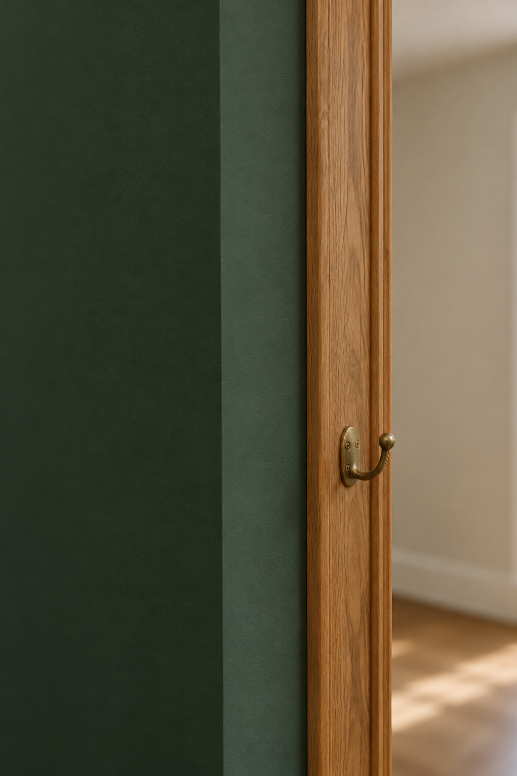
Farrow & Ball’s Calke Green No. 34 came out of the breakfast room at Calke Abbey, a deep botanical sage with warmth underneath. The other warm one is Benjamin Moore’s Forest Green 2047-10, a yellow-green with distinct golden undertones.
Which ones carry a blue cast, and where that reads well
Farrow & Ball’s Studio Green No. 93 is a cool greenblack, close to black until daylight finds the green in it. Benjamin Moore’s Black Forest Green HC-187 swings from teal in bright south light to nearly black in north light, while Hunter Green 2041-10 is cool too, a deeper jewel tone sold as an accent.
What the pigments behind these colors have to do with it
Here the argument resolves. Benjamin Moore sells Forest Green 2047-10, warm and yellow-leaning, and Black Forest Green HC-187, cool and blue-leaning: both sides of the line. Pigment is why. Chromium oxide green (PG17) is an opaque yellow-green with a warm bias, while phthalocyanine green (PG7) and viridian (PG18) carry a distinctly cool blue undertone, and the ratio of pigments decides which way a formulation lands. The name is marketing; the code is the fact.
| Shade | Undertone | Character |
|---|---|---|
| Farrow & Ball Calke Green No. 34 | Warm | Botanical sage |
| Benjamin Moore Forest Green 2047-10 | Warm, yellow-green | Whole-room green |
| Farrow & Ball Studio Green No. 93 | Cool | Greenblack in low light |
| Benjamin Moore Black Forest Green HC-187 | Cool, blue-green | Teal south, near-black north |
| Benjamin Moore Hunter Green 2041-10 | Cool, blue-green | Jewel-tone accent |
What a Period Room Has Already Decided For You
Reading existing woodwork, picture rails and cornicing before you choose a scale
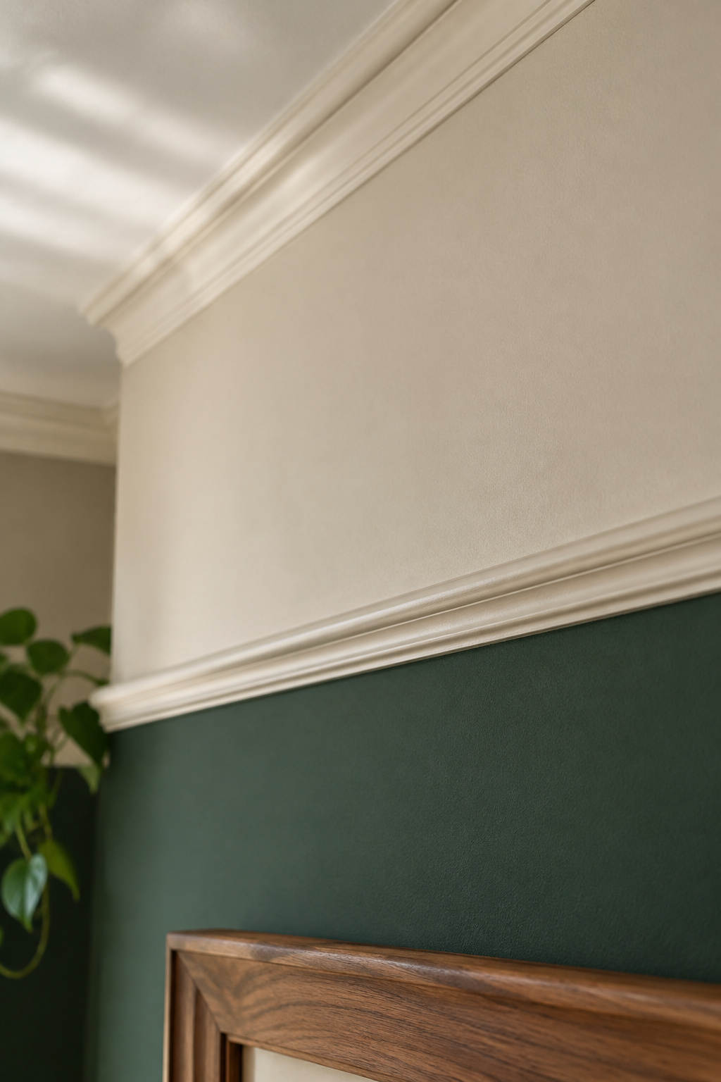
A picture rail sits 12 to 20 inches below the ceiling, or 300 to 500mm, so pictures could hang from hooks and cord instead of nails in the plaster. A dado rail sits where a chair back brushes the wall, because that is what it protected. Period joinery was functional first, and that is what makes it evidence.
Why an older house sometimes makes this decision before you walk in
A room with a picture rail and cornice may already have three paint zones: below the dado, the wall, and the frieze between rail and cornice. Drenching through all of it erases the distinction the millwork was built to make. The documented alternative carries the color to the rail and stops under the cornice. This is a reading, not a published rule for deep greens.
Look twice before you paint over what the room is telling you
SPAB’s paint guidance treats finish and gloss level, as well as color, as decisions that should suit a building’s character, and says historically important decoration is sometimes better conserved than repainted. Read old woodwork as evidence rather than as a scheme to reproduce. The Victorian Society is blunt about picking out cornice detail in a second color: “Painting is reversible, so it is not a disaster if you get it wrong.” Take a rail out and the next steward has lost it.
The Case for Each, Not a Verdict
Drench if your room has the light and the scale to hold it
Every source agrees daylight is the precondition. With it, a full drench pays: continuous, enveloping, the awkward built-in absorbed. Without it, put a mid-tone up and live with it before committing the ceiling.
Hold to one plane if you want the drama without the commitment
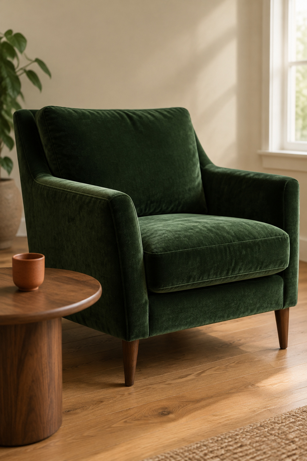
One plane buys much of the same intimacy without solving light and scale for a whole room at once. In a period room whose millwork you would rather show off than absorb, contained is the more accurate answer.
The one question to ask yourself before you decide
Are you willing to go all the way? Every failure mode in the sourcing is the same half-measure, so drench it or hold one honest plane in a pale room, and do not split the difference. If you are weighing depth against something lighter, the full range of greens a living room can carry starts a step back from here.
FAQ
Does dark green make a small living room feel smaller?
Not necessarily, and the sourcing splits. Farrow & Ball holds that dark hues are the wrong tool when enlarging is the goal, since they deliver intimacy instead. Benjamin Moore’s color consultant argues that a committed dark scheme blurs boundaries instead of shrinking them. Both agree the half-measure is worst.
What sheen works best for a dark green living room wall?
Flat or matte on the walls and ceiling. At a higher sheen, a deep saturated color gives you a glare patch and shows every roller mark. Trim, doors and window casings in the same color are commonly shifted up to satin or low-luster eggshell for durability.
Can you mix two different dark greens in the same living room?
You can, though I would be cautious. No source addresses the question directly, and general distribution guidance caps a room at three to five hues including neutrals, with one clearly dominant. Two saturated greens competing for that role look unresolved, so varying finish or value within one green is safer.