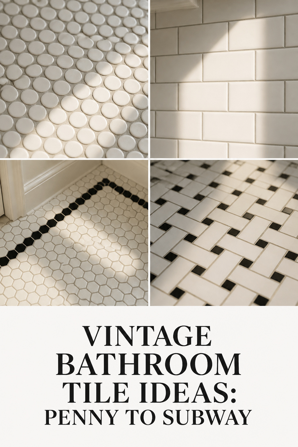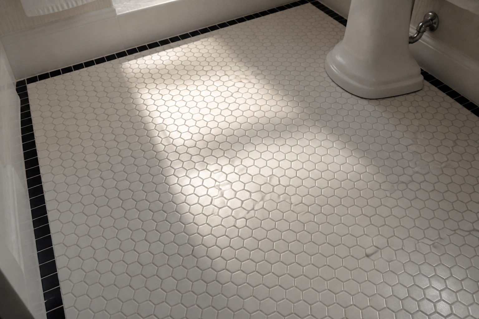

The detail that dates a reproduction bathroom is almost never the tile pattern. It is the grout. A perfect field of white hex can read as a 2015 renovation for one reason: the lines between the tiles are bright modern white, and they are too wide. Period bathrooms ran narrow joints of grey cement grout, and that single variable carries more period weight than any pattern on top of it. Get the grout wrong and the best vintage bathroom tile ideas still look new; get it right and even ordinary white tile reads as 1915.
TL;DR
- Grout, not pattern, dates vintage tile: aim for mid-grey grout at a 1/16-inch joint — bright white grout only arrived with polymer mixes in the 1980s.
- Each pattern is era-coded: penny rounds and 1-inch hex read pre-1920, 2-inch hex 1920s–30s, 3×6-inch subway from 1904 onward in running bond.
- Keep small format and keep black to an accent: large-format tile and full black walls always read contemporary, never period.
The Mistake That Ruins More Vintage Tile Installations Than Any Wrong Pattern
Most people choosing vintage tile worry about pattern. Professionals worry about the joint. When a restorer first looks at a tiled floor, the grout tells them the decade before the tile shape does — and it is the easiest thing to get wrong.
Why grout colour is the single variable that can ruin period-accurate tile
Victorian and Edwardian bathrooms were grouted in shades of white to grey, never bright white and never dark charcoal. Bright white grout reads as modern for a simple reason: polymer-modified white grout only became widely available in the 1980s. Use it on old tile and you broadcast the decade you installed it. Grout colour also changes the surface — light grout softens a pattern, dark grout emphasises every line. For a white penny or hex floor, a warm mid-grey holds the mosaic rhythm without the clinical brightness that gives a modern remodel away.
The insider principle: tile size and grout width are decade-coded, not just the pattern
Joint width is as legible as the pattern. Old rectified tile — flat, square-cornered, sharp-edged — was set tight, with grout lines of 1/16 inch or less. Modern tile has eased, slightly rounded edges and gets installed at 1/8 inch or wider, and the difference is instantly readable. Erin Byrd Oliver, principal designer at American Restoration Tile, ties the whole system to hygiene rather than looks: “One-inch hex tiles on the floors and 3-inch by 6-inch subway tiles on the walls were less about the aesthetic and more about the functionality of cleanliness. Subway tiles going up the walls had very thin grout joints.” The narrow joint was the point.
What reproduction tile gets right — and the two tells that give it away
Good reproduction tile from restoration suppliers gets the material and spacing right; the field tiles still come rectified for tight joints. Two things give the cheaper versions away. First, the joint: if it runs over 1/8 inch, the tile reads as contemporary regardless of pattern. Second, the backing — original tile was loose-laid so a setter controlled spacing by hand, while mesh-backed sheets lock in a wider, more uniform gap than period work ever had. Choosing tile is only half the job; the rest of the period look comes together in how to create a vintage bathroom as a whole.
Penny Rounds: The Victorian and Edwardian Floor Pattern
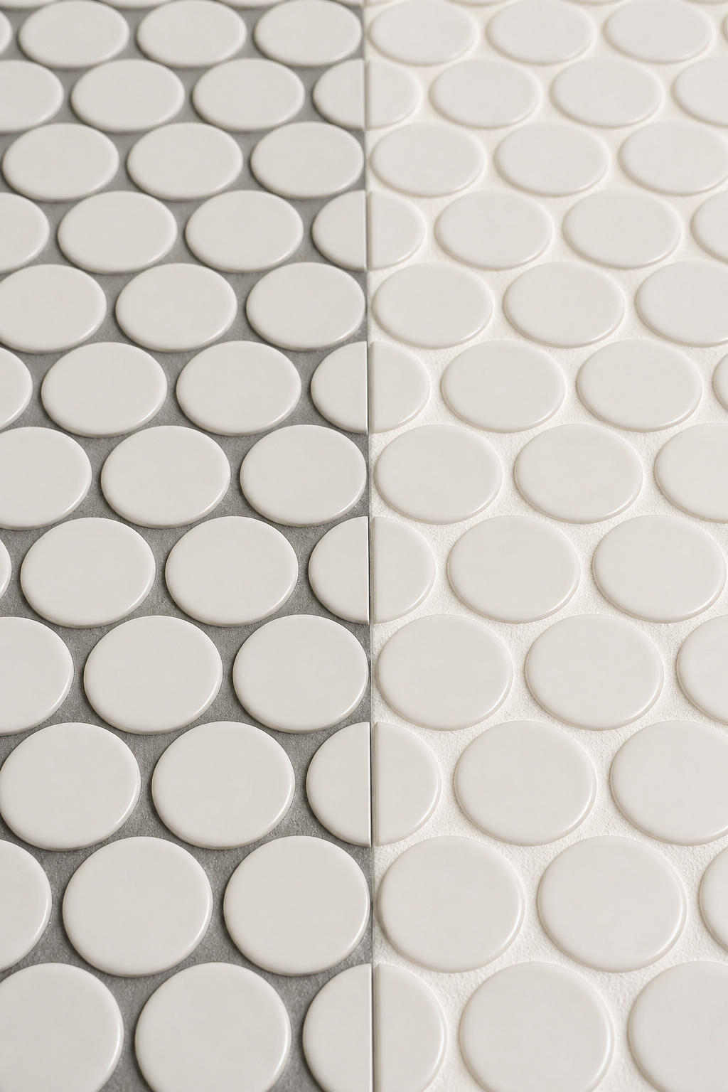
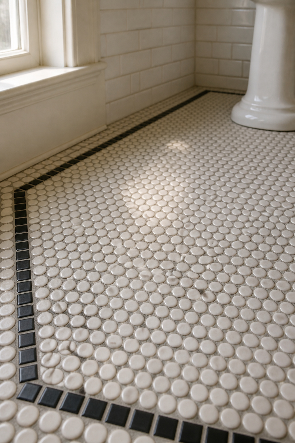
Penny tile took its name from the US penny coin — roughly 3/4 inch across — and it belongs on the floor, never the wall. Its round shape leaves more grout between tiles than any other format here, which is exactly why grout colour matters most with penny rounds.
Original dimensions and the reproductions that match them
Original Victorian penny tile measured about 3/4 inch, the diameter of the coin. Most modern reproductions are 1 inch, the size now most widely sold, and that 1-inch format reads as slightly later — Edwardian into the early 1920s. The 3/4-inch size is the period-accurate specification for anything pre-1910. The material matters too: penny tile was unglazed white porcelain, chosen because white was thought more sanitary, and the matte porcelain finish is part of what reads as old.
Colour combinations that suit the era
The simplest application was an all-white field, left bare for its clean, sanitary look. The most refined variant added a single border row of black penny rounds or small black squares, set one or two tiles in from the wall to frame the floor like a picture. A colour-centred version came later: single accent tiles in burgundy, olive or cobalt scattered through a white field, which grew fashionable after about 1910 as pigments matured.
Grout for penny rounds: the one unresolved detail
Aim for a medium grey — not bright white, which doubles the graphic contrast, and not charcoal, which busies the floor beyond what the originals intended. The grout type, though, is genuinely contested among installers. Because penny rounds are round, the gaps vary from tight to wide, and the right answer depends on the widest joint your sheets actually create: the usual rule sends anything 1/8 inch and over to sanded grout, but narrower work sits in unsanded territory, and sources disagree on where penny tile lands. Measure your own sheets before you decide rather than trusting a blanket recommendation.
Hexagonal Tile: The Inter-War Bathroom Floor
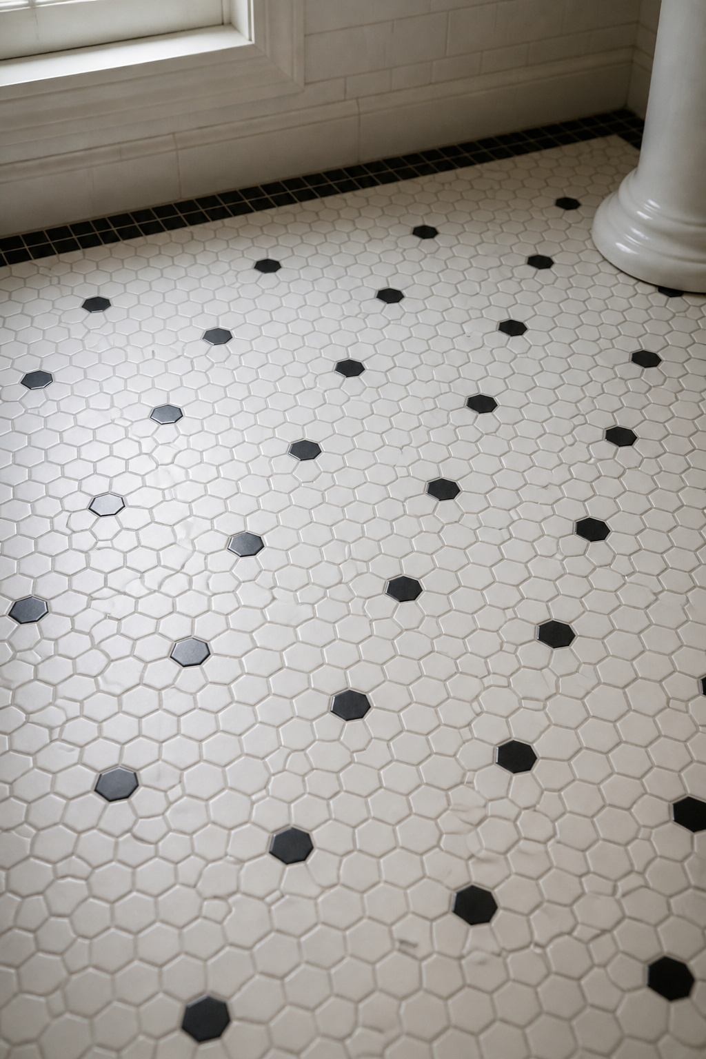
Hex tile is the most reliably era-coded pattern in the whole vocabulary, and the tell is size. The 1-inch white hex mosaic was the default sanitary floor from around 1900 through the Edwardian years; by the 1920s manufacturers offered a 2-inch format that reads firmly inter-war. Like penny, hex is a floor pattern — the walls of its era wore subway or square field tile.
Sizing by decade, black-and-white versus all-white, and where each belongs
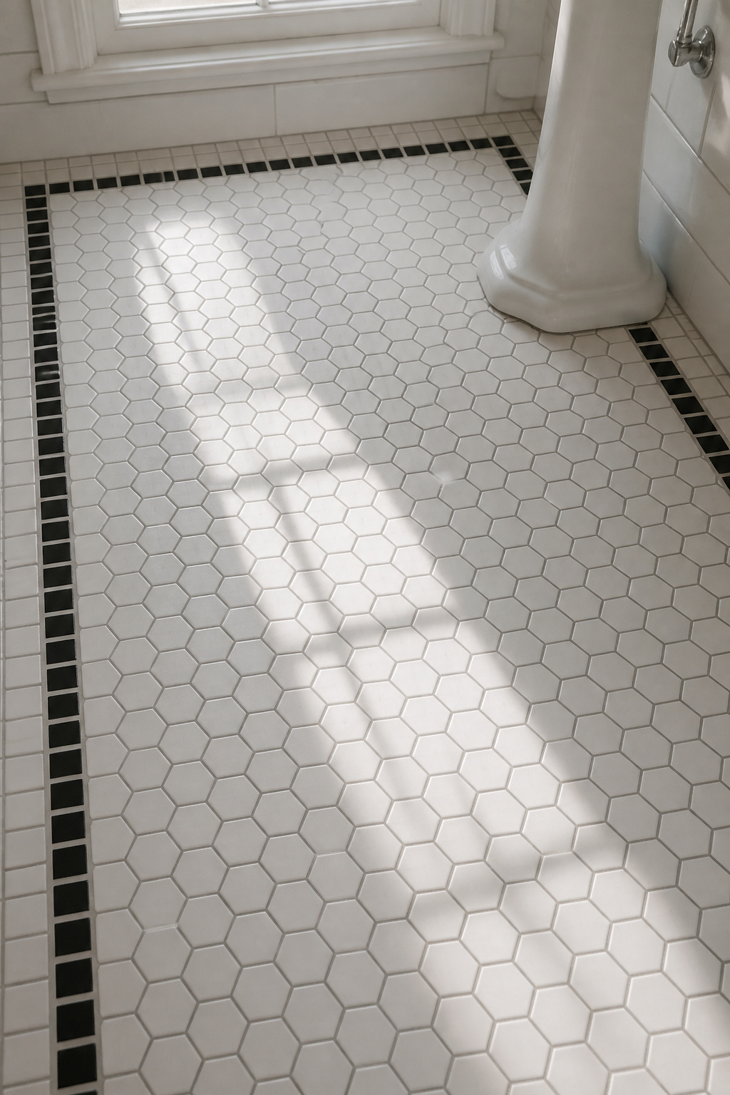
The all-white 1-inch hex floor is the classic pre-1920 room, white because the period believed white made germs easier to spot. By 1910 pigments allowed black borders, so a black accent reads as post-1910 while a fully all-white floor reads earlier. Scatter black hexagons through the field and you are firmly in the 1920s–30s — the mixed black-and-white field is inter-war, not Victorian. Hans Van Lemmen of the Tiles and Architectural Ceramics Society sums up the appeal plainly: “Tile manufacturers made very small square and hexagonal tiles, which could be fitted close together (almost mosaic-like) with no gaps in between, creating decorative, hard-wearing, and hygienic surfaces.” The table below pins each option to its decade and placement.
| Hex size & treatment | Era it reads as | Recommended grout | Where it belongs |
|---|---|---|---|
| 1-inch all-white | Pre-1920 (Victorian–Edwardian) | Mid-grey | Floor, full field |
| 1-inch white + black border | Post-1910 Edwardian | Mid-grey | Floor, perimeter accent |
| 1-inch white + scattered black | 1920s–30s inter-war | Mid-grey | Floor, full field |
| 2-inch white | 1920s–30s | Mid-grey | Floor, full field |
A rosette accent — a cluster of coloured hexagons set at intervals — appeared in higher-end floors, with yellows, olive and pink emerging by 1925. The variation you see in old burgundy borders, from light to near-black, came from the gas-kiln firing trials of the early 1900s.
Subway Tile: Wall Coverage from 1904 Onward
Subway tile has a precise birthday. In 1904, architects George C. Heins and Christopher Grant La Farge designed the first New York City subway stations and specified bright white glazed ceramic in 3×6-inch rectangles — chosen to reflect light underground and resist stains. From there it moved into homes, and by the late 1920s subway-tiled bathrooms were common.
The original specification and its proportions
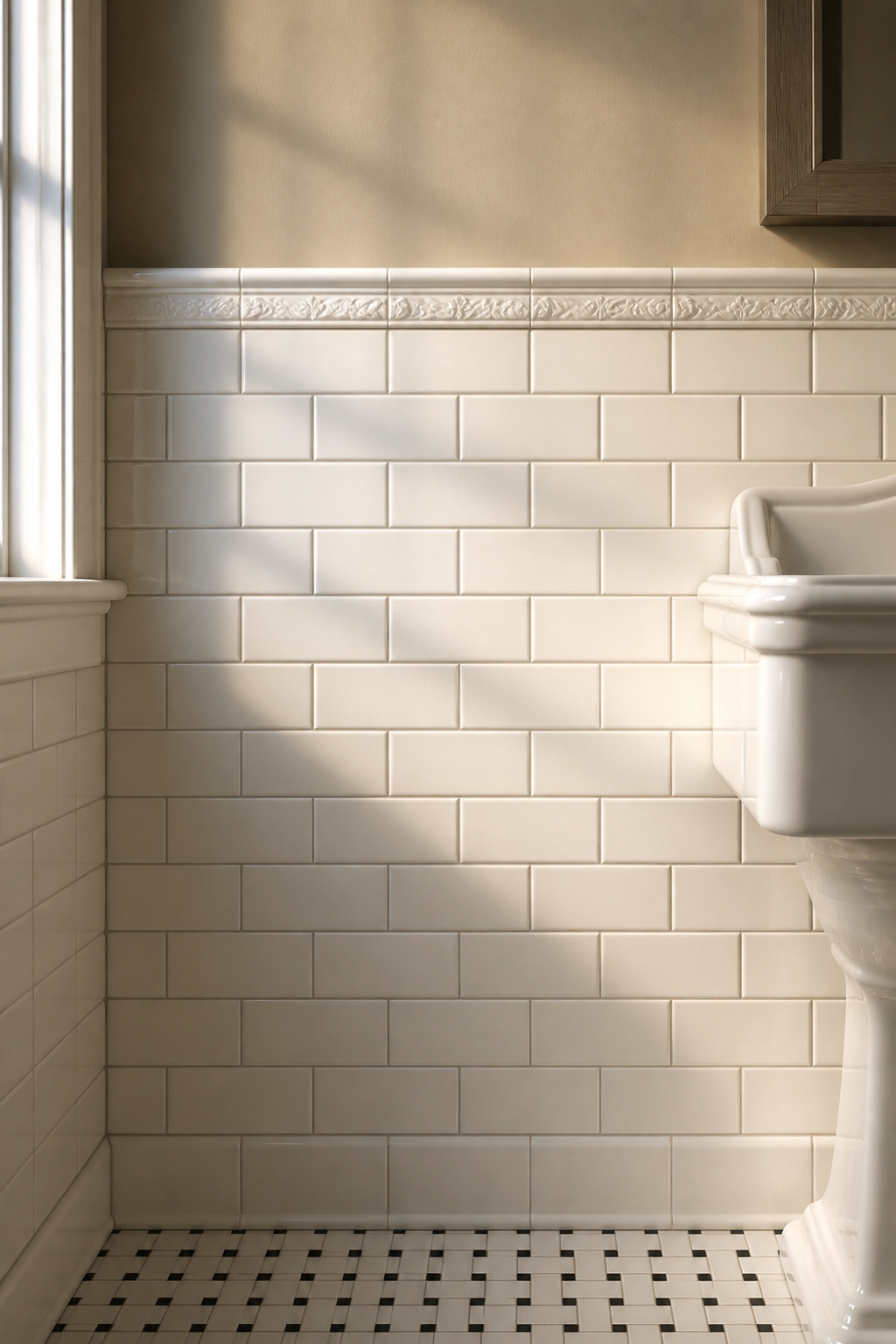
The authentic format is 3×6 inches, a 2:1 ratio, in white with grey cement grout. That grout is not a styling choice; it is what cement dried to in 1904, defining joints that carry the running-bond rhythm without disappearing. The 3×6 stays correct from 1904 through the 1940s. A 2×4 keeps the ratio but reads daintier, Edwardian; 4×8 reads mid-century; anything larger reads 21st-century. Bevelled 3×6 tile, introduced soon after 1904, is historically fair game and adds depth.
Running bond versus stack bond
Use running bond — each tile offset by half its width so its end sits at the centre of the tile above. Homes before 1950 were overwhelmingly staggered, not stacked. Stack bond, with its continuous vertical and horizontal lines, is a clean modern look and a post-1950 innovation; it does not belong in a period-accurate bathroom. The authentic offset is 50%. Where the subway tile stops, the decision continues into the wall above the tile, since the field tile and the surface above it were always planned together.
Basketweave and Decorative Border Tile: The Accent Layer
Basketweave and border tile are the finishing layer — the details that complete a period floor once the main pattern is down. A note on certainty: the dating here rests on practitioner accounts and restoration photographs rather than a single named authority, so treat the decade brackets as well-attested rather than precisely fixed.
Basketweave mosaic and where it works
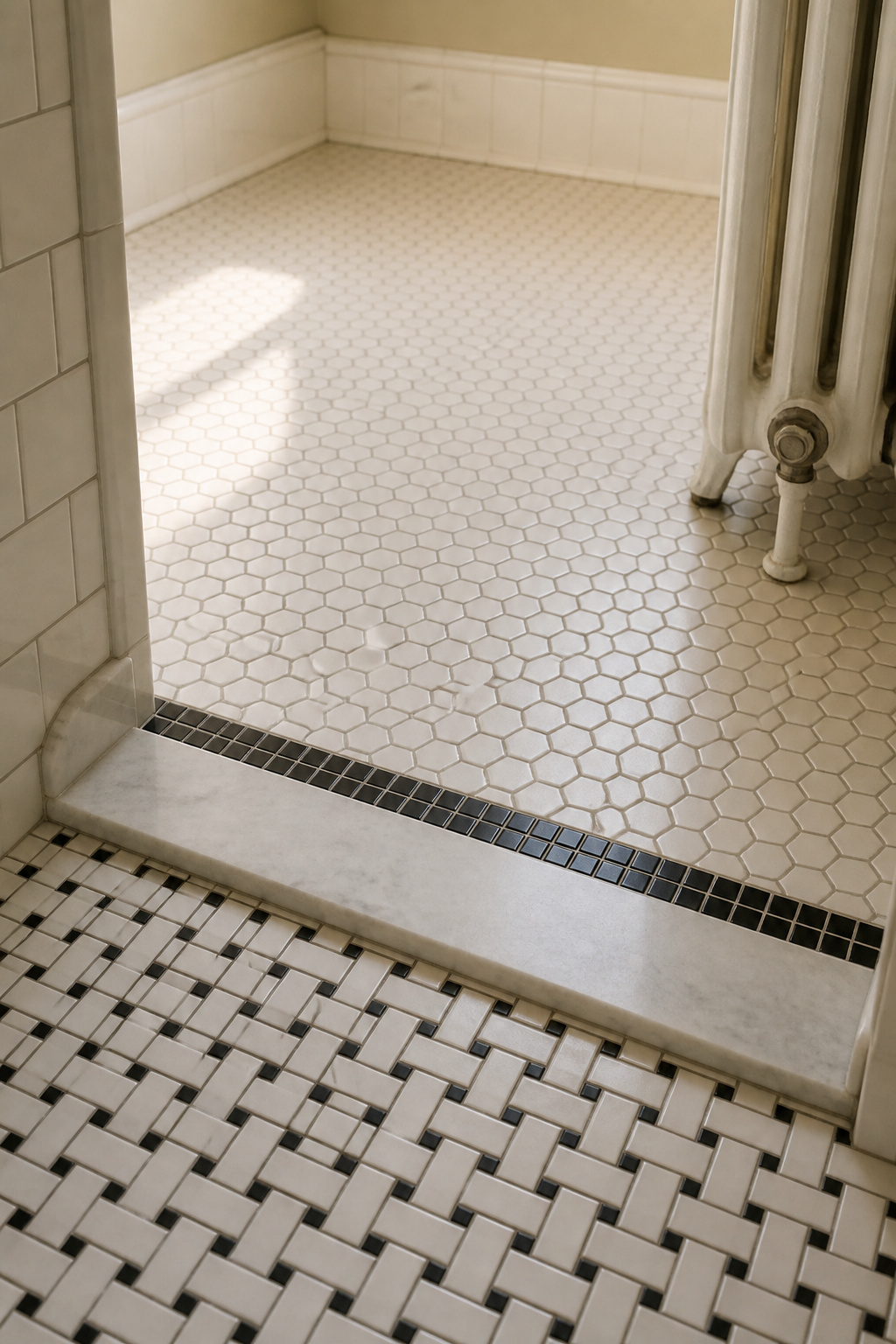
Basketweave arranges small rectangular tiles in an alternating perpendicular pattern, usually black and white, to build texture underfoot without colour. It was a floor material of the 1900s–20s, sold then as now in roughly 12×12-inch mesh sheets like hex and penny, which keeps it within reach of a careful amateur. It was one of several period options rather than the dominant one, so it works best as a feature — a shower threshold or a small zone inside a larger hex or penny field — not as a whole-room floor.
The border tile and the floor-to-wall transition
The decorative border was the chair rail of the period bathroom. A subway or square wainscot was capped by a frieze of bas-relief garlands, shells or ribbons at about shoulder height, marking where the tile gave way to paint or paper. That frieze was often the field’s white or cream, sometimes splotched with pastel pink, yellow or aqua, and almost never darker than the field tile. At the base, floor met wall through a sanitary cove or bull-nose trim, not a butt joint — the piece that stopped water pooling at the junction. Floor mosaic, wall field tile and decorative border were the three-element system that read as complete.
The Black-and-White Combination: Why It Works and How to Avoid Overdoing It
Black-and-white is the most loved vintage palette and the most overdone. The period bathroom was a white room that used black sparingly — as a border, a floor accent, a single stripe — never as a full wall.
How much black, and where it lives
The originals kept black well under a fifth of any tiled surface — closer to 10 percent or less of the total field — and that restraint is the single variable most misread today. Push black past that share and the room tips from “vintage bathroom” into graphic-design installation; a full 50/50 checkerboard reads mid-century commercial, not Victorian home. In practice, black belonged in three places:
- A single-row floor border
- Scattered accent tiles within a white mosaic field
- Occasionally a thin liner strip between the wall field tile and the decorative frieze
Black field tile on the walls is a contemporary move.
Grout in a black-and-white scheme
Reach for mid-grey again. White grout between white tiles disappears into a flat monolith; black grout creates modern drama; mid-grey gives a soft, defined joint that warms the palette and hides soap film better than either extreme. This is replication, not taste — in the early 20th century, homeowners simply laid white tile with grey-toned cement grout, and the grey was the natural colour of the cement. The same palette logic carries straight into the colours behind the tile, where a period scheme is decided room-wide.
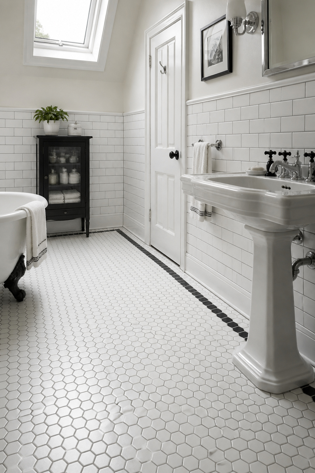
The honest short version: choose a small-format pattern that matches your decade, keep the joints narrow, and grout in mid-grey. Penny and 1-inch hex read pre-1920, 2-inch hex and scattered black read inter-war, and 3×6 subway in running bond covers the walls from 1904 on. Avoid the three things that undo it all — bright white grout, large-format field tile, and black spread past an accent — and the tile does the period work for you.
FAQ
Can I use modern large-format tiles in a vintage bathroom?
No — large-format tile (12×24 inches and up) did not exist in the Victorian, Edwardian or inter-war eras, so it reads contemporary regardless of colour. Period bathrooms used small mosaics: 1-inch hex, 3/4-inch penny, 3×6 subway. If you must go larger, a 4×8 subway on walls is the most period-adjacent option.
What grout colour should I use with white subway tile for a period look?
Use mid-grey, a close replica of the natural grey cement grout of the early 20th century. In the 1904 NYC subway and in period bathrooms, cement dried grey and created defined but not dramatic joints. Bright white grout reads modern because polymer-modified white grout did not exist before the 1980s.
How do I find penny tile that matches original Victorian sizes rather than modern reproductions?
Original penny tile was 3/4 inch — the coin’s diameter — while most reproductions are 1 inch. For strict period sizing, look to specialist historic-tile makers like American Restoration Tile and L’Esperance Tile Works. Also check the edge: period tile had rectified, flat edges set at 1/16-inch joints, not eased, rounded edges.