You already know that mint green and blush pink read as old, and that instinct separates a styled room from a flat one. The next step up with vintage bathroom colors is small but worth far more: knowing not just that a shade is vintage, but which decade it belongs to. That is the difference between a bathroom that gestures at the past and one that places itself precisely in it.
TL;DR
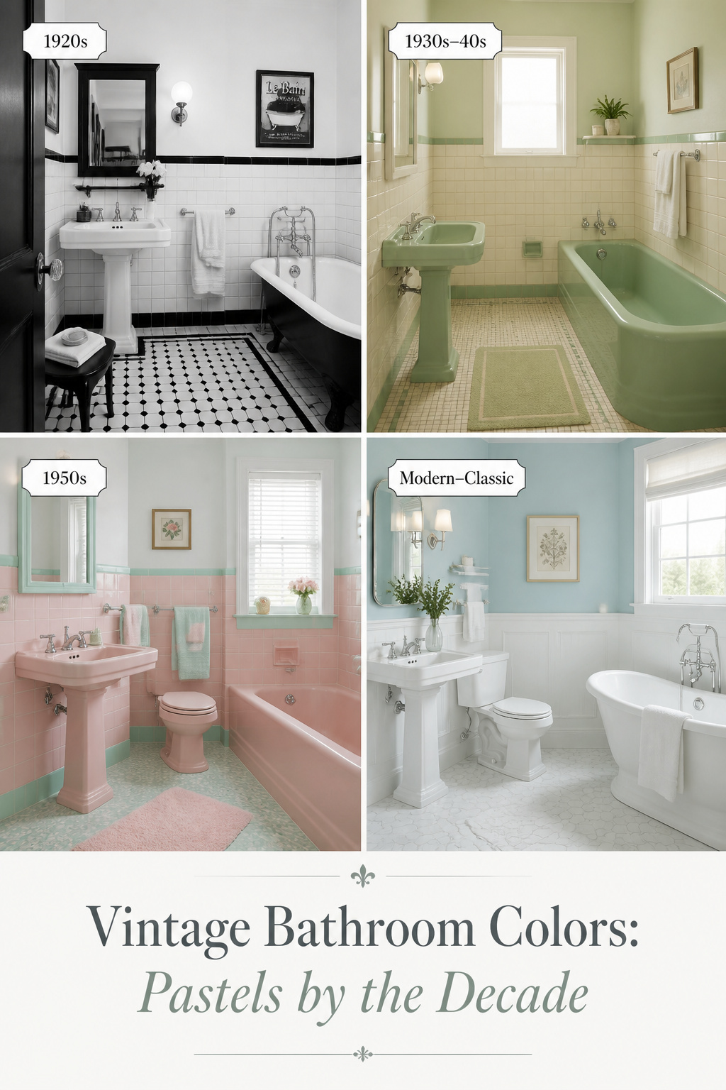
- Vintage bathroom colors are decade-coded: coloured fixtures only arrived in 1927, so 1920s rooms are white-and-black, the 1930s–40s favour greyed greens and blues, and bold pastels belong to the 1950s.
- Anchor the period to named manufacturer shades, not a vague mood: Meissen White (American Standard’s 1929 name for the era’s off-white), Ming Green and Clair de Lune Blue (1930s–40s), Peachblow and Mamie Pink (1950s).
- Keep the colour on one major element and the rest neutral; roughly five million American homes built between 1946 and 1966 had a pink bathroom, and the good ones kept white or black floors as a rest point.
Why Most Vintage Bathroom Colors Miss the Decade Entirely
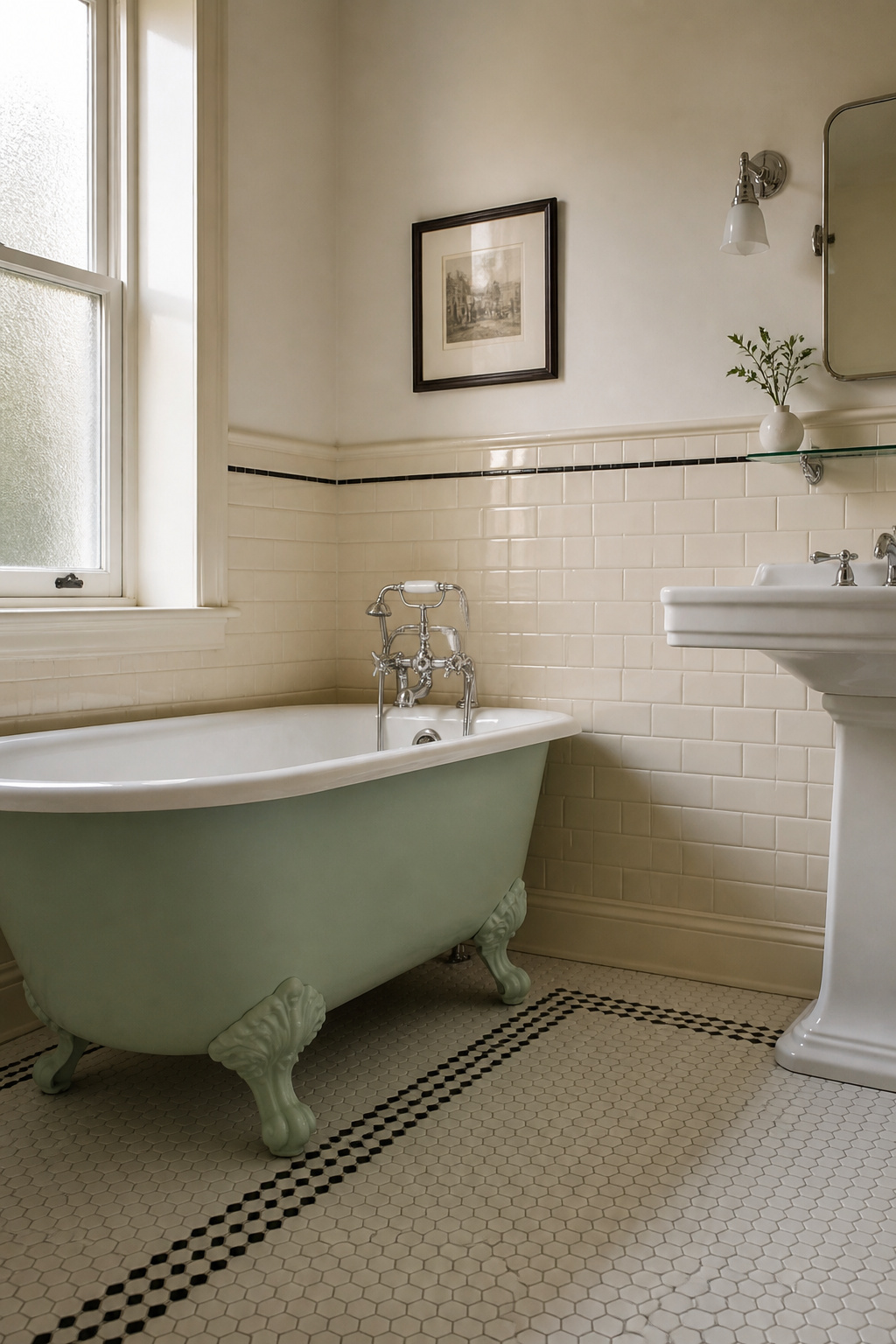
The most common error is treating “vintage” as one look. It is not. It is a sequence of distinct palettes, each locked to about a five-year span by what the factories could produce. Mix them and a trained eye reads a renovation, not an original.
The difference between ‘looks vintage’ and ‘reads as a specific era’
Pastels recall the 1950s. Bright greens and oranges read 1960s–70s. White-and-black reads 1910s–20s. Layer shades from several decades and you get visual noise no single era can claim. The colour was always conceived as a suite, coordinated with the porcelain and hardware, never as separate surfaces.
How the manufacturing history of bathroom fixtures locked colour to decade
Here is the fact that organises everything else. Coloured fixtures did not exist in the residential market until 1927. Before that, every tub and basin was white porcelain, a legacy of the sanitary reform that equated white with hygiene. When Kohler broke ranks, it offered six shades, including Spring Green. American Standard’s 1929 catalogue went further, drawing names from fine ceramics traditions: Ming Green, Meissen White, Clair de Lune Blue. A coloured fixture is a date stamp.
What a trained eye sees when the palette is off
The classic anachronism pairs a 1950s pastel-pink fixture with 1920s black-and-white hex tile, which predates it by thirty years; the room reads as costume. So anchor your period to the fixtures first, then source every surface from that decade. You can see the whole picture this decision belongs to in our guide to vintage bathroom decor.
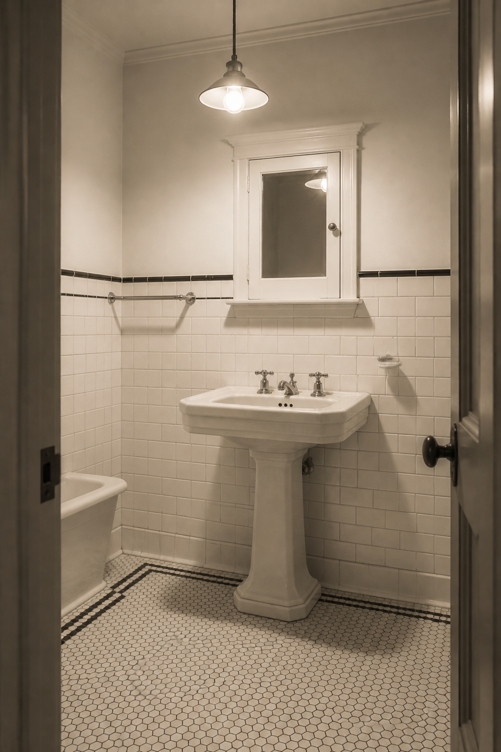
1900s–1920s: The Black-and-White Era
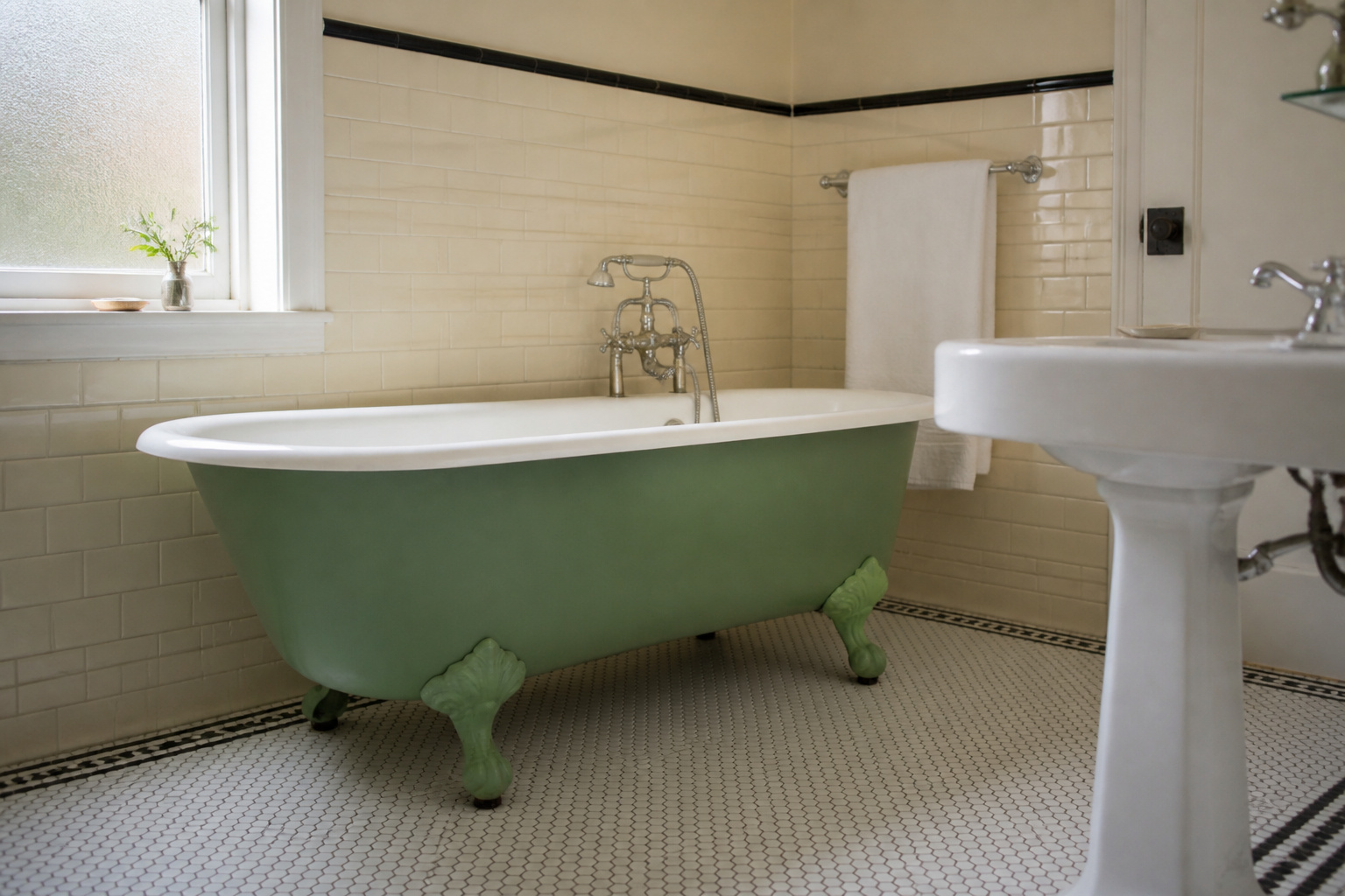
The overwhelming whiteness of an Edwardian bathroom was a public-health statement before it was a design one. Germ theory was new, and white tile let you see contamination. A 1912 shelter manual specified white hexagonal floor tile and white glazed wall tile to dado height as standard. Magazines praised the ideal bathroom as “hospital white.” That was a compliment.
Why this palette was functional, not decorative
Use it today without that narrative and you risk a photography studio rather than a home. The fix is restraint: black only as a narrow accent, with the warm porcelain supplying the single note of warmth.
Off-white versus pure white: the right choice for an Edwardian bathroom
This is where most restorations go cold. Early porcelain enamel had a warm ivory cast, not the blue-white of modern acrylic. American Standard’s 1929 catalogue listed Meissen White as the name for their off-white entry; Kohler’s nearest period neutrals were Old Ivory and West Point Gray, both warm. Beside period-white tile, target a warm creamy white such as Benjamin Moore White Dove OC-17 (a closest-available approximation, not an exact match) over any cool blue-white.
Introducing black without tipping into graphic-design territory
In an authentic 1920s room, black was structural, not a field colour: a single one-inch mosaic border on the floor, a thin cap strip where wall tile met plaster, hardware in nickel. The proportion ran roughly 90% white to 10% black. Push past that and you land in Art Deco contrast, which arrives later. Modern matte-black taps read correctly here as a stand-in for nickel.
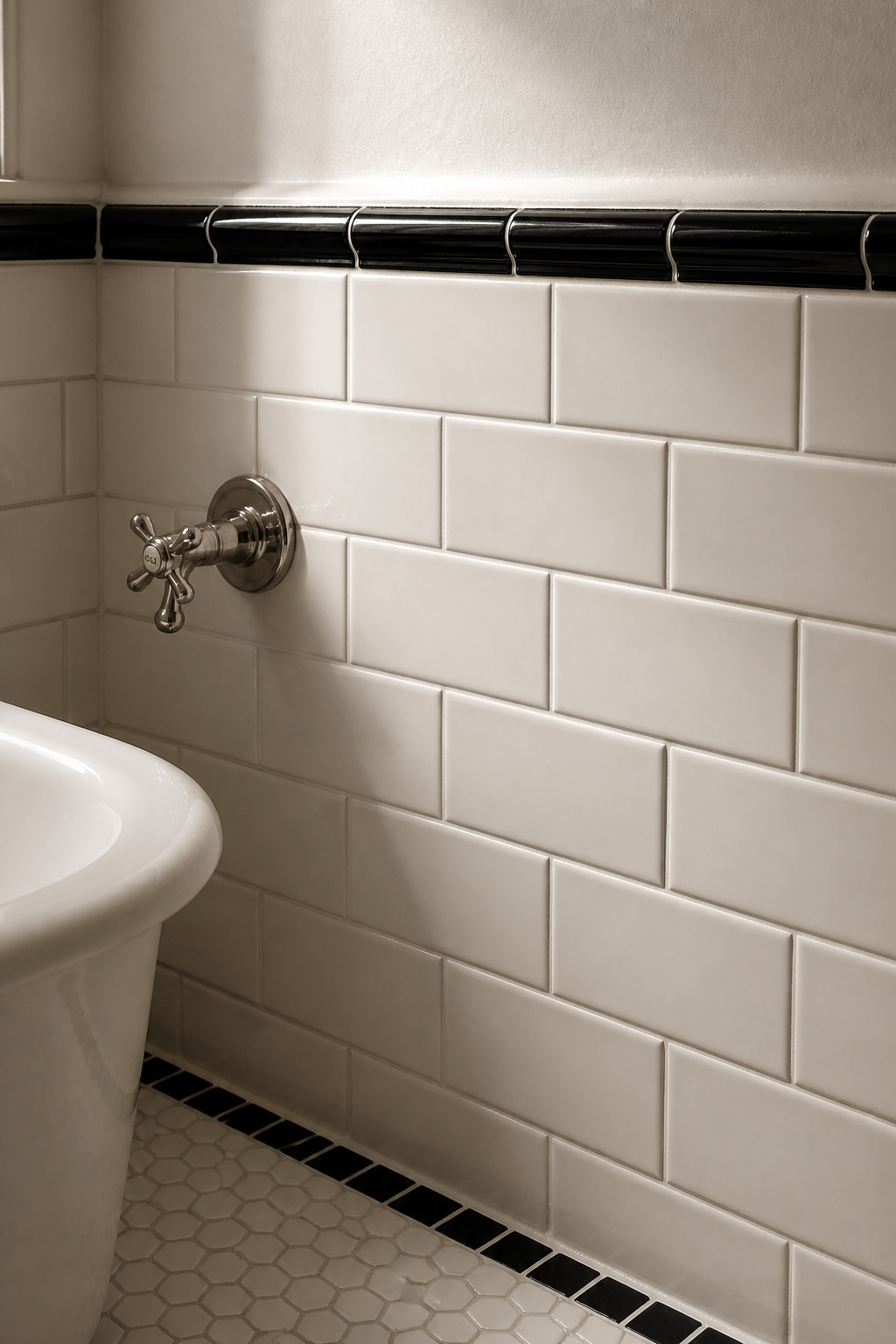
1930s–40s: Soft Greens, Blues and the Streamline Palette
The inter-war years gave us the most nuanced vintage palette, and the most overlooked. Manufacturers widened their ranges through the 1930s, pushed by Streamline Moderne and an optimistic marketing of colour through the Depression. The defining quality is a grey, dusty undertone. These greens and blues are never the bright mint of the 1950s; think sea glass, not turquoise. The named shades below place a room to within a few years.
| Decade | Wall colour range | Fixture colour | Accent detail | What to avoid |
|---|---|---|---|---|
| 1900s–1920s | Warm ivory tile, white plaster above | White only (no coloured fixtures pre-1927) | Narrow black border, nickel hardware | Blue-white paint; black as a field colour |
| 1930s–40s | Cream and ivory above a tiled wainscot | Ming Green, Spring Green, Clair de Lune Blue | Thin burgundy or black cap stripe | Bright 1950s mint; matching walls to fixtures |
| 1950s | White or single-pastel field tile | Peachblow / Mamie Pink, mint green, powder blue | Chrome hardware, white floor for rest | Saturated turquoise-mint; colour on every surface |
Sea-glass green and powder blue: the specific shades that read as inter-war
American Standard’s Ming Green ran from 1930 to 1962 and is, as Pam Kueber’s Retro Renovation catalogue research describes it, a prewar jadeite green with blue undertones. Kohler’s Spring Green (1927–1944) sits in the same family. American Standard’s Clair de Lune Blue is a pale, greyed pastel that survived in their lineup through 1950. The undertone is the tell: dusty, not candied.
Cream and ivory as neutral base colours
The neutral that grounds this palette is warm, never stark. American Standard’s Ivoire de Medici set the baseline; cream painted above a tiled wainscot is period-accurate for a 1930s–40s wall.
The colour-on-fixtures versus colour-on-walls split
The inter-war convention put colour on the fixtures and kept walls cream or white tile. A coloured tub against a white sink and toilet reads as a later replacement, not an original suite. That discipline does more for authenticity than any shade choice.
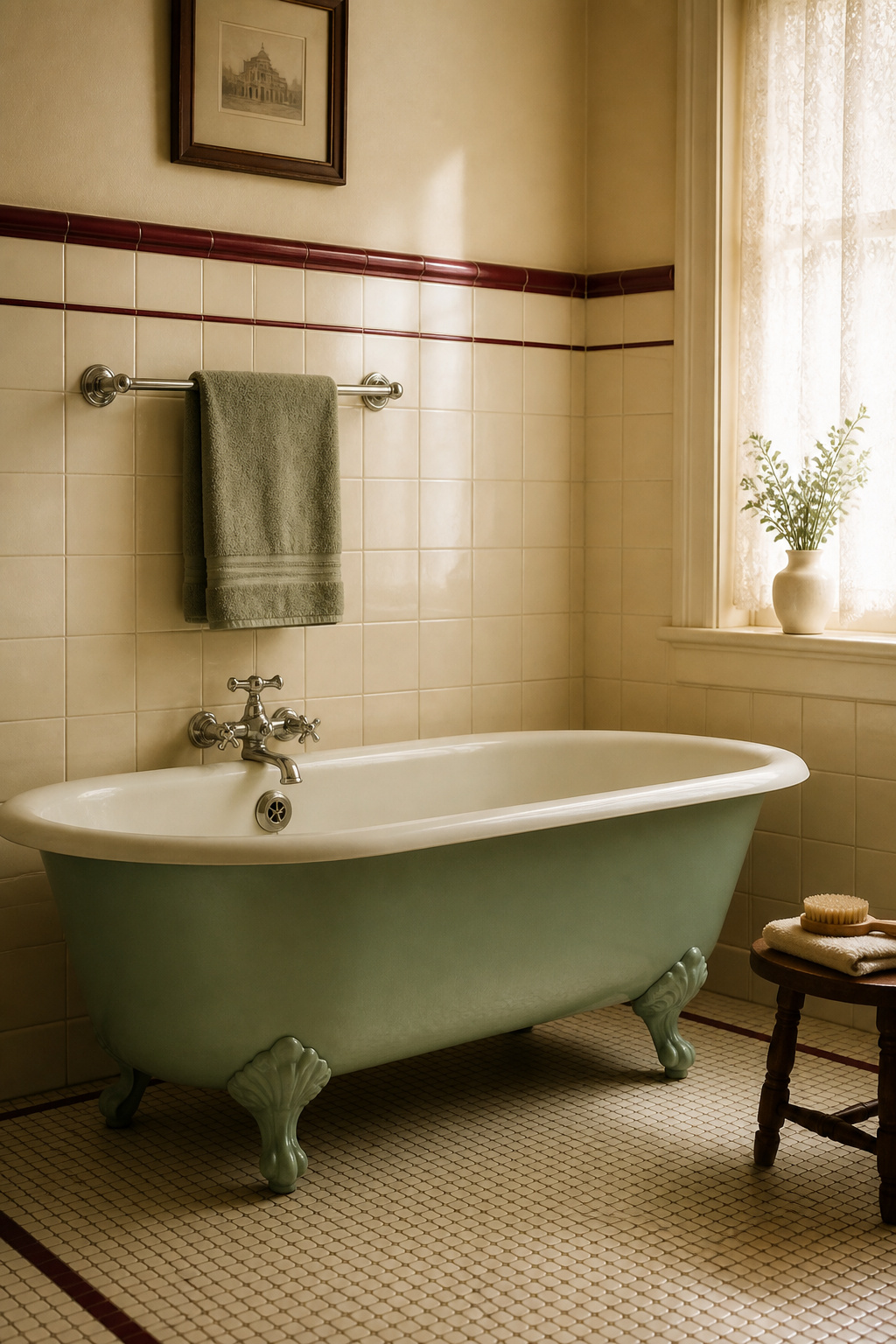
1950s: The Pastel Boom — Mint Green, Blush Pink, Powder Blue, Butter Yellow
This is the apex, and the most-searched period of all. Post-war optimism, the suburban building boom, and Mamie Eisenhower’s famously pink White House private quarters combined into an era when colour was baked into the fixture. By the early 1950s, manufacturers offered more than 200 wall-tile shades and nearly 100 floor colours, with tub, tile, and even the soap dish matched.
Why 1950s pastels were manufactured into the fixtures, not painted on
The colour was vitreous enamel fused into the cast iron or china, not applied later. Kohler’s pink, Peachblow, was introduced in 1934 and remained in production until 1973. It is a warm, coral-leaning pastel rather than candy pink. That warmth matters for everything else you choose.
Mint green: the most iconic and the easiest to overdo
Genuine 1950s mint is lighter and slightly bluer than the vivid reproduction tiles sold now. Keep Kohler Spring Green or American Standard Ming Green as your reference and you avoid the over-saturated turquoise trap. The proportion rule is the real lesson: floors and fixtures were often white or black, with the mint carried in the wall-tile field alone.
Blush pink and powder blue as primary versus accent colours
The scale is hard to overstate. Pam Kueber of Retro Renovation estimates that roughly five million of the 20 million new American homes built between 1946 and 1966 had a pink bathroom — about one in four — with the trend peaking in 1957. The shade Mamie Eisenhower popularised, sometimes called Mamie Pink, finds its fixture-world equivalent in Kohler’s Peachblow. Powder blue ran in parallel through the decade. Butter yellow is widely cited as the suite’s fourth pillar, paired with white fixtures; however, specific manufacturer shade names for yellow are less firmly documented than the greens and blues, so treat it as the softer-edged member of the quartet. You can also introduce any of these as colour through accessories rather than a fixture, which keeps a white-fixture room reading as 1950s-inspired.
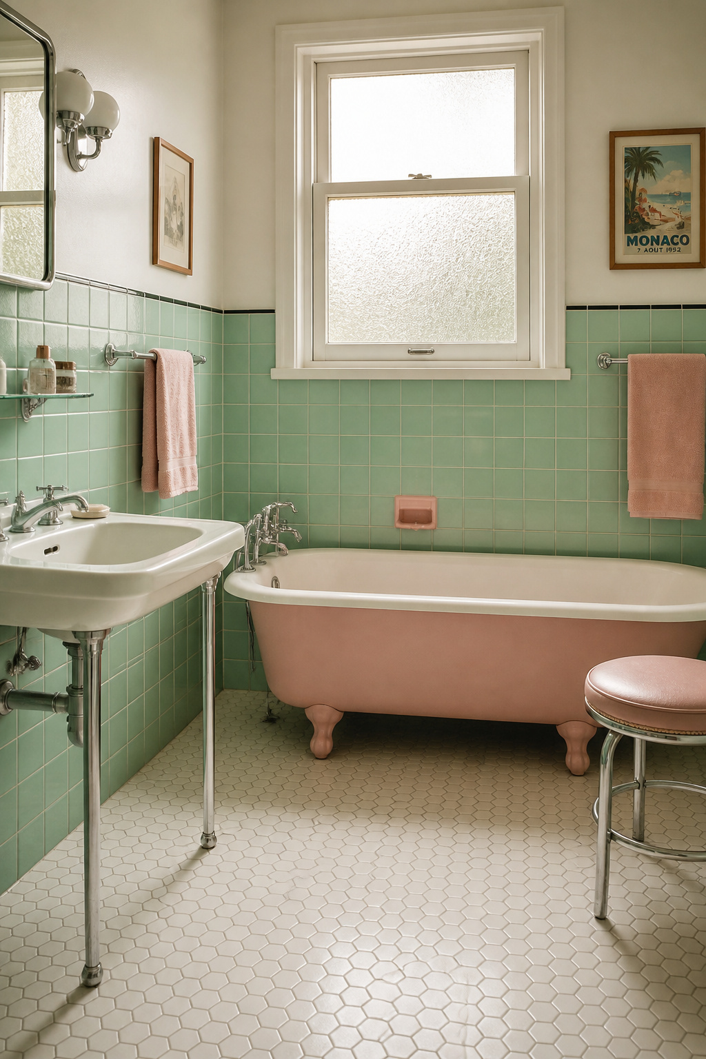
How to Use Period Colour Today Without It Reading as Theme Park
The line between period-informed and fancy-dress is almost entirely proportion. Get it right and a strong palette reads as sophisticated; get it wrong and the same colours read as a set.
The 60/30/10 rule applied to period bathrooms
Allocate 60% to the dominant surface (usually the field tile), 30% to the secondary (paint above the tile line, or the fixture), and 10% to the accent. Where mint tile already covers three walls, put the 30% in a neutral above the tile and reserve only the 10% for a period-coloured accent. The eye needs somewhere to rest.
When to put colour on the fixture, the wall, or the accessory
These options descend in both cost and authenticity. Colour on the fixture is the highest commitment and the clearest signal of genuine restoration. Colour on the wall is the most reversible. Colour through accessories is the budget and rental approach: effective, but never a restoration. The honest hierarchy runs fixture, then tile, then paint, then accessory.
Modern finishes that work alongside period colour
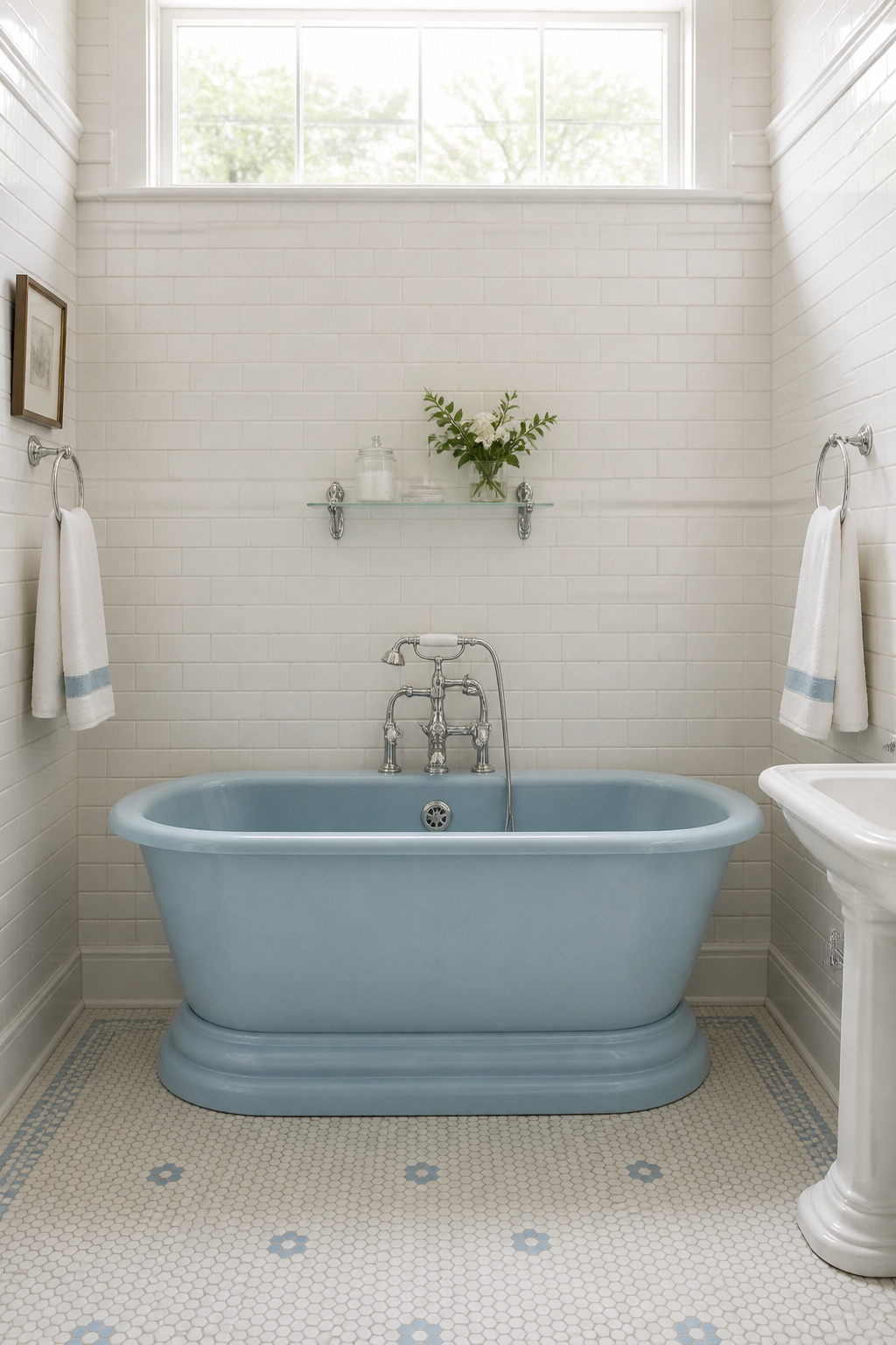
Matte black is the most forgiving modern hardware against pastel tile; it anchors pink, mint, and powder blue without the warmth clash that brass risks beside a 1950s pink. For a 1930s–40s room, brushed brass references the period’s polished brass without its maintenance burden. Whichever you choose, repeat it across taps, towel bar, and mirror frame: one isolated modern piece reads as an oversight, three as a decision. The same logic governs your wallpaper in the palette when the wall above the tile is paper rather than paint.
Mixing Period Colour with Today’s Paint Ranges
Choosing the colour is half the job. Getting it onto a damp wall so it holds is the other half.
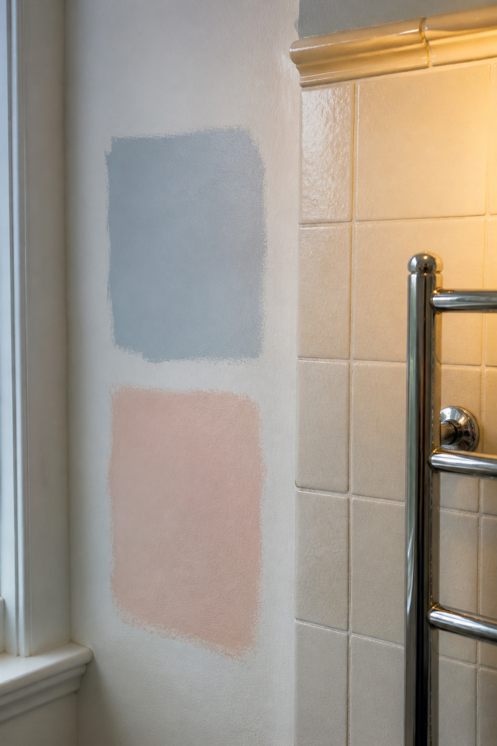
Start from the named shade, then approximate it. Kohler maintains a colour timeline listing every fixture shade by year, and Benjamin Moore’s Historical Colour Collection of 191 shades gives a systematic search path. Treat any modern paint code as a closest-available approximation, never an exact equivalent: brands use different bases, and pale pastels shift more than most. Then test properly:
- Clean the wall with a degreaser, since soap film changes how the colour reads.
- Apply two coats of the tester to a 12-inch square on the actual wall, not a card.
- Assess it in morning daylight and again under evening vanity light.
- Check it against the fixed surfaces in person: tile, fixtures, chrome. Screens are useless here.
- Commit only after 24 hours and after a shower’s steam has settled, because humidity shifts pale pastels noticeably.
For the finish, a matte, mildew-resistant bathroom paint reads more authentically period than satin and resists the discolouration that would shift your shade. Seal any stained area first, and fit a good exhaust fan before you repaint. Ventilation, more than any product, keeps a period colour true.
A bathroom that places itself in a single decade is no harder than one that merely looks old; it is the same project done with a sharper eye. Choose your decade, anchor it to a named shade, keep most of the room at rest, and it will read as restored rather than dressed up. That is taste arriving, quietly and on purpose.
FAQ
Is mint green paint or mint green tile more authentic to a 1950s bathroom?
Coloured fixtures are the most authentic. In the 1950s, mint green was vitreous enamel fused into the tub, sink, and toilet — not paint. Mint wall tile with white fixtures is a period-plausible alternative documented in original installations. Mint paint on the walls reads as a modern interpretation, because paint was never the period vehicle for bathroom colour.
What paint colour goes with a pink 1950s bathtub?
White or warm off-white walls are the most period-accurate choice, letting the pink fixture carry the room. A warm creamy white like Benjamin Moore White Dove suits the coral undertone most 1950s pinks share, so avoid cool blue-whites. Mint green tile is also a confirmed authentic 1950s pairing with pink fixtures.
Can I mix two different vintage decade palettes in one bathroom?
It can work if the decades share a colour temperature, like warm 1930s ivory with a 1950s butter-yellow accent. The rule is about fixed elements: keep tile and fixtures from one decade, then layer accessories or textiles from an adjacent one. Mixing fixed elements across decades reads as a mismatched renovation, not a restoration.