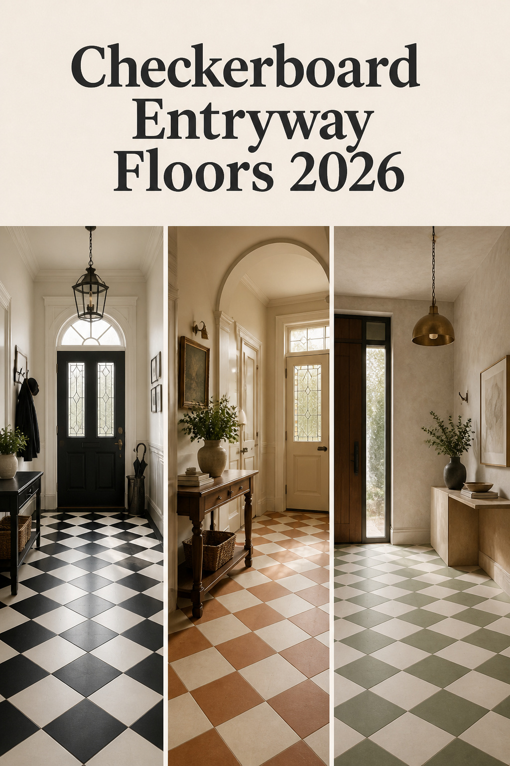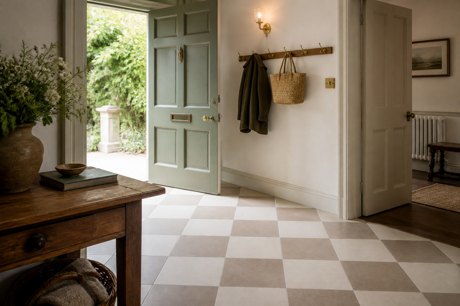

The checkerboard floor is everywhere in 2026, and most versions get it wrong. Some look like period costume — a black-and-white grid dropped into a house with no business wearing it. Others look afraid to commit, the contrast too timid to read as pattern. The grid is not the problem. A checkerboard entryway floor has worked for four centuries; it fails now because three decisions — palette, scale, and set direction — get made by eye instead of on purpose.
TL;DR
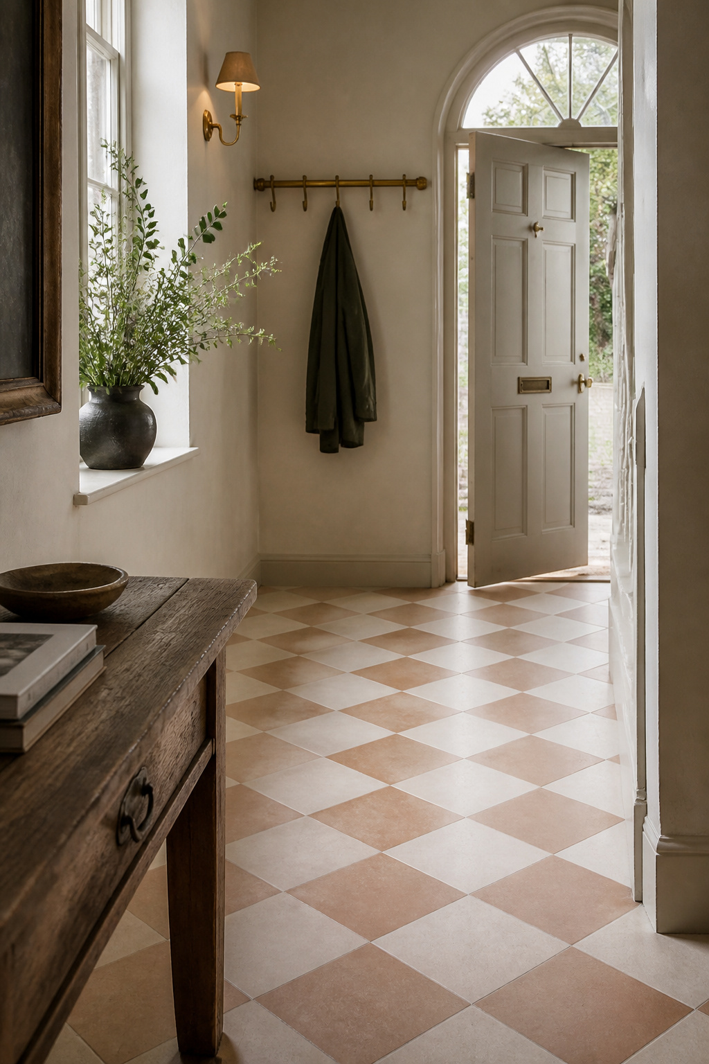
- Checkerboard reads modern in 2026 when you soften the palette (bone and clay, fog and charcoal, sage and cream) or commit fully to classic black and white in a framed, well-proportioned entry.
- Scale matters as much as colour: 4×4 and 6×6 suit narrow Victorian terrace entries, 8×8 to 12×12 suit medium foyers, and tile should not exceed roughly one-third of the entry’s shortest dimension.
- Diagonal (on-point) set makes a short entry read longer but adds 15–35% to labour and needs a 15% tile-waste allowance; straight set is period-correct and cheaper.
Why the Checkerboard Entryway Floor Has Survived Four Centuries
The two-tone grid is not a trend that returns; it is an architectural pattern that never left.
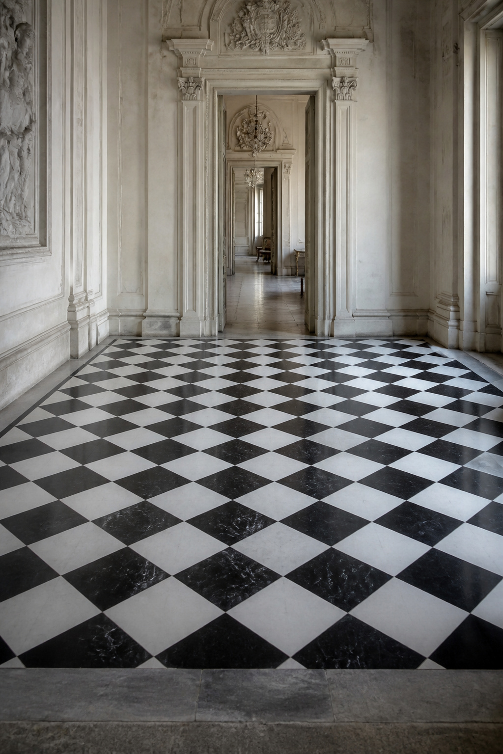
From palace floors to Victorian terraces: the grid’s working history
The checkerboard predates almost every house it now appears in. Versailles floored it in marble; Westminster Abbey was laid in black and white squares in 1677. Vermeer painted diagonal-set floors through domestic interiors from the 1650s to the 1680s, establishing the on-point grid as the sophisticated choice long before any design guide named it. The pattern reached ordinary homes when Victorian quarrying made stone affordable — tile in red, black, and white became the hallmark of the terrace entry hall.
What the two-tone geometry does for a narrow entry
A solid floor in a narrow entry reads as one flat plane. The alternating grid gives the eye a repeating anchor and adds perceived depth — the space feels wider than it measures. Set the grid on the diagonal and the corners point down the long axis, pulling the eye toward the door.
Why 2026’s revival is different from the last one
This is not the diner revival. Houzz searches for “checkerboard floor” rose 38% through the first three quarters of 2025, moving toward softer pairings — bone, mushroom, sage, oxblood — rather than stark black and white. As architect Nicholas Potts notes, the pattern crosses cultures, from Greek and Roman tile to Islamic mosaic; it is chosen now as a heritage floor, not a retro reference. The more entryway floor tile ideas guide sets it among every other option.
Classic Black and White: When It Works and When It Overwhelms
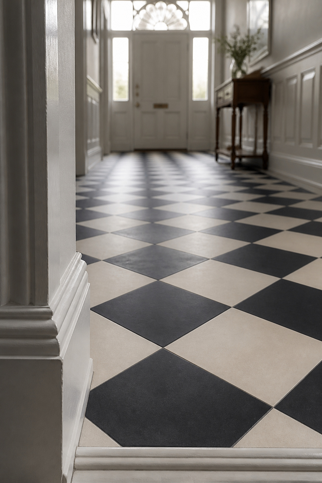
The classic palette is not dated — it is demanding. It succeeds when the entry can carry it and fails when size, finish, or grout gets misjudged.
Entry size and ceiling height as the decision variables
High contrast wants room to breathe. In an entry under roughly 35 to 40 square feet, a stark black-and-white grid turns busy under a low ceiling — soften the palette. Black and white also needs a frame: clear boundaries like panelled wainscot or a contrasting threshold contain the pattern and keep it from reading like a commercial floor.
High-gloss versus matte black: the slip-risk and maintenance difference
Polished black tile photographs well and turns dangerously slick when wet. Ask for a Dynamic Coefficient of Friction of 0.42 or higher — the residential wet-risk standard that high-gloss porcelain often misses. In European terms, look for an R11 rating. Matte black hides footprints and water marks; gloss shows every one.
The grout-colour call that most people get wrong
White grout is the most common choice and the worst for an entry — as the Edward Martin tile team puts it, it shows dirt fast and sealing is essential and never-ending at a front door. Grey grout reads as neutral between the tiles, imposes no third colour, and disguises the grime an entry guarantees. The guide to the right tile material covers durability trade-offs in full.
The 2026 Softened Palettes: Beyond Black and White
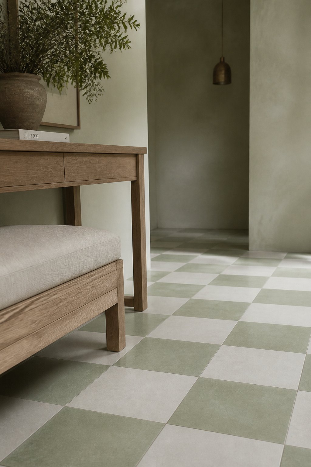
The defining shift this year is low-contrast tonal pairings. As the Studio Cement Tile team puts it, 2026 favours layered neutrals — bone, mushroom, putty — that read soft and architectural rather than sterile.
| Palette | Tile colour A | Tile colour B | Period fit | Contemporary fit | Grout recommendation |
|---|---|---|---|---|---|
| Bone and clay | Bone | Warm clay | Arts and Crafts, late Victorian | Quiet-luxury entries | Tone-matched warm putty |
| Fog and charcoal | Pale blue-grey | Charcoal | Georgian, Edwardian | Minimalist, architectural | Mid-grey to charcoal |
| Sage and cream | Soft sage | Cream | Reads botanical, not literal | Plaster-walled entries | Pale, tone-matched |
| Oxblood and ivory | Oxblood | Ivory | Strongly Victorian/Edwardian | Needs period bones | Warm stone |
Bone and clay: the warm-neutral grid
Bone and clay delivers the movement of a grid while reading as a warm neutral from across the room. It thrives where south or west light reinforces the clay tone; in north light it settles toward true neutral, still calm. Match the grout to the lighter tile so no third colour intrudes.
Fog and charcoal: the cool-toned option for north-facing entries
Fog — a pale blue-grey — against charcoal works with cool, overcast daylight rather than fighting it. Charcoal adds weight; fog keeps it from going clinical. Blue pairs well with white oak, painted millwork, and matte-black or brushed-nickel fittings.
Colour pairings — sage, oxblood, emerald — and the rooms they need
Houzz’s 2026 report names sage, cream, emerald, oxblood, and burgundy as the pairings driving the wave beyond black and white. Each needs the room behind it. Sage and cream wants tonal support — pale green-grey walls, natural linen — or the tiles read disconnected. Oxblood earns its place only in a house with genuine period bones. Emerald needs a double-height hallway; in a compact entry it overwhelms.
Scale: The Decision That Changes Everything
Palette gets the attention; scale decides whether the floor fits the room. The error is almost always tile size:
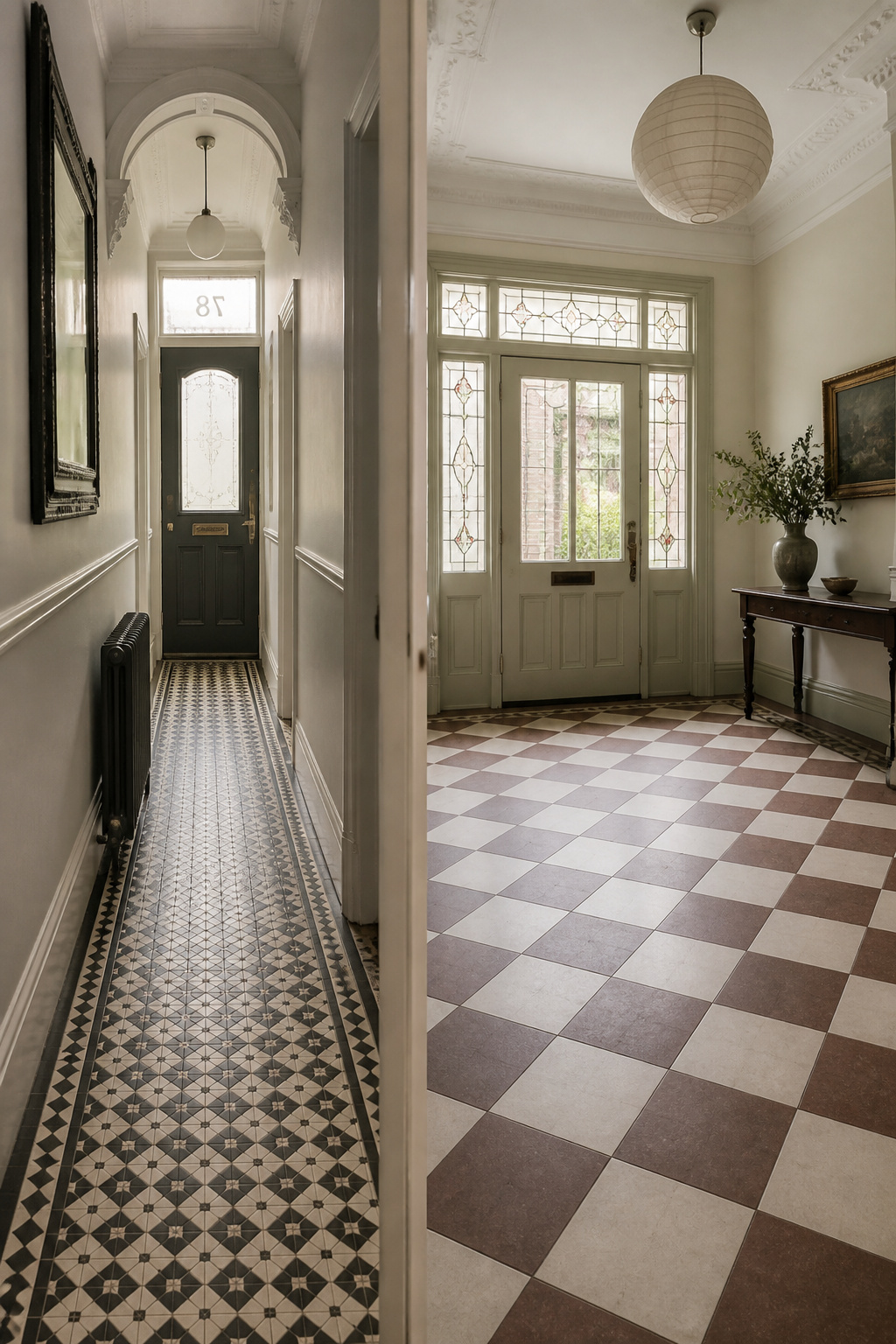
- 4×4 and 6×6 — narrow Victorian and Edwardian terrace entries, 3–5 ft wide.
- 8×8 — mid-point for 6×8 to 8×10 ft foyers; tied to 1920s–1950s bungalows, Colonials, and Craftsman entries.
- 12×12 — medium-to-large entries, 8×10 ft up; easy layout, minimal waste.
- 18×18 and 24×24 — expansive or double-height halls only; under an eight-foot ceiling they compress the space.
What each scale does to a given entry footprint
Small tiles suit small entries — the pattern frequency creates intimacy. Go too small for a softened palette and the low contrast disappears into the grout texture; below 6×6 is not worth it for bone-and-clay or fog-and-charcoal. Oversized tile makes a room read smaller: the eye expects more squares, counts fewer, and the floor reads short.
Period-appropriate scale: matching tile size to the house
Victorian hallway tile was most often 4×4 or 6×6, the format the trade produced before ceramic manufacture industrialised. Crossville’s 8×8 pressed tile later made the larger checkerboard standard in mid-century American homes; a 1940s–60s Colonial wants 8×8 or 12×12, not 4×4. The rule: tile should not exceed one-third of the entry’s shortest dimension.
How to test scale before you order
Paper samples lie about floor-scale impact. Tape a 3×3 grid of your tile on the actual floor and view from the threshold for a full day. Photograph it from the front door at standing height — the camera compresses perspective much as a visitor’s first glance will. Too dense or too open in the photo means the same underfoot.
Diagonal vs Straight Set: How the Grid Sits in the Room
Set direction is the third lever — pull it before you order, because it changes how much tile you need.
Straight set: the period-correct default
Straight set runs the grid parallel to the walls: the default for Victorian and Georgian floors, faster to lay, less waste at the perimeter. Its limitation — in a square foyer it reinforces the boxy shape and does nothing to lengthen a short entry.
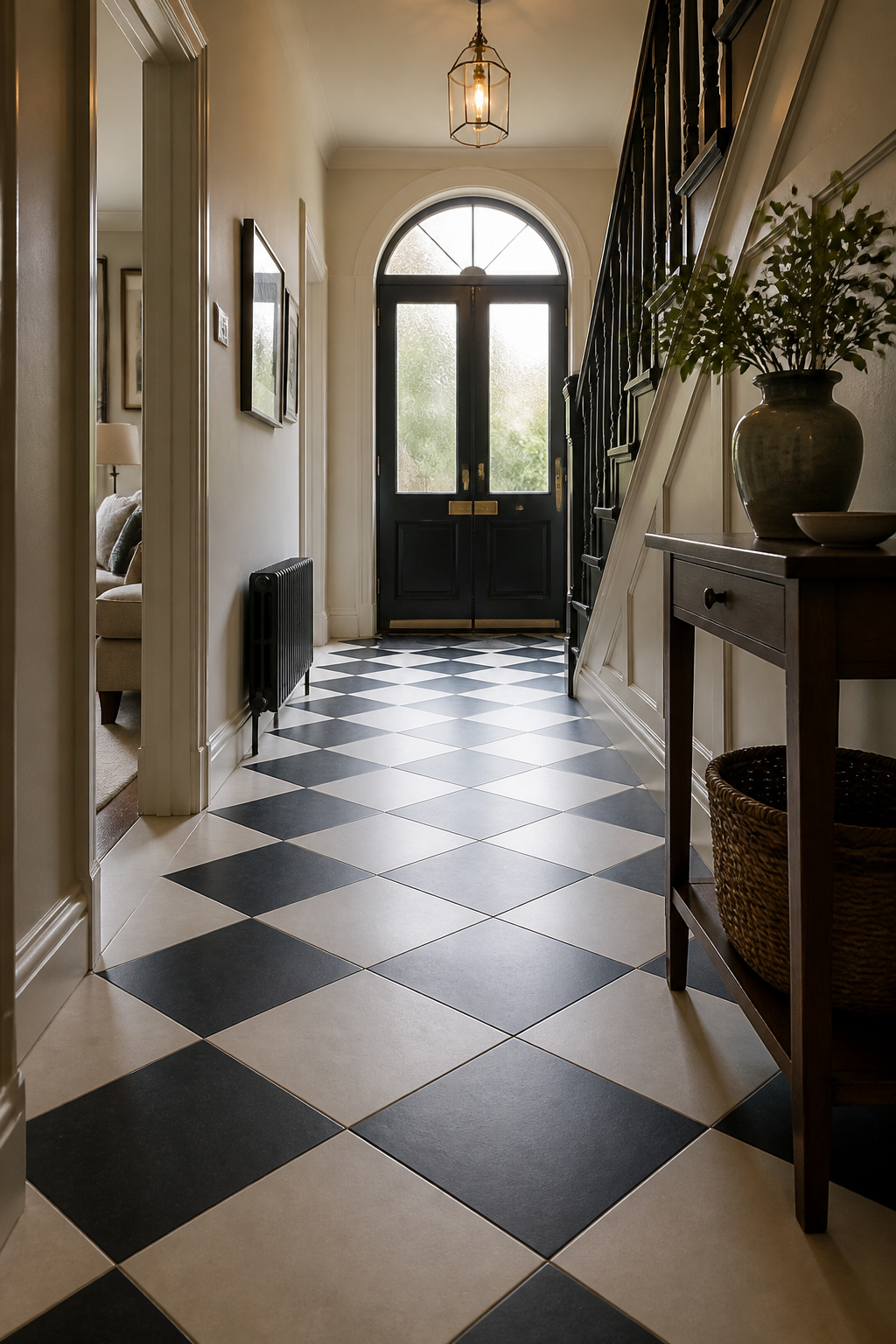
Diagonal (on-point) set: the classic trick for making a short entry read longer
Turn the grid 45 degrees and the corners point toward the door; the eye follows the diagonals and the entry reads longer. It carries real provenance — Vermeer set the grid on point three centuries before any design guide caught up, so it stays defensible in period restoration.
Waste calculation and why diagonal costs more
A 45-degree set adds 15–35% to labour and increases waste by 10–15% from corner cuts — order a 15% allowance (15–20% for irregular rooms). Always buy from one shade lot; on a softened palette a stray lot makes the lighter tile read as an unwanted third colour. The guide to other entryway tile patterns lays out herringbone, chevron, and the rest.
Borders, Insets and Finishing the Edge
A checkerboard is only finished when its edges are — a grid that runs to nothing at the skirting board looks unresolved however good the field is.
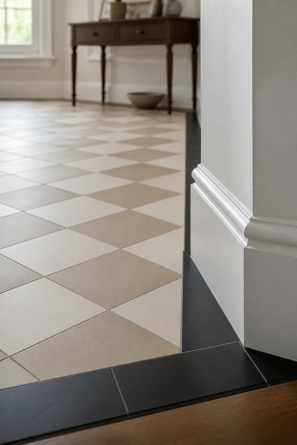
Solid-colour border tiles: framing the grid
A single course of solid-colour border tile frames the field like a rug. In period entries it was typically the darker tile with a thin pencil liner, so the field never abutted the skirting directly. Keep the border to one of your two colours — a third hue undoes the two-tone logic. The no-border look reads more contemporary but demands precise perimeter cutting and suits straight set better than diagonal.
Period corner insets and the contemporary case against them
Older Victorian floors sometimes carried a small contrasting tile at each border corner — a flourish that gave the entry a composed, formal quality. On a softened palette, leave it out: the two tones stay undisturbed, and the detail is high-skill work best reserved for a professional.
Where the grid ends at doorways and transitions
Plan the layout from the threshold inward so a whole tile — never a cut sliver — falls under the door opening. A threshold strip or border tile gives the grid a clean stop where it meets the next floor. A dry, loose lay at the bordered corners before you commit to thinset saves you from re-cutting corner tiles — the most common error on these floors.
Three decisions stand between a checkerboard that dates and one that lasts: palette, scale, and set direction — each chosen for the entry, not the photo. Make those on purpose — tape the grid, check the light, count the waste — and the floor does what it has done in entry halls for four hundred years.
FAQ
What size checkerboard tile looks best in a small entryway?
For small entries under about 35 square feet, 8×12-inch tiles are the safe range. Below 6×6 the grout frequency makes a compact space feel busy; above 12×12 the tile starts fighting the proportions. Diagonal set with 8×8 or 10×10 adds period-correctness and makes the entry read longer.
Is checkerboard floor out of style in 2026?
No. Houzz searches for “checkerboard floor” rose 38% through the first three quarters of 2025, so it is trending upward, not fading. The pattern has been in continuous use since the 17th century; only the palette cycles. Classic black and white is the most proven, while softened pairings feel current without dating quickly.
What colour grout should you use with black and white checkerboard tile?
Grey grout, from light to charcoal, is the most practical and versatile choice: it blends between the two tile colours without adding a third, and shows far less dirt than white. White grout photographs best but demands constant cleaning and sealing in an entry. Dark grout suits only large, high-ceilinged spaces.