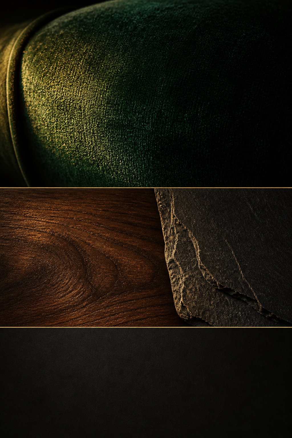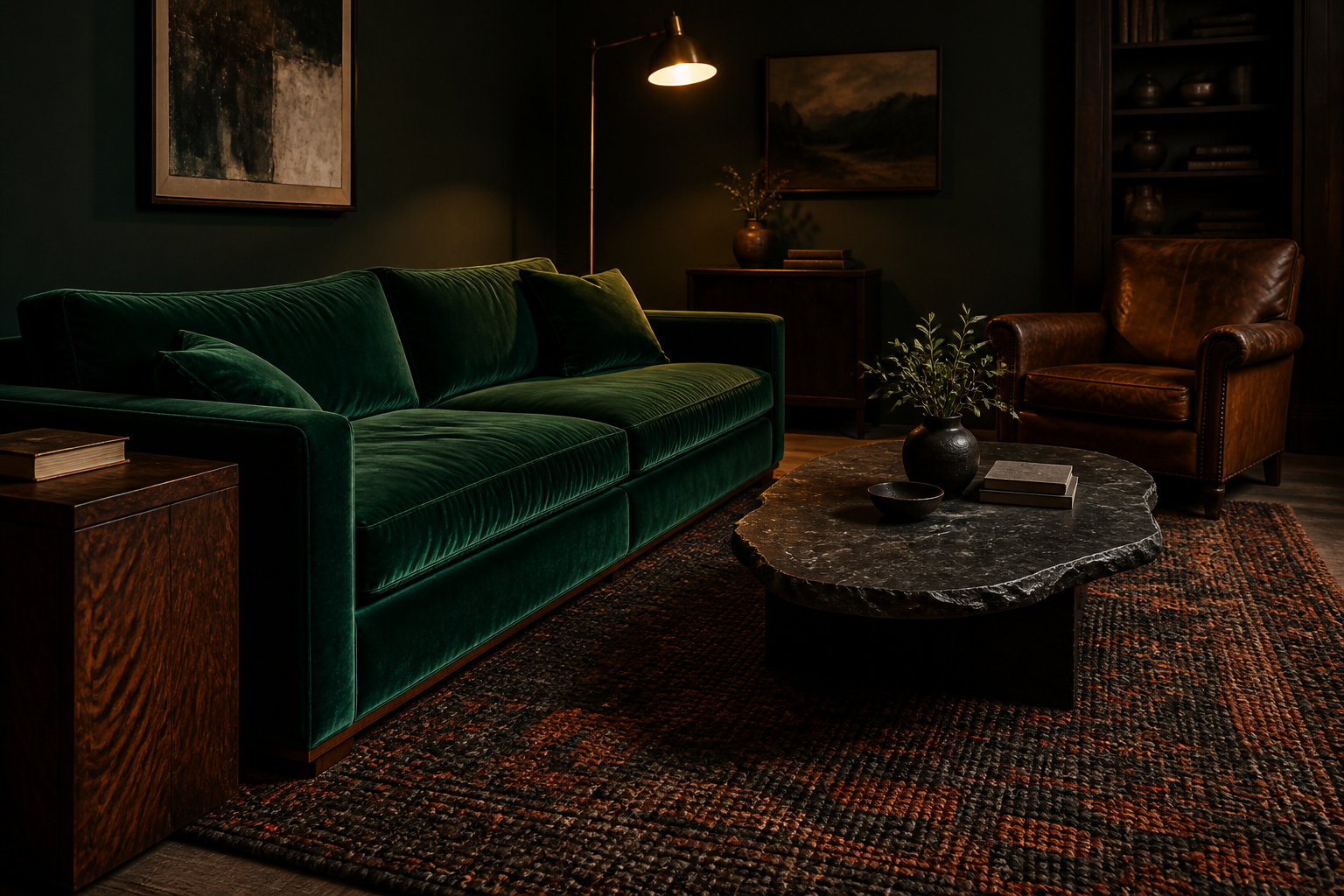
Run your hand along the arm of a good velvet sofa in a dark room and you feel the whole idea at once. The pile gives, then springs back, the colour shifting under your palm from deep forest to luminous jade where the lamp catches it. Underfoot, a wool rug swallows the click of your heel; the cool flat of slate answers the warm grain of walnut. Getting the cozy moody living room textures right is the whole job: that conversation between materials — what each does to light and to touch — separates a room that feels cocooning from one that just feels dark.
TL;DR
- Texture, not colour, makes a dark room read warm: matte materials like velvet, wool and stone absorb light and deepen the palette, while a little warm-reflective walnut or glass hands light back so the room never goes cave-like.
- Velvet is the defining material, because its pile catches lamplight at multiple angles at once; choose jewel tones over near-black for a sofa, and pair it with raw wood, aged leather or stone so it reads luminous rather than flat.
- Work to the designer 70-20-10 proportion — roughly 70% matte, 20% plush, 10% hard or shiny — and hold the room to three or four material families, each repeated at least twice, to stay layered rather than cluttered.
This guide is the material slice of the wider moody living room design system — colour and accessories live elsewhere; here the subject is the fabrics, woods, stone and fibre, and how to layer them.
The Logic Behind Cozy Moody Living Room Textures
A dark room does not feel cold because of its colour. It feels cold because of what its surfaces do with light and sound — get the materials right and the same deep green that read gloomy reads enveloping instead.
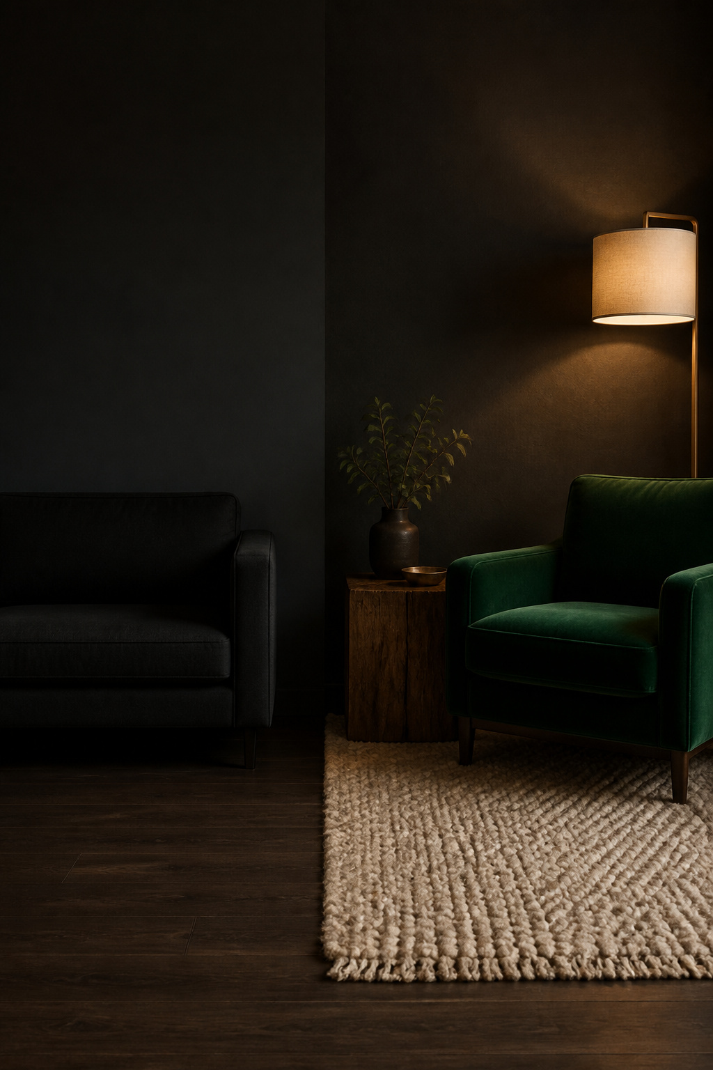
Why flat surfaces make dark rooms feel cold, not cozy
Bare walls, a tile floor and a couple of hard pieces bounce light and sound back uniformly, which in a dark scheme reads echoey and sterile. Soft, layered materials do the opposite: wool, linen and velvet absorb both light and sound, so the room feels fuller and physically warmer. As Madelynn Hudson of M.H. Interiors puts it, texture “prevents spaces from feeling sterile and makes them feel inviting.” Without it, dark colour simply reads as dim.
Texture as the mechanism that makes colour feel warm
Here is the part most people miss: texture changes how the colour itself looks. Layering materials makes a deep green or charcoal appear richer rather than heavier, because tactile variation builds perceived depth in the pigment. The material also carries its own warmth — wood, wool and leather read warm in a way no flat synthetic surface manages. Joy Lynskey of Jewel Toned Interiors recommends mixing sheen levels deliberately, matte through gloss; that layering of light response is the main warmth lever a dark room has.
The contrast principle: opulent and natural materials side by side
The best rooms set two material families against each other: opulent ones — velvet, jewel-toned fabric, polished surfaces — and natural ones — wood grain, stone, rough linen. Velvet shines beside something raw, because the contrast activates both materials and reads as deliberate. Think in opposites — a linen throw over a velvet cushion, a leather arm beside a wool rug — and the dark room stays alive instead of oppressive.
Velvet in a Moody Living Room: Where It Works and How to Use It
Velvet earns its place through construction, not fashion. Its cut pile reflects light at multiple ninety-degree angles at once, producing its luminous sheen — which is why dark velvet does not vanish into a dark room but catches light and returns it as a focal point.
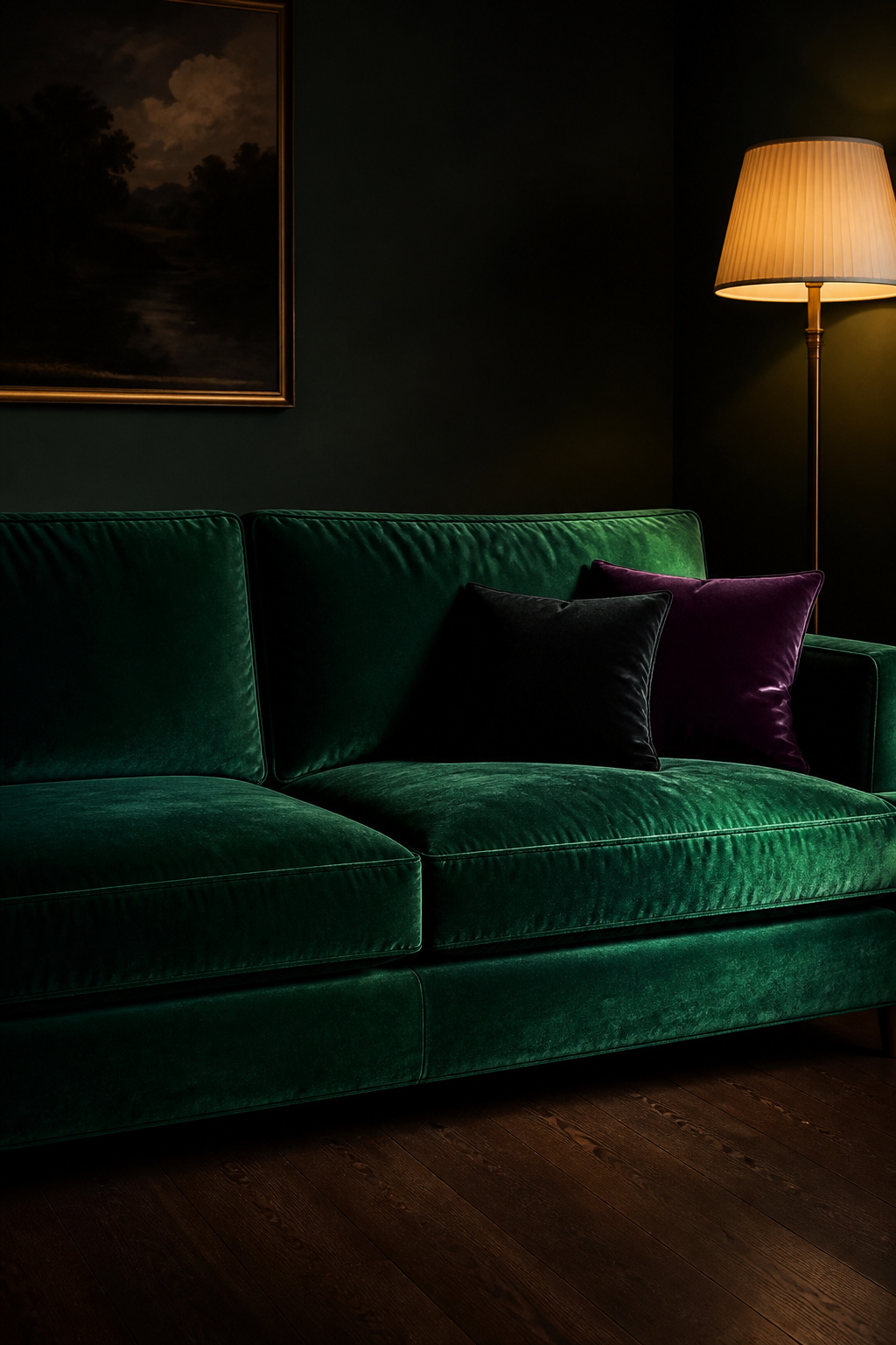
Velvet upholstery: sofa, armchairs and ottomans
A velvet sofa in a deep jewel tone anchors a moody room and amplifies the dark palette. Two truths matter before you buy. First, check the rub rating: for seating in daily use, aim for a minimum of 20,000 Martindale. Performance polyester velvet reaches 40,000 to 100,000 rubs; cotton velvet runs 15,000 to 30,000, so a cotton velvet below 15,000 wears thin at the seat quickly. Second, velvet bruises where the pile compresses; most steams out, and what remains is patina, not a fault. A few care points buyers learn late:
- Pair velvet with distressed wood, aged leather or stone — never with more plush or shiny surfaces.
- Hang velvet curtains with the nap running upward, so a hand stroked from hem to top feels smooth.
- Steam out compression bruising and treat any residue as character rather than damage.
Velvet cushions and throws as the low-commitment entry point
If a velvet sofa feels like too large a leap, start at the cushion. Cushions change a room faster than almost anything, and velvet glows in dark hues because the nap reflects lamplight rather than disappearing. Vary the shapes and slip one contrasting texture — linen or woven wool — into the group so it reads composed rather than matched. A velvet footstool is the next step up, far cheaper than reupholstering.
Dark velvet versus jewel-toned velvet: which reads richer in a moody room
Given the choice, jewel tones beat plain near-black at sofa scale, and the reason is pigment complexity. As one maker describes it, velvet “doesn’t sit on top of the fabric; it lives in it” — when the light shifts, emerald turns forest and blue turns sapphire. Against dark walls, a jewel-toned sofa reads close-toned and rich: sofa and wall share a colour family, but the sheen lifts the seat clear where flat linen would look muddy. Keep near-black velvet for an accent chair, where it adds depth without becoming a light-swallowing void at sofa size.
Wood, Stone and Raw Natural Materials: The Grounding Layer
Velvet supplies the drama; natural materials keep the room honest. Wood and stone carry an inherent warmth that reads grounded rather than decorative, and they stop a velvet-heavy room tipping into over-upholstered.
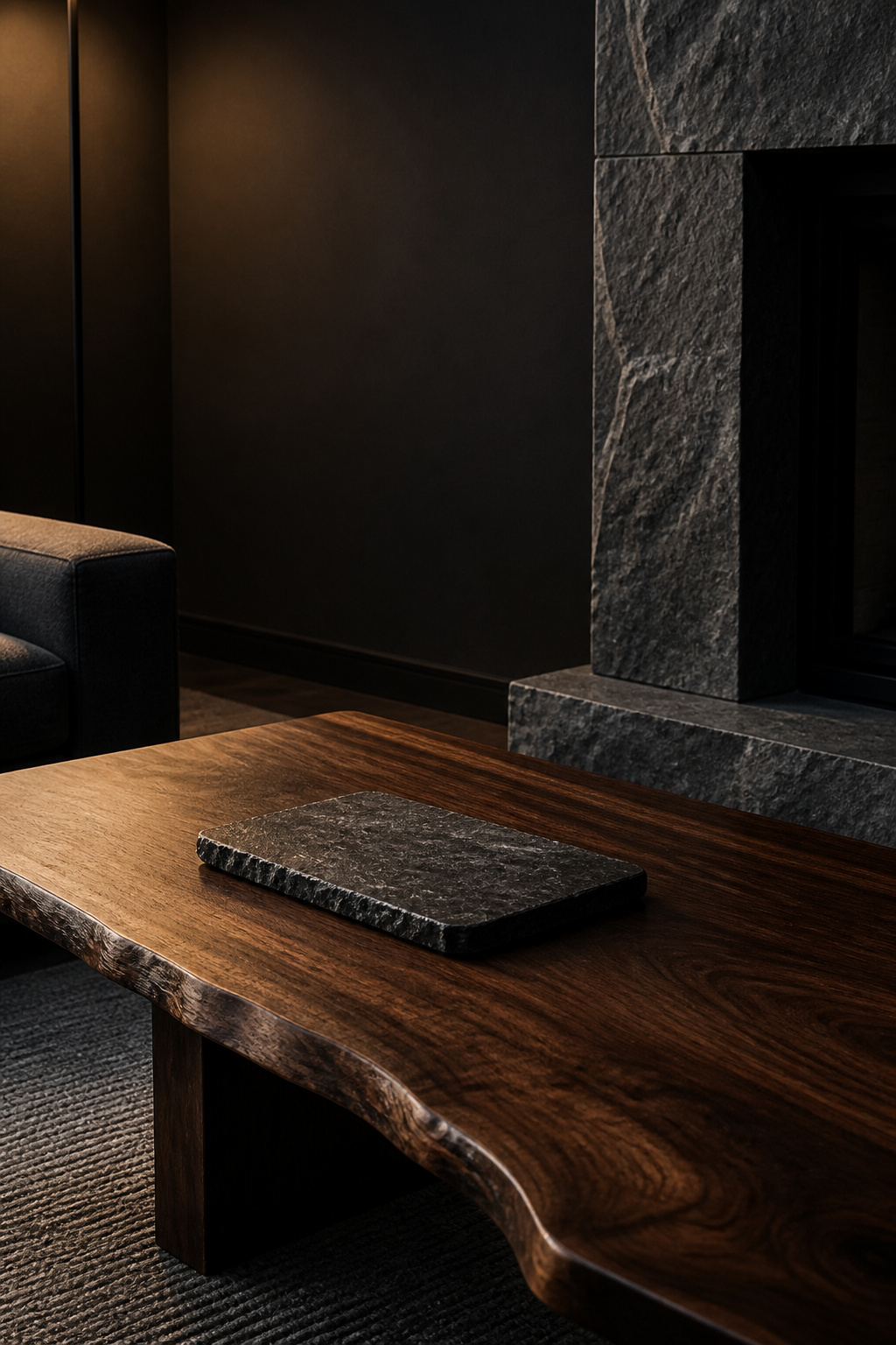
Dark-stained versus naturally aged wood: the difference in warmth
Walnut is the wood most moody rooms are best served by. Freshly cut, its heartwood runs chocolate brown with hints of purple and grey; over six to twelve months of indoor light it lightens to a warmer caramel-brown with golden undertones. So walnut grows warmer with age, not darker — which is why it is normally left unstained, oil or clear coat only, since staining mutes the depth and fights that lightening trajectory. Stained oak approximates the colour for less, but its coarser grain stays visible where walnut’s tighter grain reads quieter and richer.
Stone surfaces, slate and travertine in a moody living room
Stone adds weight fabric cannot. Slate is the most naturally moody choice — its charcoals and greys vary without pattern, suiting a fireplace surround or coffee-table top. Travertine does the opposite: its cream-to-beige tones warm one zone without breaking the palette. Both marble and travertine sit at only 3 to 4 on the Mohs hardness scale, so a stone top scratches easily and earns felt pads under heavy objects. Living-room-specific stone guidance is thin in the research, so treat these as sound directions rather than rules — pale travertine against dark walnut stages the opulent-versus-natural contrast in a single pairing.
Wicker, rattan and natural fibre: when organic texture earns its place
Rattan, wicker and woven jute work as structural counterweights, not decoration — a rattan side chair keeps a velvet-heavy room from overwhelming, and today’s organic-modern and dark Japandi interiors lean on exactly this. One tonal catch is worth flagging, and it is reasoned from principles rather than a directly cited rule: pale rattan against very dark walls can read as an accident more than design. The fix is darker-toned pieces — smoked rattan or ebonised cane — or confining a pale tone to one small element such as a basket.
Leather, Linen and Wool: The Middle-Ground Textures
Between the opulence of velvet and the rawness of stone sits the family that ties a room together: leather, linen and wool — the everyday textures that make a dark room feel inhabited rather than staged.
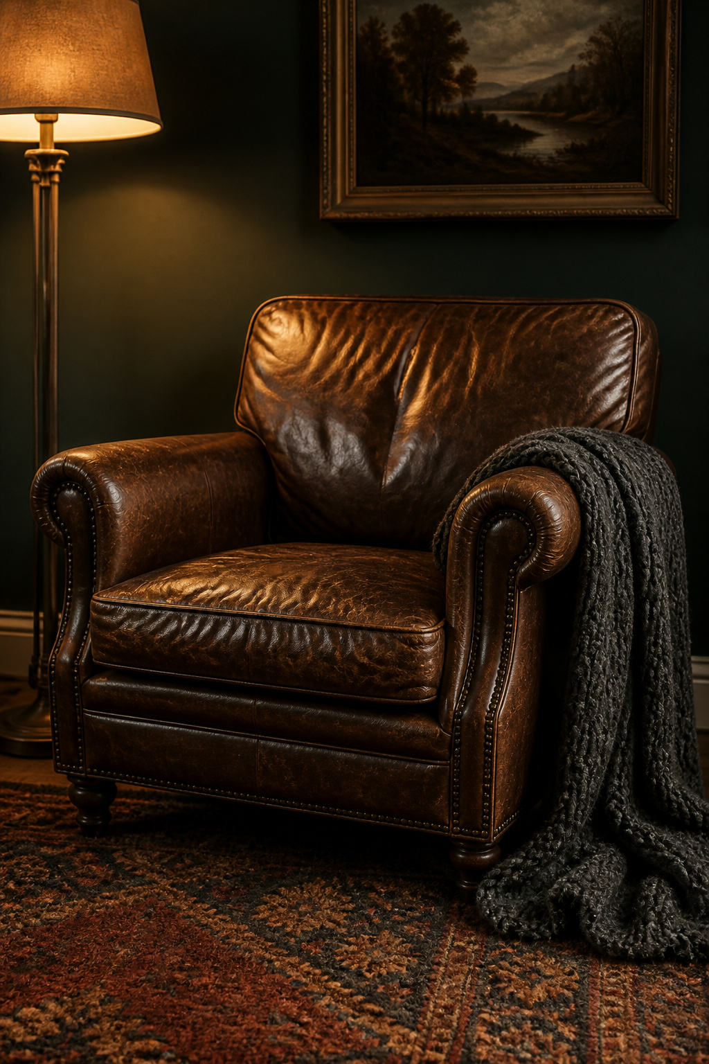
Aged leather as patina and warmth
Leather earns its place through patina — the warm sheen and colour variation that form as the hide ages with light, air and use. New leather lacks that depth; its uniformity reads as costume. Full-grain and top-grain develop the richest patina, growing supple and slightly sheened; corrected-grain and bonded leather stay flat, too uniform to age. A tobacco or cognac armchair plainly sat in — creased at the seat, lighter at the arms — is exactly what a collected room wants. If you must start new, condition it regularly and sit it in natural light; the patina arrives over six to twelve months.
Linen and heavy cotton: texture without weight
Linen brings dimensional softness without velvet’s heft — a nubby slub weave and a relaxed wrinkle that reads elevated, not untidy. Heavy linen curtains add volume at the window while behaving as velvet’s opposite: their matte, slightly rough surface absorbs light where the pile reflects it. On a sofa or chair, a heavy linen blend gives texture without velvet’s upkeep, and its roughness makes nearby velvet feel more opulent by contrast. To be straight, linen-as-upholstery is a reasoned extension here — most sourced linen guidance addresses curtains — but the surface logic carries across. For the colour side of this look, see the warm moody living room palette.
Wool throws and rugs as the warmth anchor
Wool is where acoustic warmth becomes measurable. A dense hand-knotted or tufted wool rug with a pile of half an inch or more reaches a Noise Reduction Coefficient of 0.25 to 0.35, absorbing a quarter to a third of the sound that hits it; a flat-weave rug manages only 0.05 to 0.10. In a room full of hard surfaces, that absorption is much of what reads as cocooning. A thick rug in the room’s warmest tone anchors the scheme, and a chunky wool throw over a velvet sofa earns double duty: tactile warmth in use, coarse-against-smooth contrast when draped. Throws and cushions are also where you start styling a moody room once the major materials are settled.
How Light Interacts with Texture: Absorbing Versus Reflective Surfaces
This is the engine room of the whole approach. Whether a dark space reads warm or merely dim comes down to how its materials handle light — balancing the ones that swallow it against the ones that hand a little back.
Matte surfaces and how they deepen dark rooms
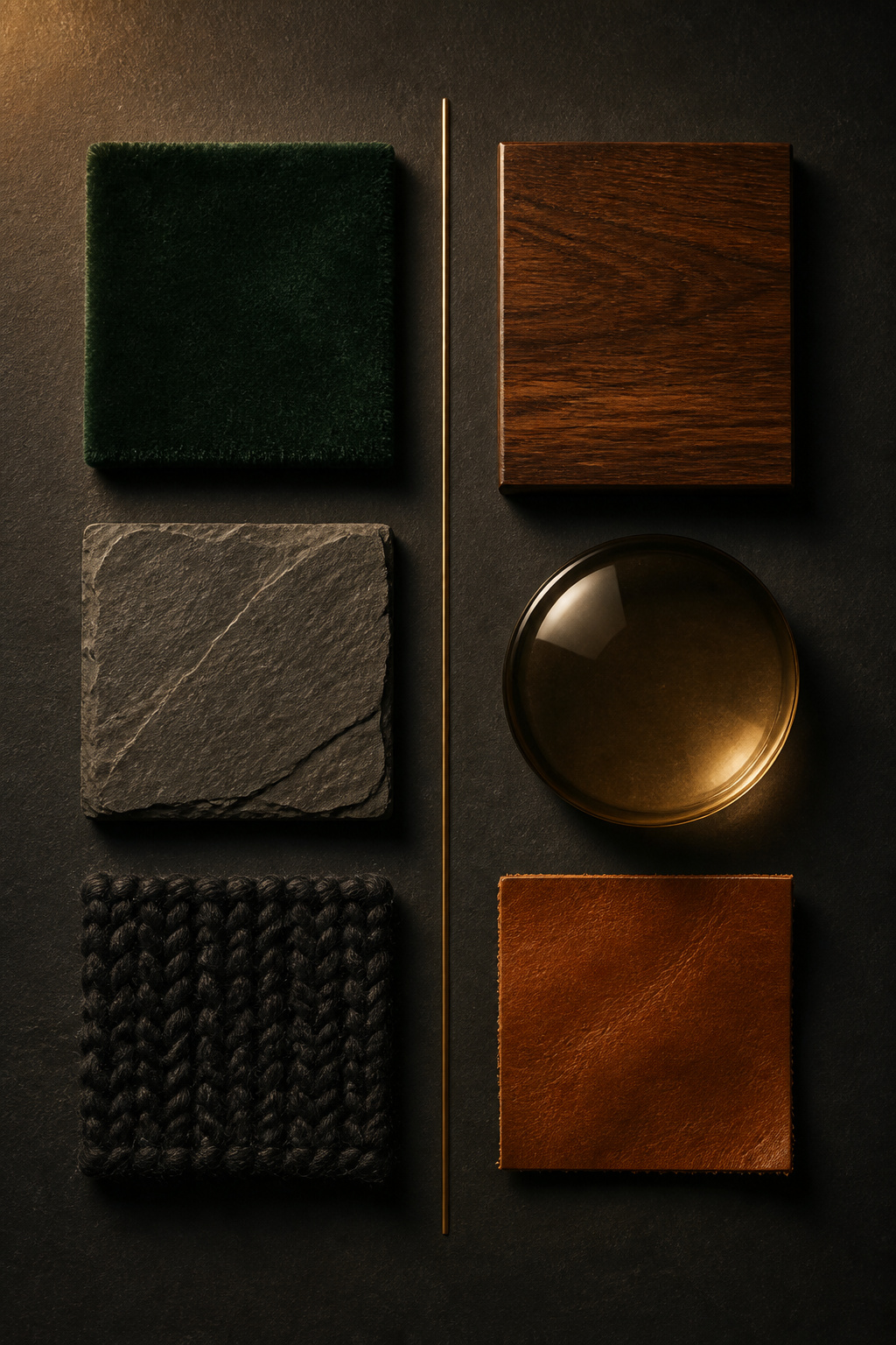
Matte materials absorb more light than they return, which is what you want across most of a moody room. Velvet pile, wool, rough stone and limewash read soft because they do not bounce light back, letting dark colours sit at full depth. Plush textiles even make colour look more saturated — emerald velvet reads a richer green than the same emerald in a flat weave under the same light. Honed stone does the matte job too, scattering light rather than reflecting it.
Reflective surfaces and what they add
A dark room still needs a few surfaces that give light back — not to brighten it, but to keep it from collapsing into a uniform void. Polished walnut, smoky glass and a lacquered tray supply the light return that prevents the cave effect. The condition is warmth: warm-toned reflectors bounce the room’s own lamplight back, while cool chrome or clear glass return cold light and read sterile. A matte velvet sofa beside a polished wood table is the same absorb-and-reflect contrast in miniature.
Balancing absorbers and reflectors
The practical guide is the designer 70-20-10 rule, which design consultant Alicia Rivett describes as keeping a room “cohesive yet dynamic.”
| Share | Surface type | Where it lives in a moody room |
|---|---|---|
| 70% | Smooth / matte (provides calm) | Dark walls, floors, main upholstery |
| 20% | Plush / soft (adds warmth) | Velvet and wool seating, rug, throws |
| 10% | Hard / shiny or raw (adds interest) | Polished walnut, smoky glass, warm metal, stone |
Keep the matte share on the largest surfaces; gloss on a wall or floor only throws harsh highlights that advertise how little light there is. The 10% reflective accent should be small and warm. Tip too far toward all-matte and the room stops feeling cosy and starts feeling dead; one warm light-return point brings it back.
Layering Textures: A Room-by-Room Assembly Guide
Knowing the materials is half of it; the order you bring them in decides whether the result feels considered or merely accumulated. Build from the floor up.
Floor to ceiling: where each texture family belongs
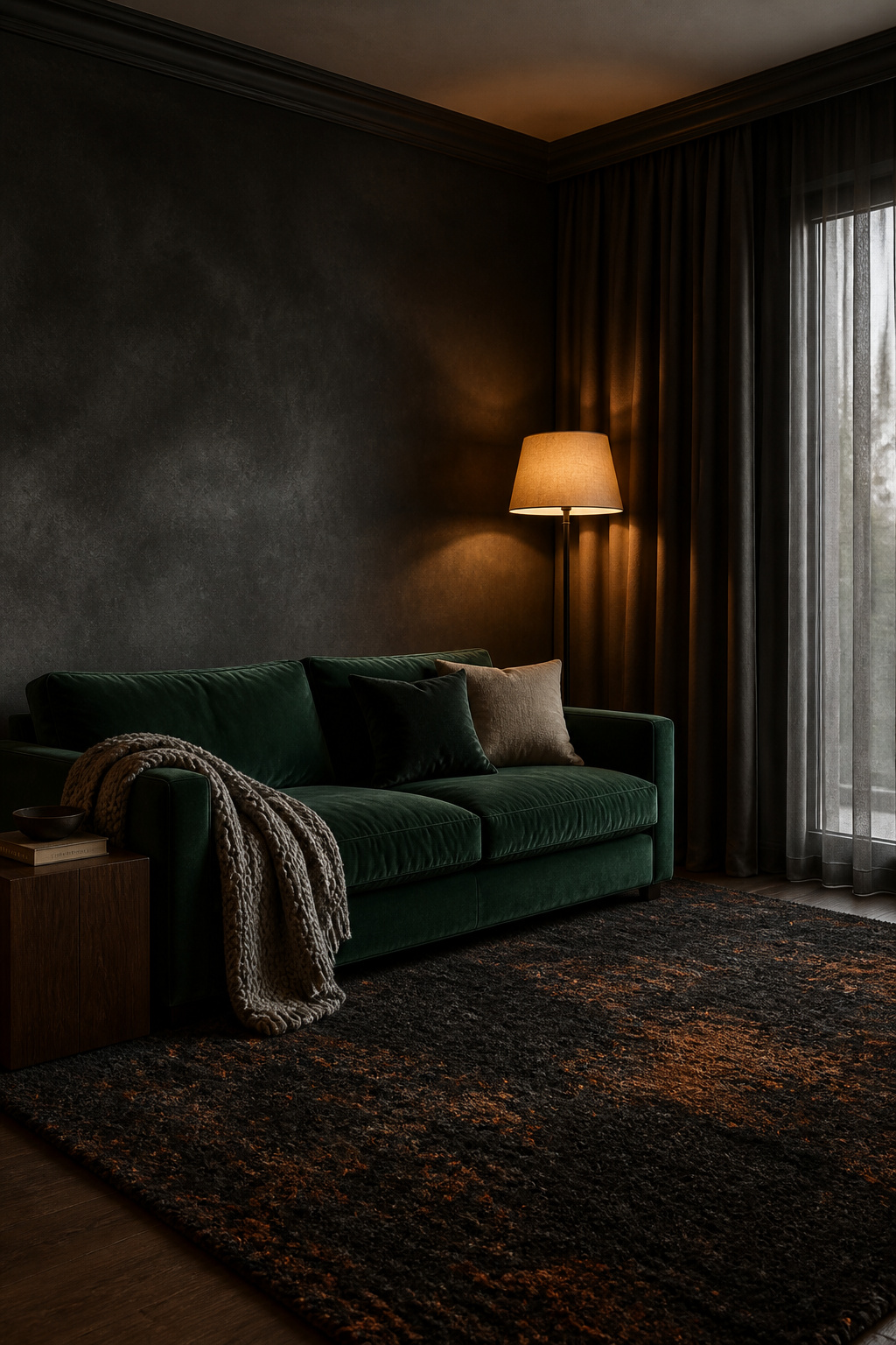
Decide the fixed surfaces first — dark floor, dark walls — then layer everything else in relation to them, in this order:
- Rug — the foundational grounding texture; hand-knotted wool, not delicate silk.
- Major upholstery — sofa and armchairs; performance velvet or heavy linen for the pieces that take the most use.
- Cushions and throws — the contrast and warmth layer.
- Window treatments — curtains as perimeter fabric volume.
- Wall surface — limewash, panelling or paper as architectural texture.
- Tables and accents — wood, stone and glass as the light-return and contrast points.
The minimum-texture rule
The practical floor is three distinct textures: one matte-absorbent textile such as velvet or wool, one natural-raw material such as wood or stone, and one soft-drape textile such as linen. Two rarely give enough contrast. Most successful moody rooms run three or four families, with four the sweet spot before clutter sets in. Slot any fourth material clearly into one of the 70-20-10 categories so it earns its keep.
When texture layering becomes clutter — and the edit that rescues it
The diagnostic is simple: if more than three or four textured elements are loud in the room’s main sightline, it is over-textured. The fix is counterintuitive — remove a material family, not colour. A room carrying velvet, leather, wool, rattan, linen and stone has six families fighting; dropping the rattan resolves the competition. A near-monochromatic palette buys latitude, because with colour contrast turned down the textures carry more weight. And repeat materials rather than use them once: if walnut appears on the coffee table, let it return as a side-table leg. As designer Alyssa Anselmo notes, materials echoed through a space make it feel connected rather than like separate decisions.
Come back to where we started: a hand on velvet pile, the rug underfoot, the warm grain of walnut answering the cool of stone. None of that asks for a bigger budget or a brighter room. It asks for two or three material families in honest contrast, balanced so most of the room absorbs light and a little hands it back, then built from the floor up and edited before it tips into clutter. Lay the materials in with that logic and a dark room stops being dark in the gloomy sense — it becomes the warm, tactile, collected room you can already feel under your palm.
FAQ
What textures work best in a moody living room?
Velvet is the defining one — its pile catches warm lamplight at multiple angles, making dark jewel tones read dimensionally rich rather than flat. Pair it with wool for tactile and acoustic warmth, walnut or slate for natural contrast, and linen or aged leather as everyday middle-ground textures. The 70-20-10 proportion then keeps the mix intentional rather than over-dressed.
How do I use velvet without my living room looking too dark?
Velvet actually fights excessive darkness: the pile reflects warm lamplight and lifts the fabric out of the wall instead of vanishing into it. Choose jewel tones over near-black, set a lighter natural surface nearby — pale travertine or warm walnut — as a light-return point, and use a warm 2700K lamp rather than cool overhead light. Velvet reads flat and gloomy under cool overhead light and luminous under directional warmth.
Can you mix different textures in a small dark room without it looking cluttered?
Yes, if you limit material families to three or four. In a small room, three is usually the sweet spot: one opulent textile, one natural material, one soft anchor. A close-toned palette gives more latitude, since uniform colour lets texture carry the weight. Repeat each material at least twice so it reads as a decision, not an accident.