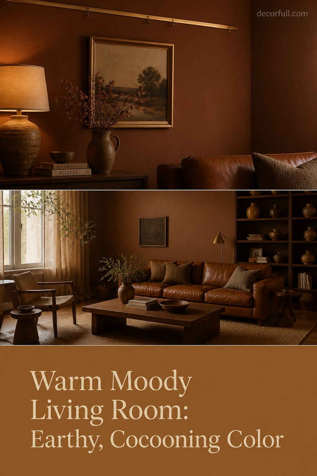
There is a branch of the moody trend that never gets painted charcoal or navy — it reaches instead for terracotta, caramel, rust and ochre, drawing its depth from the warm end of the spectrum rather than the cool. A sun-faded Provençal farmhouse puts this idea into practice without a theory: clay plaster that centuries of repainting only deepened, a single oil lamp, the colour of baked earth in every surface. The warm moody living room is that same proposition indoors — an enveloping, theatrical richness the cool-dark branch cannot produce. The two are different temperaments, and each carries its own rules.
TL;DR
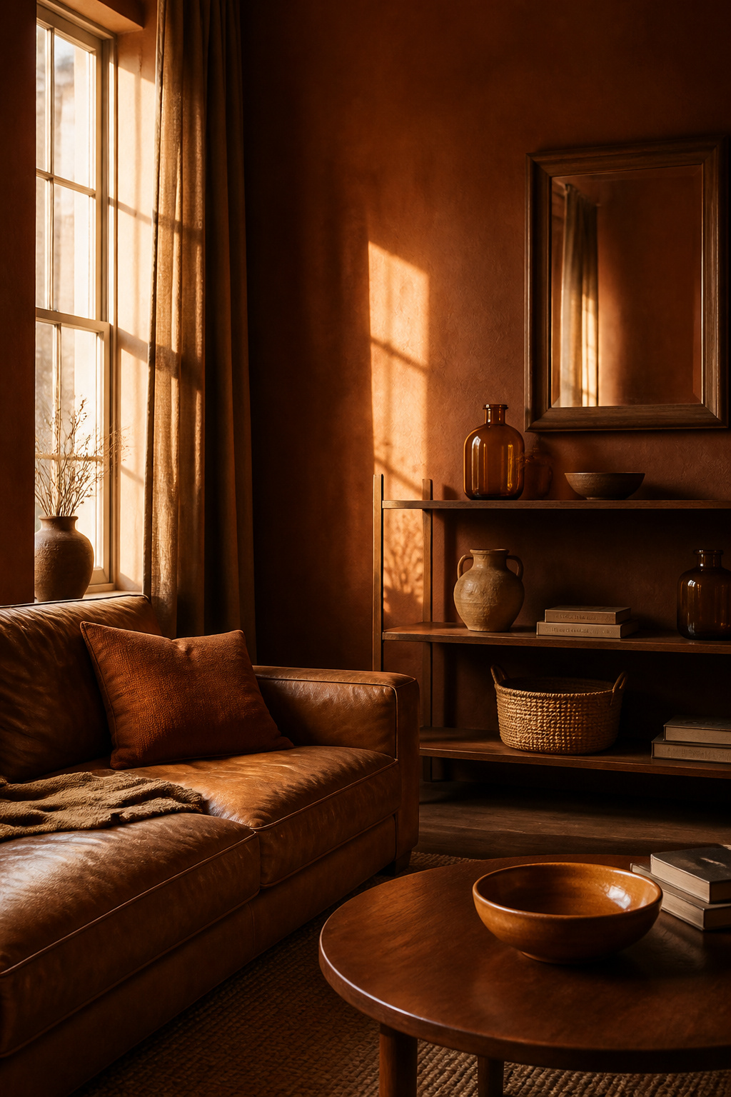
- Warm moody uses dark colours from the red-orange-yellow family — terracotta, caramel, rust, ochre and deep tobacco-brown — for a gathered, sun-faded feel; cool moody (charcoal, navy, deep green) reads calm and composed instead.
- Temperature coherence is the one rule that matters: warm walls want warm metals (brass, copper), warm woods (walnut, oak) and 2200–2700K bulbs, because a cool-grey or chrome accent fights the whole palette.
- It suits rooms with existing warm materials — honey oak floors, brick, brass — and north-facing rooms whose cold daylight the warm pigment counteracts.
This piece is the warm-toned chapter of the wider moody living room styles collection. Where the others handle dark rooms in general, here the focus is one coherent sub-style: the earthy, enveloping version, and how to tell whether it belongs in your space.
Warm Moody Versus Cool Dark: A Real Distinction With Different Rules
The moody trend splits cleanly along temperature lines, and the split is more than a paint swatch. Cool moody works in charcoal, navy, deep green and near-black; it reads precise and calm. Warm moody draws from terracotta, caramel, ochre, rust and dark warm brown; it reads earthy, sun-baked and close-held. That dominant temperature then governs every later decision in the room.
What separates warm moody from generic dark living rooms
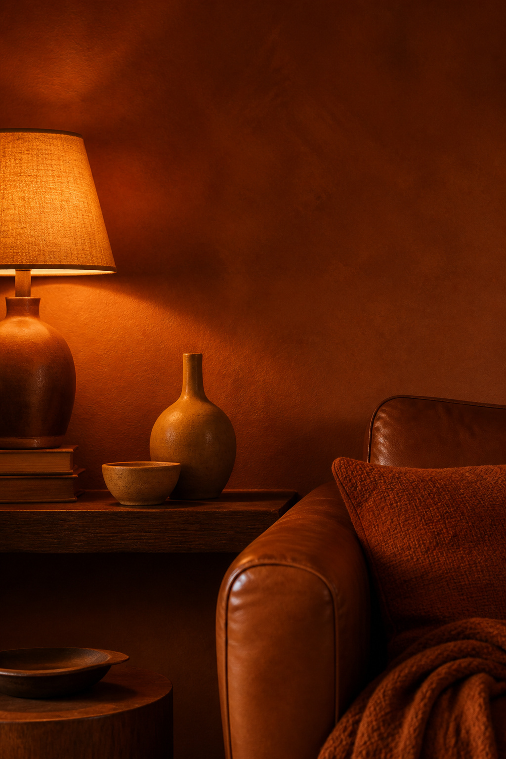
A generic dark room simply uses a dark colour. A warm moody room commits to a temperature family and holds the line. Warm tones in a dark palette add vibrancy and comfort; cool tones create calm and elegance — fundamentally different emotional results at the same depth of colour. The warm branch is not “moody with brown swapped in for grey.” It has its own logic, built around making earthy pigment glow rather than recede.
The cultural roots: sun-faded richness versus Nordic and industrial dark
The warm branch has a long lineage: Mediterranean interiors weathered by southern light, earthen render that centuries of repainting only deepened, the clay-and-umber palette the Arts and Crafts movement rescued from industrial grey. Cool moody draws on Nordic shadow and industrial sobriety. Livingetc’s Hugh Metcalf named “Tobacco” — a deeper, browner terracotta — a defining 2026 colour: “moody, rich, dark, and a little edgy,” and, as he writes, “it finds its roots in the past.”
Why the warm branch has its own logic — and its own common mistakes
Because warm pigment behaves differently, the predictable errors differ too. The cardinal one is mixing temperatures: a blue-undertone charcoal beside cognac leather and brassy gold will always feel slightly off, the colours fighting rather than harmonising. The same clash appears when terracotta walls meet cool-grey upholstery, or when chrome arrives in a room built on copper and clay. Stay inside one temperature family and the room resolves; break it, and no amount of styling rescues it.
The Warm Moody Palette: Browns, Rust, Terracotta and Caramel
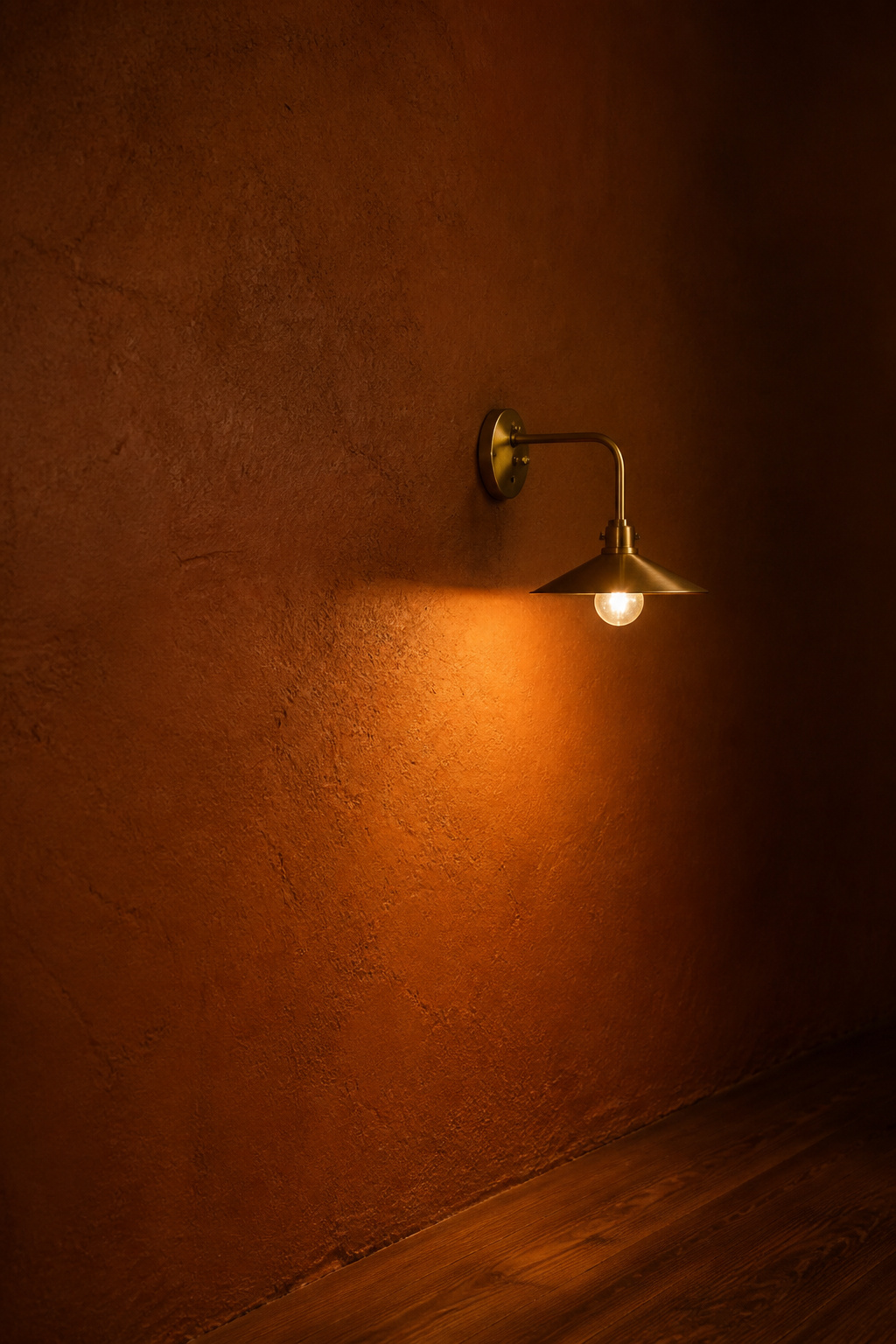
The palette runs from pale golden ochre to near-black espresso, with the most characteristic registers in mid-dark territory. Naming specific colours helps, because not all terracotta behaves alike and the way light sits on each is the detail that grades the choice:
| Colour family | Warmth character | Reads in north light | Reads in south light |
|---|---|---|---|
| Terracotta (e.g. SW Cavern Clay SW 7701, LRV ~20) | Clay-rust, mid-dark | Warm and grounded; counteracts cold daylight | More vibrant; may need restraint |
| Deep tobacco / espresso brown (e.g. BM Silhouette AF-655) | Burnt umber with charcoal notes | Rich and enveloping | Deepest end; very close-held |
| Caramel / ochre (e.g. F&B India Yellow No. 66) | Golden, honeyed | A glowing relief from cold light | Bright “golden hour” warmth |
Warm brown as the anchor: the range from tobacco to espresso
Brown is the spine of this palette, and 2026 has pushed it deeper. Benjamin Moore’s Colour of the Year, Silhouette AF-655, is a rich espresso the brand describes as weaving “luxurious burnt umber with delicate notes of charcoal” — shown colour-drenched across walls and ceiling against cream upholstery. For a lighter footing, Sherwood Tan 1054 grounds a space “while maintaining warmth” and suits smaller rooms where full espresso would feel oppressive.
Rust and terracotta: whole-wall versus accent
Terracotta is the signature shade, but its lean decides everything. Designer Nicole Cullum of Color Caravan is firm on this: “I prefer terracottas that fall more into the deep brown and red spectrum, rather than the fiery oranges for interiors because they feel more grounded in the space.” A brown-leaning clay such as Benjamin Moore Byzantine reads as a true earth tone across a whole wall; a fierier, oranger terracotta tips into feature-wall territory and is better kept to an accent. The actual mechanics of applying it — primer, finish, sampling — live in the warm dark paint colors guide; here the point is which warmth to choose.
Caramel and ochre: the transitional tones that connect warm moody to natural light
The lighter end does quiet, essential work. Farrow & Ball India Yellow No. 66 is one of their best sellers for cold north-facing rooms because it pours warmth back into chilly daylight. The 2026 surge in “honeyed neutrals” — butterscotch, caramel, warm ochre — does the same, creating what designers call a golden-hour glow. Nune’s Sheena Holton demonstrated the range in one project, pairing an ochre ceiling with a tobacco rug and butterscotch curtains for “a room that feels as though it is glowing.”
Materials and Textures That Carry the Warm Moody Feel
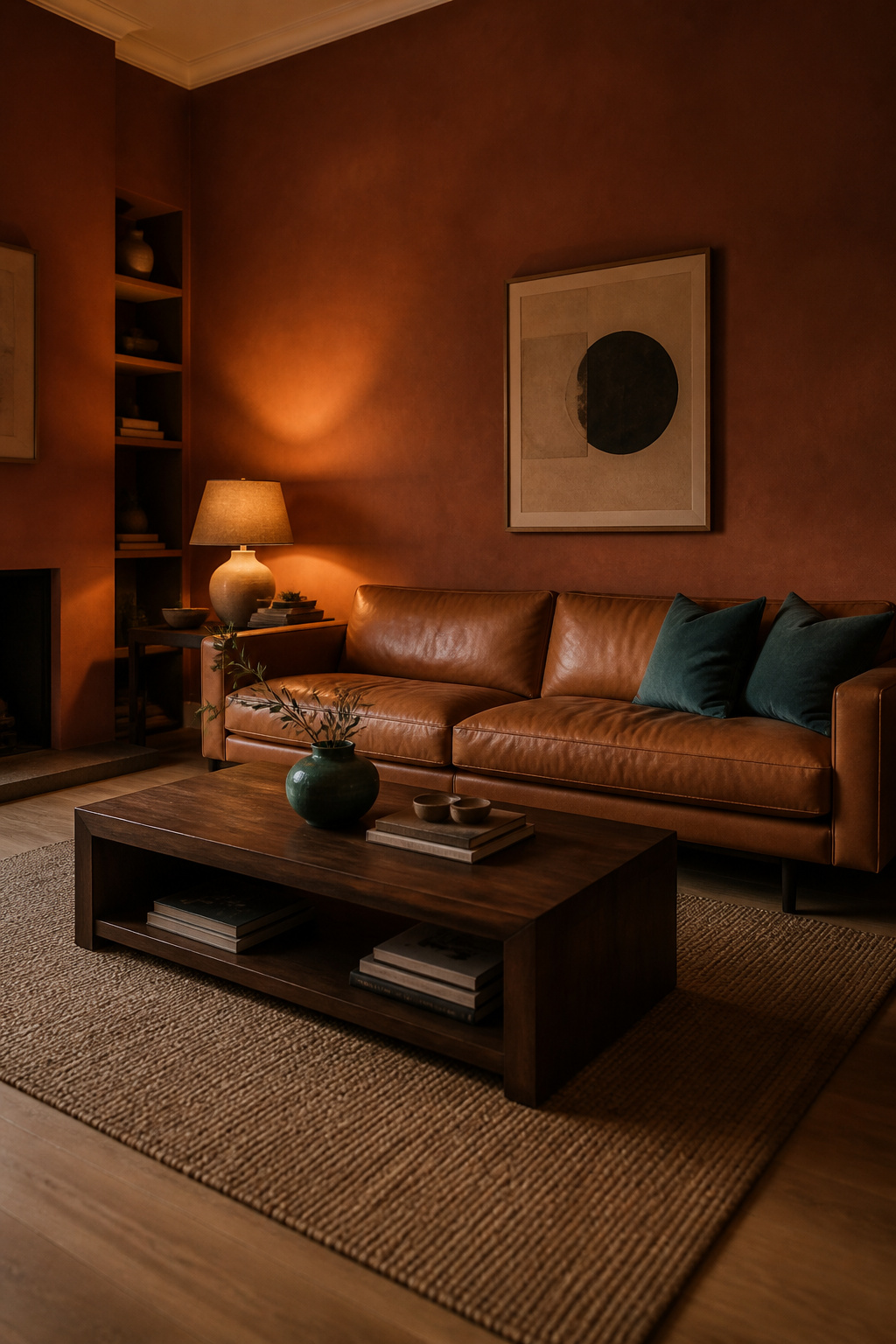
Paint sets the temperature; materials confirm it. The difference between a warm moody room that feels intentional and one that reads as a heap of dark objects is whether the materials live inside the same red-orange-yellow family. The selection criterion here is palette coherence — distinct from the contrast-driven logic of general texture layering.
Aged and honey-toned wood as the material backbone
Wood is the backbone. Walnut, mahogany and dark oak echo the brown-red undertones of an earthy palette and absorb into it rather than interrupting. The grading detail is the finish: honey-toned, lightly figured oak reads warmer than a grey-stained one, and aged or dark-patinated pieces carry the collected quality these rooms depend on. A lighter wood used sparingly — a shelf, a frame — gives contrast without breaking temperature.
Terracotta, clay and raw ceramic: the tactile grounding layer
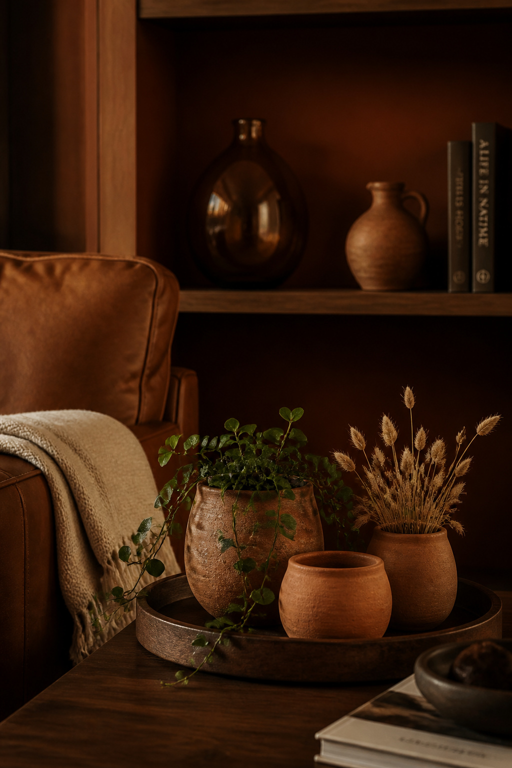
Raw clay is the most literal expression of this palette. Terracotta bowls, jugs and planters add a third earthy surface — wall, floor, object — without introducing a single new colour. Their natural variation, from sandy buff to deep rust, mirrors the tonal range already on the walls. Grouped in threes at varying sizes, raw and lightly glazed ceramics read as accumulated rather than bought.
Linen, sisal and undyed wool: natural fibres in a warm moody palette
Natural fibres ground the room at floor and window. A jute rug in honey-beige sits in the warm range and never fights the scheme; jute is softer than sisal and the better choice for a living room. One caution: in a dim warm room, the rug should never be the darkest element — a mid-toned caramel reflects warmth upward instead of swallowing it. For the full discipline of building these layers, see cozy texture layering.
Light in a Warm Moody Room: A Different Calculus Than Cool Dark
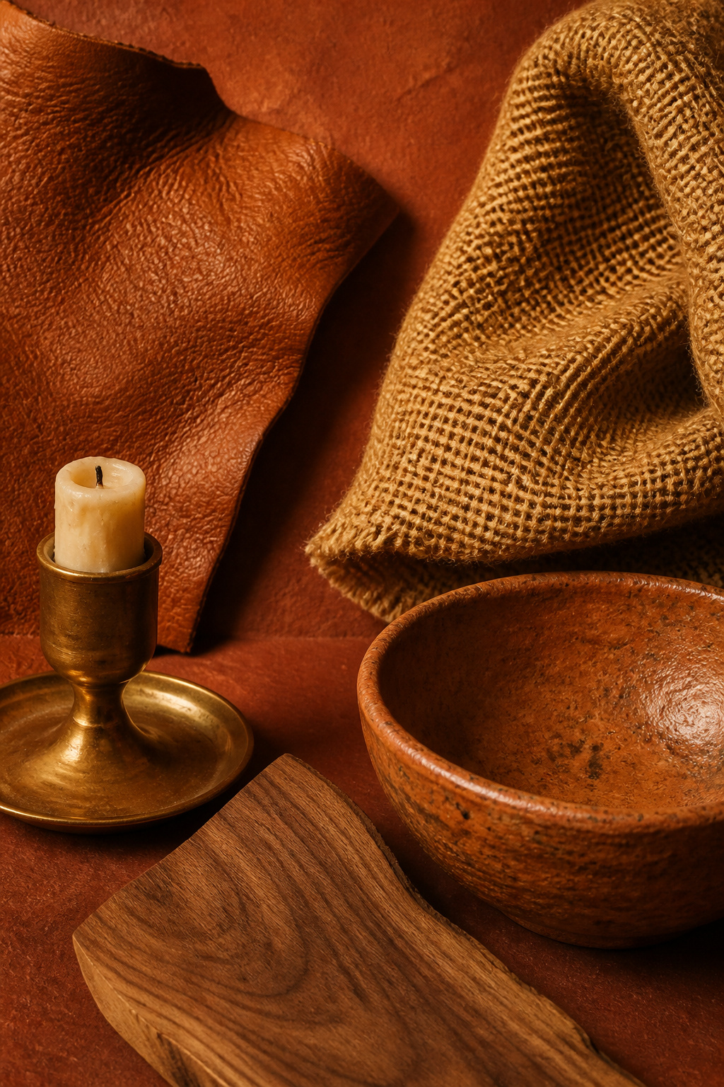
A warm palette depends on artificial light even more than a cool one does, because earthy pigment absorbs light and needs a warm source to come alive. Get the colour temperature wrong and terracotta turns muddy; get it right and the walls glow.
Why warm moody needs even warmer bulb temperatures than cool dark
The working range is 2200K to 2700K. At 2200K the light mimics candlelight — a deep amber that activates the red-orange undertones in clay and brown. At 2700K you get warm white with golden undertones: the practical minimum for an earthy palette. Bulbs above 3000K begin to cool terracotta toward muddy flatness; above 3500K they actively grey out warm materials, stripping the pigment of the very warmth you chose it for.
Candlelight and fire as mood anchors, not just accessories
In a warm moody room, flame is a lighting layer, not a decoration. A candle flame burns at roughly 1800K — warmer than any LED, deep into amber — and a cluster on a walnut or terracotta surface throws moving warmth no fixed fitting can copy. Multiple low-positioned lamps produce the pooled, intimate quality hygge-lighting literature associates with firelight. In an earthy room, light and palette reinforce each other.
Natural light in a warm moody room: what to encourage and what to filter
North-facing rooms are the warm palette’s natural home — the cold blue daylight is exactly what warm pigment counteracts, and the two balance. South-facing rooms can take either temperature, but warm tones intensify in strong afternoon sun and may want a heavier linen at the window. Floor-pooling curtains a shade warmer than the walls filter that light and, when drawn, complete the envelope.
Styling a Warm Moody Living Room: Metals, Objects and Greenery
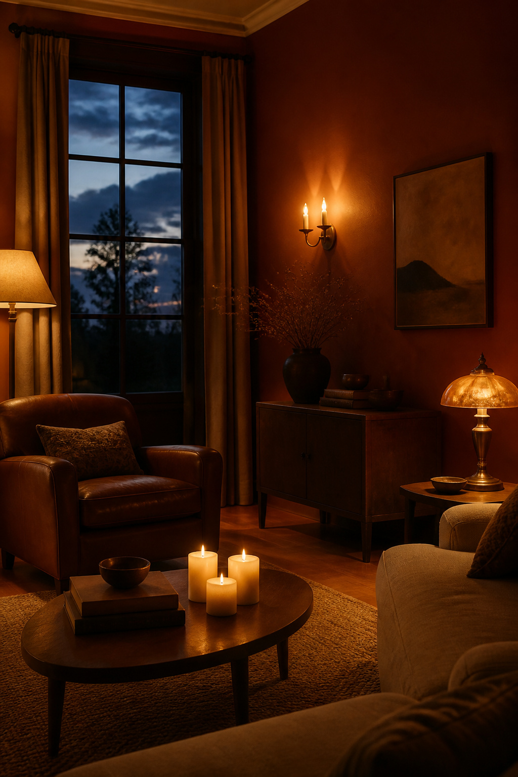
The finishing layer earns the room its gathered character through accumulated weight rather than one bold gesture. Every object should add either tactile contrast or a slightly different value of the same warm temperature. The selection rule is the same as the rest of the room: temperature coherence first.
The fastest way to hold the line is a keep-or-reconsider habit:
- Keep: unlacquered or aged brass, copper and warm bronze — their yellow-brown and reddish warmth echoes the palette. Brass lamp bases and amber glass shades earn their place twice: they amplify the warm output of a 2700K bulb while carrying the room’s material language.
- Keep: terracotta and warm-glazed ceramics, amber glass, aged-wood frames, raw stone and mirrors in warm-toned frames (aged brass, dark wood, rattan). A mix of these at different values — same temperature family — builds a shelf or coffee table that feels accumulated rather than styled.
- Keep: dried botanicals — pampas, eucalyptus, rust-toned florals — and deep-green trailing plants in terracotta pots.
- Reconsider: chrome, brushed nickel and silver-toned metal, which read cold against clay and brass.
- Reconsider: matched sets and mass-produced décor, which erase the collected quality earthy rooms depend on.
What to avoid: the cool-toned accents that break a warm moody palette
A small cool note is allowed, and useful. Navy, sage or forest green, kept to roughly a tenth of the room in cushions or a throw, reads as depth rather than cold and stops the palette flattening into sameness. What breaks the room is cool used carelessly. As Nicole Cullum warns, a relief white must carry “a very minimal touch of warmth,” because terracotta clashes with cool grays and amplifies any pink or yellow beside it.
When to Choose Warm Moody Over Cool Dark (and Vice Versa)
The choice is not about fashion — it is about your room’s light, its bones and the feeling you want to walk into.
Room orientation and natural light quality as the deciding factor
Light orientation is the first filter. A north-facing room, cold and blue all day, is the warm palette’s natural ally: the earthy pigment warms the chill and the room stops reading flat. If your daylight already runs cool and you fight it every winter, warm moody is the more forgiving answer.
Architectural period: which rooms suit which moody direction
The building’s existing materials often decide for you. A room with honey oak floors, a brick chimney breast, walnut furniture or brass fixtures is already speaking warm; an earthy palette absorbs those features rather than fighting them. Polish studio Kubieniec + Długosz chose tobacco brown for exactly this reason — co-founder Katarzyna Długosz noted it “perfectly complements the retro elements” and “honours the building’s historic character.” Cool moody, by contrast, suits crisper, more contemporary or industrial bones.
Personal register: the feeling each branch produces and who it suits
In the end it is a question of temperament. Cool darks read calm and composed, like a private library. Warm darks feel enveloping and theatrical: the fire at the end of the day. Choose by how you want the room to hold you in the evening hours you actually live in it — and everything from the brass to the bulb temperature follows from that honest decision.
FAQ
What is the difference between a warm moody living room and a dark living room?
A dark living room simply uses a deep colour. A warm moody living room commits to the red-orange-yellow family — terracotta, caramel, rust, ochre and tobacco-brown — and matches every element to it: brass and copper metals, walnut woods and 2200–2700K bulbs. The result is a coherent, enveloping, sun-faded richness rather than just a room that happens to be dark.
What colors make a living room feel warm and cozy without being too dark?
Caramel, ochre and honeyed butterscotch sit at the lighter end of the warm palette and deliver glowing warmth without heavy depth. Farrow & Ball India Yellow is a reliable choice for cold north-facing rooms. Pair them with a warm off-white that carries a minimal touch of warmth, walnut wood and brass, keeping every tone inside the warm family.
How do I create a cocooning earthy living room on a budget?
Start where the warmth shows most: a mid-toned caramel or ochre rug, warm 2200–2700K bulbs in lamps you already own, and a cluster of candles for firelight-level warmth at very little cost. Add thrifted terracotta ceramics, brass objects and a heavyweight linen throw in rust or oat. Paint is the highest-impact single move once your budget allows it.