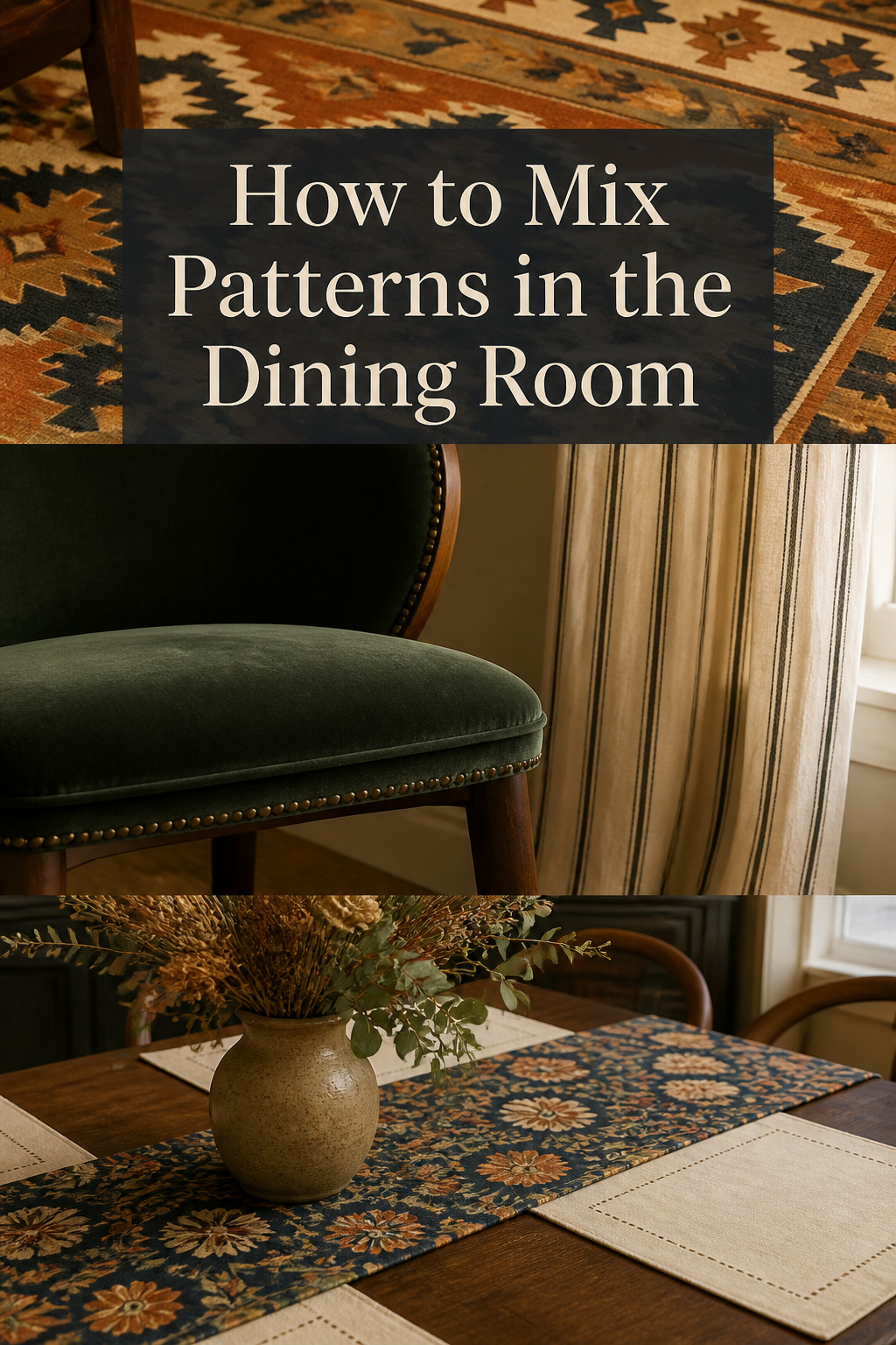
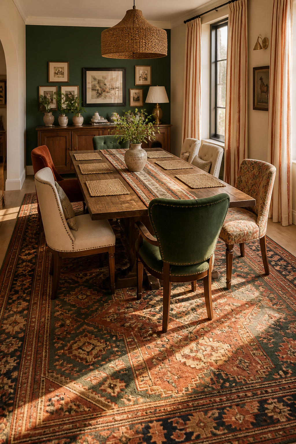
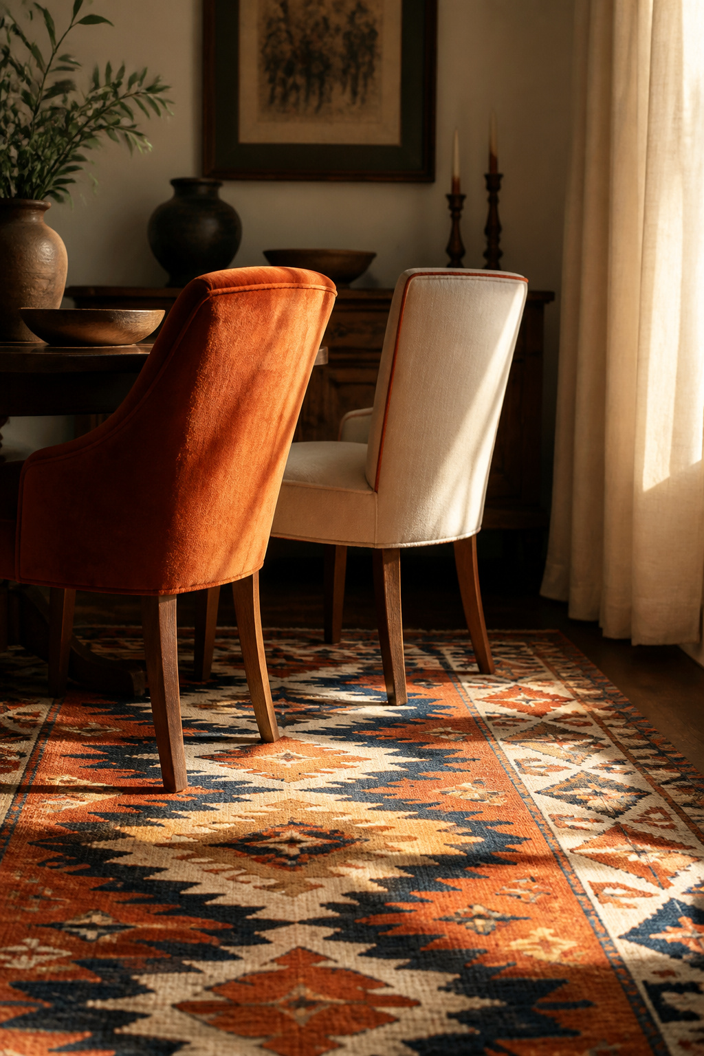
Step into a dining room that has its textiles right and you feel it before you can name it. A vintage kilim holds the floor in faded terracotta and navy. Linen curtains soften the afternoon light. One chair is deep velvet underhand, the next a cool flat-weave linen. Nothing matches. Everything belongs. That sense of a room collected over years rather than bought in an afternoon is the whole reward of mixing patterns in a dining room — and it follows rules you can learn.
TL;DR
- Vary the scale: one large-scale hero pattern (usually the rug, 12-inch-plus repeat), one medium, one small — three patterns maximum.
- Link every textile with one shared hue; if you can pull a single color from each piece, the room coheres, even when the patterns differ wildly.
- Let the rug carry the dominant motif and keep curtains plain when it’s bold; size it to extend 24 to 30 inches past every table edge so chairs stay on it.
This is craft, not magic — pattern mixing has a structure underneath it, the way a well-built chest has joinery under its finish. It is one layer of the complete guide to eclectic dining rooms; here we stay with the textiles.
The Scale Rule: How to Vary Motif Size So Patterns Coexist
Scale settles first, because it does more work than any other variable. Two patterns of similar repeat size fight for the same attention and neither wins. Vary the scale, and the eye knows where to land.
Large, medium, and small: the three-scale framework
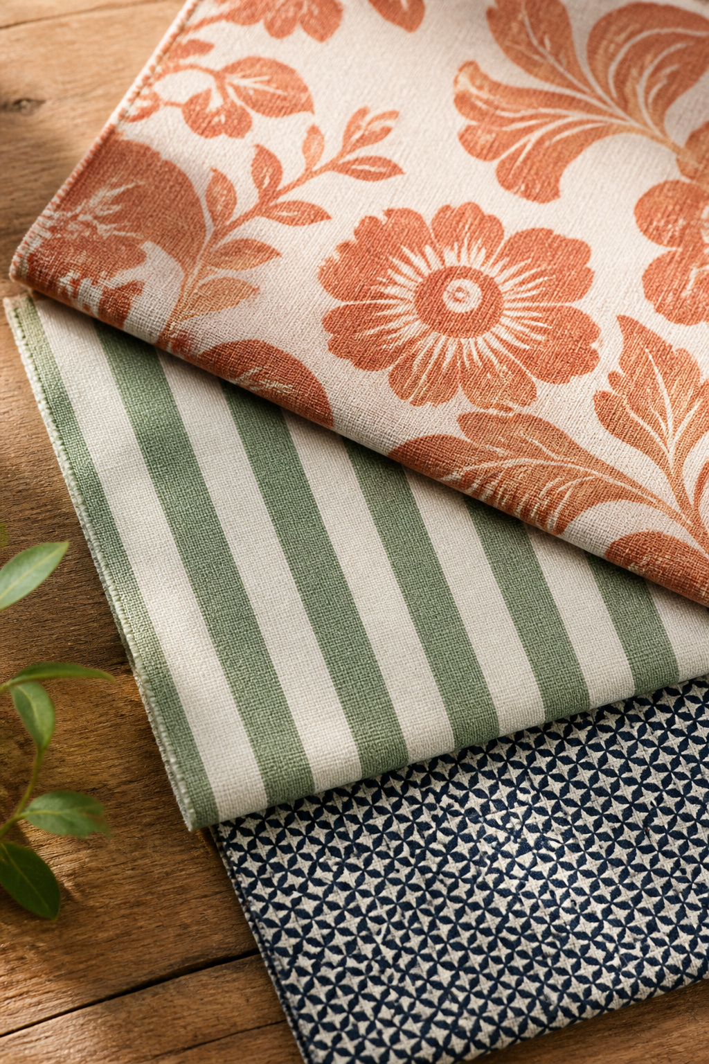
The rule designers return to is the rule of three: one large-scale hero, one medium for contrast, one small for detail. A hero repeat runs 12 inches or more; a small-scale repeat measures one to four inches, and the gap between those poles is what makes a mixed scheme legible. Keep the total to three patterns — beyond that, the eye loses its resting point. The 60/30/10 split helps you allocate: roughly 60 percent solids or dominant pattern, 30 percent secondary, 10 percent small accent.
This table maps each motif type to the scale and surface where it tends to sit best.
| Motif type | Recommended scale | Best dining-room surface |
|---|---|---|
| Geometric / tribal (kilim) | Large — the anchor | Rug |
| Floral | Medium | Chair upholstery, runner |
| Stripe | Medium to small | Curtains, placemats, napkins |
| Spot / small all-over | Small — the detail | Napkins, cushions, trim |
Geometric, floral, and stripe — how motif type affects scale pairing
Motif type matters as much as size. Textile designer Charlotte Gaisford warns against pairing large scales: “You really have to avoid mixing large scales together as this will lead to the fabric designs fighting with each other.” Stripes earn their keep as moderators — their steady linear repeat calms a bolder neighbor like a tribal kilim.
The one pattern that should dominate and the ones that support
Let one pattern lead. In a dining room the dominant motif almost always lives on the rug, the largest textile surface; upholstery takes the medium scale, linens the small. Sophie Ashby of Studio Ashby keeps loud expanses calm: “Usually pattern works best in touches, not as the main event.”
Linking Every Pattern with a Shared Hue
Scale lets patterns coexist; color makes them belong together. Every credible source agrees on one principle: each pattern must share at least one color with the others. That thread can shout or whisper, but it has to be present in every piece.
How to identify the linking color in each pattern you own
Start with the dominant pattern — usually the rug — and pull its two or three strongest colors; those become the palette every other textile must draw from. Sophie Ashby looks for exactly this: “I’m always looking for that hero pattern which combines those five colors.” Keep it tight — a narrow palette is what makes several patterns read as one collection.
The one-color test: if you can pull one hue from every textile, the room coheres
Here is the test that settles most arguments. Lay every sample side by side and ask whether one hue — however muted — appears in all of them. A navy stripe, a cobalt floral, and a dusty blue geometric work together because the eye connects the blue running through all three; the exact shade matters far less than the shared hue family. If one print shares no thread, swap it or bridge the gap with a small accent in the missing color.
When the shared hue is neutral: ivory, warm grey, aged linen
The linking hue need not be saturated. Ivory, warm grey, and aged linen unify a scheme as reliably as terracotta, and they buy more freedom in the accents — with a neutral ground holding everything to common terms, individual patterns can carry wilder colors without tipping into noise. Aged linen suits an eclectic dining room especially, because it already references the patina of vintage textiles. Choosing those colors well is its own task, which is where settling on a color palette comes in.
The Rug: Anchor Pattern That Sets the Room’s Scale
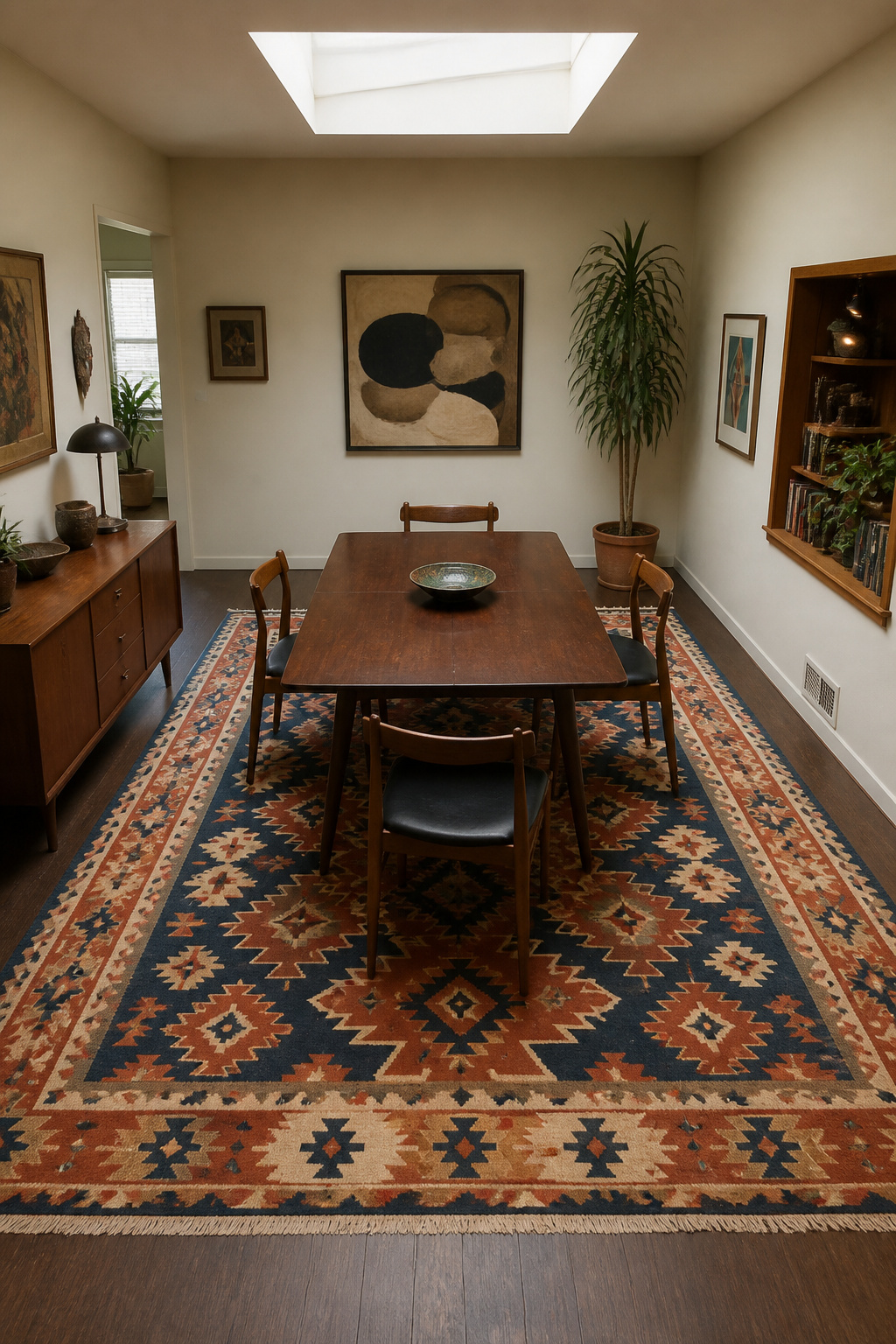
If one purchase decides the rest, it is the rug. It covers more square footage than any other textile, so its scale dominates and its palette becomes the room’s palette. Penny Morrison starts every scheme here: “Since rugs are the hardest thing to find matches for, if you start with the rug and work from that then you’ve got your match before you begin.”
Why the rug carries the largest motif in most dining rooms
Because the rug fills the visual field from seated height and from above, it is the natural home for the largest motif. Choose a flat surface for dining — low-pile wool, flat-weave, or kilim — so chair legs slide easily and bold motifs read clearly without deep pile distorting them.
Vintage kilim versus contemporary geometric: what each asks of the room
The two anchors make different demands. A vintage kilim carries its own past — tribal motifs, hand-variation, soft natural-dye colors — and, being flat-woven with no knotted pile, its geometry lies flat and reads easily beside mismatched chairs and aged-finish casegoods. A contemporary bold geometric is graphic and modern, and it demands quieter company — plain curtains, solid upholstery — or the room tips into noise.
Sizing the rug so all chair legs sit on it when pulled out
Size is where most dining rugs fail. A dining rug should extend 24 to 30 inches beyond every table edge so chairs stay on it even when pulled out. As a rule of thumb, a six-seat table needs at least an 8-by-10-foot rug; an eight-seat table needs 9 by 12. Undersizing is the single most common mistake — a rug only the table legs reach reads as a decorative accent, not an anchor, and shoves chair legs off the pile every time someone sits. When the rug is also your dominant pattern, size up generously so the motif breathes.
Curtains and Upholstery: Playing the Supporting Pattern Roles
With the rug anchoring the dominant pattern, curtains and upholstery take supporting roles — and the common error is letting a supporting player try to lead.
Why plain curtains often serve a bold rug better than patterned ones
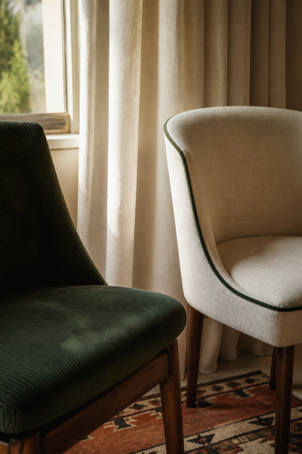
When the rug is bold, plain curtains earn their place by supplying a pause. The rule is reciprocal: a large-scale pattern on one surface wants a small-scale or plain one on the next, never two bold patterns at the same scale. Curtains in a color pulled from the rug create a direct echo. Penny Morrison flags a specific risk: a row of three large windows dressed in pattern “will overpower one side of the space,” so solids keep an entire wall from competing.
Upholstery as the medium-scale pattern layer
Upholstery is the natural home of the medium-scale pattern — close enough to touch, large enough to register, small enough to support. In a room of mismatched chairs, each seat can carry a different medium-scale pattern as long as every one shares the room’s linking hue; the principle is the textile cousin of the seating question. A plain trim sharpens the edge: Ashby binds a patterned cushion “with a plain green trim,” then repeats that trim color elsewhere to tie it in.
Mixing tactile materials: linen, velvet, cotton, and what each contributes
Texture is pattern even when there is no motif. Velvet chairs bring pile and depth; set beside flat-weave linen, the contrast between sheen and matte reads as dimensional richness without formality. Push the values apart — a lighter linen against a darker velvet — and the textural difference amplifies; match them and it flattens. A reliable four-way layer is a flat-weave or jute rug, linen on one or two chairs, a velvet accent chair, and cotton or linen at the table.
Table Linens: The Layer You Can Change Every Season
Table linens are the lowest-stakes pattern layer in the room. You can buy, try, and replace a runner without painting a wall or reupholstering a chair — which makes the table the place to experiment.
Using table linens to test a new pattern before committing
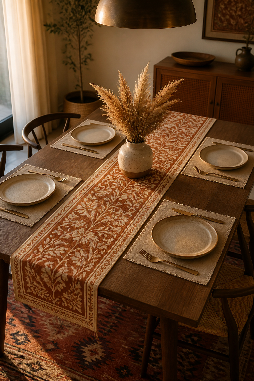
Before committing a pattern to chair upholstery, run it as a table runner first. If it sits well against the rug and reads as the medium scale, it has earned a place on the chairs; if it fights the rug, the runner just saved you a costly reupholstery. Linens can also slip in a fourth accent color without permanently altering the palette.
Mixing a patterned runner with plain placemats (and vice versa)
The runner-and-placemat pairing mirrors the larger hierarchy: one carries the pattern, the other provides rest. A patterned runner with plain placemats works; so does a plain runner with woven, textured placemats, where surface alone adds interest. For more depth, layer a short patterned runner over a longer plain one, the long piece acting as quiet ground beneath the motif.
Seasonal swaps: how linen flexibility keeps an eclectic room fresh
Because the rug, curtains, and upholstery hold the permanent palette, seasonal linens can be bolder than anything you would commit to a rug — light florals in spring, breezy stripes in summer, deep ochre and rust in autumn. The trick is to anchor with one constant, such as a ceramic centerpiece in the room’s base color, and rotate the textiles around it. That connecting-thread logic carries straight up to an eclectic gallery wall, where the same rule governs the art.
Common Pattern Mixing Mistakes and How to Recover
When a mixed room goes wrong, it is almost always one of three faults — and the recovery is more often subtraction than addition. The usual failure modes, with their one-line fixes:
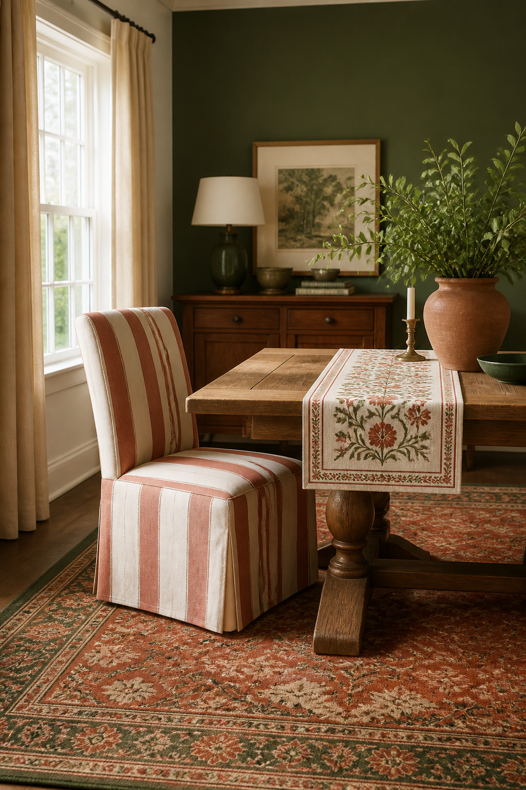
- Too many large-scale motifs at once. The room feels busy even when each piece is lovely. Fix: keep one large scale, demote the rest to smaller surfaces.
- Every pattern from one family — all geometrics, all florals. The room reads flat. Fix: swap one for a different motif type; a kilim, a floral, and a stripe hit all three families.
- Patterns that share no color. The room looks like a store display. Fix: audit for the shared hue and bridge any gap with a small accent.
- Adding more pattern to calm a busy room. The instinct is backwards. Fix: remove, don’t add.
The recovery protocol is simple. Lay every textile flat, pull the one piece causing the most conflict, and judge the remainder; most often the trouble was quantity, not any single piece. Then audit the survivors for the shared hue, adding a small accent in the missing color if the thread has broken. And if you would rather not part with anything, simplify the palette first: even with every pattern kept, reducing to two or three colors makes the mix read as deliberate.
A dining room is used on occasion rather than constantly, which makes it the right place to be brave with pattern. Get the scale varied, the colors threaded, and the rug sized, and you reach the room from the start of this piece — the one where nothing matches and everything belongs. Start with the rug, pull your hue from it, and let every textile after answer to those two decisions.
FAQ
How many patterns can you mix in a dining room?
Three is the designer-recommended maximum: one large-scale hero (usually the rug), one medium-scale bridge (upholstery or a runner), and one small-scale detail (napkins or trim). Beyond three, the eye loses its anchor. Texture counts as a pattern type, so a velvet chair, jute rug, and woven curtain can mix with no printed motifs at all.
Should dining room curtains match the rug?
Curtains and rug should coordinate, not match. Identical patterns on both look catalogue-stiff; sharing one color or undertone creates the cohesion you want. The core rule: if the rug is large-scale and bold, keep curtains plain or very subtle. The most reliable pairing is pulling one color from the rug and using it as the curtains’ solid color.
What textures work well together in an eclectic dining room?
The highest-impact combination is velvet chairs, a flat-weave or kilim rug, and linen or cotton curtains — pile, flat-weave, and woven each read differently under light. A practical four-texture formula: jute or kilim rug, linen on one or two chairs, velvet on one accent chair, and cotton or linen at the table. Avoid even 50/50 splits, which dilute the contrast.