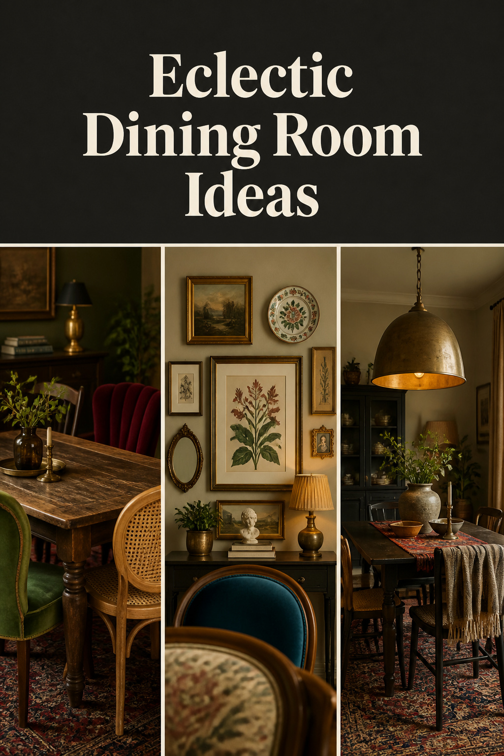
The word eclectic arrives from the Greek eklektikos, meaning to select — and the philosophers who first wore the label in the eighteenth century used it for exactly that. Rather than swear allegiance to one school, they chose the soundest ideas from several and combined them into a position of their own. A century later, architects borrowed the same instinct, setting Gothic Revival, Neoclassical and Byzantine elements side by side because no single style felt like the whole truth. Eclectic dining room ideas are not an invitation to buy whatever catches your eye; they are the practice of selecting deliberately and making the result cohere. That is the whole difference between a room that reads as collected and one that reads as confused.
Today the rooms that hold attention are assembled the older way: a piece inherited, a chair rescued, a chandelier carried home from a sale, each with a past of its own. The matched dining suite — table, chairs and sideboard finished as a set — is loosening its grip. What follows surveys how to build that look and the single principle that keeps it from tipping into clutter. Every facet has its own guide on this site; here is the map.
What Makes a Dining Room Eclectic Rather Than Simply Mismatched
Variety alone does not make a room eclectic. Mismatched is what happens when pieces accumulate without intention; eclectic is what happens when they are selected with one. The whole style rests on a single organising principle: a shared thread, repeated across diverse pieces, that signals the mix was a choice. Get that thread right and almost anything coheres. Leave it out and even beautiful objects read as error.
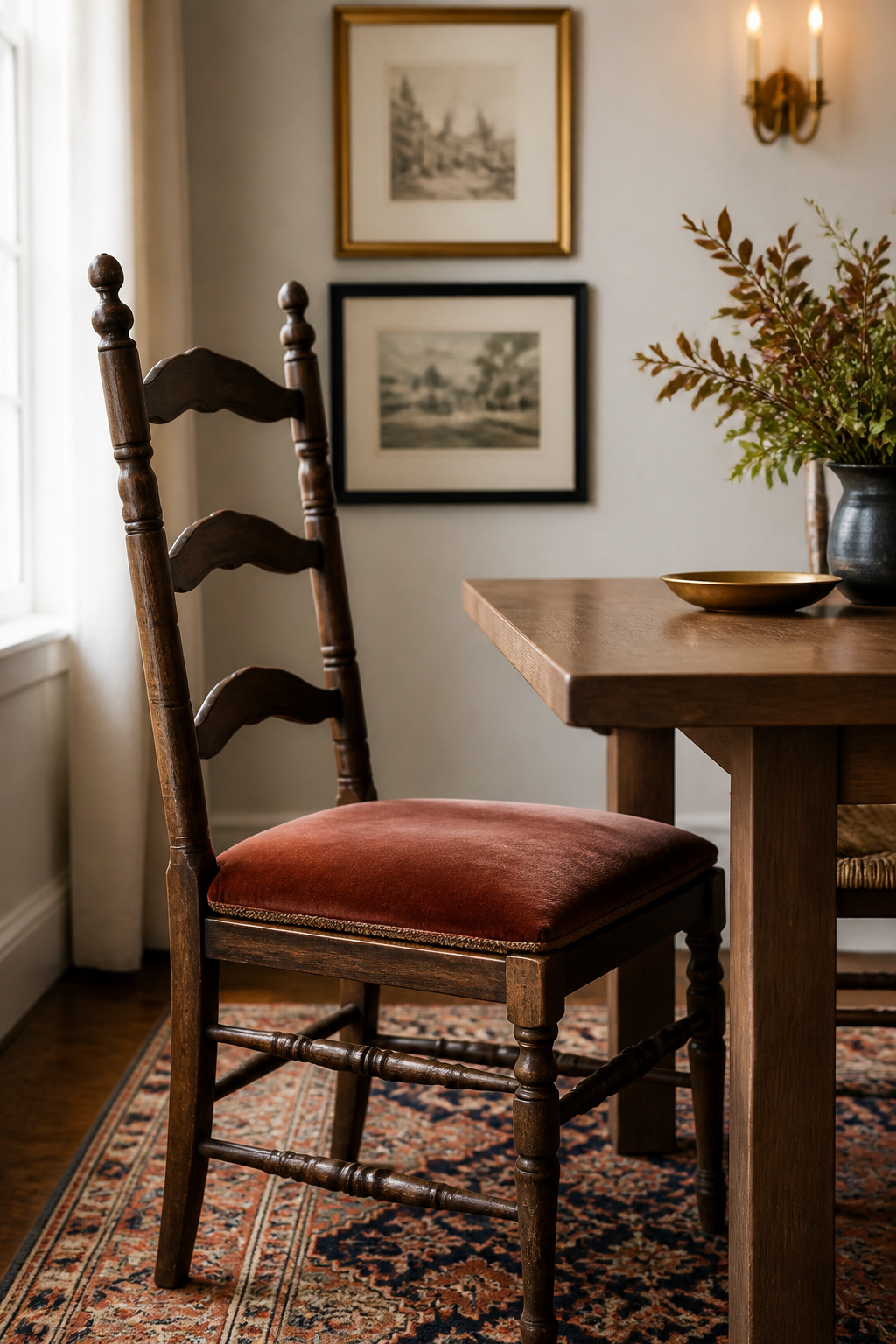
The defining rule: one repeated element across every piece
Repetition is the primary tool of cohesion. Interior designer Erika Ward states the problem bluntly: “Currently nothing in this room has common characteristics.” Her fix is to introduce one repeated element — a color, a finish, a material or a silhouette — that appears at least twice across the space. That single thread stops the eye reading the variety as a mistake. It can be aged brass running from the chandelier to the cabinet pulls, a curve echoed from a chair back to a mirror, or a wood tone repeated from table to picture frame.
A focal point does the second half of the work. Without a dominant piece to anchor the room — a large artwork, a statement chandelier, an antique table — a varied space reads as scattered rather than gathered. The anchor gives the eye somewhere to settle first, and every smaller risk orbits it.
A shared color thread as the room’s connective tissue
If repetition is the principle, color is its most reliable expression. A unifying hue can appear in upholstery, window treatments, artwork and accessories without any two of those pieces matching in style. The discipline is to choose one main color and let it thread quietly through the room as the backdrop, then layer bolder accents on top — never substituting the loud accent for the steady thread.
The professional shorthand for this is undertone consistency. Pieces that span centuries and continents will still cohere if they share a temperature — all warm amber, or all cool grey — even when nothing else about them agrees. Emily Henderson’s much-studied budget reveal proved the point: she repeated thin black metal, warm wood and leather, circular forms and a terracotta-and-teal pairing across pieces that were roughly eighty percent thrifted, and that repetition is what made the mix read as deliberate rather than random.
How eclectic differs from maximalist and bohemian
Eclectic is often confused with its louder cousins, and the confusion costs people the discipline that makes it work. Eclectic blends two or more periods in a balanced way; it bends and melds rules rather than breaking them. Maximalism is a philosophy of intentional abundance — more color, pattern and objects in every inch. Bohemian is a free-spirited style rooted in global travel and handmade finds, layering saturated color throughout with a relaxed, undisciplined quality. Eclectic can borrow from both, but it keeps the palette and proportion discipline they relax.
| Style | Defining trait | Repeated element | Palette discipline | Key risk |
|---|---|---|---|---|
| Eclectic | Balanced, intentional mix of periods | Essential — one thread carried throughout | Neutral backdrop, accents repeated | Losing the thread, reading as random |
| Maximalist | Intentional abundance, more-is-more | Optional — density is the statement | Low — color layered everywhere | Volume of objects overwhelms curation |
| Bohemian | Free-spirited, global, handmade | Loose — mood over rule | Low — saturated hues throughout | Organic abundance overruns proportion |
The practical takeaway: eclectic asks for fewer decisions than maximalism — one thread, one anchor, a held palette — and those constraints are what let the bold pieces feel bold rather than merely present.
Mixing Vintage and Modern Dining Furniture: The Casegoods Foundation
The casegoods — table, sideboard, credenza — establish the old-and-new dynamic most visibly, because they are the largest and most permanent objects in the room. Settle them first and everything lighter answers to them. The governing idea: style match matters far less than the balance of mass, era and tone across the pieces.
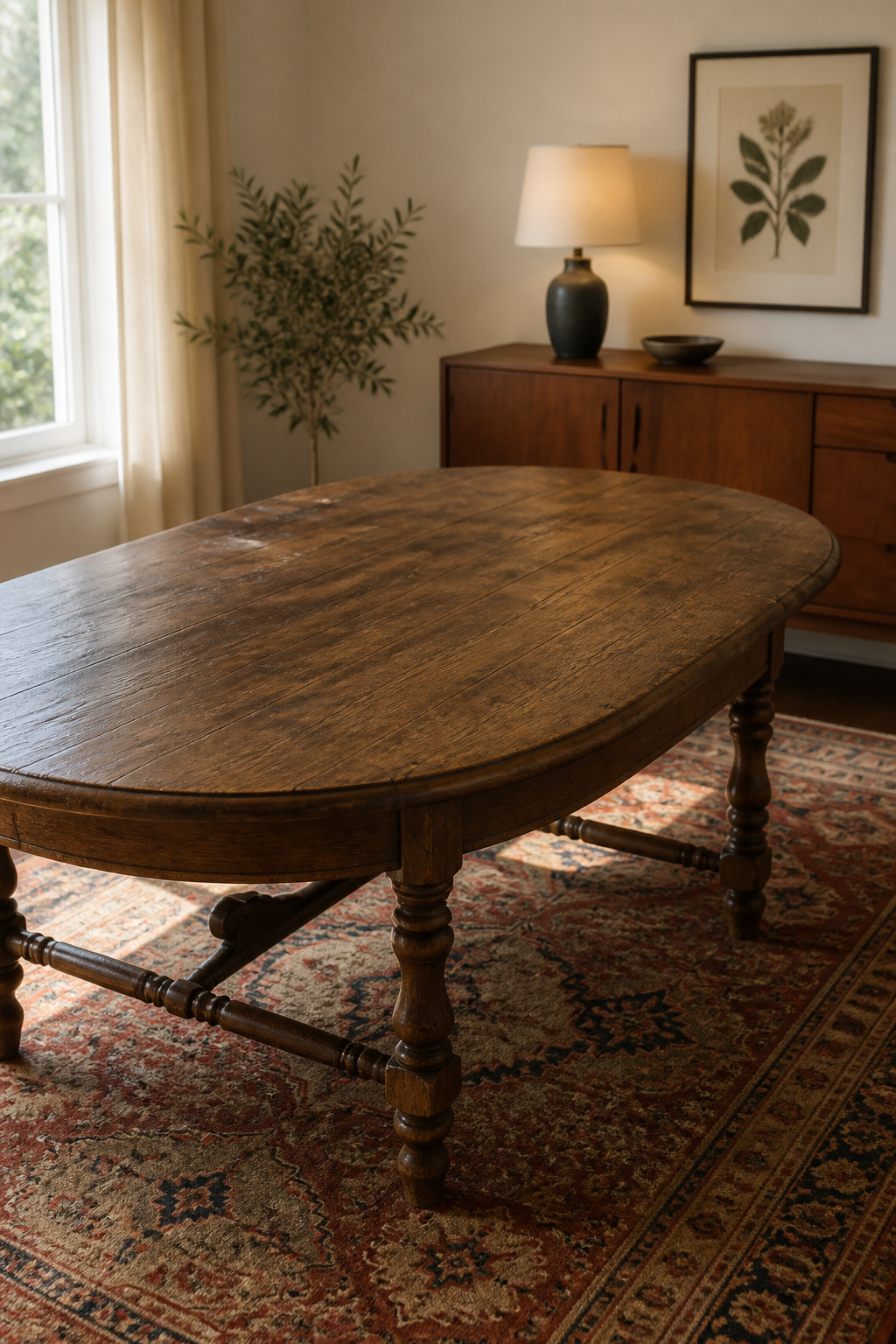
Pairing an antique table with a modern credenza (and vice versa)
Decide which era leads. Letting one period take roughly sixty percent of the casegoods gives the room a direction, so the second era reads as accent rather than competition. Then distribute the periods rather than grouping them: an antique table with a modern sideboard, a vintage print above a contemporary console. As the styling guide Urban Rhythm warns, putting all the old pieces on one side and all the new on the other “will only emphasize the difference in styles rather than bring them together.” Scale and silhouette do more work than vintage credentials — two pieces of similar height and visual weight hold a room across centuries.
How to mix wood tones without visual noise
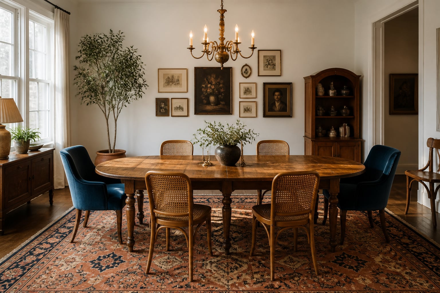
Wood tone is where mixed rooms most often go wrong. The rule of threes caps a room at three distinct wood tones; a fourth tips the balance into distraction. Each tone should then repeat at least twice — a walnut table wants a walnut frame or candle holder elsewhere, or it reads as an accident rather than a choice. When you do contrast, contrast boldly: Studio McGee’s principle is to go the opposite direction entirely rather than landing two woods that are almost-but-not-quite the same, because near-matches read as a failed attempt while a dark walnut against a light oak reads as deliberate. Matched undertones are the shortcut beneath all of it.
Reading quality cues: grain, joinery, and finish that grade a piece
Before a vintage piece earns a place at the table, it should tell you where it has been — and the joints tell first. Hand-cut dovetails, slightly uneven in their spacing, point to construction before roughly 1860; the precise machine-cut version marks the industrial era that followed. Phillips-head screws date a joint to no earlier than the late 1930s, since the head was patented in 1936, while wooden pegs or square-cut nails place a piece earlier. A single wide-board tabletop signals old-growth timber and pre-industrial cutting; modern pieces lean on veneers over a core. These cues separate a real find from a reproduction — and they go far deeper in our full guide to mixing vintage and modern dining furniture.
Layering Patterns and Textures Across Soft Furnishings
With the furniture set, the textiles layer over it — rug, curtains, upholstery, linens — following their own grammar. Pattern in a dining room is governed by two rules: vary the scale, then link the variety with color. Hold to both and even wildly different motifs cooperate.
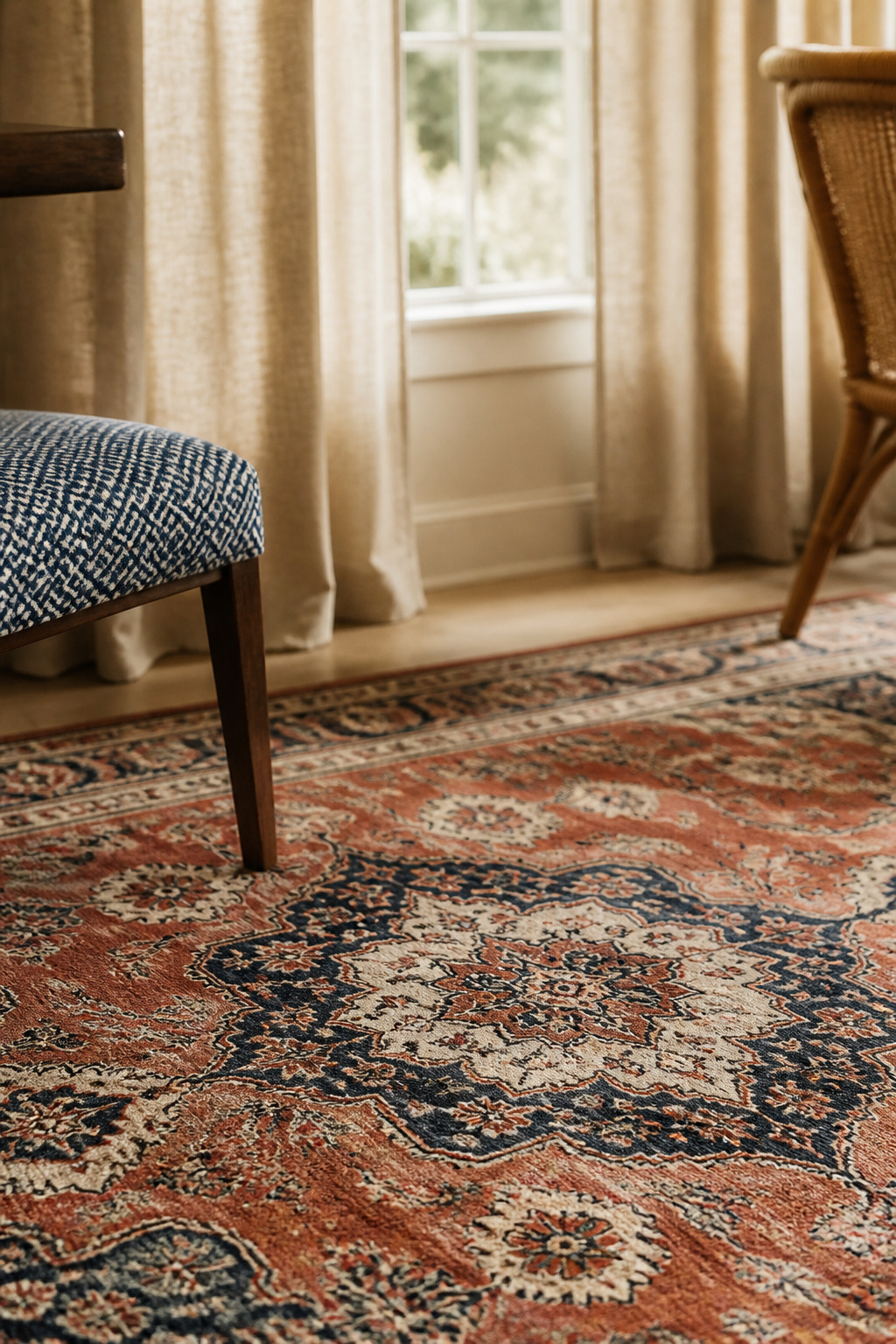
The scale rule: vary motif size across rug, curtains, and upholstery
The scale rule is the most important guideline in pattern mixing. Pair a large-scale motif on one surface with a medium and a small on the others, so the eye has a hierarchy to climb. If the rug carries a large floral, move the curtains to a small geometric and the cushions to a medium stripe — or to plain. One large pattern should dominate so the focus stays clear; two large patterns competing at the same register is the most common failure. The professional ceiling is three active patterns in any one dining area.
Linking patterns with a shared hue
Scale lets patterns coexist; color makes them belong together. Find one or two colors that appear across all your patterns and repeat them — a navy in the rug, picked up in a curtain stripe and a chair cushion — and you create rhythm without requiring the motifs to match. The rug usually sets that conversation, since it is the largest patterned element and its palette suggests what everything above it should echo. A bold rug asks for plain or subtly textured curtains; a graphic curtain becomes the statement in a solid-rug room. For anyone nervous about clashing prints, mixing tactile materials — a flat-weave rug, a linen curtain, a velvet chair — adds depth at lower risk. The full rule set lives in our guide to mixing patterns and textures.
Lighting as the Eclectic Room’s Permission to Be Bold
A fixture that would exhaust in a kitchen — one you faced every morning — belongs here, where the room’s intermittent life lets it delight rather than fatigue. The threshold for “too much” sits higher here than in any room you occupy from morning to night.
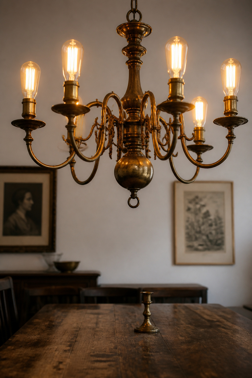
Why dining rooms tolerate a statement or quirky fixture
Because nobody faces a dining fixture at seven in the morning, it can be the conversation piece a kitchen overhead never could. Eclectic lighting leans into this, juxtaposing vintage shapes with modern finishes, ornate detail with minimalist form — a fixture that both lights the table and demonstrates the room’s commitment to curation over safe matching. The single technical rule holds regardless of style: hang the lowest point of a chandelier 30 to 36 inches above the table on a standard 8-foot ceiling, adding 3 inches for every additional foot of height, and keep its diameter to half or two-thirds of the table’s width, never more.
Mixing pendant styles and heights over the table
Over a long table, a run of two or three pendants often beats a single centred chandelier, distributing warm light across the full length and introducing rhythm rather than emphasis. Play with their drops and shapes, but unify them — a shared finish or bulb type keeps a glass pendant and a metal cage from reading as an incomplete set. Mixing materials across the ceiling plane, from aged bronze to hand-blown glass to woven rattan, gives the room its own texture overhead.
Using patina and aged brass as a unifying thread
Aged, unlacquered brass develops a living patina, and that warm evolving tone is the most naturally compatible metal for an eclectic room — it answers the worn-in quality of vintage pieces rather than fighting it. Spread one finish through the room — fixture, candlesticks, cabinet hardware, a mirror frame — and you create a visual circuit that holds diverse furniture together without requiring any of it to match. When you mix metals, distribute each finish throughout and contrast boldly: brass with matte black reads as intention, where satin nickel beside polished chrome reads as a near-miss. The fixture-level depth is all in our guide to eclectic dining room lighting.
Building an Eclectic Gallery Wall in the Dining Room
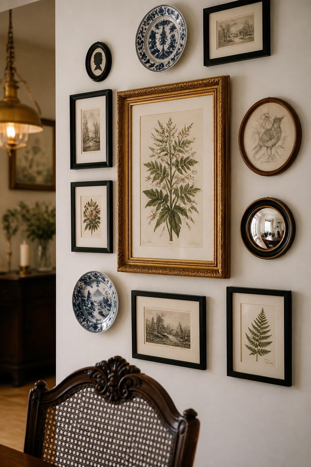
The walls are where the room’s collecting story becomes literal. An eclectic gallery wall is built on an anchor and filled outward — and like every other layer, it lives or dies by a connecting thread carried through frames, art and objects.
Anchoring with one large piece, then filling organically
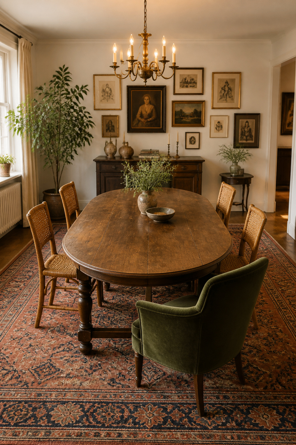
Start with the largest piece, positioned slightly off-centre, then balance outward with pairs of similar sizes — this gives the wall a clear focal point rather than a random scatter. A gallery needs five to seven pieces to register as a collection, with a deliberate mix of scales: one or two large anchors, two or three medium works, two smaller accents. Keep 2 to 3 inches between neighbours so the group reads as one composition. Above a buffet, the lowest frame sits 6 to 12 inches above the surface, and that clearance supersedes the museum standard of centring art at 57 inches.
Mixing frame styles and art types with a connecting thread
Three frame styles is the accessible entry point — a black, a white, a natural wood — repeated across the wall for rhythm. The connecting thread should be one of: a shared finish family, a shared profile weight, or a shared mat color. Vary on all three axes at once and the wall goes chaotic instead of collected. Mixing vertical and horizontal pieces keeps the arrangement alive, and a held thread is what lets a period gilt frame hang beside a slim modern one without either looking marooned.
Adding dimensional objects: plates, small shelves, mirrors
Flat frames alone stay flat. Dimensional objects — decorative plates, a small mounted shelf, mixed mirrors in round and oval and rectangle — give the wall a depth print arrangements cannot reach. Plates earn a particular place in a dining room, where the table connection makes them native rather than imported, and an inherited china collection turns the room’s collecting story into something you can read on the wall. The full method, including the floor-template discipline, is in our guide to build a dining room gallery wall.
Mismatched Dining Chairs: The Seating Mechanic That Defines the Look
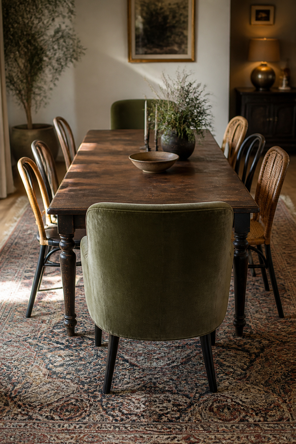
If one feature says eclectic dining room more than any other, it is the mismatched chairs — the most searched and most defining move of the whole style. The mechanic looks free-form but rests on one non-negotiable rule.
Equal seat height as the non-negotiable rule
Seat height is the hidden detail that holds a mixed set together. As long as every diner sits at the same level, One Kings Lane notes, you are “free to mix and match styles with abandon.” Standard dining chair seats run 17 to 19 inches from the floor, pairing with a 29-to-30-inch table for the 10 to 12 inches of clearance comfortable dining needs. Let the seat heights vary, though, even by an inch or two, and the whole arrangement looks uneven — the chairs read as collected mistakes rather than collected intentions, however lovely each one is on its own.
The head-chair anchor and the two-end-chairs starter move
The lowest-risk way in is to change only the two chairs at the ends of the table — the composed, symmetrical move that always reads as intentional while asking just two chairs to differ. From there, the classic formula is armchairs at the heads as anchors and armless side chairs along the flanks, which establishes a hierarchy and seats more people per linear foot. Working in pairs is the cohesion shortcut: two velvet chairs at the heads, two rattan on one side, two wooden on the other reads as three coordinated styles, not six unrelated ones.
Repeating one color or finish across a mixed set
A repeated finish turns a grab-bag into a set. Painting every frame the same color, or reupholstering thrifted chairs in one closely related fabric, is the fastest way to unify different silhouettes — the same logic as repeating a metal finish across light fixtures. That consistent thread supplies the visual grammar that marks the arrangement as a collection. The complete seating playbook, including the reupholstery route, is in our guide to mixing mismatched dining chairs.
Choosing a Color Palette That Holds the Mix Together
Everything above depends on the palette — the true engine of eclectic cohesion. A mixed room can carry enormous variety in shape, age and material precisely because color is doing the quiet work of holding it all together.
Picking the shared hue that repeats across every element
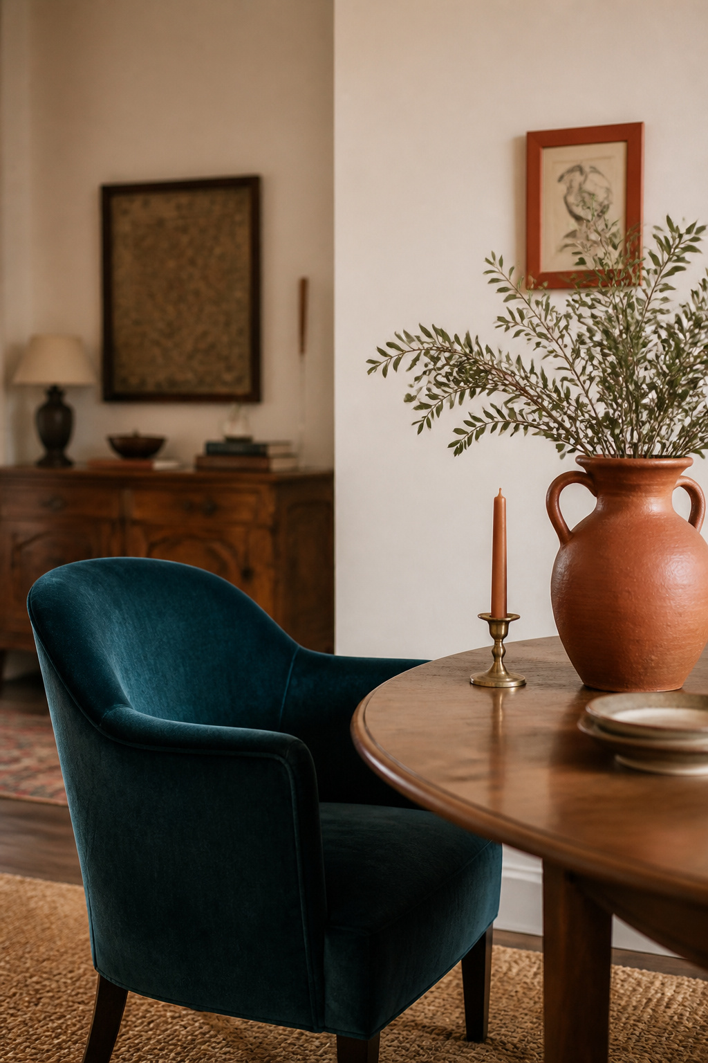
The professional standard is the 60-30-10 rule: roughly 60 percent of the room in a dominant hue, usually neutrals on the walls and floor; 30 percent in a secondary color on the main furniture; 10 percent in an accent that repeats across cushions, objects, lamps and artwork. That 10 percent is what most people picture as “the eclectic color” — a terracotta, an emerald, a deep navy — but its impact depends entirely on repetition. A single terracotta cushion reads as leftover stock; the same terracotta in a cushion, a small artwork and a ceramic vase reads as a deliberate thread. Pulling that accent from within the rug is the most reliable starting point.
How many colors an eclectic room can hold
The working ceiling is three colors — a dominant, a secondary and an accent — though each can appear in several tones. Most eclectic palettes fall into a handful of recognisable types:
- Neutral-plus-one-accent — a neutral backdrop with a single bold hue repeated; the most forgiving and easiest to keep cohesive.
- Tonal / monochrome — one color family across multiple depths, where variety comes from material and texture rather than hue.
- Warm-undertone collected — pieces spanning eras unified by a shared amber undertone (warm whites, honey oak, brass, terracotta).
- Complementary accent pair — two accents from opposite sides of the wheel (terracotta and teal), held in check by a generous neutral majority.
To grow a palette, add one accent at a time and live with it for two weeks before deciding, rather than introducing three new colors at once.
Anchoring with neutrals so bold accents read intentional
Neutral walls are the eclectic room’s essential quiet backdrop. If the walls carry their own bold color or pattern, every varied piece competes with them instead of being displayed against them. As Kate Hartman puts it, “If you have bold, patterned pieces, opting for a neutral-coloured wall will prevent the space from feeling too chaotic.” The neutral majority also makes the accent feel bold rather than merely present, and it gives the eye a place to rest. The full selection method is in our guide to choosing an eclectic color palette.
Assembling the Look on a Budget: Thrifting and Vintage Sourcing
The eclectic look and the affordable look pull in the same direction. Its collected-over-time quality is most convincingly achieved by actually collecting over time — from thrift stores, estate sales and consignment shops rather than a showroom.
Which pieces deliver the most visual impact when thrifted
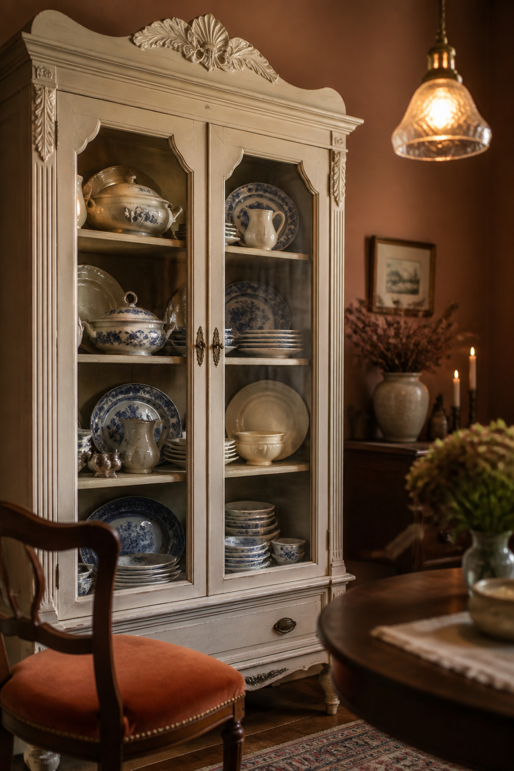
A few categories punch far above their price secondhand. Vintage wooden dining chairs are plentiful, durable when solid-wood, and transform with new upholstery for very little. China cabinets are a high-impact centrepiece, far cheaper at thrift than at consignment. Vintage pendants and table lamps carry a patina that new budget lighting cannot match. Emily Henderson’s roughly eighty-percent-thrifted reveal proved it: a cohesive eclectic room never required a matched set — the repeated threads did the unifying a showroom suite would have charged you for.
What to buy new versus secondhand in an eclectic room
The split is structural. Buy secondhand: hard casegoods, lighting, decorative objects, and solid-frame seating you can reupholster. Buy new: the rug, where hygiene and durability favour it; curtains, where sizing precision matters; and any upholstered seating with a foam core you cannot inspect, since old foam degrades unseen. Hold a repeating thread in mind before you shop, or the finds will not cohere at home.
Real costs: chairs, lighting, china cabinet, dinnerware
Treat prices as typical ranges that vary with your local market, not fixed figures — but they are directionally clear and encouraging. Thrift dining chairs commonly run $10 to $100 each; china cabinets $25 to $200 at thrift against $500 to $2,500 at consignment; vintage pendants $20 to $80. Mismatched vintage dinnerware at a dollar to five dollars a piece builds a collected table setting no retail set can match for personality. Check your own market first, and the full sourcing strategy is in our guide to pull the look together on a budget.
Eclectic Ideas for Small Dining Rooms and Dining Nooks
Small is relative — a nook off a kitchen, a tight room, a corner doing the work of a dining room — and the eclectic method does not break at that scale. It runs at edited intensity: fewer pieces, each chosen more carefully, discipline turned up rather than variety turned down.
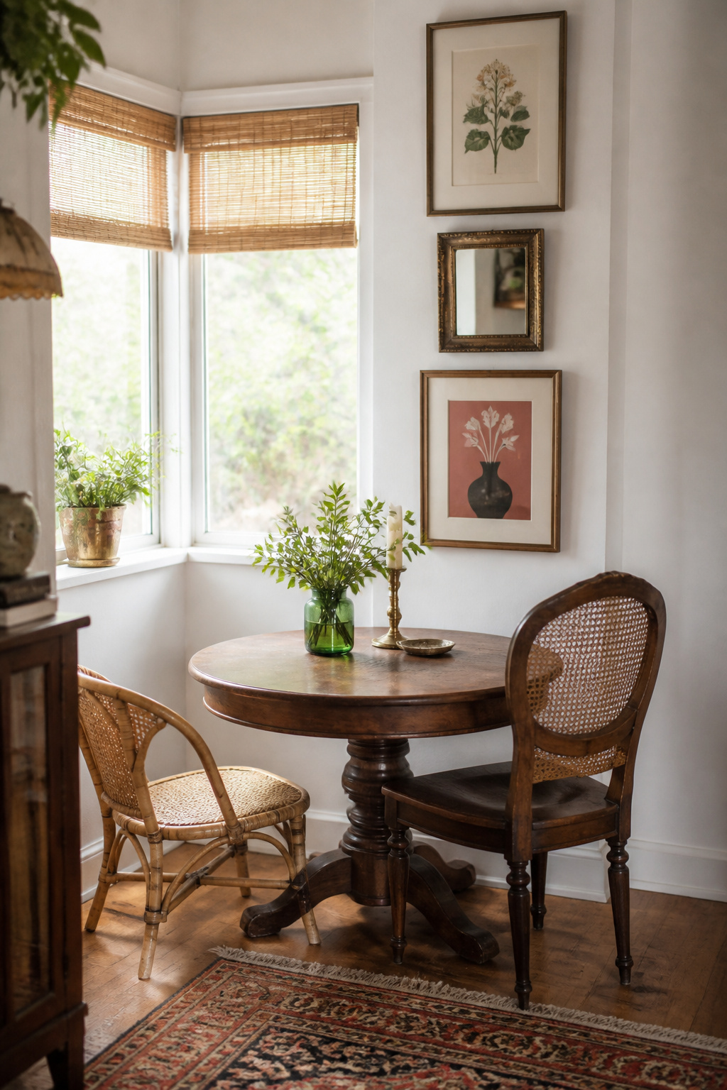
Editing the mix so a small room reads collected, not cluttered
A large room hides mediocre choices in its corners; a small one shows every piece at once, which forces a sharper editing eye. Favour multi-functional pieces — a cabinet that stores linens, a sideboard that serves as a bar — and apply a one-in, one-out discipline. Mismatched chairs are quietly an advantage here: a matched set reads heavy and formal, where lighter-framed rattan, cane or bentwood chairs reduce the visual mass and keep a tight room breathing. A round pedestal table helps flow, with no sharp corners or corner legs to navigate.
Scaling pieces and the gallery wall vertically
A small room is short on floor area but rarely short on height, so claim the wall. Hanging art from mid-wall up toward the ceiling draws the eye upward and makes the room read taller, and a vertical column of frames suits a narrow wall far better than a horizontal scatter. Scale the fixture to the diners, not the footprint: a pendant hung at the correct 30-to-36-inch height reads in proportion to the people at the table regardless of ceiling height, and oversizing a fixture for a small room is the more common, more damaging error.
Using palette and light to keep a busy small space breathing
Pale or white walls are the primary tool for keeping a small eclectic room from tipping into clutter — they reflect light downward and supply the neutral backdrop that lets varied pieces read as collection. Limit the accent to a single hue rather than the two a larger room can carry, since two accents compete for attention in a small visual field. Mirrors bounce light and apparent depth around the room, and curtains hung high and wide make the windows look larger. The full editing discipline is in our guide to eclectic ideas for a small dining room.
For all its variety, an eclectic dining room comes down to a handful of principles easier to hold than the catalogue-perfect alternative. Choose one repeated element — a color, a finish, a curve — and carry it through every piece. Anchor with one dominant focal point and let everything else orbit it. Hold the palette to three colors of a shared undertone, with neutrals doing most of the work so the accents can be bold. Vary scale deliberately, in pattern and art alike, and give the eye places to rest. The mistakes that undo these rooms are the mirror image: adding without a thread, letting every piece compete to be the showstopper, abandoning the palette discipline. Do the opposite, and the room reads exactly as the word always promised — selected, not accumulated, and unmistakably yours.