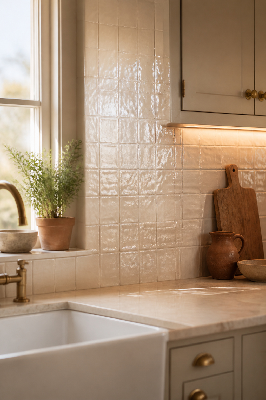
Step into the kitchen at eight in the morning and the wall behind the sink is already doing something. Light comes in low from the left, and the cream tiles don’t return it evenly — the glaze pools thicker at one edge and thins at another, so the surface reads as a field of soft glosses and quiet shadows that shift as the sun climbs. That living quality is what people mean when they call a farmhouse kitchen warm. It is a choosable set of materials, not a mystery, and the choosing is what separates an authentic farmhouse kitchen backsplash from a themed one.
TL;DR
- Handmade-look tile carries the warmth: zellige (hand-glazed, $18–$28/sqft) or cream handmade subway in running bond catch light unevenly the way factory tile can’t.
- The details sell it — warm grey or beige grout (not white), a bullnose or pencil-liner edge (not metal), and a wood transition rather than tile-to-drywall.
- One material with real character beats three themed ones; for renters, framed peel-and-stick is the budget route, kept 12 inches clear of burners.
Stand in a Farmhouse Kitchen That Feels Lived-In
Before any tile decision, name what you are actually chasing. Farmhouse warmth is felt before it is specified, and almost all of it traces to one thing: how the surface meets the light.
The light on an uneven glaze
A factory tile reflects light uniformly — one angle, the whole face at a single brightness, which is why it reads as inert. Handmade glazed tile does the opposite. Its surface relief and pooled glaze give a backsplash what one tile maker calls a “lively, almost glowing quality,” reacting differently through the day as light shifts angle. Designer Danielle Chiprut of Danielle Rose Design Co. is direct about the lever: “Lighting also makes a huge impact — sconces or picture lights can turn a backsplash into a true feature moment.” Texture supplies the warmth; light amplifies it.
Why character can’t be printed
This is the part lookalikes can’t fake. Hand-cutting leaves variation in thickness and slight undulation, and that physical relief casts the shadow lines between tiles. A printed texture has no relief, so it casts no shadow — the eye reads it as flat however convincing the photo. Tile designer Deb O’Connor puts it plainly: handmade tile against machine-made is “grandma’s homemade chocolate cookies vs store-bought.” The imperfection is the feature, not a flaw to forgive.
Authentic versus themed
Here is the antagonist: the costume kitchen. Assemble every farmhouse signifier — apron sink, open shelving, barn hardware — and you can still land on a stage set if no single surface shows evidence of how it was made. Designer Rebecca Hughes notes that 2026 demand is for tiles “with texture and tonal variations that create a truly unique finish.” Choose one surface that carries its own making and the room stops performing farmhouse and starts being it. The overview of kitchen backsplash styles and materials is the wider map; this article walks the warm corner of it.
The Handmade-Look Tiles That Carry It
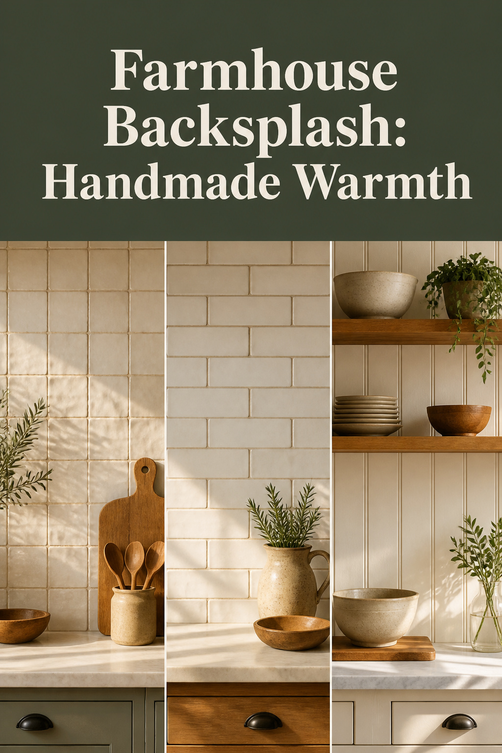
Three material families deliver that warmth, mapping to budget and how loudly the backsplash speaks. Zellige commands attention; handmade subway sits in the middle; beadboard recedes into the cabinetry.
| Material | Why it reads warm | Material cost |
|---|---|---|
| Zellige | Hand-glazed, kiln-fired colour variation; highest character | $18–$28/sqft (imported Moroccan) |
| Handmade subway | Variable thickness casts shadow at every joint | Mid-price, domestic producers |
| Beadboard | Painted vertical grooves; recedes as backdrop | MDF $0.80–$1.00/sqft; PVC for stove zone |
Zellige and its irregular glaze
Zellige earns its character honestly. It comes from Fez, with craft origins in the 10th century: each tile is shaped by hand from local clay, sun-dried, hand-dipped in glaze, and fired overnight in a beehive kiln fuelled by olive branches — the volatility of that firing is the source of its colour depth. UNESCO recognises the craft as intangible cultural heritage; the provenance is documented, not marketing. Standard kitchen sizes are the 4×4-inch square or 2×6-inch bejmat. Before installing, mix tiles from several boxes so the variation spreads evenly rather than clustering.
Classic and handmade subway
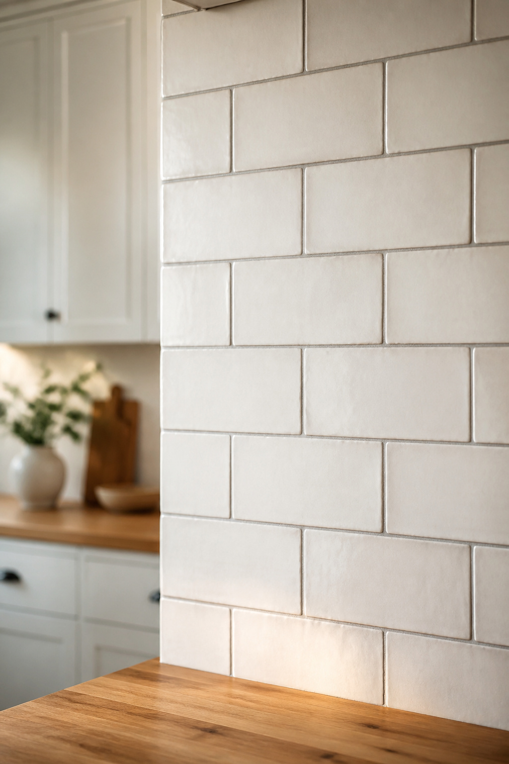
Subway tile is the most accessible route into this warmth, but only the genuinely handmade version carries it. Machine subway holds a consistent quarter-inch thickness; handmade tile varies across its face, throwing shadow at the grout joint. For farmhouse work, cream or off-white in running bond — the period-honest pattern for the pre-1950 era these kitchens invoke — sits beautifully against wood and stone. Layout and grout are their own deep subject, which my subway and handmade tile guide covers in full.
Brick and beadboard alternatives
Two structural alternatives round out the field. Thin brick tile — roughly 0.3 to 0.5 inches thick in standard brick proportion — gives genuine masonry texture on ordinary backsplash substrate without structural weight. Beadboard is the budget answer: painted vertical grooves that recede as backdrop rather than announcing themselves, with a DIY run costing as little as $30 in materials. Behind the stove, use moisture-resistant MDF or PVC rather than plain wood; PVC wipes clean without warping under steam and grease.
Grout, Edge and Trim: The Details That Sell It
Most people choose the tile and stop. But the line between authentic and themed runs through three details nobody plans first: grout colour, edge treatment, and how tile meets cabinetry.
Grout colour for an aged look
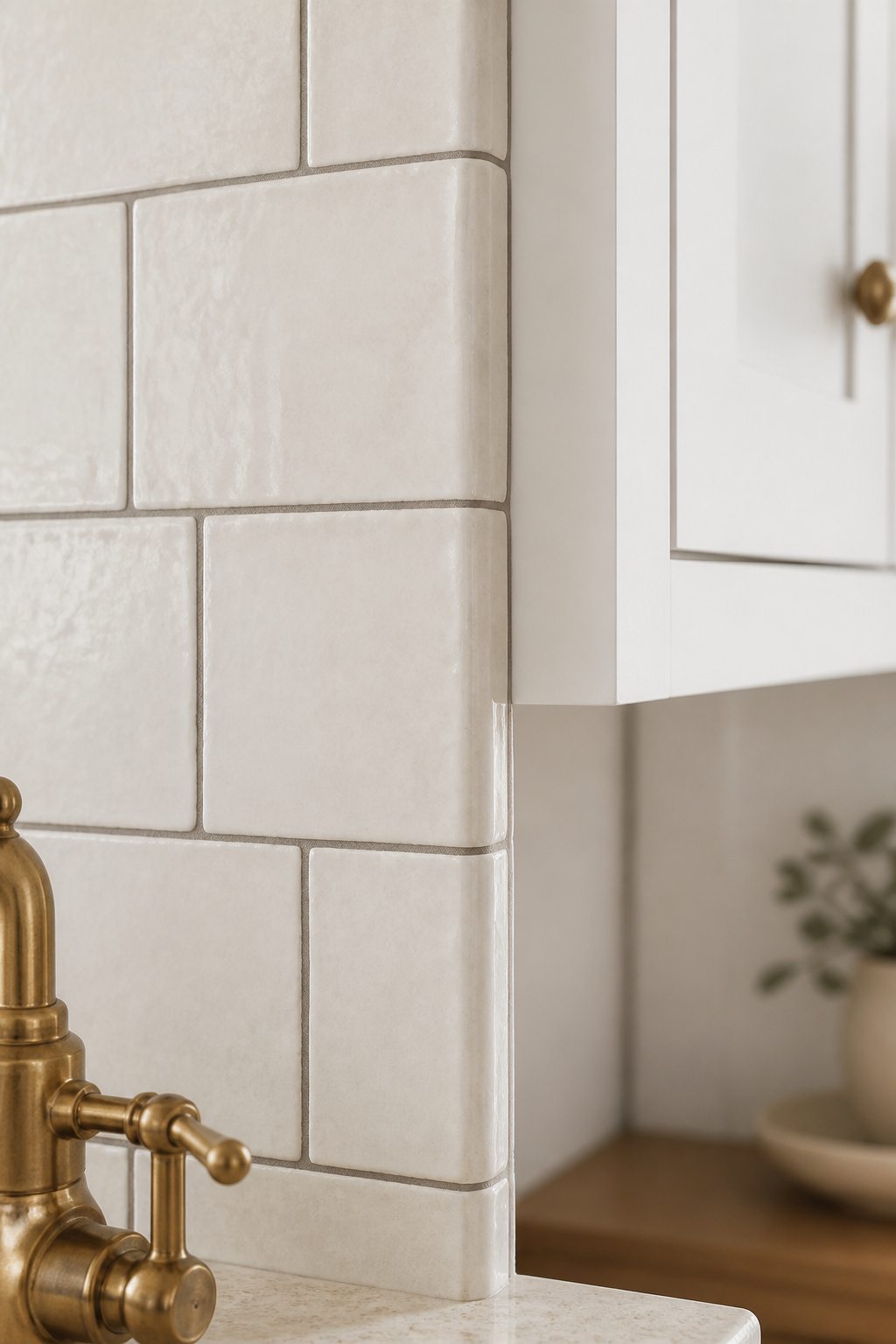
Grout is where good tile gets undone. White grout against cream tile creates a harsh contrast that fragments the wall and makes every handmade irregularity read as a defect. Match the undertone: warm tile wants warm grout. For cream subway, reach for Mapei Warm Gray — a neutral grey with a faint beige cast that reads softer than white. Beige tones like Biscuit work where the tile leans warmer. For zellige, the joint should be 1/16 inch or less; Riad Tile recommends Mapei Ultracolor Plus FA, a fine-aggregate polymer-modified formula whose particles are too fine to scratch the glaze — conventional sanded grout would.
Honest edges over crisp modern ones
The edge treatment quietly dates the whole job. A bullnose tile — one factory-rounded edge in the same glaze as the field — closes a backsplash cleanly and reads continuous to the boundary: the period-honest finish. A brushed-nickel or chrome metal profile does the contemporary job instead, wrong against handmade tile — it pulls the register out of farmhouse. Where bullnose pieces aren’t available, a pencil liner in a matching glaze does the same work. Avoid a raw cut edge at a window return; the unglazed body reads unfinished however good the tile.
Wood and trim transitions
Tile meeting drywall reads modern; tile meeting wood reads farmhouse. A narrow strip of aged timber framing the field, or a wood chair-rail cap at the top of the run, gives honest material contrast — common in 1900–1940 kitchens. Open wood shelving above lets the tile read as one continuous surface. At the countertop joint, colour the caulk to match the grout, not the counter; white caulk against a warm wall breaks the read every time.
Keeping It Warm, Not Costume
Farmhouse tips into costume from too much — barn-red brick behind shiplap behind a chalkboard sign above a rooster border, each element shouting the same word until the room becomes a theme park. The principle that rescues it is restraint.
The restraint rule
One material with genuine character does more work than three themed ones combined. A surface that carries its own narrative needs no reinforcement — reinforcement undercuts it. Zellige already tells a thousand-year story in its glaze; surround it with barn-wood shelving, vintage signage and mason jars and you bury that story. Let the high-character surface lead and keep everything around it understated: plain cabinetry, warm hardware, quiet walls.
Modern farmhouse vs cottage
It helps to know which farmhouse you are building. Modern farmhouse is pared-back and higher-contrast — crisp whites, warm creams, soft greys, the backsplash usually off-white with a grout joint that reads as a clean grid. Cottage is the softer, lower-contrast cousin: dusty sage, blush, antique cream, more willing to carry colour or pattern. The same handmade tiles serve both; the surrounding palette and styling separate them. A cottage-leaning kitchen often benefits from beadboard painted soft sage, letting the colour carry the warmth where modern farmhouse leans on the tile’s texture.
A renter-friendly version
If you can’t install tile, a credible budget route exists. Peel-and-stick in farmhouse subway patterns runs roughly $3–$15 per square foot against $15–$40 for installed tile. Two caveats: keep it at least 12 inches clear of active burners — adhesive fails above roughly 150°F — and apply it in a framed section between counter and cabinets, since the printed grout line reads flatter than a real joint. For the full performance picture and clean removal, my colleague Tess covers the renter-friendly farmhouse option in detail.
Your Warm Wall, Within Reach
Come back to that eight-in-the-morning wall. It is no longer an abstraction — it is a scheme you can name, order a sample of, and live with.
A scheme you can picture
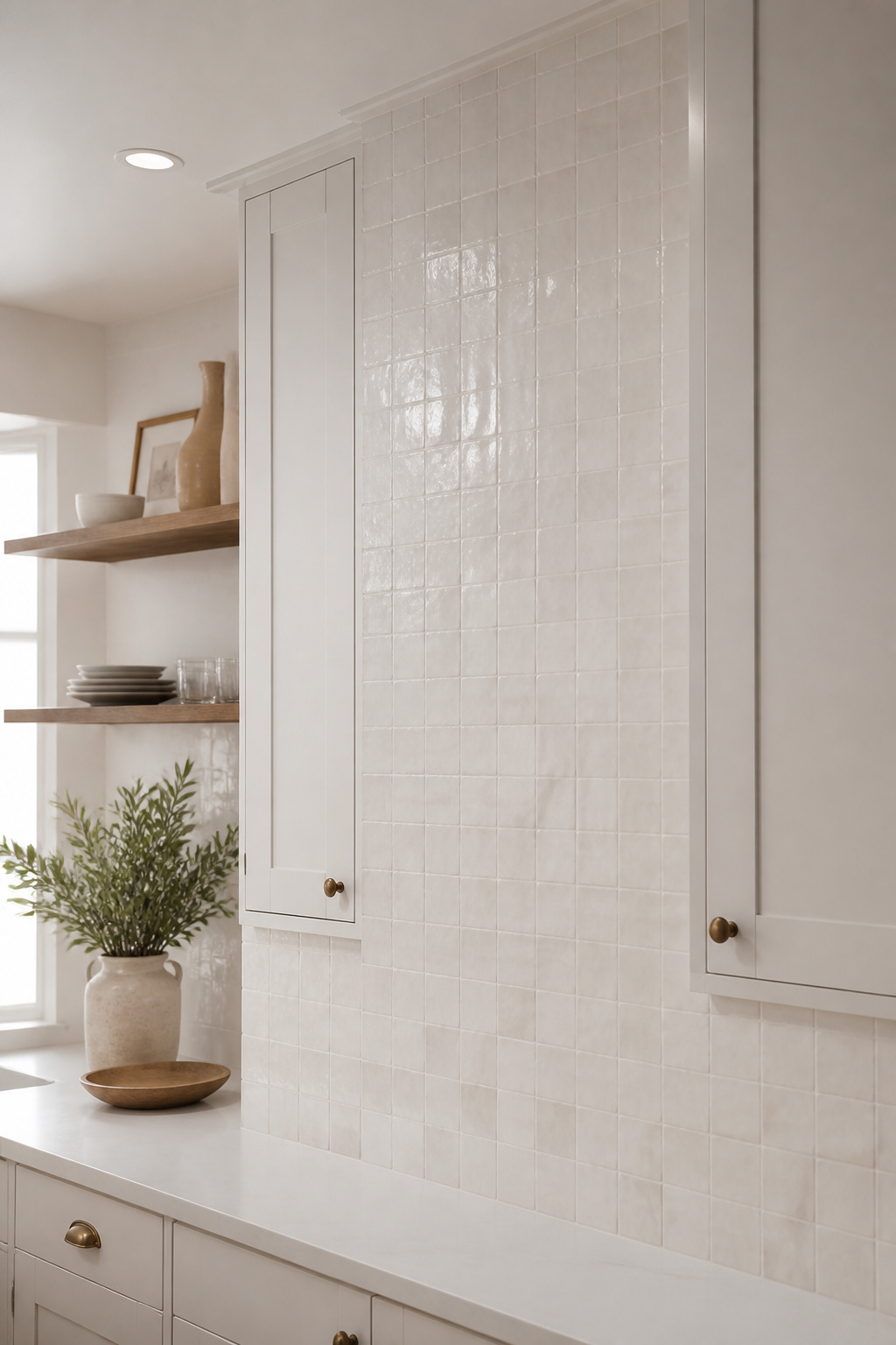
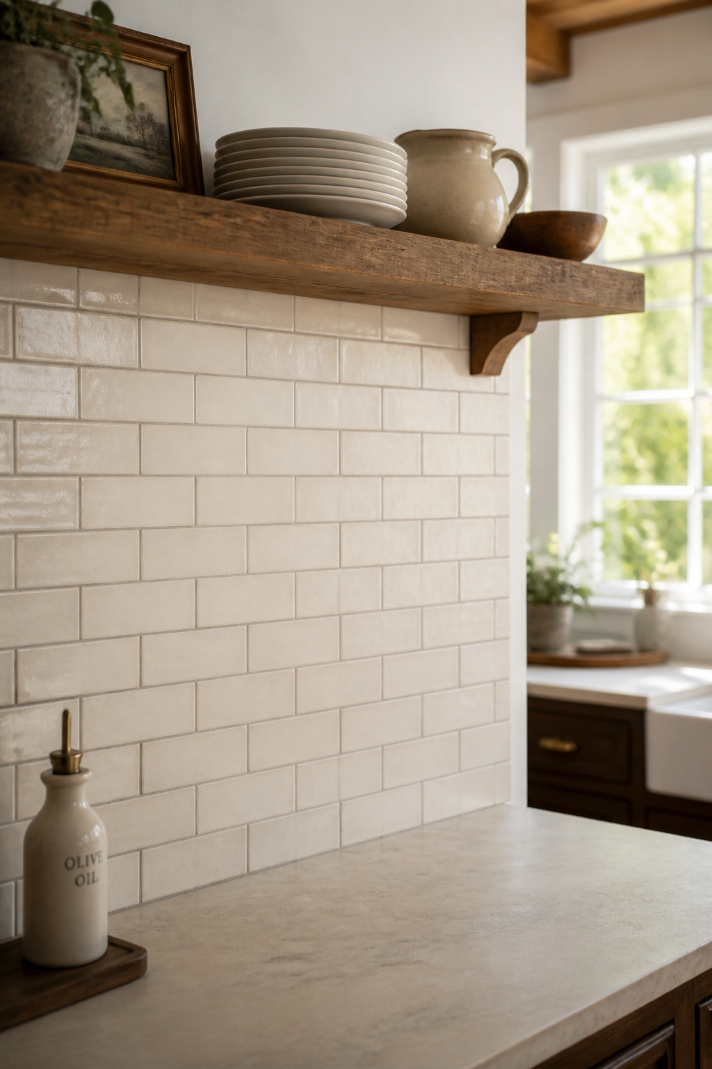
Three schemes cover most kitchens. The highest character: zellige in cream with Mapei Warm Gray grout and a bullnose edge. Mid-price: handmade subway, 3×6 cream in running bond, same warm grout, bullnose edge. Budget: PVC beadboard painted Sherwin-Williams Alabaster (LRV 82) capped with a narrow wood chair rail. Across all three, the grout rule holds: match the undertone, and avoid cool greys against cream.
The first sample to order
Don’t commit from a screen. Every major supplier sells samples for $5–$15; order two or three and test them on the actual wall in both morning and evening light. For zellige, request samples from different batches — colour varies meaningfully across production runs. Hold the sample at countertop-to-chest height, where the tile will actually live, not flat on a table.
Living with it day to day
Each material has one upkeep habit. Zellige’s pitted glaze catches grease near the cooktop — apply a penetrating sealer on installation and re-seal annually; cleaning becomes a damp-cloth job. Glazed handmade subway is as easy to wipe as machine tile; the variation is on the surface, not in the porosity. Painted beadboard behind the stove wants a durable enamel and a weekly wipe, since the grooves collect more residue than a flat face. Choose the material whose upkeep you’ll actually keep, and the warm wall stays warm for the next steward of the kitchen as much as for you.
FAQ
What backsplash works best for a modern farmhouse kitchen?
White or cream zellige tile (4×4-inch square or 2×6-inch bejmat) is the strongest choice — its handmade glaze variation delivers warmth while the neutral colour keeps the palette clean. Handmade subway in cream with warm grey grout is the budget-friendlier alternative. Either way, pair one high-character tile with understated cabinetry and warm hardware.
Is zellige tile good for a kitchen backsplash?
Yes. Zellige’s glazed surface wipes clean, and its narrow 1/16-inch grout joints collect less residue than standard joints. Apply a penetrating sealer on installation and re-seal annually near the cooktop, where cooking oil can penetrate the pitted glaze. Avoid zellige on floors — its wet-slip rating is too low — but as a wall backsplash it performs well.
What grout color looks best with farmhouse tile?
Warm grey — Mapei Warm Gray is the most-cited professional pick — suits both off-white zellige and cream handmade subway. It reads softer than white and won’t fragment the wall with harsh contrast. Match warm tile to warm grout; a cool grey against cream reads sterile. Test samples against your actual tile under the kitchen’s own lighting before committing.