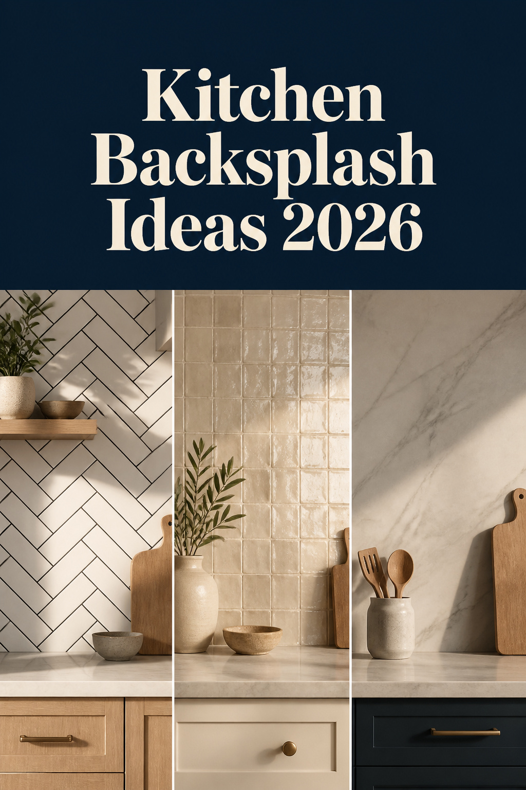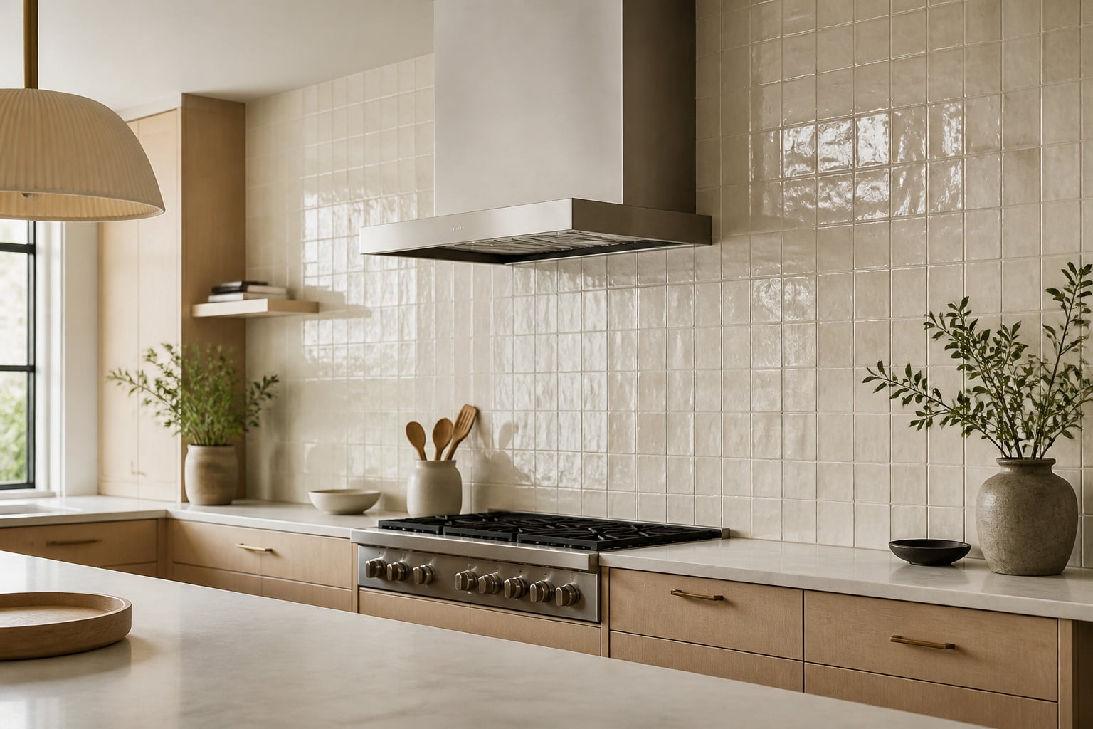

Open a folder of kitchen backsplash ideas and you will find a hundred walls that all look right. Cream tile in warm light. A dark grid behind a stove. A pale slab running unbroken to the ceiling. Each one is somebody’s finished kitchen, and not one of them tells you whether it belongs in yours. That is the real difficulty with this topic. The pictures are everywhere and the decision logic is nowhere, so the more you scroll, the less you can choose.
The question I am asked most is not “which tile is best.” It is “why can’t I pick one?” The answer is that a gallery hands you the result of three separate decisions and labels none of them. This guide does the opposite. It pulls those three decisions apart, walks each one at survey depth, and points you to the deeper article when you are ready to commit. You will not leave with more options. You will leave with a shortlist.
What a Kitchen Backsplash Actually Has to Do
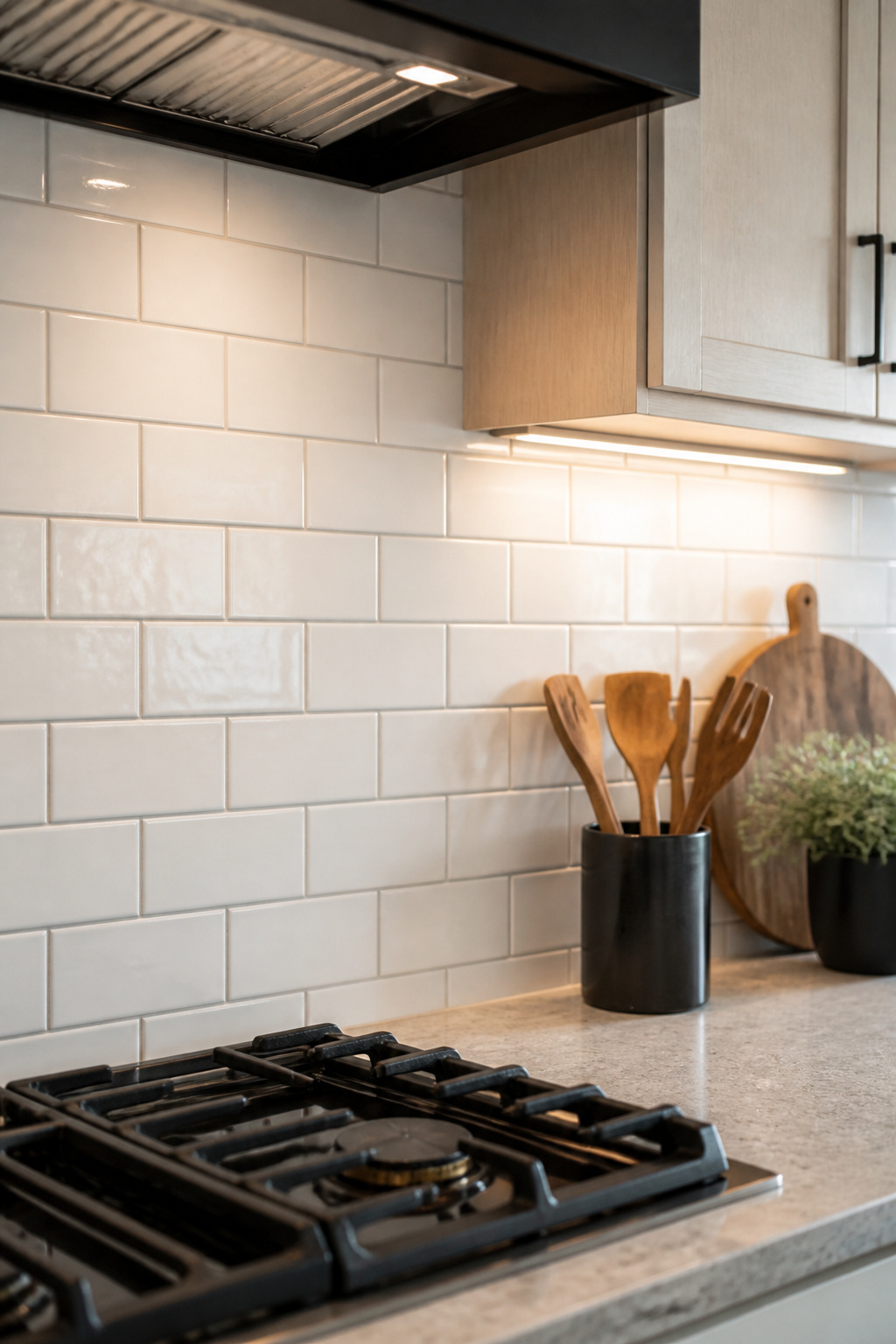
Before any of the pretty choices, the wall has a job. A backsplash seals the surface between your countertop and your upper cabinets against water, steam, grease and food splatter. It is a protective surface first and a decorative one second — and the order matters, because a backsplash chosen only for looks will fail at the part nobody photographs.
Protection first: the splash zones that matter
Three zones take nearly all the punishment. Behind the sink, water is constant. Directly behind and beside the cooktop, heat and grease land hot. The main prep counter catches everything else. The standard gap you are protecting is 18 inches of wall between counter and cabinet, with around 30 inches of clearance up to a range hood — those two dimensions define how far the splash zone reaches.
Material follows from this, not from a mood board. Behind the range, non-porous surfaces — porcelain, glass, quartz, stainless steel — win, because grease cannot soak into a face it cannot enter. Grout is the weak point everywhere: standard cement grout is porous and stains over time, so it should be sealed or specified as epoxy in the high-grease zone. None of this is glamorous. All of it decides whether the wall still looks good in five years.
The three decisions hiding inside every photo
Here is the reframe that makes the whole topic manageable. Every backsplash photo you have saved encodes three independent decisions: which material family, how high to run it, and which style direction. The image shows you all three at once and names none of them, which is exactly why comparing photos feels like work that goes nowhere.
The useful part is that these three decisions are orthogonal — they do not constrain each other. You can run a modern large-format material at a modest standard height in a warm farmhouse kitchen, and nothing about that combination contradicts itself. So instead of choosing between finished walls, choose along three axes one at a time. Material. Height. Style. Decide each, and the wall assembles itself.
Why most galleries don’t help you choose
A gallery is built to inspire, not to decide. It shows hundreds of rooms with no criteria to test against your own, which is why most people end up defaulting to the most-pinned image — a kitchen whose cabinet colour, counter and light may look nothing like theirs. The image was never wrong. It was just answering someone else’s three questions.
So treat the rest of this guide as the labels the galleries left off. Each section takes one decision, gives you enough to make it, and hands you to the article that goes deeper. The overwhelm is not your taste failing you. It is three unlabelled decisions wearing one photograph.
Start With the Material, Not the Look
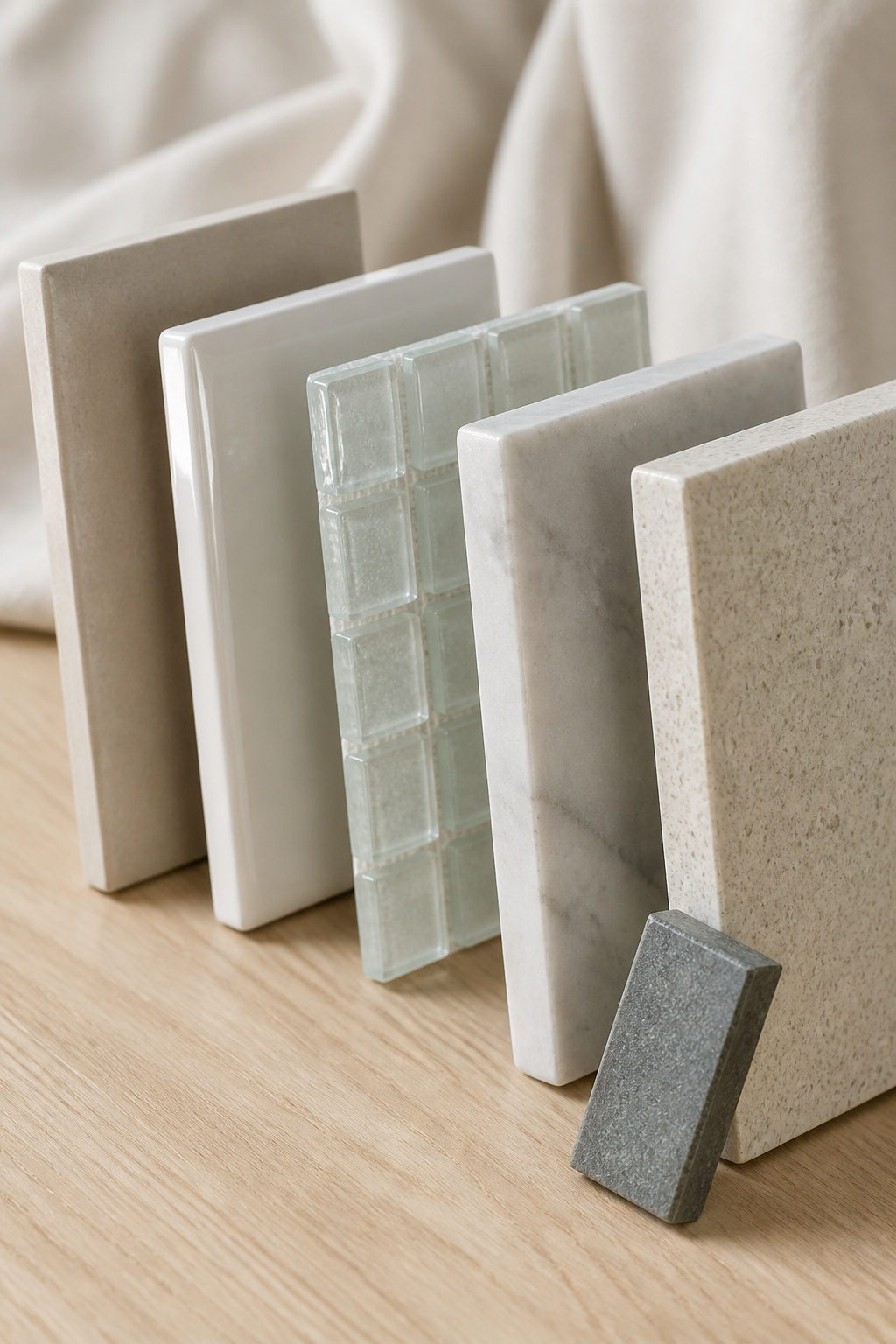
The instinct is to choose what you like the look of and work backwards. Reverse it. Ask first what you want this wall to be — a surface you forget about, or a material you are happy to maintain — and the material family answers itself before aesthetics enter the room. Five families cover almost every kitchen.
The five material families at a glance
Ceramic, porcelain, glass, natural stone and quartz slab differ less in looks than in behaviour. Here they are on the axes that actually decide it, with rough installed cost.
| Material | Durability | Upkeep | Rough installed cost (per sq ft) |
|---|---|---|---|
| Ceramic (glazed) | Good | Low — no sealing | $12–$45 |
| Porcelain | Excellent | Low — no sealing | $16–$60 |
| Glass | Good, shows marks | Low — non-porous | $18–$42 |
| Natural stone / marble | Good to excellent | High — seal twice a year | $30–$150 |
| Quartz / stone slab | Excellent | Very low — wipe only | $80–$100 |
Read it once and the families stop looking interchangeable. Ceramic is the budget-accessible default. Porcelain is the durable workhorse. Glass is the easy-clean light-thrower. Natural stone is beauty with homework. Slab is the seamless premium.
How material drives durability and upkeep
The number that separates ceramic from porcelain is water absorption: porcelain sits under 0.5%, ceramic at 3–7%. That makes porcelain harder and effectively impervious — the standard commercial kitchens demand. Glass absorbs nothing at all and wipes clean with a damp cloth. Natural stone is the opposite case: marble, granite and quartzite must be sealed on install and resealed roughly twice a year, which is a real commitment in an active kitchen. Quartz slab needs no sealing and its dense face lets spills sit rather than soak.
One principle runs underneath all of it. Grout lines are the weakest point in any tiled wall, so the fewer of them, the less cleaning and sealing you sign up for over the material’s life. That single fact quietly favours larger tile and slab whenever low maintenance matters more than pattern.
Match the material to how you cook
Cooking habit decides more than budget here. Cook hard — daily frying, high heat — and you want a non-porous face behind the range: porcelain, glass or quartz. Cook lightly and you have latitude, including handmade and natural materials that need a little care. Andy Kilborn, a handyman expert reviewed by Angi, keeps it plain: “The simplest materials to clean are tile, glass, stainless steel, and ceramic.” If low effort is the whole point, porcelain or quartz slab asks the least of you for decades.
This is a survey, not the full head-to-head. When you are ready to settle this axis properly, compare backsplash tile materials gives each family its own verdict and a pick-this-if rule.
Decide How High to Go
The second decision is the most Googled and the most over-mythologised: how far up the wall the tile runs. There are four practical heights, and each protects a different amount of wall, signals a different level of commitment, and costs a meaningfully different amount.
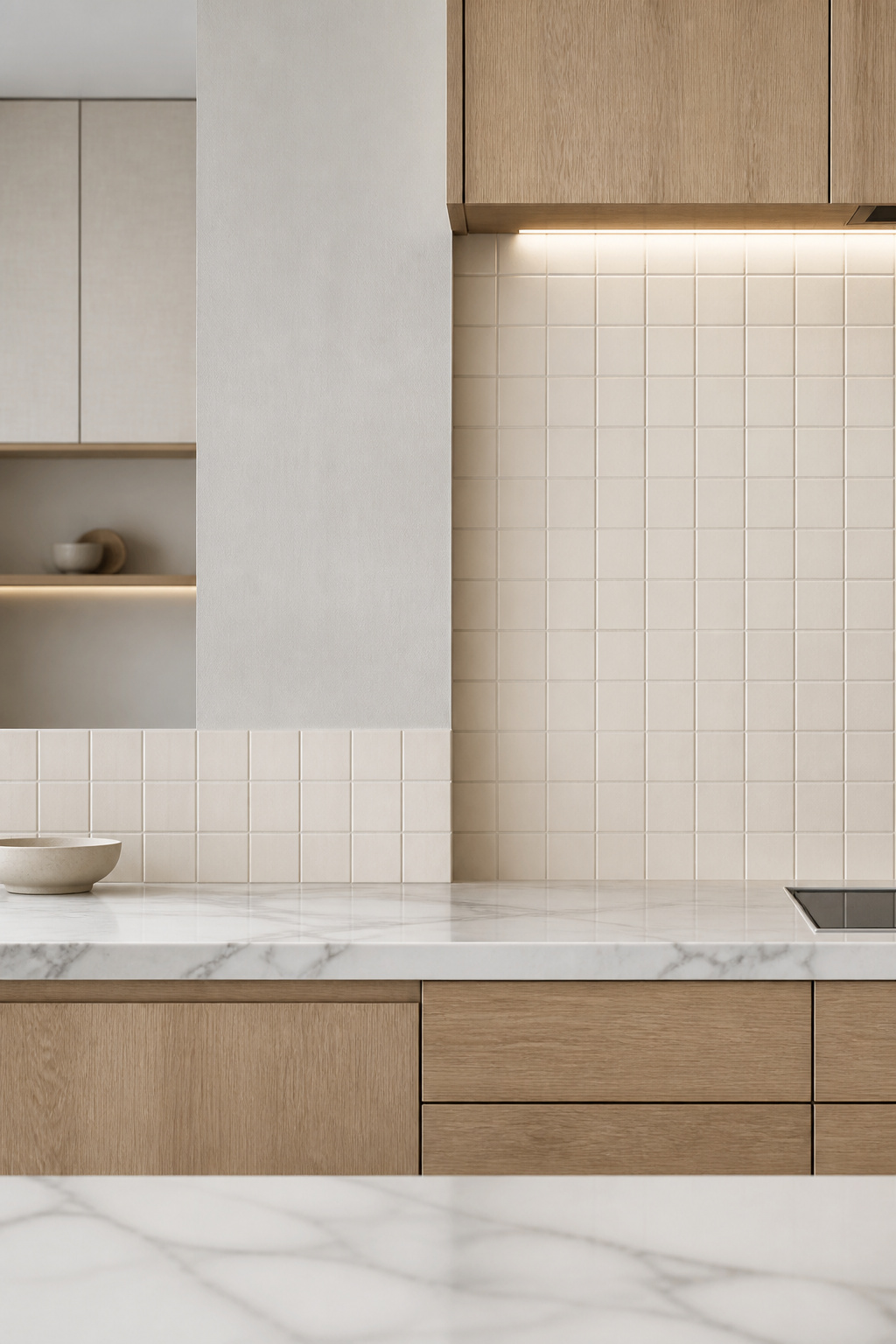
Standard 4-inch, 6-inch, full-height, ceiling
The tiers are simple to hold in mind:
- 4-inch standard — the minimum protection band, often cut from the same stone as the counter, the most common run in US kitchens.
- 6-inch — a slightly more generous ledge, more protection without becoming a tiled wall.
- Full-height to the cabinets — covers the whole 18–24-inch counter-to-cabinet gap, now the popular mid-range upgrade.
- Ceiling — the most architecturally committed option, natural where there are open shelves or no upper cabinets.
A full professional install runs $500–$1,700 for a standard kitchen, with full-height costing more than standard simply because there is more material and more labour.
What height signals and what it protects
A 4-inch band protects the immediate splash zone and reads as practical and finished — not, despite the trend talk, as a builder-grade failure. Full height does two things at once: it covers the wall that condensation and splatter actually reach, and it removes the awkward strip of painted wall between a short ledge and the cabinet that always looks unfinished and never cleans well. Ceiling height goes further, raising the apparent height of the room — genuinely useful under a standard 8-foot ceiling or in a galley kitchen, where a tall run draws the eye up and the space breathes.
The stove-only full-height compromise
Here is the move I reach for most when the budget will not stretch to tiling every wall. Run full height behind the stove only — the zone that needs protection most — and keep a standard ledge everywhere else. The wall behind the range is already a natural focal point, framed by cabinetry and a hood, so treating it differently reads as deliberate rather than partial. It is the most cost-effective way to get the impact of a feature wall without paying to tile the whole kitchen.
That is the axis at survey level. The cabinet, window and proportion rules that settle it — and the full cost picture — are in the guide to how high to run your backsplash.
Subway Tile, and Why It Still Earns Its Place
No backsplash survey is honest without subway tile, because it remains the single most-installed choice and the one most people pick by reflex. It deserves better than reflex. The reason it endures is not the tile — it is that two cheap secondary choices, layout and grout, do almost all the design work.
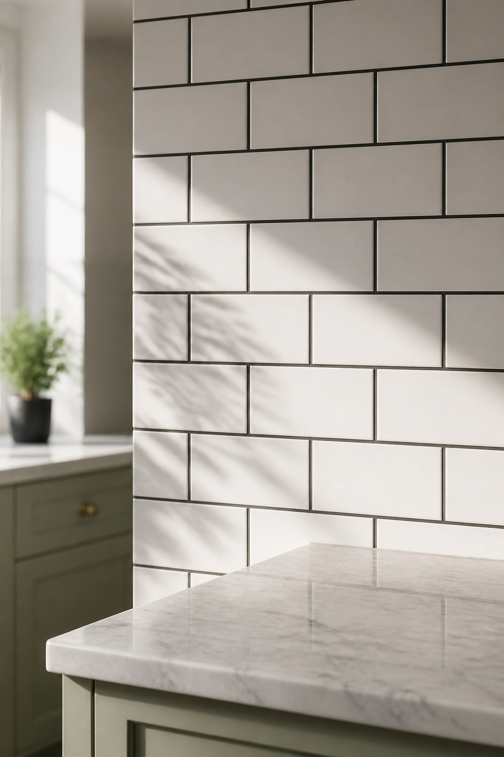
The layout does the work
The same 3×6 rectangle reads completely differently depending on how it is laid. Running bond, the classic offset, is timeless but slides into builder-default without an intentional grout or format choice. Herringbone, set at 45 degrees, adds movement and reads custom immediately. A vertical stack makes a low room feel taller. The tile never changed; the layout did the talking. One cost note: herringbone and other complex layouts command higher labour — around $100 an hour against $40–$60 for straight-set — so a pattern upgrade is a budget decision, not just a visual one.
Grout as a design decision
Grout colour is the cheapest lever in the entire kitchen. White tile with white grout makes the pattern recede into a quiet backdrop — fine if that is the intent, invisible if it is not. White with grey grout adds gentle depth and hides everyday dirt. White with charcoal or black grout turns the layout itself into the feature, strongly contemporary in 2026. Nothing about the tile order changes; the grout you specify decides whether the wall reads as a default or a choice.
When subway is the wrong call
Subway is the wrong tool when the goal is seamless and grout-line-free, because its frequent grid works directly against that aim — that outcome wants large-format tile or slab instead. In a very small kitchen, the repeating grid can also feel hemmed-in, where a larger format stretches the wall. And for genuine farmhouse warmth, flat factory subway lacks the surface variation of a handmade or beveled version. When subway is right, though, the depth is in the layout. Subway tile layouts that look custom shows how to specify one that reads deliberate rather than default.
The Two Style Roads: Handmade Warmth or Seamless Calm
The third decision is the most subjective, and in 2026 it splits cleanly into two roads. One is handmade warmth — zellige, textured ceramics, the slightly irregular glaze that catches light. The other is seamless calm — large-format tile, slab, minimal grout. Neither is safer than the other; both are firmly in trend. The right road is the one that fits the material language your kitchen already speaks.
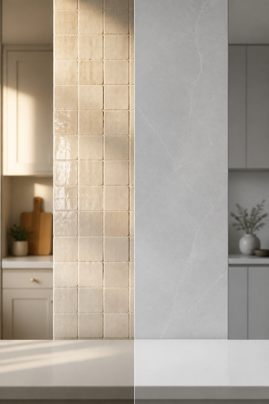
Farmhouse and handmade character
The defining material of the warm road is zellige — hand-shaped, kiln-fired Moroccan clay whose irregular glaze reads differently from every angle, producing a luminous quality flat factory tile cannot copy. That variation is the design intent, not a defect. Interior designer Rebecca Hughes notes a “strong demand for decorative, hand-painted tiles alongside the ongoing popularity of zellige tiles for backsplashes.” Fluted and ribbed profiles do related work, creating depth through shadow rather than colour. This road suits kitchens with shaker cabinets, wood and visible grain, where the backsplash earns artisanal weight beside those materials.
Modern, large-format and slab
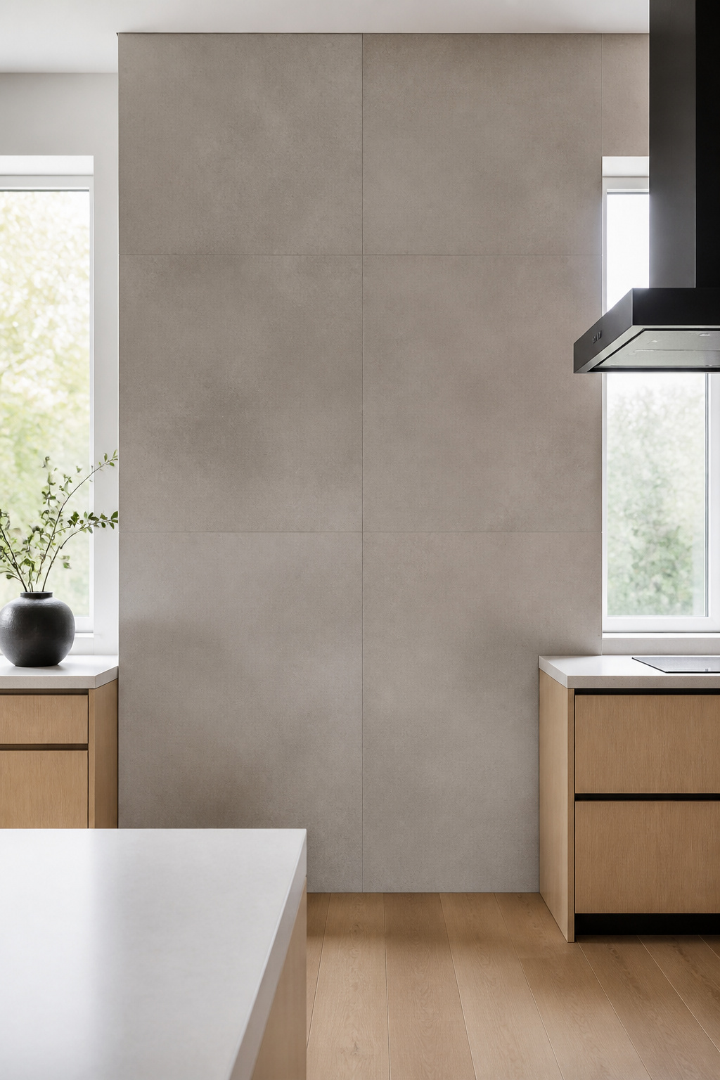
The opposite road removes interruption. A slab carries the countertop material straight up the wall in one continuous, groutless plane. Mor Krisher, head of design at Caesarstone, describes the pull: “Homeowners are increasingly drawn to clean, uninterrupted expanses that blur the line between the two, creating a sense of continuity and understated sophistication.” Large-format porcelain in marble-look or concrete finishes delivers most of the drama at a fraction of stone’s maintenance. This is the road for flat-front cabinets, minimal hardware and a stone or concrete counter — the continuous surface simply extends the logic already on display.
How to tell which road is yours
The diagnostic is not your taste in the abstract; it is your existing kitchen. Clean-line cabinets and a stone counter point to seamless calm. Shaker doors, wood and texture point to handmade warmth. Lighting is the tiebreaker: zellige and handmade tile come alive under natural or directed pendant light that activates their glaze, while large-format and slab read best under even, diffuse light. Pick the road that matches what is already there, and the backsplash sits naturally instead of fighting the room. Go deeper on warm farmhouse backsplash looks or on the seamless modern backsplash, depending on which road is yours.
What Works Behind White Cabinets
White cabinets are the most common starting point in American kitchens, and they change the decision in one specific way: they carry no colour identity of their own, so the backsplash sets the kitchen’s character almost single-handed. That is a risk and a gift. The mistake is reading white cabinets as an instruction to use white tile.
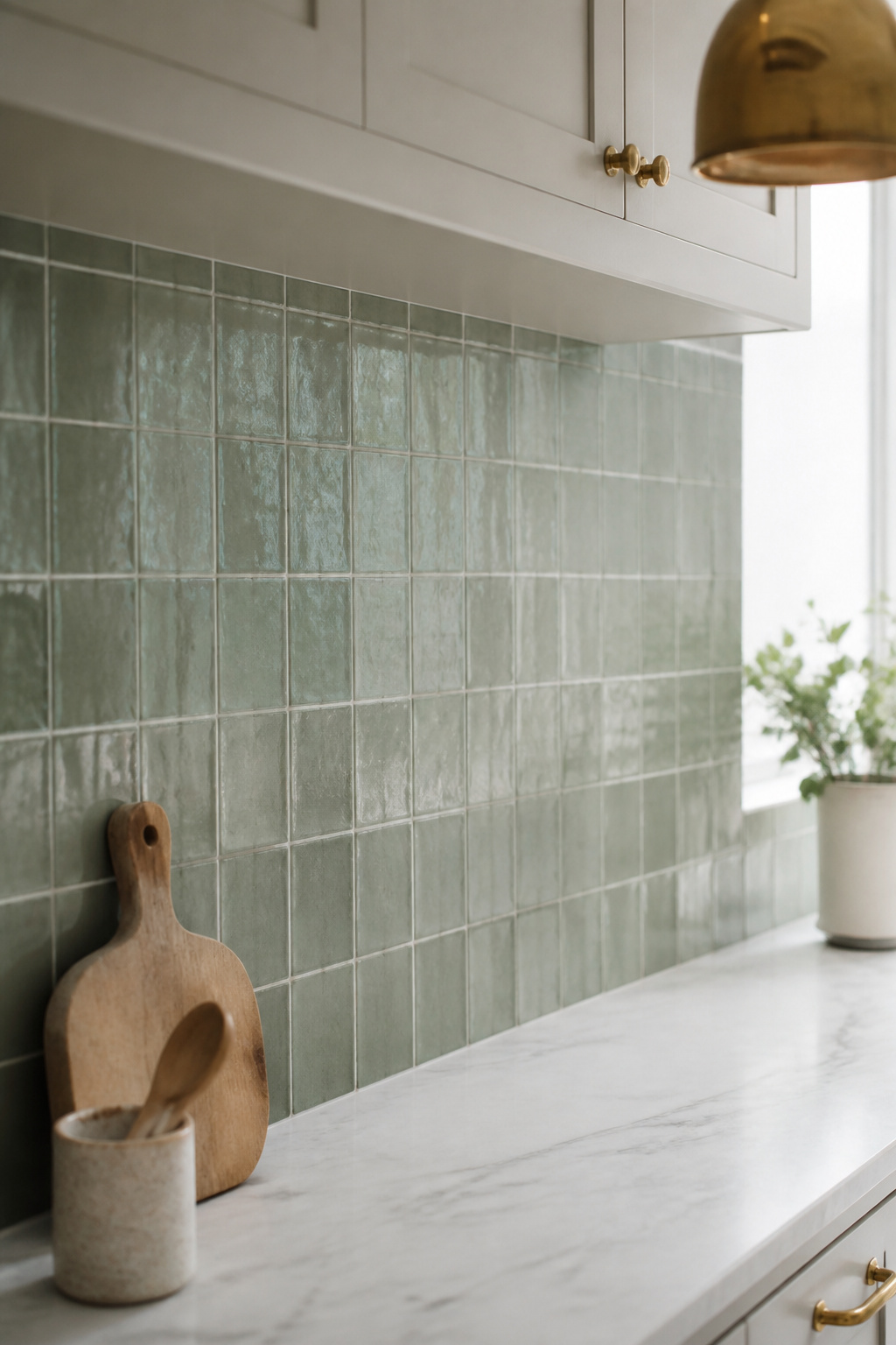
White cabinets as a canvas
A white cabinet takes its read from whatever sits beside it, which makes it the most flexible base colour for tile pairing. In 2026, designers have stopped expecting a white kitchen to wear a pale backsplash — contrast, pattern and colour are actively encouraged as the way to give a white kitchen personality. Zellige against white is one of the most requested combinations of the year precisely because its glaze variation keeps the room from reading flat or sterile.
Contrast, colour and pattern
The levers run from quiet to bold. Charcoal-grouted white subway in herringbone gives sharp graphic contrast. Soft blues and greens — sage, dusty teal — add a calm pop that reads intentional without drama. Terracotta brings a warm Mediterranean note a cool white kitchen otherwise lacks. White marble herringbone keeps the palette disciplined while supplying pattern and texture. Each is a deliberate move, and against a white backdrop almost any of them reads more vividly than it would beside a darker cabinet.
Beyond white-on-white
If you do want a white backsplash, make it earn its place through texture rather than flat tile — zellige, ribbed or 3-D relief tile, where light and shadow do the work that colour would otherwise do. The cheapest route to depth is contrast grout: a charcoal, sage or navy joint under a pale tile adds dimension without committing to a coloured field. These are current trend positions in 2026, not timeless rules — the full set of pairings, sorted by what you want the wall to do, is in backsplash options for white cabinets.
The Renter’s and Budget Route
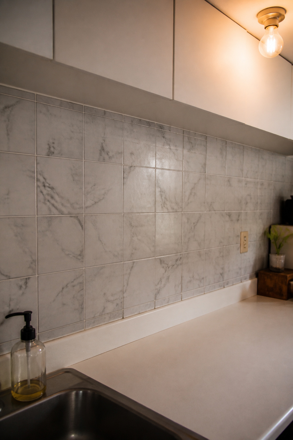
Not every backsplash decision is permanent, and not every reader owns the wall. Peel-and-stick tile serves a real and distinct case: renters who cannot alter the surface, and owners who want a cheap test before committing to real tile. It is a legitimate route with honest limits, and the limits are where most people get burned.
Where peel-and-stick fits
Peel-and-stick is built for rental kitchens, temporary upgrades and budget walls where a full renovation is years off. It needs a clean, smooth, fully painted surface to bond to — unprimed drywall or a textured wall will defeat it. Traci Snyder of Improveit Home Remodeling adds one boundary: it can be “a good short-term solution for a pop of color,” but keep it out of high-moisture spots where the bond struggles over time. Treated as a temporary surface in the right place, it does the job. Treated as real tile, it disappoints.
What it costs versus real tile
The cost gap is the whole appeal. Peel-and-stick materials run roughly $3–$15 per square foot with no professional labour, against $12–$32 for ceramic installed. The trade is lifespan: a realistic 5–10 years for peel-and-stick versus 20–30-plus for real tile. Those lifespan figures are commonly cited industry estimates rather than manufacturer specifications, but the direction is right — you are buying a few good years cheaply, not a permanent wall.
Doing it without losing the deposit
Two failure modes matter. The first is heat: do not run adhesive tile behind or beside the cooktop, where temperatures release the adhesive and tiles begin to slide off the wall. The second is removal — the deposit killer — where the adhesive pulls paint or drywall paper away. A removable primer layer before install and slow, gently warmed removal at move-out are what keep the wall intact. For the full cost breakdown, the gas-stove safety detail and the clean-removal method, read the honest take on peel-and-stick.
What It Costs and the Mistakes That Waste It
Cost is where a clear head saves real money, because backsplash spending ranges enormously — from a few hundred dollars of DIY ceramic to several thousand for marble professionally installed. Knowing the ranges, and the handful of mistakes that quietly waste them, is what turns a nervous decision into a confident one.
DIY vs professional install ranges
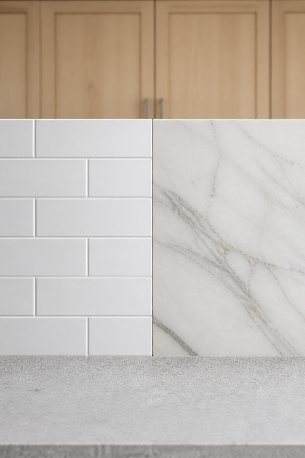
A professional install averages around $1,000 for a standard 35-square-foot kitchen, landing between $500 and $1,700 for most tile. Labour alone runs $5–$20 per square foot for straight-set work, climbing toward $100 an hour for complex patterns. A DIY job costs $300–$800 in materials and tools and saves the labour, at the risk of cutting errors and rework. Premium stone is its own bracket: marble can reach $4,500 installed, with the material, not the labour, driving the total.
| Route | Rough cost | Best for |
|---|---|---|
| DIY tile | $300–$800 total | Confident hands, simple layouts, tight budgets |
| Professional standard tile | $500–$1,700 (avg ~$1,000) | Most kitchens, complex cuts, full height |
| Slab or premium stone | up to $4,500+ | Seamless looks, statement walls, low upkeep |
The five common backsplash mistakes
Most wasted budget traces to five errors:
- Too-small tile in the wrong kitchen — more grout lines to clean, and a hemmed-in feel in a small room.
- No 10% waste allowance — tile lot numbers shift between orders, so a later repair rarely matches if you ran short.
- Unsealed cement grout behind the cooktop — porous grout in the grease zone wants epoxy or sealing instead.
- Stopping tile at an arbitrary height behind the range — leaving an unprotected painted band that collects grease above the tile line.
- Leaving raw, untiled patches beside tiled areas — unfinished to the eye and unprotected on the wall.
Where to spend and where to save
The principle is simple: spend on the material, save on the extent. The backsplash is permanent and seen daily, so a cheap-looking tile shows immediately — this is not the place to economise on quality. Save instead on how much of it you install. A full-height feature tile behind the stove paired with standard-height ceramic elsewhere buys maximum impact for minimum total. A straight-set layout over herringbone saves the labour premium without touching tile quality. And bundling the work with a counter replacement spares you a second mobilisation fee. CLE Tile’s team flags the grout trap specifically: “for a backsplash or shower, epoxy is usually your best bet,” because cement grout needs resealing over time to keep stains and moisture out.
How to Choose: Your Shortlist in Three Moves
You arrived with a folder of walls and no way to choose between them. You leave with three moves. Each one settles a single axis, and together they produce a shortlist concrete enough to quote and budget — one material family, one height, one style road. That is the whole decision, collapsed.
Move 1: pick a material family
Start from how you cook and what you will maintain. Heavy daily cooking points to porcelain, glass or quartz slab — all non-porous. Light cooking with a wish for warmth opens the door to handmade ceramic with sealing. Budget-and-durability-first lands on standard ceramic at $2–$10 a square foot in material. Maximum investment, minimum upkeep is quartz slab at $80–$100 installed. Name one. To settle it in detail, start with materials.
Move 2: pick a height
Now set the extent. A rental or tight budget takes a 4–6-inch standard band. Most home renovations are best served by full height to the cabinets, eliminating the unprotected gap and reading as intentional. A design-forward or open-plan kitchen earns ceiling height or slab. And the value move, every time the budget pinches, is full height behind the stove with standard height elsewhere. Pick one of the four, then settle the height.
Move 3: pick a style road
Finally, choose the road. Shaker cabinets, wood and grain take the handmade-warmth road — zellige, fluted, textured tile. Flat-front cabinets and a stone or concrete counter take the seamless-calm road — large-format or slab with matched grout. White cabinets accept either, so let the countertop and the kitchen’s light cast the deciding vote. From these three moves you can now name a single wall — say, “porcelain tile, full height to the cabinets, large-format vertical stack with tonal grout.” That sentence is a shortlist, not a folder. As the Homes and Gardens editorial team frames the year, 2026 backsplashes are “considered, statement, and personalized to the space they reside” — which is only possible once the decision is yours rather than the most-pinned photo’s. Make the three moves, and the next article you open is the one that matches the wall you just named.