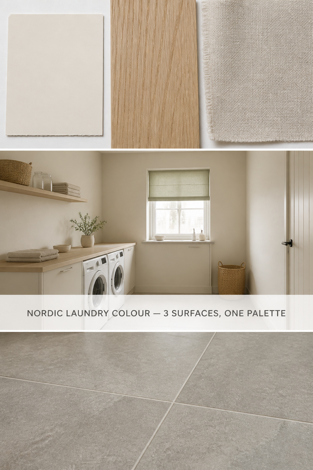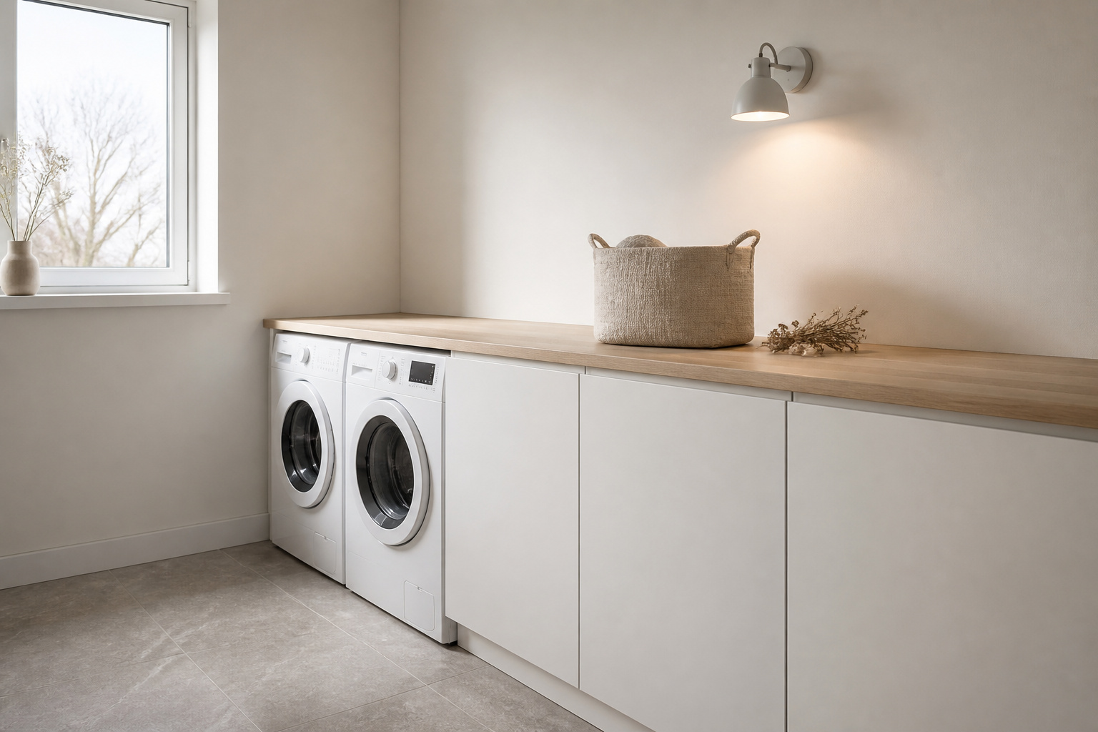
In a Scandinavian winter you choose colour for the light you do not have. December in Stockholm gives fewer than seven hours of daylight, most of it low and faintly blue, and a room either stretches that scarce light or swallows it. So a nordic laundry room color palette is reasoned out from that one fact about the sky, not assembled from a mood board — and every paint chip and wood sample then sorts itself.
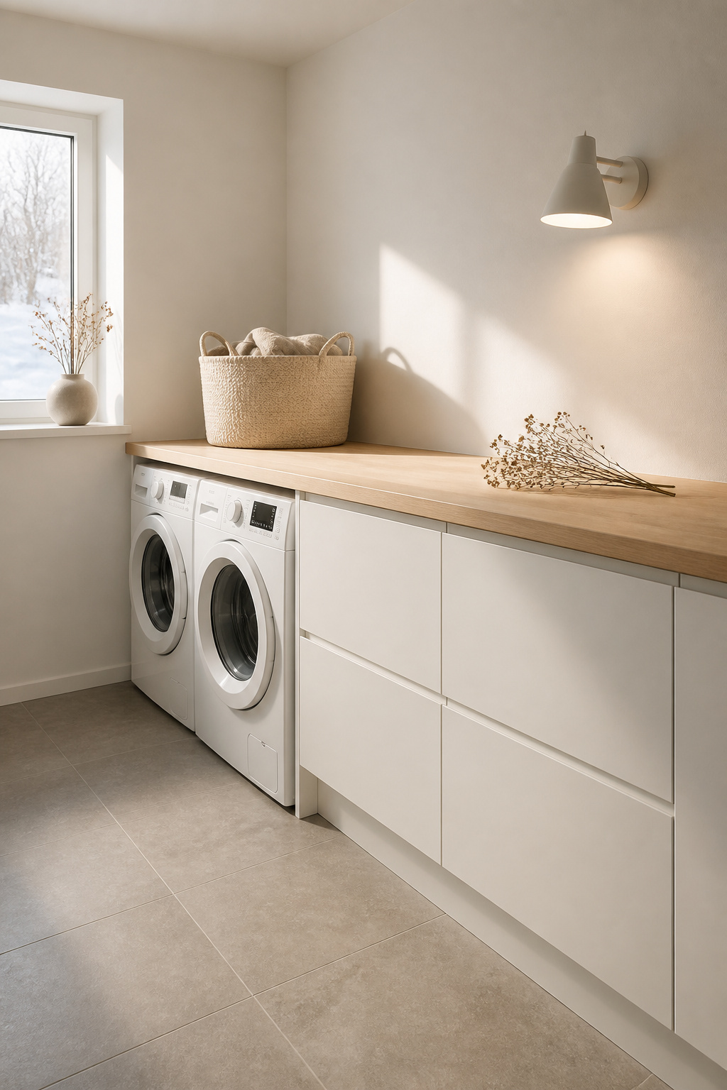
TL;DR
- Build the palette on warm off-white walls — cool whites read blue-grey in low northern light, while warm whites stay inviting; Farrow & Ball Wimborne White (LRV ~89) or Jotun Egg White (LRV 84) are reliable.
- Layer warm greige and pale oak over the white, never cool blue-grey, because oak’s warm undertone fights a cold wall; reserve any accent for one linen textile, not a fourth paint colour.
- Apply paint in satin, not flat, for laundry humidity, and test a large sample on the wall in 7am winter light before buying.
Why Winter Light Drives the Nordic Laundry Room Color Palette
In the North, every colour choice begins with the light available — and the palette we call “Scandinavian” was a practical answer to a dark sky before it was a style.
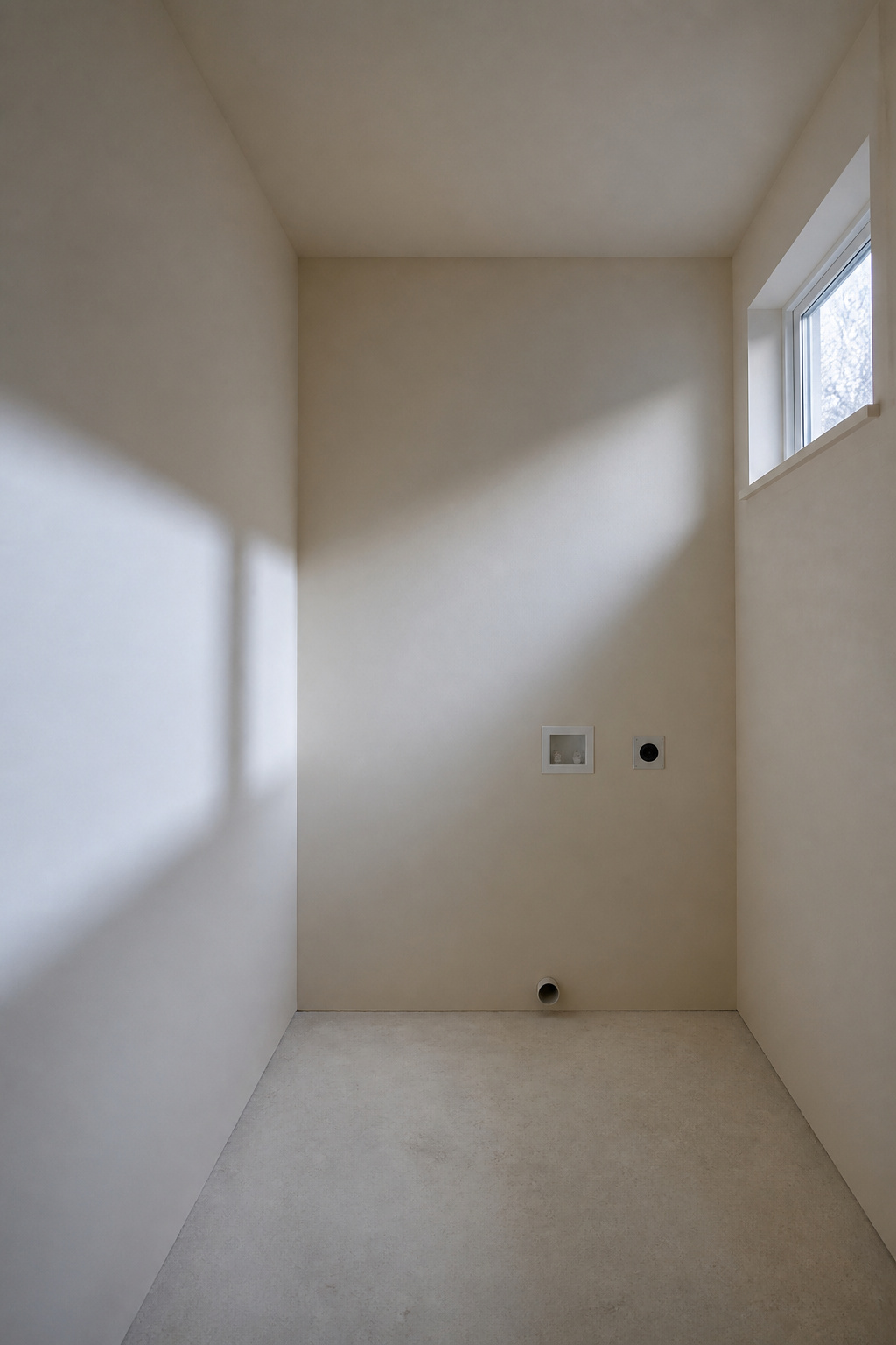
The Scandinavian starting point: light is scarce, so the room must generate it
Where daylight is rationed for half the year, pale colours become structure — walls, ceiling and floor all bouncing the light rather than absorbing it. A laundry, usually interior or north-facing with one small window or none, feels this most sharply.
How the Nordic palette evolved — whitewash, timber and stone as the original register
The register came from what was to hand: limewashed plaster, pale timber left raw or oiled, granite or limestone underfoot — the three voices a Nordic room still speaks in: a pale wall, a light wood, a stone-toned floor.
Why the same rules apply to a laundry room as to any Nordic interior
North-facing rooms want warmer undertones, because cool northern light amplifies any blue or green in the paint, so a wall reads colder than the chip promised. The same logic that governs the rest of Scandinavian laundry room design governs the colour scheme, with even less margin for error in a windowless room.
White and Off-White: The Foundation Coat
White is where most palettes quietly go wrong: not “white” but which white, and that turns on undertone.
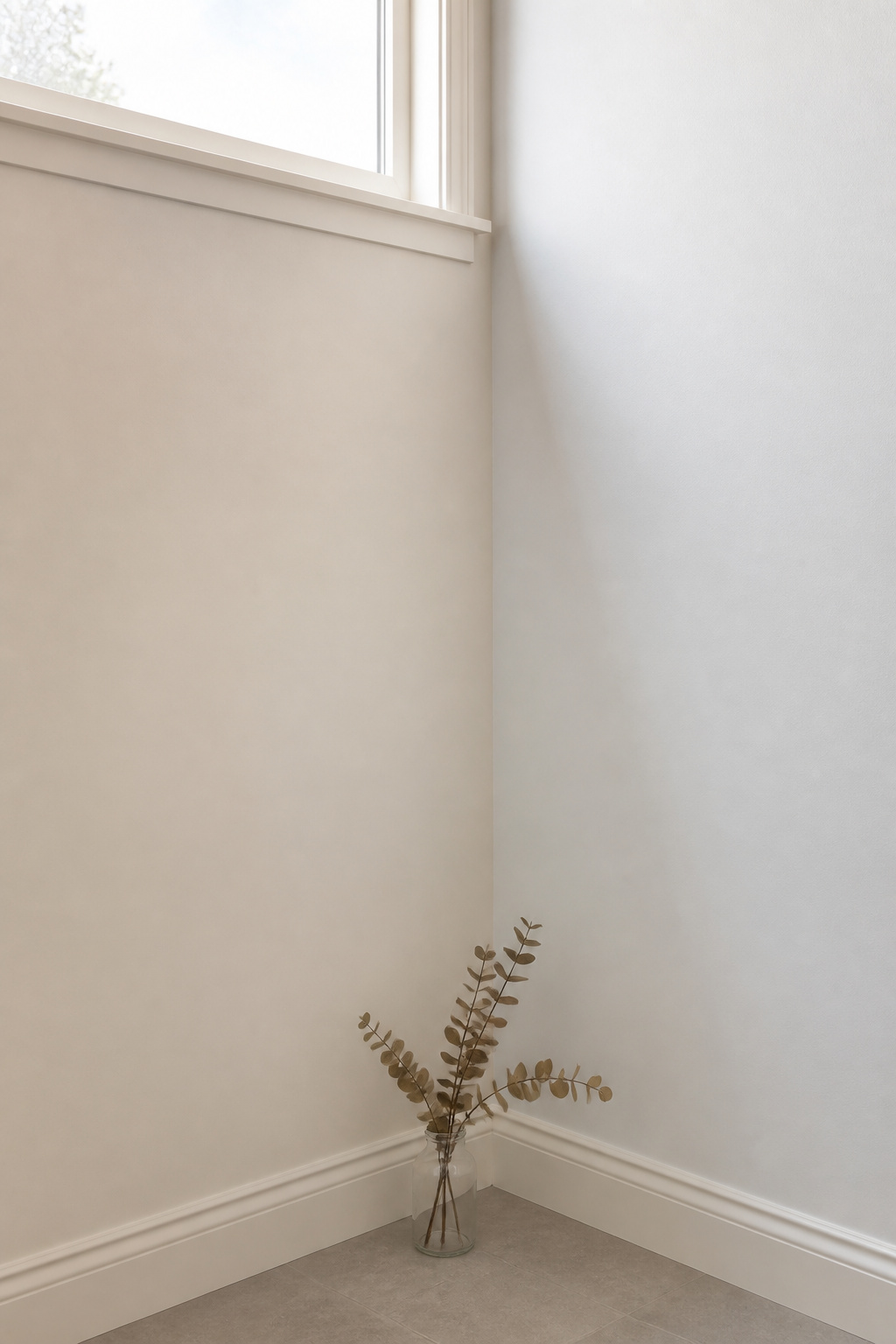
Pure white versus warm white — why the undertone matters more than the chip
In low northern light a cool white can look clinical, even faintly blue, so for a room with little sun the warm white is almost always right — warm whites, as colour consultant Kylie M Interiors notes, “have a yellow, red or brown base” and suit rooms with less light. The options worth trusting: Farrow & Ball Wimborne White (No. 239) at LRV roughly 89, and their Shaded White (No. 201) near LRV 66 for a creamier off-white. Jotun’s Egg White (code 1001, LRV 84), Benjamin Moore White Dove (LRV 83) and Sherwin-Williams Greek Villa (LRV 84) sit in the same forgiving band.
Which paint finishes survive laundry humidity (eggshell, satin, not flat)
Satin is the professional recommendation — a soft sheen that still reflects light, with the moisture resistance a humid room needs. Flat and matte drink moisture and peel; eggshell is tolerable in a dry laundry closet, not where a washer vents steam. Farrow & Ball’s Modern Emulsion carries a preservative against mould, so specify it over the standard Estate finish.
Testing whites in winter light: the sample method Nordic designers use
A north-facing laundry runs cooler than the shop, shifting any mild cool undertone toward blue-grey, so no chip survives the real room. Buy a sample pot before any full tin, paint a large patch on the wall, and read it at 7am in winter light — if it reads cold at that worst moment, choose warmer.
Warm Grey: The Middle Register That Does the Work
Grey gives depth without introducing a colour — but only one kind of grey works in a laundry.
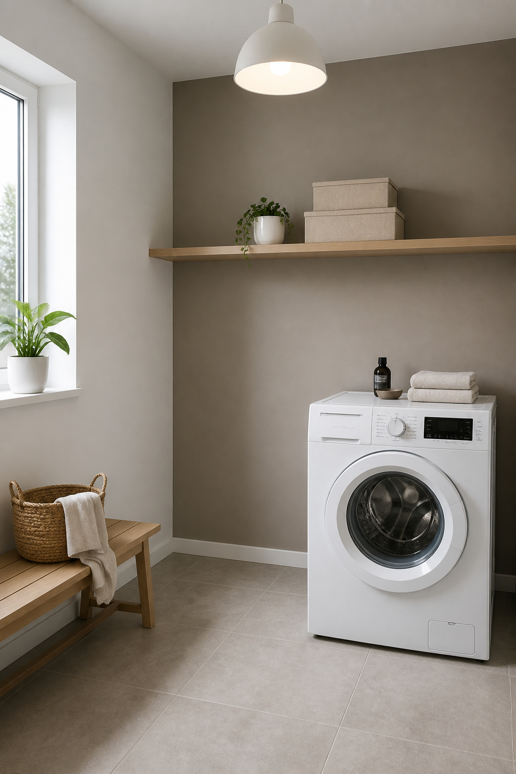
Warm grey versus cool grey — and why cool greys read blue in a laundry
The trap is the cool grey: in a north-facing room its blue undertone reads flat and icy. The grey that works is closer to greige — a faint yellow, taupe or ochre base that holds neutral as the light shifts. Coco Lapine Design is blunt: the colour “can easily turn out more beige or blue depending on the light… so it’s always important to test, test, and test.”
Using grey on one wall versus throughout — the Nordic restraint rule
Among named greys, Farrow & Ball Worsted and Purbeck Stone are the safe greige choices, and Jotun’s Lady range offers Grey Touch, Comfort Grey and Tender Greige — warm-leaning tones for low Nordic light. Avoid cooler greys like Farrow & Ball Pavilion Gray, which turns silvery-lavender in a dim north-facing laundry. Keep whichever you choose to a single wall — one wall, not four.
Grey and wood tone together: the pairings that work and the ones that fight
Grey never sits alone — it sits next to wood, and the undertones have to agree. The table shows which pairings settle and which quietly fight.
| Grey undertone | Wood it pairs with | Combined mood | What to avoid |
|---|---|---|---|
| Warm greige | Honey oak | Settled Nordic warmth | Cool blue-grey beside oak |
| Soft warm grey | Birch (near white) | Bright, airy, cream-leaning | Birch against a true grey wall |
| Cooler pale grey | Ash | Calm, restrained, cooler | Warm oak against a cool wall |
Honey oak against warm greige is the dominant language of contemporary Nordic interiors — the warm wood keeps minimalism from tipping cold. Refuse warm oak with a blue-grey wall, where the wood only makes it look more frozen. Settle colour against wood, then plan Nordic laundry room lighting to complete the picture.
Pale Wood Tones: Oak, Birch and Ash as Colour
A wood shelf or countertop here is a colour decision — grain and tone push the room warmer or cooler as surely as paint.
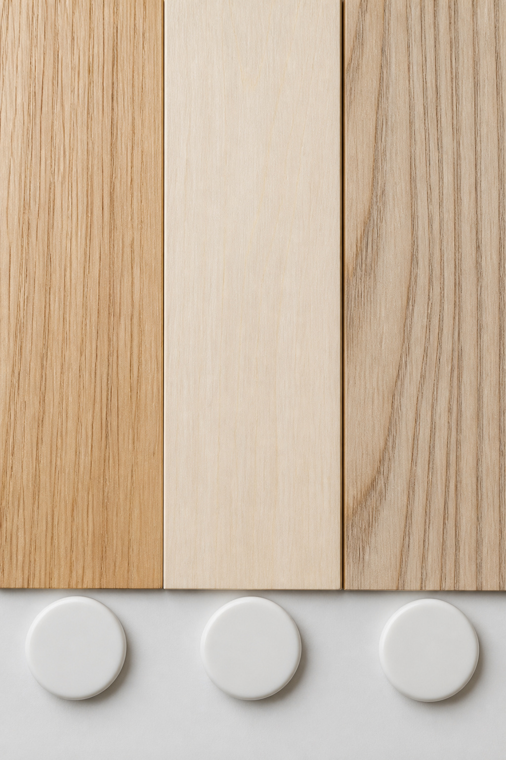
Reading wood tone as a colour decision, not a material decision
Birch is the palest, almost white when freshly worked, so it bridges white walls and off-white cabinetry. European oak gives a warm honey-beige even at its lightest, pairing with cream — which is why it dominates the look. Ash, with cool grey-brown streaks, is the cooler pale wood, the better partner for a grey wall where warm oak would shout.
How humidity affects wood colour in a laundry — and which species resist it
A laundry is wet, and over repeated humidity cycles an untreated board can open at the joints and discolour where mould takes hold. Oak resists this far better than birch — density and tannins put it in the “durable” to “very durable” band, while birch rates “non-durable” and needs sealing on every face. So solid birch above a washing machine is the high-risk choice: seal every face, or keep it where the air is drier.
Treating or sealing pale wood in a wet utility room
Seal the exposed end grain first since it drinks moisture fastest, then build two to three coats of waterproof topcoat. For countertops, a tung-oil sealer such as Waterlox requires three to five coats with drying time between each, adding only a faint amber tint that keeps the wood’s Nordic blondness while waterproofing it. Let that warm note set the room’s tone for natural-material storage.
The Soft Accent: When One Colour Changes the Room
Nordic design permits one accent — used once, quietly, through fabric rather than paint.
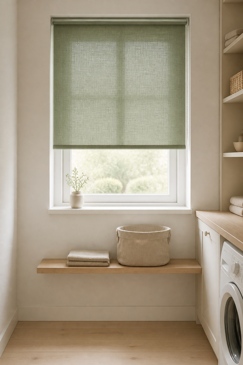
Which soft pastels work in a Nordic laundry — sage, dusty blue, muted terracotta
Three accents test well: sage green beside wood, dusty blue against white walls and light oak, and muted terracotta with greige and birch. The rule across all three is desaturation — dusty blue not navy, sage not emerald, terracotta not rust. A saturated colour in a Scandinavian room reads as a mistake.
How much accent is enough — the one-surface rule
The Nordic accent follows roughly the ten-percent rule — about a tenth of the visual field carries the colour, the rest stays neutral. So put it on one surface, never two: a dusty-blue blind and a dusty-blue feature wall cancel rather than double.
Using textiles (linen baskets, cotton blind) rather than paint as accent
The better route to colour is fabric, not a fourth tin of paint. A linen blind, a laundry-bag cover or a basket in a single muted tone carries the accent while leaving the walls free to reflect light, and undyed ecru reads as both colour and material at once.
Putting the Palette Together: A Nordic Laundry in Three Surfaces
One fact about the winter sky resolves into one rule: a Nordic laundry has only three surfaces that carry colour — wall, floor, joinery. Decide those well and everything else follows.
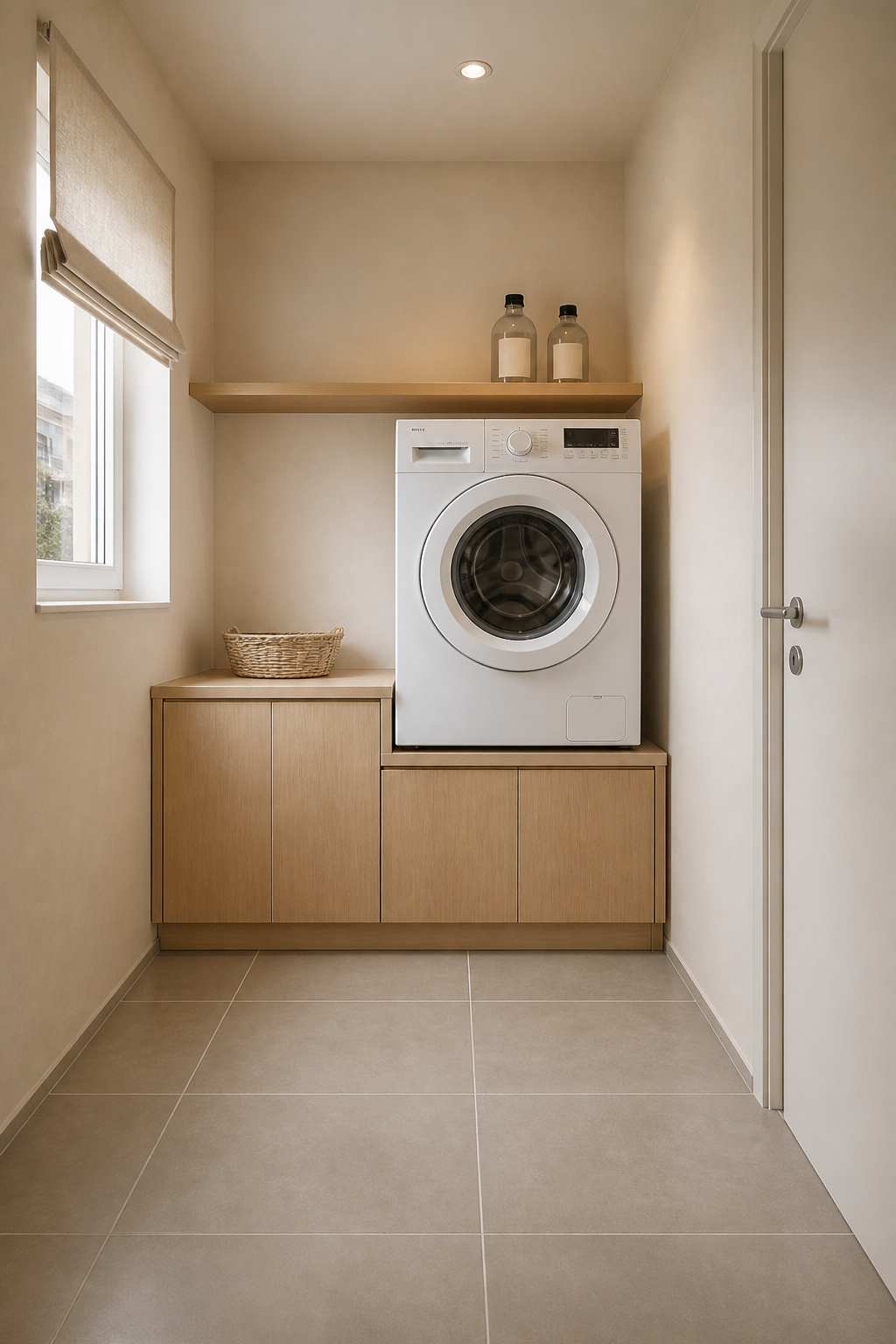
The three-surface rule: wall, floor and joinery as the only three decisions
This is the clearest way I know to keep a palette from sprawling — not a published standard, just three decisions with texture on top, never a fourth colour. The wall is a soft warm white or greige; the floor is warm-grey matte porcelain in a stone look, moisture-proof, in formats from 300mm to 600mm; the joinery is the warm note.
Henrik’s committed palette recommendation — not a range of options
I would rather commit than hand you a menu, so here is the palette I would build:
- Walls: warm off-white in satin — Wimborne White (LRV ~89) for bounce, or Shaded White (LRV ~66) in Modern Emulsion for a creamier, mould-protected finish.
- Floor: warm-grey matte porcelain in a stone look, 600mm or larger, with grout in near-white or pale grey, never bright white.
- Joinery: pale European oak, natural or lightly oiled; engineered oak on shelving above appliances, sealed on every face.
- Accent: one linen textile — a blind or laundry bag in ecru or a single muted tone, on one surface only.
When to break the palette and why you probably shouldn’t
The urge to break the palette usually means the room needs better light, not more colour. So sort the lighting first; the full case is in the right laundry lighting. If it genuinely wants more interest, the Nordic answer is a darker material — a matte-black tap, a charcoal basket — contrast that stays inside the achromatic register.
FAQ
What is the best white paint for a Scandinavian laundry room?
Farrow & Ball Wimborne White (No. 239, LRV ~89) in Modern Emulsion is the top professional pick: a warm, bright white whose formula resists mould in humid rooms. A cheaper alternative is Jotun Lady Egg White (code 1001, LRV 84), a Norwegian warm white made for Nordic light. Apply either in satin and test a large sample first.
Should laundry room walls be warm white or cool white for a Nordic look?
Warm white is the right choice for most laundry rooms. Cool whites, carrying blue or green undertones, shift noticeably toward grey in north-facing or low-light rooms, working against the warmth at the heart of hygge design. The exception is a south-facing laundry with strong direct sun, which can take a slightly cooler white.
How do I add colour to a Scandinavian laundry without breaking the palette?
Use one muted pastel on a single textile surface — a linen blind, a basket liner, or a laundry-bag cover in sage, dusty blue or soft terracotta. Textiles carry the accent without removing the walls’ light-reflecting function. Stay within the ten-percent rule, keep the colour to one surface, and choose desaturated tones over saturated ones.