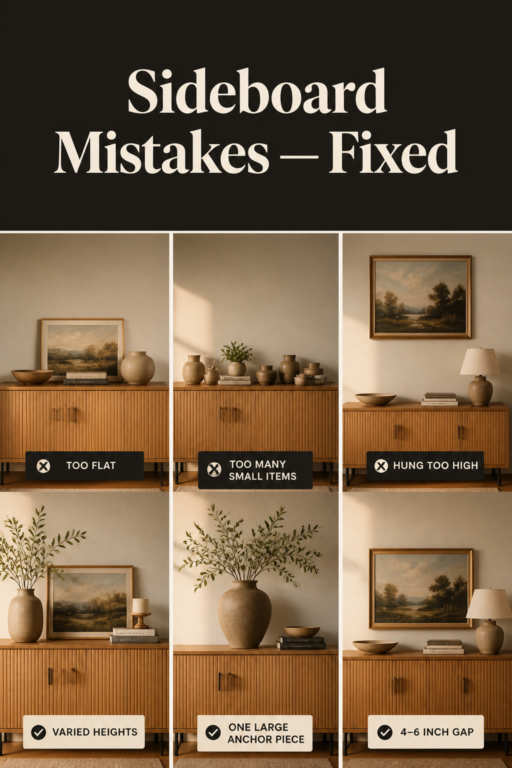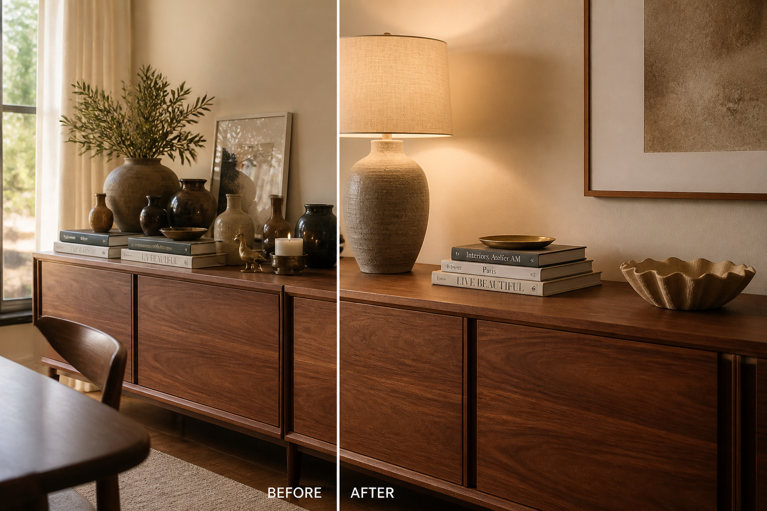
You have probably been told your buffet just needs “a few more things.” It almost certainly does not. The most common sideboard styling mistakes are not deficits of stuff — they are errors of arrangement, and adding objects to an arrangement problem is like adding books to a shelf you cannot find anything on. The display reads as off, you cannot say why, so you reshuffle the same pieces and land back where you started. So let us name the wrongs, each with its fix.
TL;DR
- The fix is almost never “add more”: designers leave 30–40% of a sideboard surface clear, and objects closer than 6 inches apart merge into one visual mass the eye reads as clutter.
- Build three height tiers in one composition — a tall anchor at 20–30 inches, a mid element at 10–18 inches, a low piece at 4–8 inches — because uniform height is the error behind most flat displays.
- Run the six-point checklist on any arrangement: height, object count, anchor, negative space, wall-zone scale, and a lamp; fix the anchor first, since a missing anchor undermines every other correction.
The Real Reason Most Sideboards Never Look Quite Right
The reflex, when a buffet looks wrong, is to shop for it. As Few and Far’s stylist Gonia Chylinska puts it, that is the biggest mistake people make: choosing objects without asking what the arrangement is already doing wrong.
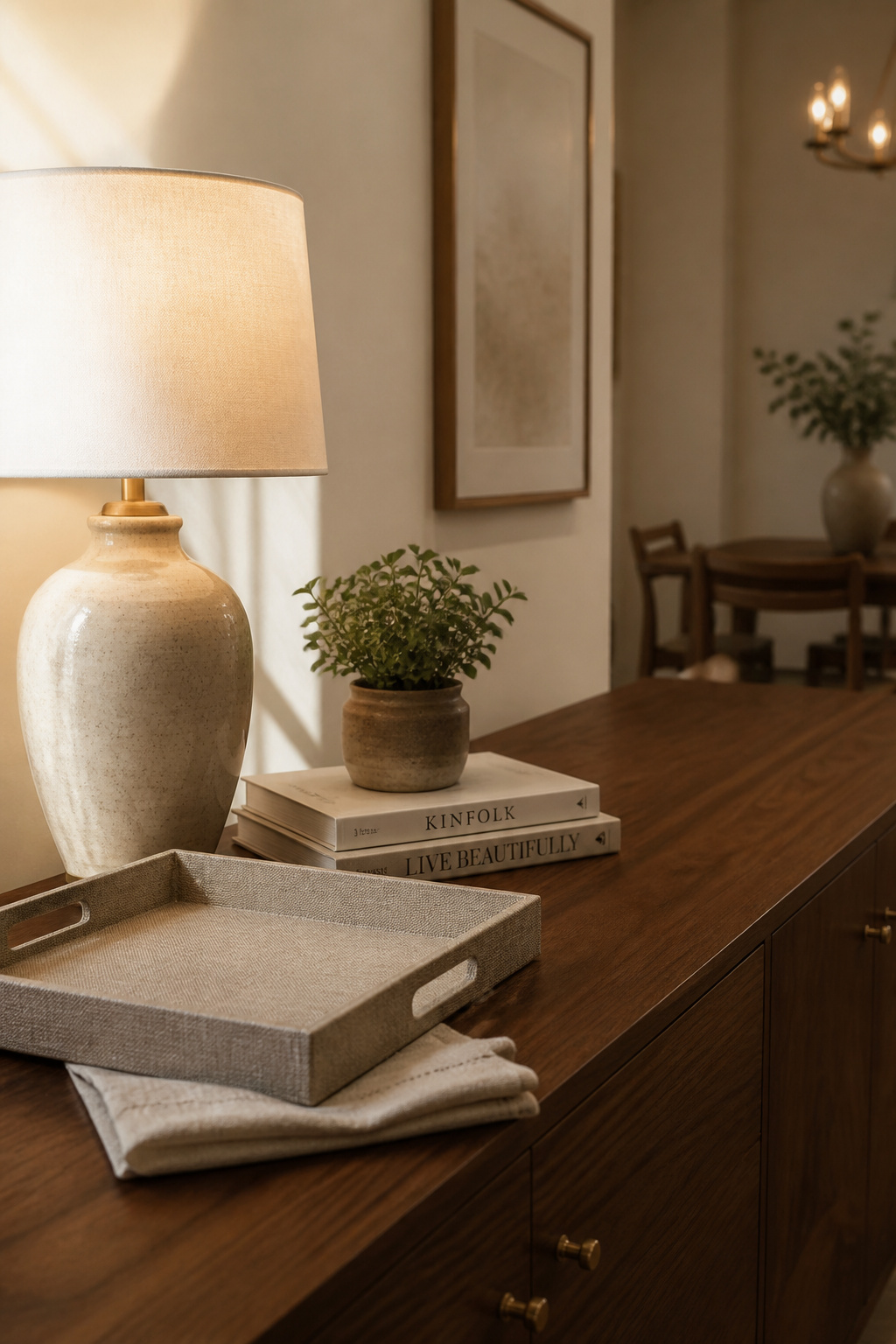
Why standard advice still produces a flat display
“Rule of three.” “Vary the height.” Sound advice that still leaves you stuck, because it names the destination without diagnosing where you are. Designers think in three horizontal zones — a tall anchor, a mid transition, a low grounding piece — and a missing zone reads as unfinished however many objects sit there.
The difference between the right objects and the right arrangement
A flat display fails on one of three counts — no height variation, no anchor, or no negative space — none of which a nicer vase will solve.
How a diagnostic approach changes what you see
Assign every object to a height zone and the missing or overcrowded zone announces itself — that, not taste, is your fix-signal, and it is the lens the full sideboard styling guide applies in full.
Mistake 1: Everything at the Same Height
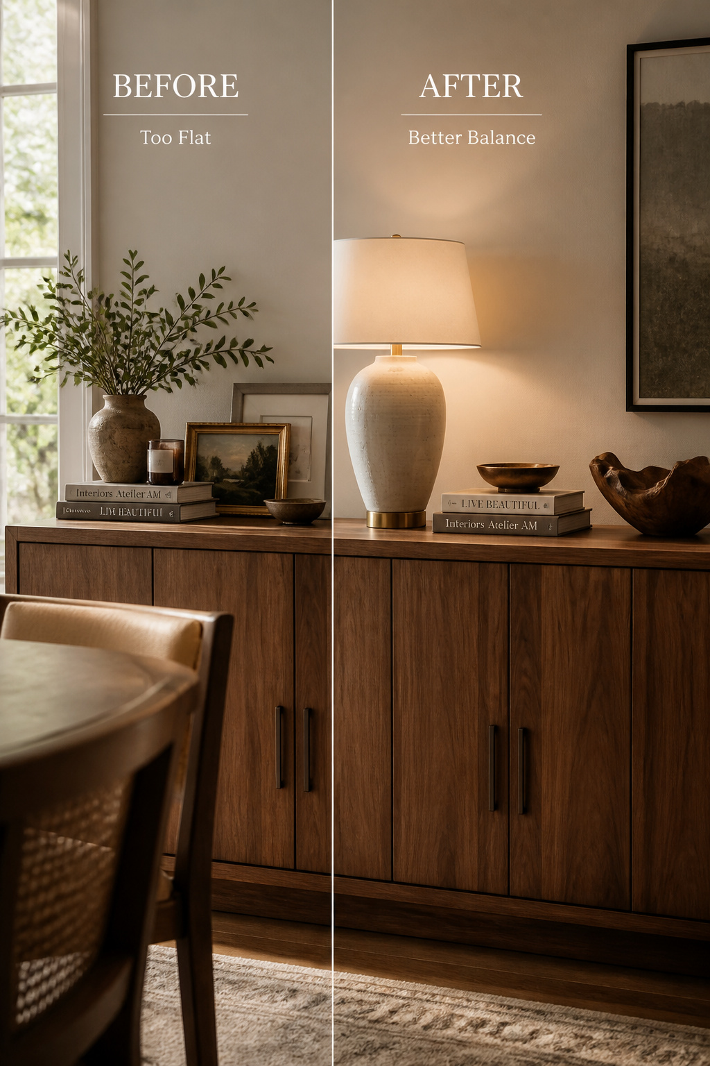
When everything sits at the same level, the eye tracks a flat horizon and finds nowhere to rest — the visual plateau.
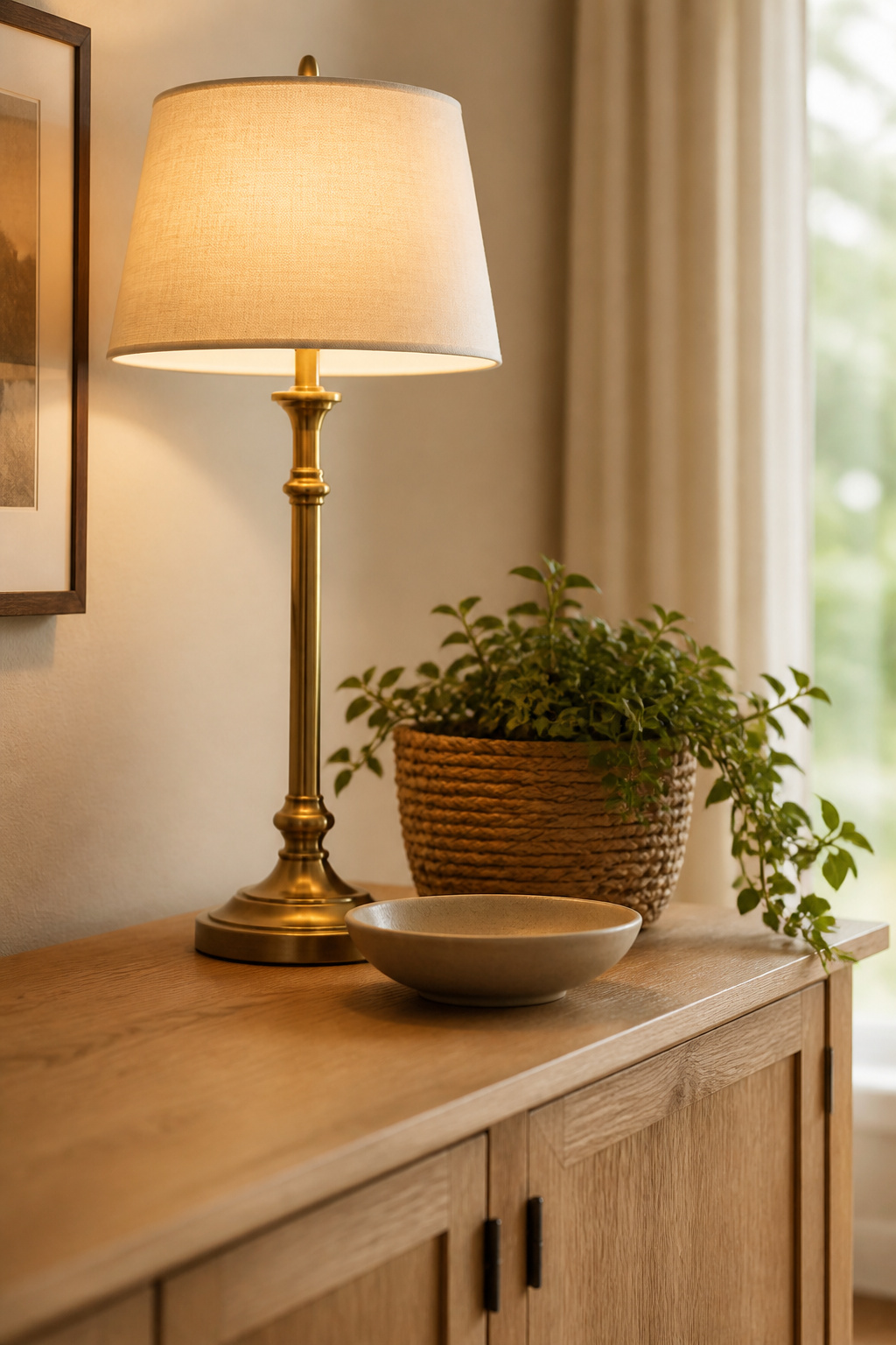
Why uniform height kills composition
The tall element works best between 20–30 inches above the surface: below that range, the arrangement feels temporary. An object under 6 inches wide reads as a thin accent, not an anchor, regardless of its height.
The three-tier fix: tall, medium, low
Build all three zones into one composition — tall anchor at 20–30 inches, mid transition at 10–18 inches, low piece at 4–8 inches — so the eye travels a diagonal, not a flat line. Keep the mid zone to two objects of similar but not identical height; match both height and material and they fuse into one lump.
What to add when you only have flat objects
If everything you own is short, the fastest cure is a single lamp at 32–36 inches, which establishes the tall zone with nothing else changing — and a stack of art books makes an instant mid-tier riser at no cost.
Mistake 2: Too Many Small Objects (The Trinket Problem)
This is the most common error on any surface — the buffet ends up occupied rather than styled.
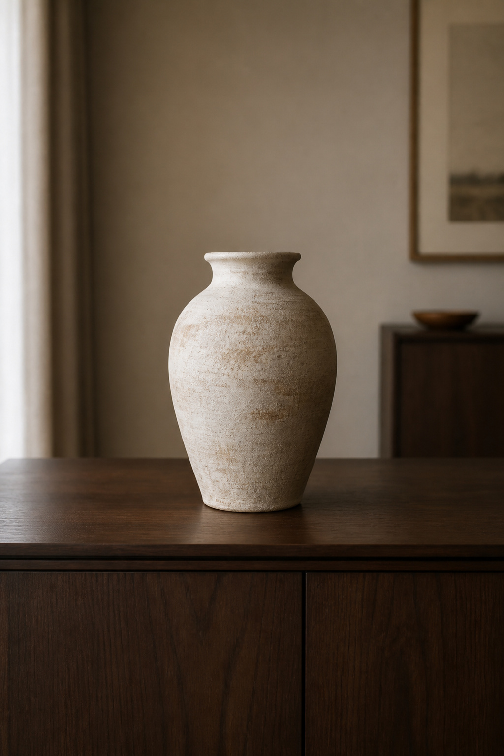
Why small objects multiply and what they do to the eye
Objects closer than 6 inches apart merge into one visual mass; each addition below that threshold deepens the clutter rather than adding character. Professional stylists leave 30–40% of the surface clear so each piece registers as deliberate. Because trinkets tend to be short, a crowded surface usually fails the height test too.
The consolidation fix: group or remove
Corral the scattered small items into a single tray, so the group reads as one cluster that lifts off in one gesture when you serve. Then trade many small pieces for one or two larger ones; crowded objects compete and all lose.
The threshold test: if you cannot name its role, it goes
Every object should serve one named role — tall anchor, mid-zone texture, low-zone width, colour accent, or a real function like a lamp. The piece you cannot assign is your first removal; and keep the largest object to roughly a third of the sideboard’s length.
Mistake 3: Lazy Symmetry — Mirror-Image Arrangements That Go Flat
Symmetry is not the villain. Accidental symmetry is: two matching objects set at either end out of habit, producing a static, showroom composition. As designer Linda Merrill observes, too much symmetry bores a room and too much asymmetry unbalances it — we need both.
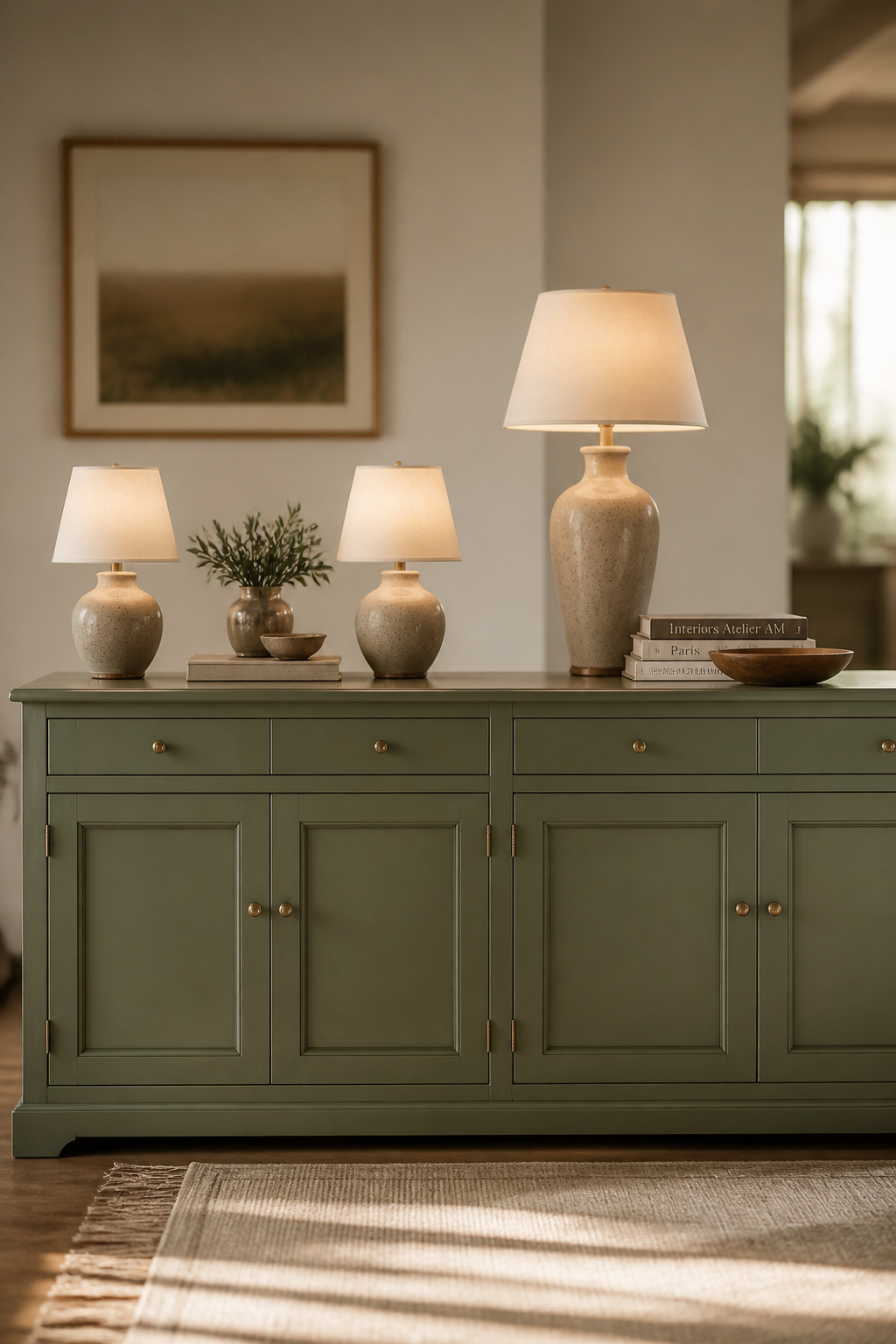
Intentional symmetry versus accidental mirror-image
Intentional symmetry shares a logic across the arrangement — one palette, one material language, matched weight either side of a centre. Accidental mirror-image shares only the object’s shape, not its finish, so it reads as duplicated — and two matching lamps flanking empty air is just dead space.
How to break a lazy symmetry without losing balance
Swap one twin for something of equal visual weight but different form — a tall vase, or stacked books and a small plant: same height zone, different material. Place the tall element about a third of the way in from an edge, not dead centre, and hold two or three recurring colours so the asymmetry reads as considered rather than random. There is no tape measure for “lazy” — you diagnose it by eye, asking whether each side was chosen or copied.
When perfect symmetry is actually correct
In a formal or traditional dining room, symmetry is the right call: slim lamps flanking a centred mirror, candlesticks matched at each end. The mistake is defaulting to mirror-image in a casual room where it reads as habit, not intent.
Mistake 4: Art Hung Too High or Too Small Above the Buffet
Two numbers govern the wall zone, and as diagnostics they reveal a gap problem or a width problem.
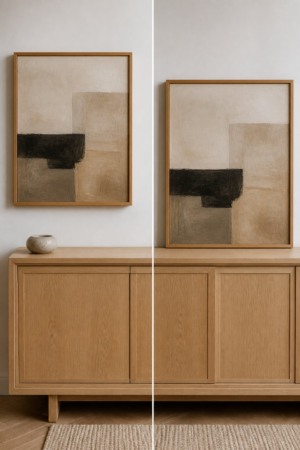
The floating effect: what it looks like and why it happens
Art hung too high floats — a wide gap opens between surface and frame, and the two read as unrelated things sharing a wall. With a mirror, you also lose the standing reflection once its centre rises past eye level. The usual culprit is the 57-inch museum standard, which does not apply above furniture.
The 4–6 inch gap and two-thirds-width rules as diagnostics
| Check | Correct | Symptom if wrong |
|---|---|---|
| Gap, surface to mirror frame | 4–6 in | Over 6 in: floats. Under 4 in: rests on the surface |
| Gap, surface to artwork frame | 6–10 in | Under 6 in: crowds the surface. Over 10 in: floats |
| Width vs furniture | ⅔ of width | Narrower reads as an afterthought; never wider than the furniture |
A 60-inch sideboard wants 40–45 inches of art; a 72-inch piece wants 48–54. The fastest test: hold a tape from the surface to the bottom of the frame — if it reads 8, 10, or 12, the piece is floating.
Fixing hung-too-high art without re-patching the wall
You rarely need to touch the old hole. Adhesive hanging strips, rated to about 15 lb for large frames, let you reposition the piece with no new drilling. Getting the height and width right the first time saves the trouble entirely.
Mistake 5: No Anchor Piece — and the Display That Goes Nowhere
A display without an anchor has no centre of gravity: the eye scans an even field, never settles, and the surface feels unfinished even when full. The anchor is the organising centre — the first and largest piece, sized first, everything else placed against it.
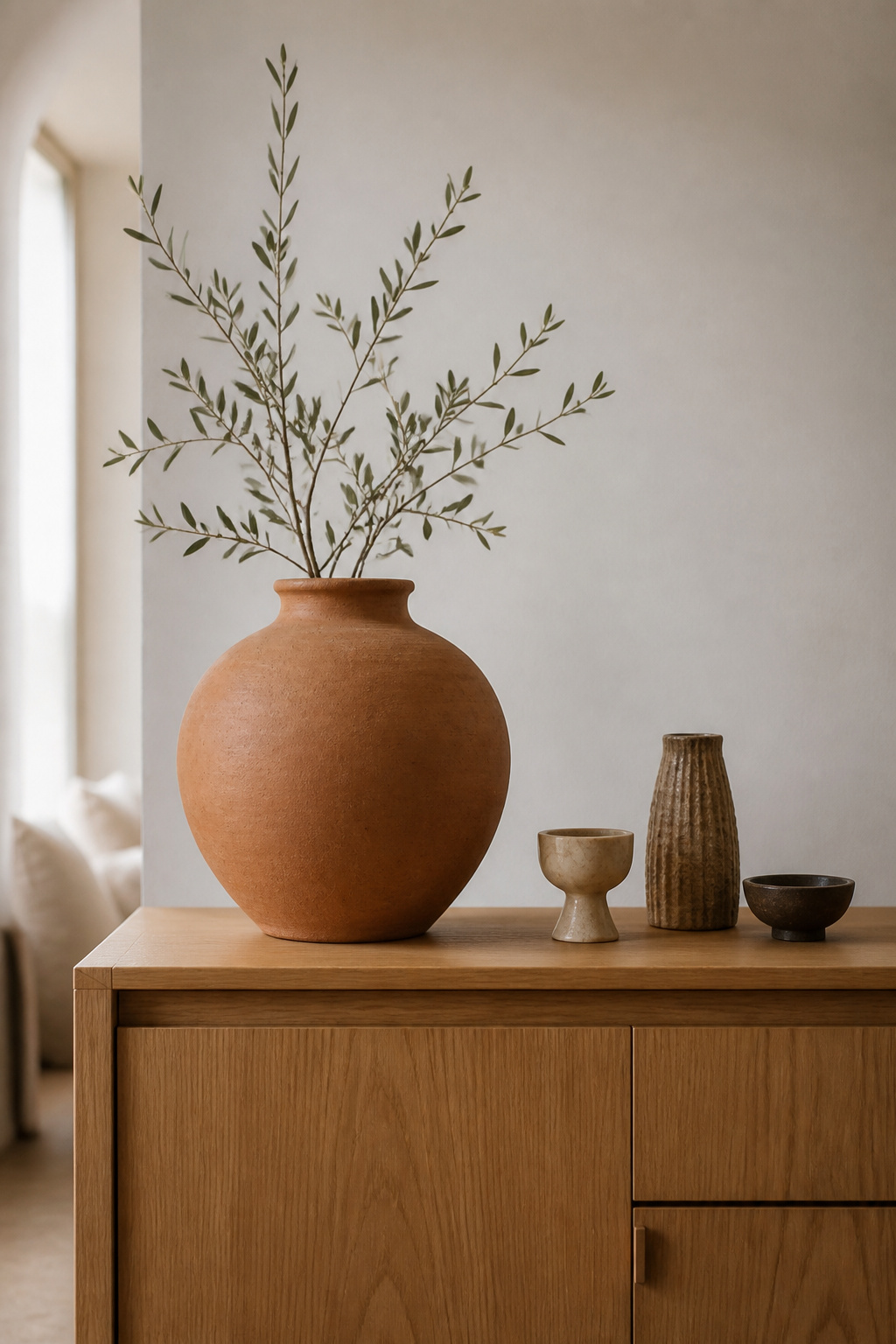
What an anchor does and how to tell if you have one
Ask the question I use on any surface: when someone looks cold, where does the eye go first? If the answer is “nowhere in particular,” there is no anchor. A large buffet may want two, one per end.
Retrofitting an anchor into an existing arrangement
The quickest retrofit is a 32–36 inch buffet lamp at one end or slightly off-centre. If a lamp does not suit, lean a large artwork or mirror directly on the surface — a no-commitment anchor that builds tall zone and focal point at once. As you add it, thin the other objects: a tall lamp surrounded by twenty pieces of equal weight has joined the crowd, not anchored it.
The Checklist: Catch Sideboard Styling Mistakes in Five Minutes
Here is the payoff — a reusable audit for any arrangement. I once converted a client’s hallway into a library corridor with 10-inch-deep shelving, in a space they had been told nothing would fit; it taught me the answer is rarely “more room” and almost always a better diagnosis of the room you have. A buffet is the same lesson at one surface. Run these six checks:
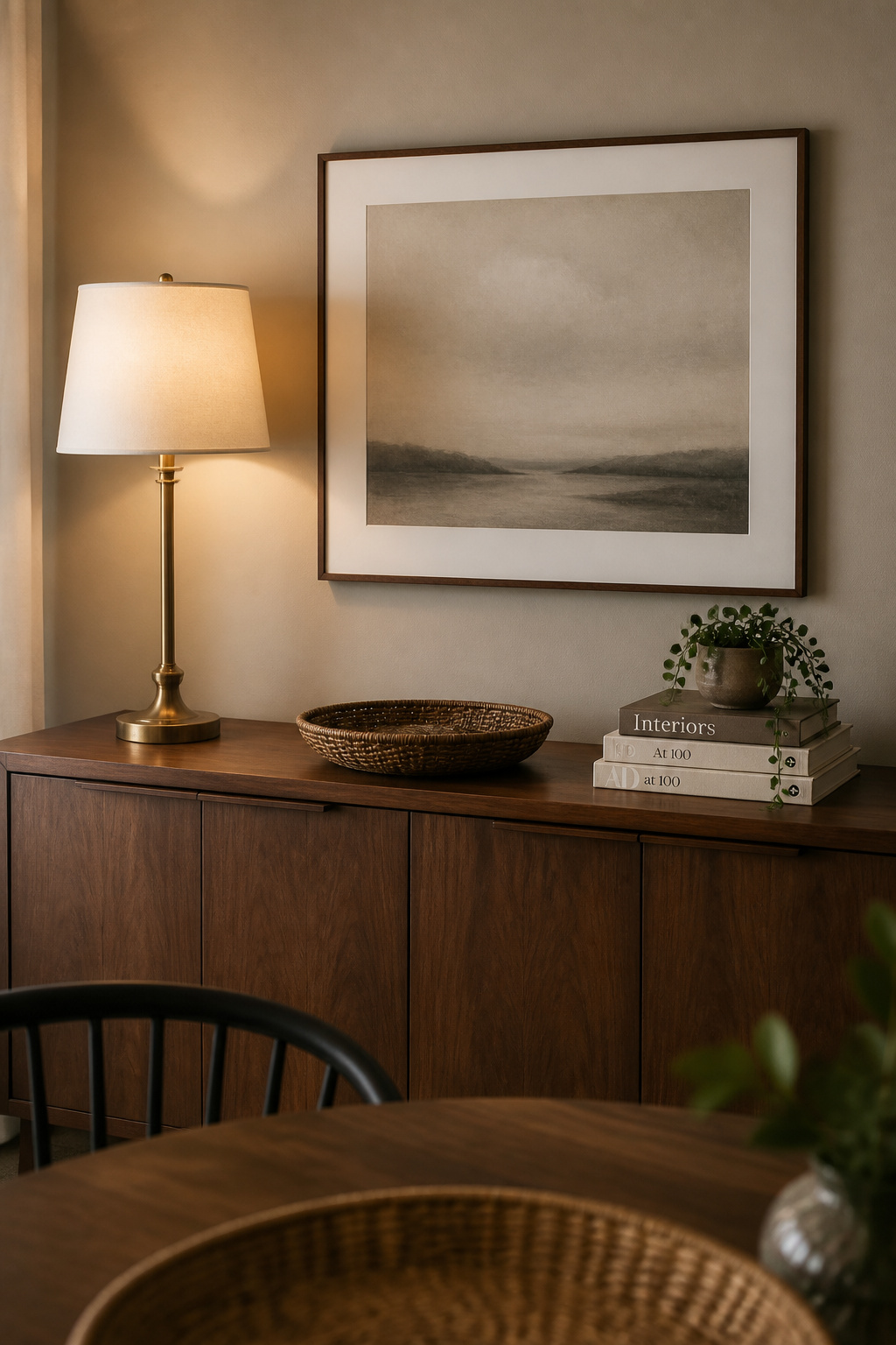
- Height variation. Can you assign every object to a tier — tall (20–30 in), mid (10–18 in), low (4–8 in)? A missing tier is the first fix.
- Object count. Is at least 30–40% of the surface clear? If not, consolidate small items into a tray.
- Anchor. Step back: does your eye go to one object first? If not, add a lamp, large vase, or leaned art piece.
- Wall-zone scale. Does the art sit 4–6 inches above the surface and span two-thirds of the furniture’s width? Either fail means a disconnected wall.
- Symmetry intent. Is the symmetry by design or by default? Composed symmetry suits a formal room; check it is deliberate in a casual one.
- Lamp or lighting. Is there a lamp for evening light and tall-zone height? Without one the surface is flat and unlit after dark.
How to prioritise when there are several problems
Work in sequence: clear the surface, set the anchor, build height around it, check negative space, then the wall. Anchor first always — tuning height on a display with no organising centre is wasted effort.
Seasonal overcrowding — the special case
The trinket problem reliably returns at the holidays, because seasonal accents get added on top of a display instead of swapped in. Keep the base and swap the accents: the anchor and lamp stay year-round, only the mid and low zones change. For the detail on farmhouse sideboard decor, where seasonal layering tips toward clutter fastest, the principles are the same — only the materials differ. Rachel Blackwood’s guide to seasonal sideboard styling builds a whole method on the keep-the-base discipline.
You can now do the one thing standard advice never allowed: look at your own buffet and name exactly what is wrong — plateau, trinkets, lazy symmetry, floating art, or a missing anchor — then apply the matching fix instead of reshuffling in hope. The point was never rigid rules; it is a surface that finally works. Clear it tonight and run the list.
FAQ
Why does my sideboard always look cluttered no matter what I put on it?
Usually you have too many small objects with under 6 inches of clear surface between them, so they merge into one visual mass the eye reads as clutter. The fix is removal, not rearrangement: consolidate small items into a tray, then clear the surface until 30–40% is visible. A missing anchor compounds it.
How do you know if your sideboard is styled correctly?
Step back and ask whether your eye goes to one clear object first — that confirms an anchor. Then check that objects span three height tiers (tall 20–30 in, mid 10–18 in, low 4–8 in) and that 30–40% of the surface is clear. A final test: removing any object should feel like a loss, not a relief.
What is the most common mistake when decorating a buffet?
Overcrowding the surface with too many objects, especially small ones, is the error designers cite most. The fix is to curate down rather than add. The next most common is uniform height — a flat plateau with no movement — solved by a tall anchor at 20–30 inches, a mid piece, and a low grounding object.