


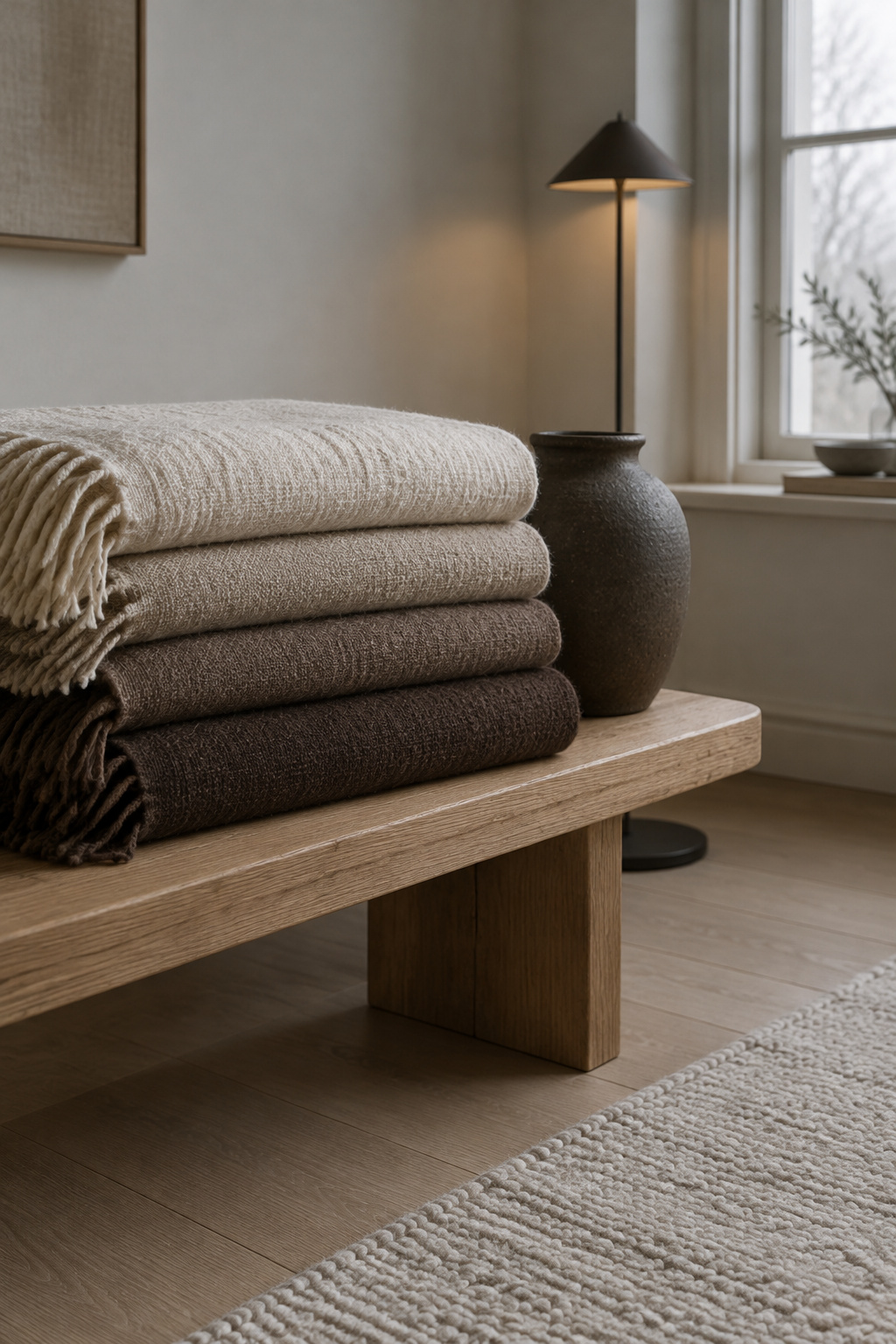
A room in one shade is not calm. It is undecided. You can paint every wall oat, buy the oat sofa and the oat throw, and still feel your shoulders creep up when you sit down at night. A tonal living room works when its color runs from light to dark inside one loose family, with one deep tone holding the bottom of the range. Without that bottom, the eye keeps looking for somewhere to land, and in a pale room it usually lands on the phone charger.
TL;DR
- A tonal room uses one color family at several strengths, from a pale wall down to one clearly dark piece, and paint makers already sell neutrals that way.
- In lab tests, lighter walls and ceilings made rooms look somewhat taller and a lighter floor changed nothing; whether neutral colors add anything beyond their lightness is still open.
- In a low-contrast room the darkest object takes the eye, so choose one deep anchor on purpose and move the accidental ones, like a black charger, out of sight.
A Tonal Living Room Calms Only When It Runs From Light to Dark
Before choosing a paint chip, name what the room should do to you. Mine should let an evening settle: the scanning stops, and attention finds somewhere soft to stay.
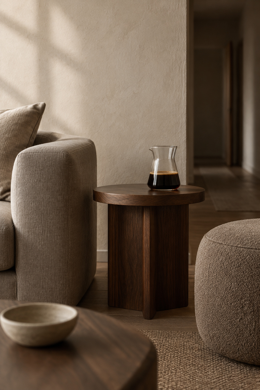
A tonal scheme is one color, or one close family, used at several strengths. Paint makers sell it as a staircase. Resene’s neutral cards show up to six strengths of one color side by side. Paint & Paper Library groups 95 shades into 19 families of five strengths each, numbered by how much pigment they carry.
With little difference in lightness, nothing tells the eye where to rest, so it keeps moving. Resene says it plainly: a completely tonal scheme can look boring without texture or a deep neutral to give it interest. So the room needs a top, a middle and a bottom — a pale step for the large surfaces, a middle for what you sit on, and a clearly dark step low in the room, where it can hold everything else down.
Spread One Family Across Walls, Sofa, Wood and Textiles
Give the palest step to the large upright surfaces, because they fill most of what you see. Upholstery takes the middle. The darker steps go low and smaller: wood, a rug, a cushion or two.
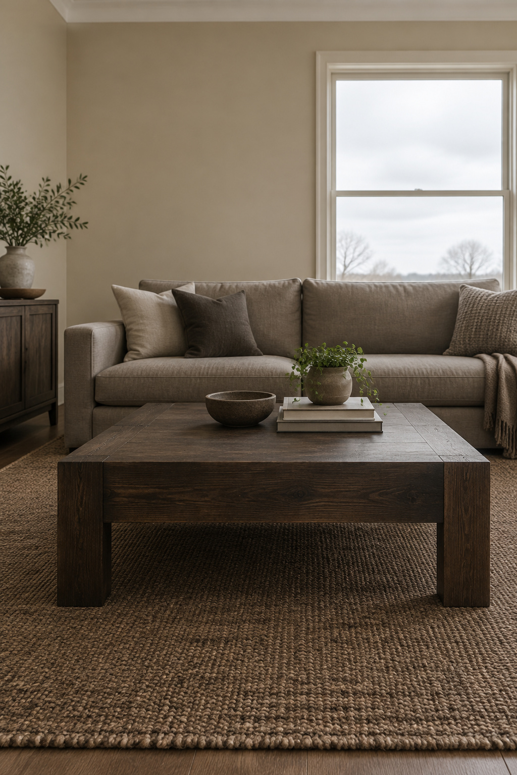
The wall is the palest step and the one you look at longest, so it deserves its own decision; choosing a greige for the walls against the floor and sofa you already own is where I would begin.
Here is how the steps usually fall in a living room.
| Step | What usually carries it | What to watch |
|---|---|---|
| Top | Ceiling, trim, walls | Ceiling and trim can go lighter than the walls |
| Upper middle | Curtains, a linen throw | Sheer or linen texture keeps them from vanishing into the wall |
| Middle | Sofa and upholstered chairs | Same temperature as the walls: all warm or all cool |
| Lower middle | Rug, cushions, a pouf | A knobbly weave or self-pattern instead of a new color |
| Bottom | Wood, one dark piece | One clear deep tone, low in the room |
Layered neutrals work best all warm or all cool, and the large surfaces are where a mismatch shows. A fabric and a wall can also match under the window and part ways under a lamp, so judge every step in both lights. Let texture and gloss supply the variety.
Do Neutrals Make a Room Look Bigger? Lighter Walls Read Taller
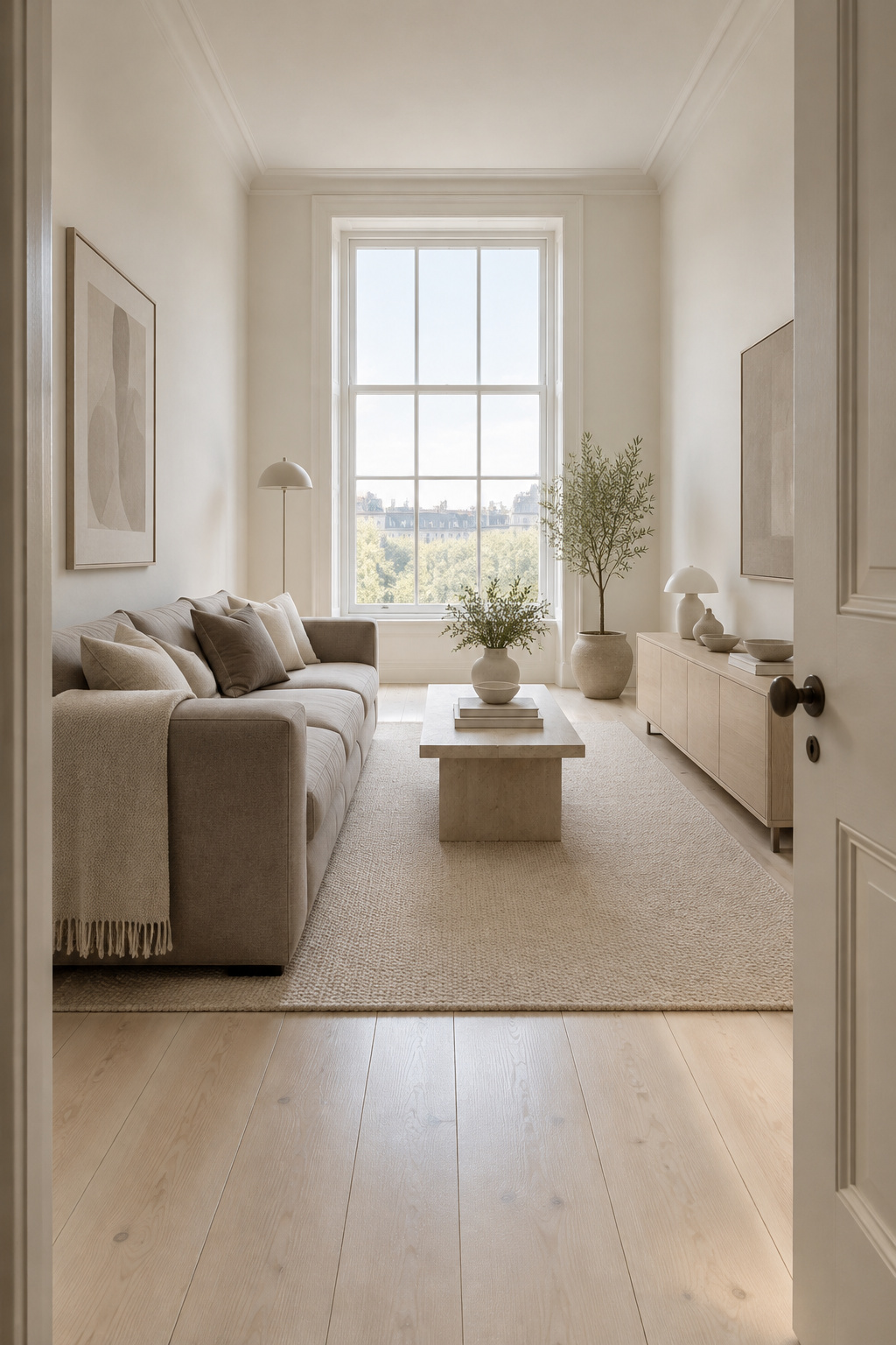
It is the promise attached to almost every neutral room, and the closest thing to a test comes from the University of Mainz. In 2010, Daniel Oberfeld and colleagues built virtual rooms, gave the walls, ceiling and floor gray finishes at three levels of lightness, and asked people to judge how tall each room was (Quarterly Journal of Experimental Psychology 63(10)). Lighter ceilings made the rooms look taller. So did lighter walls. Floor lightness made no difference. A 2011 follow-up in Human Factors put a modest size on it: a lighter ceiling added about 4.5 cm to how tall a room looked, and did nothing to how wide it looked.
The study measured height, in gray rooms on a screen, with 12 and then 20 observers. Depth and overall spaciousness were never judged, and because every surface was gray, color in the everyday sense — warm beige against a soft green of the same lightness — never entered the room. No study has compared a neutral room with a colored one at matched lightness. Lightness is what was tested; whether neutrality adds anything on top is open.
The paint companies split on it too. Sherwin-Williams argues that light colors advance and can make a room feel smaller; Benjamin Moore UK’s color handbook says lighter colors recede and make a space feel bigger.
For a tonal room, keep the walls and ceiling light if height matters to you, and put the deep steps in the furniture, or a dark floor, since floor lightness made no difference to height, and the range stays whole.
Hold the Bottom of the Range With One Deep Anchor, Not a Matched Set
Matching sets look calm in photos and fussy in life. In a picture, sofa, loveseat and chair in one fabric make a tidy block. Sit among them and every piece carries the same weight and the same middle value, and the room seems to ask you to keep it that way. (I say this as someone who rearranges one open kitchen shelf more often than I’d admit.) Designers more often call it flat; Ashley Hauza of Hauza Studio says identical wood tones, finishes and silhouettes leave a room with no contrast. I see it a little differently: sameness at that scale feels like something to maintain, and maintenance is not rest.
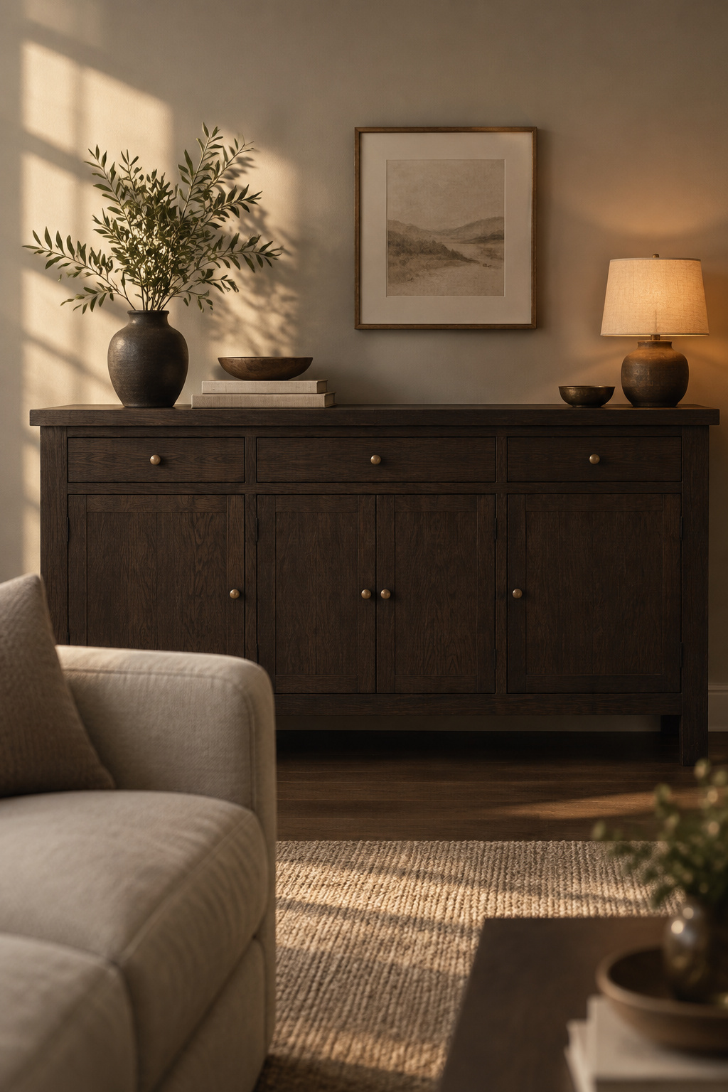
A loose family is calmer. The pieces share a temperature, but not a dye lot. Then one piece goes clearly deep: a dark wood sideboard, a deep rug, or a chair in charcoal or a brown-edged gray, the deep neutrals Resene suggests for a tonal room. Only one, though: several mid-dark accents just make a murkier middle. A single deep tone, low and fairly large, gives the palette a floor to stand on.
Wood is the easiest anchor because most rooms already have some, and it often supplies both the middle and the deepest steps; using wood as the darker tones covers how to choose and repeat them. If your anchor is upholstered instead, know that very dark furniture shows dust and fingerprints more than any other color.
The Lone Black Object: Why a Phone Charger Can Run a Whole Quiet Room
A client of mine had a reading nook that faced the charging station, and she couldn’t stop checking her phone. We moved the charger to another room. That changed the nook more than anything she had bought for it.
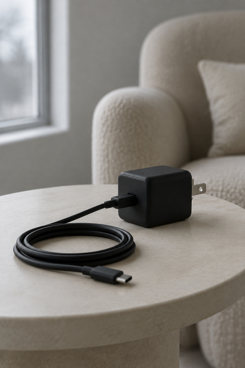
Part of that is the pull of a phone. Part of it, I think, is simpler. Dark and high-contrast objects carry more visual weight, which means they draw attention first, and an object sitting in light, empty space looks heavier still. In a busy room a black charging block is one dark thing among many. In a quiet tonal corner it is the darkest thing in sight, and the eye keeps going back. The calmer the room, the louder its one accidental contrast.
So the first work is subtraction. What can leave? My usual order:
- The charger and its cables, to a drawer or another room
- Black frames and boxes sitting on pale shelves
- A dark remote, speaker or router on a light surface
- The TV, when it hangs as the only dark rectangle on a pale wall
The TV rarely leaves, so the fix runs the other way: set it against the room’s deepest step, a dark wall or a dark rug below, so it sinks into the bottom of your range.
Tonight, sit with it for ten minutes from your usual seat and find the darkest object you can see. If you didn’t choose it, move it.
Start From One Fabric You Love, Then Step Lighter and Darker
If the paint chart feels like too many decisions, begin with something you can touch. A rug or upholstery fabric was designed to hold a pleasing set of colors, and you see it in your own room, not as a small chip under shop lighting.
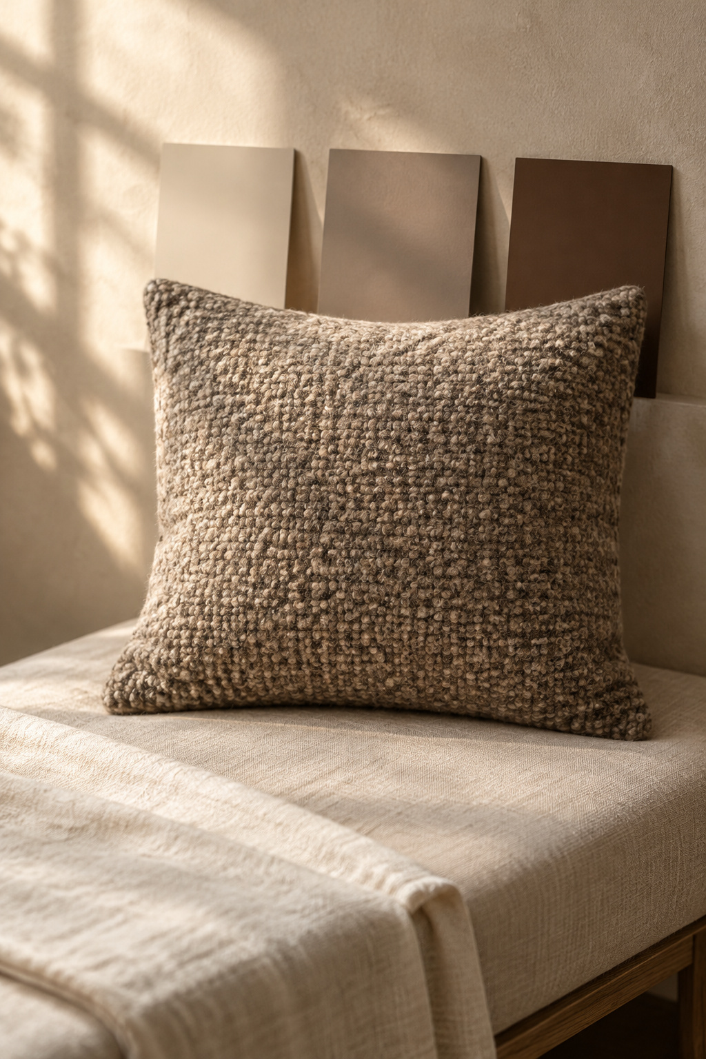
- Choose the fabric you love most in the room and name its main color. That is your middle.
- Find a step lighter in the same family for the walls.
- Find a clearly darker step for one piece low in the room: wood, a rug or a single chair.
- Check temperature. A warm fabric wants warm walls and a warm anchor.
- Paint large samples, two coats, let them cure for a day, and look at all three steps in daylight and again under your evening lamps.
- Squint from the doorway until the colors blur. If it all melts into one cloud, the room has a middle and nothing else; you want a top, a middle and a bottom.
Then add texture, not another color. The sofa, lamps and sound of the room have their part too, and the neutral cozy living room ideas bring those pieces together.
The paint makers will go on arguing about whether a pale wall comes toward you or falls away. I trust the evening test instead. Sit in the room at the hour you actually use it, let it be a little empty, and notice whether your eye has somewhere to land.
FAQ
What is the difference between a tonal and a monochromatic living room?
There is no standard line between them; the two words are used almost interchangeably. Monochromatic usually means one hue in lighter and darker versions. In a neutral living room I use tonal a little more loosely: one family that can drift from oat to mushroom to cocoa, as long as it shares a temperature.
Can you mix warm and cool neutrals in one room?
You can, but keep the large surfaces in one temperature. Layered neutrals work best all warm or all cool, and walls, sofa and floor are where a clash shows first. Put the other temperature into smaller accents, and make those clearly lighter or darker so the contrast looks deliberate rather than like a near-miss.
How do you keep a tonal living room from looking flat?
Give it range and texture. Include at least one clearly light and one clearly dark tone so nothing clusters at the same middle value, then vary texture and gloss inside the family: a linen curtain, a knobbly rug, grainy timber, self-patterned cushions. A flat tonal room usually has a middle and no bottom.