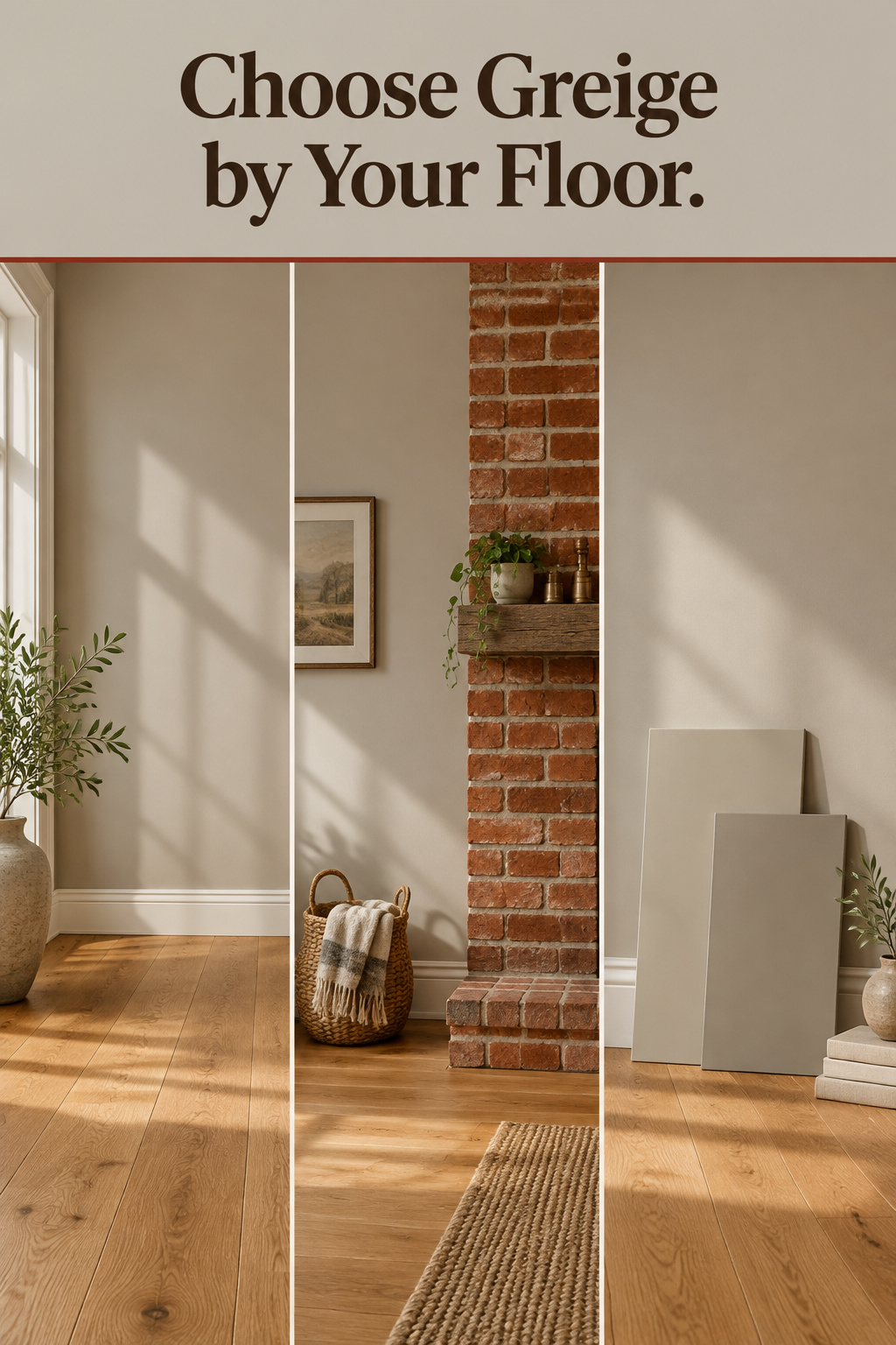
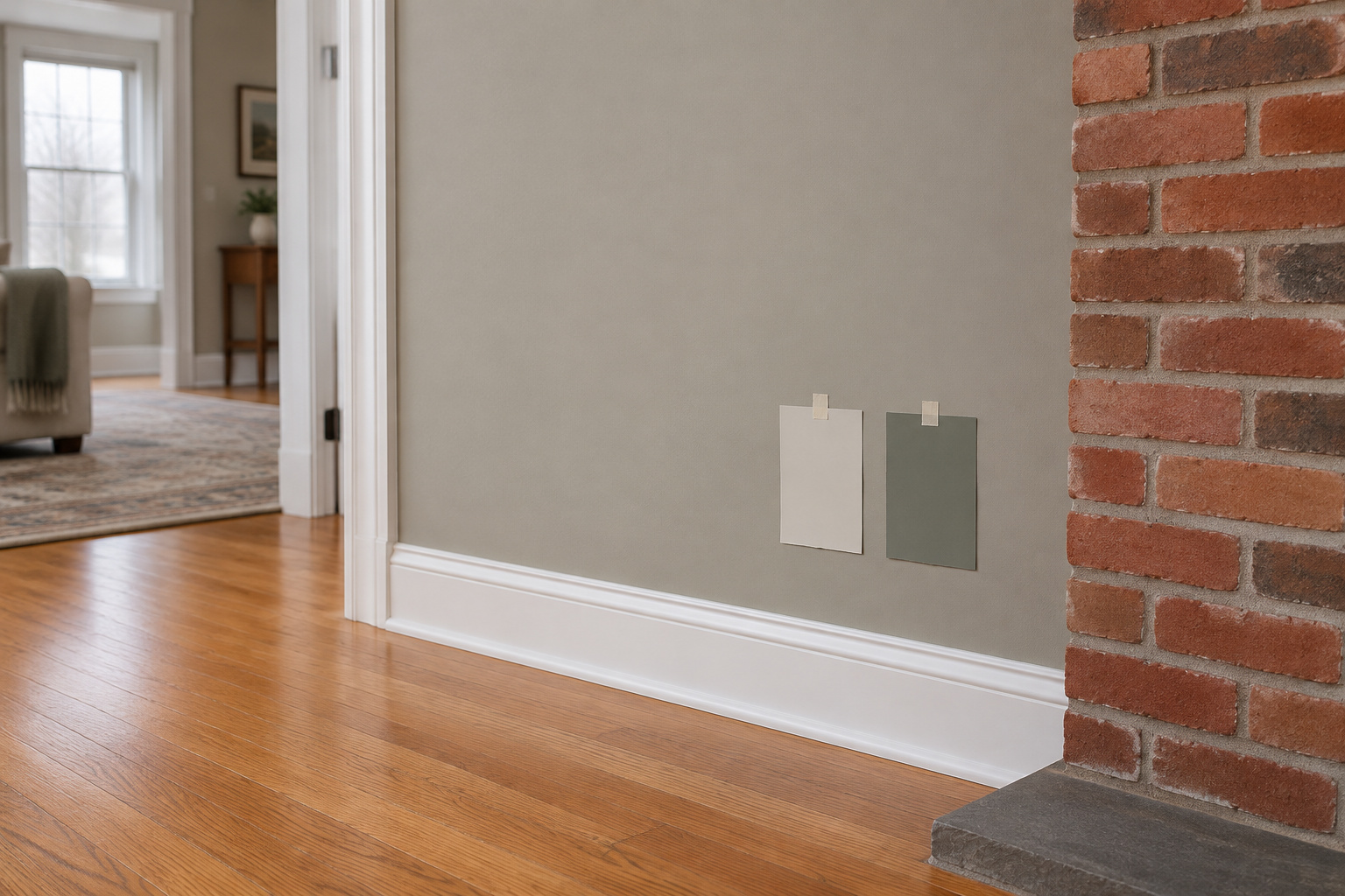

Look down before you look at a single paint chip. In many older living rooms the floor is red oak under a 1990s or 2000s polyurethane, and its color has two sources: the wood’s own pink-red cast and the yellow in the finishes of that era, which together read orange. That floor was there before you. In a greige living room it decides more about the wall than the name on the chip does.
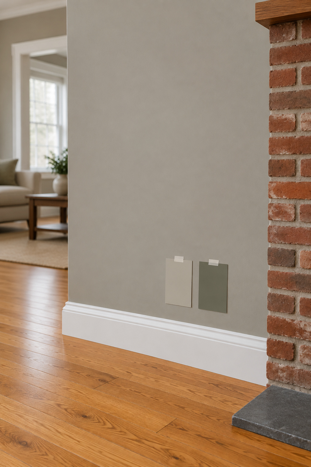
Greige is a beige with gray worked into it, and on its own it hasn’t made up its mind. Beside a warm floor, red brick or creamy trim it takes a side. So choose backwards: start with what you can’t change, and let those colors pick the paint.
TL;DR
- Greige shifts with what sits next to it: beside honey or orange oak a warm greige can look gray, because the floor becomes the warmest thing in the comparison.
- Worldly Gray (LRV 57.238), Mindful Gray (47.698) and Perfect Greige (41.654) are three Sherwin-Williams greiges worth sampling against your own floor and brick.
- Test on a movable board at least 2 ft square, two coats, held against the floor and trim, and judge it morning, afternoon and under lamps before you buy a gallon.
Greige Living Room Walls Start With the Floor, Not the Paint Deck
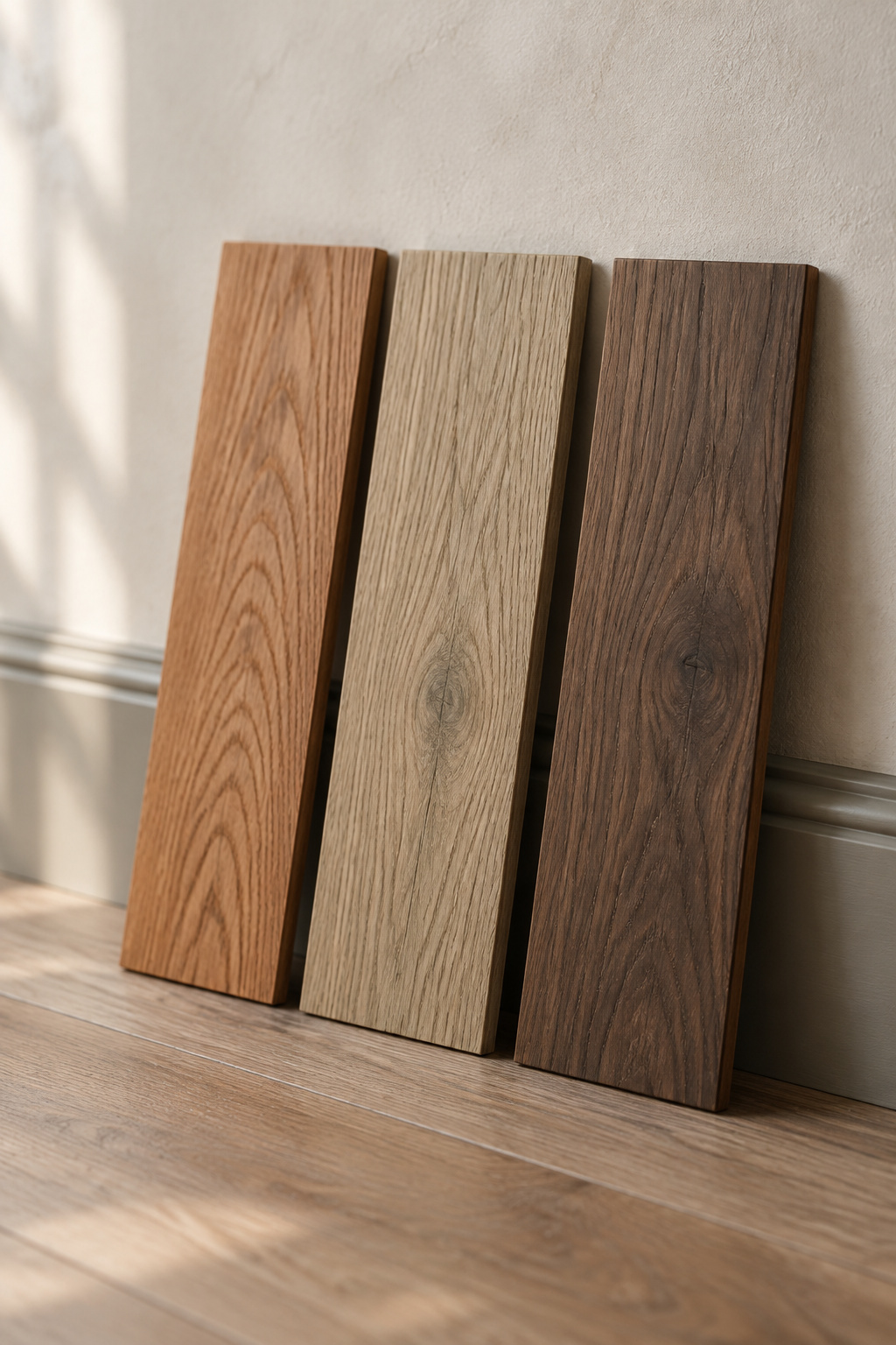
Oak is not one color. Red oak commonly carries a reddish cast, a pink tint that flooring people will tell you is hard to disguise. White oak commonly runs olive, often showing gray or green once it’s down, so it isn’t warm in the way red oak is. Walnut is the least predictable, anywhere from pale brown to dark chocolate, sometimes with a gray, purple or reddish cast.
Color consultant Max Ruthven describes a warm greige that “suddenly” looks gray beside honey oak, because the floor’s yellow, orange or red makes the wall look cooler by comparison. “The paint did not change. The comparison did.” Beside golden wood a greige’s gray side may move forward, and a muted green in it can become easier to see, since red and orange push a gray toward green.
Read the floor before you judge anything. Hold a sheet of white printer paper against the boards and the undertone shows at once; oak usually goes yellow-orange. Judge the installed floor from across the room rather than one board. Wood furniture can be read the same way, but the floor is the biggest surface and it gets first say.
Brick, Stone and Trim: The Other Fixed Colors That Pull Greige Off Course
I live in an 1898 brick house in Bucks County, Pennsylvania, and old brick is stubborn. It has no plans to change for a paint chip, so I test colors against it, not the other way round.
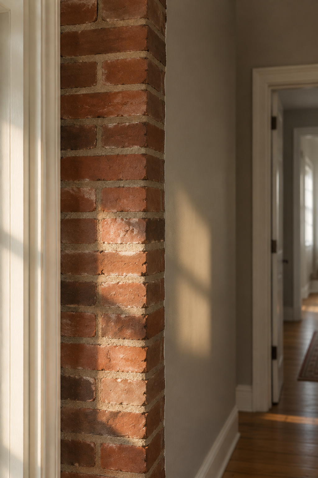
Let’s see what it’s made of. Brick and stone are multi-toned, so step back and judge the average, then look at the mortar. Designer Kylie Mawdsley notes that mortar often carries a warm violet or green undertone, and advises a neutral that shares the brick’s undertones if you want the brick to settle down.
Here the advice splits. Some say a green-leaning greige balances red brick or red oak. Mawdsley says avoid blue and green undertones in a greige beside pink and red brick, because they fight its warmth. Both camps are reasonable, so let the brick settle it. Hold the sample against it and believe what you see.
Trim is easier. Stark cool-white trim tends to make a warm wall look dull, and a warm, creamy white is the usual fix. Nobody has published how a greige reads beside aged cream trim, so test that pairing too. Color stylist Jessica Williams gives the same advice for every fixed surface: if the floor, counters or tile are locked in, match the wall’s undertone to them, not against them.
Three Greiges to Test Against Oak, Brick and Cream Trim
These three Sherwin-Williams greiges make a sensible sampling set because they step down in lightness. LRV, light reflectance value, runs from 0 for black to 100 for white and tells you how much light a color returns. It says nothing about which way the color leans, and the labels disagree: Sherwin-Williams’ own description calls Worldly Gray “a warm gray,” while its HGTV Home line labels Worldly Gray and Mindful Gray “Cool.” The undertone column is what reviewers report.
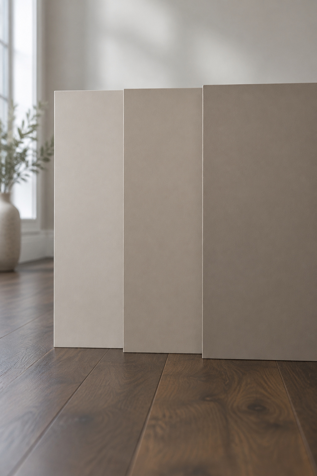
| Greige | LRV | How reviewers read the undertone |
|---|---|---|
| Worldly Gray SW 7043 | 57.238 | Passive warm gray, very mild green bias; cooler in north light, more greige in warm sun |
| Mindful Gray SW 7016 | 47.698 | Warm gray leaning cool, brown with a slight green; grayer in daylight, warmer under lamps |
| Perfect Greige SW 6073 | 41.654 | Taupe with a faint pink or violet cast in cool light |
The steps are plain subtraction: 57.238 − 47.698 = 9.540 from Worldly Gray to Mindful Gray, 47.698 − 41.654 = 6.044 on to Perfect Greige, 15.584 across the set.
None of them comes with a verdict on your floor; nobody has published these shades beside red oak or brick. The principles above predict that Worldly Gray, with its faint green, is the likeliest to swing cool beside orange oak, and that Perfect Greige, darkest and most taupe, should hold its own best beside warm wood. Those are predictions, not results. For Pale Oak, Edgecomb Gray and Accessible Beige, the modern farmhouse paint colors article has the numbers.
Test Greige Where It Will Live: Big Samples, Two Walls, Three Times of Day
My workshop has a coffee can full of labeled paint chips from houses I’ve worked on. I started keeping them after a client insisted a pink was original, and the layers proved it dated from the 1950s. Old isn’t the same as original, and the can is how I check before I say so. A greige deserves the same habit: check the colors you can’t change before you call any chip right.
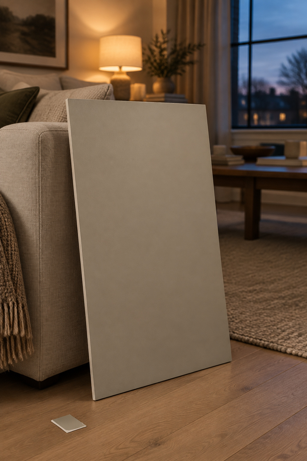
A chip can’t show undertone on its own; it only shows against the room’s floor and trim. So:
- Paint a board, not the wall. White foam core works. Two coats, at least 2 ft by 2 ft.
- Stand it on the floor against the boards, brick or trim, and look from where you sit.
- Move it between the wall opposite a window and the wall beside it.
- Leave it up at least a full day: morning, mid-afternoon, and night under lamps. If it only works at one time of day, it’s the wrong color.
- Compare three or four related greiges, but keep the boards apart; colors set edge to edge distort each other.
- Sample in the sheen you’ll buy, since sheen can make a color look lighter or darker. The same goes for limewash in a greige tone: sample the finish that will actually go on.
Peel-and-stick samples from Samplize skip the painting: $6.95 for 9 x 15 in, $9.95 for 15 x 18 in. The Sherwin-Williams ones come in satin, so allow for that against a matte wall.
A good restorer leaves notes for the next one. Write the name, number and sheen on the back of each board and on the lid of the can you buy. The next person to repaint may well be you.
What Goes With Greige: Start With the Sofa You Already Own
The question “what goes with greige?” assumes the wall comes first. In a lived-in room the sofa is already there, the third fixed color after floor and brick, so hold the swatch against its fabric too. Designer Helen Shaw groups color families: warm grays such as greige with reds and oranges, cooler grays with blues and mauves. If the sofa is another neutral, keep it warm too.
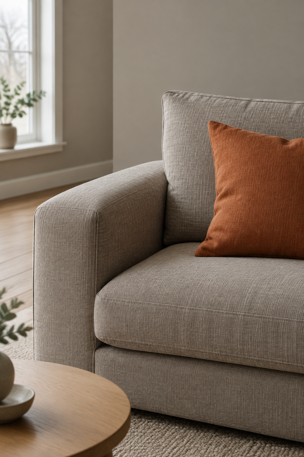
Decorilla’s Katarina Skipic warns against matching too well: a greige sofa landing almost exactly on the wall color can disappear unless the fabric has strong texture. Let the wall be the palest step and the sofa a clear step darker, then bring in mustard, burnt orange or navy as the accents. For running the whole scheme from light to dark, see building a tonal room around the wall color.
When Greige Is the Wrong Neutral, and What to Use Instead
The difference from beige is in the pigment. Beige is built on yellow, gold or red pigment and usually stays warm. Greige has gray in it, which can push it toward green or purple. Williams says it “refuses to commit,” and the undertone that is faint on the chip turns loud on the wall.
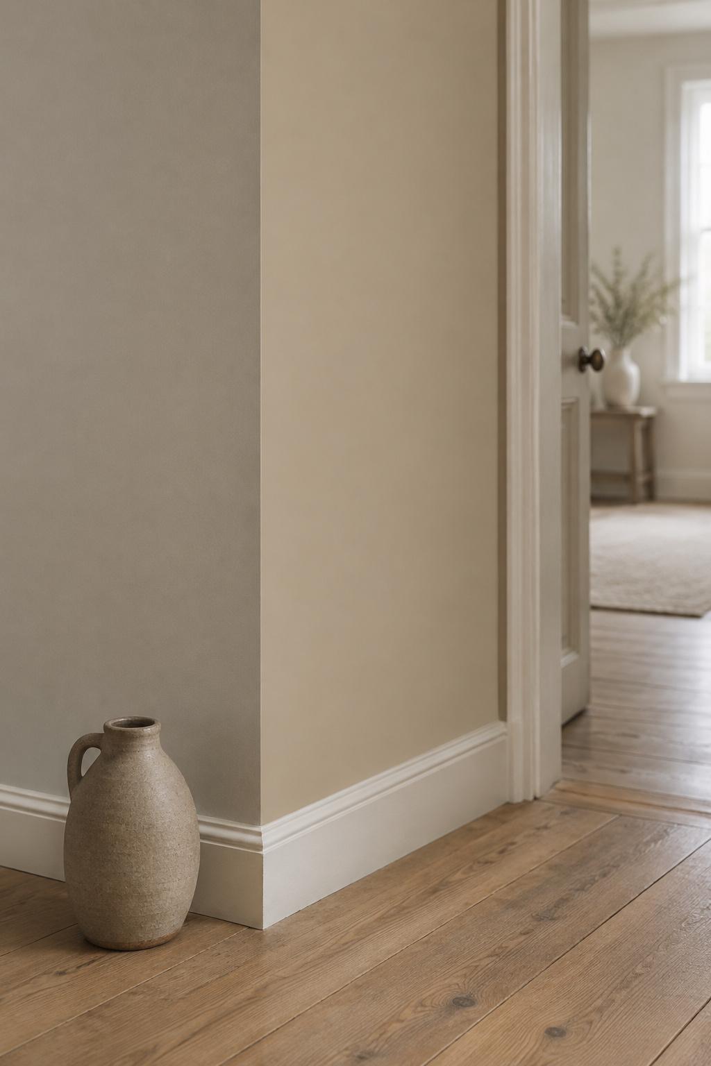
That doesn’t mean an oak or brick room must give up greige. A cool greige is what fails there, and a green-leaning one is the case to test; red-toned oak wants warmer neutrals, a warm greige, warm white or soft taupe. The rules I’d keep:
- Read the floor, brick and trim first, with white paper.
- Treat “warm” and “cool” labels as relative; your floor decides which way the paint leans.
- Where every fixed color is strongly warm, choose a warm greige, taupe or warm beige.
- Keep the sofa a step darker than the wall.
- Decide only from a large sample held against the real materials.
Greige is one route to a neutral living room that feels warm, not the only one. In your own room, start with a single test: lay white paper on your floor, see which way it leans, and sample only the greiges that lean with it.
FAQ
Is greige going out of style?
Warm greiges aren’t, but cool ones are. Emily Kantz, a color marketing manager at Sherwin-Williams, says cooler, steely grays are fading while softer, warmer grays with beige or taupe undertones remain relevant, and she counts soft greiges and putty tones among the neutrals replacing them.
Does greige look different in matte and eggshell finishes?
Yes, slightly. Sheen can make a color appear lighter or darker depending on the light, and flat finishes give a richer, non-reflective color. Sherwin-Williams recommends satin or eggshell for living-room walls and calls matte suitable too; Benjamin Moore recommends eggshell. Whichever you pick, sample in that sheen, because a satin sample reads a little differently on a matte wall.
How many coats of greige do you need over a darker wall color?
Plan on primer and at least two topcoats. Crown Paints says primer is essential when covering dark colors and to expect at least two topcoats over very dark walls, with some stubborn colors needing three. Use a primer made for big color changes, and follow the maker’s drying time between coats.