
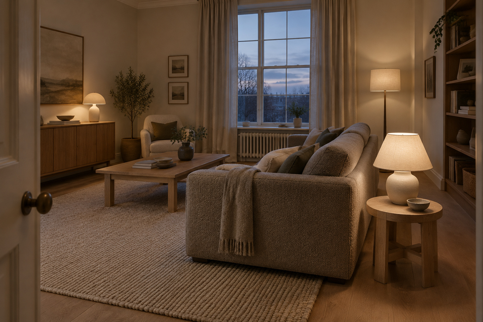

It is early afternoon and the room is at its tidiest. Daylight comes in flat from the window and lies evenly on everything: the oat walls, the oat sofa, the pale rug, the cream cushions standing in a row along the back. You rest a hand on the sofa arm. The fabric is cool and tight, and the arm gives nothing back. The room is quiet in the wrong way. It would photograph well, and you still don’t want to stay.
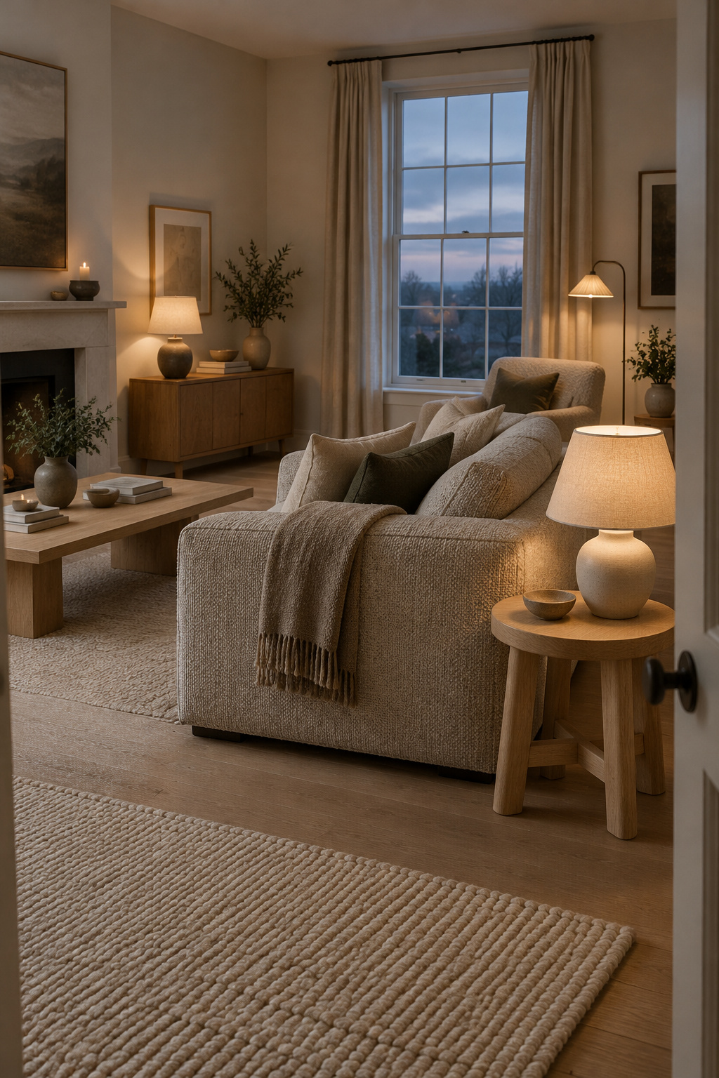
A neutral cozy living room is made from the same beige, greige and cream as this one. The usual guess is that the cold version needs color, or more things. It usually needs neither. What changes is the range: some surfaces light and some dark, some hard and some soft, a seat that lets you lean back, and fewer cushions that all look alike. All of it can be built, a wall at a time.
Why a Neutral Room Goes Cold: One Lightness, One Material Everywhere
Look at that room again and count how many different lightnesses it holds. Two, perhaps. The walls, sofa, rug and cushions sit within a shade or two of each other, and most of them are the same kind of soft, smooth fabric or flat paint. Nothing in it is dark, and nothing is hard or grained. The eye moves across it without stopping, and so does the hand.
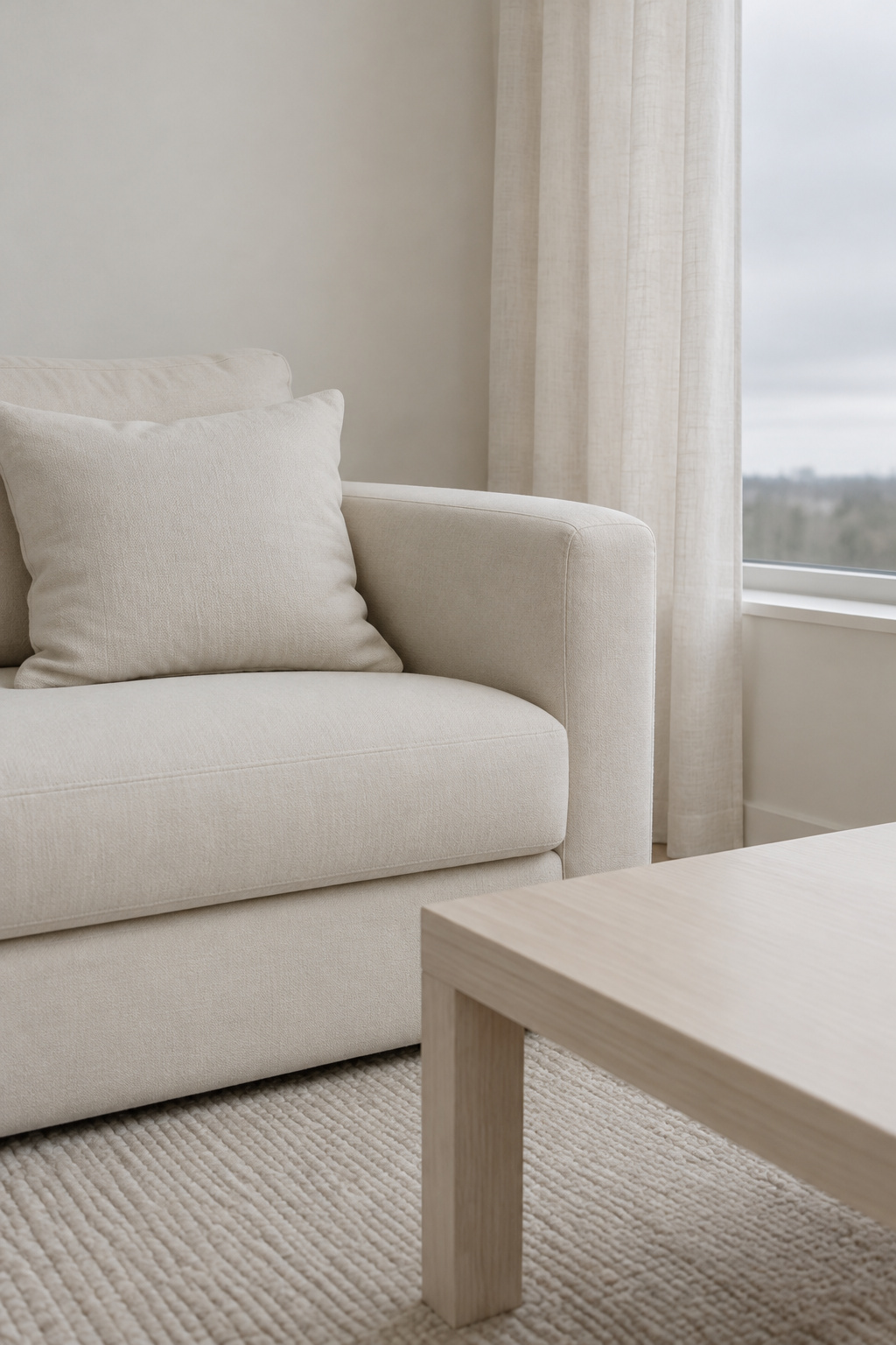
That sameness is what designers keep naming when a neutral room falls flat. Sophie Paterson puts it plainly: “Neutral schemes tend to fall flat when every item is almost exactly the same color.” She applies the same test to fabric. If every pillow has the same texture, she says, the room can still feel flat even when the shades differ slightly. Emma Shone-Sanders makes the distinction I find most useful, that a busy, lived-in living room wants richer neutrals with more contrast and depth, while a bedroom can take gentler, lower-contrast ones.
Low contrast is not a mistake everywhere. One paint maker, Farrow & Ball, recommends it on purpose for rooms meant to feel restful, and in a bedroom I would agree. A living room is different. People sit in it, talk, eat at the coffee table, fall asleep on the sofa. A room that is used that hard needs something for the eye to hold and something for the hand to find.
This is designer judgement, not a lab result. It still fits the cold beige room: the beige is rarely the problem. So the usual fix, a rust cushion or an olive throw laid on top, misses. It adds a color to a room whose real trouble is that every surface reads the same. Look instead for the places where one lightness and one material repeat, and break them.
A Neutral Cozy Living Room, Wall by Wall
Here is one room, walked around once, so the idea has a shape you can copy. It has four walls and a corner, and each does a different job.
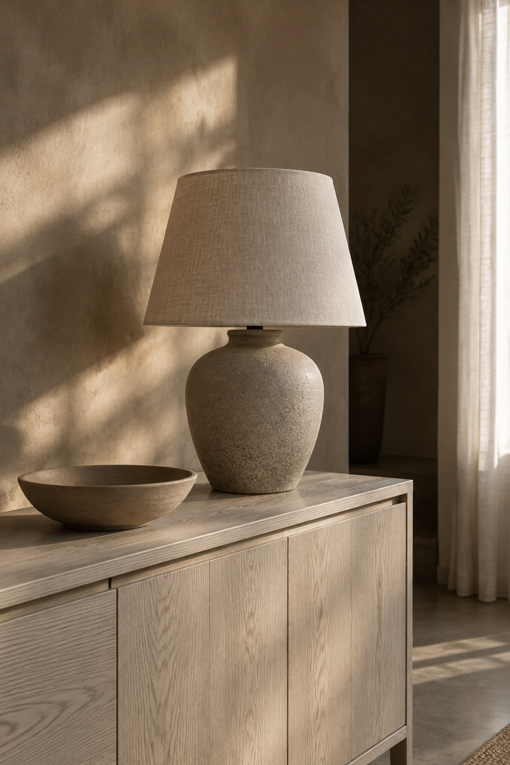
The window wall is the lightest. Paint it in a warm off-white in a low sheen, with the trim a little glossier, and hang plain linen at the glass. In daylight this wall and the window are almost one surface. It is the top of the room’s range, and it should look calm, not bright.
Turn left and there is the wood wall. One real piece stands here, a chest or a sideboard in oak or walnut, with its grain visible from the door. It is the first hard, warm thing the eye meets after the window. Cream beside walnut is Shone-Sanders’ own example of contrast. The wood looks richer next to the pale wall, and the wall looks warmer next to the wood.
The third wall holds the lamp. A table lamp with a fabric shade sits on a side table, and in the evening it lights this end of the room before anything else. In daylight it is just a shape. After dark it is the reason the room has a near side and a far side.
The sofa wall comes next, and the sofa is the middle of the room’s range: darker than the walls, lighter than the wood. Its fabric should have a weave you can feel under your palm, a nubby wool or a slubby linen, so the largest soft thing in the room is not also the smoothest.
Last, one corner goes deep. A chair in a dark brown or charcoal, or a corner painted in a near-black. Paterson’s advice on darker notes is that they make the lighter things around them look better, and Farrow & Ball suggest a very dark shade can make a room feel cocooning rather than closed in. Keep it to the one corner. Spread across four walls, it becomes a dark room, which is a different project.
Stand back in the doorway. The room is still entirely neutral. It works because no two walls share both a lightness and a material.
Start With the Sofa: The Piece You Sink Into Sets the Room
If I could change one thing in most cold living rooms, it would be the sofa. I would judge it by how it sits long before its color.
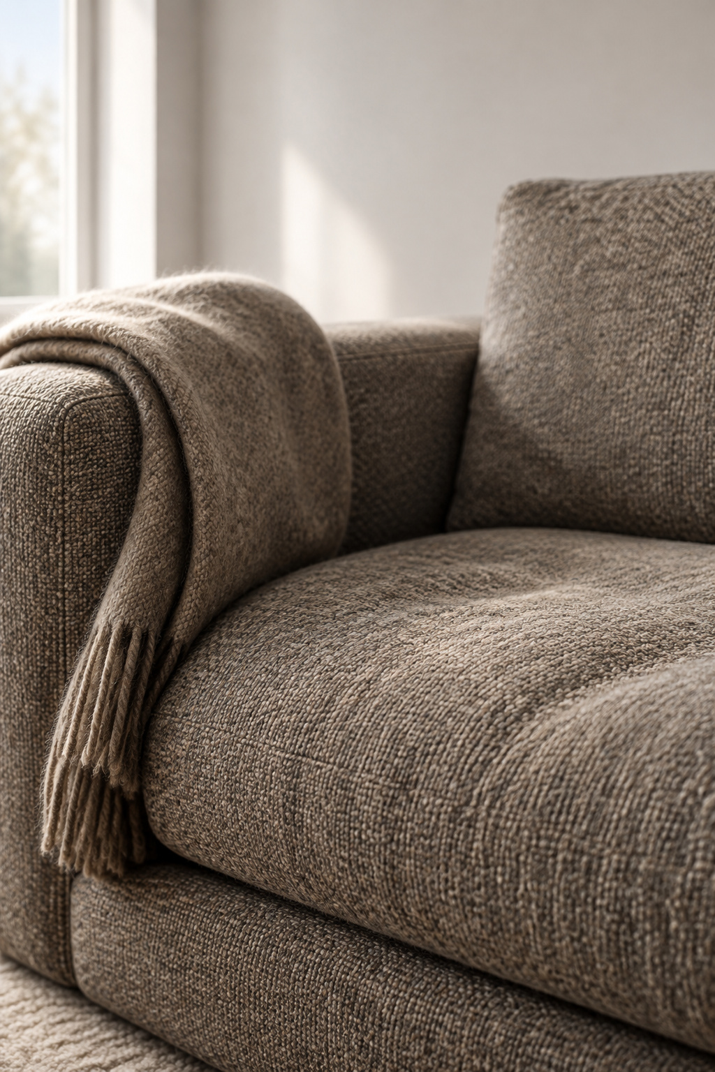
A sofa is the one piece of furniture you use with your whole body. Sit on it before you look at it. Lean back fully, the way you will at ten at night, and notice whether your shoulders reach the back cushion and your feet still reach the floor. A seat you have to perch on the front edge of will never make a room feel warm, whatever shade it is.
The deepest sofa is not always the most comfortable. Samuel Parlier, a furniture maker at The Pattern Room, says American sofas tend to run deep because depth photographs as luxurious, and that a seat too deep leaves you either perching or slouching with your legs out. Depth guides disagree with each other by a few inches, so I would not buy from a number at all. Buy the sofa you can sit back in, and test it in the shop for longer than feels polite. Fill matters too: softer cushions make a seat feel deeper, firmer ones hold you up.
Then the color. A sofa usually ends up as the middle of a neutral room, so it needs to sit a step darker than the walls and survive the household that sits on it. Choosing a neutral sofa color your household can live with is a decision about what your house spills and sheds, and about whether the cover can come off and be washed. Check how the fabric is cleaned before you fall for it.
I would rather put the budget here than anywhere else in the room. A good sofa that you sink into will make plain walls look intentional. A beautiful wall cannot rescue a seat nobody wants to sit in.
The Wall Neutral: A Warm Greige Tested Against What Can’t Move
The walls are the largest surface in the room and usually its lightest, so their color decides the top of the range. It also has to live with things you are not going to change: the floor, a brick fireplace, the trim, and the sofa you have just chosen.
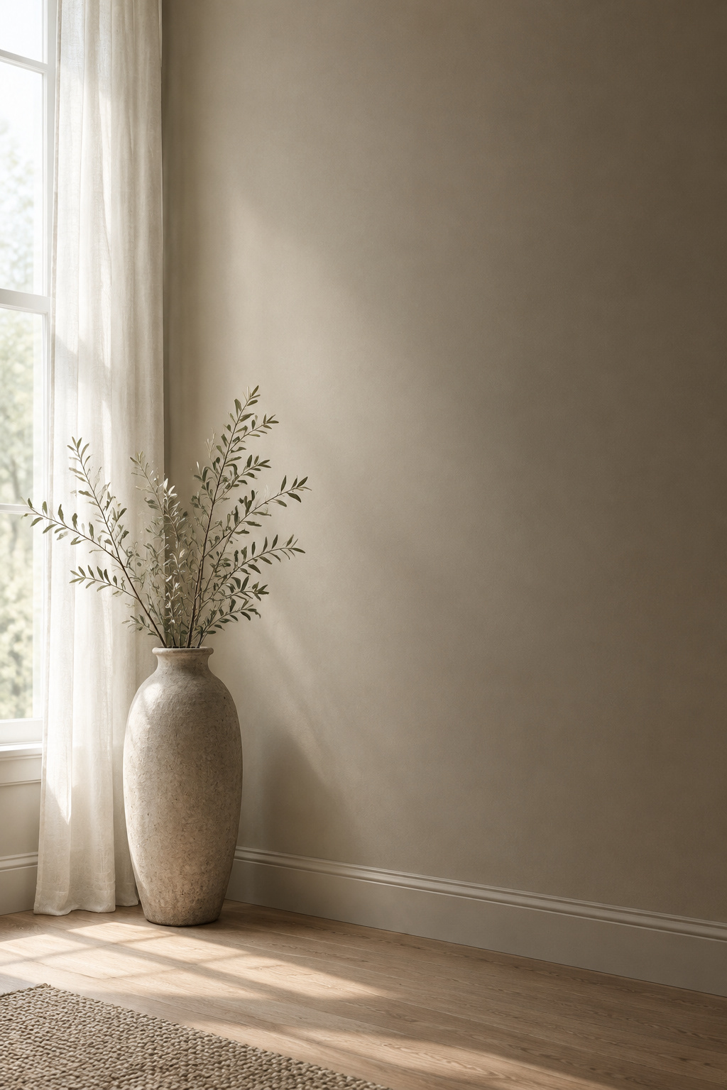
Daylight changes a wall color more than most people expect. Sherwin-Williams describes morning light as warmer and yellowish, midday light as cooler and bluer, with colors looking washed out, and late afternoon light giving rooms a reddish cast. Which way the windows face shifts it again. North light is cool, so the paint makers’ consistent advice for a north-facing room is a neutral with a warm undertone, and to steer away from light colors built on blue or grey. Our article on green paint for north-facing rooms goes further into light direction, and the modern farmhouse paint colors piece covers warm whites.
I grew up in Uppsala and now live in a 1950s house outside Duluth, and in both places a color that looks soft on a chip in a bright shop can read thin on a wall that only ever gets cool light.
A warm greige is a good answer for many living rooms because it sits between beige and grey and can lean whichever way the room needs. But it leans. Beside an orange oak floor, a greige that looked warm on its own can suddenly look cool, because the floor has become the warmest thing in view. That is why I would never choose it from a fan deck. Picking a greige against your floor and brick means holding a large painted sample against the real floor, the real brick and the real sofa, at more than one time of day, and trusting what you see.
Give the wall a day or two of looking before you buy a gallon.
Light to Dark: Giving Your Neutrals Somewhere to Go
A neutral room needs a range of value. Benjamin Moore UK suggests building a palette around an anchor color and adding a lighter version and a mid-tone or darker version of it. Little Greene sells its neutrals in graded families of light, mid and dark that are meant to be used together. A cold room tends to use only one strength of it.
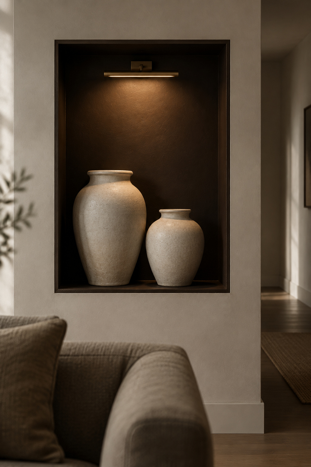
Here is how the three steps usually fall in a living room, and what each one does.
| Step | What usually carries it | What it does for warmth |
|---|---|---|
| Light | Walls, ceiling, curtains | Holds daylight and gives the room its calm |
| Mid | Sofa, rug, a mid-toned floor | Carries the soft surfaces you touch most |
| Dark | One wood piece, a lamp base, a frame, a deep corner | Gives the eye somewhere to stop and makes the pale surfaces look better |
Get the dark row right first. It is the one that cold rooms leave out, and it does the most. In a pale room, even a single walnut bench or a dark linen chair changes how the walls read, because the walls now have something to be lighter than. Several mid-dark pieces scattered around do less than one clearly dark one, placed low.
Pale walls and ceilings made lab rooms look taller, which is about all that has been shown for them. That is one more reason to keep the light step high in the room and the dark step low.
Layering neutrals from light to dark takes this further: how to keep the whole range in one loose family, how to keep the large surfaces at one temperature, and how to spot the dark object that took over the room by accident.
Wood Beside Soft Weaves: One Real Material Needs a Partner
Put your hand flat on a wooden tabletop, then on a ceramic tile. The wood feels warmer, even when the two are at nearly the same temperature. Measurements bear this out: fingertips lose less heat to solid wood than to tile, terrazzo or glass, and the feeling of warmth follows that.
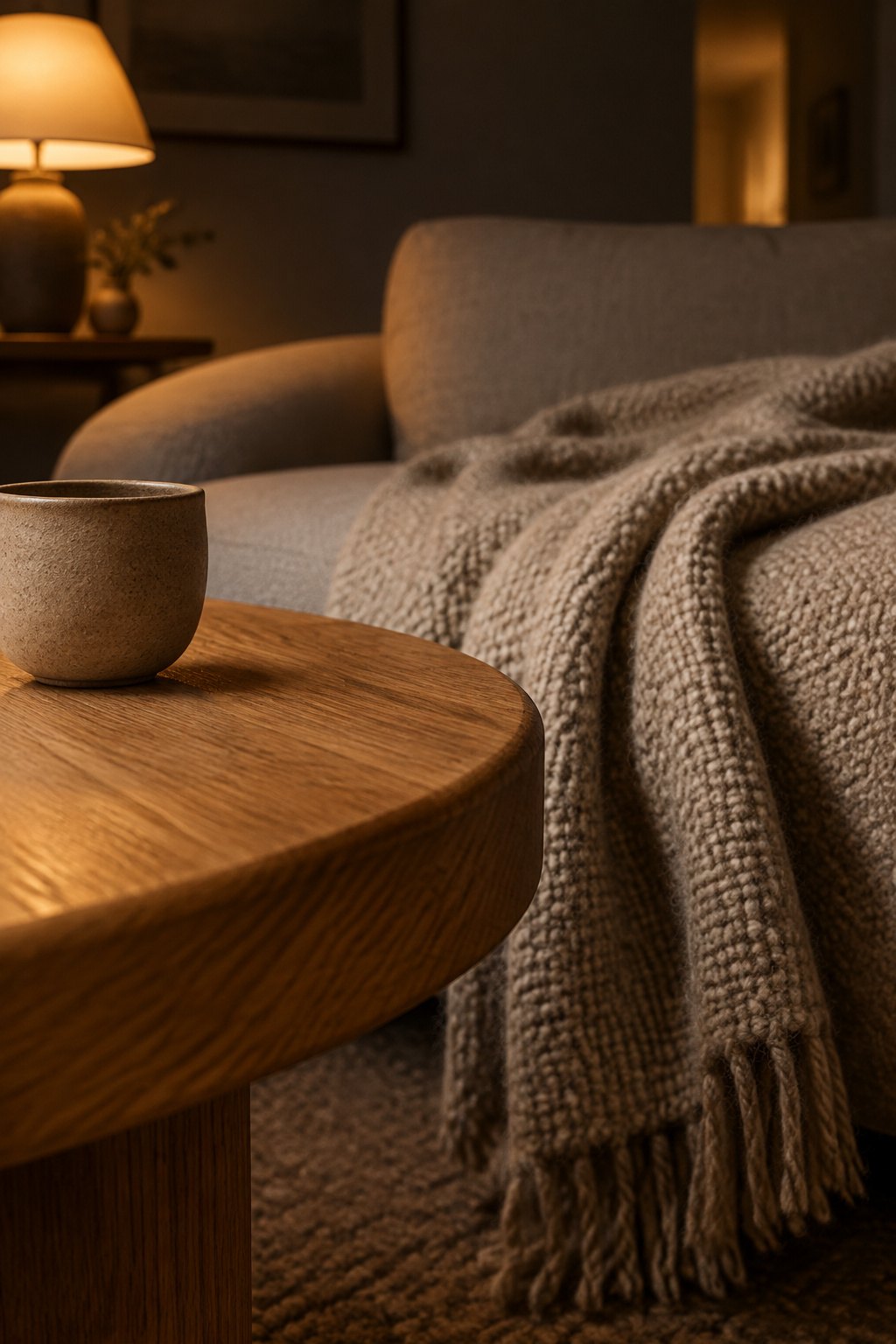
The same holds when people only look. In a 2018 study by Begüm Ulusoy and Nilgün Olguntürk, 96 people rated model rooms finished in different wall materials. Timber and fabric were rated equally warm, and both warmer than plasterboard. Then the researchers paired timber with fabric, and the pair was rated no warmer than either material on its own.
The result stops a common overclaim. Wood and wool together do not add up to extra warmth. What they give a room is range. A neutral room built only from paint and upholstery has one kind of surface. Add grain under the hand, the edge of a solid table, a woven throw lying over a smooth chair arm, and the room has several. That variety is what the eye and the hand are missing in the cold version.
So buy one real piece of wood before you buy three that only look like wood. A solid oak coffee table or an old pine chest has grain that runs right through, edges that wear soft, and a surface that changes as you live with it. Veneer pieces bought to fill a wall tend to be pale, smooth and alike, which is the sameness we are trying to break.
Once there is more than one wood in the room, the question becomes how they sit together: which leads, which contrasts, and what to do when they almost match. Mixing wood tones in a living room answers that, starting from the floor. For texture as a wider palette of materials, our moody living room textures piece lists the options.
What You Hear and What You Switch On: Soft Surfaces, Echo and Lamps
Two more things can leave a neutral room cold, and neither shows in a photograph.
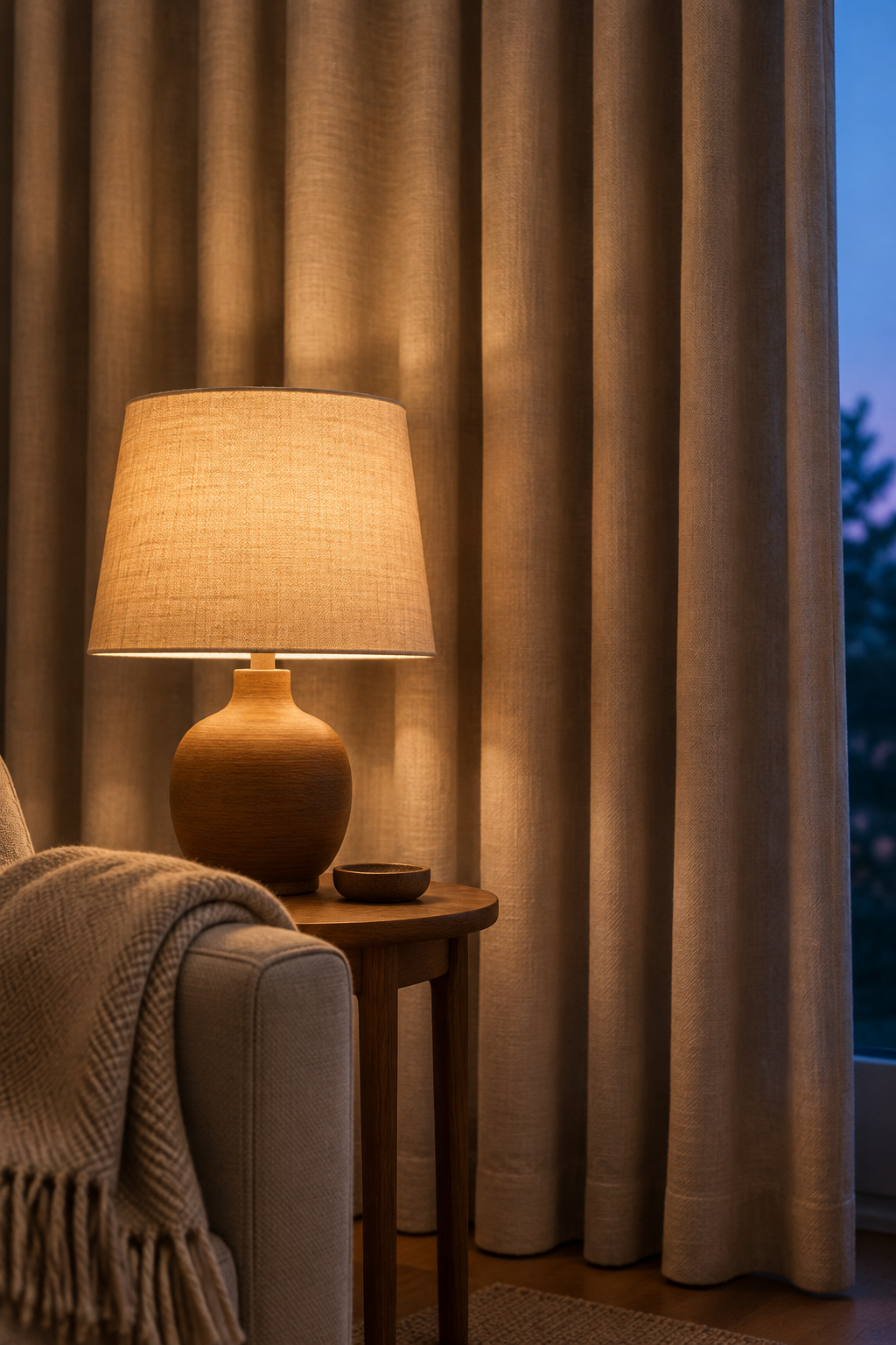
The first is sound. A room of hard surfaces gives every voice and footstep back, and I find a room that rings feels cold whatever the palette. The soft pieces that fix it are the same ones that make the room pleasant to touch, and how to reduce echo in a living room puts them in the order to buy them.
The second is what happens after dark. A neutral wall has little color of its own at night and borrows it from the lamps. Sherwin-Williams notes that warm incandescent-style light intensifies warm colors and dulls cool ones, so a warm white wall and warm lamp light strengthen each other, while a cool white under the same lamps looks dull. It is worth keeping every bulb in the room the same color, and our moody living room lighting article covers color temperature and dimmers. How many lamps, and where, is a separate question, and counting living room lamps by the seats answers it one chair at a time.
A Textured Wall Finish: When Limewash Is Worth a Weekend
Sometimes a room has every step of the range and still feels thin, because the walls are perfectly flat. A large wall in flat paint, in the pale colors a neutral room uses, can look like nothing at all.
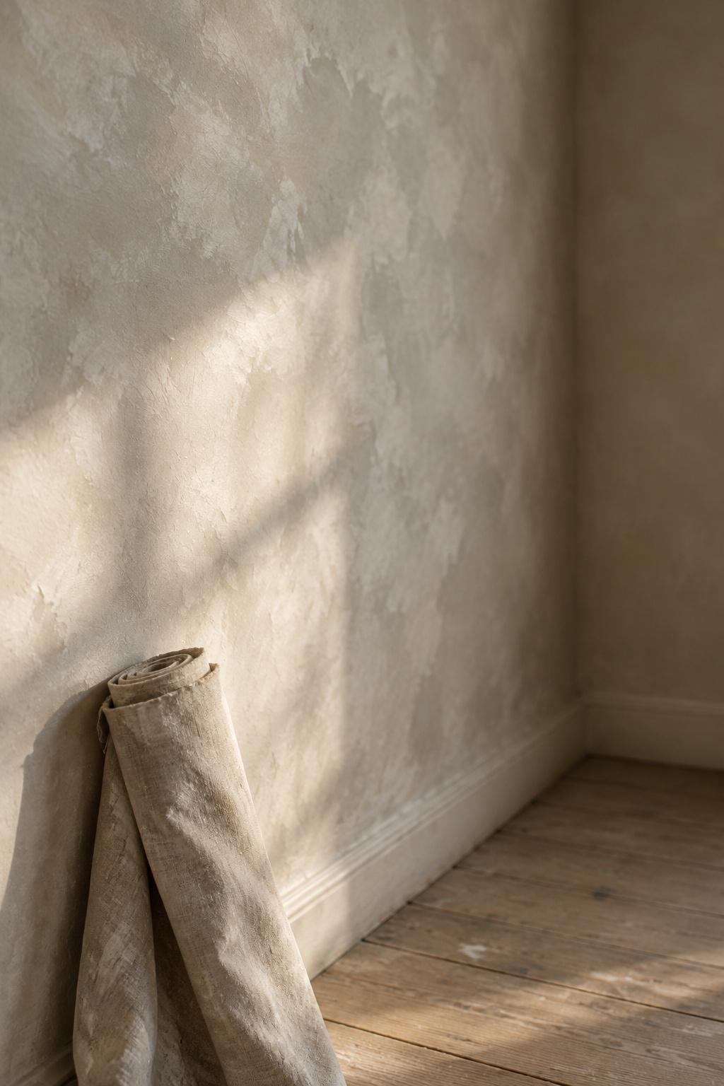
Limewash behaves differently. It is a mineral finish that soaks into the surface, and its cloudy, mottled look does not come from any physical build-up. Bauwerk, one of the makers, explains that the depth comes from minerals in the paint catching the light. So the wall looks different at nine in the morning and at four in the afternoon, and different again when a lamp sits beside it. Pale colors show a quieter movement and darker ones a stronger texture, so choose the color knowing how much movement you want.
It is also more work than paint. Over ordinary painted walls the makers want a primer or prep coat first, the finish usually goes on in two coats, and it takes longer and costs more than painting the same wall. Limewashing living room walls yourself walks through the prep, the sample, the coats and the real cost.
Do one wall, not four. The wall behind the sofa or the one that catches raking light from a window is usually the right one. Paint the others a plain warm neutral, and the limewashed wall becomes the room’s one textured surface instead of its whole personality.
What to Take Off the Sofa: Cushions, Throws and Matched Sets
A couple once asked me why their sofa was uncomfortable. There were twelve throw pillows on it. I took ten off, and they could sit back for the first time.
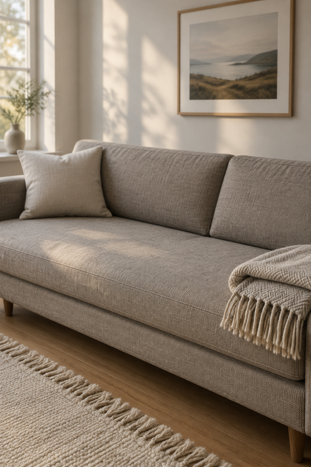
Designers who count cushions arrive at much smaller numbers than most sofas carry. Stella Weatherall suggests three for a two-seater and five for a larger sofa, and her test is the one I would keep: too many is when you can’t comfortably sit back. Galey Alix goes further and would rather see one or two excellent pillows on the corners than a row of nine. King, quoted by Martha Stewart, settles on three to five for a sofa, and the highest designer count I can find is seven, on a sectional with three corners. None of these comes near twelve. The numbers vary, and a very deep seat may need more support behind your back, so treat none of them as a rule. The test stays the same: sit down and lean back.
Matched sets cause the other problem. A row of identical cushions in one fabric and one shade repeats the exact sameness the rest of the room is trying to escape. In my view, neutrals that don’t quite match make a more interesting room than one precise shade repeated. Keep the cushions that differ from each other in weave or tone, and give away the ones that only match.
Throws divide designers. Some rarely use them on sofas because they are hard to make look right; others like one folded over an arm. I would rather have one good wool blanket than six decorative cushions. A blanket gets used. It goes over your knees in the evening, and it is soft and heavy, which is where a neutral room needs weight. If you have to unpack a sofa before you can sit on it, it has become storage.
The same thinking carries into the bedroom, and our cozy bedroom ideas cover layering bedding and warm bedroom light. Once the room is warm, the coffee table styling guide picks up the surfaces.
Now go back to that afternoon room. The same walls, the same daylight, the same beige. But there is a dark chair in the corner, a solid wood table in front of the sofa, and a limewashed wall catching the window light. Rest your hand on the sofa arm again. There is a wool blanket over it now, and when you sit, the seat takes your weight and you can lean all the way back. Start there. Take the matched cushions off, keep the two you like best, and sit down.