Picture the wall behind your TV right now. If it’s the builder’s off-white the room came with, here’s what happens every night you watch something dark: the screen throws its own light onto that pale surface, the wall bounces it back, and a faint glow settles around the bezel. Your blacks lift toward grey and the picture flattens — you paid for contrast the wall is quietly stealing. The best TV accent wall ideas all start from the same fix: a tin of dark paint and an afternoon, the cheapest upgrade I know that changes how the room looks and how the screen performs at once.
TL;DR
- A dark wall with an LRV under 20 (deep charcoal, navy, or forest green) absorbs ambient light so the screen reads as the brightest thing in the room — colors look richer and blacks look deeper with no change to the TV.
- Finish matters: matte (0–5% reflectance) for a dedicated viewing room, eggshell (10–25%) for a family room. Never gloss near a screen.
- Keep dark on one wall only, the ceiling pale, and layer your lighting — that’s what stops a dark TV wall from feeling like a cave in a small room.
Why the Wall Behind the TV Matters as Much as the TV
The wall is part of the optical system whether you planned it or not — yet most people mount the panel against whatever color the room already was.
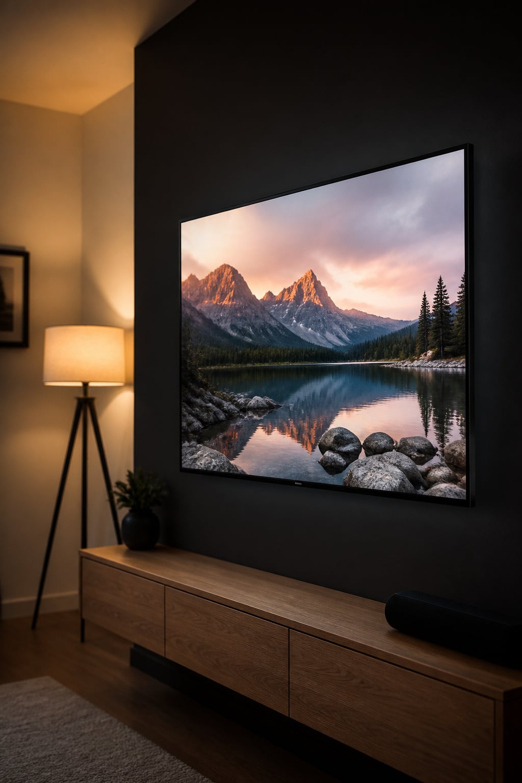
How a light wall bleeds into the screen and kills perceived contrast
A bright wall acts like a second, accidental light source. The screen emits light, the pale surface reflects it back, and your eye — which judges black levels relative to everything around them — registers a higher black floor than the panel is actually producing, so dark scenes lose their depth. A warm wall is worse still: your eye adapts to the dominant color, so a yellow or red surface skews what you see on screen.
The dark-wall effect: why theaters paint black
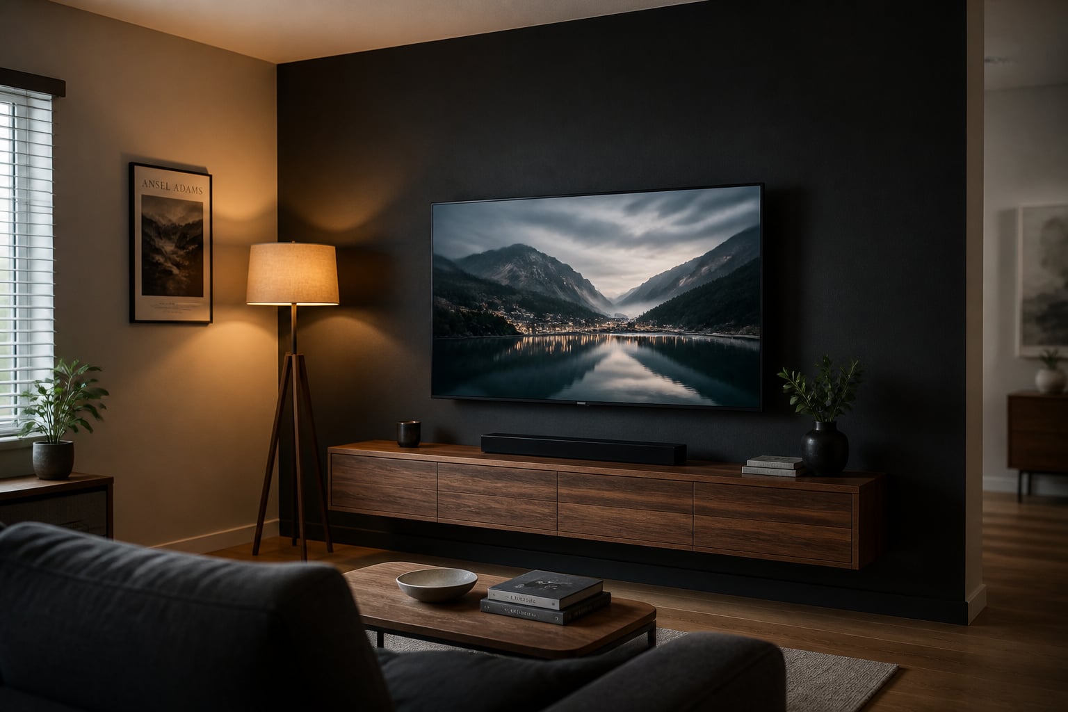
Walk into any cinema and the walls are near-black — not for mood, but physics. A dark wall absorbs stray light instead of bouncing it back, so the screen becomes the primary light source in your view, and through simultaneous contrast colors read more saturated and blacks read inkier. The AV publication LumenMatrix calls dark walls the gold standard for home theaters for exactly this reason — projector or flat panel, the principle is the same.
The before/after most living rooms never make
Almost nobody makes this change. The default white wall is a choice by omission, leaving the screen as a black void punched into a bright surface rather than a focal point. Paint that one wall a deep, muted color and the same TV, on the same content, appears to produce richer color and deeper blacks — no calibration, no new gear, and one gallon covers a standard accent wall (72–100 square feet) with paint to spare.
Dark TV Accent Wall Colors: What Works and Why
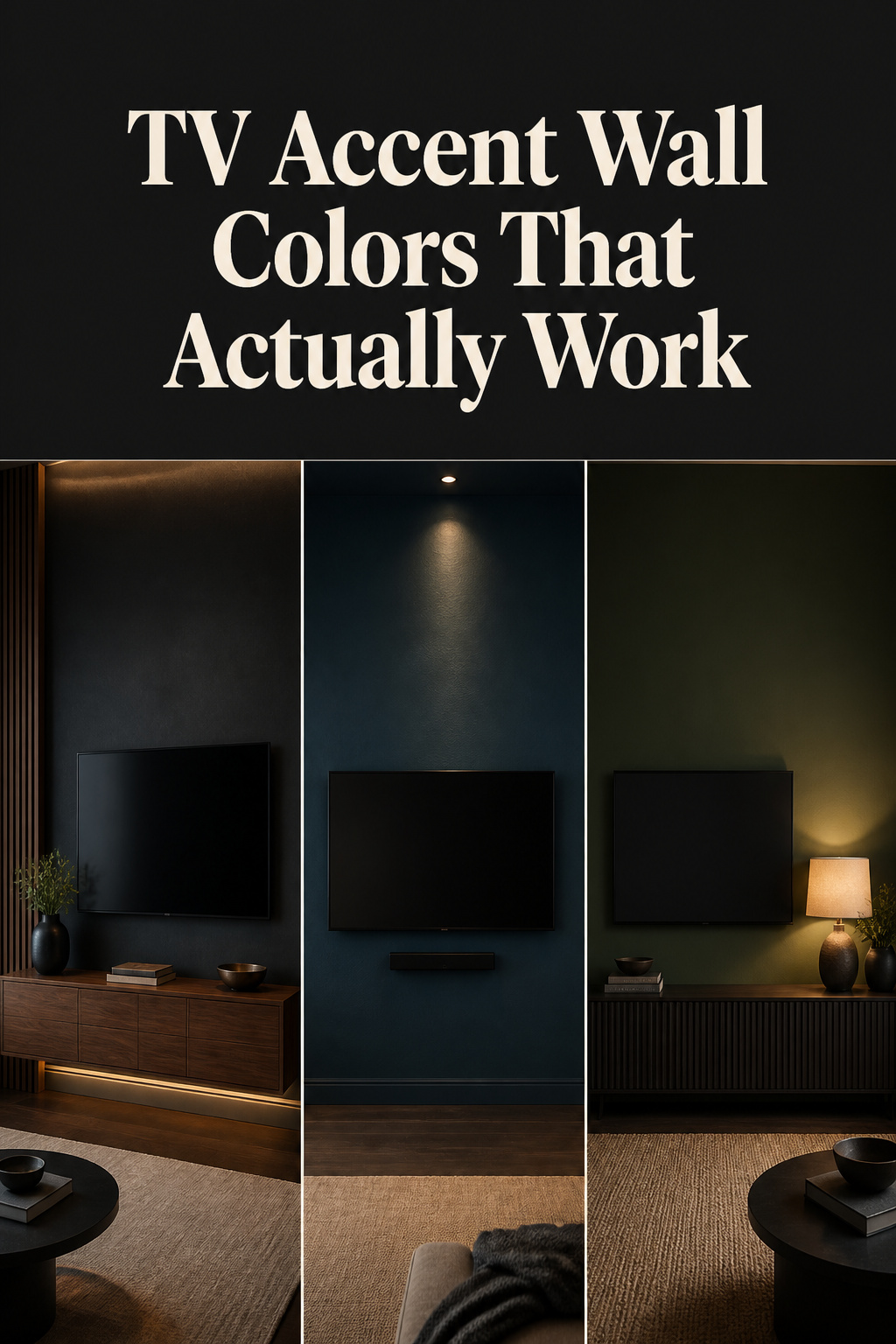
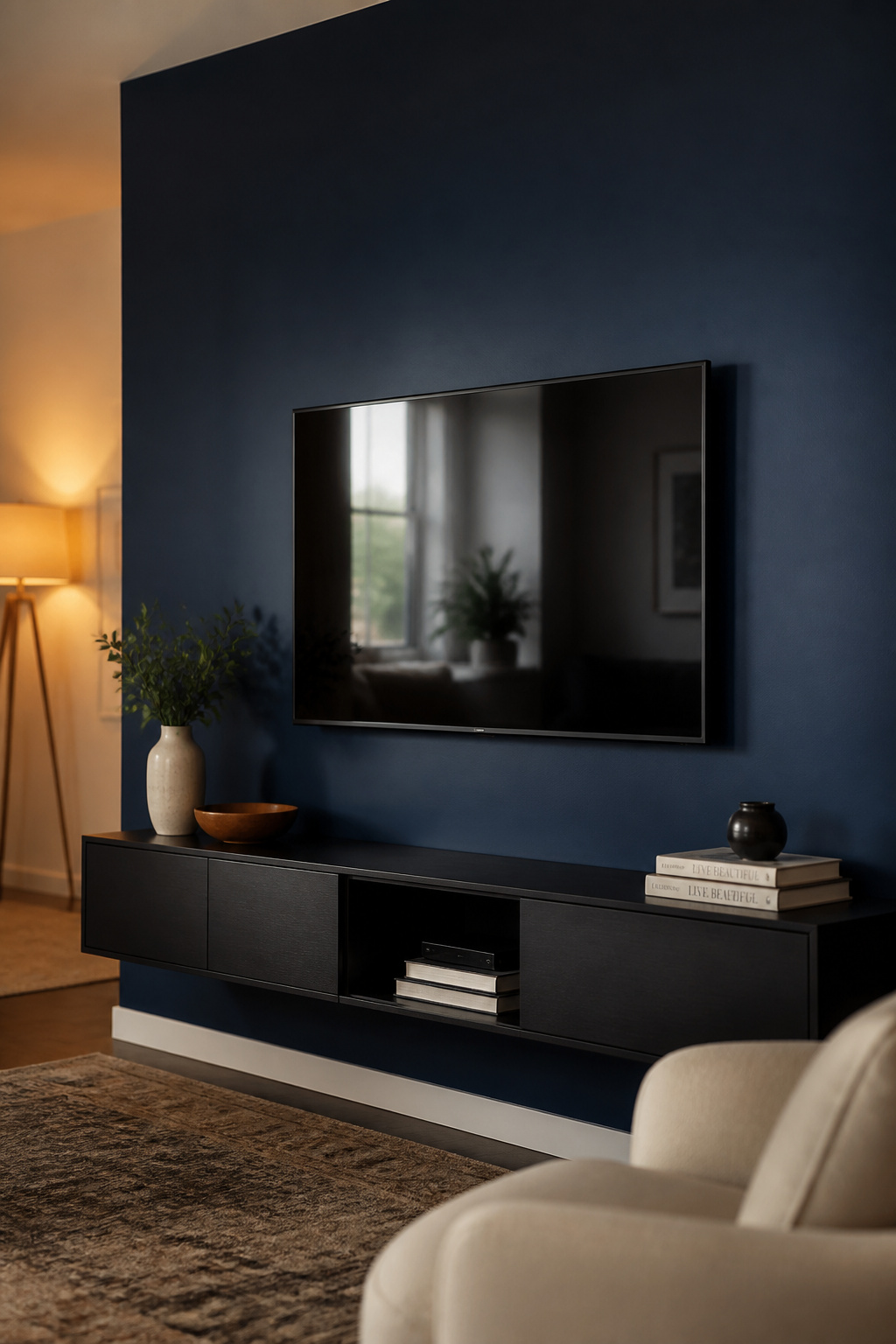
The colors that work behind a screen sort into three families, tied together by LRV — Light Reflectance Value, where 0 is black and 100 is white. Effective TV wall colors live under 20, with a sweet spot of roughly 7 to 15: dark enough to absorb, with enough undertone movement to stay alive rather than flat.
| Color family | Example & LRV | Best for | Daytime feel |
|---|---|---|---|
| Near-black charcoal | SW Iron Ore (LRV 6), BM Kendall Charcoal (LRV 13–14) | Maximum contrast, neutral palettes | Sophisticated, recedes |
| Deep blue / blue-green | BM Hale Navy (LRV 8), F&B Hague Blue (LRV ~7) | Contrast without heaviness | Architectural, cool but rich |
| Warm dark | F&B Studio Green (LRV ~7), F&B Brinjal (LRV ~6–7) | Rooms lived in by day | Cozy, enveloping |
Near-blacks and deep charcoals: the reliable performers
For the strongest contrast with the least risk, start here. Sherwin-Williams Iron Ore (LRV 6) is the workhorse — a near-black charcoal whose faint cool-green undertone keeps it from going flat. Benjamin Moore Kendall Charcoal (LRV 13–14) sits a notch lighter; designer Kate Marker used it on a TV accent wall because its depth camouflages the bezel while the palette stays neutral. One caution on a popular pick: Farrow & Ball Railings reads as a near-black graphite in person, but its measured LRV is around 28.4 — well above those charcoals. Don’t assume it absorbs light the way Iron Ore does; it’s the softer, navy-shifting option, not an equivalent to a true LRV-6 black.
Deep blues and blue-greens: contrast without feeling oppressive
Navy gives you most of a charcoal’s absorption with more life in daylight. Benjamin Moore Hale Navy (LRV 8) has green undertones that pair well with wood — sophisticated, not cold. Farrow & Ball Hague Blue (LRV ~7) shifts between navy, ultramarine, and deep teal with the light. SW Naval (LRV 4) goes deeper still, but can feel oppressive in a small or dim room without extra light.
Warm darks — forest green, terracotta, plum — for living rooms that still need to feel livable
A room that’s also where you read and host can’t go full blackout, and warm darks solve this — the undertone doubles as decor when the TV is off. Farrow & Ball Studio Green (LRV ~7.2) reads near-black in low light and reveals real green in daylight, while Brinjal (LRV ~6–7), a deep aubergine, turns warm and red in late-afternoon sun. For a brighter room, SW Cavern Clay (LRV 20) sits at the light end of the range — a terracotta where a deeper color would close in.
Paint Finishes for a TV Accent Wall: The Detail Most Guides Skip
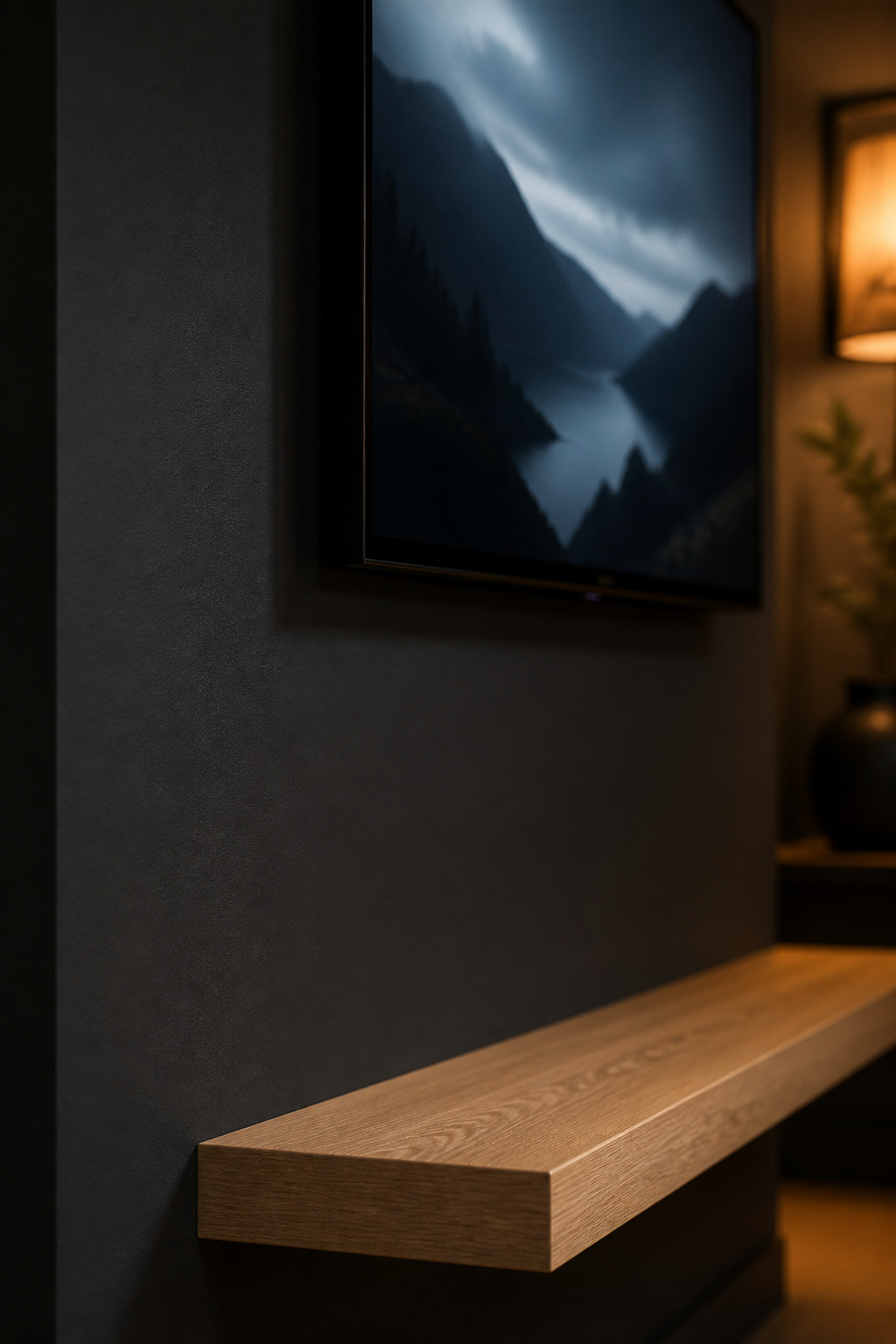
You can pick the perfect color and still undermine it with the wrong finish. Sheen controls how much light the wall throws back, and near a lit screen even a modest reflectance bump is visible. It’s the part most galleries skip — and the part my work makes me notice first.
| Finish | Reflectance | Glare risk | Practical notes |
|---|---|---|---|
| Matte / flat | 0–5% | Lowest | Best image quality; hardest to clean |
| Eggshell | 10–25% | Low | The family-room standard; wipes down |
| Satin | 25–35% | Moderate | Only for small/dim rooms needing bounce |
| Semi-gloss / gloss | 35–70%+ | High | Avoid on the wall surface entirely |
Matte and flat finishes: maximum glare reduction, minimum washability
Matte reflects only 0–5% of the light that hits it — the lowest of any finish, which is why theater rooms standardize on it. The catch is durability: standard flat paint resists cleaning, so if you have kids, reach for a “washable matte” formula that holds up far better.
Eggshell and satin: the practical compromise for family rooms
For most living rooms, eggshell (10–25% reflectance) is the right call, and the finish professional painters reach for on dark accent walls — below the glare threshold but wipeable with a damp cloth. Satin (25–35%) helps a north-facing room avoid the cave feeling, but edges toward the glare line — use it only when you need the bounce.
What to avoid — gloss near a screen
Semi-gloss and gloss behave like mirrors next to an active screen, throwing the TV’s own light back as hotspots — the exact ambient-light problem the dark color is meant to solve. Glossy trim wrapping the wall is fine; glossy paint on the wall itself is a straight functional error.
How Much Wall to Paint: Full Wall vs. Partial Panel
Scope is really a question about how the room reads when the TV is off. You have three sensible options:
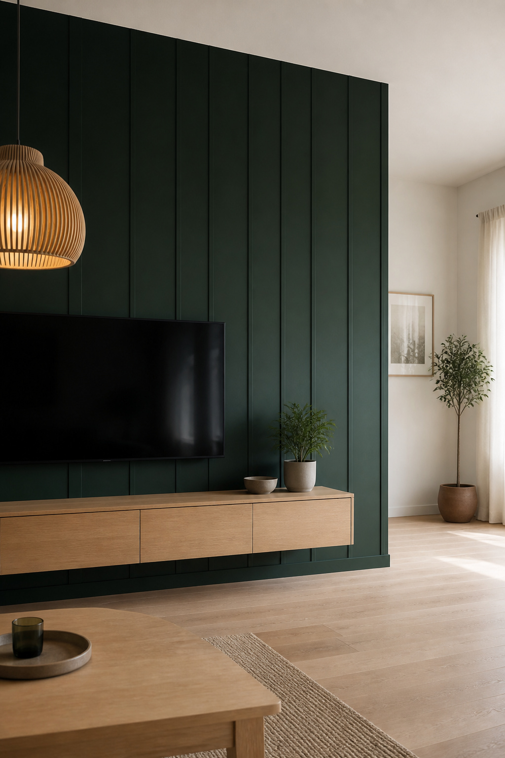
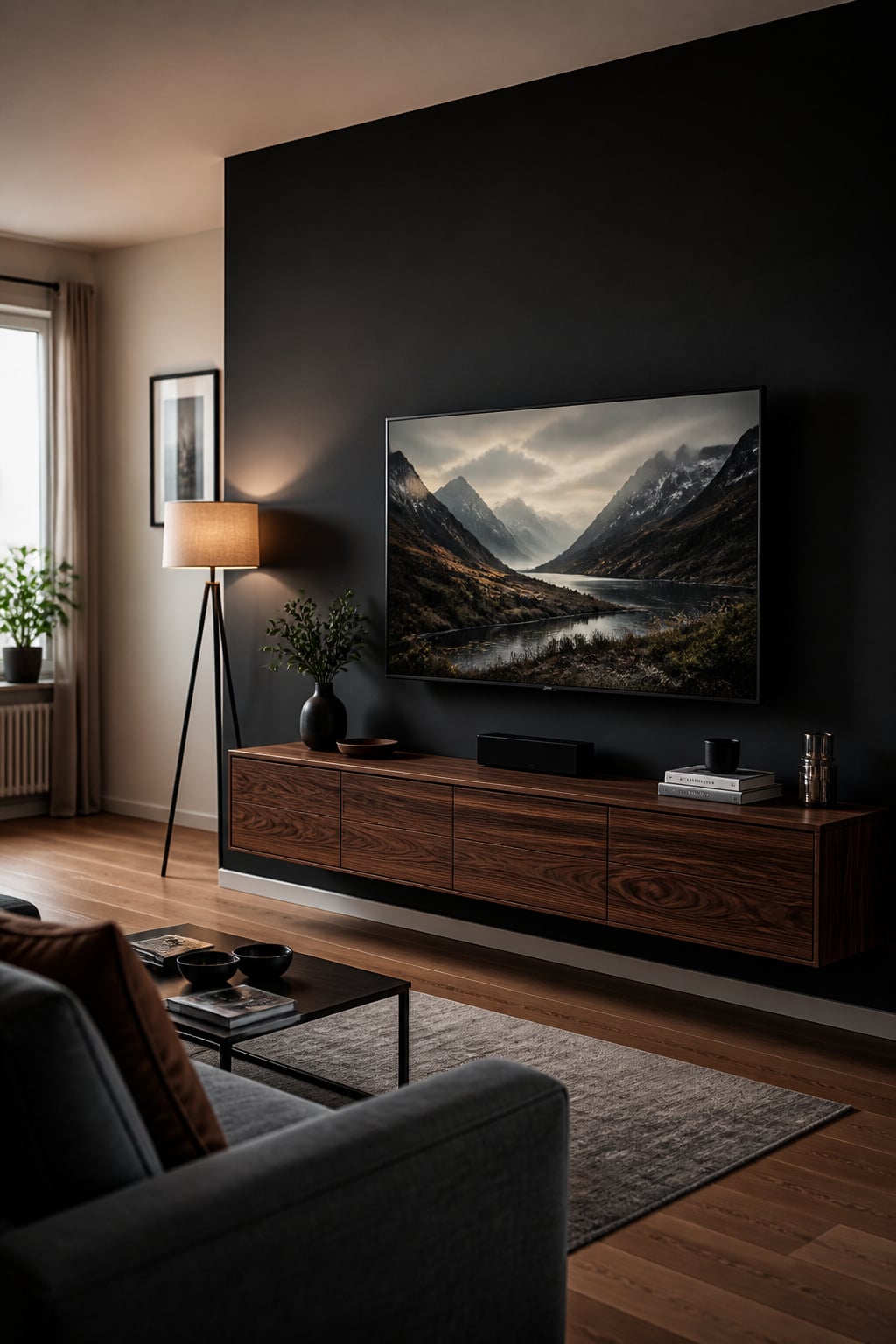
- Full accent wall — paint the wall edge to edge. Strongest contrast, simplest to execute, the clear winner in a large or bright room. Keep the other three walls neutral so the dark one reads as focus, not chaos.
- Panel behind the TV only — a band of dark color around the screen. Subtler, cheaper, and reversible, which suits renters. One practical note: a partial panel needs a trim or molding border to look intentional. Without that edge, a half-painted wall reads as a mistake rather than a choice.
- Extending down to the console — carry the color floor-to-ceiling behind a floating console. Screen, console, and wall then read as one designed unit, and the visible floor beneath a console mounted 16–20 inches up keeps it from feeling heavy.
Whichever you choose, keep the ceiling lighter than the wall. A dark ceiling over a dark wall pushes the room down; a pale ceiling holds your sense of height however deep you go.
Making a Dark TV Wall Work in a Small or Low-Light Room
The objection in small rooms is always the same: won’t dark make it feel like a box? Rarely — and when it does, the cause is one of three fixable things: the wrong undertone, too little lighting, or dark color on more than one wall.
Using warm undertones to prevent the closed-in feeling
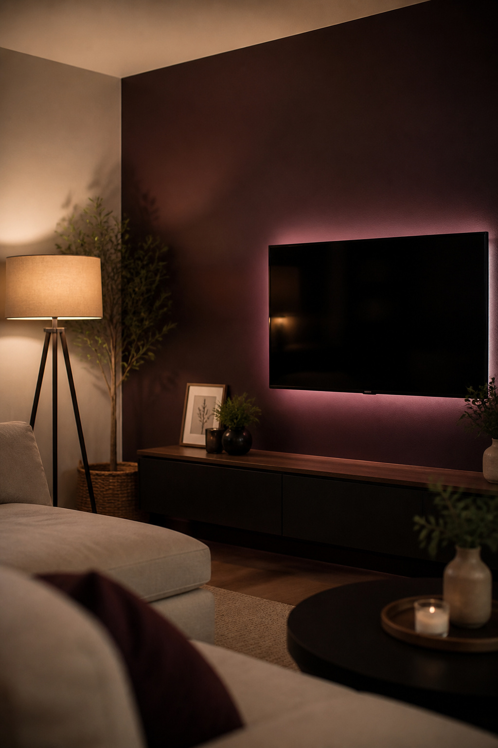
Cool darks struggle in tight, dim spaces. SW Iron Ore’s cool-green undertone, gorgeous in a bright room, can feel heavy in a small one with poor light. Swap to a warmer dark — Kendall Charcoal’s green-brown, a deep forest green, a plum — and the same depth reads cozy instead of oppressive. A white or light-grey sofa against it keeps the room from reading as a single shadow.
Layered lighting that separates the wall from the ceiling
Dark walls drink light — a dark-walled room needs roughly 10–30% more output than a white one to feel equally comfortable. One bright ceiling fixture won’t do it; layer the light instead:
- Ambient — a floor lamp beside the sofa, soft and low.
- Accent — bias lighting (an LED strip behind the TV) that throws a halo separating the screen from the wall.
- Task or overhead — a dimmable ceiling source you can pull back at viewing time.
Bias lighting earns its place twice: it cuts eye strain during dark scenes and lifts the TV off the wall so the surface doesn’t read as a slab. Run it at 6500K (daylight) for color accuracy — warmer strips below 3000K can tint on-screen whites.
The one-wall rule: why dark stays on the TV wall only
This is the rule that makes everything else work. Dark goes on the TV wall; the other three stay pale, because the drama depends entirely on the bright surfaces beside it. Spread the color to a second wall and you lose both the contrast and the spaciousness. North- and east-facing rooms need warmer undertones especially — cool light strips the warmth out of a navy or grey-black and leaves it flat. If restraint is the whole point, the same logic scales to a minimalist TV wall — one quiet color, nothing surplus.
Finishing the Look: What to Put on a Dark TV Accent Wall
A dark wall does the heavy lifting; everything around it just needs to stay out of the way. Making the screen look intentional comes down to the console, the mount, and the trim.
Console and mount choices that read against a dark surface
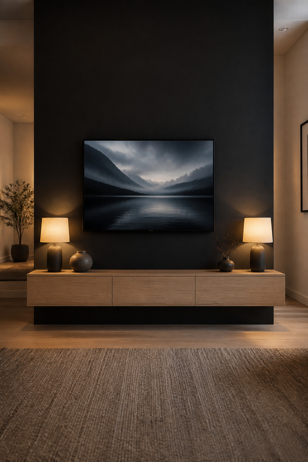
A flush wall mount with no visible arm lets the TV sit as part of the wall rather than bolted onto it. Below it, a floating console — wall-mounted, not floor-standing — keeps the floor sweeping underneath so the lower wall doesn’t feel heavy. Pale wood (light oak, ash, maple) gives you contrast there so the bottom of the wall doesn’t dissolve into shadow, and echoing the screen’s black elsewhere — a lamp base, a vase — keeps the bezel reading as part of a palette, not a lone void.
Trim, molding, and border details that define the panel
Trim decides whether the wall reads as one surface or a framed one. Color-drench it — same dark paint on trim and wall — and the plane recedes together; paint the trim crisp white and you get an architectural frame that makes the dark deliberate. For texture, run thin MDF panel molding in a grid painted the wall color, or go further with a wood slat feature wall.
What to skip — gallery walls, art, and the clutter trap
Restraint is the whole game — the dark wall makes the image pop, so anything busy around it fights it. Three things to skip:
- The gallery wall. Framed prints flanking the TV become visual noise the moment the screen is on, competing for the eye you wanted on the picture.
- Visible cables. Silver or white cords against a near-black wall read as bright lines pulling your eye to every wire — far worse than on a pale wall. An in-wall kit or a raceway painted to match is the minimum.
- A crowded console. One plant, a pair of lamps, a couple of books — every object should earn its place against the drama behind it.
If you’re weighing this against wood, built-ins, or a fireplace mount, explore more TV wall ideas for the bigger picture — but the dark wall is the move I’d make first: it’s the cheapest, fastest change on the list, and it improves the picture as much as the room.
FAQ
What color should I paint the wall behind my TV?
Choose a dark, muted color with an LRV under 20 — deep charcoals like Iron Ore (LRV 6) or Kendall Charcoal (LRV 13–14), navies like Hale Navy (LRV 8), or deep greens. For a room used by day, pick a warm undertone over a cold grey-black, and test a large sample on the wall under your own lighting first.
Does a dark wall behind a TV make the room look smaller?
Not when it’s on one wall only. A single dark wall can actually appear to recede, making it feel further away. The closed-in feeling comes from spreading dark color across several walls, a cool undertone in a north-facing room, or too little lighting — so keep the ceiling pale, the furniture light, and layer your lamps.
What sheen of paint is best for a TV accent wall?
For a dedicated viewing room, use matte or flat (0–5% reflectance) to kill glare completely. For a family living room, eggshell (10–25%) is the practical standard — low enough sheen to avoid glare near the screen, durable enough to wipe down. Avoid satin, semi-gloss, and gloss, which reflect the screen’s own light back as hotspots.