Almost nobody tells you this about vintage bedroom paint colors: most of them are wrong. Not wrong in taste — wrong in chemistry. The soft, slightly muddied greens and roses we read as “old” were never mixed to look subtle. Victorian painters ground natural earth pigments into white lead and linseed oil, and that binder muted and yellowed everything it touched. The restraint we admire was the material, not the decorator. So when a modern “vintage” tin promises the same shade at full synthetic saturation, it delivers a colour that looks right on the chip and reads as costume on four walls. The whole job of this guide is to keep you out of that trap.
TL;DR
- Authentic heritage colours sit at a Light Reflectance Value (LRV) of roughly 6–25; most mass-market “vintage” reproductions land above 40 and read too bright — check the LRV before you buy.
- The five palette families — moss green, rust, ochre, dusty rose, faded indigo — are facets of one period palette, all from the muted tertiary zone, all designed to set off dark antique wood.
- Sample on a two-coat A2 board for at least three days, prime saturated shades with a tinted base, and finish in eggshell (10–25% sheen) rather than flat for a period look that survives real life.
Why Vintage Bedroom Paint Colors Look Different From Modern Reproductions
Before you choose a colour, it helps to know why the old ones look the way they do — because that is exactly what the cheaper modern versions get wrong.
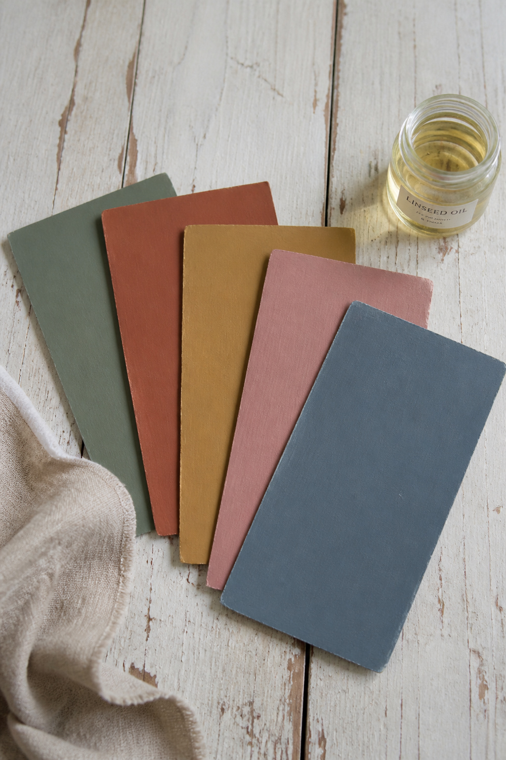
How period pigments and oil bases created the soft, complex tones we associate with vintage rooms
A Victorian decorator did not buy paint by the tin. They mixed it on site, grinding natural pigments — ochre, burnt umber, stone — into white lead and linseed oil. That binder chemistry is the source of the softness we now read as authentic; the oil muted and yellowed the colour over time, and the earth pigments could never reach the chroma of a modern primary. I learned to read that history the slow way. The two years I spent restoring a Victorian terrace with my father — the project that turned a history degree into a trade — taught me that the period palette is not a paint chart but a record of what the chemistry allowed. We scraped back six layers in one bedroom and found the earliest coat was a soft ochre-stone, exactly the low-chroma tone the earth pigments and oil could produce, and nothing brighter. Bright Victorian colour did not really arrive until synthetic dyes like alizarin appeared in the 1870s and 80s. So the earlier rooms, the 1840s to 1870s, lived in stone, ochre and burnt umber by necessity, not by some refined act of self-denial. The Arts and Crafts designers who followed Morris made that desaturation deliberate: green became olive, red became terracotta, yellow became ochre — tertiaries, never primaries.
What modern heritage-paint ranges do right — and where they still drift too bright
The best modern ranges respect that history. Farrow & Ball, Little Greene and Mylands build high pigment loads on complex base mixes, so the colour shifts character across the day the way real period paint did — Farrow & Ball’s head colourist Joa Studholme makes exactly this point. Little Greene’s Victorian collection is reconstructed from paint analysis in real period buildings, over fifty colours pulled from Georgian, Victorian and Edwardian rooms. Where mass-market “vintage” paint drifts is in saturation — modern pigment reaches brightness the Victorians could not, and the marketing keeps it there. The reliable check is the LRV. Genuine dark Victorians sit at LRV 6 to 25; most over-bright reproductions land above 40.
The light-response test: why a colour that reads on a chip may not read on four walls
A chip lies most under retail fluorescent light, and it lies again about scale. North-facing rooms pull cool undertones forward, so a warm sage can turn grey-blue on a north wall, while south-facing rooms see colour at its truest — Farrow & Ball’s own guidance is blunt on exactly this point of orientation. Bulbs do the same work — warm incandescent deepens ochre and sage, cool-white LED strips the warmth out and flattens the palette toward grey. Here is the part nobody can sell you around: you cannot reproduce lead paint, so the goal is a modern paint with the same tonal weight and complexity. Match the depth, not the swatch.
The Five Heritage Palette Families and What Each Delivers
These five families are not a menu of unrelated options. They are facets of a single period palette — all drawn from the muted tertiary zone of the colour wheel, all achievable before synthetic pigment, and all built to flatter the same dark-stained antique wood. Choose by your room’s light and the furniture already in it.
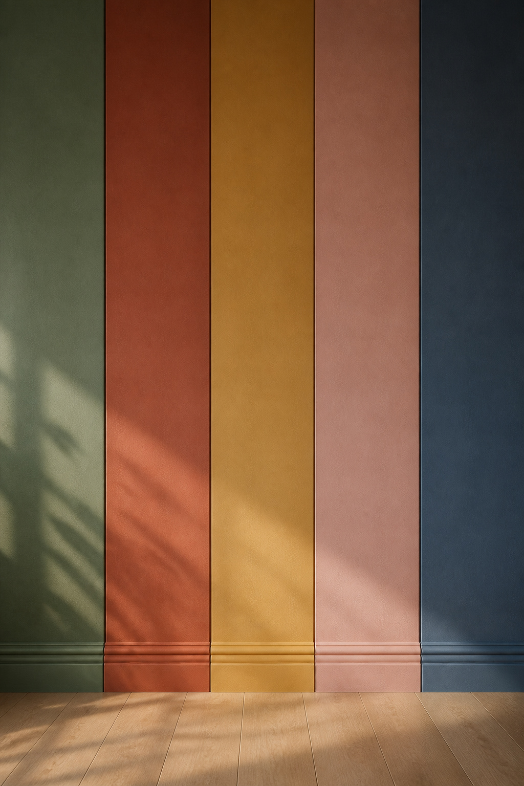
Moss and sage green: the easiest heritage colour for a bedroom — why it works with everything
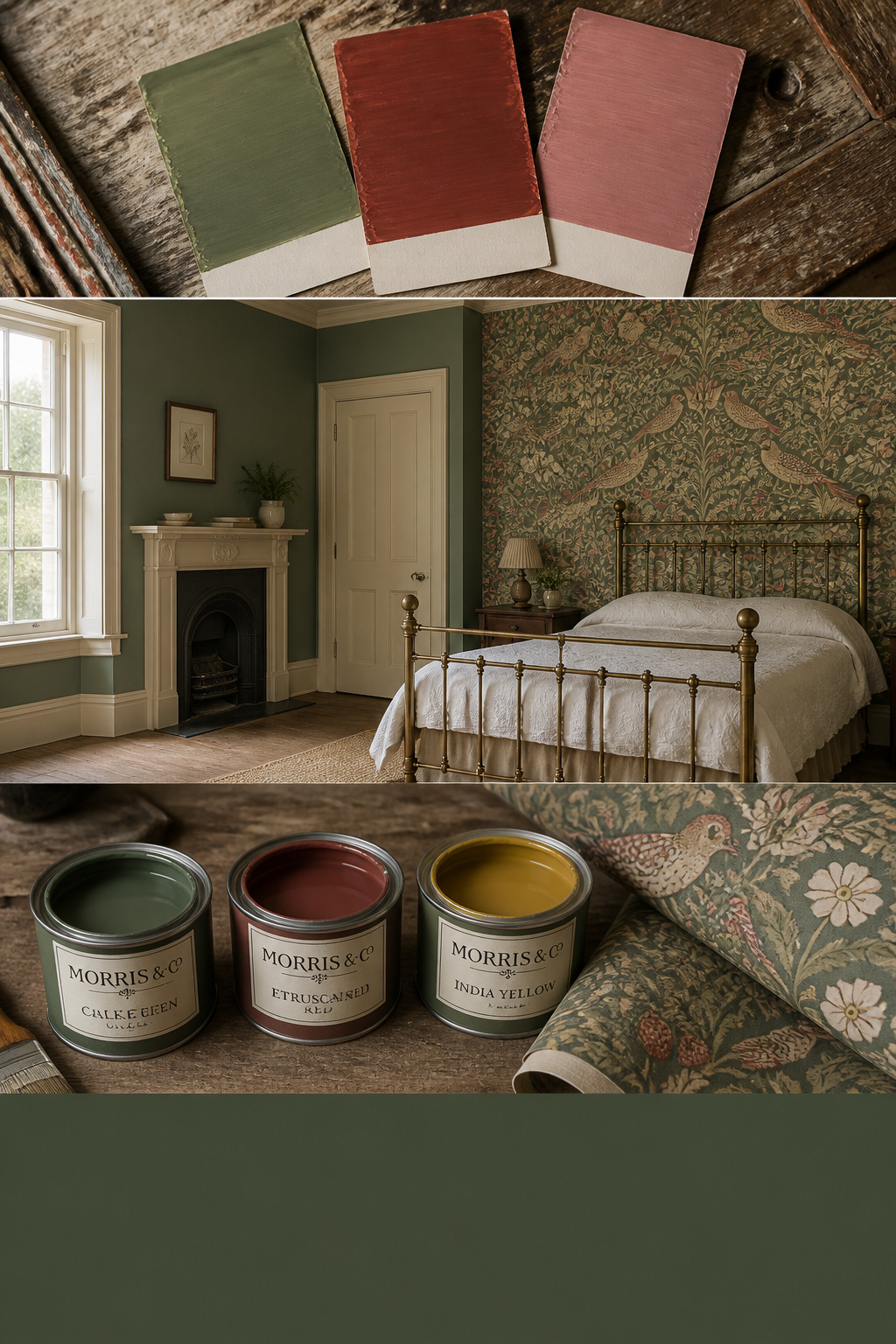
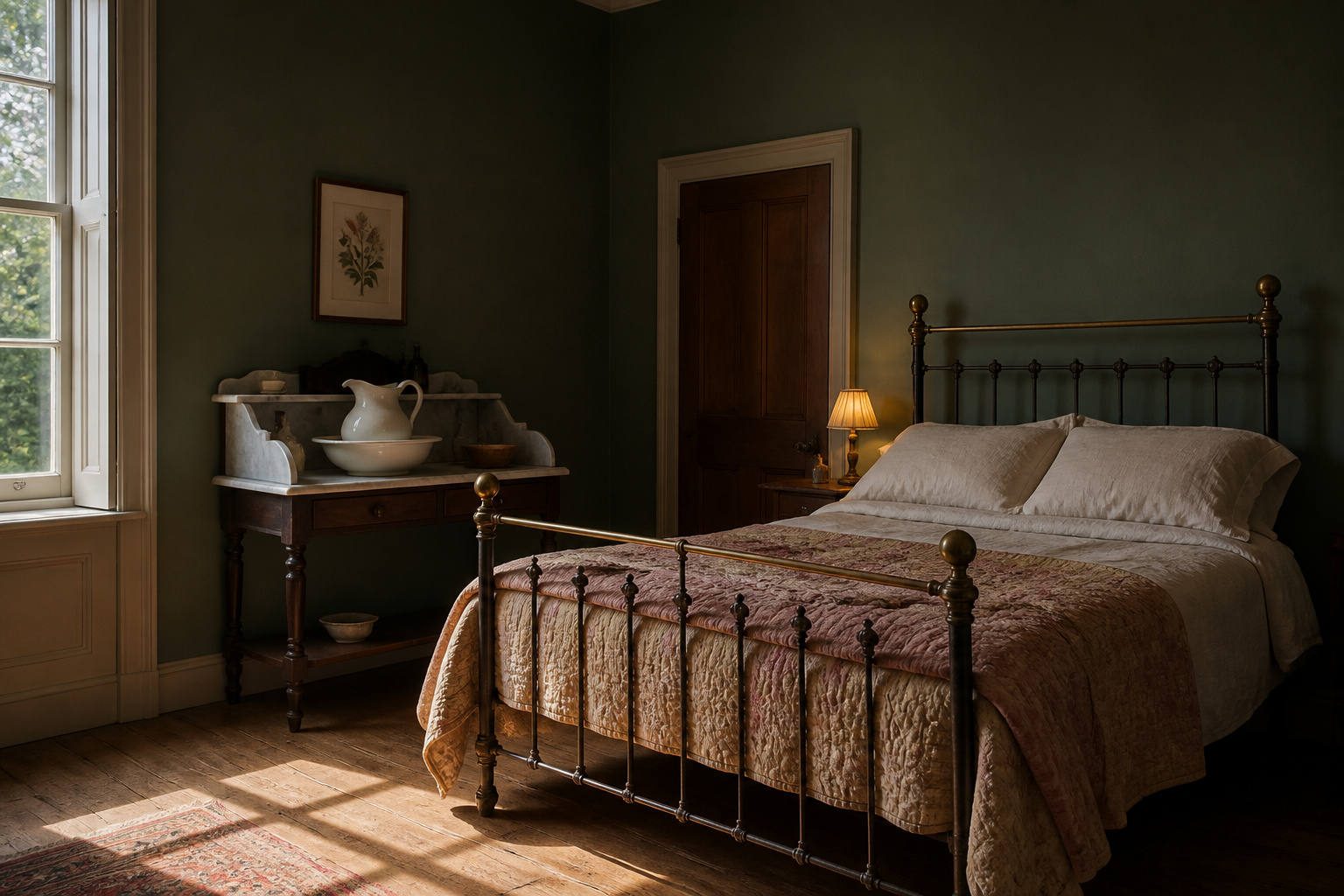
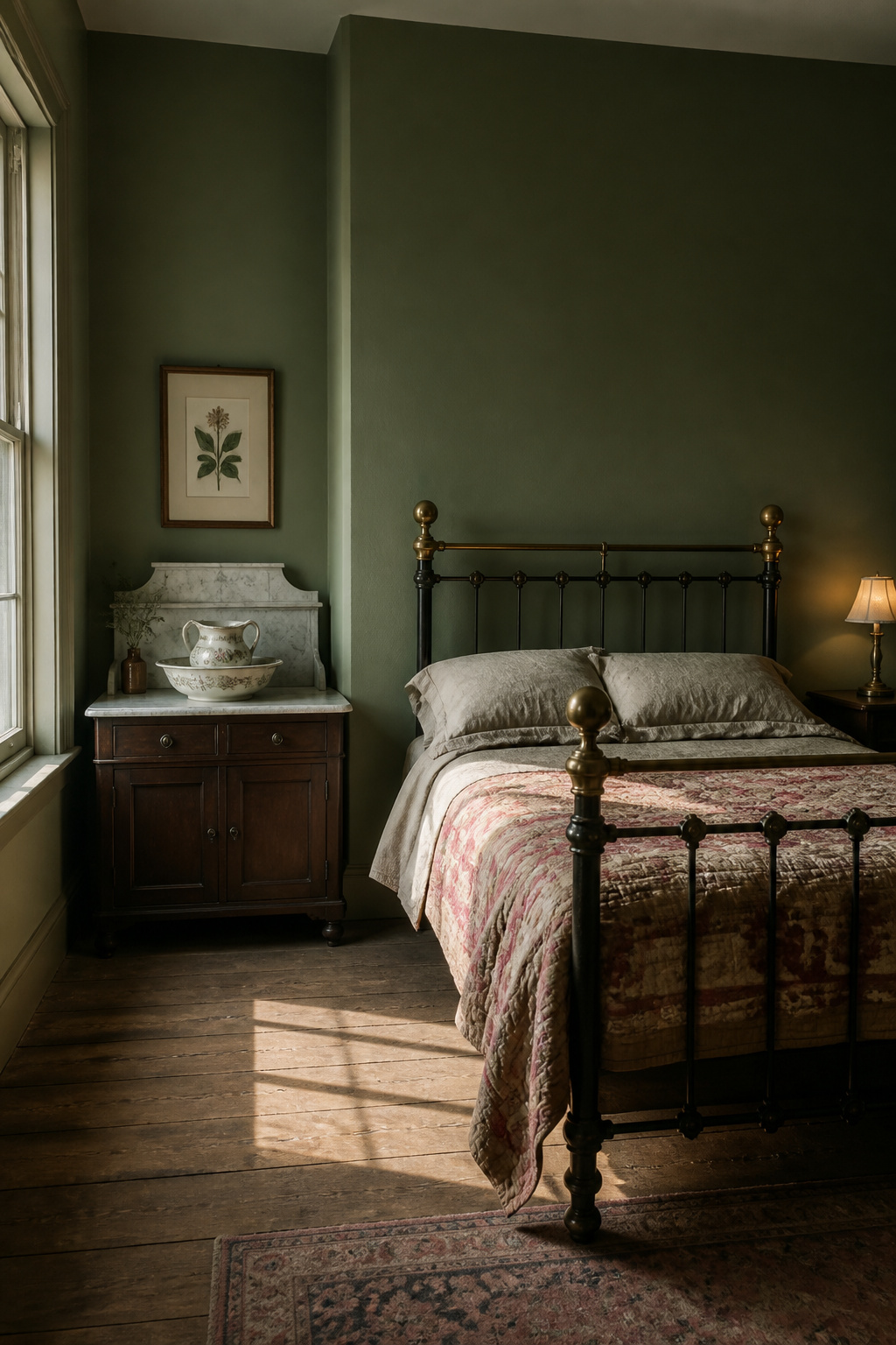
If you are nervous, start here. Green is the most forgiving heritage family because its cool base contrasts the warm reds and oranges in walnut, mahogany and oak, and each makes the other more vivid — a contrast that has governed period interiors since the Regency. Farrow & Ball Calke Green No.34, taken from the breakfast room at Calke Abbey, is a deep botanical sage at LRV 9 that carries woodwork as happily as walls. For a north-facing room, reach instead for Mizzle No.266: its grey base stops it reading too cold. Little Greene’s mossy greens and drab olives go further into period accuracy because they hold black and umber, the very pigments that produced the low-chroma greens of real Victorian rooms.
Rust and terracotta: warm depth without heaviness, and the trim colours it needs
Rust gives you warmth without the room going dark or shouting. Farrow & Ball Etruscan Red No.56, revived from the archive, is described as an oxblood with a lot of brown through it — muted enough to warm a room without screaming red. That brown is what keeps it period; the Arts and Crafts rule was always red desaturated toward terracotta. The trim it needs is a warm off-white, never blue-white. Farrow & Ball pair it with White Tie No.2 or Joa’s White No.226, both warmer than a standard bright white.
Ochre and gold: the most period-accurate choice for Victorian and Edwardian rooms
Ochre is arguably the most documented bedroom colour of the era, partly because it was the cheapest earth pigment on the shelf. Farrow & Ball India Yellow No.66 takes its name from a genuine imported period pigment; at LRV 62.8 it is a warm mustard with brown undertones that stop it turning sharp. That high LRV is also a warning — India Yellow wants south or west light. In a north-facing room the cool light strips its warmth and it can read as a tired greenish-yellow.
Dusty rose and muted blush: the feminine palette that avoids nursery-pink
The line between heritage rose and nursery pink is grey and brown pigment. Farrow & Ball Sulking Room Pink No.295 — named for the boudoir, from the French bouder, to sulk — carries barely any yellow, which pushes it bluer, dustier and more grown-up than any candy pink. Cinder Rose No.246 does the same work with a calm, romantic quality that suits a bedroom. For trim, Farrow & Ball’s own pairing is Great White, whose hint of lilac keeps the powdery quality intact rather than sharpening it.
Faded indigo and slate blue: the coolest heritage option and how to warm it with textiles
Indigo is the boldest and the coolest of the five, so it needs a warm hand. Farrow & Ball Inchyra Blue No.289, drawn from a Georgian house in Scotland, sits at LRV 12.5 — it absorbs light and compresses a room into something intimate, ideal for a bedroom used in the evening, and shifts between grey, blue and green as the light changes. The standard fix for the chill is to bring warmth through everything that is not the wall: amber, ochre and rust in the coordinating vintage bedding and curtains, antique brass over chrome, and warm bulbs at 2700K or below. Hague Blue runs darker still at LRV ~7; for most bedrooms Inchyra is the more liveable of the two.
The families share a logic, and a quick reference makes the choice faster:
| Palette family | Period association | Best room light | Anchor trim colour |
|---|---|---|---|
| Moss / sage green | Victorian, Arts & Crafts | Forgiving in most, even north | Old White |
| Rust / terracotta | Arts & Crafts (1880s–1910) | Warm and south-facing | White Tie / Joa’s White |
| Ochre / gold | High Victorian bedrooms | South or west only | Warm cream |
| Dusty rose / blush | Late Victorian, Edwardian | Soft, even daylight | Great White |
| Faded indigo / slate | Victorian navy, Edwardian blue-grey | Evening rooms; warm with textiles | Warm off-white |
Vintage Floral Wallpaper: Scale, Pattern and the Trim Decision
Wallpaper is where a heritage room stops being a paint job and starts having a point of view. The fear is overwhelm — bold colour plus bold pattern. The way out is to treat scale, placement and trim as three linked decisions, not one leap.
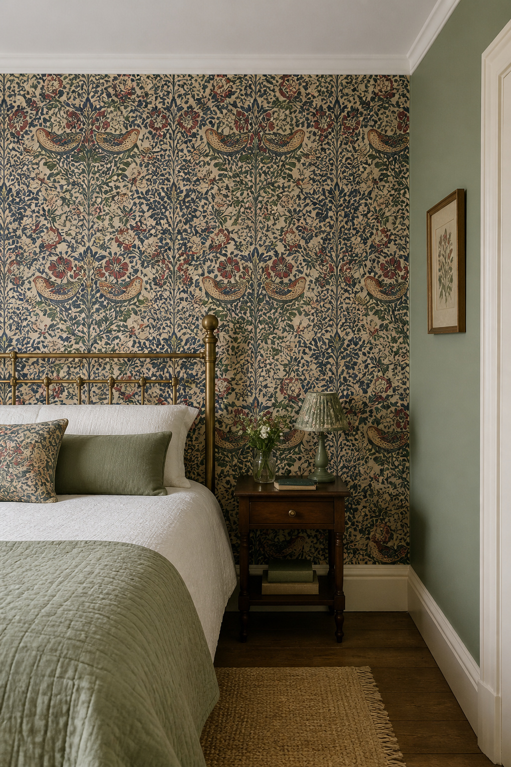
Reading pattern scale: small repeat vs large botanical and how room size determines the choice
Scale is about the repeat measured against the wall. Morris & Co Strawberry Thief has a 42cm repeat on a 68.6cm by 10.05m roll, and it needs a wall of at least three metres across to land — below that, the repeat gets cropped awkwardly and the pattern looks cut off rather than designed. Morris held the contrarian view that large patterns suit small rooms, and the modern resolution is more precise: a large botanical with strong vertical rhythm carries a small room because the eye travels upward instead of reading clutter. Acanthus took thirty woodblocks and fifteen colours for a single repeat — gloriously dense, and best kept for a big, full-height wall. For tight rooms, a small repeat under 25cm reads as texture, not noise.
Mixing floral wallpaper with a painted palette — which walls get pattern
The heritage move is not the modern feature wall. In period country-house schemes, the chimney-breast or bedhead wall got the paper, and the remaining walls were painted in the paper’s own background colour — a tonal relationship, not a contrast. A small or tonal print can also run continuously across all four walls, where it softens into an enveloping texture that suits a bedroom’s job of resting you. If the room has a natural focal wall, an alcove or chimney breast, that wall is your default for pattern.
Trim colour when wallpaper is in the room: the three reliable choices
When paper is in play, the trim should calm the pattern, not enter the fight. Three approaches reliably do that:
- Warm off-white (Farrow & Ball Old White or Slipper Satin, Little Greene Stone Pale Warm) — the safest choice, lifting the room without adding a competing colour. A blue-white clashes with the warm ochres and terracottas in most period prints.
- Match the paper’s deepest background tone on all woodwork — colour drenching the joinery for an immersive, historically accurate result; best when the paper has one clearly dominant ground colour.
- The paper’s deepest accent colour on skirting and architraves — a graphic, high-Victorian effect that reads as deliberate, though it is the boldest and least forgiving of the three.
Avoid pure brilliant white. It modernises everything and makes the woodwork advance and interrupt the pattern. Morris, incidentally, wanted patterns busy enough that you cannot count the repeats; that “satisfying mystery” is why his big designs rarely overwhelm a well-proportioned wall.
Coordinating Walls with Furniture and Textiles
A wall colour does not live alone. It is the largest single surface in the room, and everything you own will be read against it — so the colour decision is really a coordination decision.
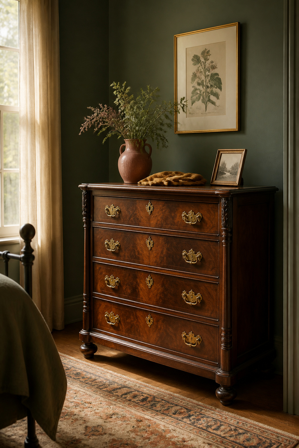
How dark heritage walls set off antique wood — the contrast principle
Dark walls do not bury dark furniture; they frame it. Most antique finishes — mahogany, walnut, dark-stained oak — carry orange, red or purple undertones, so a cool-undertone wall in green or grey-green pushes that warm wood forward and lets the grain and patina read as foreground. This is the principle behind pairing forest-green walls with walnut or ebonised pieces. If you are still assembling the room, the same contrast logic should guide the antique furniture to anchor the room.
Bedding and textile choices that complete a heritage palette (not compete with it)
After the wall colour, layered fabric is the fastest, cheapest way a room reads vintage — and aged textile has a quiet advantage, because its texture absorbs and softens wall colour instead of bouncing it back. Pull the textile palette from the adjacent segment of the heritage wheel: faded rose, ochre linen and warm cream against sage or moss; amber, rust and terracotta against indigo and slate, where warm bedding is the main tool that makes a cool blue room feel habitable rather than austere.
The mistake of matching: why tonal contrast reads more vintage than a matched set
The single most common error is matching — pulling the bedding to the exact wall colour, which reads as a hotel package rather than a room gathered over years. Authentic vintage interiors mixed eras and budgets: an indigo wall with an ochre quilt, a sage room with a dusty-rose coverlet. Aim for a tonal staircase instead — dark sage walls, medium walnut furniture, light linen bedding. Three elements at the same depth produce a flat, unreadable room. The 60-30-10 rule keeps it honest: the wall is your 60%, the dominant textile the 30%, accent ceramics and hardware the last 10%, with no more than three to five hues in total.
Painting a Room with Heritage Colour: The Practical Steps
You have the palette and the pattern. What remains is the execution, and heritage colour fails in three specific places where the standard modern approach lets you down.
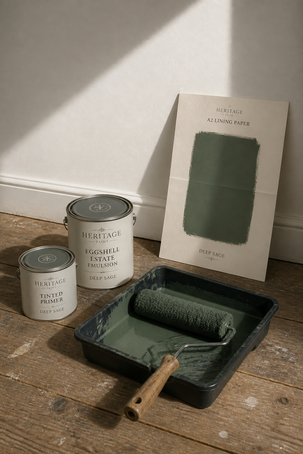
Sample testing on four walls: why the chip and the wall are different experiences
The professional way to sample a dark heritage colour is a process worth following in order:
- Paint a full sheet of lining paper, A2 minimum, with two coats — never judge from the chip.
- Allow 24 hours to cure fully before you look properly.
- Leave the board in the room for at least three days, moving it between walls.
- Assess at 8am, noon and 4pm, then again after dark under the exact bulbs you will use.
For a north-facing room, check at midday and after dark, and expect cool-toned sages and slate blues to read two to three tones darker and cooler than the chip promised.
Primer choice for heritage colours — why saturated shades need a tinted base
Saturated colour over white primer is how you get a patchy wall and an unplanned third coat. Tint the primer to roughly 50–75% of the topcoat’s depth; that mid-tone foundation improves coverage and cuts the number of finish coats. For the deepest shades — anything under LRV 20, your Calke Green, Inchyra Blue or Etruscan Red — use two coats of tinted primer over a neutral grey base. Grey keeps the topcoat’s undertone honest, where a colour-tinted primer can skew it.
Finishing sheens for a vintage bedroom: why eggshell reads more period than matt
True period walls used distemper — a chalk-and-glue wash that dried flat and slightly chalky. On sound plaster in a low-traffic bedroom, flat emulsion is a perfectly period choice. For most modern plaster or drywall, eggshell at 10–25% sheen is the better compromise: enough reflectance to give a dark colour depth and accuracy, well below the glare of satin, and washable in a way flat paint is not. Farrow & Ball’s own period specification follows the same split — Estate Emulsion on walls, Estate Eggshell on the joinery.
Once you know that vintage colour is muted by chemistry and not by chance, the choices fall into order: pick the family that suits your light, keep it in the LRV 6–25 range where heritage colour actually lives, pull your wallpaper and trim and textiles from the same muted wheel rather than matching them, and prove the colour on a two-coat board across a full day before you commit a tin. Do that, and the room stops reading as a paint job done last weekend and starts reading as one that was always there. For where the walls sit inside the wider scheme, the vintage bedroom decorating guide ties the colour decision back to furniture, lighting and the rest of the room.
FAQ
What paint colors were actually used in Victorian and Edwardian bedrooms?
Victorian bedrooms from the 1840s to 1900 used earth pigments ground into white lead and linseed oil — ochres, stone buffs, muted sage greens and brick reds. Bright synthetic colour was not yet available. Edwardian rooms after 1901 shifted to lighter pastels: pale blue, soft pink, lavender and cream. Both eras used flat, chalky distemper rather than modern emulsion.
Can I use dark heritage paint colors in a small bedroom without it feeling oppressive?
Yes, provided you commit fully. Paint all four walls rather than one feature wall, which reads as a heavy block. Full-room application removes visual breaks and cocoons the space, which most people find restful. Layer at least three lighting zones so the walls do not absorb all the light, and embrace north light with deep shades rather than fighting it.
How do I choose a trim color to go with vintage floral wallpaper?
Three reliable approaches: a warm off-white such as Old White or Slipper Satin (safe and versatile, lifts without competing); the wallpaper’s dominant background colour on all joinery for an immersive period look; or its deepest accent colour on skirting for a graphic high-Victorian effect. Avoid pure brilliant white — it reads modern and makes the woodwork fight the pattern.