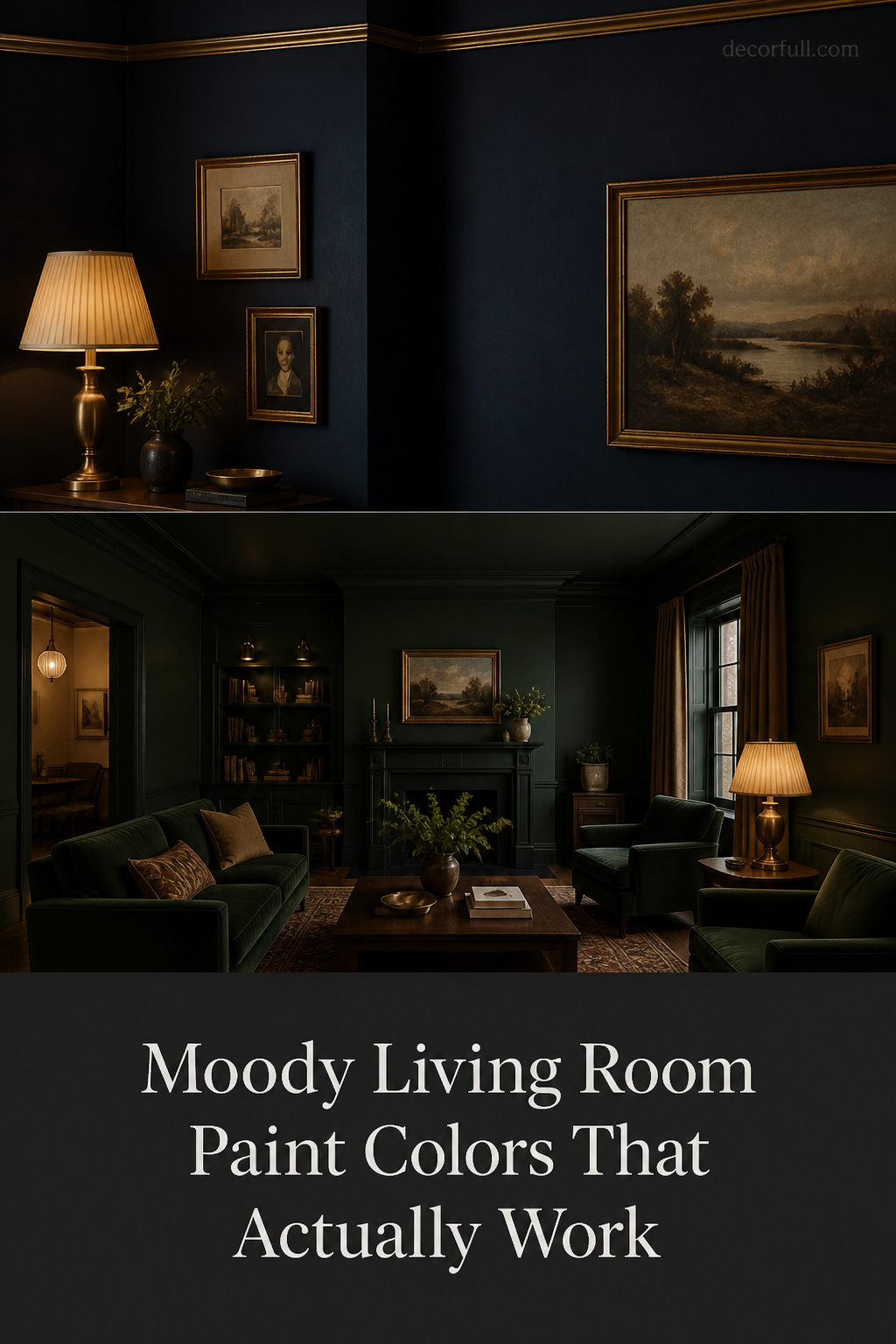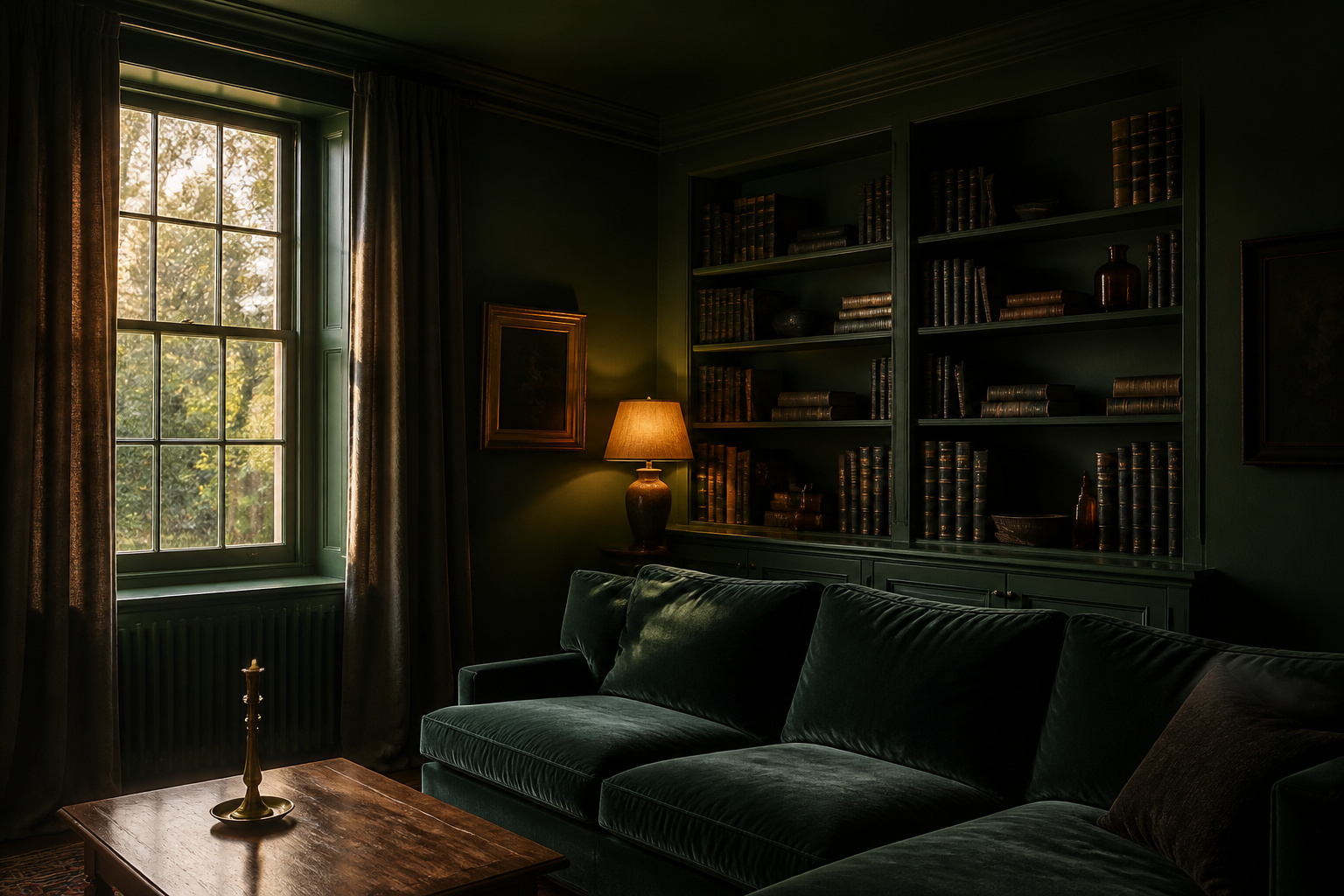
The Victorians understood dark walls long before the trend did. A late-nineteenth-century parlour was built for lamplight, its deep bottle greens and inky blues chosen to come alive under a single oil flame. They knew a dark color does not sit still — it shifts with the light and deepens after dark, rewarding a room used in the evening. That instinct is what makes the right moody living room paint colors work today, and what makes the wrong ones read as a flat, sullen void.
TL;DR
- The reliable families are deep greens (Farrow & Ball Studio Green No. 93, LRV ~7.2), green-undertone navies (Benjamin Moore Hale Navy HC-154, LRV 8) and warm near-blacks (Sherwin-Williams Iron Ore SW 7069) — all chosen because they warm rather than chill under 2700K evening light.
- Finish matters as much as color: a flat or matte sheen (0–5% reflectance) gives the deepest result, while eggshell (10–25%) is the cleanable working standard for most walls.
- Test a large two-coat sample on lining paper — at least 12×12 inches — moved around your actual room, because a dark color darkens as it dries and behaves nothing like its store chip.
This guide is one slice of the wider moody living room ideas collection; here the focus is narrow — which colors go on the walls and ceiling, in what finish, and where.
The Color Families Behind the Best Moody Living Room Paint Colors
Three families do almost all the work: deep greens, navies, and the charcoal-to-warm-brown spectrum. Each behaves differently once warm light hits it, and each pairs with its own woods and metals.
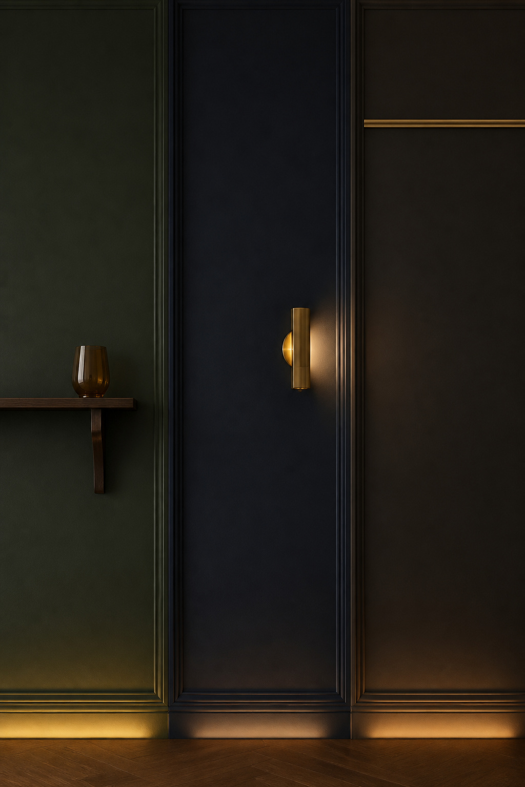
| Color family | Mood character | Complementary wood tones | Compatible metal accents |
|---|---|---|---|
| Deep green | The most forgiving dark; reads natural, not oppressive | Walnut, dark oak (cool greens); lighter woods (warm olives) | Unlacquered brass, aged bronze |
| Inky navy | Sophisticated and architectural; warms under candlelight | Walnut, dark-stained oak | Brass, antique gold |
| Charcoal / warm near-black | The most dramatic; depends on a warm undertone to stay rich | Dark woods, ebonised finishes | Brass, blackened steel |
Deep greens: forest, bottle and sage-dark compared
Green is the family I steer most people toward first, because designers consistently find it least likely to read as oppressive — its connection to the natural world keeps it grounded. Farrow & Ball Studio Green No. 93, at an LRV around 7.2, is the deepest: a heavy black base reads near-black in low light, then reveals its green as the light comes up. For a green that stays green rather than tipping to blackened green, choose a more readable tone like Benjamin Moore Boreal Forest AF-480.
Navies and inky blues: from maritime to midnight
A navy lives or dies by its undertone. Benjamin Moore Hale Navy HC-154 (LRV 8) carries a subtle green undertone that warms it beautifully under 2700K incandescent and candlelight — the reason it tops so many lists for evening rooms. Farrow & Ball Hague Blue No. 30 (LRV ~7) runs deeper, reading as navy, ultramarine or teal as the light changes. Avoid a purple-undertone navy under warm light — it muddies rather than deepens.
Charcoals, near-blacks and warm browns: the non-green alternative
When green and blue feel wrong, the charcoal spectrum gives depth without a hue committing the space. Sherwin-Williams Iron Ore SW 7069 is the one I name most often: a warm soft black with a green undertone that keeps it from going cold under lamplight, where blue-based near-blacks so often fail. For warm browns and aubergines, the warm earthy moody palette covers that territory in full.
How Light Orientation Changes Everything About Dark Paint
The most-skipped step in choosing a dark color is reckoning with the light the room actually gets. The principle is directional and reliable: north light runs cool, while south and west light runs warm. That difference decides whether a dark reads rich or chilly.
North-facing rooms: the colors that stay rich rather than cold
North light is cool and blue-toned all day, and it amplifies any cool undertone in the paint. As a principle, this is where warm-undertone darks earn their place: a green-undertone navy like Hale Navy, a warm charcoal like Iron Ore, or a forest green with yellow-green warmth all hold their richness rather than shifting grey. Both Sherwin-Williams and Benjamin Moore steer north-facing rooms toward darks with red, brown or yellow in the mix, and away from icy blues that only get colder through the day.
South and west light: when deep color gets even richer
South-facing rooms are forgiving — their bright, warm light balances intense shades, so a strong dark reads rich rather than heavy. West-facing rooms are the quiet favourite for a moody living room, because their golden afternoon light warms a dark color precisely when the room is most used: a color that looks merely adequate at noon will glow with depth by five o’clock. Farrow & Ball makes the same point — west light draws out the red and brown undertones that north light lets recede.
Testing samples in your actual room — the only method that counts
No swatch under a paint-store light tells the truth, because retail lighting runs cool (4000–5000K) and your room runs warm (2700K). The professional method is worth the patience:
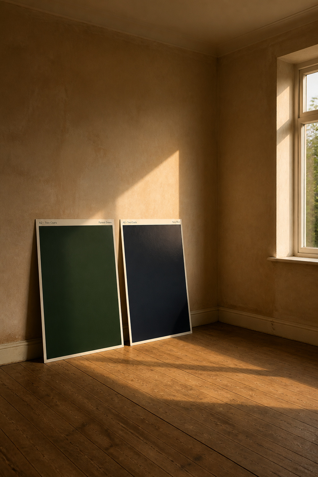
- Paint a sheet of lining paper — at least 12×12 inches, ideally 24×24 — with two full coats.
- Let it cure a full 24 hours, since dark colors darken further as they dry.
- Move it to several walls, near the window and away, judging it against white, not a dark surface.
- Approve the color only after seeing it in the room’s worst-lit position.
As Patrick O’Donnell of Farrow & Ball puts it, the classic mistake is “buying too many samples and painting them all next to each other, often on a stark white background.” Treat one painted sheet as a “moveable feast” instead.
Color Drenching a Living Room: Walls, Woodwork and Ceiling Together
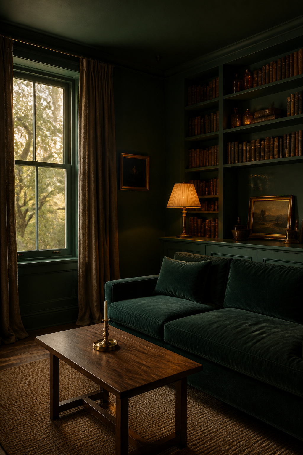
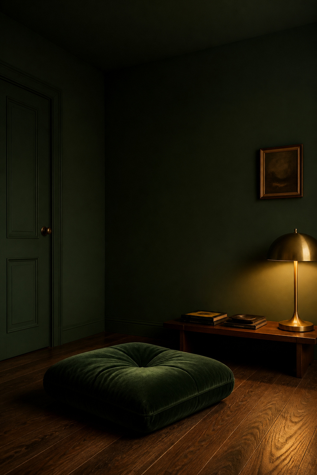
Color drenching is the technique that separates a dark room from a genuinely moody one. It means painting everything the same shade — walls, woodwork, ceiling, even radiators and shelving — so the contrast between surfaces disappears.
What color drenching actually means and what it achieves
By removing that contrast, drenching blurs the room’s edges into a seamless cocoon. O’Donnell describes darker tones as creating “a cosy cocoon of colour” that “especially suits rooms you use in the evening.” For the deepest result, Farrow & Ball recommends a virtually zero-sheen Dead Flat finish across every surface.
Which colors drench well and which fight the technique
Deep, saturated colors with one dominant hue drench best — a clear deep green, navy or charcoal reads consistently across five surfaces. Colors with competing undertones fight it, because an undertone that shifts between purple and green by angle turns restless across a whole room. If full commitment feels like too much, a “stepped drench” — the same color at roughly 75% strength on the ceiling, full strength on the walls — keeps the enveloping feel while anchoring the proportions.
Practical sequence: order of surfaces and how to handle transitions
A clean drench follows a set order:
- Prime the ceiling first — primer is non-negotiable, because dark pigment over unsealed plaster adheres patchily and dries to an uneven sheen.
- Paint the ceiling in full-formula wall paint, flat or matte — never standard ceiling paint, which is built to hide, not hold depth, and goes chalky in a dark tone.
- Paint the walls next, cutting in cleanly at the cured ceiling line.
- Finish the woodwork last. When mixing finishes — Dead Flat on walls, eggshell on joinery — do the matte first and let it cure before cutting in the eggshell.
Dark Ceiling Living Room: When to Go All the Way Up
The ceiling is the surface most people lose their nerve on, and it is where a moody room is won or lost. Designer Emma Deterding of Kelling Designs calls a dark ceiling “transformative,” noting it “brings down the height and makes a room moodier and much more atmospheric.”
The visual effect of a dark ceiling versus a light one
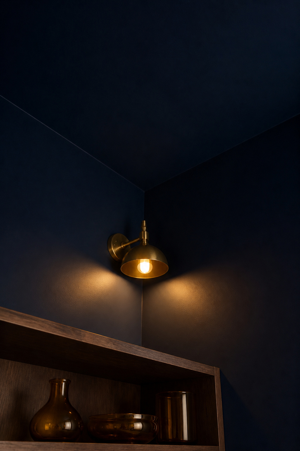
A dark ceiling over dark walls reads as deliberate, enveloping compression. A dark ceiling over light walls creates a problem Deterding describes plainly: “the weight of the room is hanging over your head, making you feel trapped.” The professional consensus is firm — keep it tonal. The exception is strong cornice or crown moulding at the junction, which reads as an intentional border and lets the dark ceiling feel picked out rather than dropped on.
Which ceiling heights work and which to approach cautiously
Height changes the calculation. Dark ceilings work best at 9 feet and above; at 10 feet or more, the darkness trims excess loftiness into intimate elegance. In a standard 8-foot room, a dark ceiling should arrive as part of a full drench, not as a lone dark plane against pale walls — drenched, its weight spreads across all five surfaces and envelops rather than oppresses.
Dark ceiling finishes: matte versus eggshell versus satin
Matte is almost always right overhead, for two reasons: it hides the roller lines that stay invisible in white paint but show clearly in a dark one, and it suppresses the glare a satin ceiling throws back down at the people beneath it. The advanced alternative is a lacquered ceiling, which Deterding suggests where the ceiling itself is the feature — elaborate plasterwork, say. For most rooms, flat or matte over a proper primer is the dependable choice.
Paint Sheen and Finish: The Detail Most Guides Get Wrong
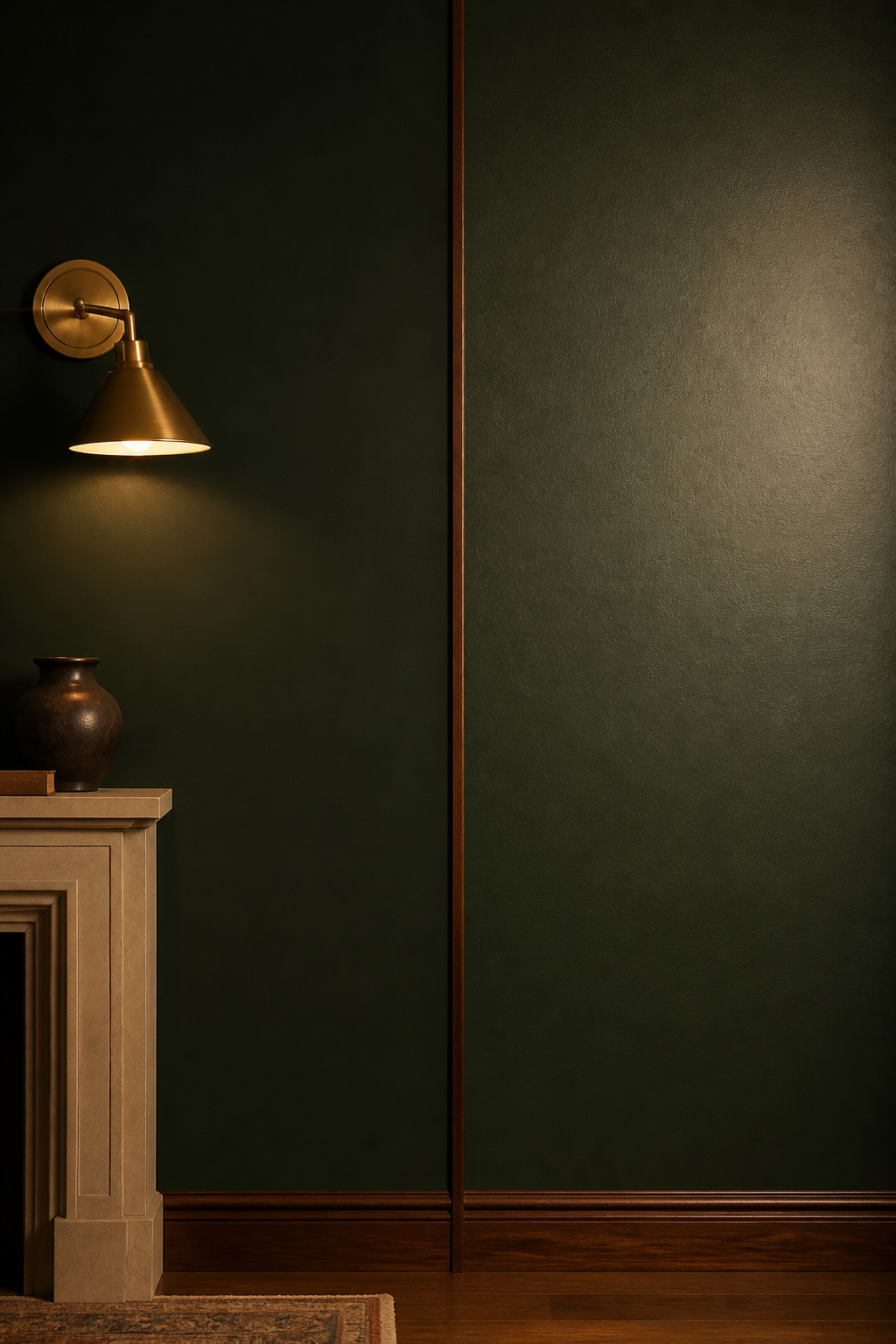
Sheen is the specification most guides dismiss in a line, yet it changes how a dark color reads more than almost anything else. The rule is simple: the flatter the finish, the deeper and truer the color; the higher the sheen, the lighter it appears.
Matte: maximum depth, minimum forgiveness
A flat or matte finish reflects roughly 0–5% of light, absorbing nearly everything and rendering the color at its most saturated — which is why Dead Flat is the drenching recommendation. The cost is honesty about your walls: matte hides nothing, so every roller mark and plaster bump shows under raking light, and it does not wash — a scuff wipes to a burnished patch. Prepare the surface properly before committing to it.
Eggshell: the working compromise for most dark living rooms
Eggshell (10–25% sheen) is the professional standard for dark living room walls. It gives a slight velvety glow, cleans up, and stays below the glare threshold of satin. Here is the detail most guides miss: in deep colors (LRV under 15), the perceived brightness gap between matte and eggshell is far smaller than in pale colors — so eggshell reads only a fraction lighter than matte, and you gain washability at almost no visual cost.
Satin and beyond: when reflectivity becomes a design choice
Satin (25–35% reflectance) is a deliberate move, not a default. In a well-lit south or west-facing room it can lend a dark color a wet, jewel-toned depth; in a north-facing or dim room it backfires, catching lamp sources as harsh hot-spots. As designer Emily Henderson notes, eggshell is the finish “recommended most often for living rooms,” with “a subtle, velvety sheen just enough to bounce light gently around the room.”
Accent Walls Versus Full Drenching: Knowing Which Approach Your Room Needs
The choice between one dark wall and a full drench is a question of architecture, and the answer is a matter of designer judgement rather than a fixed rule. The consistent position among experienced practitioners: a room with a clear focal point rewards a targeted accent, while a room without strong hierarchy wants the envelope of a drench.
When an accent wall is the right call (and when it is a half-measure)
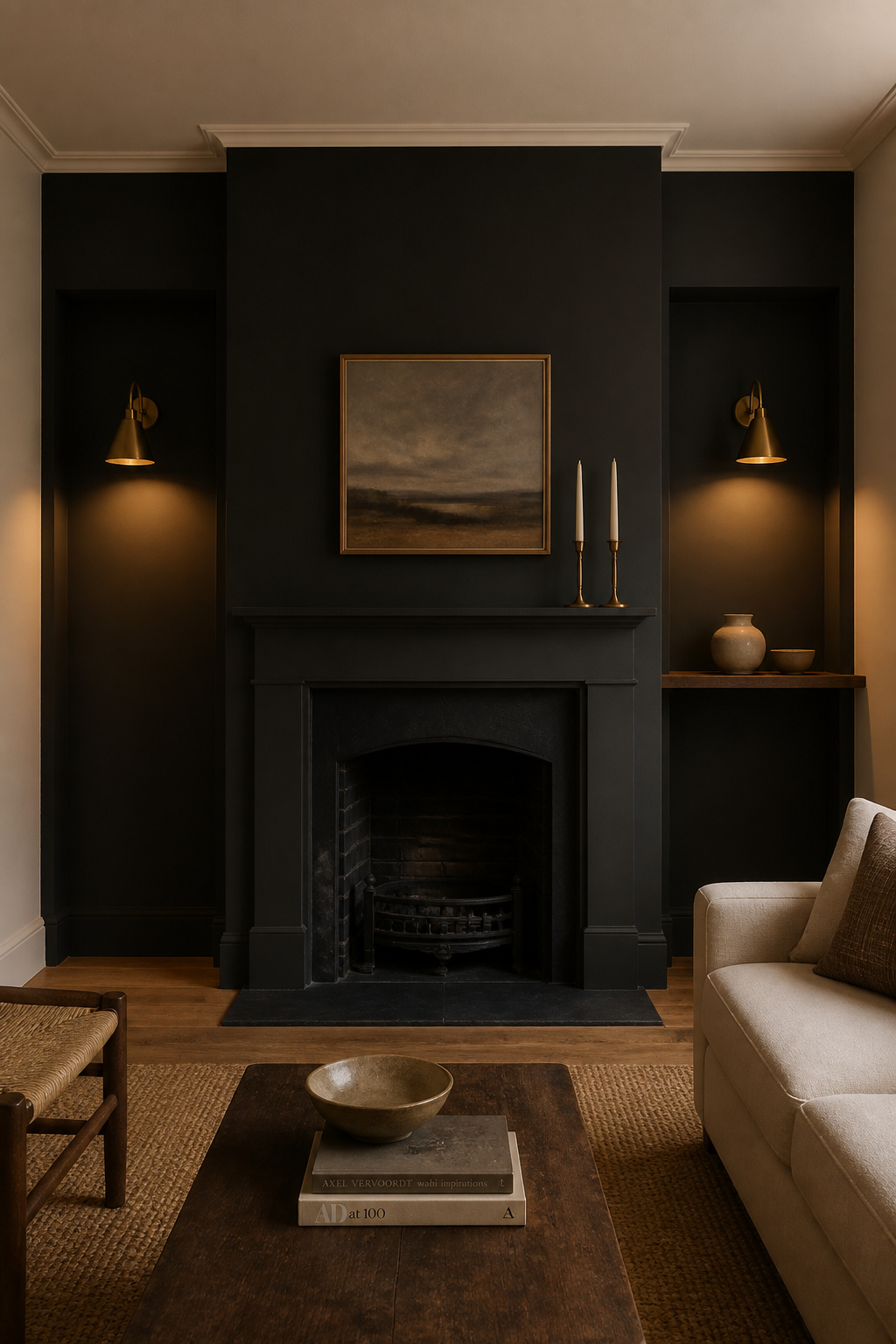
An accent wall works when the room hands you a focal point: a chimney breast, an alcove with built-in shelving, or a wall anchored by a sofa or bookcase. Designer Kate LeCerf draws the line at three legitimate places — “the wall you first see when entering a room,” a focal-point wall, or “a wall where you want to create the illusion of depth and recession.” The wall should also be solid; one broken by windows and a door fragments the color into patches, and there a full drench serves better.
The architectural features worth picking out in a darker tone
The chimney breast is the most resolved accent location in any living room, because the fireplace is already the focal point. Paint it a deep charcoal, navy or green and the surround reads as a designed frame, the firebox pushed forward by the recession behind it. The flanking alcoves suit dark paint especially well — their recessed geometry already holds shadow, which a deep color exaggerates as intentional contrast. A dark wall behind built-in bookshelves does the same for the contents: books and art read with far more clarity against deep navy than against off-white.
Making a single dark wall read as intentional, not unfinished
The trick to a deliberate accent is the company it keeps. The three remaining walls should be a chosen tone, never a leftover builder’s white — LeCerf advises that the accent and the other walls share an undertone family, so a deep navy sits with a warm off-white or soft greige and fights a cool bright white. Because dark walls depend entirely on the light around them, plan that next: the right lighting for dark walls keeps a deep accent looking rich rather than dead.
A moody living room is not made by one brave can of paint. It is made by matching the color to the light the room receives, committing to a finish that protects the depth you chose, and deciding whether the room wants a full drench or a single well-placed dark wall. Choose a warm-undertone deep, test it large and dried in your own evening light, and lay it on in flat or eggshell. Get those three right and the color does what those Victorian parlours did: it comes alive after dark, in the hours you are actually in the room.
FAQ
What is the best paint color for a moody living room?
Deep greens such as Farrow & Ball Studio Green No. 93 (LRV ~7.2) are the most forgiving, as their natural character resists reading oppressive. For cooler drama, Hague Blue No. 30 (LRV ~7) or Benjamin Moore Hale Navy HC-154 (LRV 8) lead the navies; for a warm near-black, Sherwin-Williams Iron Ore SW 7069. The best choice depends on your room’s light orientation and how you test it in situ.
Does dark paint make a room look smaller?
Not necessarily — it is largely a myth. High-contrast dark walls against a white ceiling and trim do feel enclosed, but a full color drench distributes visual weight evenly and can push the walls back, reading as an intimate envelope rather than a shrinking box. The deciding factor is even, layered light that keeps any single surface from falling entirely into shadow.
Should I paint the ceiling the same color as the walls in a dark room?
Yes, if you want a fully enveloping result. A dark ceiling against light walls creates a heavy “lid”; matched to dark walls, it becomes a seamless cocoon — Emma Deterding advises, “if you’re going dark on the ceiling, go dark throughout.” Use full-formula wall paint in flat or matte over a proper primer, not standard ceiling paint, which goes chalky in deep tones.