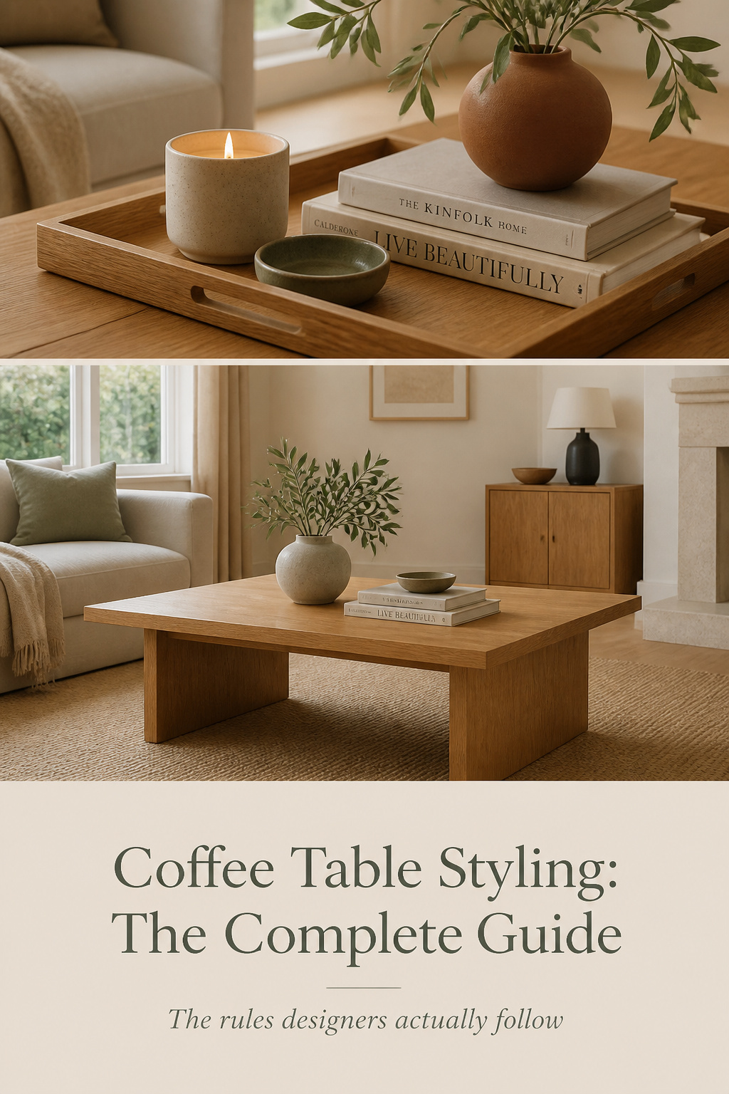
Here is the part of coffee table styling that almost no one believes until they try it: the table that looks wrong is rarely under-decorated. It is over-decorated. The instinct, when a surface feels flat, is to add — another candle, a second bowl, a stack of magazines — and each addition makes it worse, not better. Designers know the opposite move. The fix for a busy table costs nothing, because it is subtraction. Take things off, and the few that remain finally have room to be seen.
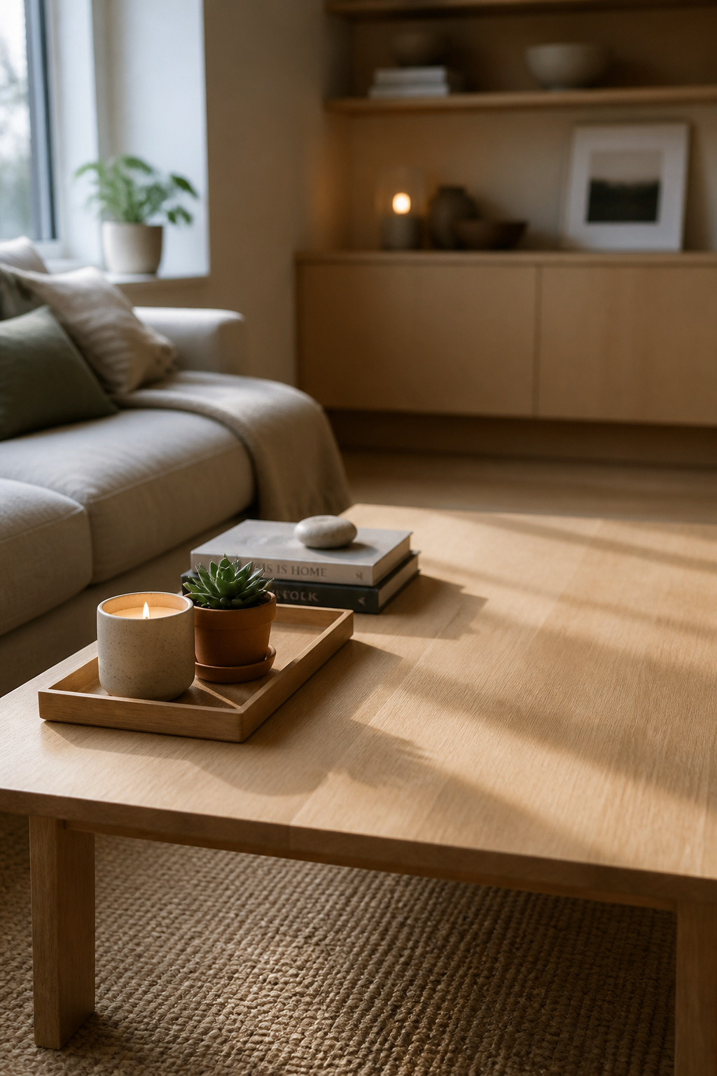
I learned to trust this the slow way. For years I have photographed rooms at seven in the morning in February — the worst light a northern home gets all year. A table styled for a magazine collapses in that light; clutter that looked rich at golden hour just looks like a pile. Only the edited table holds up. That is the test behind everything here: coffee table styling that survives the dullest Tuesday morning, not just the photo.
This is the full system — the rules, the objects, the method, and how all of it bends for your table’s shape, the season, your budget and your floor space. Each section sends you on to a deeper guide where one part deserves more room.
Why Most Coffee Tables Look Wrong (And the Fix That Costs Nothing)
The most consistent finding across designers who style tables for a living is not about what to buy. It is about restraint. Too many objects turn a coffee table into what one editor flatly called a dishevelled mess — and the cause is almost always accumulation, not lack.
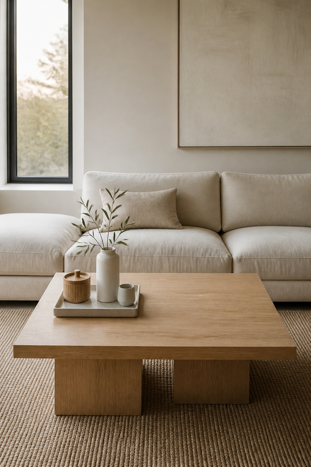
The over-decoration trap: why more objects make a table look busier, not better
There is a measurable reason a crowded table feels stressful. Environmental psychologists describe a point — roughly five or more objects — where the brain stops reading a surface and starts scanning it. It hunts for hierarchy, for the thing meant to matter most. When it finds none, it registers the table as chaos rather than design. The effect has a name: scanning fatigue. You do not consciously think “too much”; you just feel faintly uneasy in the room and never quite know why.
The 2026 design mood has caught up with this. The maximalist coffee table that dominated the early part of the decade has given way to minimal, considered styling. Kathy Kuo, interior designer and CEO of Kathy Kuo Home, frames the goal well: there is no single correct way to style a coffee table, but it is a mistake not to treat the surface as a chance to build a genuinely beautiful vignette. The vignette is the unit — one composed grouping — not a full surface of competing things.
Negative space is not empty space — it is rest for the eye
Empty surface frightens people. It looks unfinished, so they fill it. This is the error. In design, the unoccupied area around objects does real work: it is what lets each object register at all. When every inch holds something, the eye drifts without landing, and nothing reads. Leave deliberate space, and the same objects suddenly look chosen.
A working number helps here. Style no more than two-thirds of the surface and leave at least a third clear — closer to 40 percent on a coffee table, which has a job to do beyond looking good. That clear area is not waste. It is where the cup goes, where the book lands, and visually, it makes the surrounding furniture feel larger by comparison. Bare surface used on purpose is not absence; it is the quiet that lets the rest be heard.
The three-question test before placing any object
Before any object earns a spot, ask three things of it. Does it add a different height to the group? Does it bring a texture or material the others lack? Does it feel personal rather than generic? An object that fails all three is filler, and filler is exactly what scanning fatigue feeds on.
There is a fourth, sharper question for objects that pass — one borrowed from how designers use trays. Helen Ashmore, head of design at Laura Ashley, treats trays as a way to create order on the tabletop, “organisation in disguise” that gives every item a place. So the last question becomes: does this belong inside the boundary, or outside it? If it has no home on either side, it has no home on the table.
The Core Rules of Coffee Table Styling
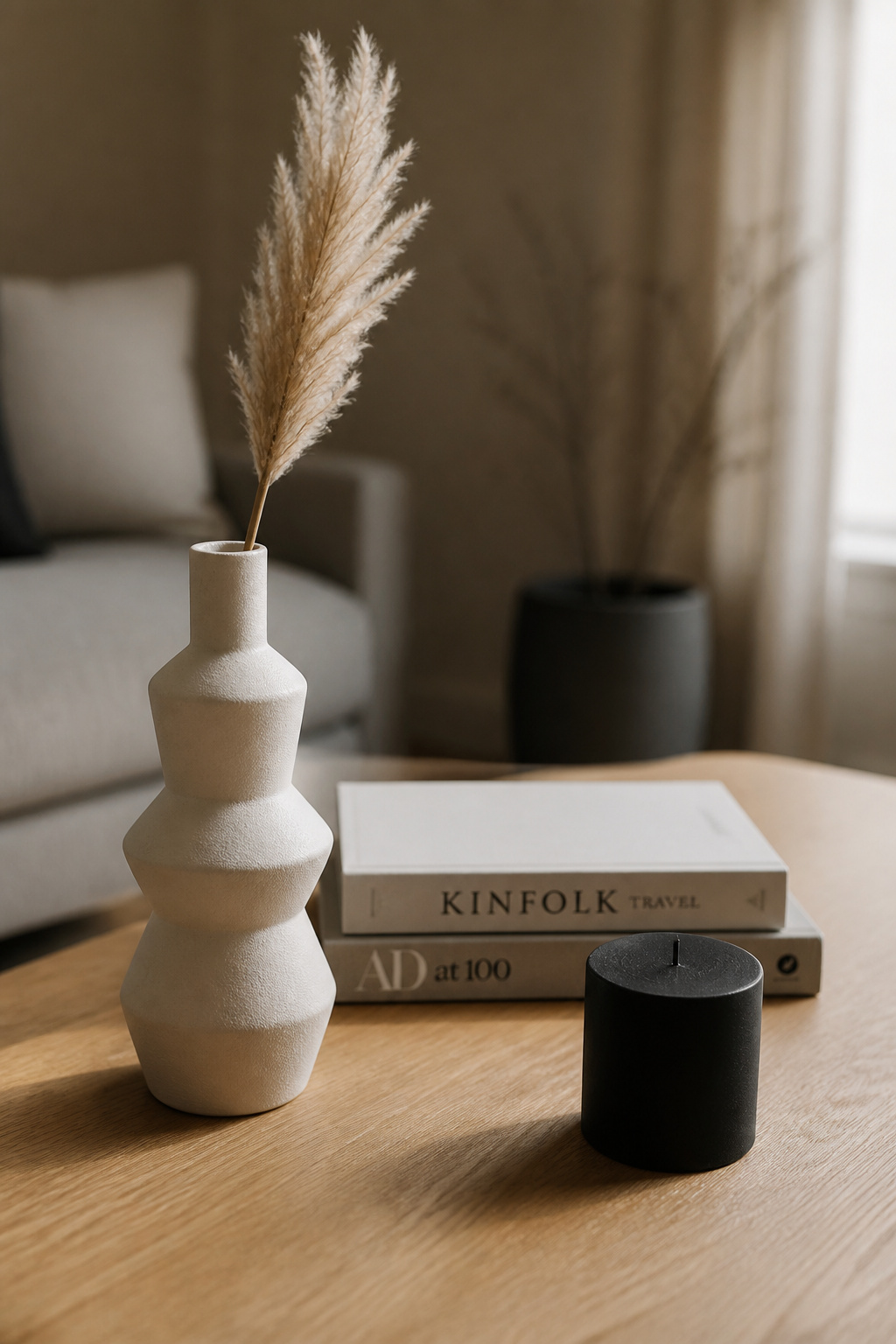
Four rules sit under every good arrangement, regardless of style or budget. Learn them once and you stop styling by trial and error. The table below is the whole foundation at a glance; the prose after it commits to how to apply each one.
| Rule | What it does | How to apply it |
|---|---|---|
| Odd numbers (rule of three) | Keeps the eye moving instead of resting on a static pair | Group three objects; expand to five or seven, never even numbers |
| Vary height, filler, personal touch | Builds a visual triangle so the group reads as composed | One tall (10–15 in), one medium (4–6 in), one low (1–3 in) |
| Visual weight and balance | Stops the grouping tipping toward one edge | Heavy or dark pieces anchor centre/back; light pieces float outward |
| Leave room for a drink | Protects the table’s actual function | Keep roughly one clear 12 × 12-inch zone always |
Rule of three and odd numbers: why they work
Three is the smallest number that makes a pattern the eye finds satisfying. Two objects read as a matched pair — symmetrical, predictable, a little dull. Three keeps the eye travelling around the group rather than settling, which is what gives a still arrangement a sense of movement. As Dream Interiors NY puts it, odd numbers draw the eye into motion where even numbers feel static. Nature works this way too: flowers, branches, seed heads tend to gather in odd counts, so the arrangement reads as familiar rather than staged.
Three is the practical minimum on a coffee table. Five suits a larger surface, seven is about the ceiling before scanning fatigue sets in. The principle is the oddness, not the exact number — but if you remember one figure, remember three.
Vary height, filler, and personal touch in every grouping
This is the rule that does the heavy lifting. The Emily Henderson team distils it to a non-negotiable triad: one tall object, one medium, one short. A plant or sculptural vase at 10 to 15 inches; a tray or book stack at 4 to 6; a candle or low dish at 1 to 3. Three heights, one of each. The LuxDeco version adds a fourth element — the personal touch — and that addition matters more than its size suggests. The personal object is what turns a styled surface into a home rather than a showroom.
One caution from daily use: a vase or plant much above 12 inches photographs beautifully and blocks the conversation across the table. If people sit facing each other in this room, keep the tall element below seated eye level, or choose a sculptural piece slim enough to see past.
Visual weight and balance: heavy pieces anchor, light pieces float
Height is not the only axis. Objects carry visual weight — dark, dense, glossy things pull the eye harder than pale, matte, airy ones. The trick is to set the heavy pieces toward the centre or back and let the lighter ones drift outward, so the group feels anchored rather than tipped to one side. The surface beneath plays a part too: a glass top lets height feel weightless, while solid wood or stone absorbs weight and asks for lighter, airier objects on top. And vary the materials — smooth ceramic against rough wood against a little metal — so the table reads as collected over time, not ordered from one catalogue.
Leave room for a drink: functionality as a design constraint
A coffee table is furniture before it is a plinth. Style it so a mug has nowhere to land and you have failed the brief, however good the photo. Keep at least one clear zone of roughly 12 by 12 inches, always reachable. Two measurements from designers protect the rest of the function: a table sits best 14 to 18 inches from the sofa edge, close enough to reach without leaning, and around 16 to 18 inches high so it aligns with the seat. Betsy Burnham of Burnham Design notes that a table too low for a seated guest to use comfortably is simply the wrong table. Usability is a design input, not an afterthought.
The Coffee Table Styling Toolkit: What to Actually Put on It
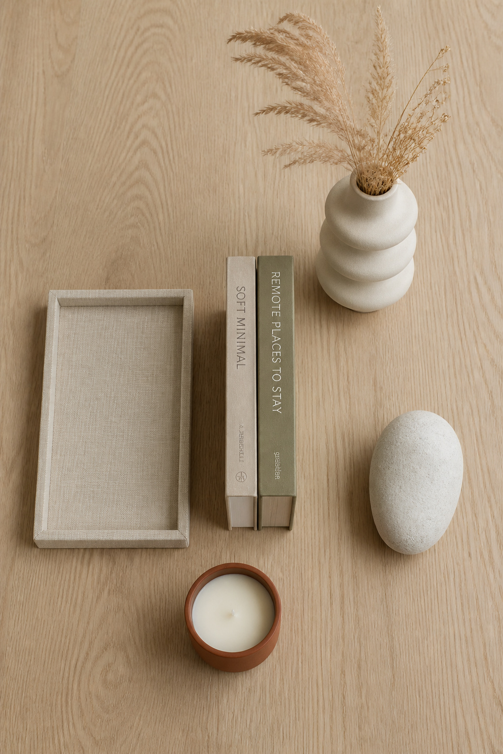
Five categories of object cover every arrangement. Each plays a distinct role, and the mistake most people make is doubling one and skipping another — two trays and no greenery is as off-balance as no tray at all. Use this as the kit; pull one from each row and you have a complete table.
| Object | Styling role | What it contributes |
|---|---|---|
| Tray | Corralling boundary | Turns scattered items into one intentional group |
| Coffee table books | Riser and anchor | Height, a pedestal for small objects, personality |
| Candle or vessel | Mid-height texture | Warmth, material contrast, a low focal glow |
| Plant or organic element | The living element | Life, irregular form, softens hard geometry |
| Sculptural accent | The personal touch | The piece a visitor picks up and asks about |
The tray comes first because it does the most structural work. The Emily Henderson team calls it the rug of the coffee table — the thing that corrals everything else and holds the group together. Choose one that contrasts the tabletop, so it reads as a distinct element rather than vanishing into the wood, and size it generously; a tray that floats anchors nothing. There is far more to it than the pillar can hold, so for tray size, shape and what goes inside, see the full guide on how to style a coffee table tray.
Books are the quiet workhorse. Stacked largest to smallest, they add height and double as a pedestal — set a small object on top and it gains presence the bare table could not give it. They also carry personality through their subjects and spines. Choosing the books and stacking them well is its own craft, covered in styling and stacking coffee table books.
Candles and vessels supply the mid-height and the texture. A cluster of pillars at varied heights reads classic; one large candle in a marble or ceramic holder reads modern, with the holder doing as much visual work as the flame. Plants are the easiest single addition that brings life — but if the centre of your room sees little light, dried stems, pine cones or moss balls give the same organic texture with none of the care. And the sculptural accent goes down last: the found object, the inherited piece, the thing that fills the gap in the composition and tells the room whose it is.
A Step-by-Step Coffee Table Styling Formula Anyone Can Follow
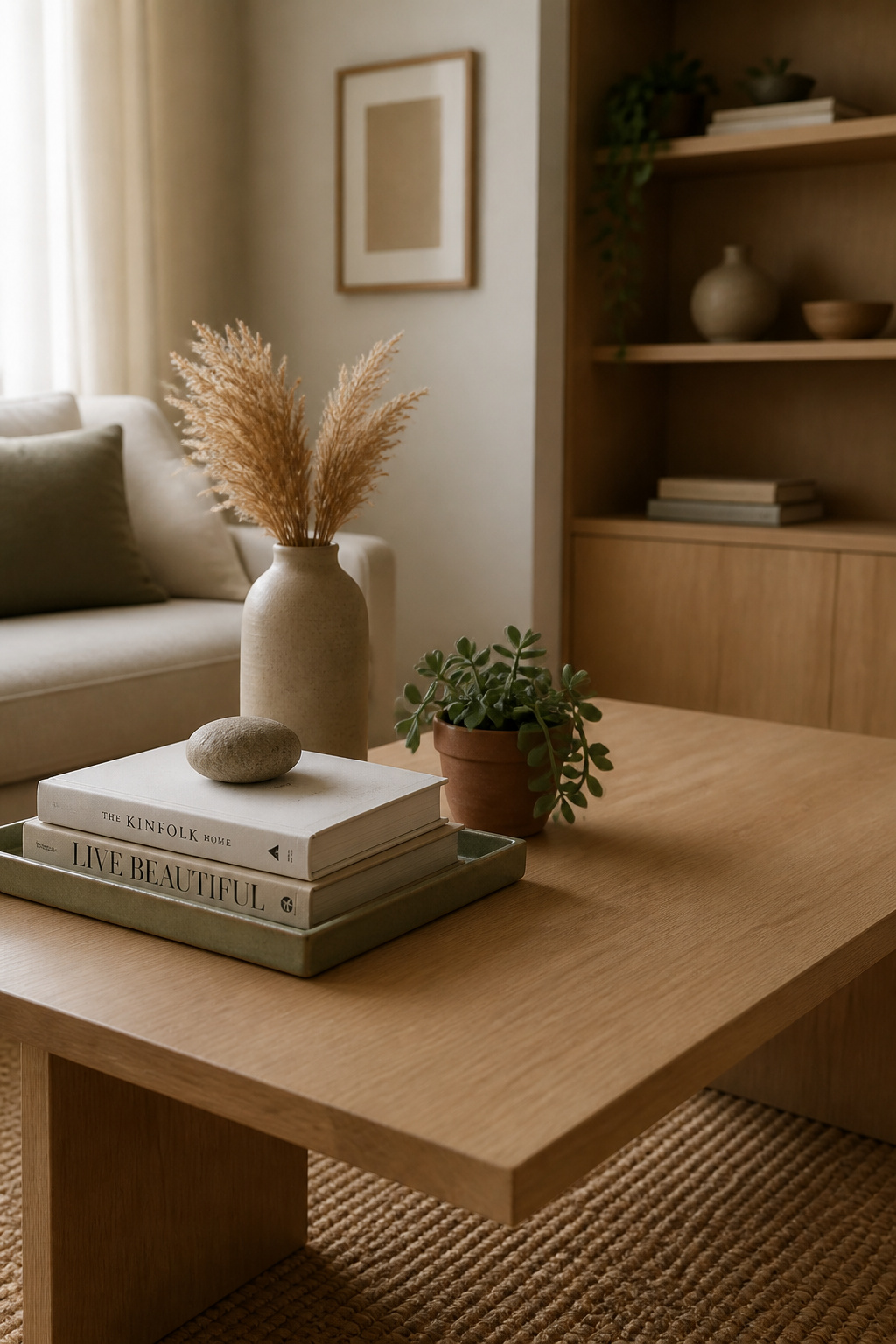
Professional stylists converge on the same sequence, and following it in order is what separates a composed table from a pile that grew. The hard part is not the building — it is the last step, which feels wrong every time and is right every time.
- Clear the surface and start from zero. Take everything off. This sounds fussy, but it is why most restyling fails: people add around what is already there instead of starting fresh, so the old clutter stays embedded. While the table is bare, settle on a palette of three to five colours, so nothing mismatched accumulates by default.
- Anchor with a tray or the largest object. Place the tray first — it decides where everything else goes. Set it slightly off-centre for a relaxed look, or centred for a formal one. On a rectangular table, picture the surface in three sections and put the tray in one; that alone guarantees a clear third.
- Build height variation around the anchor. Add the three-tier trio: one tall item (10–15 inches), one medium (4–6), one low (1–3). Arrange them as a loose triangle — tallest slightly back or off-centre, the others forward and apart — so the eye travels rather than hitting a flat line. Keep the tall piece off dead-centre; perfect centring reads as staged.
- Add the living element. The plant or organic piece goes in second-to-last, placed wherever the group feels stiffest, because its irregular form is the one thing no manufactured object can fake. Scale it to the table: a small succulent or a single stem on a modest table, something that reads across the room on a large one.
- Remove one item — the finishing rule. When it looks done, take one piece away: the one that feels least essential. This is the single most-recommended professional finishing step and the hardest to do, because by now every object feels chosen. The test is simple. If the table looks better without the piece, it was visual noise. The arrangement should be worse for losing anything that stays.
That fifth step is the whole philosophy in one move. A well-styled coffee table is finished not when nothing more can be added, but when nothing can be taken away without the loss showing.
How Your Table Shape Changes Everything
The same rules apply to every table, but the geometry decides where the weight wants to sit. Apply a rectangular formula to a round table and the objects strand themselves at the edges. Read the shape first and the arrangement half-places itself. This is a survey; for the full per-shape formulas, see the dedicated guide on decorating a coffee table by shape.
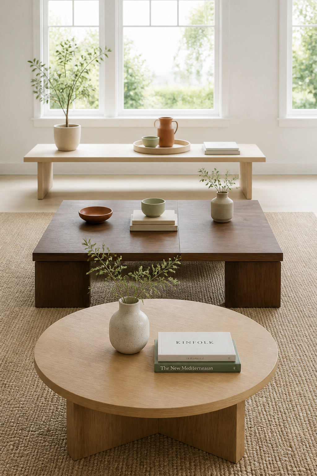
Round tables: the central cluster approach
A round table has its corners cut away, so it holds less than it looks and everything concentrates in the middle. Pull objects to the edge and you break the circle. Build a single central cluster of two or three objects at clearly different heights — a vase, a short book stack, a low ceramic — or commit to one large statement object that owns the centre. And when you add a tray, contrast its shape: a square or rectangular tray on a round table keeps the arrangement from reading as circle-on-circle.
Square tables: four-quadrant scene-setting
A square is the most generous shape to style because it gives you a grid for free. Picture four quadrants, activate three, and leave one open — that single empty cell builds negative space into the layout structurally, and it is where the day’s drink and remote live. A classic version runs two diagonal book stacks, an organic form in a third corner, and the fourth left clear. Vary the footprint of the objects across the cells so the grid does not read as four identical spots.
Rectangular and oval tables: the three-section stretch
The rectangle is the most common shape and the least forgiving — its long axis exposes a lazy arrangement instantly. Divide the length into three sections and give each a job: a tray grouping in the centre, a taller plant or vase anchoring one end, and the third section left as clear surface. Aim for equal visual weight across the sections, not equal object counts. An oval behaves the same way; just pull end objects slightly inward so they do not look precarious on the curve. One proportion holds across both: the table runs best at about two-thirds the length of the sofa it serves.
Styling by Intent: Minimalist, Seasonal, and Statement Tables
The rules stay fixed, but what you want the table to say changes how you apply them. Three intents cover most rooms, and the first question is always the same one — what do I want this surface to be — before any object is chosen.
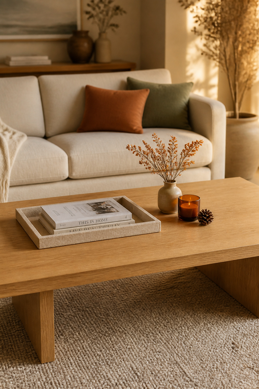
The minimalist table: one tray, three objects, done
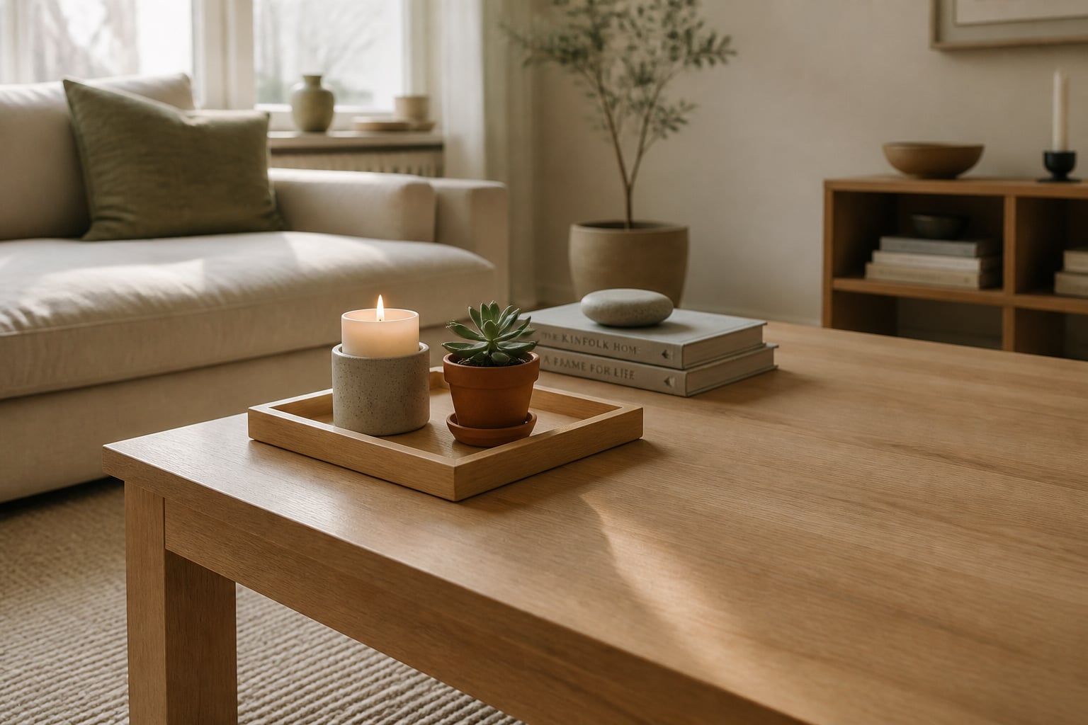
The pared-back table is harder than it looks, because restraint reads as either calm or unfinished depending on a hair’s breadth of judgement. The discipline is one tray, set off-centre, holding two or three pieces — a candle, a small organic element, one quiet object — and the rest of the surface deliberately bare. The difference between minimalist and merely empty is intention: a bare table looks forgotten, while a minimalist one keeps a single focal point so the eye has somewhere to rest. Material quality carries the load when quantity drops, which is why this approach rewards one good piece over three ordinary ones. The full discipline of editing down lives in the guide to minimalist coffee table decor.
Seasonal refresh: a swappable base with rotating accents
The smartest seasonal styling is not four new tables a year. It is one stable base — a favourite tray, a low book stack, a vessel you genuinely like — that stays put while you swap only one or two accents around it. Spring brings fresh stems and a pale candle; summer, glass and something light; autumn, dried botanicals and a warmer vessel; winter, evergreen, pine cones and a metallic glint. Each swap takes about five minutes and makes the room feel current rather than neglected. Store the accents by season in a labelled box and you stop re-buying what you already own. The season-by-season detail is in seasonal coffee table decor ideas.
The statement table: when more is intentional
Here I will give an opinion rather than a rule, because the design world has not settled one. A table with more objects and more presence can work, but only on one condition: internal coherence. Twelve objects that share a single colour family, one material story, or one thread — a travel collection, a run of blue-and-white ceramic — read as a collection. The same twelve in mixed materials and clashing colours read as hoarding. The line between statement and clutter is not the count; it is whether the accumulation follows a language the eye can follow, and whether that language agrees with the room. Betsy Burnham allows that accessories can be “bursting with colour and personality” — provided the personality is the room’s, not a random pile’s.
Budget and Small-Space Coffee Table Styling
Two constraints sharpen styling rather than weaken it: a small budget and a small floor. Both force the editing the rest of us should be doing anyway. The principle under both is the same — method beats money, and a well-placed inexpensive object outperforms an expensive one dropped down without thought.
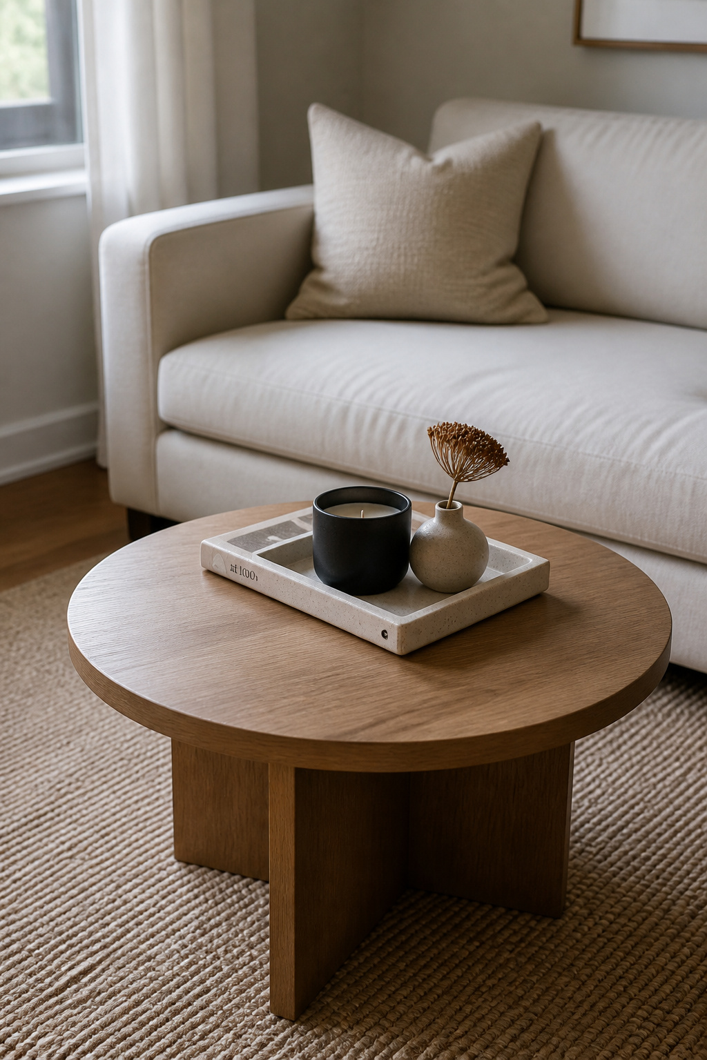
Thrifting and DIY: making the objects, not just arranging them
The styling method decides the outcome far more than the price of any single object. A modest thrifted bowl, set correctly into a three-tier height arrangement, will beat a costly designer piece placed carelessly — and secondhand shops are the best source anyway for the personal-touch object, the one that needs provenance a chain store cannot supply. You can also skip the purpose-made tray entirely: a large hardback book, a vintage breadboard, a shallow wooden bowl all draw the same corralling boundary. For making and sourcing the pieces rather than assuming you own them, see DIY coffee table decor on a budget.
Small tables in tight rooms: proportion and the single-vignette rule
A small table needs one rule above all others: one contained vignette, not several scenes. Multiple groupings on a small surface read as overwhelmed; a single tight cluster occupying at most two-thirds, with the rest clear, reads as calm. Scale matters more here than anywhere — nothing taller than about 12 inches on a table under 30 inches across, or the proportion tips immediately. A single stem in a bud vase gives the living element its height without the bulk a full plant would force. The proportion question for tight rooms goes further in styling a small-space coffee table.
Where to spend and where to skip
If the budget is tight, put it where it works hardest. Spend on the tray and the personal-touch object — the two pieces doing the most structural and emotional work. Skip on the books (libraries and secondhand shelves are full of them), the candle (a plain pillar in an interesting cheap vessel beats an expensive plain one), and the organic element (a foraged branch or grocery-store flowers cost almost nothing). Spending follows function, not price tags.
The Mistakes That Make a Coffee Table Look Cluttered
Every cluttered table I have ever fixed broke one of four rules — and each mistake is simply a core rule turned upside down. Knowing them from this side is its own correction.
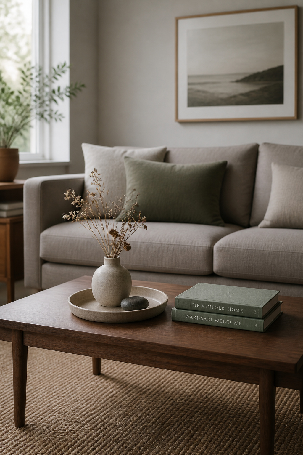
- Everything at one height. When all the objects sit level, the table reads as flat and busy at once: no hierarchy, nothing for the eye to land on. This flat horizon is the single most common amateur mistake. The fix is the three-tier trio — even two heights beat one, three create the visual triangle.
- Too many unrelated objects. Objects with no shared colour, material or theme become noise, however good each one is alone. Three pieces from three different design languages will fight harder than a coherent six. Hold a palette of three to five colours and let material contrast — matte against gloss, rough against smooth — do the work that clashing colours cannot.
- Ignoring the room. A coffee table does not exist alone; it answers to the sofa and the rug. Style it from the sofa seat, since that is the view people actually have, and let at least one object pick up a colour from the upholstery or the rug. That single thread is what stops the table reading as an island. Elizabeth Krueger notes the table’s material should even follow the room’s use — a softer ottoman for TV rooms, a harder surface for conversation.
- No negative space. Fill every inch and the surface turns claustrophobic; the eye drifts and nothing registers. Target somewhere around 20 to 40 percent of the surface left clear — a coffee table can run to the higher end given its job. When in doubt, the remove-one-item rule is the corrective: if the table looks fine with a piece gone, leave it gone.
So the discipline is the same from either direction. Add with the rule of three, height variation, weight balance and a clear zone for the cup; correct by spotting the inverse of each. Style the surface from where you actually sit, in the worst light your home gives, and trust the empty space to carry as much as the objects. A coffee table styled this way is not the one that holds the most. It is the one you stop noticing because everything on it finally belongs — and that, in the end, is the point of styling it at all.